TYPE DESIGN INFORMATION PAGE last updated on Mon Jul 13 21:25:49 EDT 2026
FONT RECOGNITION VIA FONT MOOSE

|
|
|
|
Fontsmith
[Jason Smith]
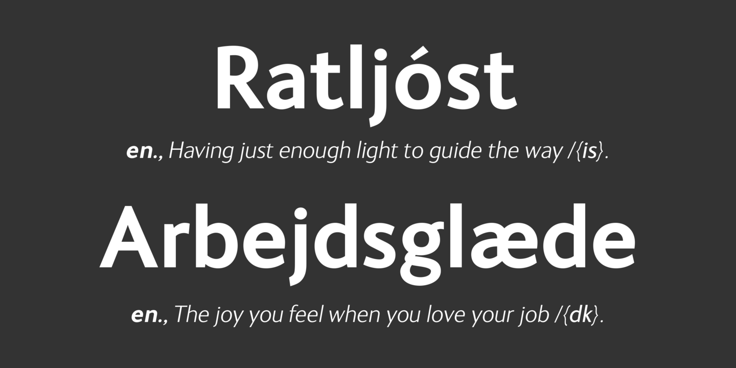
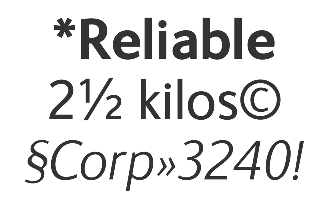
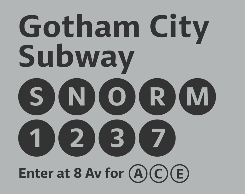
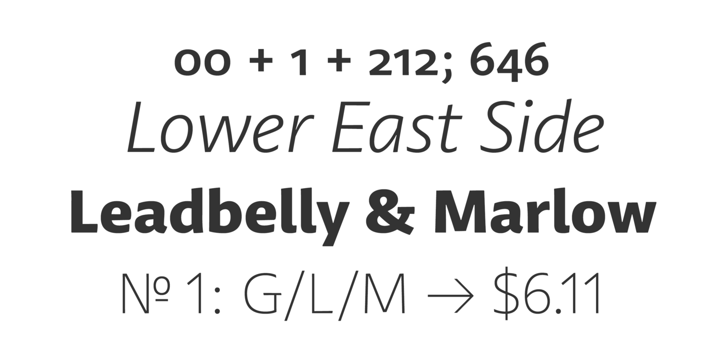
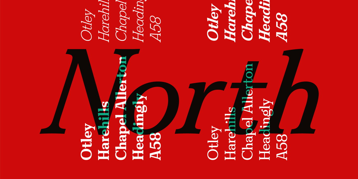
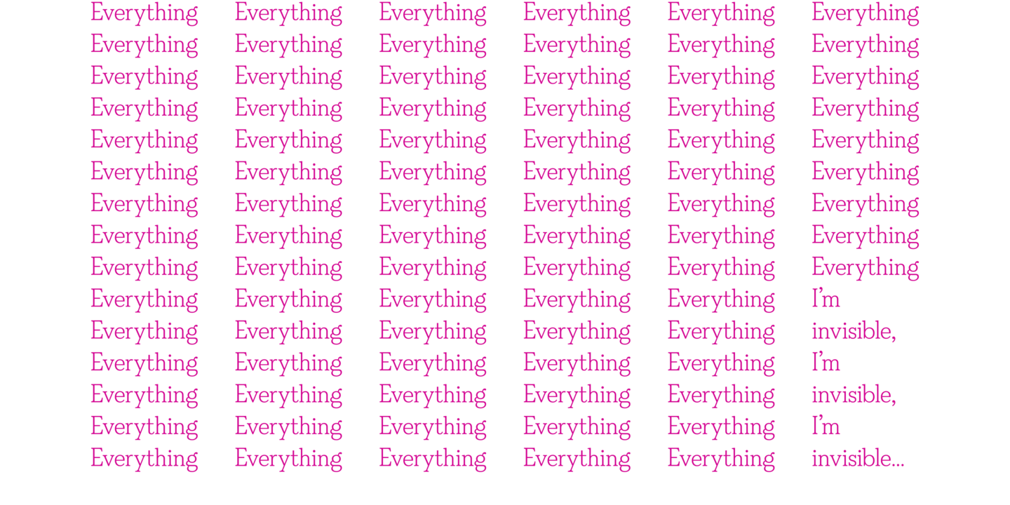
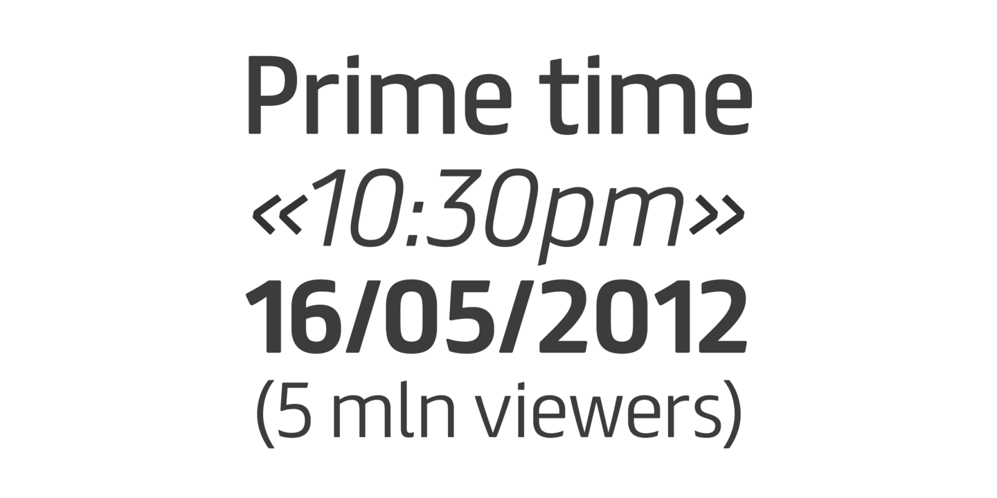
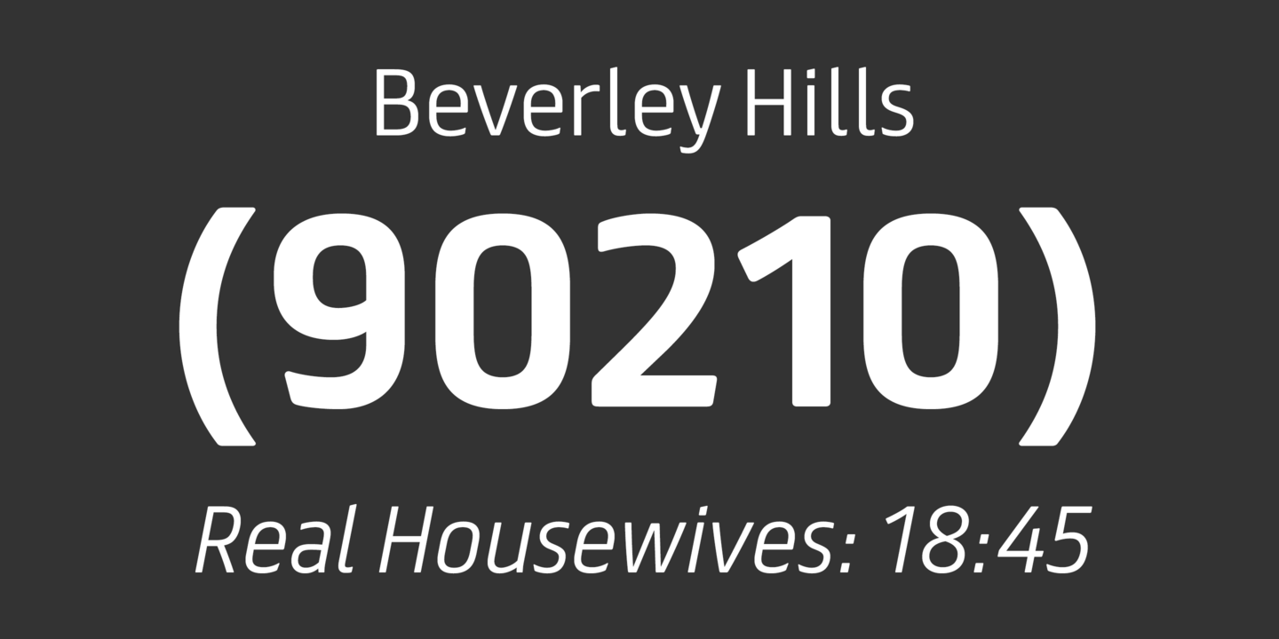
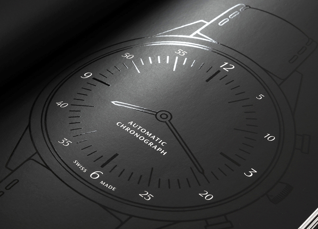
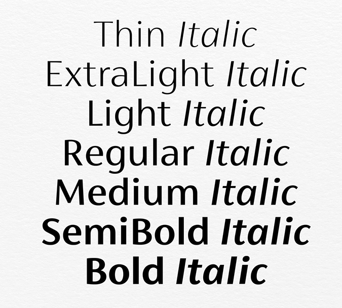
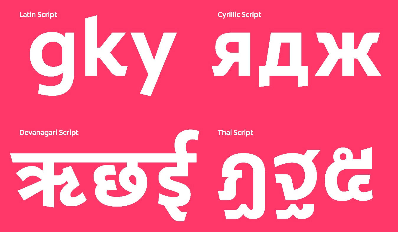
Jason Smith is the British corporate typeface designer who founded Fontsmith in 1997, where he retailed his own designs from his office in London. He has created a typographic identity for the Post Office in the UK. Phil Garnham was one of the in-house type designers. In January 2020, Fontsmith was acquired by Monotype. Smith's custom typefaces include Casey, Seat, Tractebel, PPP Healthcare, Powergen, Allied Irish Bank, UUnet, Channel 4, and Saudi Aramco, Champions (2009: for the UEAFA Champions League), Colgate Ready (2014: for Colgate, covering Latin, Cyrillic, Eastern European, Devanagari and Thai), More4 (2005, for the Channel 4 Adult Entertainment channel), ITV (2006, for the ITV network), BBC ONE (2006, for the BBC), Post Office Sans (2003), Severstal (2009), and Moto GP (2020: a custom techno / sports font). Vernon Adams and Fontsmith got into a quarrel about Vernon's Mako, which was submitted and rejected by Fontsmith, which published its own similar typeface Lurpak a few weeks later. Most of Jason Smith's typefaces are now at MyFonts, after Monotype's take-over in 2020:
|
EXTERNAL LINKS |
| | |


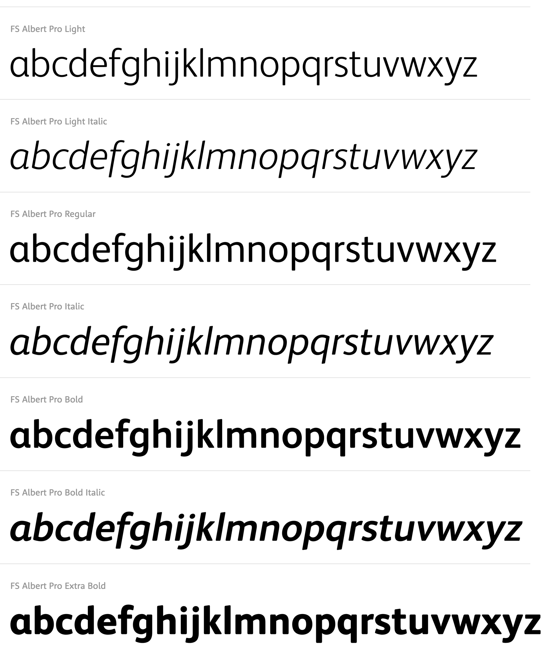
file name: Fontsmith F S Albert 2020 343368 002
file name: Fontsmith F S Albert 2020 343369

file name: Fontsmith F S Albert 2020 343370 002

file name: Fontsmith F S Albert 2020 343371 002

file name: Fontsmith F S Albert 2020 343372 002

file name: Fontsmith F S Albert 2020
file name: Mitja Miklavcic Jason Smith Phil Garnham F S Albert Pro 2009
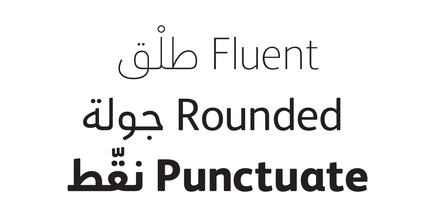
file name: Fontsmith F S Albert Arabic 2020 343395 002

file name: Fontsmith F S Albert Arabic 2020 343396

file name: Fontsmith F S Albert Arabic 2020 343397

file name: Fontsmith F S Albert Arabic 2020 343398 002

file name: Fontsmith F S Albert Arabic 2020 343399 002

file name: Fontsmith F S Albert Arabic 2020
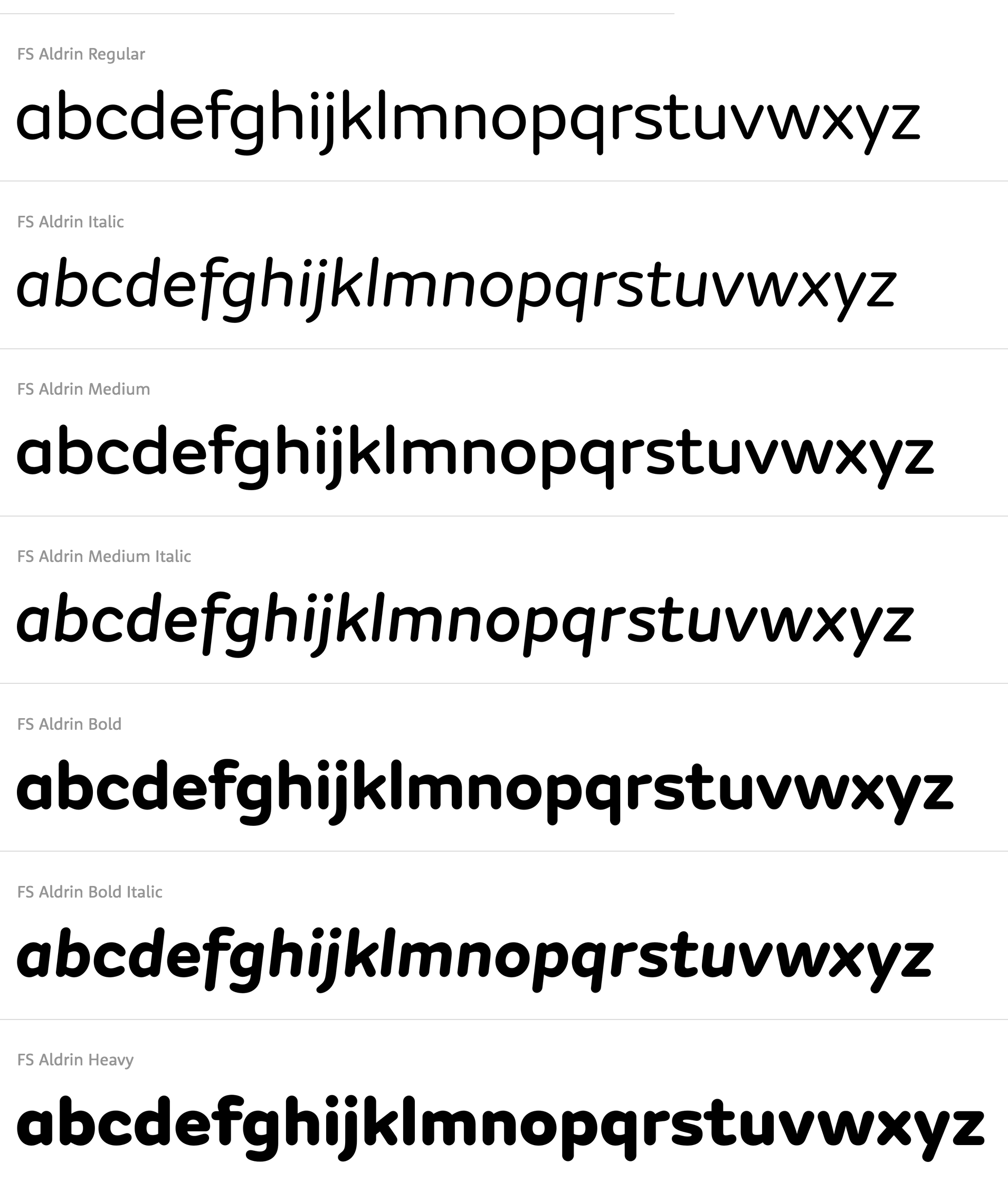
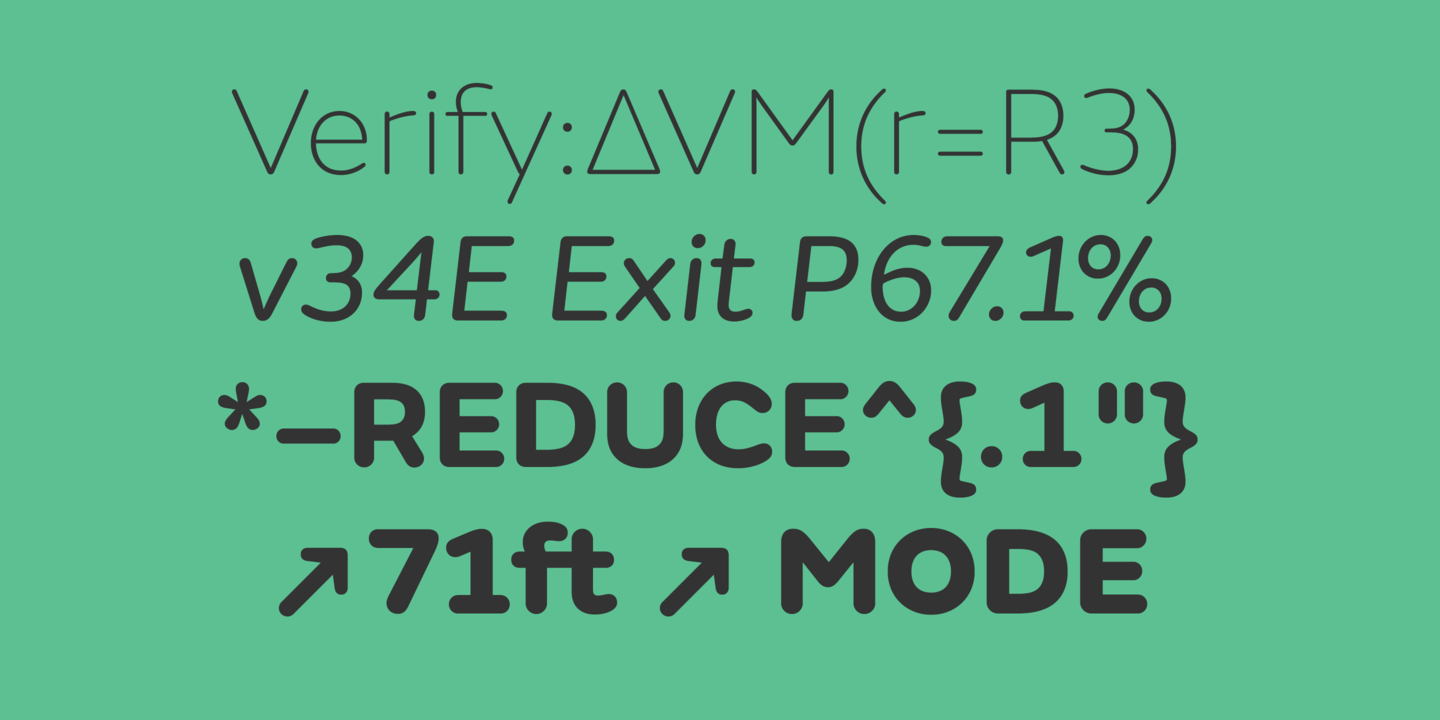
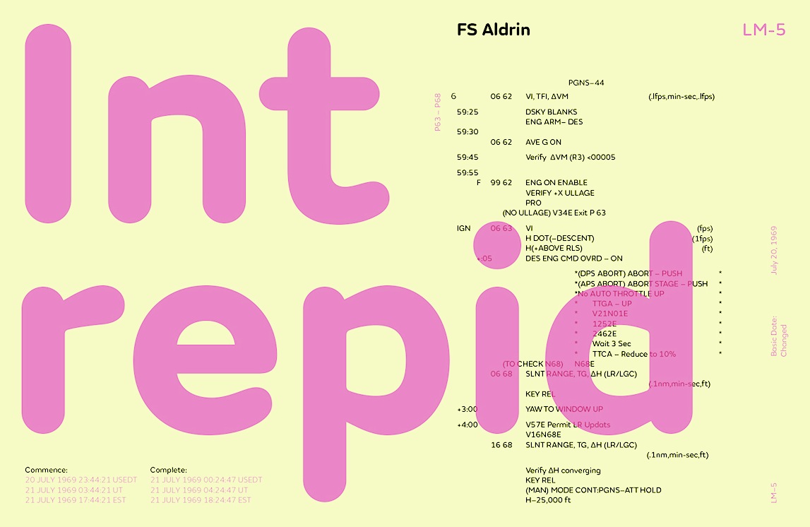
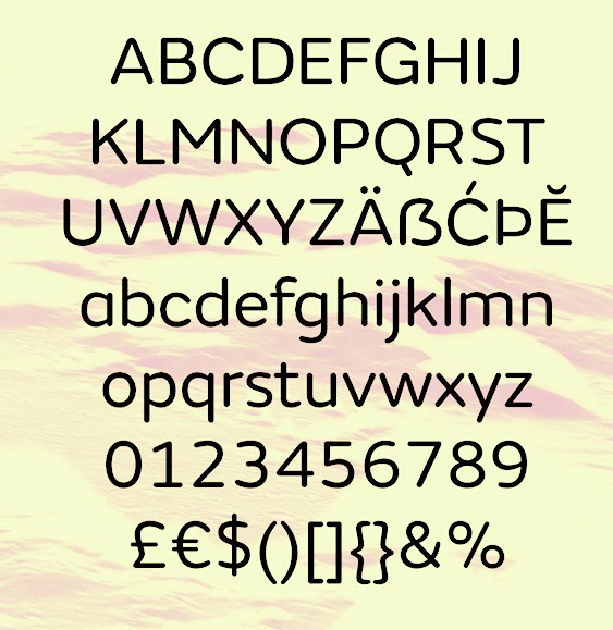
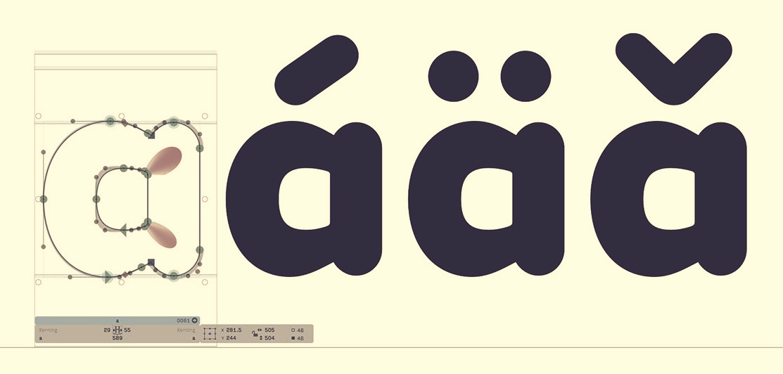
file name: Phil Garnham F S Aldrin 2016

file name: Fontsmith F S Aldrin 2020 342577 002

file name: Fontsmith F S Aldrin 2020 342578
file name: Fontsmith F S Aldrin 2020 342579

file name: Fontsmith F S Aldrin 2020 342580

file name: Fontsmith F S Aldrin 2020
file name: Fontsmith F S Aldrin 2016b
file name: Fontsmith F S Aldrin 2016c

file name: Fontsmith F S Aldrin 2016d
file name: Fontsmith F S Aldrin 2016e

file name: Fontsmith F S Alvar 2020 342184 002
file name: Fontsmith F S Alvar 2020 342186

file name: Fontsmith F S Alvar 2020 342187 002

file name: Fontsmith F S Alvar 2020
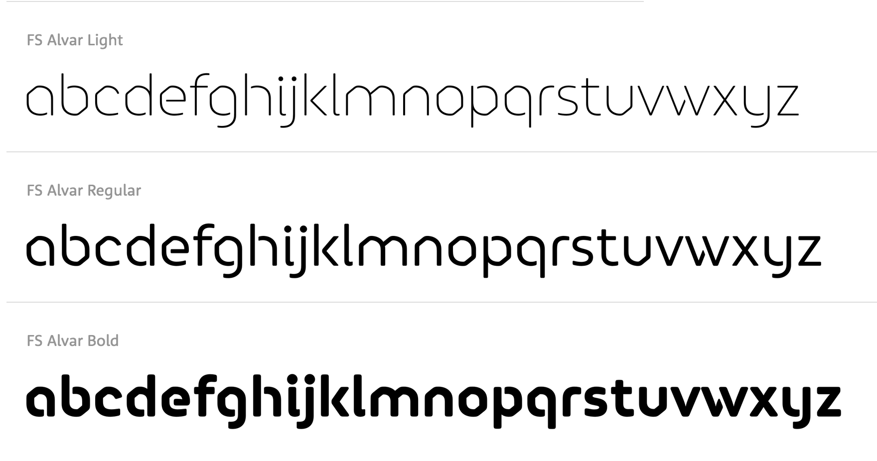
file name: Jason Smith Phil Garnham F S Alvar 2007

file name: Fontsmith F S Benjamin 2020 342525 002
file name: Fontsmith F S Benjamin 2020 342527 002

file name: Fontsmith F S Benjamin 2020 342528

file name: Fontsmith F S Benjamin 2020 342529 002

file name: Fontsmith F S Benjamin 2020
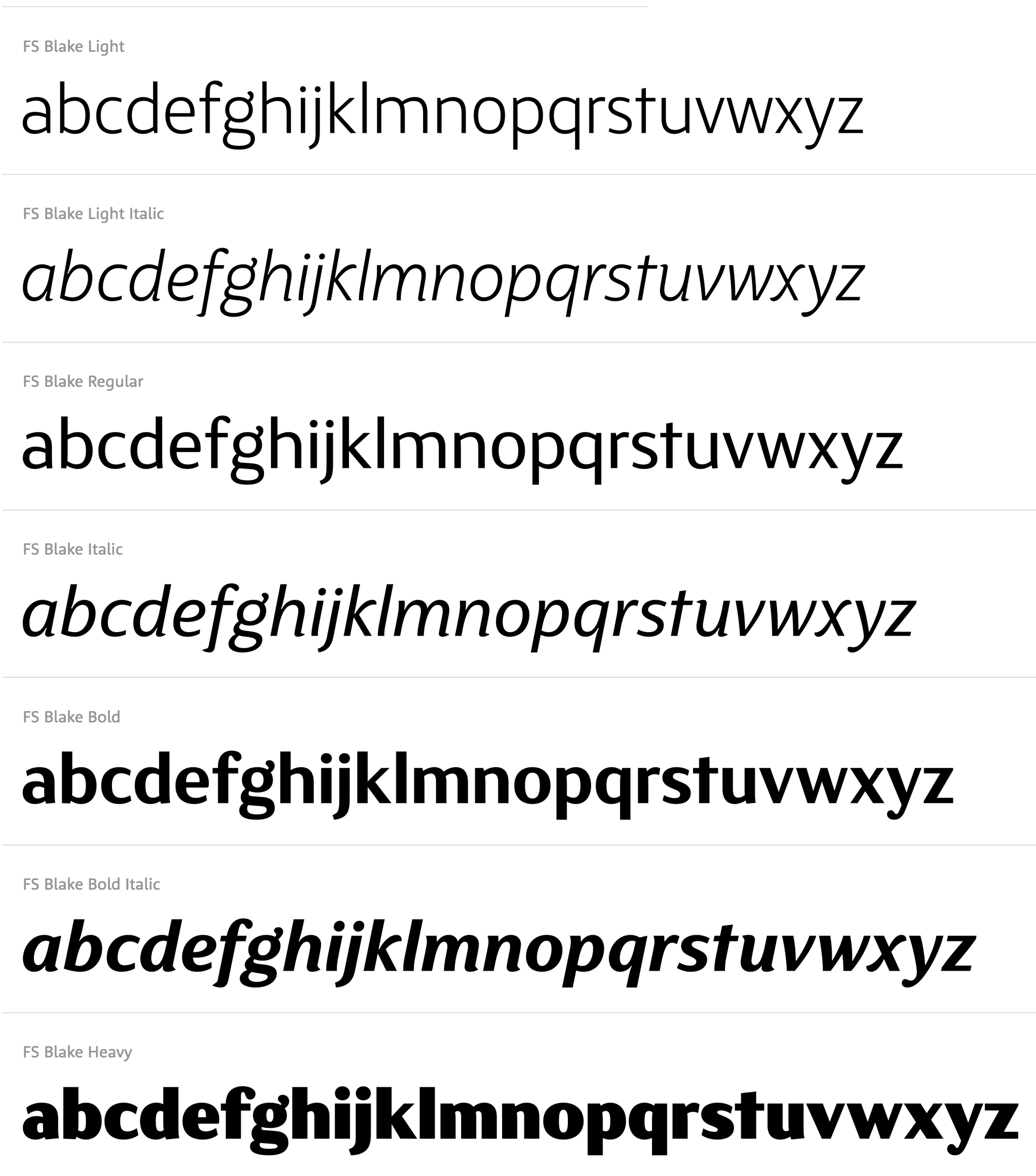
file name: Emanuela Conidi F S Blake

file name: Fontsmith F S Blake 2020 342959

file name: Fontsmith F S Blake 2020 342960 002

file name: Fontsmith F S Blake 2020 342961 002

file name: Fontsmith F S Blake 2020 342962 002

file name: Fontsmith F S Blake 2020 342963

file name: Fontsmith F S Blake 2020

file name: Fontsmith F S Brabo 2020 343385 002
file name: Fontsmith F S Brabo 2020 343386 002
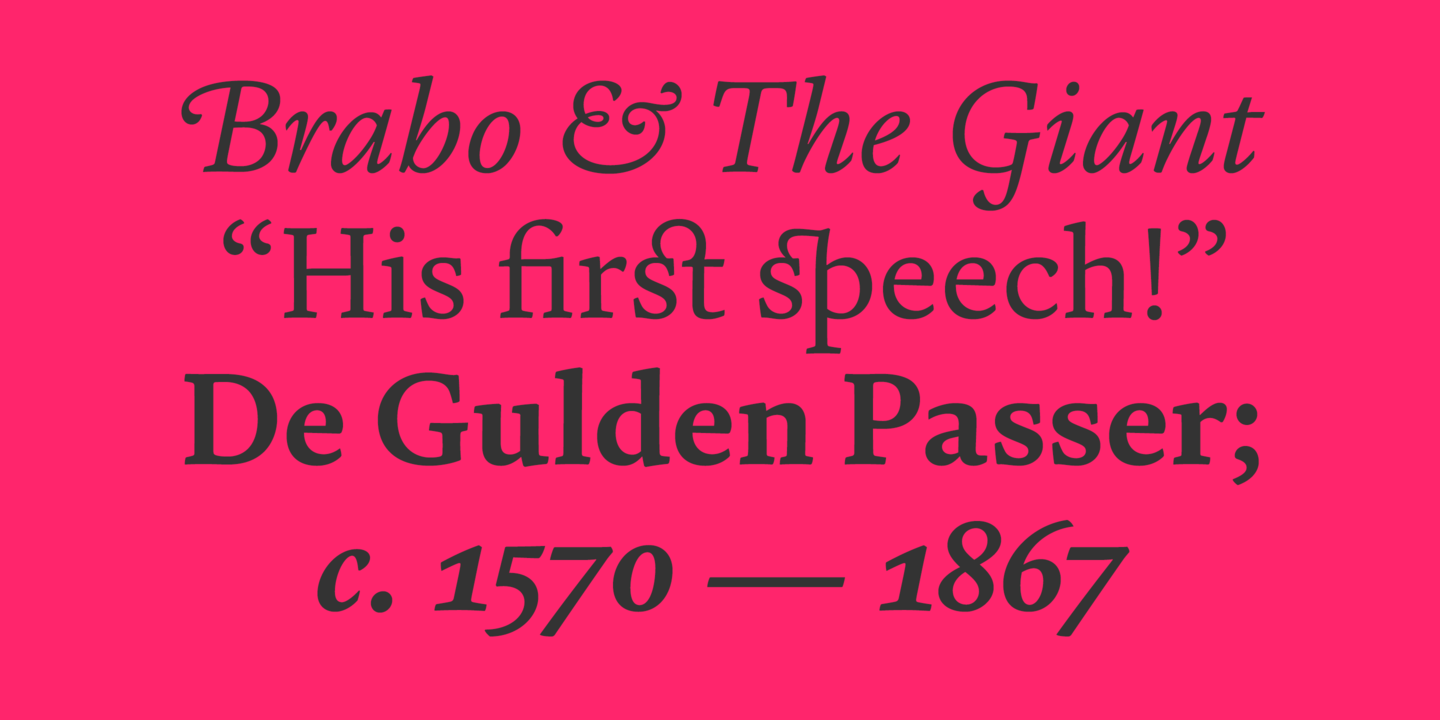
file name: Fontsmith F S Brabo 2020 343387 002
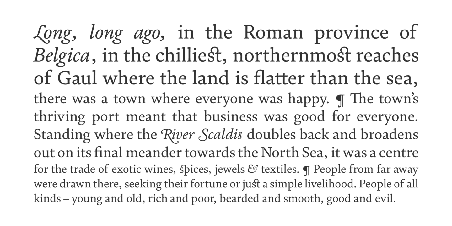
file name: Fontsmith F S Brabo 2020 343388 002

file name: Fontsmith F S Brabo 2020 343389 002

file name: Fontsmith F S Brabo 2020

file name: Fontsmith F S Clerkenwell 2020 342481 002

file name: Fontsmith F S Clerkenwell 2020 342482 002
file name: Fontsmith F S Clerkenwell 2020 342483 002

file name: Fontsmith F S Clerkenwell 2020 342484

file name: Fontsmith F S Clerkenwell 2020
file name: Phil Garnham Jason Smith F S Clerkenwell Light 2004

file name: Fontsmith F S Conrad 2020 342461
file name: Fontsmith F S Conrad 2020 342462 002

file name: Fontsmith F S Conrad 2020 342463

file name: Fontsmith F S Conrad 2020 342464

file name: Fontsmith F S Conrad 2020

file name: Fontsmith F S Dillon 2020 342985
file name: Fontsmith F S Dillon 2020 342986 002

file name: Fontsmith F S Dillon 2020 342987

file name: Fontsmith F S Dillon 2020
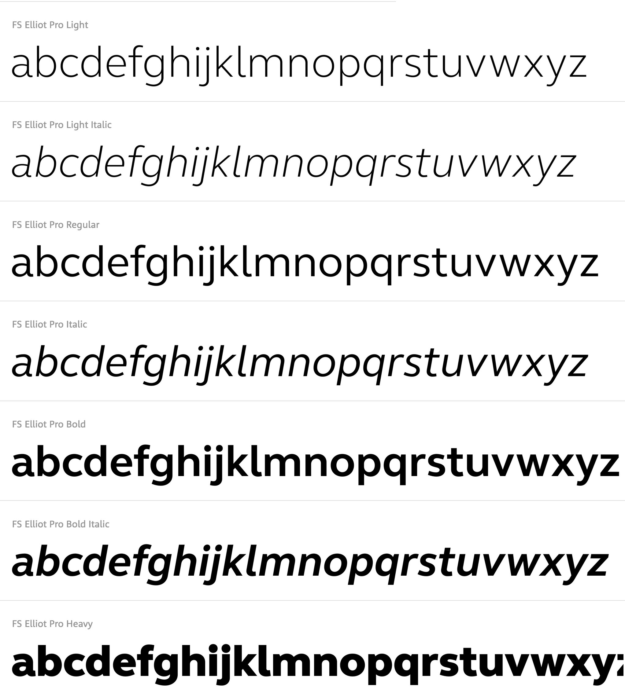
file name: Nick Job F S Elliot 2012
file name: Fontsmith F S Elliot 2020 342456

file name: Fontsmith F S Elliot 2020 342457

file name: Fontsmith F S Elliot 2020 342458 002

file name: Fontsmith F S Elliot 2020 342459 002

file name: Fontsmith F S Elliot 2020

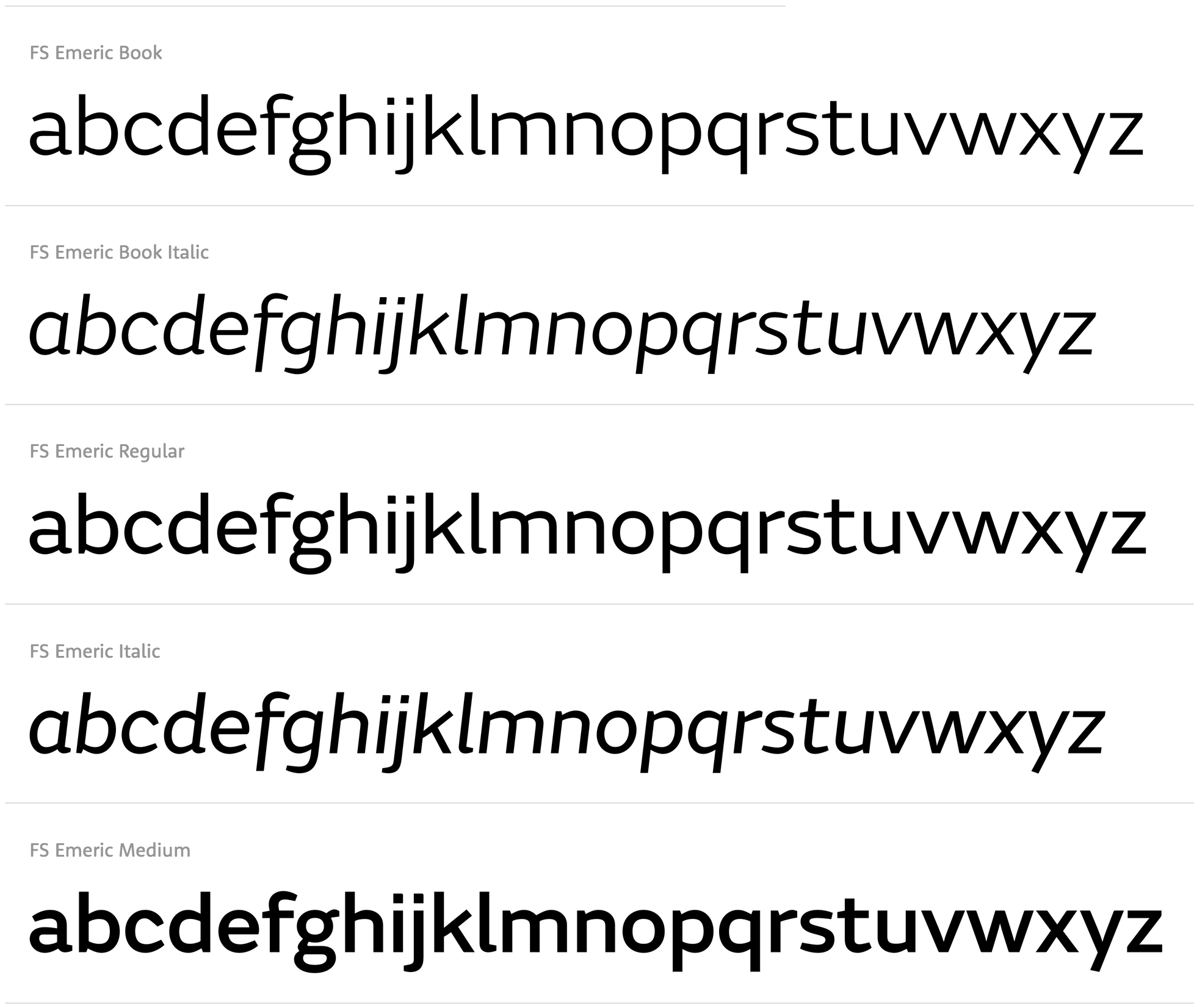
file name: Fontsmith F S Emeric 2020 342520 002

file name: Fontsmith F S Emeric 2020 342521

file name: Fontsmith F S Emeric 2020 342522 002
file name: Fontsmith F S Emeric 2020 342523

file name: Fontsmith F S Emeric 2020 342524

file name: Fontsmith F S Emeric 2020
file name: Phil Garnham F S Emeric 2013

file name: Fontsmith F S Hackney 2020 342446 002

file name: Fontsmith F S Hackney 2020 342447
file name: Fontsmith F S Hackney 2020 342448

file name: Fontsmith F S Hackney 2020

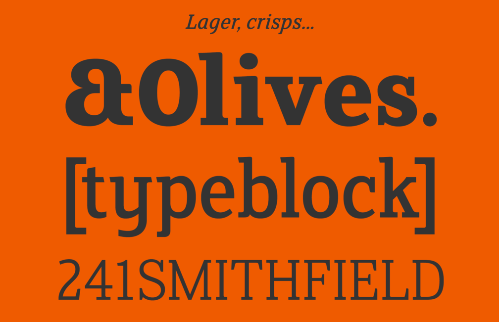
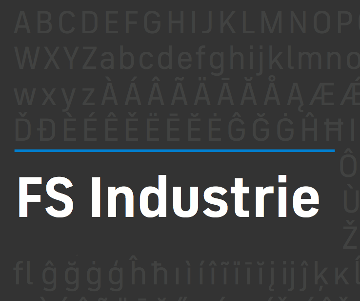
file name: Fontsmith F S Industrie 2020 342501

file name: Fontsmith F S Industrie 2020 342502

file name: Fontsmith F S Industrie 2020 342503 002

file name: Fontsmith F S Industrie 2020 342504 002

file name: Fontsmith F S Industrie 2020
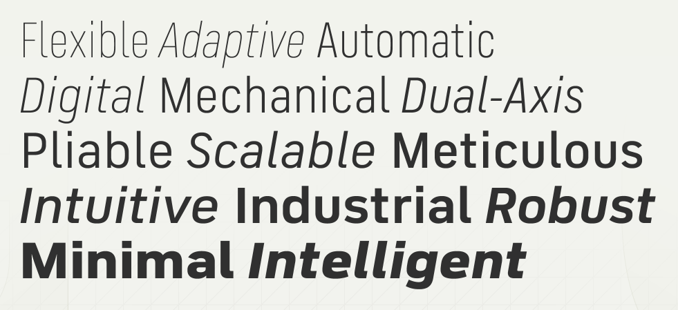
file name: Fontsmith F S Industrie 2018
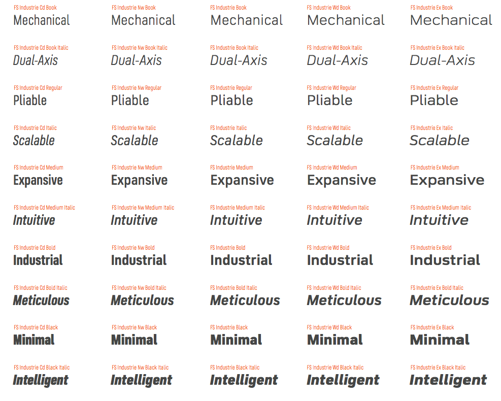
file name: Fontsmith F S Industrie 2018b
file name: Fontsmith F S Industrie 2018c
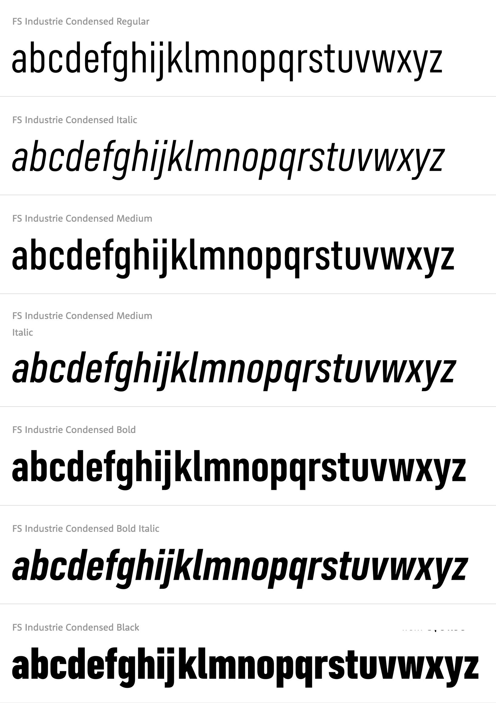
file name: Phil Garnham Fernando Mello F S Industrie Condensed 2018
file name: Fontsmith F S Ingrid 2020 342573 002

file name: Fontsmith F S Ingrid 2020 342574 002
file name: Fontsmith F S Ingrid 2020 342575 002

file name: Fontsmith F S Ingrid 2020

file name: Jason Smith F S Ingrid

file name: Fontsmith F S Irwin 2020 342466
file name: Fontsmith F S Irwin 2020 342467 002
file name: Fontsmith F S Irwin 2020 342468

file name: Fontsmith F S Irwin 2020 342469

file name: Fontsmith F S Irwin 2020

file name: Fontsmith F S Jack 2020 342496 002

file name: Fontsmith F S Jack 2020 342497 002

file name: Fontsmith F S Jack 2020 342498 002

file name: Fontsmith F S Jack 2020 342499 002

file name: Fontsmith F S Jack 2020
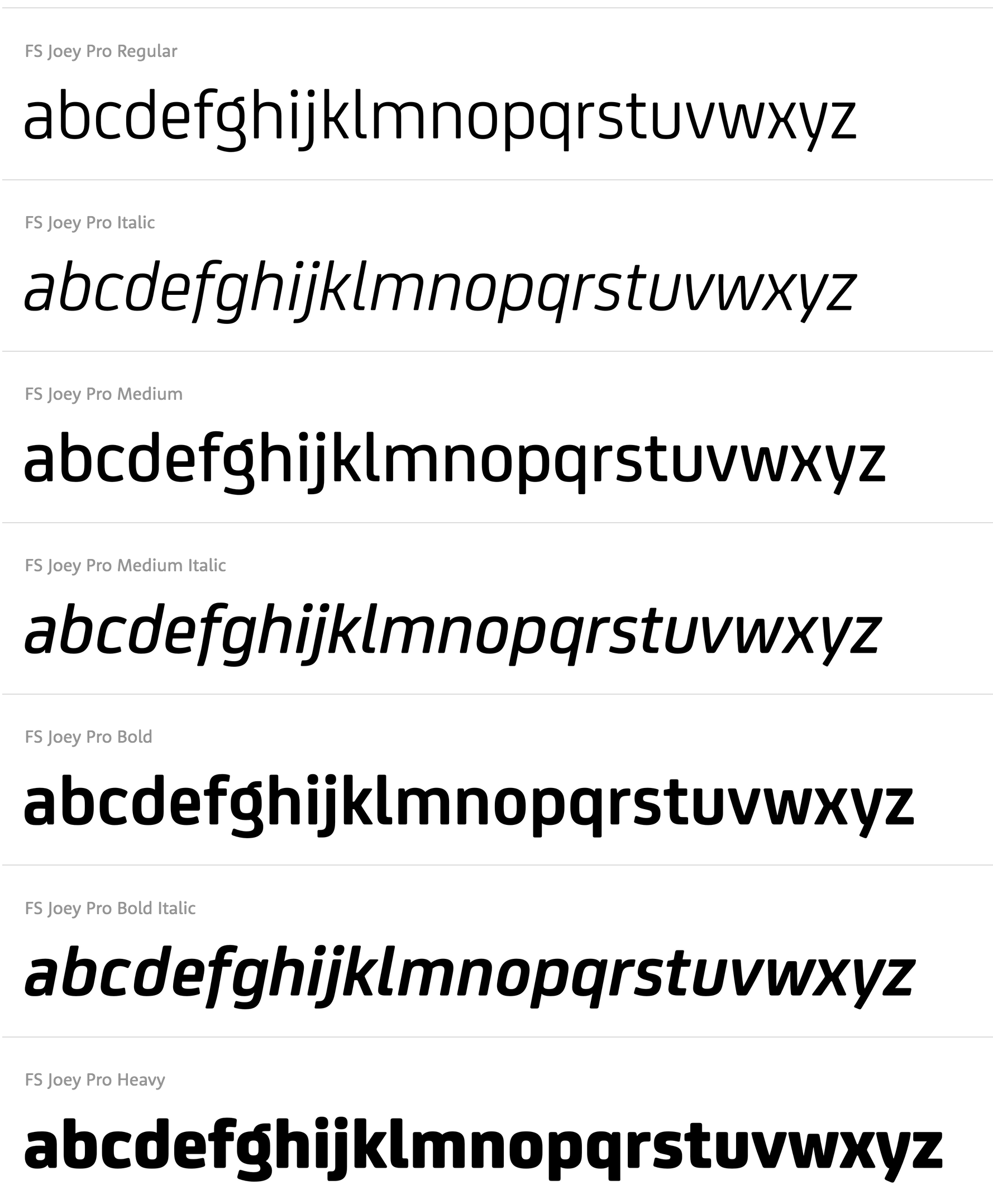
file name: Jason Smith Fernando Mello F S Joey 2009

file name: Fontsmith F S Joey 2020 342515 002

file name: Fontsmith F S Joey 2020 342516
file name: Fontsmith F S Joey 2020 342517 002

file name: Fontsmith F S Joey 2020 342518
file name: Fontsmith F S Joey 2020 342519 002

file name: Fontsmith F S Joey 2020
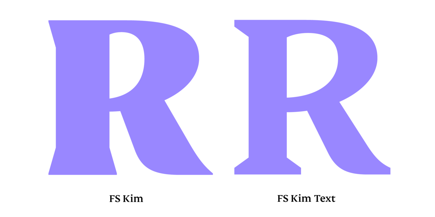
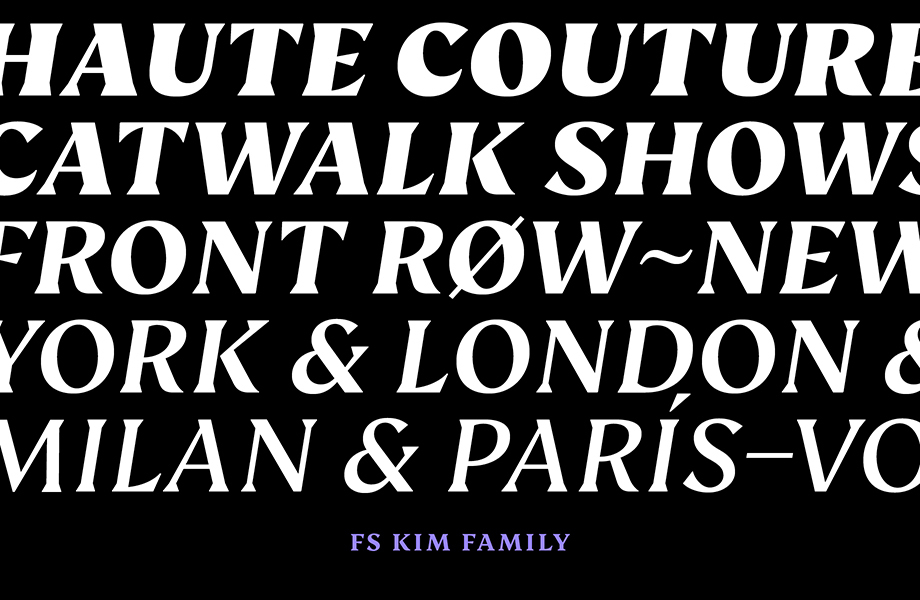
file name: Fontsmith F S Kim 2020 342169

file name: Fontsmith F S Kim 2020 342170

file name: Fontsmith F S Kim 2020 342171
file name: Fontsmith F S Kim 2020 342172 002

file name: Fontsmith F S Kim 2020 342173

file name: Fontsmith F S Kim 2020

file name: Fontsmith F S Kitty 2020 342440

file name: Fontsmith F S Kitty 2020 342441 002
file name: Fontsmith F S Kitty 2020 342442 002

file name: Fontsmith F S Kitty 2020 342443 002

file name: Fontsmith F S Kitty 2020

file name: Fontsmith F S Koopman 2020 342164

file name: Fontsmith F S Koopman 2020 342165

file name: Fontsmith F S Koopman 2020 342166 002
file name: Fontsmith F S Koopman 2020 342168 002

file name: Fontsmith F S Koopman 2020

file name: Fontsmith F S Lola 2020 342139 002
file name: Fontsmith F S Lola 2020 342141 002
file name: Fontsmith F S Lola 2020 342143 002

file name: Fontsmith F S Lola 2020

file name: Fontsmith F S Lola 2006

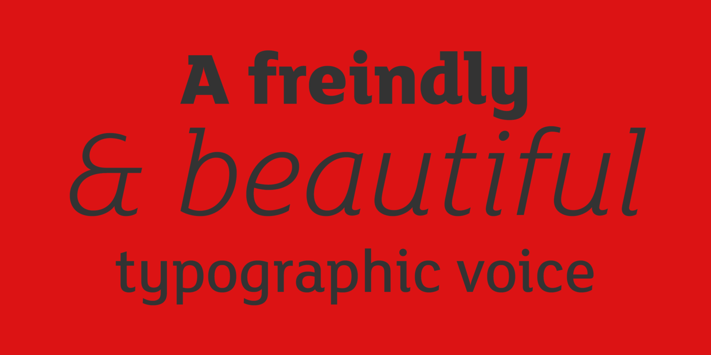
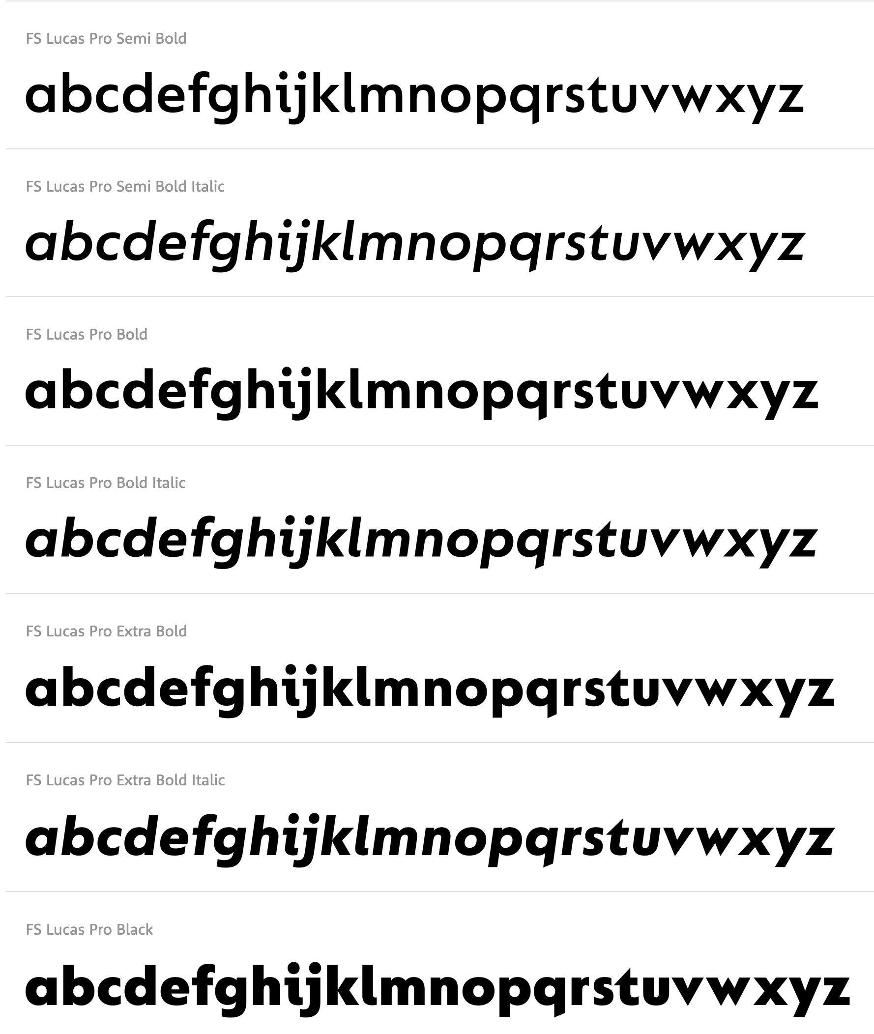
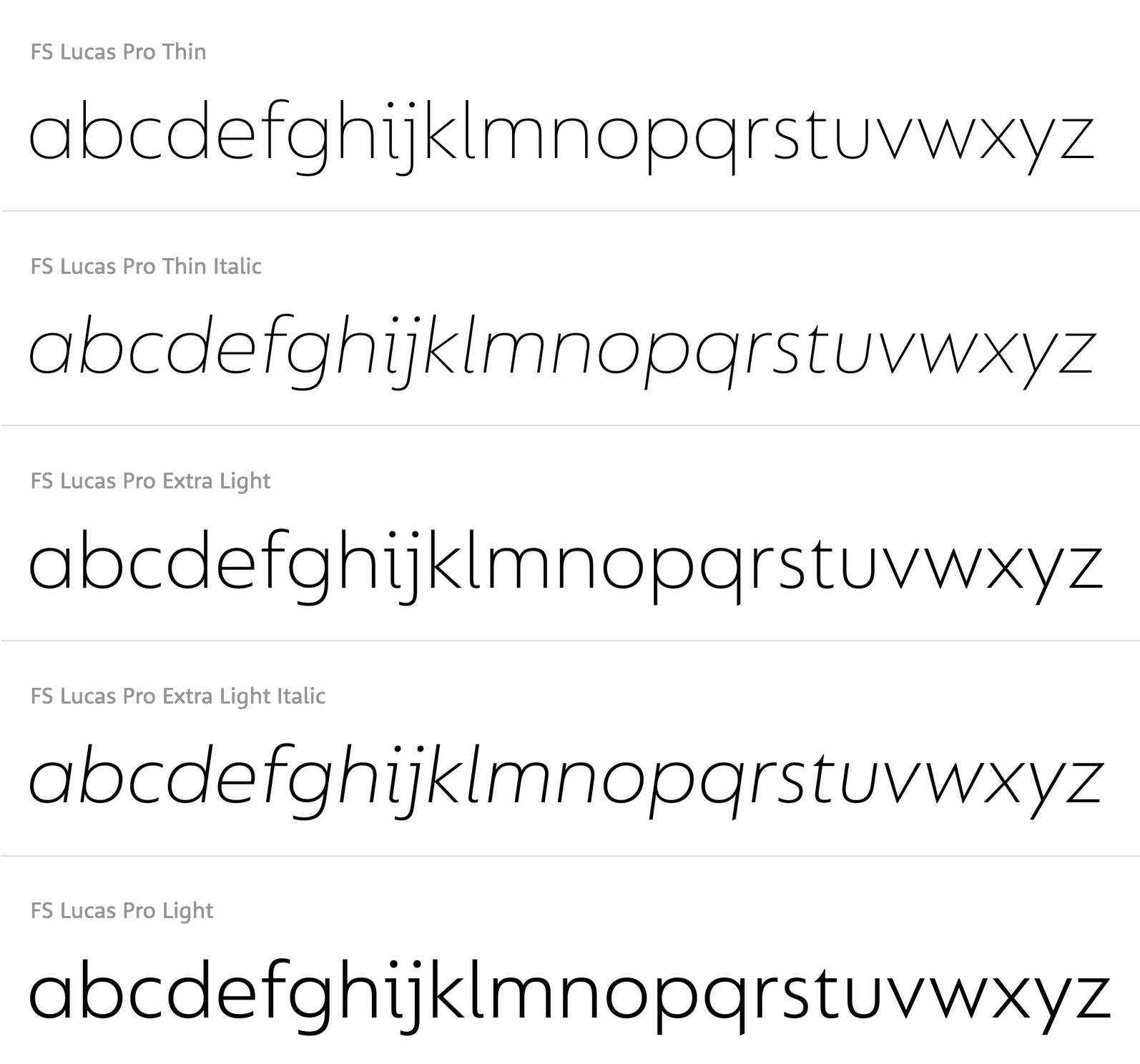
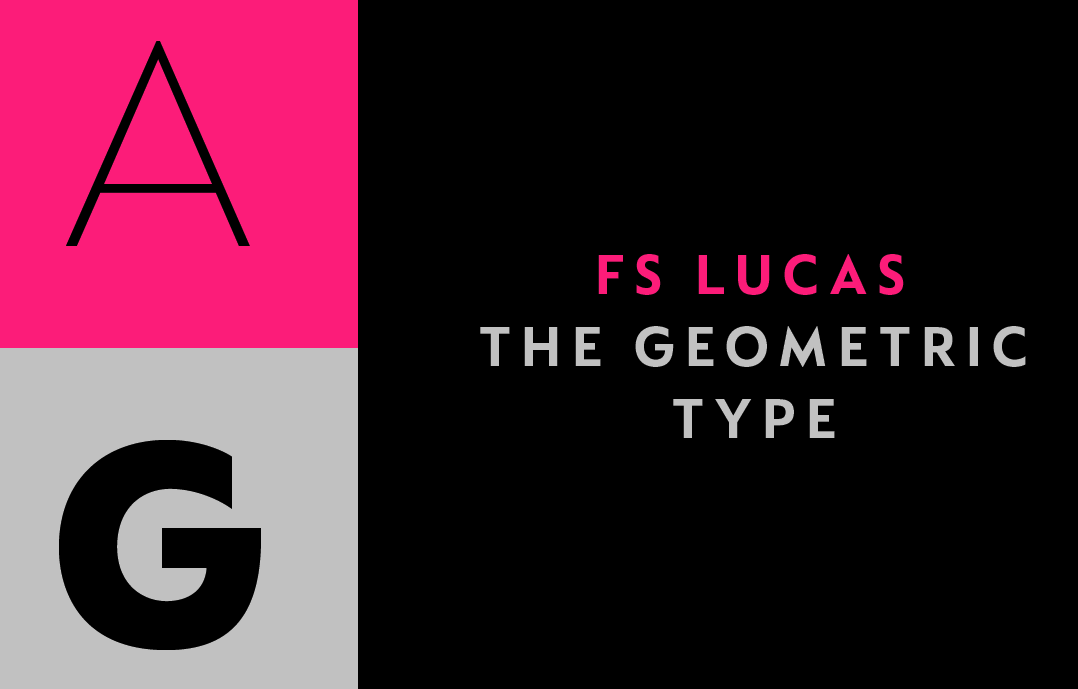
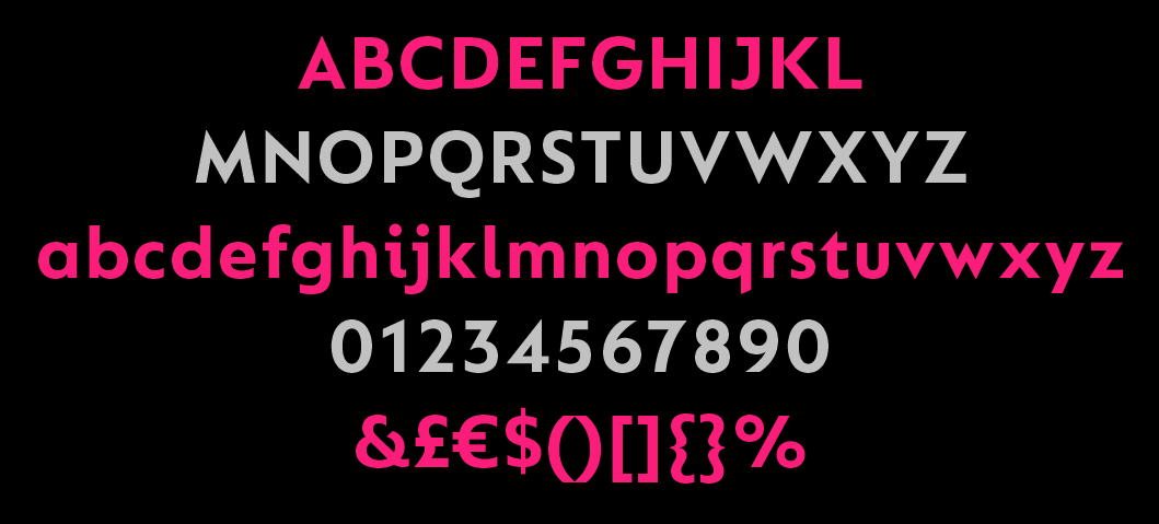
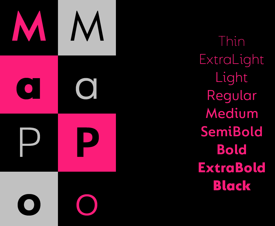
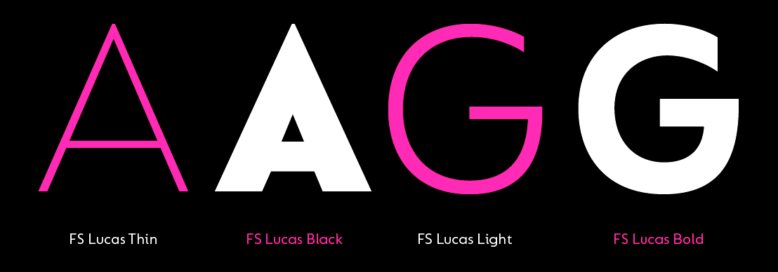
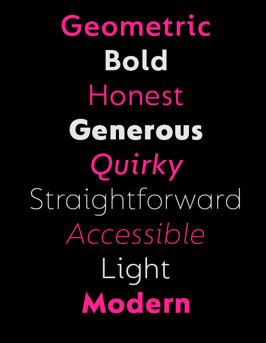
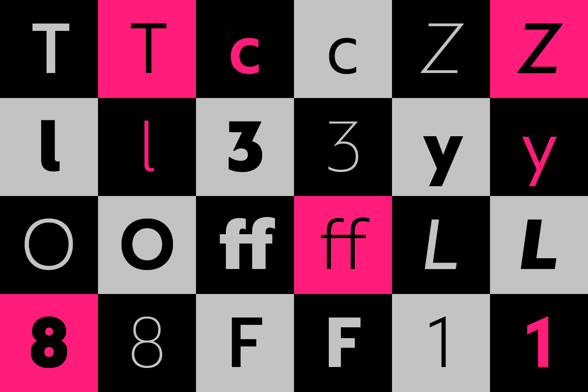
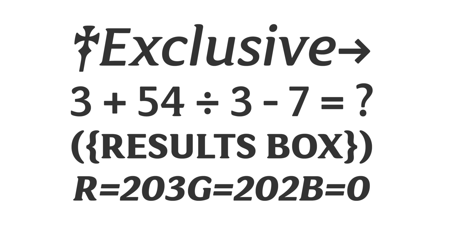
file name: Fontsmith F S Lucas 2020 343390
file name: Fontsmith F S Lucas 2020 343391 002
file name: Fontsmith F S Lucas 2020 343392 002

file name: Fontsmith F S Lucas 2020 343393

file name: Fontsmith F S Lucas 2020 343394 002

file name: Fontsmith F S Lucas 2020
file name: Stuart De Rozario F S Lucas 2016
file name: Stuart De Rozario F S Lucas 2016
file name: Fontsmith F S Lucas 2016
file name: Fontsmith F S Lucas 2016a

file name: Fontsmith F S Lucas 2016b
file name: Fontsmith F S Lucas 2016d
file name: Fontsmith F S Lucas 2016e
file name: Fontsmith F S Lucas 2016f
file name: Fontsmith F S Lucas 2016g

file name: Fontsmith F S Maja 2020 342476 002
file name: Fontsmith F S Maja 2020 342477 002

file name: Fontsmith F S Maja 2020 342478

file name: Fontsmith F S Maja 2020

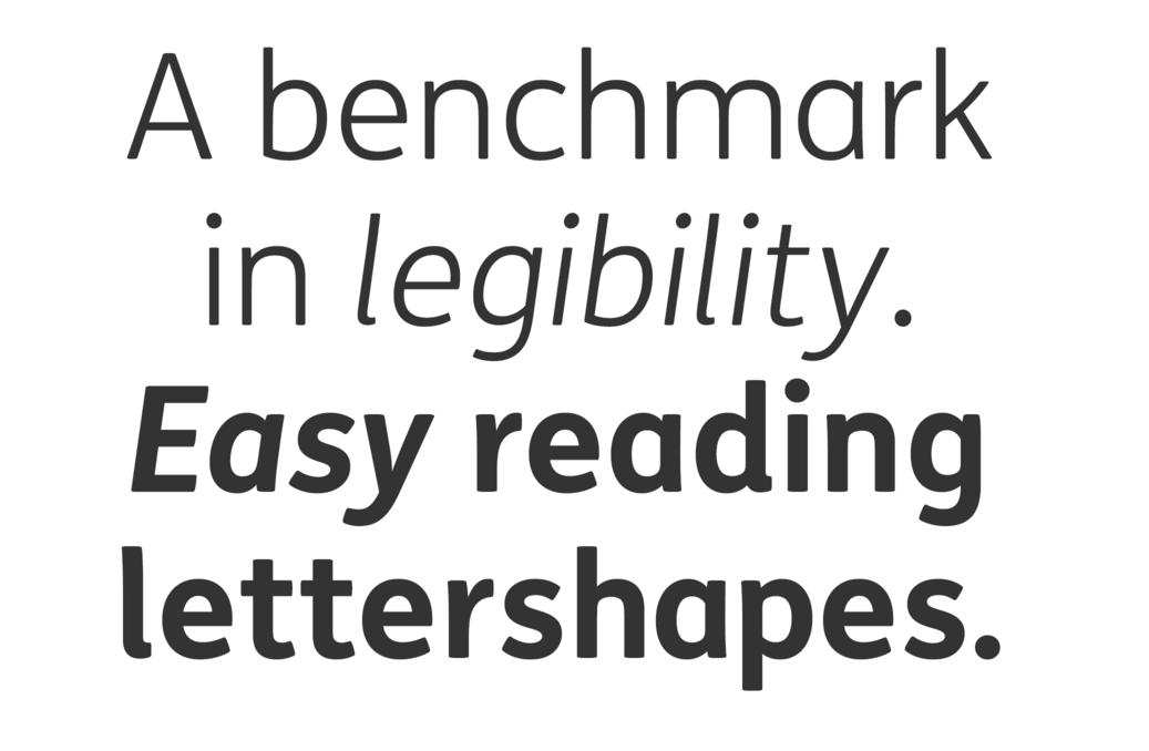
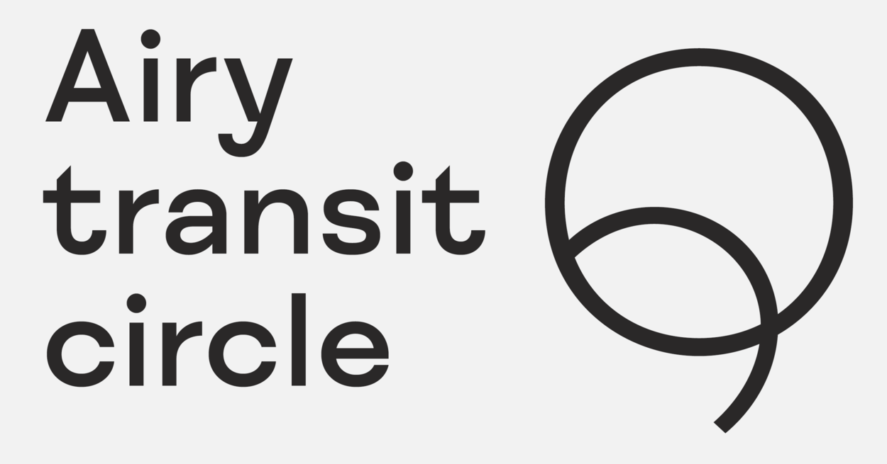
file name: Fontsmith F S Matthew 2020 342970
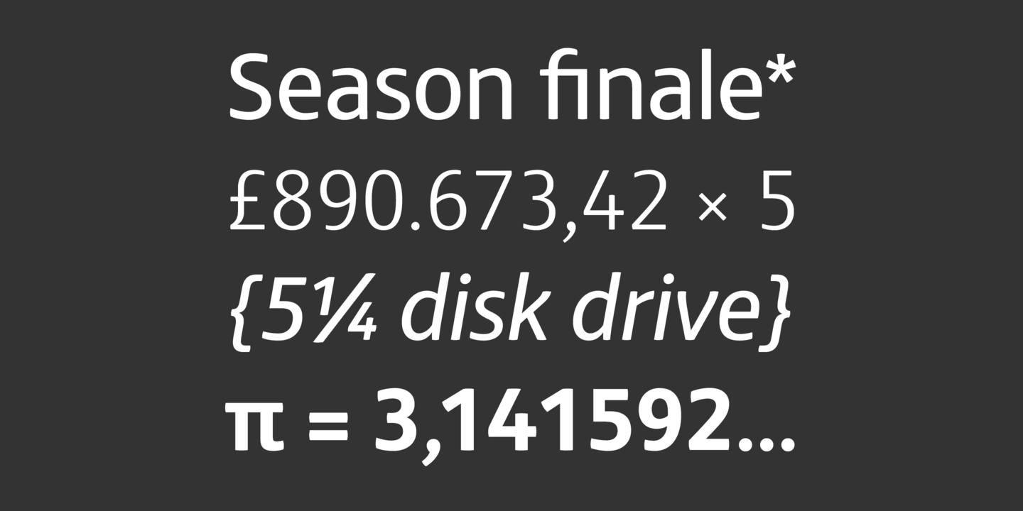
file name: Fontsmith F S Matthew 2020 342971

file name: Fontsmith F S Matthew 2020 342973

file name: Fontsmith F S Matthew 2020
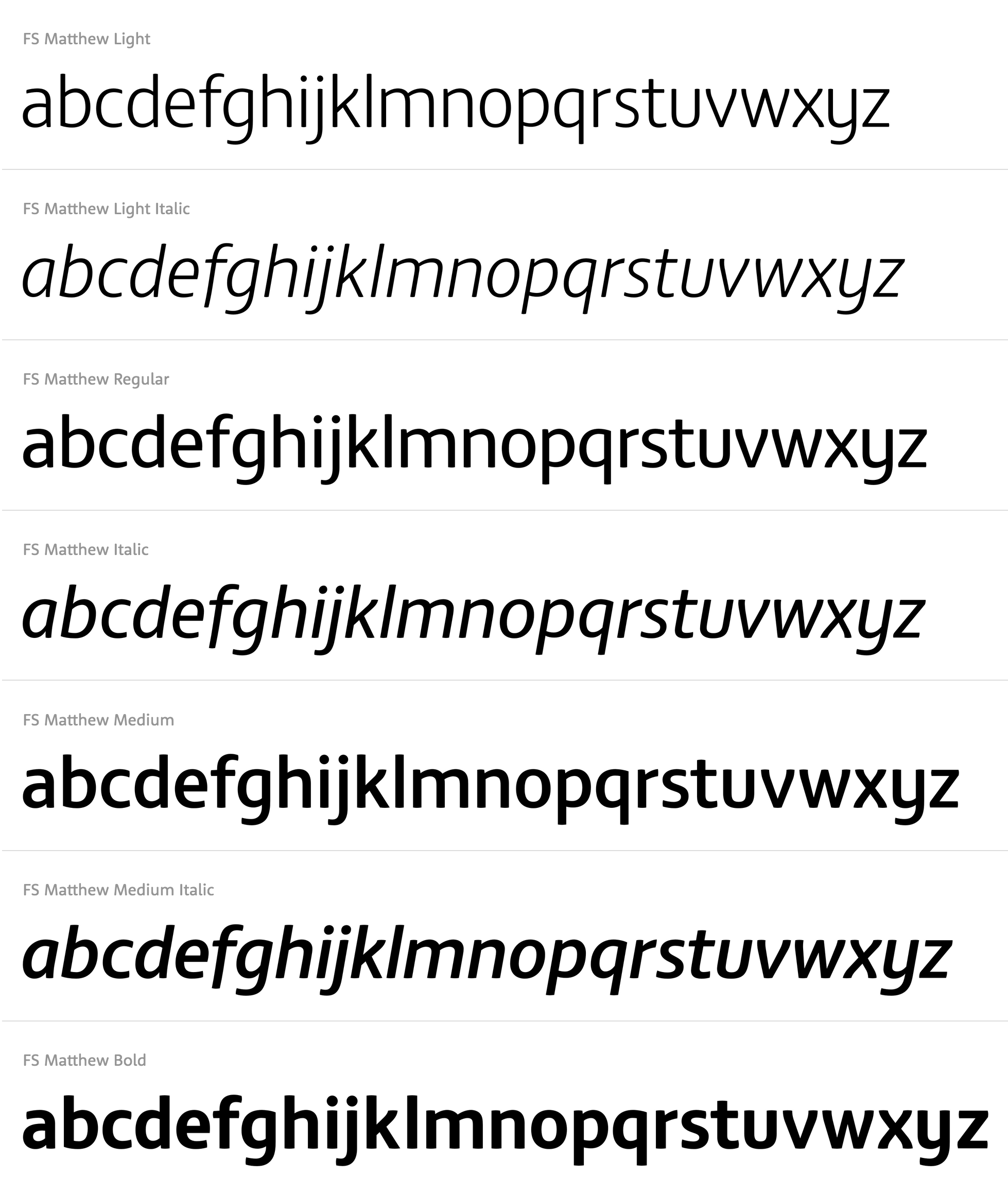
file name: Jason Smith F S Matthew

file name: Fontsmith F S Me 2020 342601

file name: Fontsmith F S Me 2020 342602

file name: Fontsmith F S Me 2020 342603 002

file name: Fontsmith F S Me 2020 342604 002
file name: Fontsmith F S Me 2020 342605

file name: Fontsmith F S Me 2020
file name: Fontsmith F S Meridian 2020 342175

file name: Fontsmith F S Meridian 2020 342176 002
file name: Fontsmith F S Meridian 2020 342177

file name: Fontsmith F S Meridian 2020 342178

file name: Fontsmith F S Meridian 2020
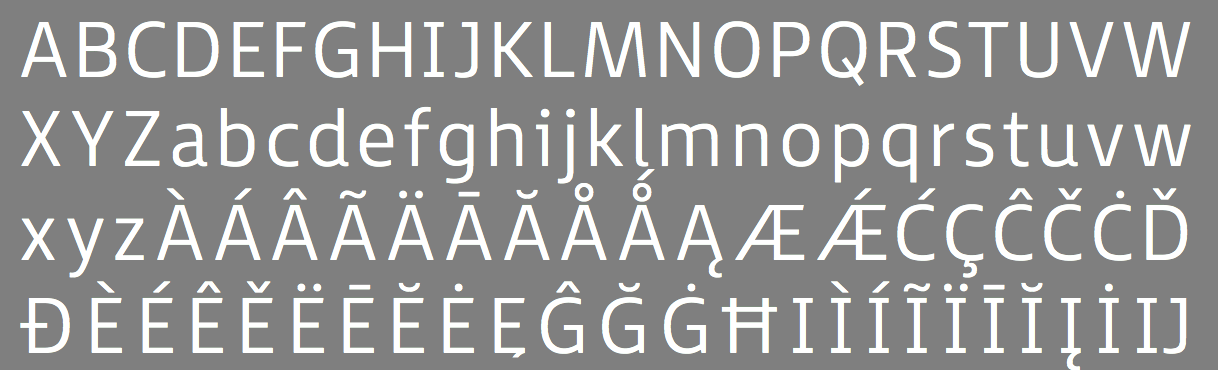
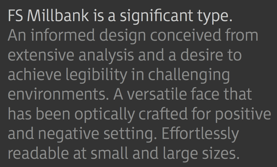
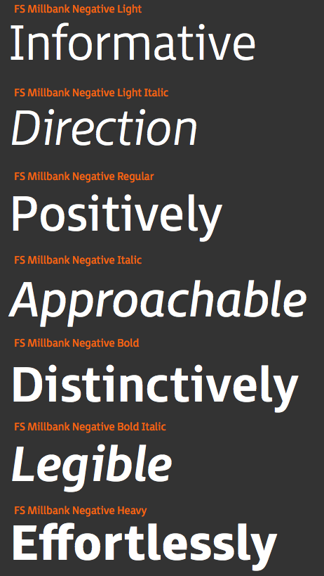
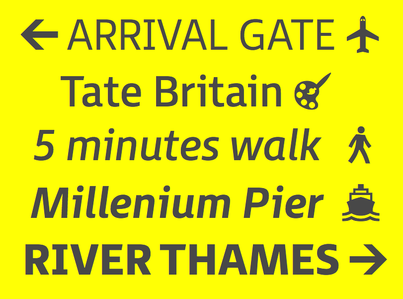
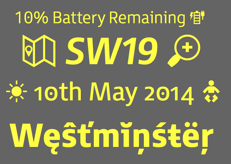
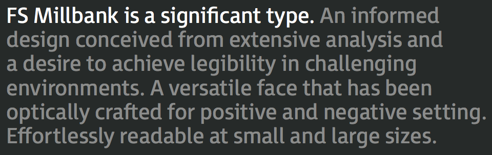
file name: Fontsmith F S Millbank 2020 342567 002
file name: Fontsmith F S Millbank 2020 342568

file name: Fontsmith F S Millbank 2020 342569 002
file name: Fontsmith F S Millbank 2020 342570 002

file name: Fontsmith F S Millbank 2020

file name: Stuart De Rozario F S Millbank 2015
file name: Stuart De Rozario F S Millbank 2015b

file name: Stuart De Rozario F S Millbank 2015c
file name: Stuart De Rozario F S Millbank 2015d
file name: Stuart De Rozario F S Millbank 2015e
file name: Stuart De Rozario F S Millbank 2015f
file name: Stuart De Rozario F S Millbank 2015g

file name: Stuart De Rozario F S Millbank 2015h
file name: Stuart De Rozario F S Millbank 2015i

file name: Stuart De Rozario F S Millbank 2015j
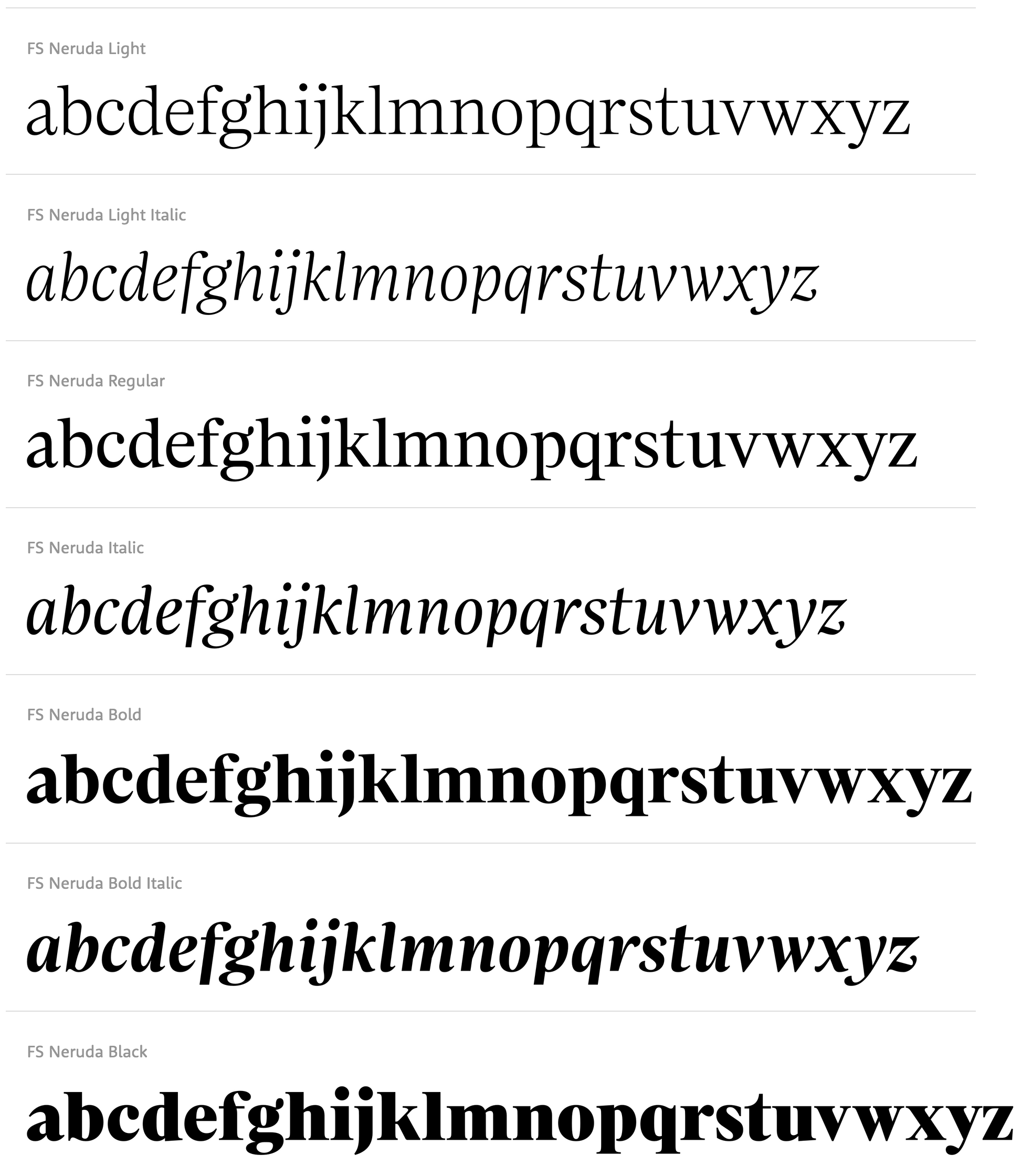
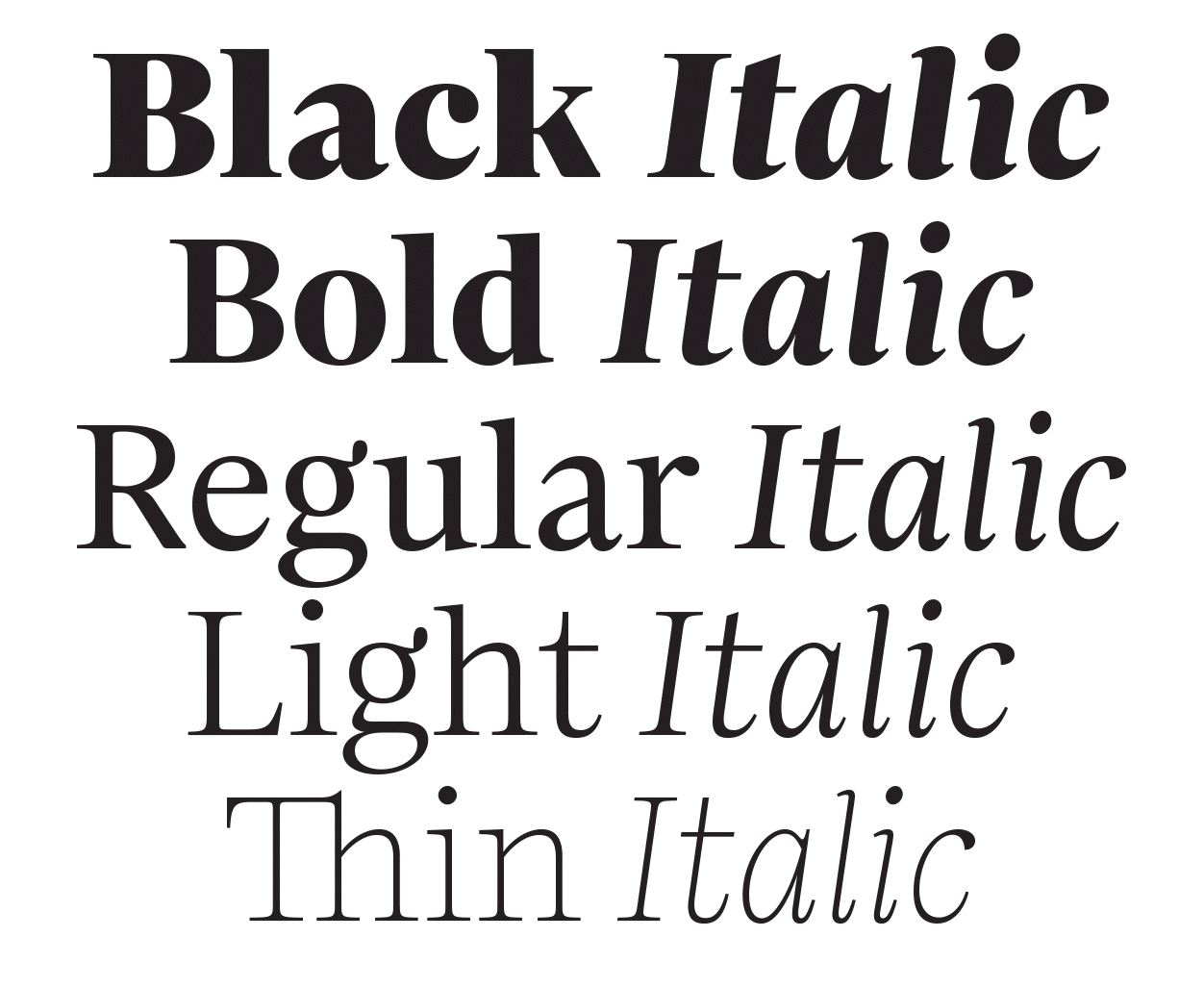
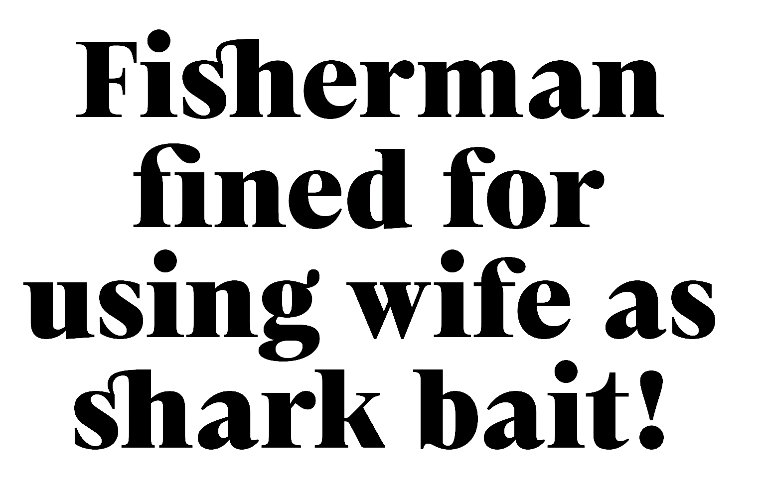
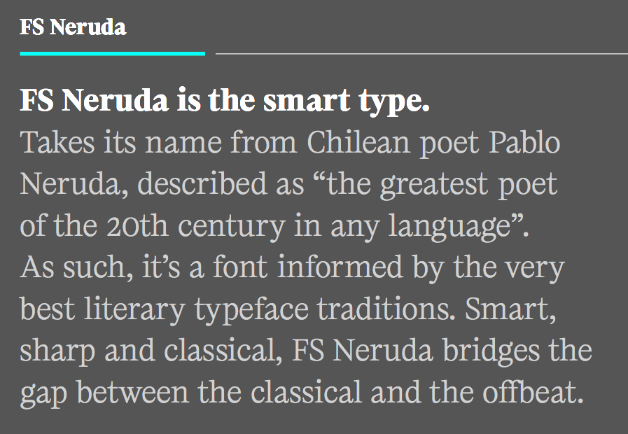
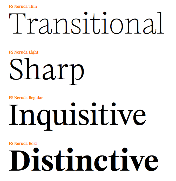
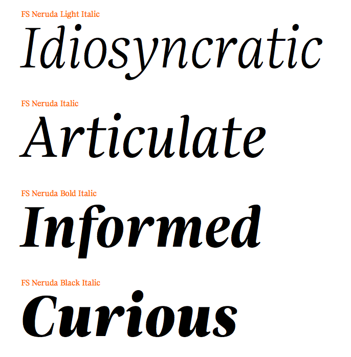
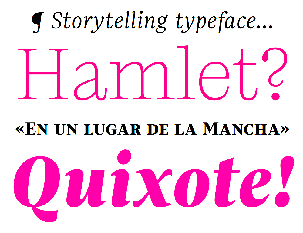
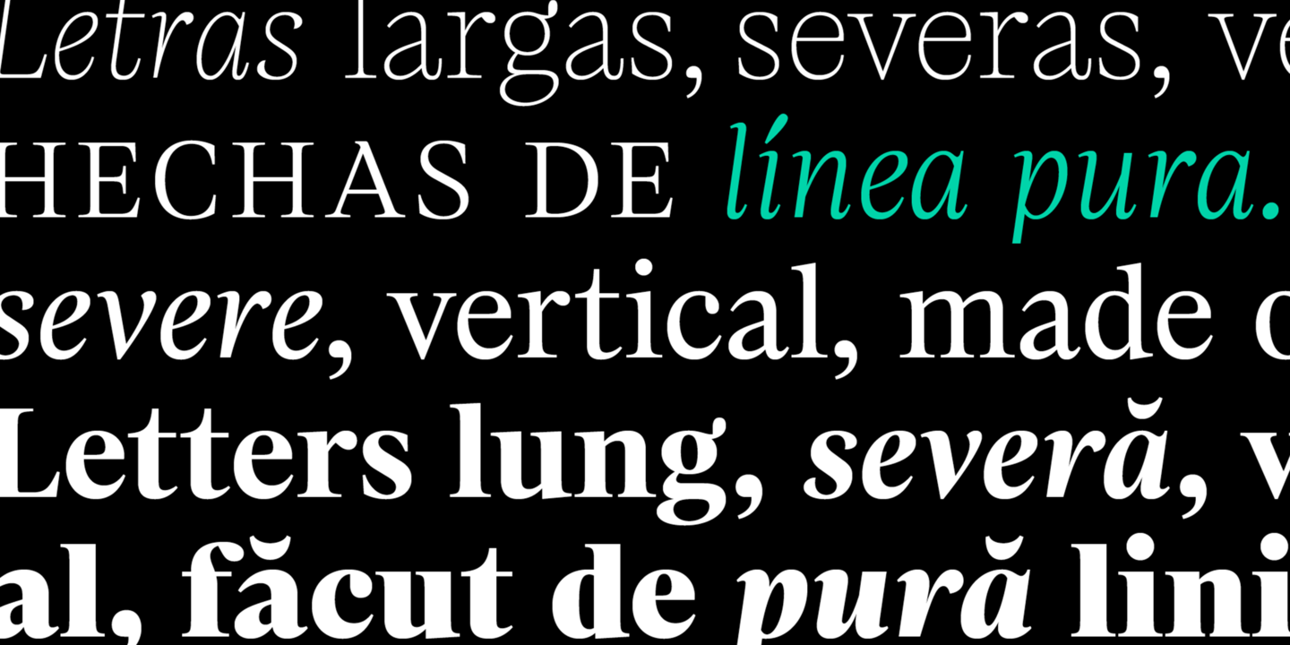
file name: Pedro Arilla F S Neruda 2018
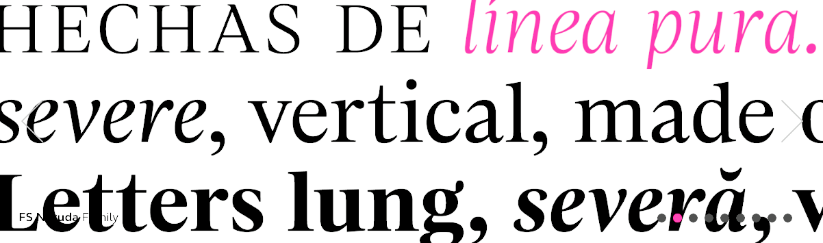
file name: Fontsmith F S Neruda 2018b
file name: Fontsmith F S Neruda 2018c

file name: Fontsmith F S Neruda 2018d
file name: Fontsmith F S Neruda 2018e

file name: Fontsmith F S Neruda 2018g

file name: Fontsmith F S Neruda 2018h

file name: Fontsmith F S Neruda 2018i
file name: Fontsmith F S Neruda 2018m
file name: Fontsmith F S Neruda 2018n
file name: Fontsmith F S Neruda 2018o

file name: Fontsmith F S Neruda 2018p
file name: Fontsmith F S Neruda 2018r

file name: Fontsmith F S Neruda 2018s

file name: Fontsmith F S Neruda 2020 342189 002

file name: Fontsmith F S Neruda 2020 342190 002
file name: Fontsmith F S Neruda 2020 342191
file name: Fontsmith F S Neruda 2020 342192

file name: Fontsmith F S Neruda 2020 342193

file name: Fontsmith F S Neruda 2020
file name: Fontsmith F S Olivia 2020 342974 002
file name: Fontsmith F S Olivia 2020 342975
file name: Fontsmith F S Olivia 2020 342976 002

file name: Fontsmith F S Olivia 2020 342977

file name: Fontsmith F S Olivia 2020
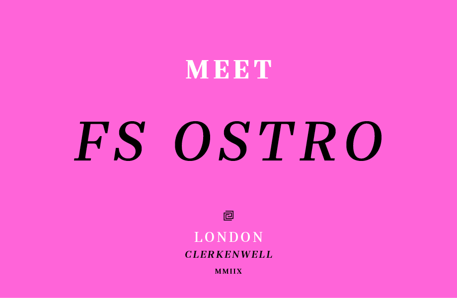
file name: Fontsmith F S Ostro 2020 342490 002
file name: Fontsmith F S Ostro 2020 342491 002

file name: Fontsmith F S Ostro 2020 342492 002
file name: Fontsmith F S Ostro 2020 342493 002

file name: Fontsmith F S Ostro 2020 342494

file name: Fontsmith F S Ostro 2020
file name: Fontsmith F S Ostro 2018
file name: Fontsmith F S Ostro 2018b
file name: Fontsmith F S Ostro 2018c
file name: Fontsmith F S Ostro 2018d

file name: Fontsmith F S Ostro 2018e
file name: Fontsmith F S Ostro 2018f
file name: Fontsmith F S Ostro 2018g
file name: Fontsmith F S Ostro 2018h
file name: Fontsmith F S Ostro 2018i

file name: Fontsmith F S Ostro 2018j

file name: Fontsmith F S Ostro 2018k

file name: Fontsmith F S Ostro 2018l

file name: Fontsmith F S Ostro 2018m

file name: Fontsmith F S Ostro 2018n

file name: Fontsmith F S Pele 2020 342589

file name: Fontsmith F S Pele 2020

file name: Fontsmith F S Pimlico 2020 342144 002

file name: Fontsmith F S Pimlico 2020 342145
file name: Fontsmith F S Pimlico 2020 342146

file name: Fontsmith F S Pimlico 2020 342147 002

file name: Fontsmith F S Pimlico 2020 342148 002

file name: Fontsmith F S Pimlico 2020

file name: Fontsmith F S Rome 2020 342506
file name: Fontsmith F S Rome 2020 342507
file name: Fontsmith F S Rome 2020 342508

file name: Fontsmith F S Rome 2020 342509

file name: Fontsmith F S Rome 2020

file name: Fontsmith F S Rufus 2020 342159 002
file name: Fontsmith F S Rufus 2020 342160

file name: Fontsmith F S Rufus 2020 342161 002

file name: Fontsmith F S Rufus 2020 342162

file name: Fontsmith F S Rufus 2020 342163 002

file name: Fontsmith F S Rufus 2020

file name: Fontsmith F S Sally 2020 342485

file name: Fontsmith F S Sally 2020 342486 002

file name: Fontsmith F S Sally 2020 342488 002
file name: Fontsmith F S Sally 2020 342489

file name: Fontsmith F S Sally 2020

file name: Fontsmith F S Sammy 2020

file name: Fontsmith Severstal 2009

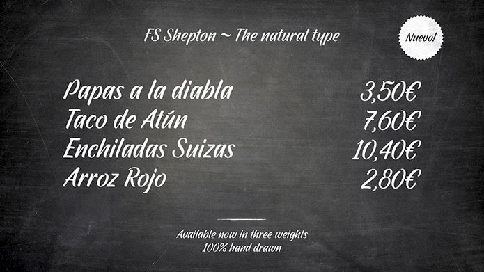
file name: Fontsmith F S Shepton 2020 342979 002

file name: Fontsmith F S Shepton 2020 342980

file name: Fontsmith F S Shepton 2020 342981 002

file name: Fontsmith F S Shepton 2020 342982

file name: Fontsmith F S Shepton 2020 342983 002

file name: Fontsmith F S Shepton 2020
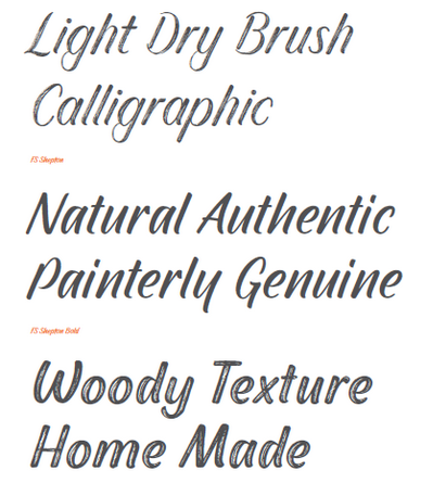
file name: Fontsmith F S Shepton 2015
file name: Fontsmith F S Shepton 2015b
file name: Fontsmith F S Siena 2020 342155
file name: Fontsmith F S Siena 2020 342156

file name: Fontsmith F S Siena 2020 342157
file name: Fontsmith F S Siena 2020 342158

file name: Fontsmith F S Siena 2020

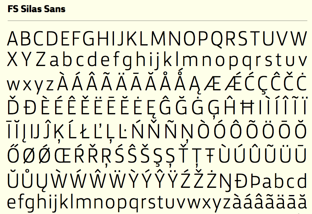
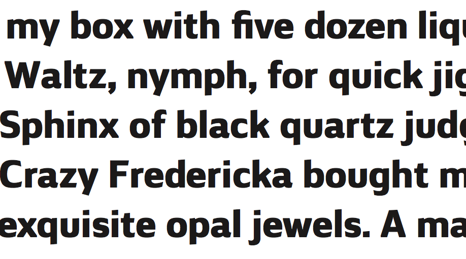
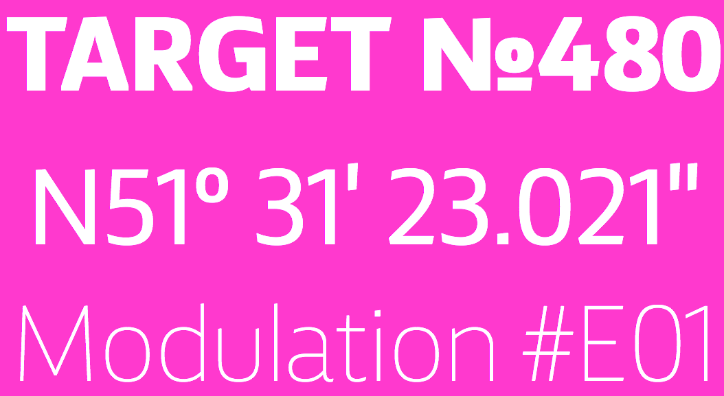
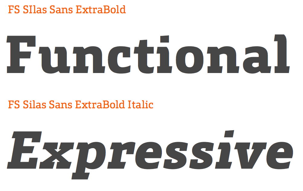
file name: Fontsmith F S Silas Sans 2020 342452
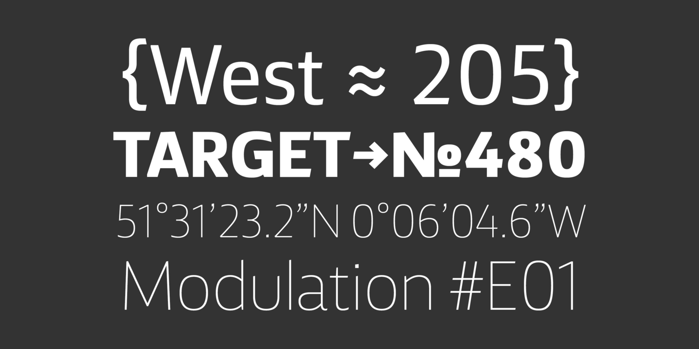
file name: Fontsmith F S Silas Sans 2020 342453

file name: Fontsmith F S Silas Sans 2020 342454

file name: Fontsmith F S Silas Sans 2020
file name: Fontsmith F S Silas Sans 2015
file name: Fontsmith F S Silas Sans 2015b

file name: Fontsmith F S Silas Sans 2015c

file name: Fontsmith F S Silas Sans 2015d
file name: Fontsmith F S Silas Sans 2015e
file name: Fontsmith F S Silas Sans 2015f

file name: Fontsmith F S Silas Sans 2015g

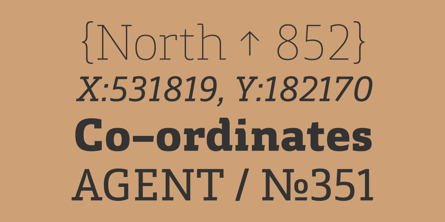
file name: Fontsmith F S Silas Slab 2015
file name: Fontsmith F S Silas Slab 2015b
file name: Fontsmith F S Silas Slab 2015c

file name: Fontsmith F S Silas Slab 2015d
file name: Fontsmith F S Silas Slab 2015e
file name: Fontsmith F S Silas Slab 2015f

file name: Fontsmith F S Silas Slab 2015g

file name: Fontsmith F S Silas Slab 2015h
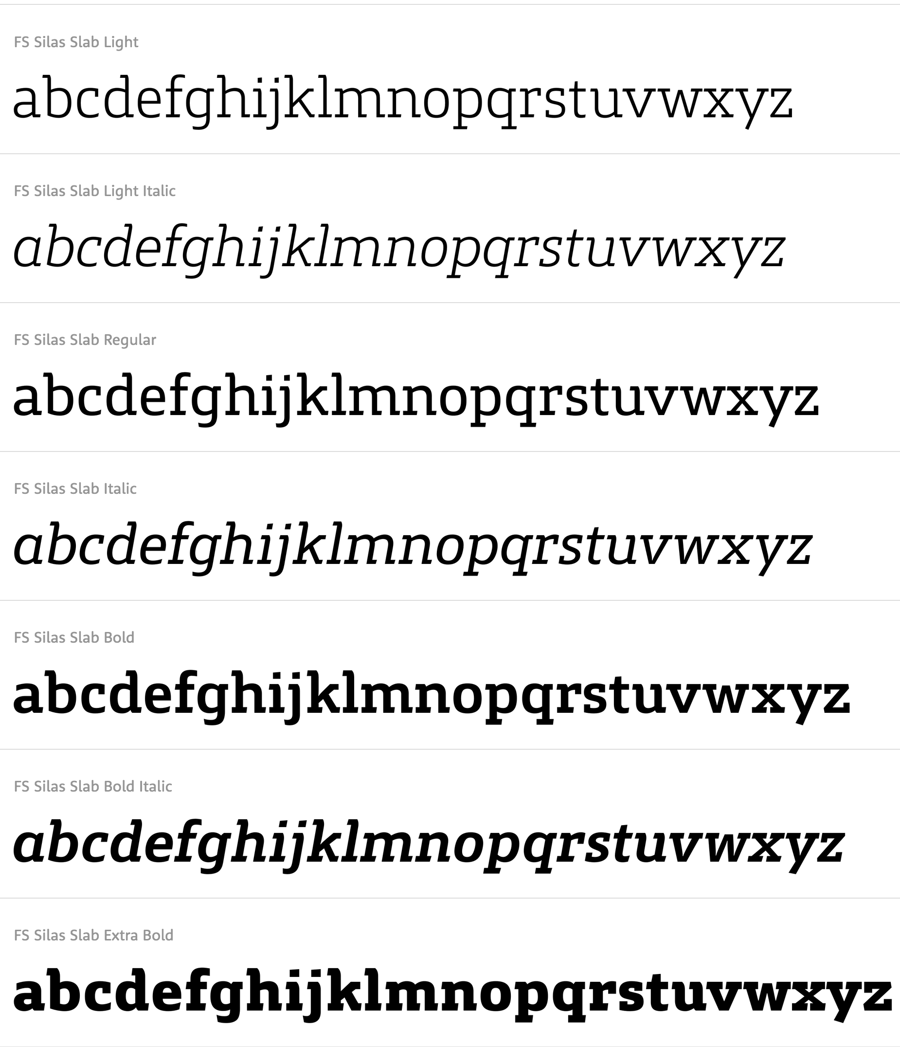
file name: Bela Frank F S Silas Slab 2015

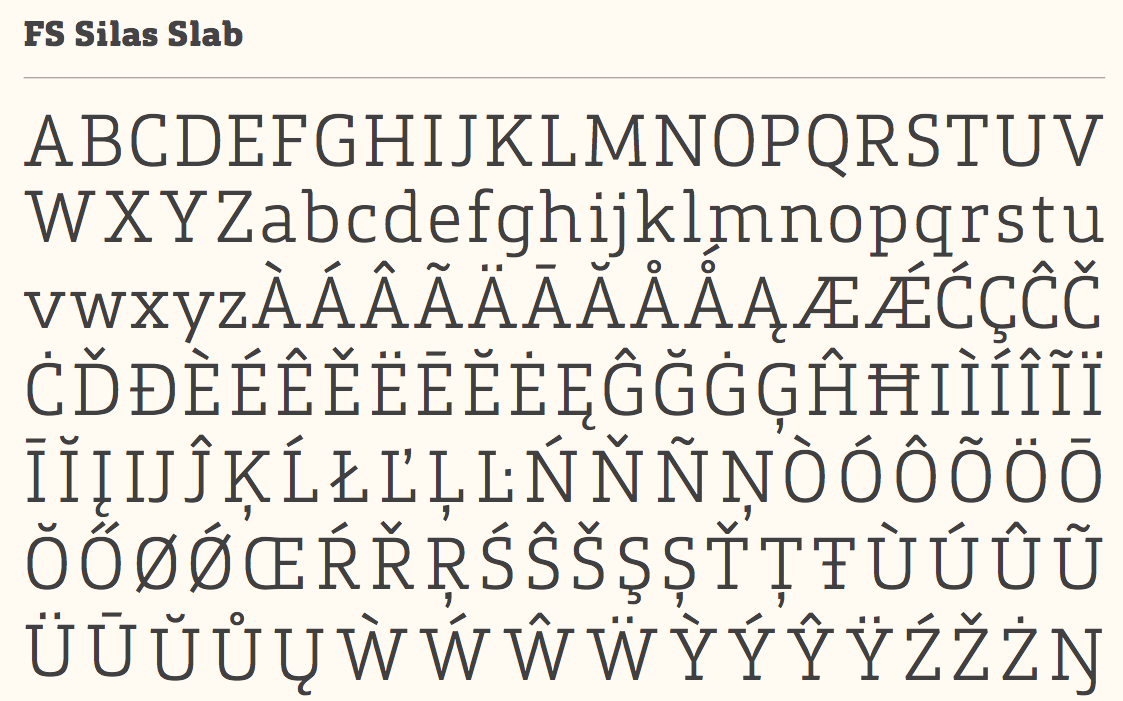
file name: Fontsmith F S Silas Slab 2020 342472
file name: Fontsmith F S Silas Slab 2020 342473

file name: Fontsmith F S Silas Slab 2020 342474 002

file name: Fontsmith F S Silas Slab 2020

file name: Fontsmith F S Sinclair 2020 342562

file name: Fontsmith F S Sinclair 2020 342563 002
file name: Fontsmith F S Sinclair 2020 342564

file name: Fontsmith F S Sinclair 2020 342565 002

file name: Fontsmith F S Sinclair 2020
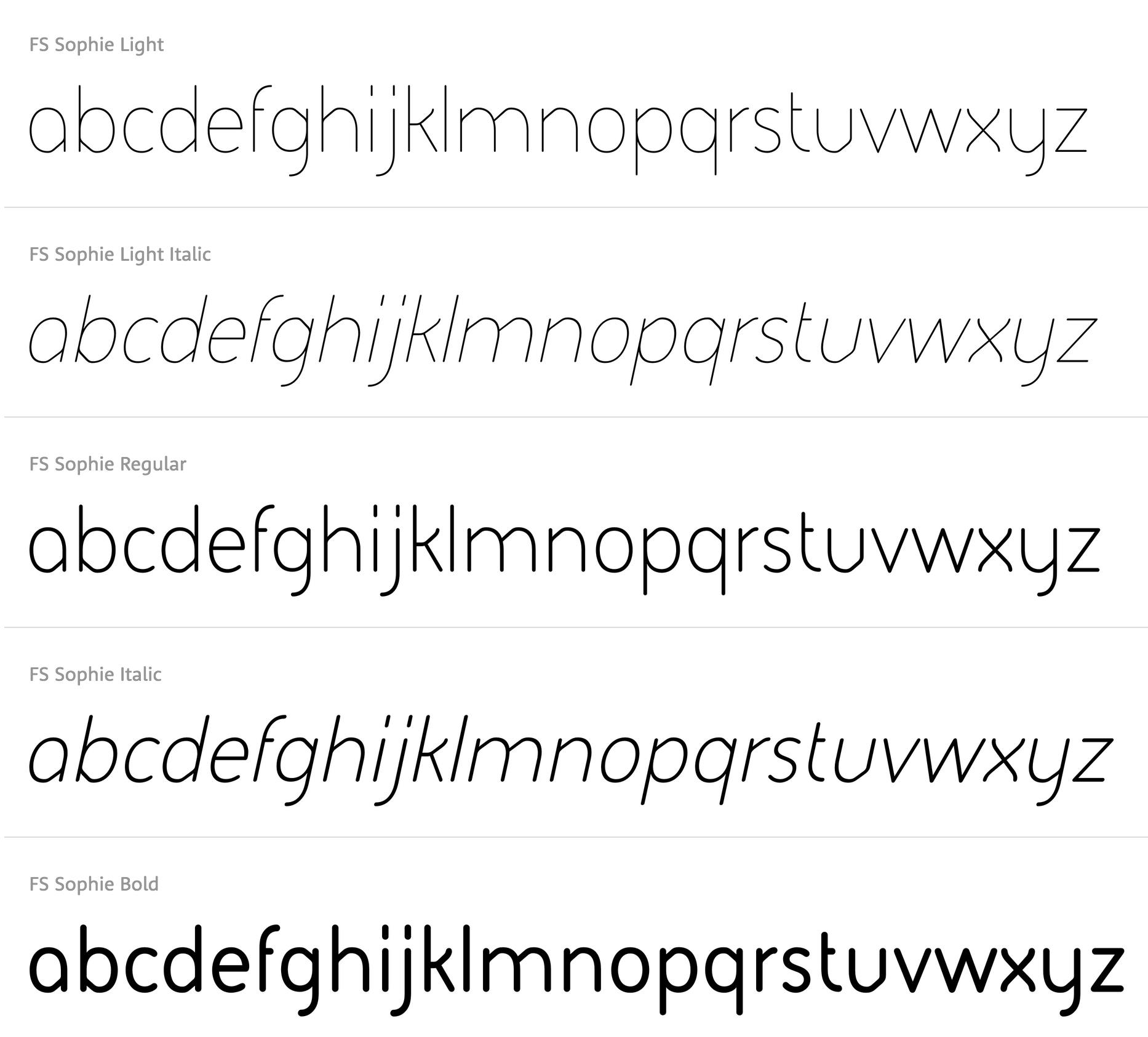
file name: Jason Smith F S Sophie 2004

file name: Fontsmith F S Sophie 2020 342436
file name: Fontsmith F S Sophie 2020 342437 002
file name: Fontsmith F S Sophie 2020 342438 002

file name: Fontsmith F S Sophie 2020

file name: Fontsmith F S Split Sans 2020 342596 002

file name: Fontsmith F S Split Sans 2020 342597
file name: Fontsmith F S Split Sans 2020 342598
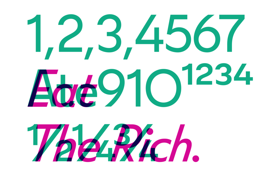
file name: Fontsmith F S Split Sans 2020 342600

file name: Fontsmith F S Split Sans 2020
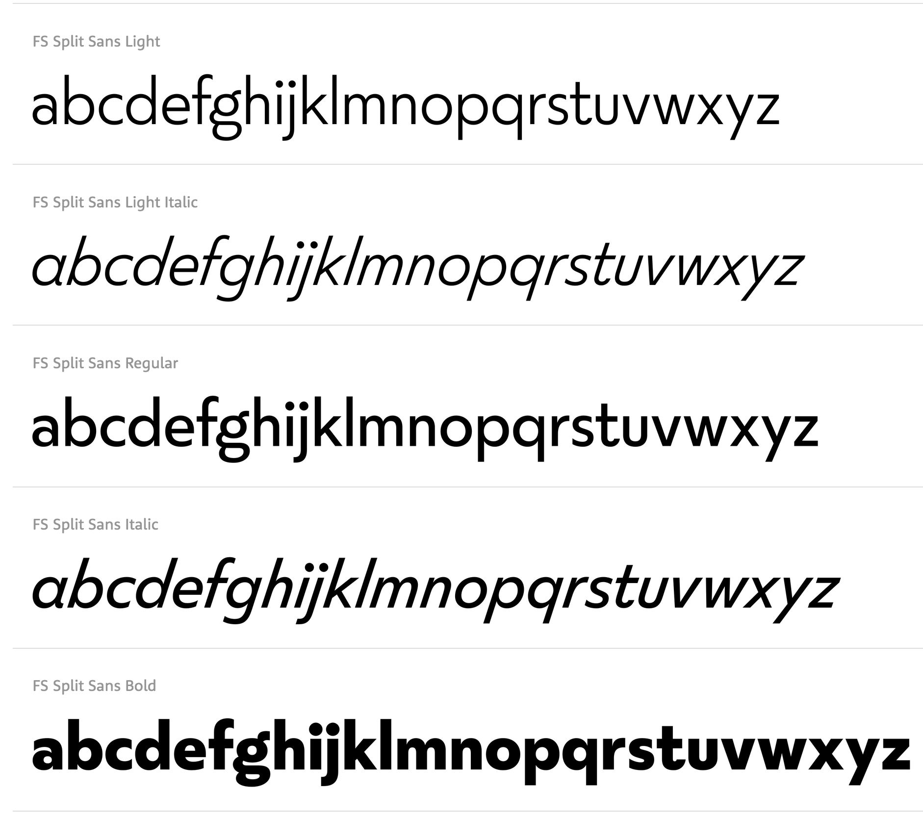
file name: Jason Smith Fernando Mello F S Split Sans 2019
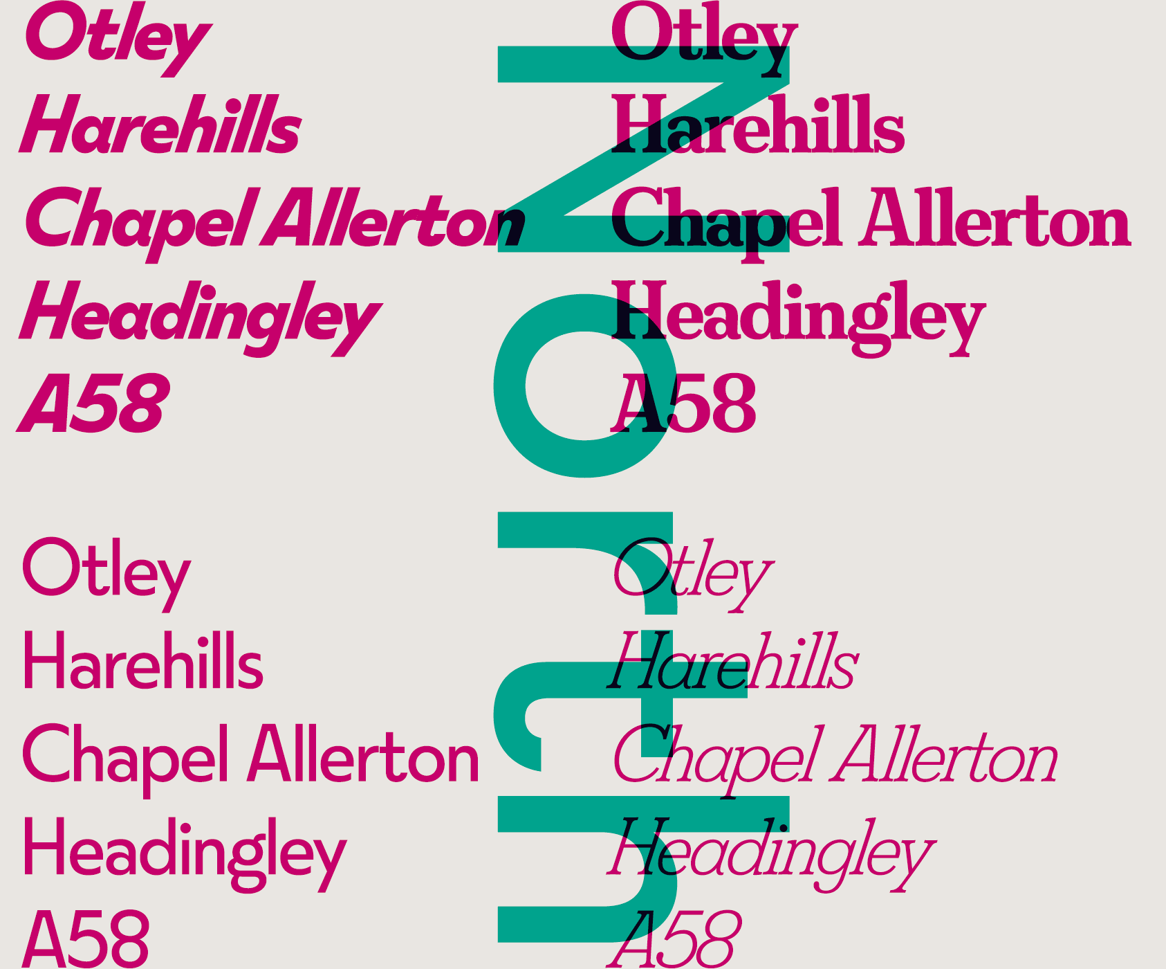
file name: Fontsmith F S Split 2019

file name: Fontsmith F S Split 2019

file name: Fontsmith F S Split 2019

file name: Fontsmith F S Split 2019
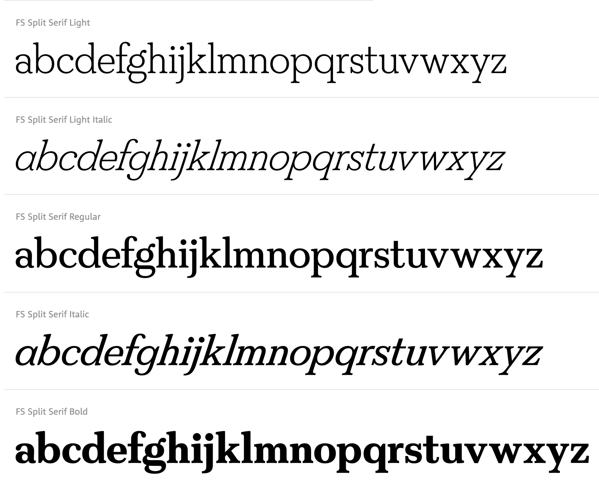
file name: Jason Smith Fernando Mello F S Split Serif 2019
file name: Fontsmith F S Split Serif 2020 342966 002
file name: Fontsmith F S Split Serif 2020 342968 002

file name: Fontsmith F S Split Serif 2020

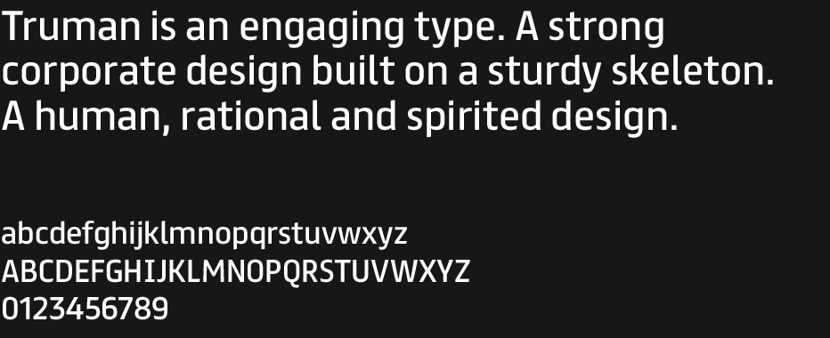
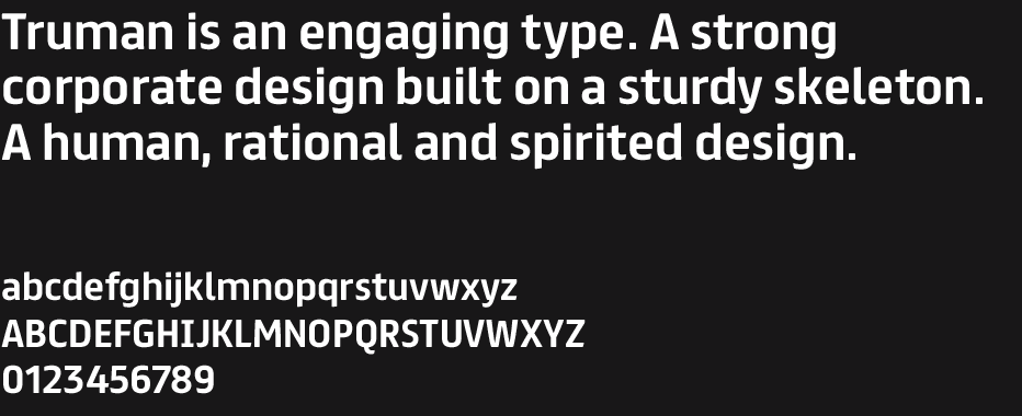
file name: Fontsmith F S Truman 2020 342511 002

file name: Fontsmith F S Truman 2020 342512
file name: Fontsmith F S Truman 2020 342513
file name: Fontsmith F S Truman 2020 342514

file name: Fontsmith F S Truman 2020
file name: Fernando Mello Jason Smith F S Truman 2012
file name: Fernando Mello Jason Smith F S Truman Bold 2012

file name: Fontsmith F S Untitled 2020 342617 002
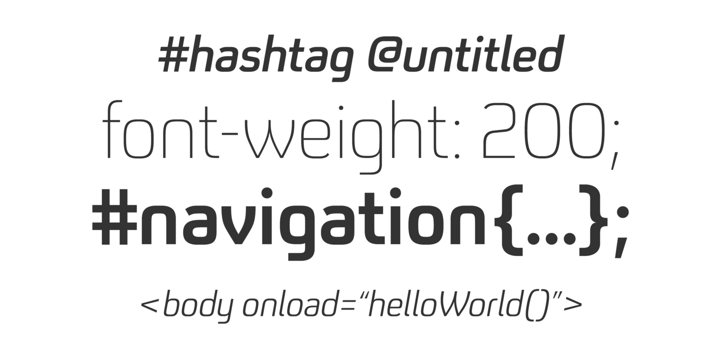
file name: Fontsmith F S Untitled 2020 342618 002

file name: Fontsmith F S Untitled 2020 342619
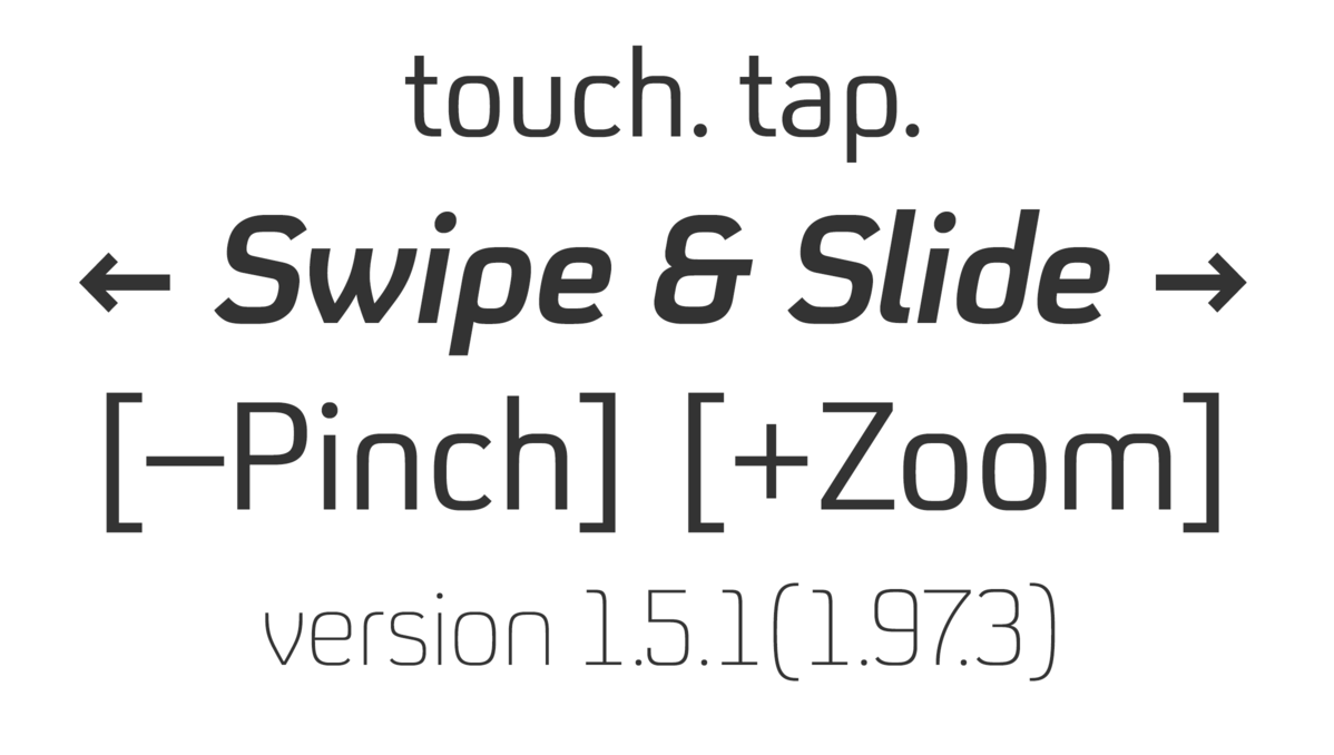
file name: Fontsmith F S Untitled 2020 342620 002

file name: Fontsmith F S Untitled 2020
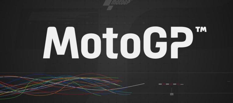
file name: Fontsmith Moto G P 2020

file name: Fontsmith F S Kim 2018
file name: Fontsmith F S Kim 2018

file name: Fontsmith F S Kim 2018

file name: Fontsmith F S Kim 2018
file name: Fontsmith F S Kim 2018

file name: Fontsmith F S Kim 2018

file name: Fontsmith F S Kim 2018
file name: Fontsmith F S Kim 2018
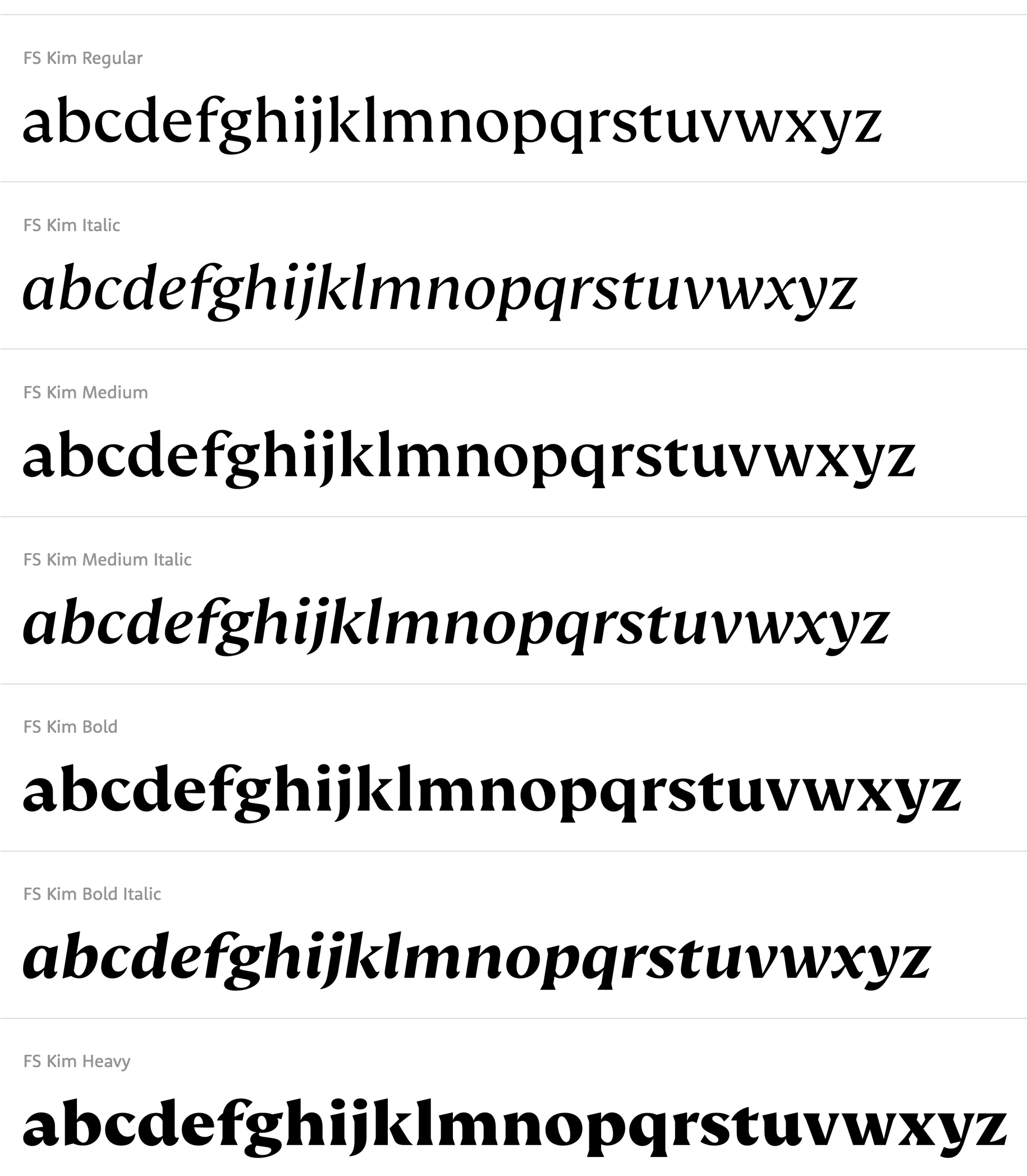
file name: Krista Radoeva F S Kim 2018
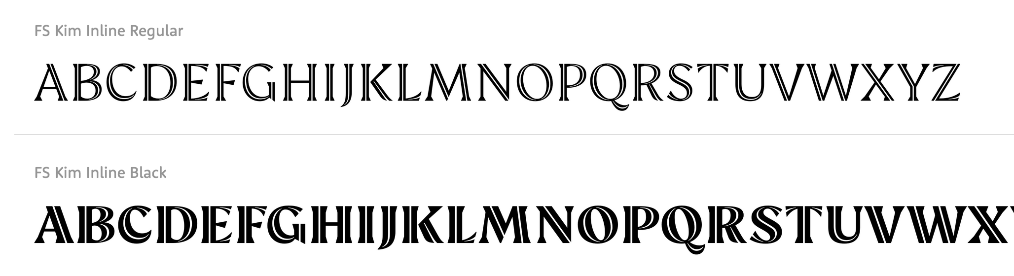
file name: Krista Radoeva F S Kim Inline 2018
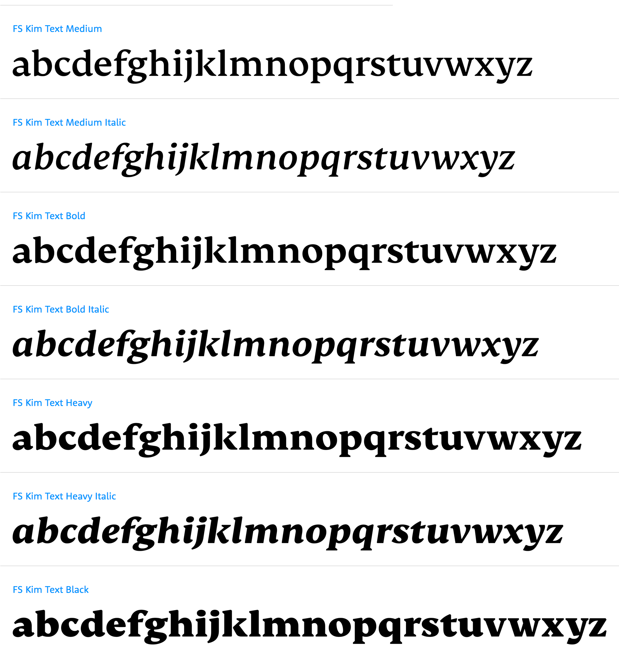
file name: Krista Radoeva F S Kim Text 2018
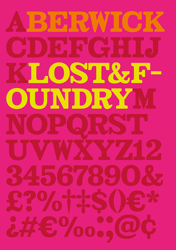
file name: Stuart De Rozario Pedro Arilla F S Berwick 2018
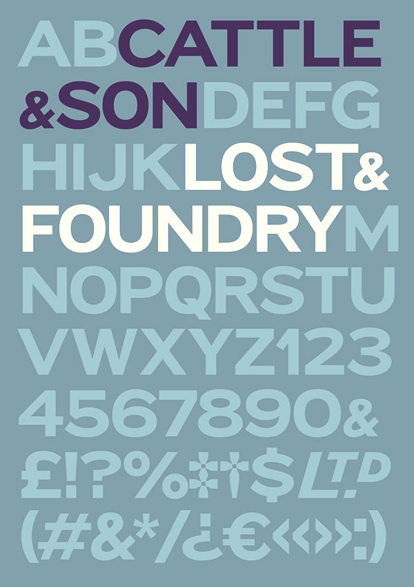
file name: Stuart De Rozario Pedro Arilla F S Cattle Son 2018
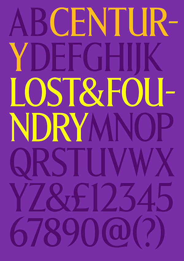
file name: Stuart De Rozario Pedro Arilla F S Century 2018
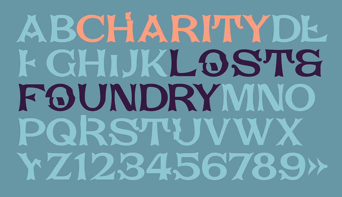
file name: Stuart De Rozario Pedro Arilla F S Charity 2018
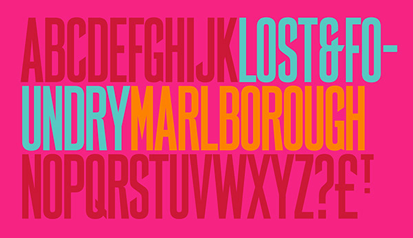
file name: Stuart De Rozario Pedro Arilla F S Marlborough 2018
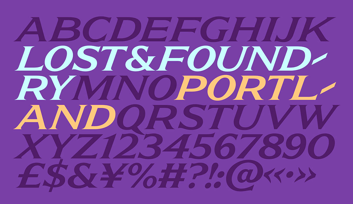
file name: Stuart De Rozario Pedro Arilla F S Portland 2018
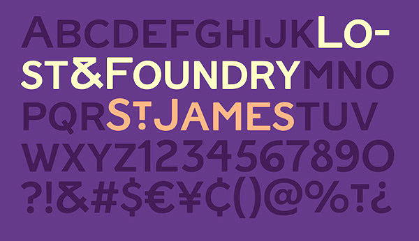
file name: Stuart De Rozario Pedro Arilla F S Saint James 2018

file name: Stuart De Rozario Pedro Arilla Fontsmith Lost Foundry 2018
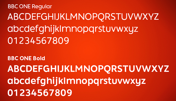
file name: Fontsmith B B C One 2006

file name: Krista Radoeva Jason Smith F S Siena 2016

file name: Krista Radoeva Jason Smith F S Siena 2016c
file name: Krista Radoeva Jason Smith F S Siena 2016d
file name: Krista Radoeva Jason Smith F S Siena 2016g
file name: Krista Radoeva Jason Smith F S Siena 2016h
file name: Krista Radoeva Jason Smith F S Siena 2016j

file name: Fontsmith Colgate Ready 2014

file name: Fontsmith Colgate Ready 2014b
file name: Fontsmith Colgate Ready 2014c
file name: Fontsmith F S Untitled 2016

file name: Fontsmith F S Untitled 2016b

file name: Jason Smith Champions Bold 2009

file name: Jason Smith Champions Headline 2009

file name: Jason Smith Champions Regular 2009

file name: Vernon Adams Mako Light vs Lurpak Light 2010
| | |
|
Luc Devroye ⦿ School of Computer Science ⦿ McGill University Montreal, Canada H3A 2K6 ⦿ lucdevroye@gmail.com ⦿ https://luc.devroye.org ⦿ https://luc.devroye.org/fonts.html |