TYPE DESIGN INFORMATION PAGE last updated on Wed May 6 16:17:19 EDT 2026
FONT RECOGNITION VIA FONT MOOSE

|
|
|
|
Hex
[Nick Sherman]
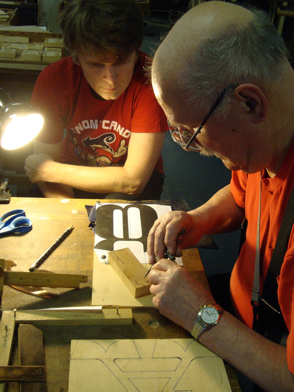
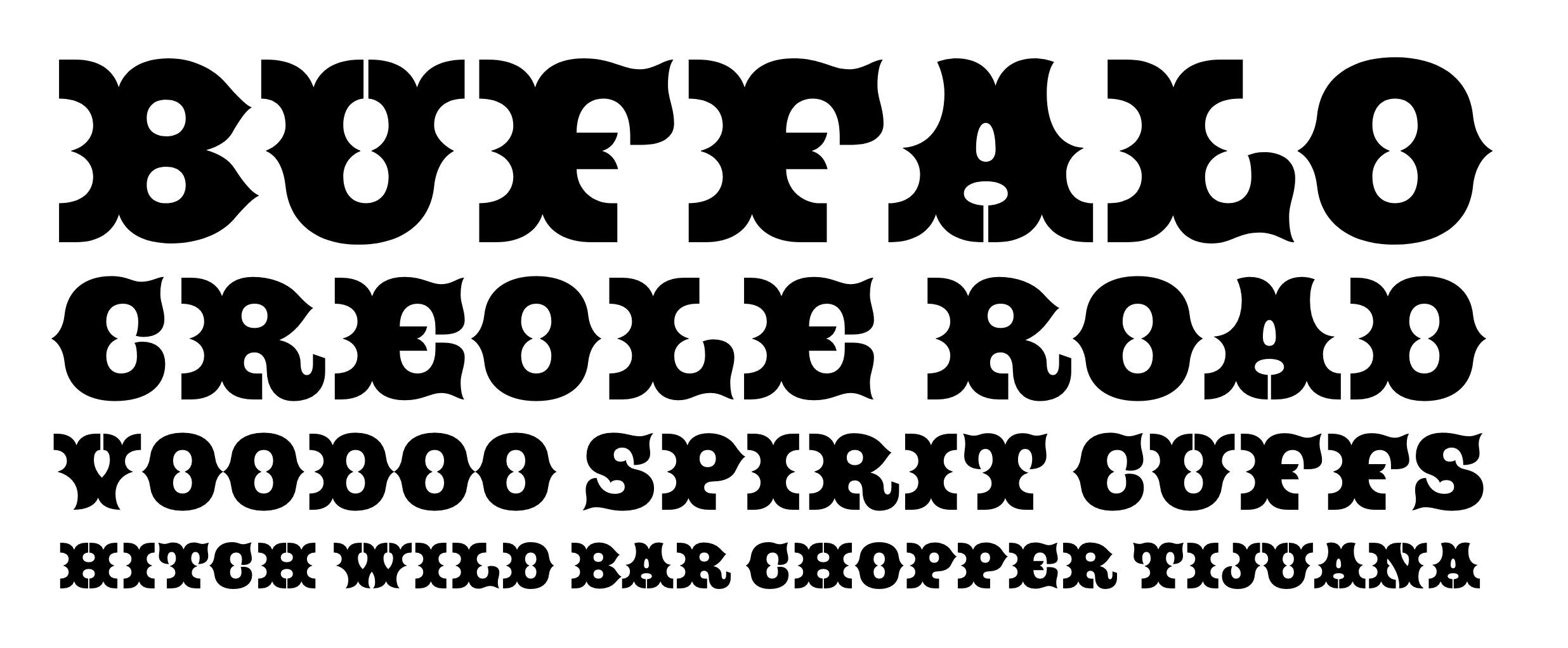
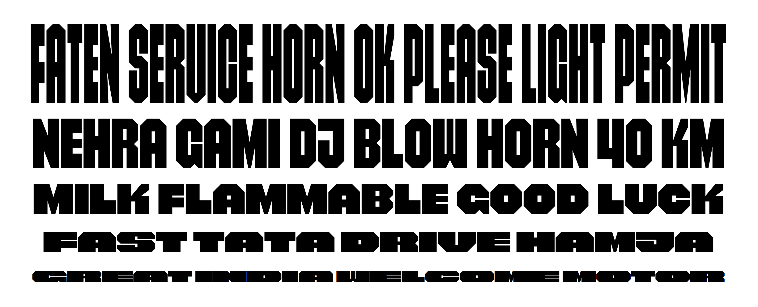
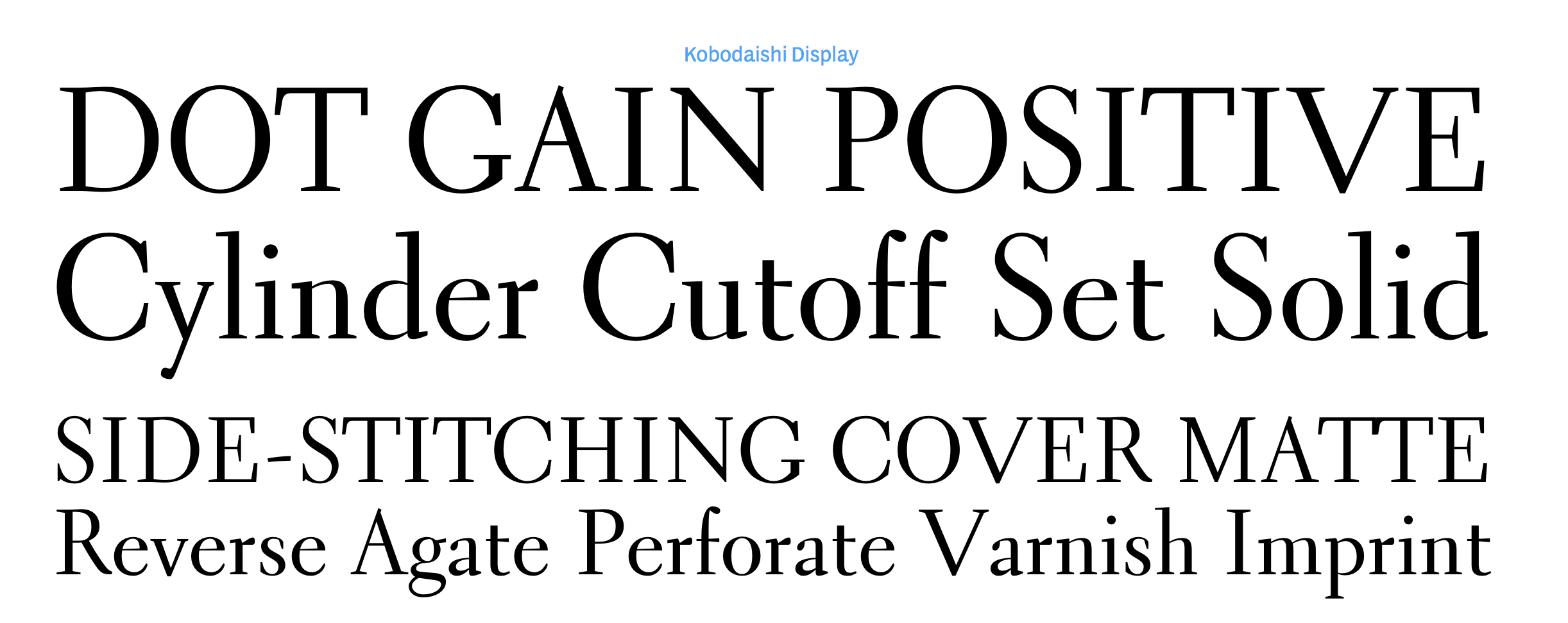
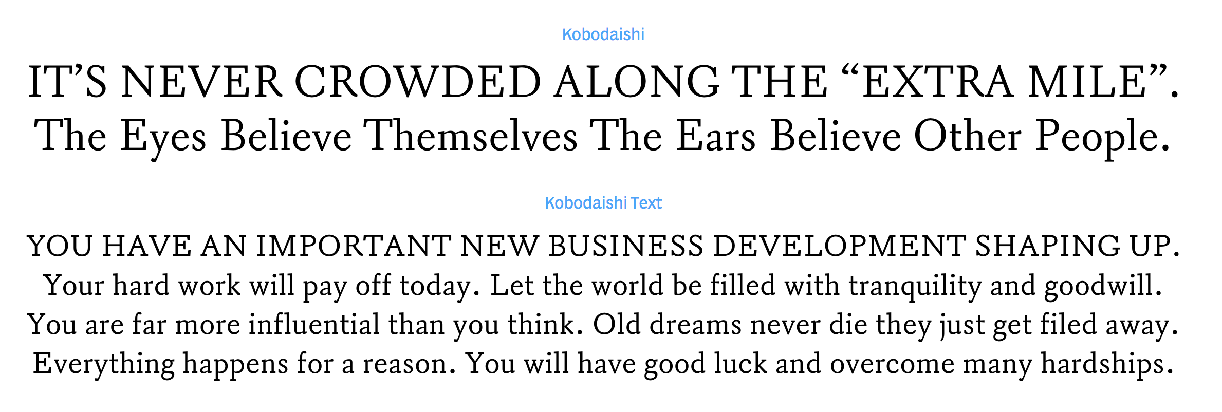
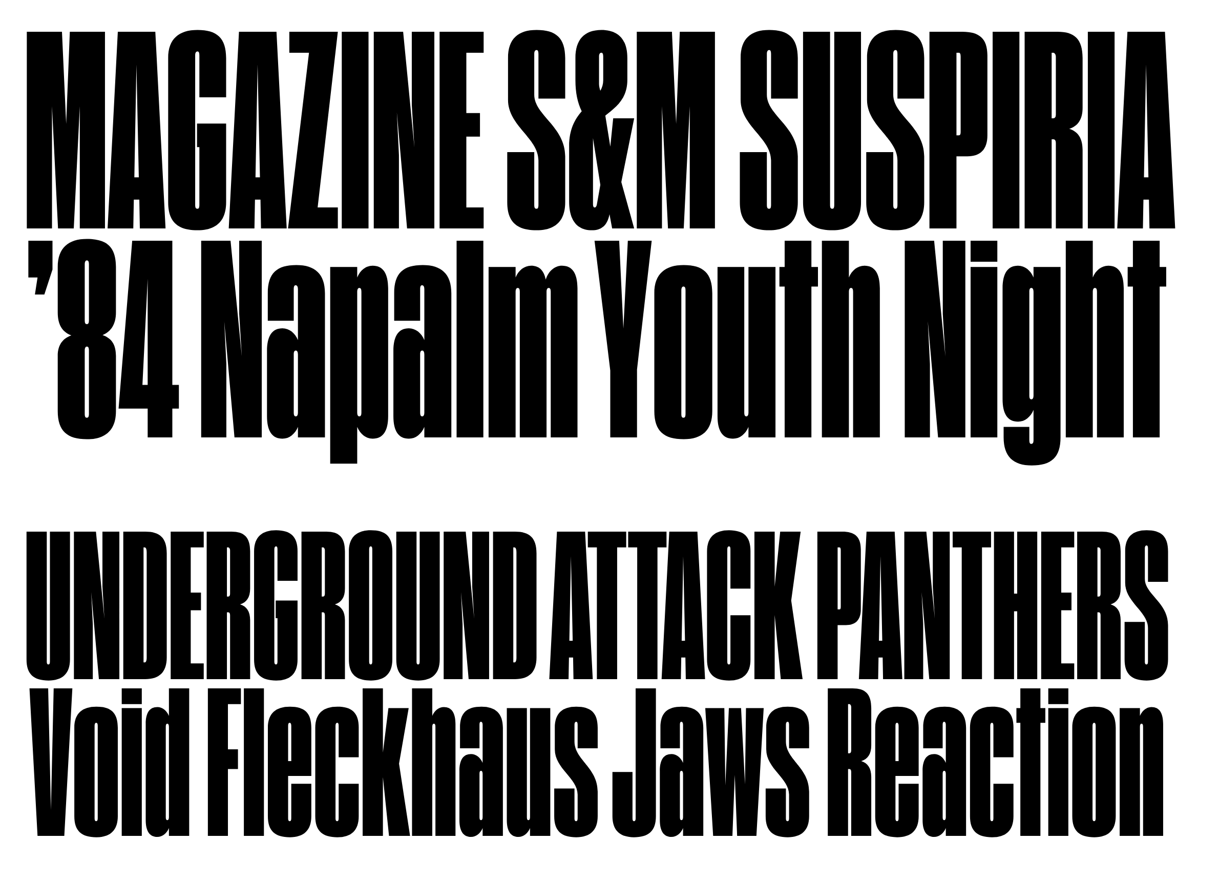
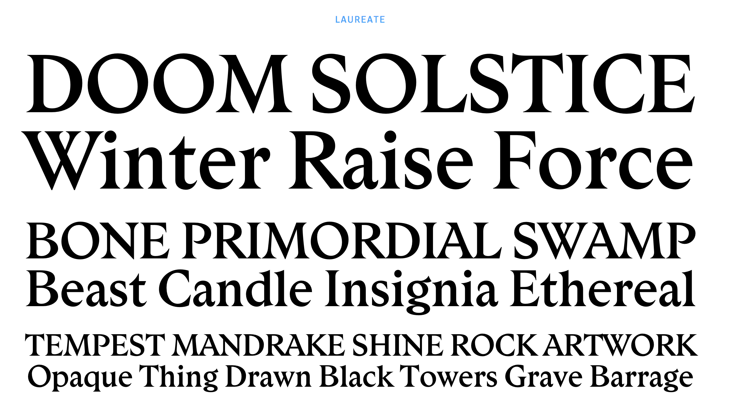
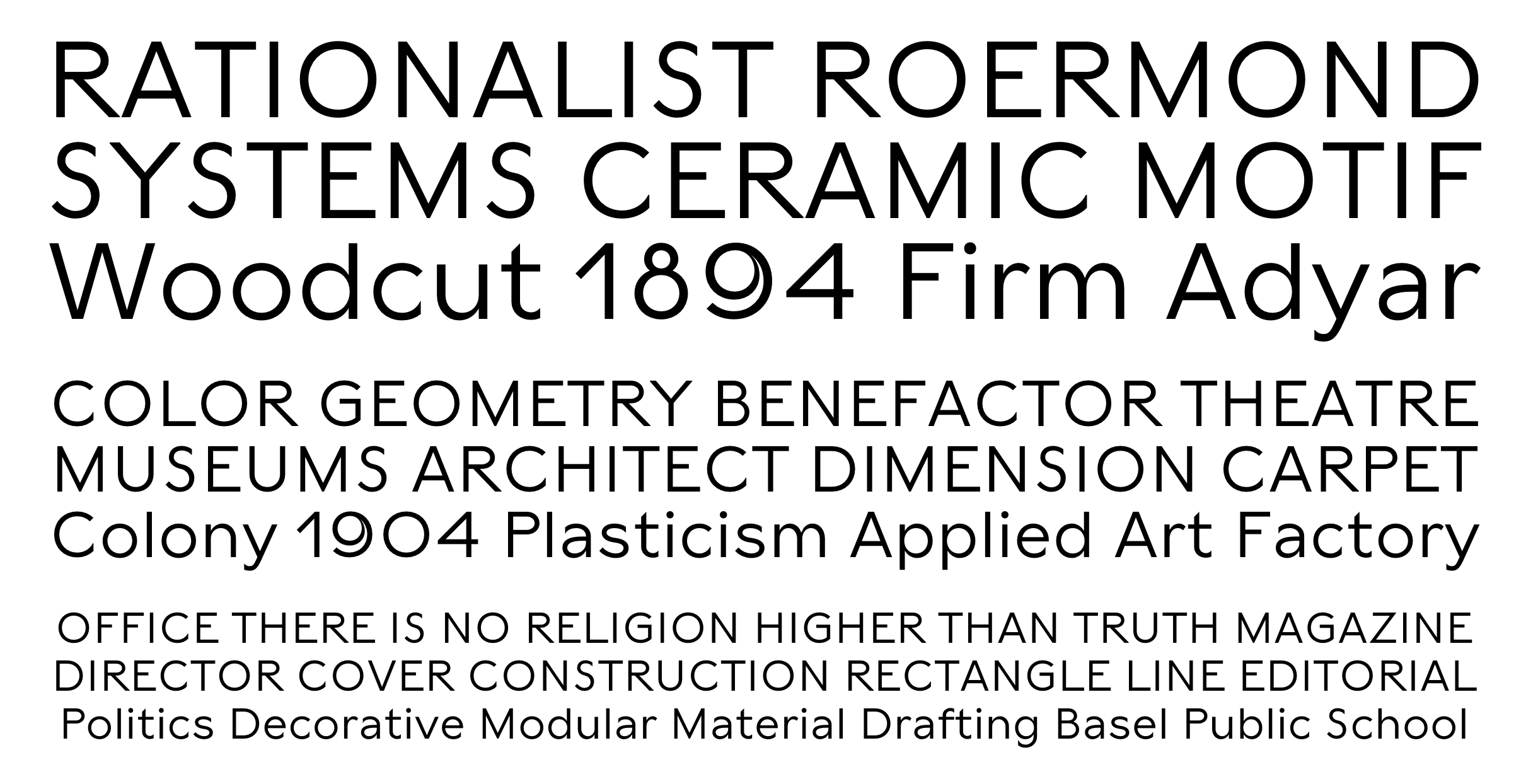
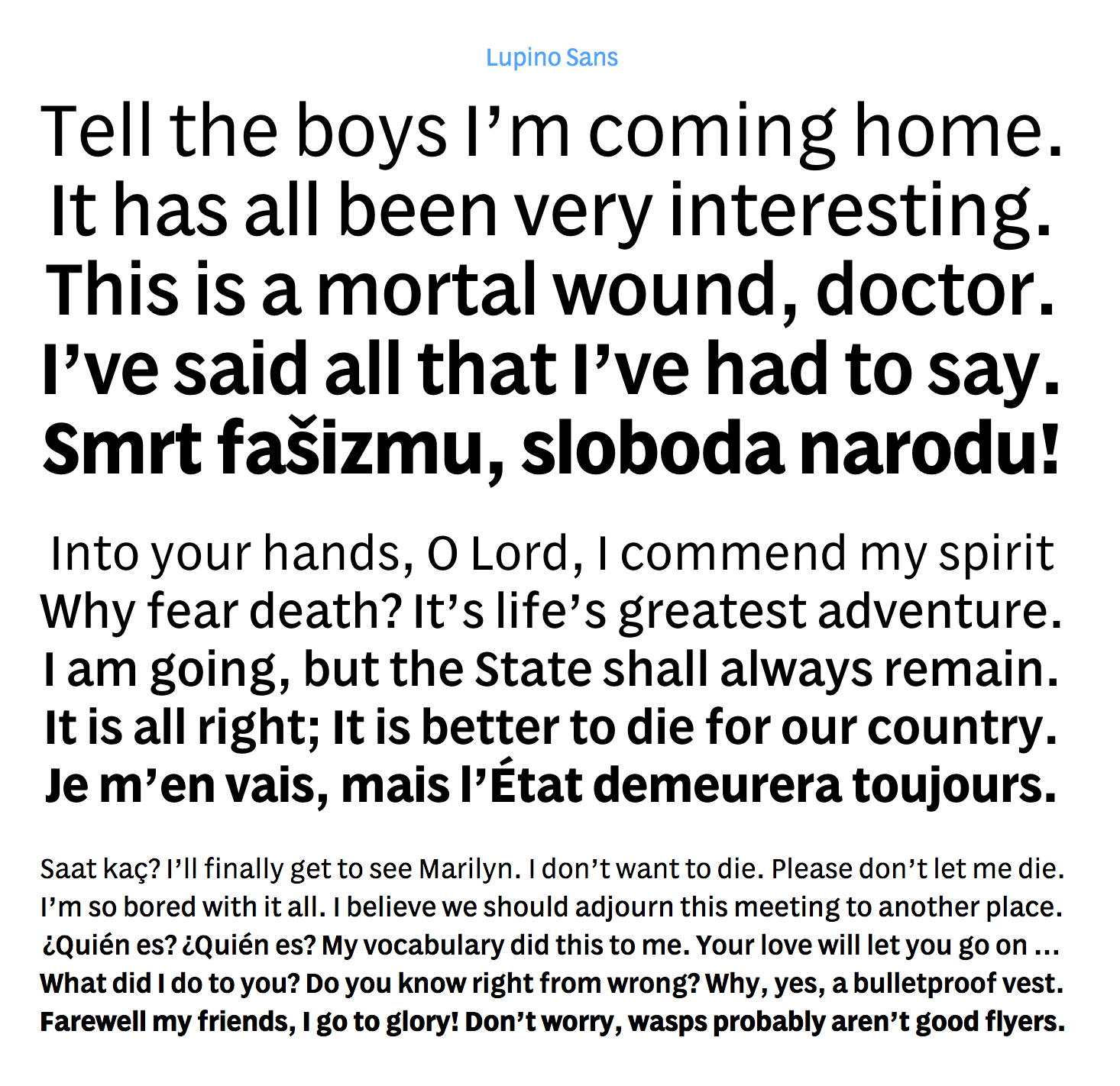
Hex was founded by Nick Sherman (b. 1983). Nick is a typographer and typographic consultant based in New York City and Los Angeles. He is a co-founder of Fonts In Use and a graduate of the Type@Cooper typeface design program at Cooper Union. He serves on the board of directors for the Type Directors Club, the Adobe Typography Customer Advisory Board, as well as the artistic board for the Hamilton Wood Type & Printing Museum. He has taught typography, typeface design, letterpress printing, and responsive design at MassArt and Cooper Union. He previously worked at Font Bureau, Webtype, and MyFonts, directing web design and promotional material for typefaces. Originally from Hyannis Port and Boston, MA, he studied graphic design at MassArt in 2005. His degree project there, entitled A Modern Day Specimen Book, is beautifully presented, and leads us through thoughts on type classification to the idea of type molecules, with the nodes in the molecules representing styles or descriptions or dates, and the edges representing typefaces. He is interested in wood type, and occasionally helps out the organizers of the TypeCon conferences. As a designer at MyFonts (from 2007 until 2010), he was in charge of the interviews, presentations, and web designs of their successful and useful pages. In 2010, he joined Font Bureau. Flickr page. He is the founder of Woodtyper, an online journal focused on large and ornamented type and related matters. He also set up the type documentation project Type Record together with Indra Kupferschmid. His type designs:
He wrote Type from the Crypt about horror fonts. He started the Flickr group called Manicule about pointing hands (fists; see, e.g., here and here). He wrote the long essay on printing fists called Toward a History of the Manicule (2005). Check out this pic he took of Lucha Libre posters in Mexico City in 2009. He also designed the poster for the 2008 documentary on wood type called Typeface. Speaker at ATypI 2011 in Reykjavik. Speaker at ATypI 2013 in Amsterdam. Future Fonts link. |
EXTERNAL LINKS |
| | |
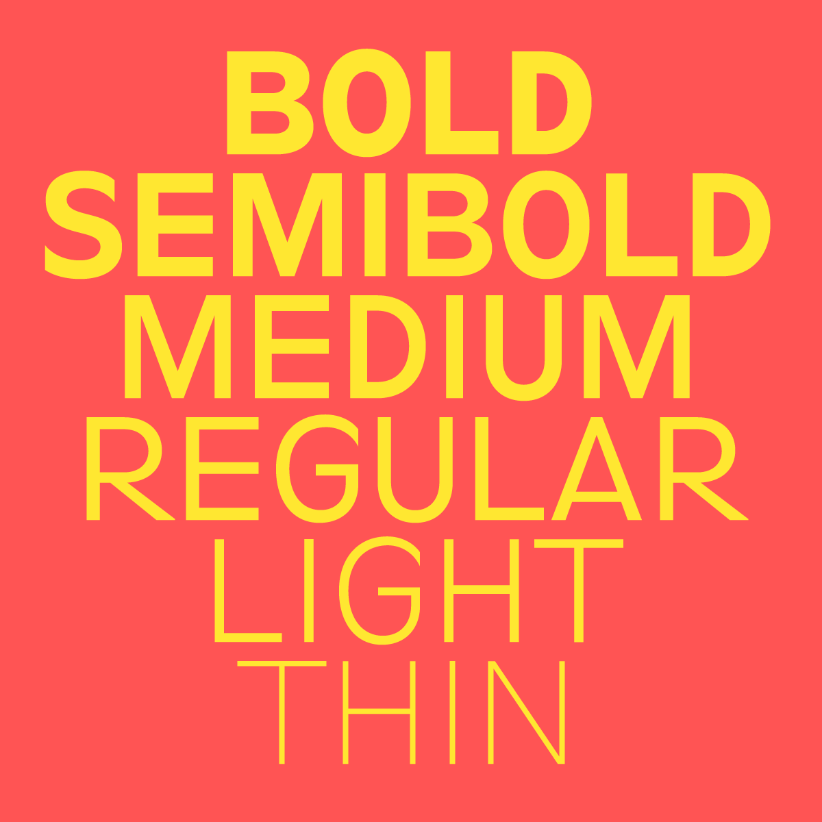
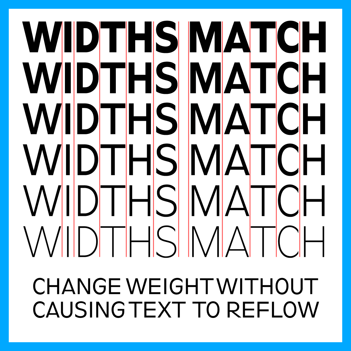
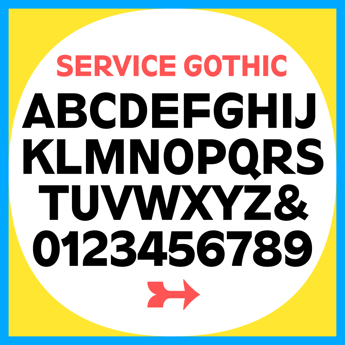
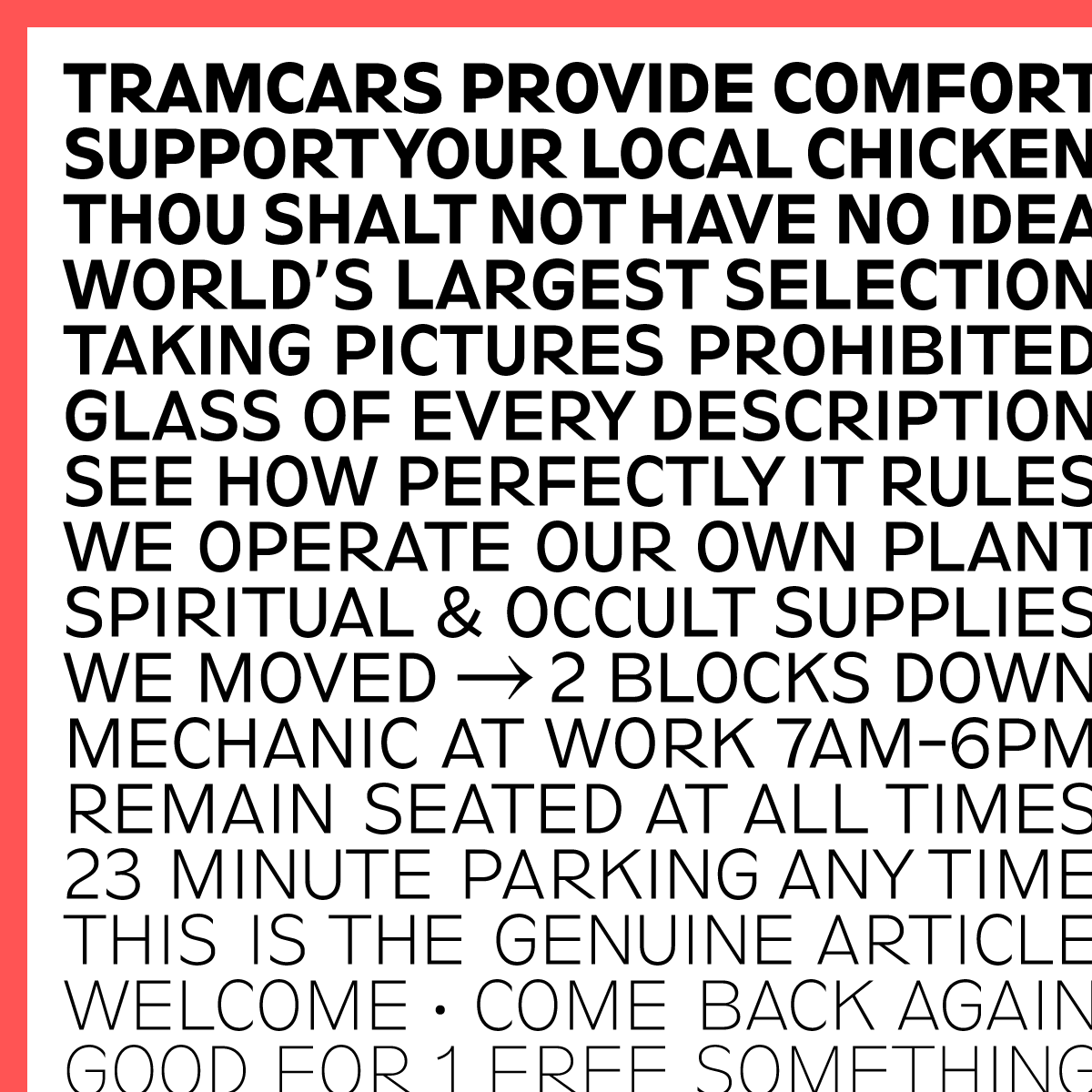
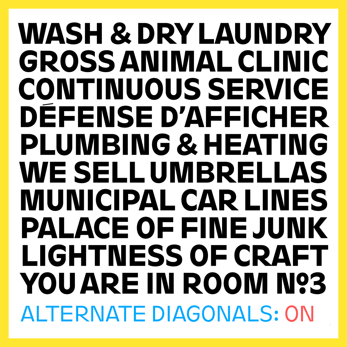
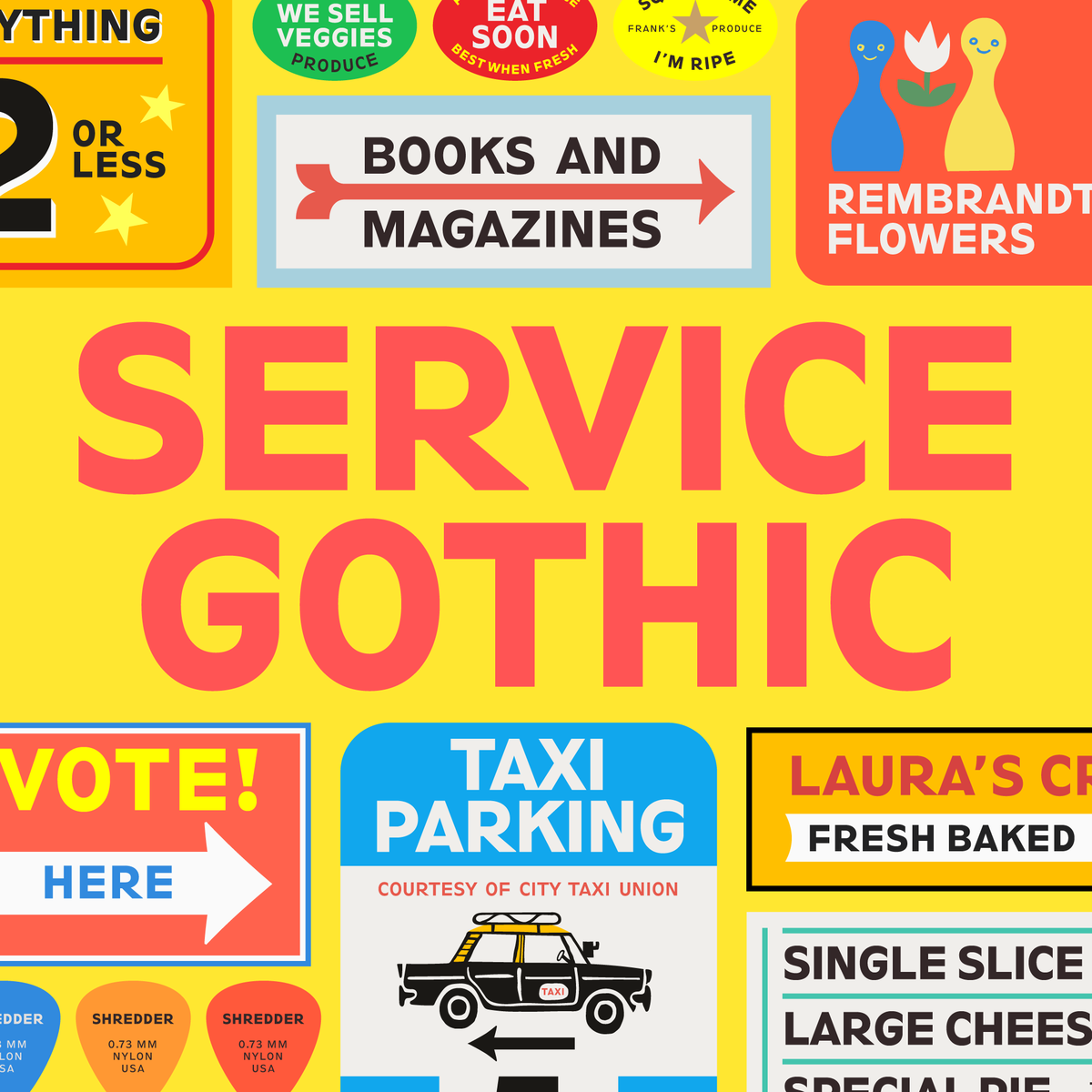
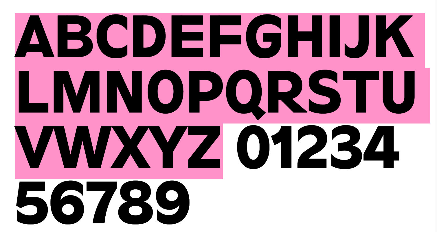
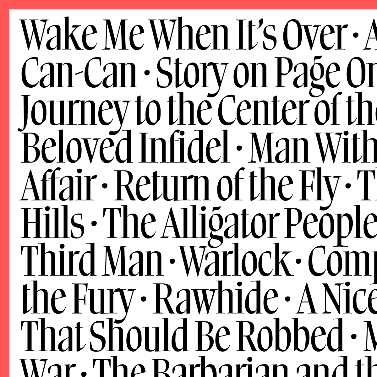
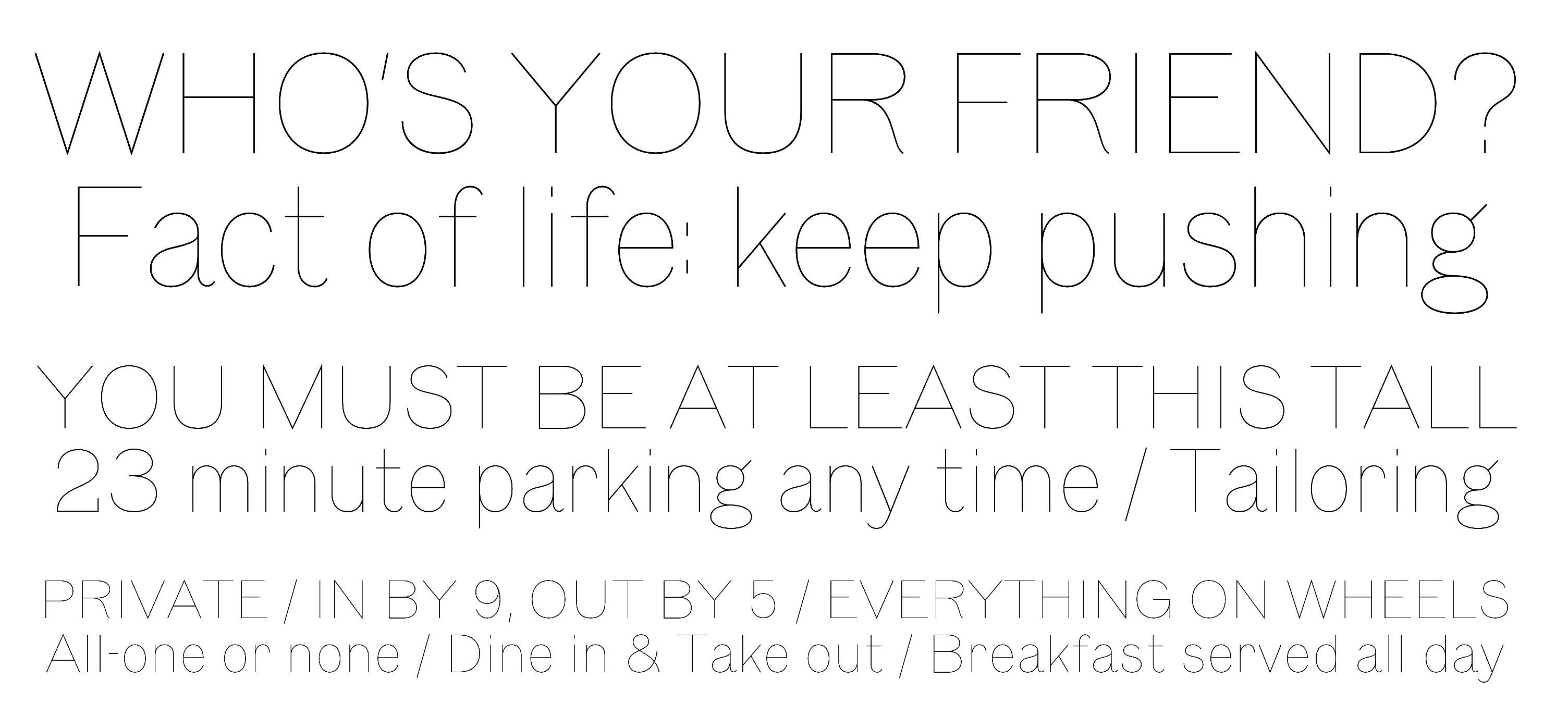
file name: Nick Sherman Service Gothic 2020
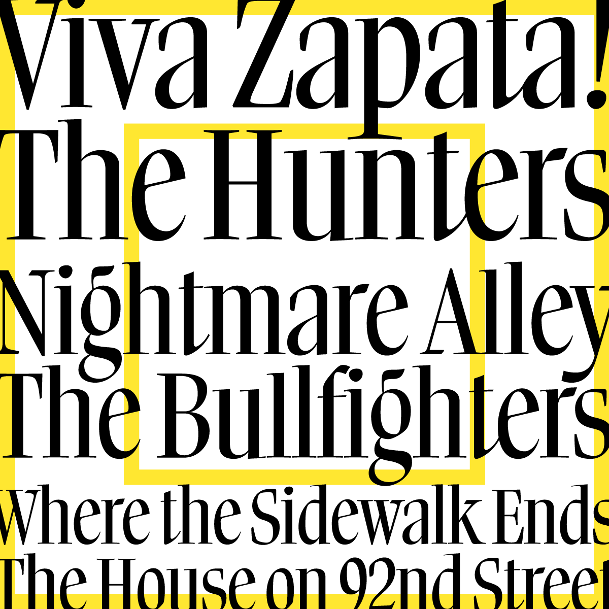
file name: Nick Sherman Service Gothic 2020
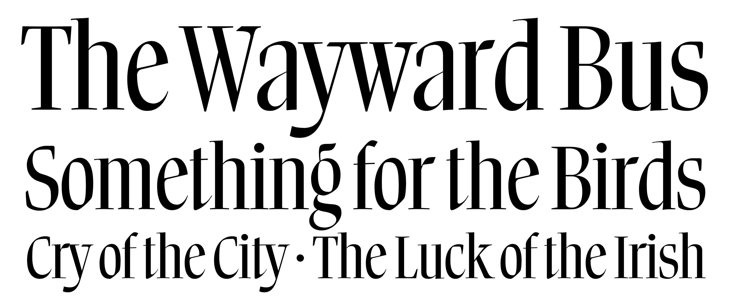
file name: Nick Sherman Service Gothic 2020
file name: Nick Sherman Service Gothic 2020
file name: Nick Sherman Service Gothic 2020
file name: Nick Sherman Service Gothic 2020

file name: Nick Sherman Service Gothic 2020
file name: Nick Sherman Service Gothic 2020

file name: Lucha Libre Posters Photo By Nick Sherman
file name: Nick Sherman Norb Brylski 2017
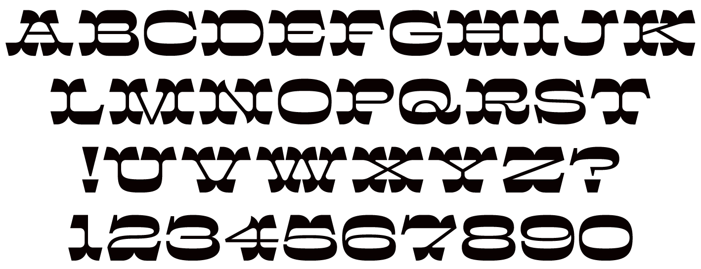
file name: Hamilton Wood Type Foundry H W T Brylski 2017 239925
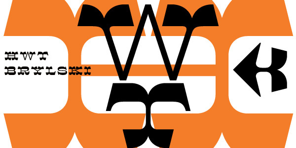
file name: Nick Sherman H W T Brylski 2017
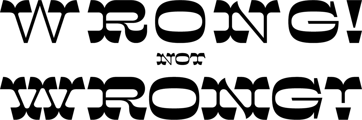
file name: Nick Sherman H W T Brylski 2017b
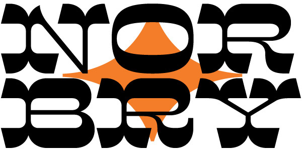
file name: Nick Sherman H W T Brylski 2017c
file name: Nick Sherman H W T Brylski 2017d
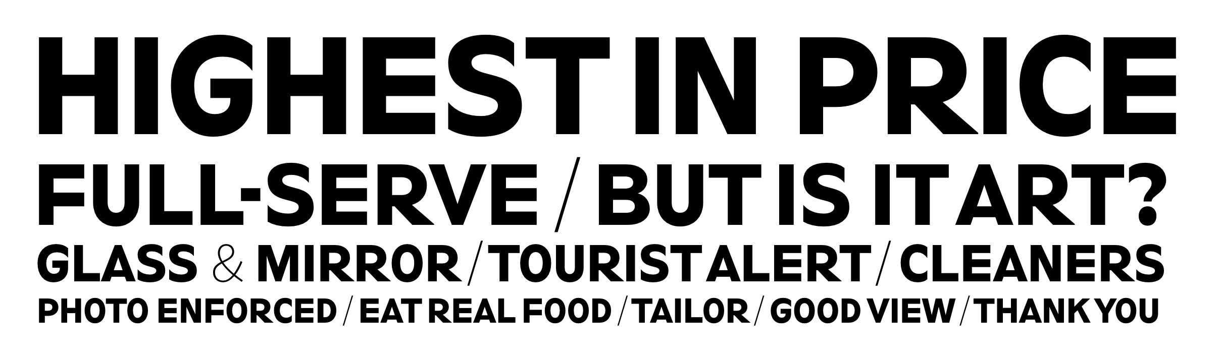
file name: Nick Sherman Cleaner
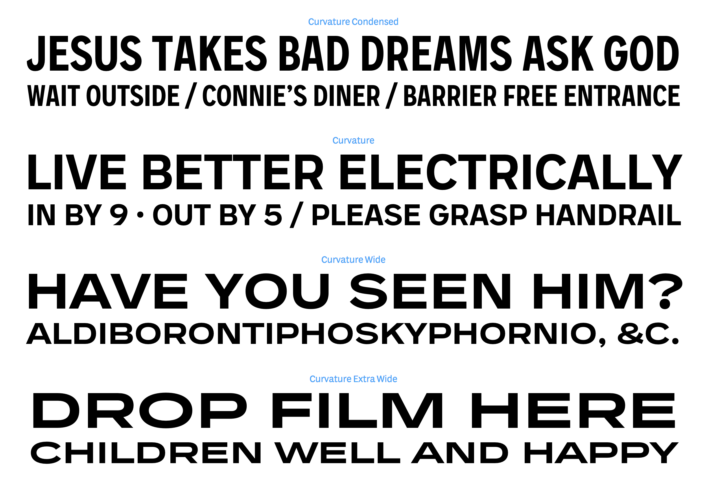
file name: Nick Sherman Curvature
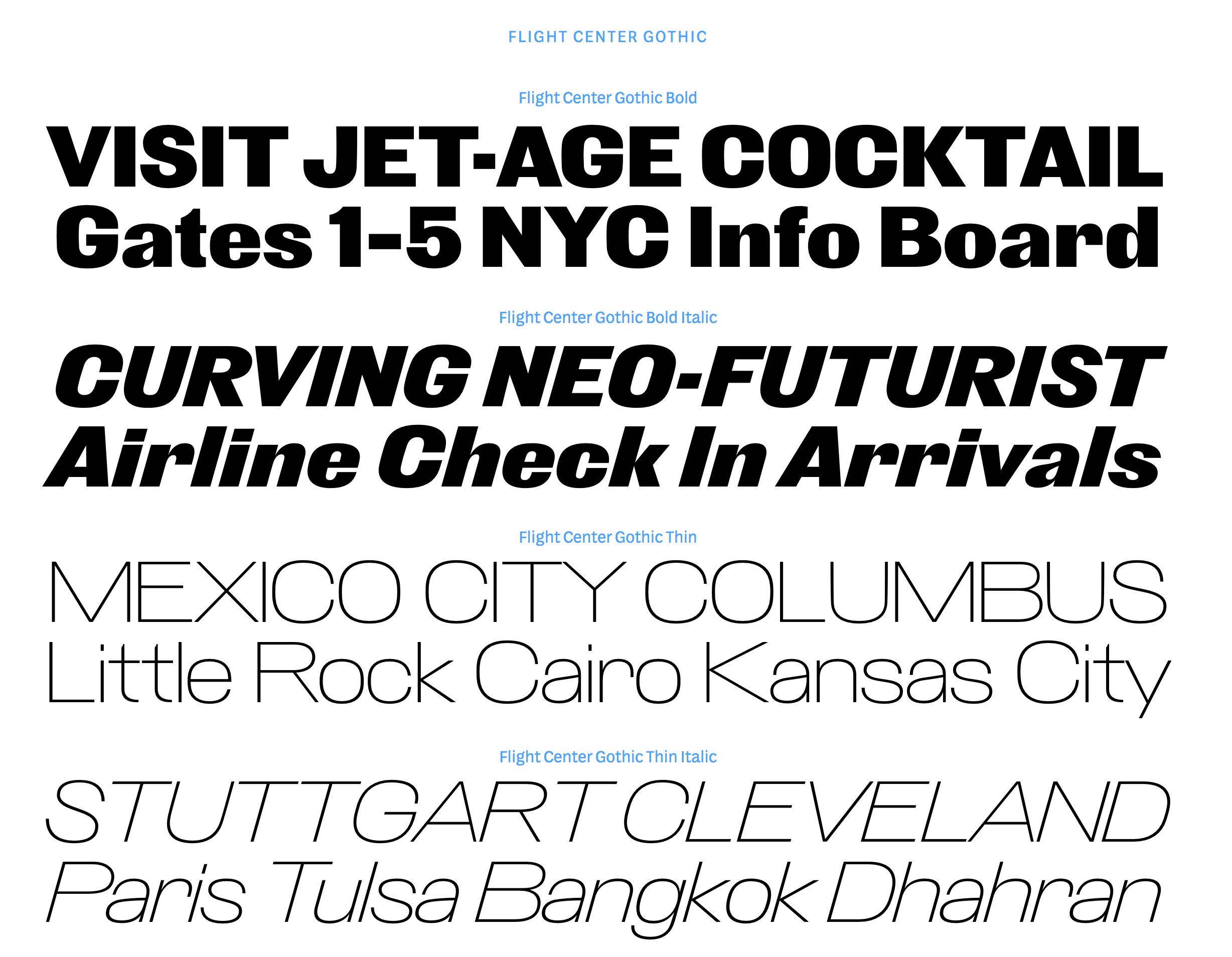
file name: Nick Sherman Flight Center Gothic
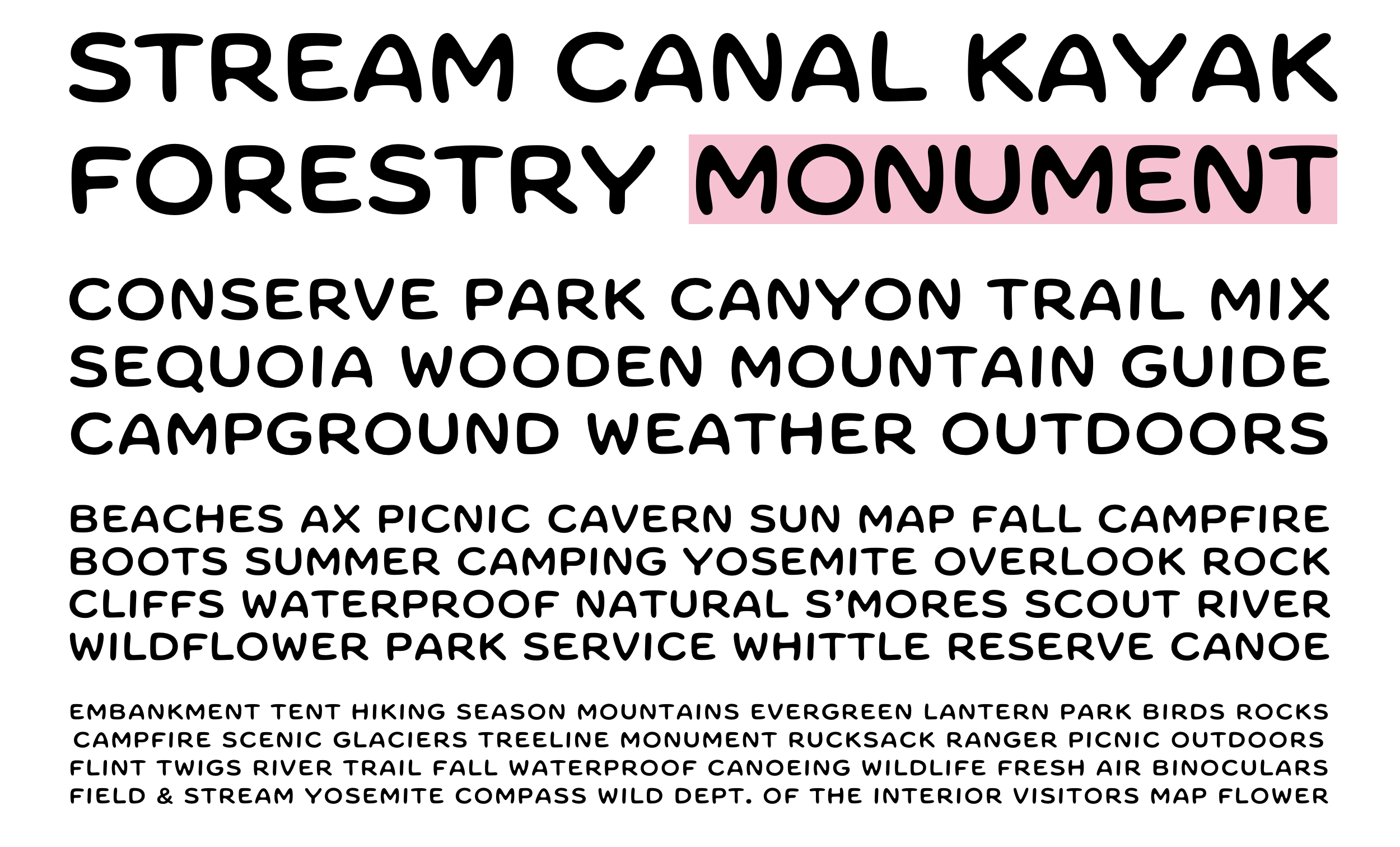
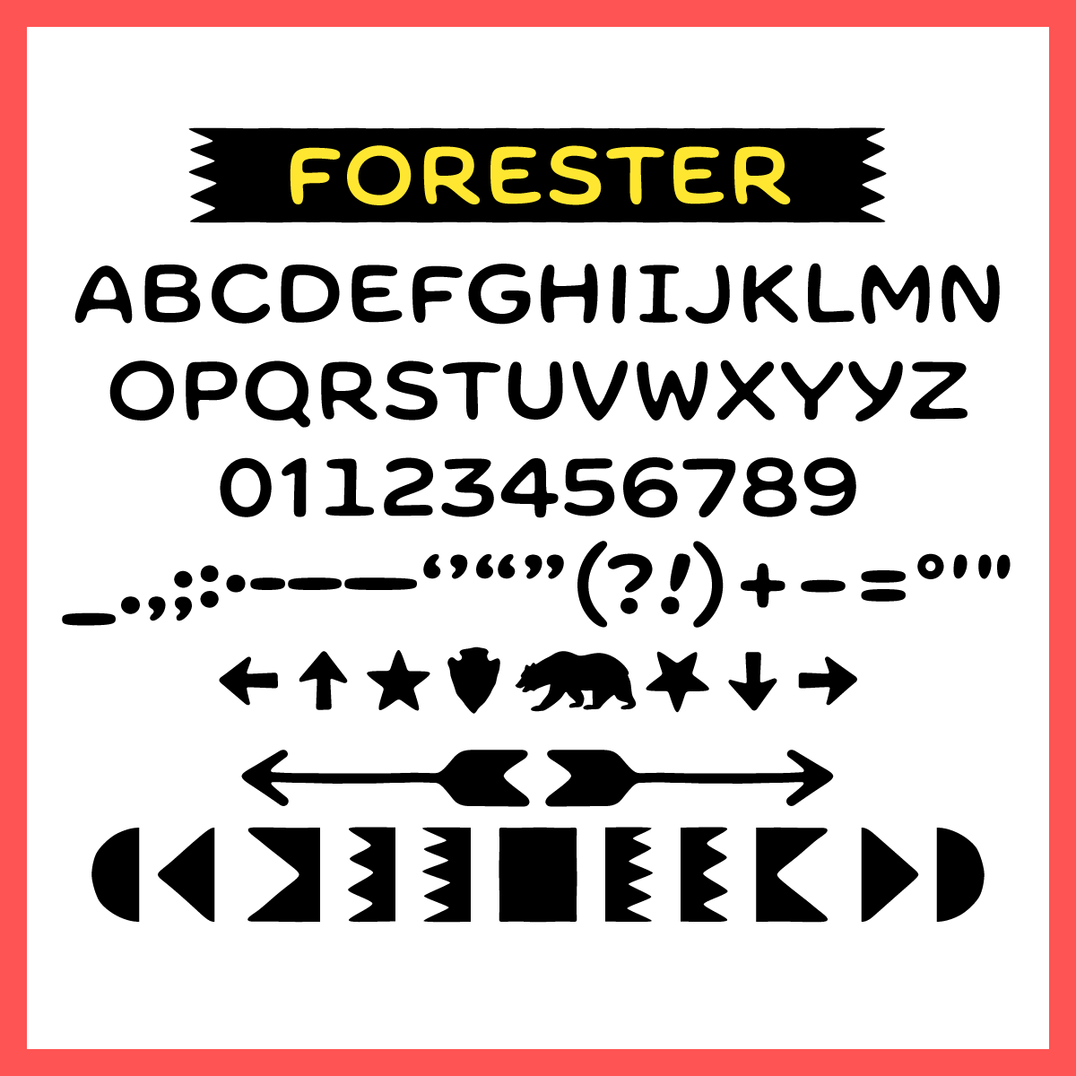
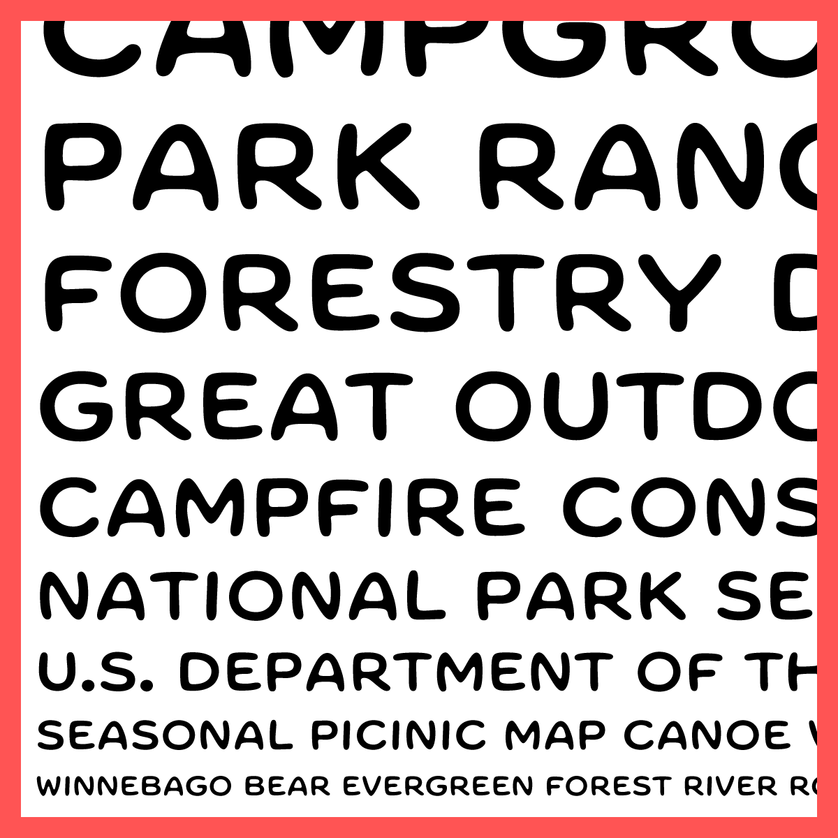
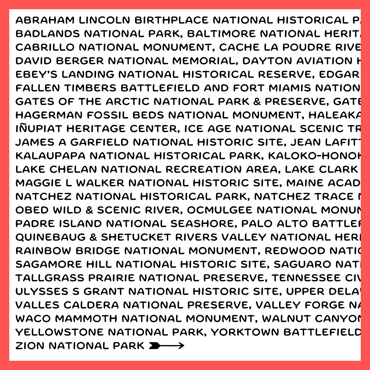
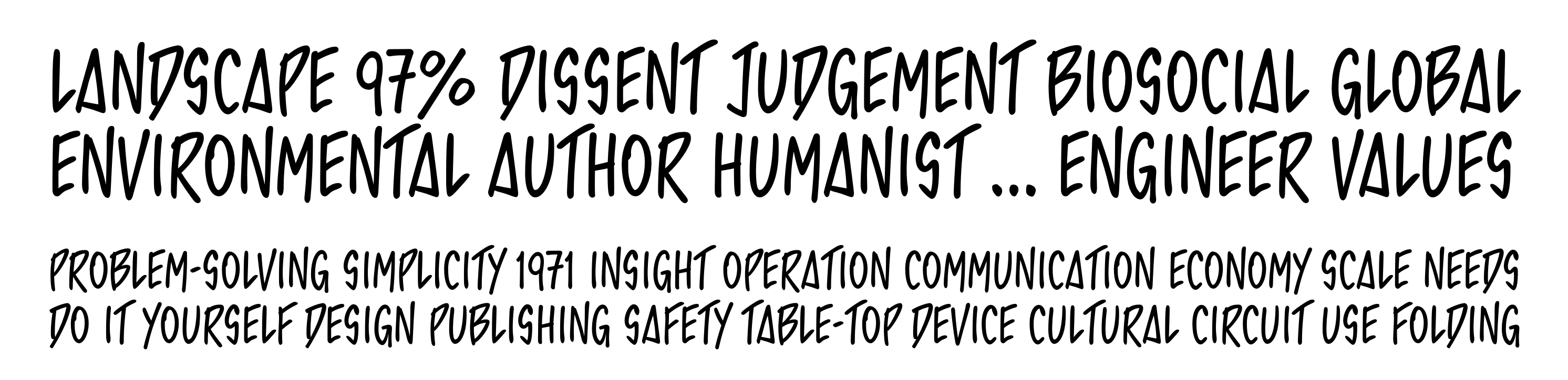
file name: Nick Sherman Forester 2019
file name: Nick Sherman Forester 2019
file name: Nick Sherman Forester 2019
file name: Nick Sherman Forester 2019

file name: Nick Sherman Forester 2019

file name: Nick Sherman Forester 2019
file name: Nick Sherman French Tuscan
file name: Nick Sherman Horn Pleasen
file name: Nick Sherman Kobodaishi Display
file name: Nick Sherman Kobodaishi Text
file name: Nick Sherman Kultur
file name: Nick Sherman Laureate
file name: Nick Sherman Lauweriks
file name: Nick Sherman Lupino Sans
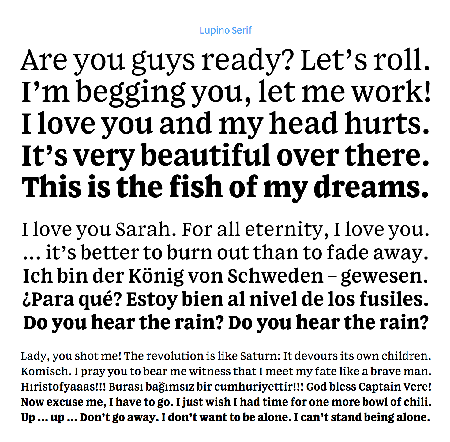
file name: Nick Sherman Lupino Serif
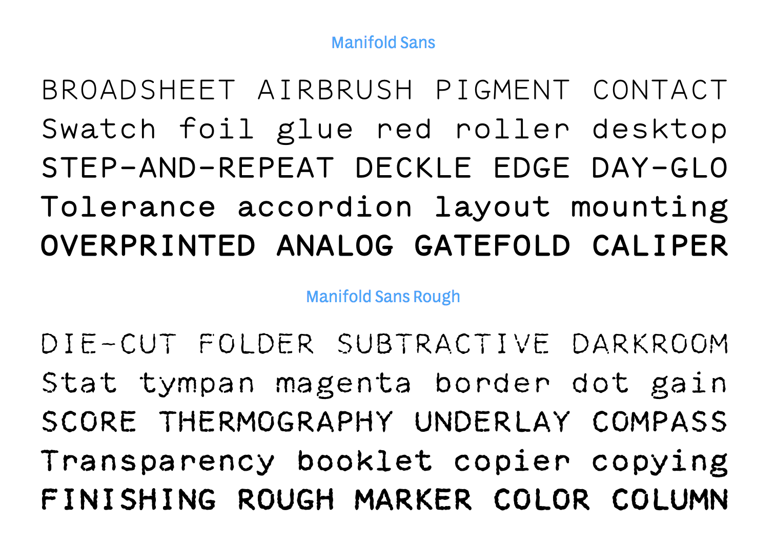
file name: Nick Sherman Manifold Sans
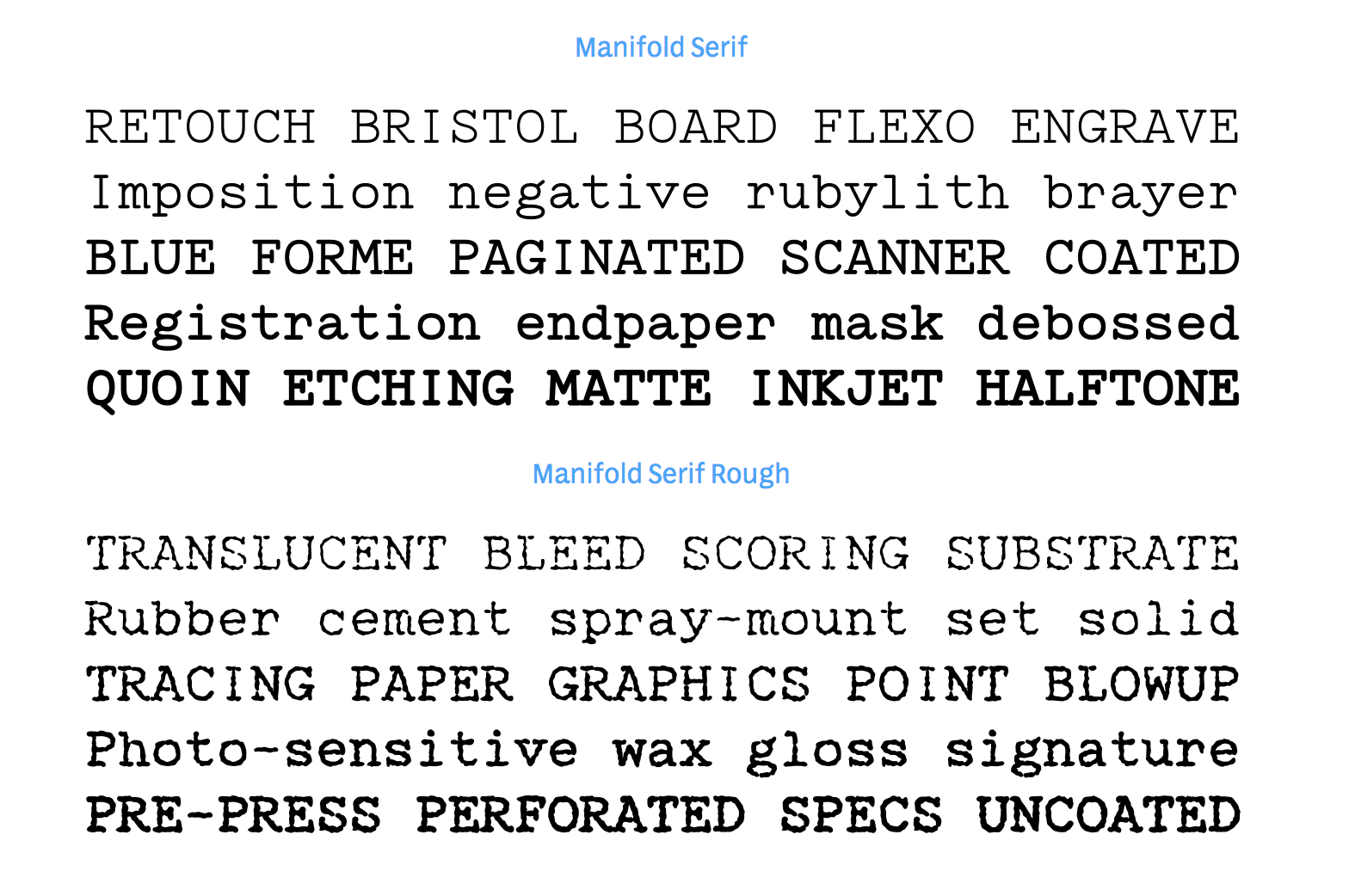
file name: Nick Sherman Manifold Serif
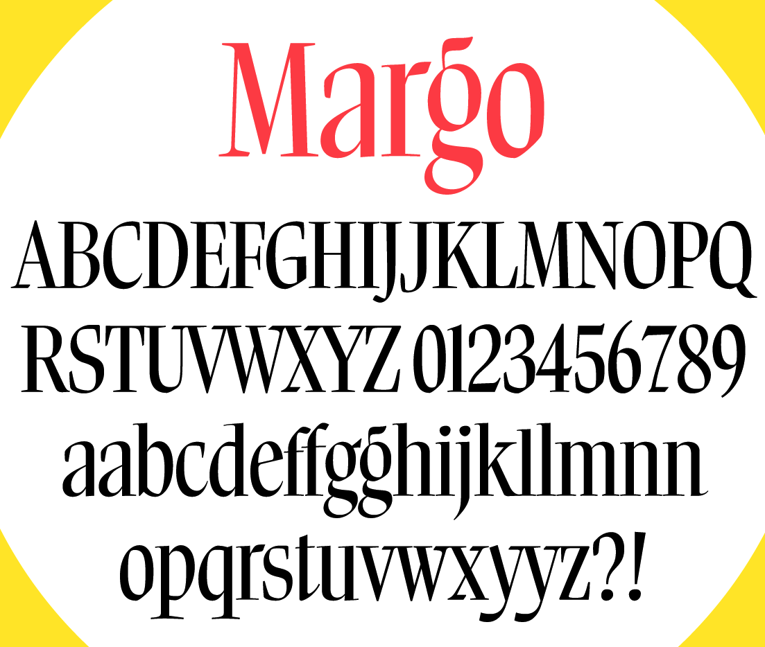
file name: Nick Sherman Margo 2019
file name: Nick Sherman Margo 2019

file name: Nick Sherman Margo 2019
file name: Nick Sherman Margo 2019
file name: Nick Sherman Margo
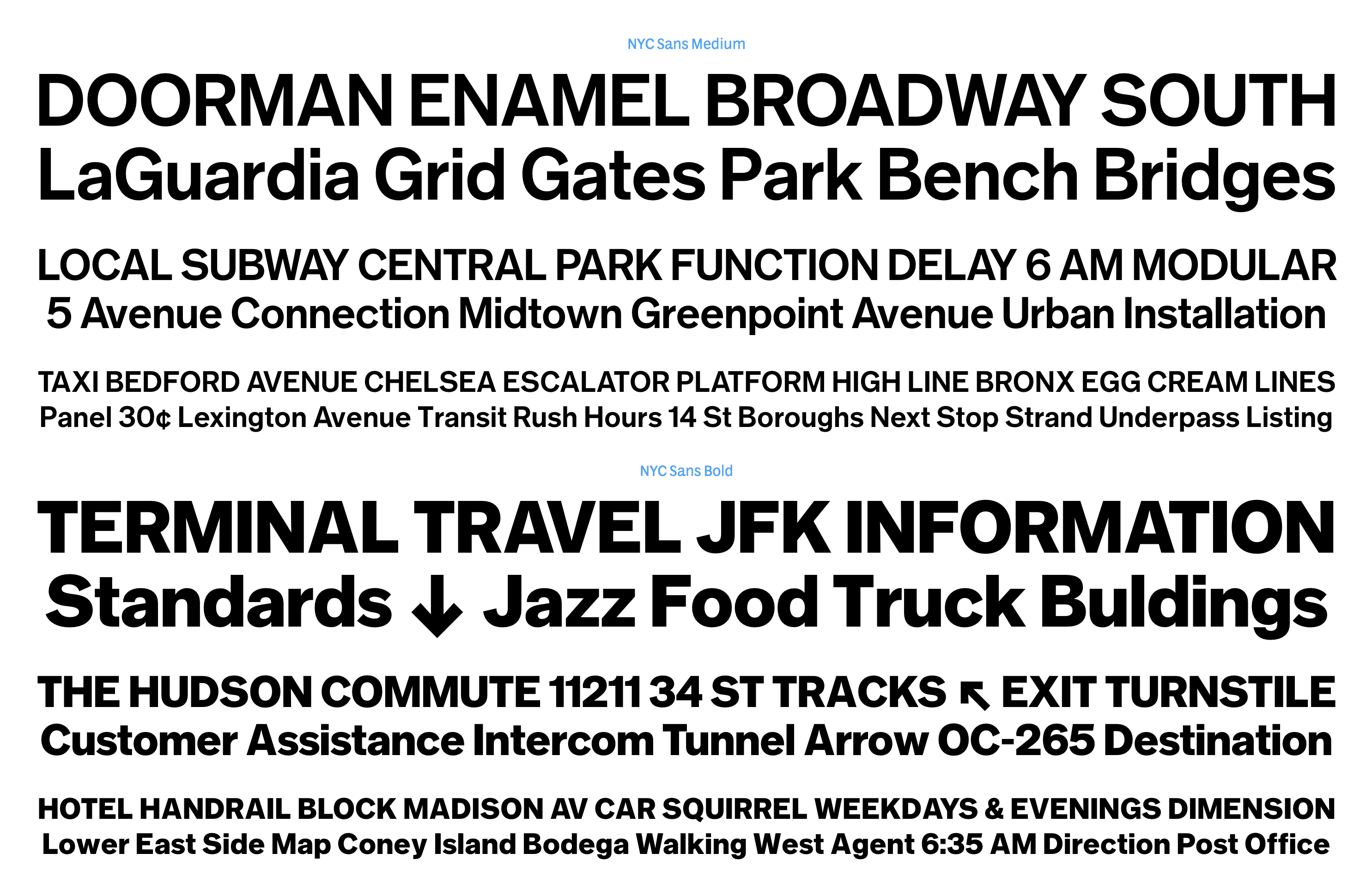
file name: Nick Sherman N Y C Sans
file name: Nick Sherman Papanek
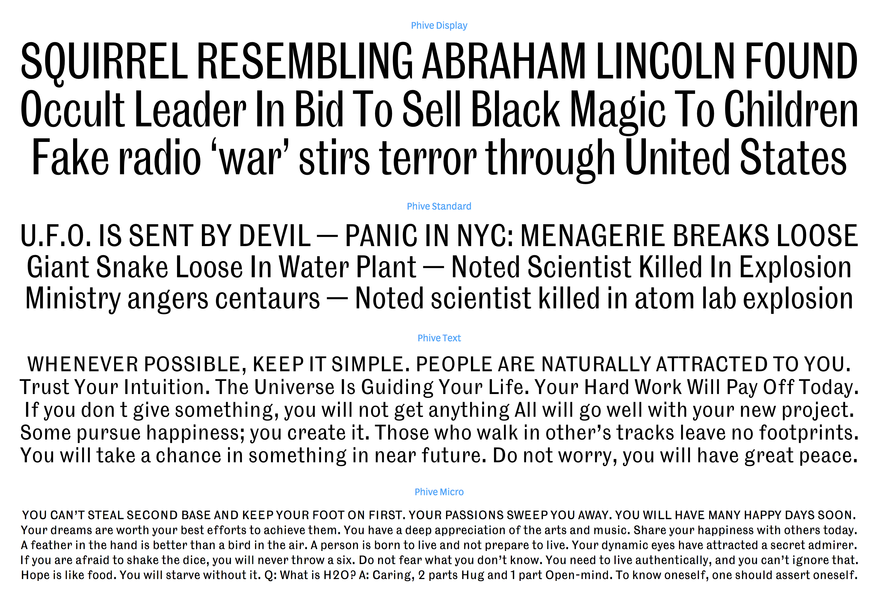
file name: Nick Sherman Phive
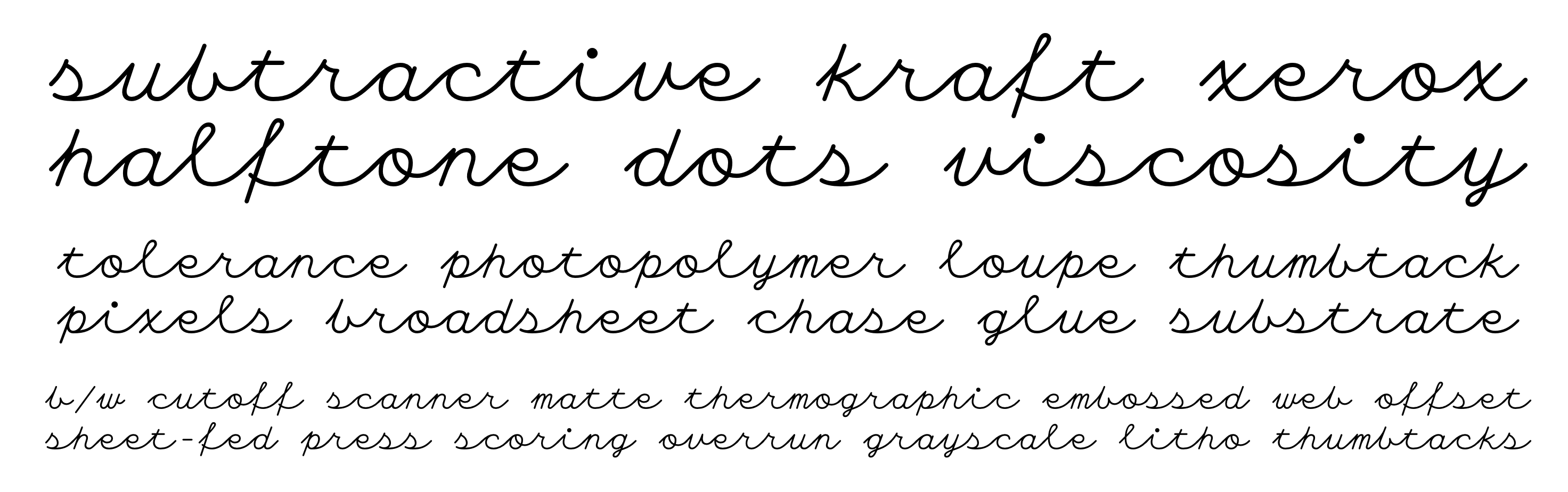
file name: Nick Sherman Plastic Script
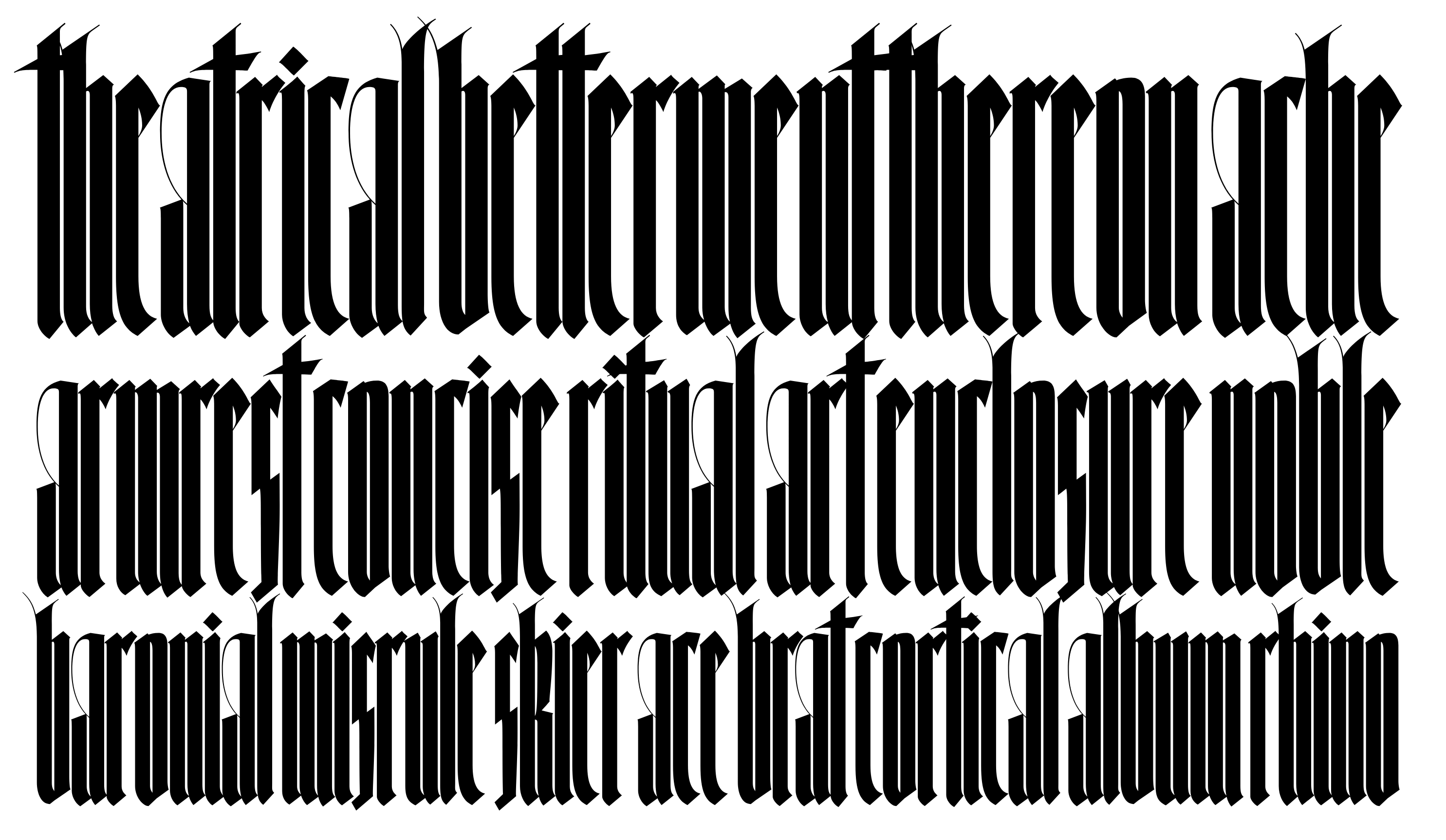
file name: Nick Sherman Skelter
file name: Nick Sherman Strike

file name: Nick Sherman 2008 Poster For Typeface Movie

file name: Nick Sherman Type Con 2016

file name: Nick Sherman Pic

file name: Nick Sherman Pic
| | |
|
Luc Devroye ⦿ School of Computer Science ⦿ McGill University Montreal, Canada H3A 2K6 ⦿ lucdevroye@gmail.com ⦿ https://luc.devroye.org ⦿ https://luc.devroye.org/fonts.html |