|
Best fonts of 2006: Typographica
Stephen Coles and Joshua Lurie-Terrell publish their list of the 23 best fonts of 2006. These are the Oscars of type design. A summary: - Guardian, by Paul Barnes and Christian Schwartz. Not yet available for licensing. Proprietary license expires in 2008. Carl Crossgrove: A slab-serif design with a large x-height, low contrast and open aperture, the Guardian superfamily (including the subfamilies Guardian Egyptian, Guardian Sans, Guardian Text Egyptian, Guardian Text Sans, and Guardian Agate) offers the designers of the newspaper a galaxy of expressive weights which most certainly fit the various editorial tones required of such a publication.
- Titling Gothic, by David Berlow. Mark Simonson says: According to the Font Bureau's promotional copy, Titling Gothic was inspired by Railroad Gothic. To me it feels a more like old standbys Univers and Helvetica, but with the panache of custom-lettered advertising headlines from the fifties and sixties.
- Estilo, by Dino dos Santos. Chris Rugen states: The geometric simplicity of the characters is the basic step in this stylish Deco face's surprising range.
- Exchange, by Tobias Frere-Jones. Proprietary commission. Not available for licensing. Commissioned as a replacement for the Wall Street Journal's DowText. Christian Schwartz says: The real genius of this typeface is that it still has enough formal ties to DowText that I really doubt whether many of the readers will notice a difference.
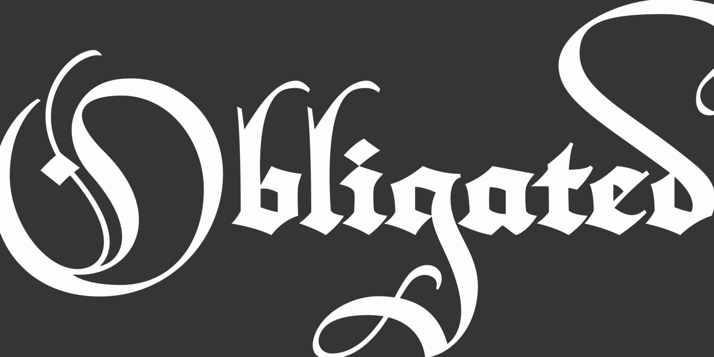
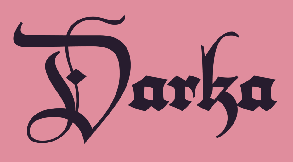
- Darka, by Gabriel Martinez Meave. Mark Jamra raves: Darka is a fine achievement — not only for its crisp tension and accomplished nuances, but also for its sheer inventiveness. He has thrown the revivalists' rules out the window and, operating from what is obviously a firm understanding of blackletter forms, has created a hybrid which combines elements of gothic cursives, frakturs (uppercase and ascenders) and French lettre bâtardes (lowercase) with a hint of the Spanish-influenced Rotundas thrown in for good measure.
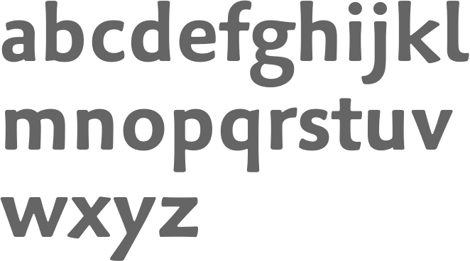
- FF Milo, by Michael Abink. Cheshire Dave comments: It's like a more modern, more square Gill Sans. The legs and tails (e.g., roman ‘K' and ‘R', italic ‘h', ‘k', ‘m', ‘n', and ‘x') have personality without dominating the design. Anyone searching for a versatile sans would likely be very happy with FF Milo.
- Fabiol, by Robert Strach. Tim Ahrens loves it: Compared to most other Garalde fonts Robert Strauch's Fabiol is less rational. It has a very sensual touch and an almost "hand-made". It is not irregular or pretentious.
- Rumba, by Laura Meseguer. Jan Middendorp loves it: Script typefaces are published at a dazzling rate nowadays; but Rumba is one of the most personal and most intelligent ones I've seen in a while.
- PTL Skopex, by Andrea Tinnes. Jan Middendorp again: With the Gothic expecially, Andrea Tinnes achieved an overall text image that is quite original: it doesn't emanate the late-modernist chill of a latter-day Helvetica or Akzidenz, nor does it try to be “warm” by conforming to the humanist model. If anything, it's close to some American gothics, but becomes more German as it gets bolder. An interesting hybrid.
- Omnes, by Joshua Darden. Armin Vit comments: The italics truly stole my heart. If you can look at Omnes Black Italic and not feel joy, you have Yoohoo running through your veins and you should get that checked. Omnes is chameleonesque. Last year we designed the identity for a non-profit organization devoted to fighting childhood obesity and we used Omnes for each kind of application and audience without missing a beat.
- Paperback, by John Downer. Paul Hunt states: Paperback's handsome appearance is enhanced by a range of optical sizes, so everything from miniscule body copy to ginormous headlines looks clean and crisp. The roman exhibits a warmth that is absent from most typefaces following the same rationalist construction principles.
- Margie Script, by G. Marggraff, Dan X. Solo. Anna Malsberger: Margie is a sexy, robust script that commands attention, a typeface that knows how to play a crowd. Wearing ball terminals and flauncy flourishes like big baubles and gauzy scarves, you might think she was compensating for a lack of substance.
- Eudald News, by Mário Feliciano. John Downer's opinion: This is a new set of four additions to Mário Feliciano's previous interpretations of typefaces by the 18th Century Spanish punchcutter, Eudald Pradell. The fonts form a handsome quartet: diverse in scope, yet sufficiently tame for newspaper work.
- KLTF Tiptoe, by Karsten Lücke. Dan Reynolds says: Like his TDC2 Award winning KLTF Litterata, Tiptoe is subtly inspired by early blackletters. Just as scribes would fit more letters onto a page by breaking the curves on their strokes, Karsten tells the forms in Tiptoe who's boss. Instead of letting the curves themselves define weight growth, his unorthodox angles allow for more density without sacrificing letter integrity. The result is a heavy typeface with surprisingly open counters and increased legibility.
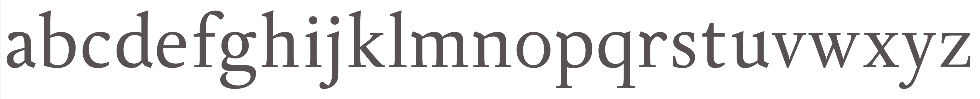
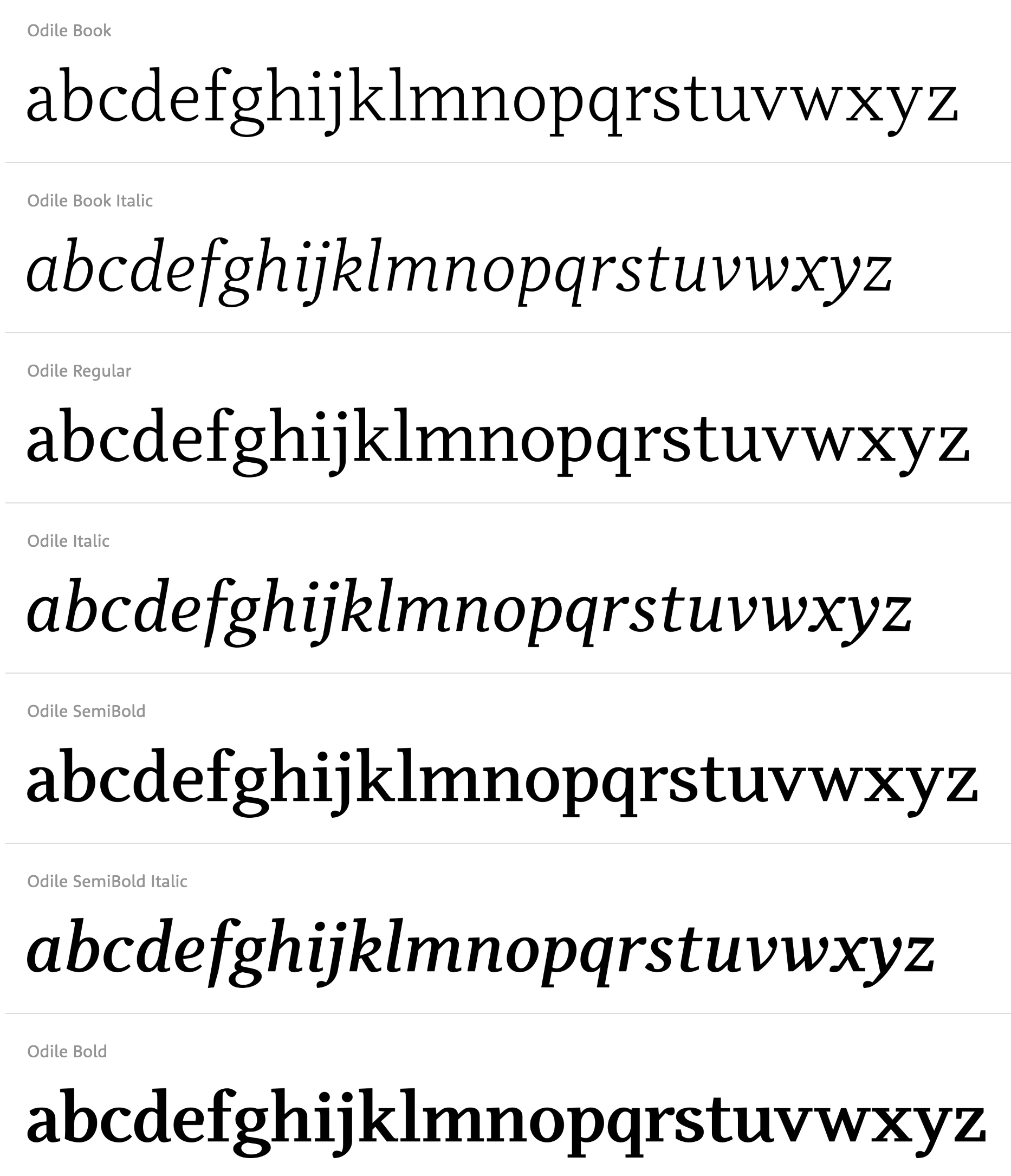
- Odile, by Sibylle Hagmann. Following Yves Peters: Odile is definitely not some half-arsed “fun font” with curly bits all over. The initial caps have a perfectly balanced, interesting texture with carefully designed curves, which are contrasted with abruptly placed straight lines. Just the right amount of flair is added in the Initials, whereas the playful and intricate Deco Initials look like modern reinterpretations of medieval illuminated capitals.
- Palatino Sans, by Hermann Zapf and Akira Kobayashi. Hrant Papazian comments: The confluence of competence, freedom and kiai (more on that below) evident in Palatino Sans is breathtaking. The sober organicity, the bravado of the raised ‘r', the confident flair of the italic; all done before, but never in such a usable, contemporary whole. The texture of its setting is dynamic yet serene, reminiscent of a masterful exhibit of martial arts. Officially, the brilliance of this effort is ascribed to the old master, Zapf. But I, for one, have to wonder whether this isn't essentially a product of Kobayashi instead, delivering a personal showing of bujutsu.
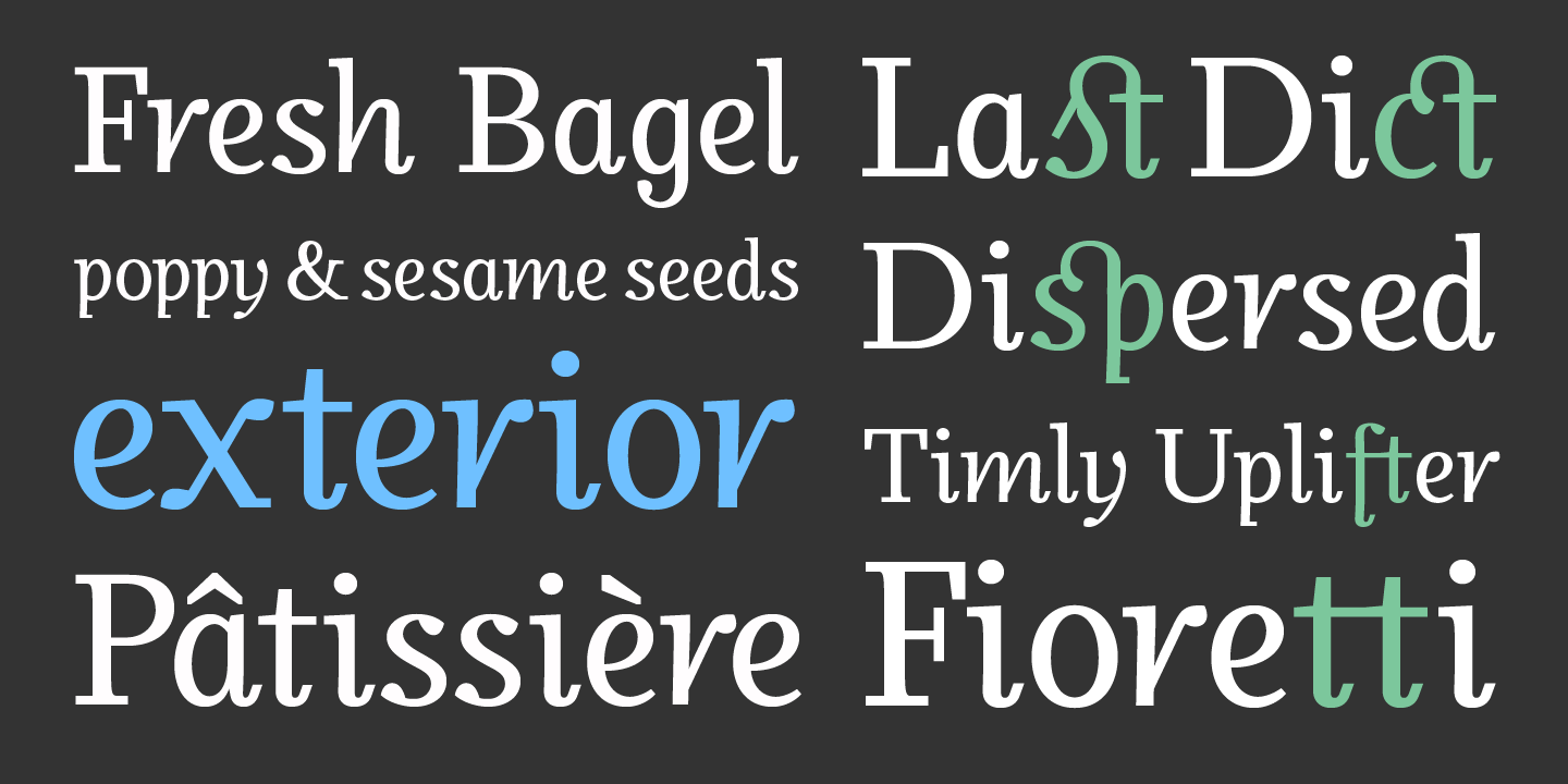
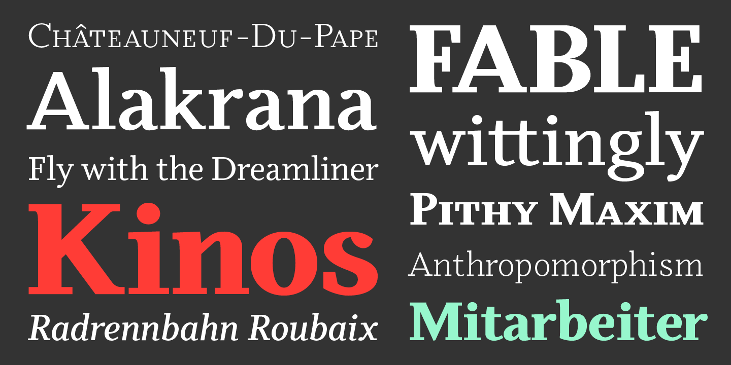
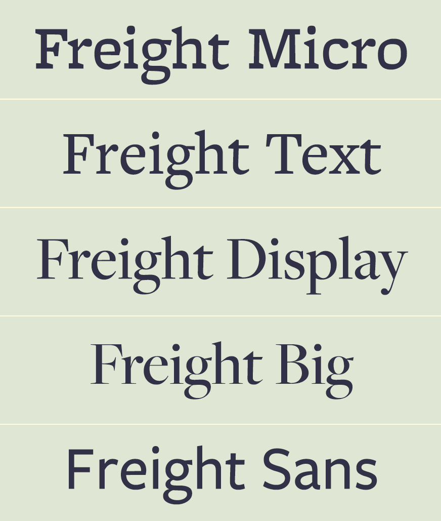
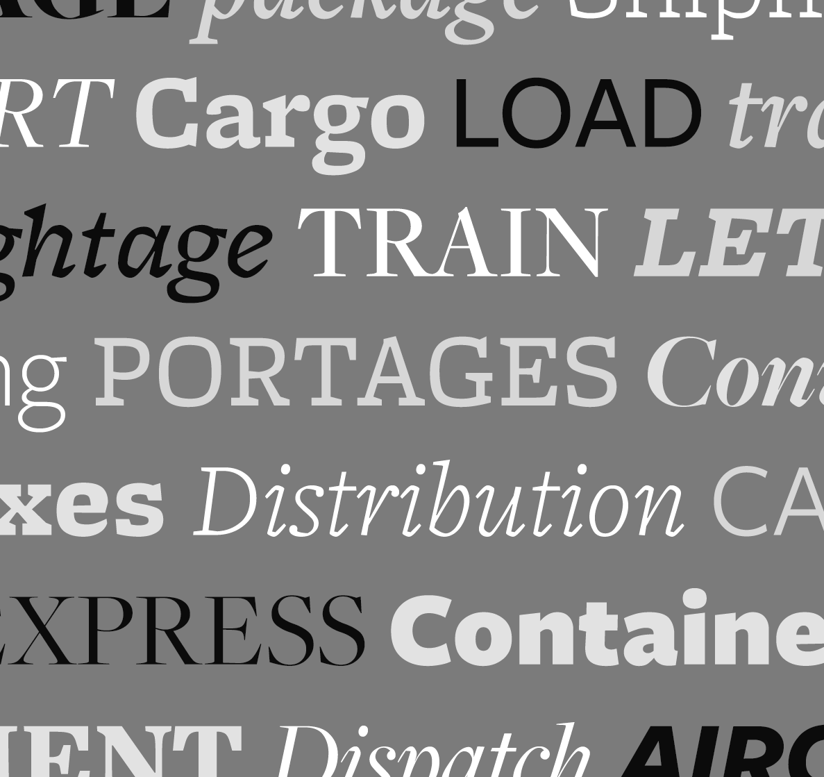
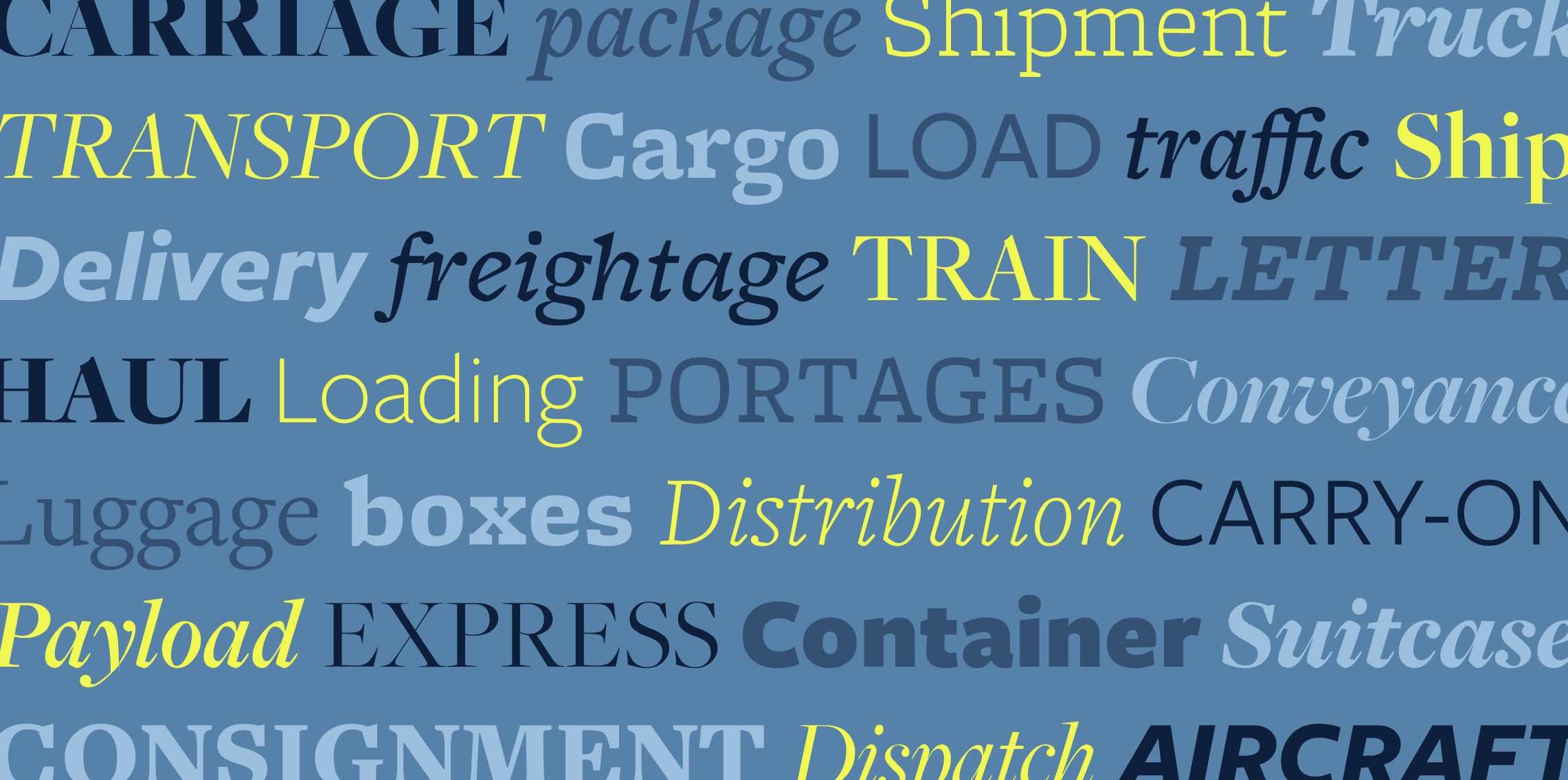
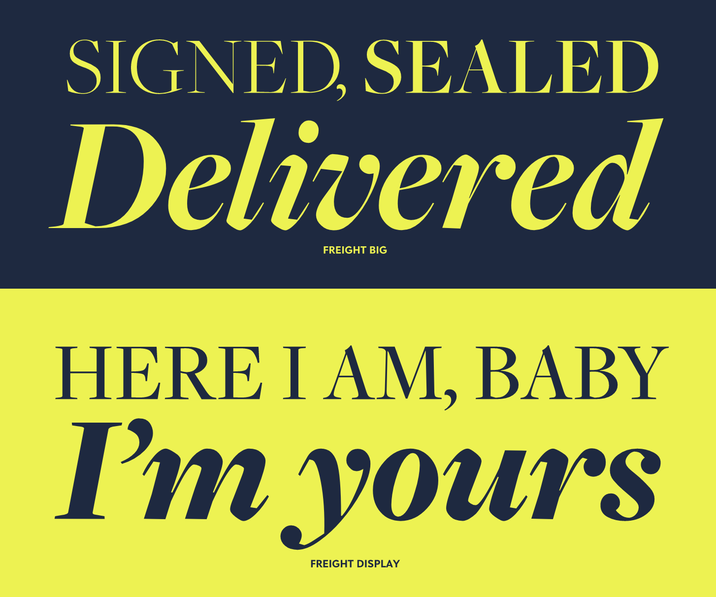
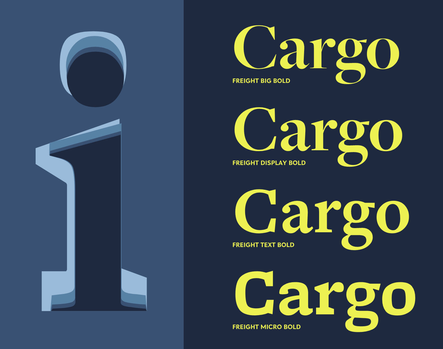
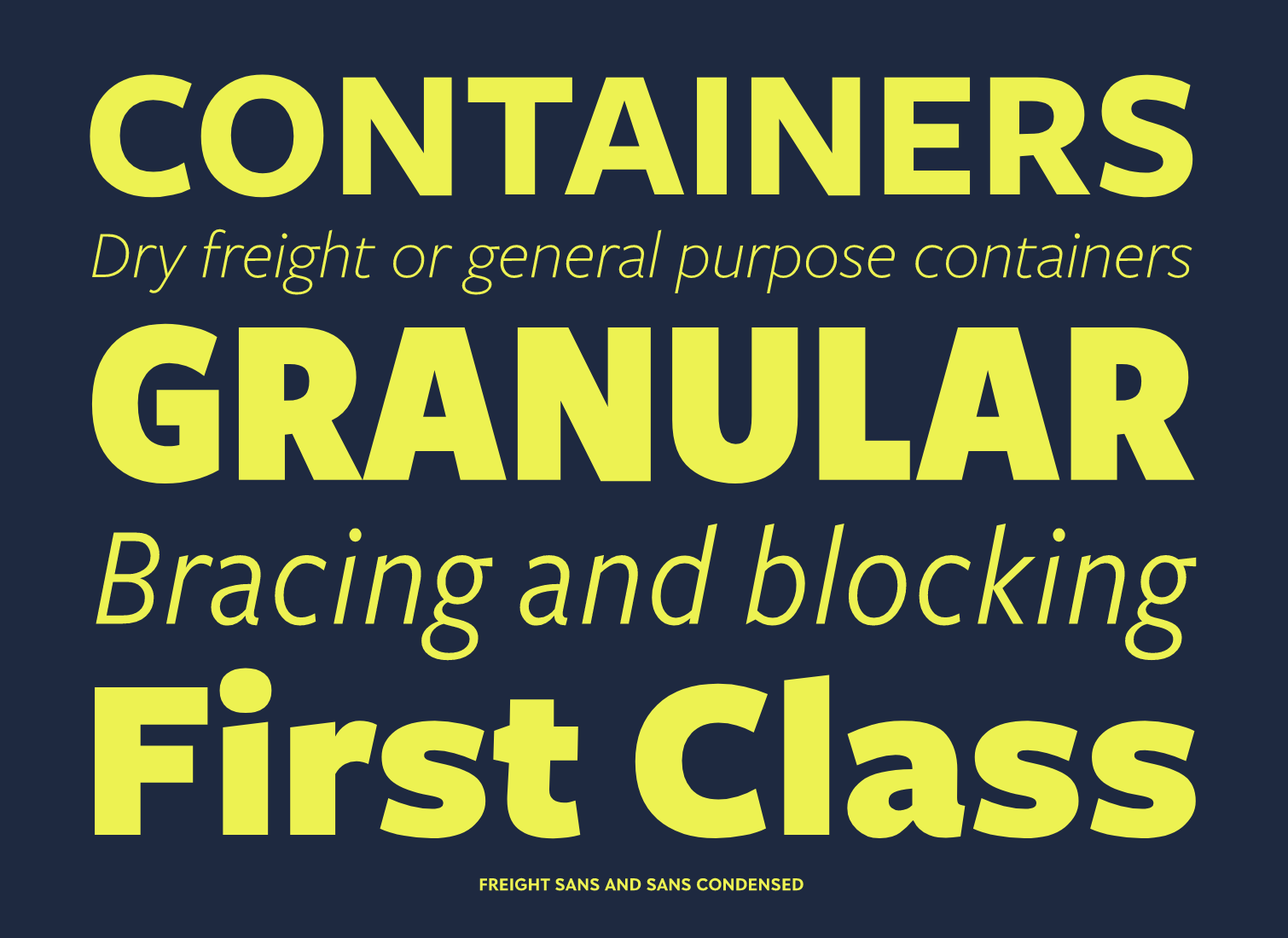
- Freight Big and Display, by Joshua Darden. This one was expected by all typophiles. Dyana Weissman explains: This family is insane. Not only because of the 100 styles, but also because of its charming little quirks. The tail of the ‘G', the italic ‘i's, the delicious ‘k'. While we move out of the era of the antiseptic sans serifs, Freight Sans offers refreshing anomalies that warm up the design.
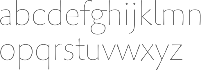
- Young Finesse, by Doyald Young. According to Peter Bruhn: I am in love with Young Finesse! The subtle slim calligraphic strokes is pure beauty. Based on classic Roman proportions — like a modern, slim and gentle serifless version of Van Krimpen's Lutetia and clear references to Hermann Zapf's Optima — it transcends all references and takes it step further.
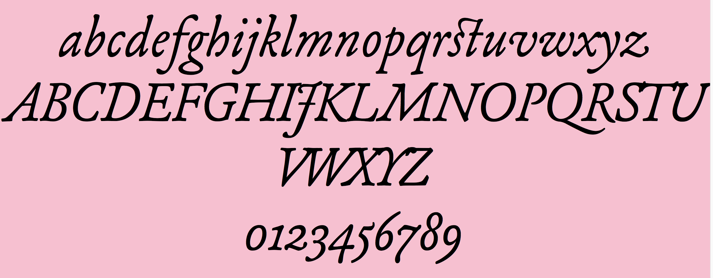
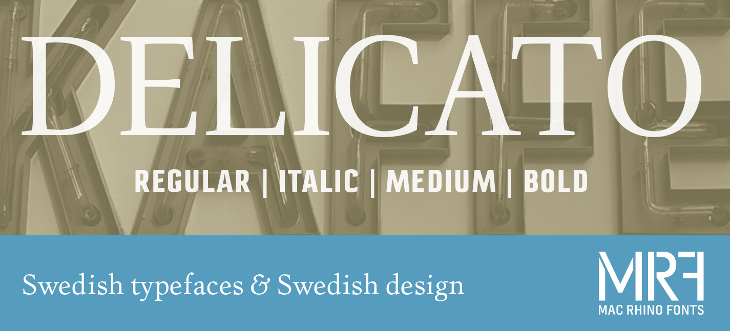
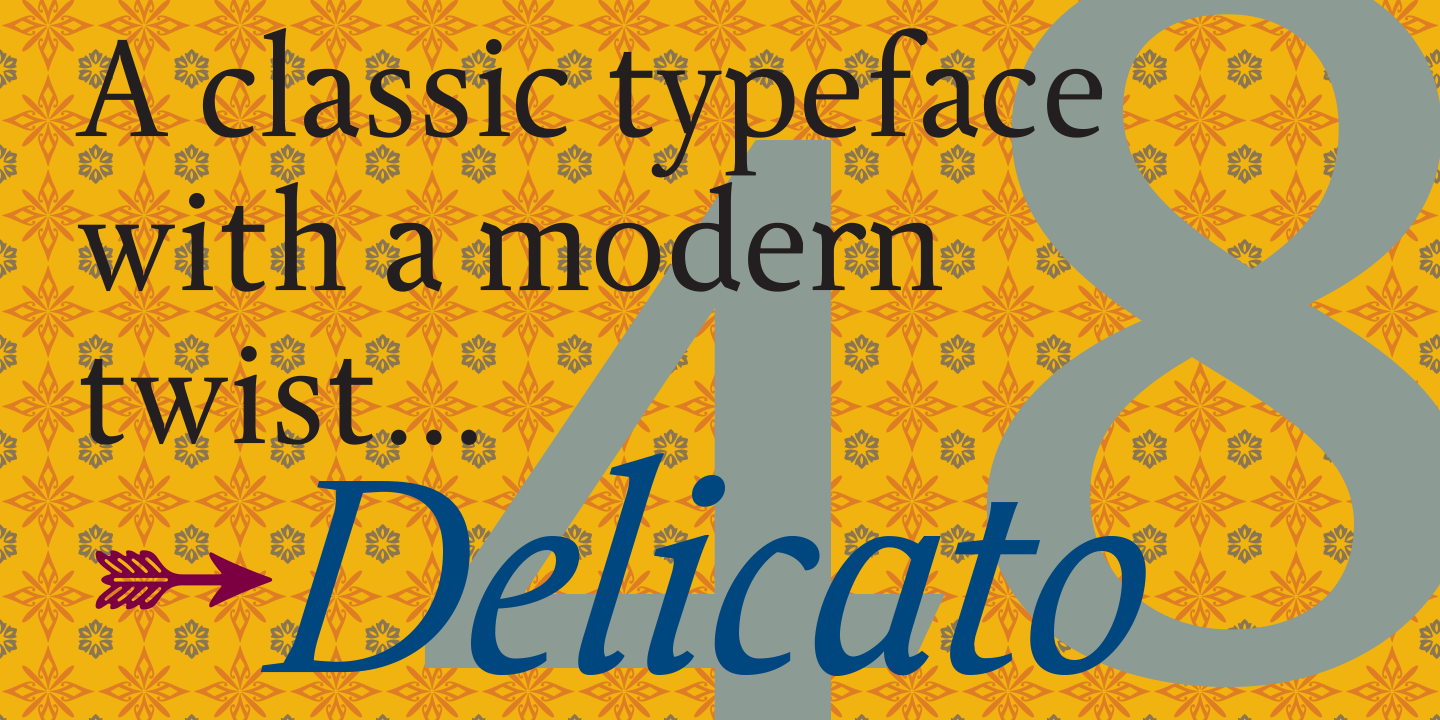
- Esta, by Dino dos Santos. Brad Pityo says: It possesses the characteristics of recent serif typefaces — like Fabiol, Delicato, and Relato — with a Mediterranean-Catalan twist. If Esta's warm and curvy teardrops don't win you over, its versatility will. Esta is economical and humble when set small, but its strokes and counterspaces can also dance beautifully — in a postmodernist sort of way, believe it or not — when set large.
- Luxury, by Dino Sanchez and Christian Schwartz. Kris Sowersby comments: No longer shall we slum it with Helvetica, fake it with Trajan, or be shamed by out-dated Optima. The Luxury Collection is made available and affordable to us lowly typographic peons and our budget-conscious clients by the style mongers at House Industries.
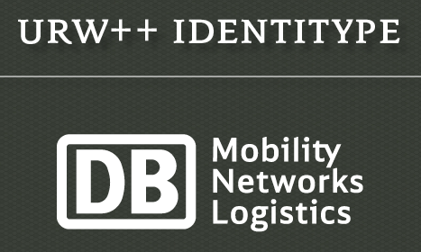
- Deutsche Bahn, by Christian Schwartz, Erik Spiekermann, and Tal Leming. Proprietary commission. Not available for licensing. This impressive comprehensive system of fonts was made for the German national rail system (Deutsche Bahn AG) and you can't buy it. Richard Kegler: This practical and well-considered type system was made to suit the many needs of the client and performs with utmost efficiency. It looks great too. However, Linotype and URW++ (as DB Display: 2017) now seem to sell it. In 2007, Schwartz and Spiekermann were awarded a gold medal by the German Desig Council for this system of fonts.
- Confetti, by Josep Patau. Stephen Coles himself writes: Confetti hits the market at just the right time, joining Signal, Loupot, Zigarre, and Coptek in a group of underexposed retro scripts. Patau writes: The Confetti is a typeface created about 1930 by the defunct José Iranzo foundry in Barcelona, and imitates the forms and gestures of handwriting created with a round nib as Speedball Series B. The original typefaces were a pair, called Escritura Energica and Escritura maravilla.
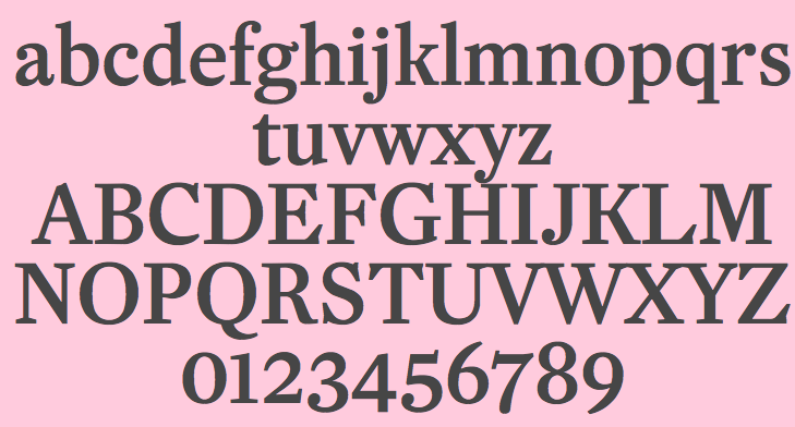
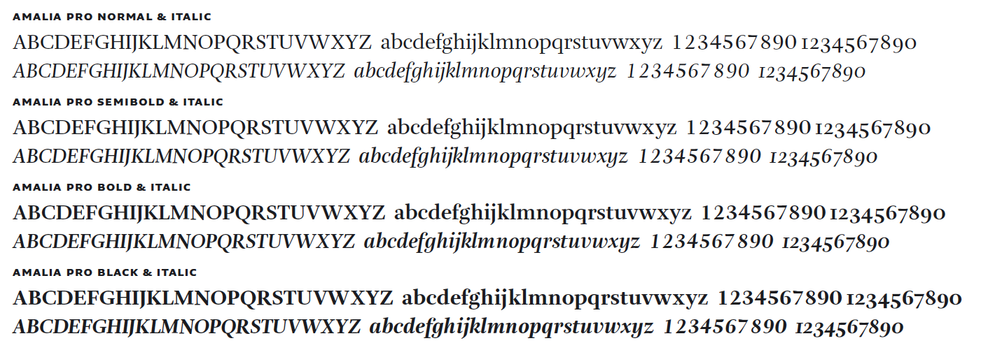
- Amalia (OurType), by Nikola Djurek. Eben Sorkin mulls: a type family quietly breaking conventions of matching serifs, modes of contrast, and letter shape — all to good effect. Amalia feels open and approachable despite its Didone contrast usually associated with formality and authority. It also features a finely restrained but almost cheeky exuberance.
|
EXTERNAL LINKS
Best fonts of 2006: Typographica
MyFonts search
Monotype search
Fontspring search
Google search
INTERNAL LINKS
Choice of fonts ⦿
Modern style [Bodoni, Didot, Walbaum, Thorowgood, Computer Modern, etc.] ⦿
Tear drop terminals ⦿
Eric Gill and his typefaces ⦿
Curly typefaces ⦿
|