|
Japanese typefaces

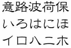
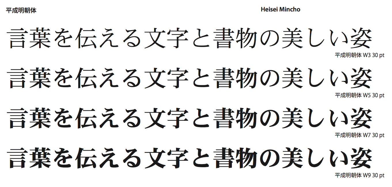
Classification of Japanese typefaces (with passages taken from a beautiful document by Philip Ronan: - Mincho. The Mincho style is clean, legible, and used just about everywhere, including books and newspapers. Strokes often start and/or end with small "serifs", and vertical strokes tend to be narrower than horizontal strokes. Examples: Heisei Mincho W3, Heisei Mincho W9.
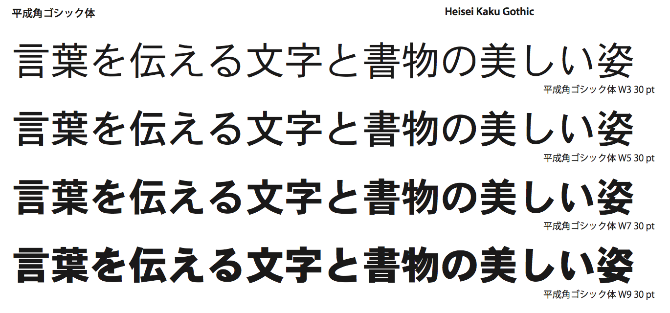
- Gothic. Japanese Gothic typefaces (also called "Kaku Gothic") consist of plain rectangular strokes of equal width and with little or no serifs. They are highly legible even at small point sizes, and are used as widely as Mincho styles. Examples: Heisei Kaku Gothic W3, Heisei Kaku Gothic W9.
- Round Gothic. Also called "Maru Gothic". These are Gothic styles in which the angles at the middle and end of all the strokes have been rounded off. They are similar to Western rounded sans-serif typefaces such as Arial Rounded. Examples: Heisei Maru Gothic W4, Heisei Maru Gothic W8.
- Kaisho (block script). Anyone who studies Japanese calligraphy will start by learning the Kaisho style. It consists of discrete strokes drawn with various hooks and flourishes. Typical uses include formal notices and new year cards. Examples: Arisawa Kaisho, Hakushu Gokubuto Kaisho.
- Kyokasho (textbook). This is a print typeface derived from the Kaisho style for use in primary school textbooks. It minimizes the use of flourishes, resulting in a neat, legible typeface that provides a good example of writing style to learners of Japanese. Example: DFP Kyokashotai,
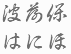
- Gyosho (semicursive script). A reasonably legible style of calligraphy in which it is possible to see a flowing motion between one stroke and the next. The basic character shapes are similar to those of the Kaisho style. Typical uses include greetings cards. Examples: HG Shonan Gyoshotai, HG Kyokusui E.
- Reisho (clerical script). An old Chinese style consisting of simplified characters that could be drawn quickly and easily. It is still used in official documents such as certificates and banknotes, and in newspaper mastheads and other types of logo. Examples: DFP Reisho, Takahashi Reisho.
- Kantei-ryu. The Kantei-ryu style originated from the Japanese kabuki tradition over two centuries ago. It consists of broad, curving, closely-packed strokes. Typically used in connection with traditional Japanese arts and crafts. Examples: HG Edomoji Kantei-ryu, DFP Kantei-ryu.
- Koin. A printed style resembling the appearance of old printed characters, including simulated aging effects such as lumpy broken strokes. Typically used to give an antiquated feel to text in book covers and headings. Examples: Hakushu Tenkoin Kyo, HG Han Koin.
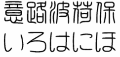
- Pop styles. Japanese pop styles typically resemble characters drawn with a broad felt pen, like the "Special Offer" signs you see inside shops. They are sometimes used only for Japanese (kana) characters, with regular Gothic typefaces used for the Chinese (kanji) characters. Examples: HG Pretty Frank H, HG Soei Iori, HG Soei Kaku Pop, HG Soei Maru Pop.
- Tensho (seal script). Sosho (cursive script) This is a very old style that is still used in the name seals that pass for signatures in Japan (like the red name stamps that are used to sign Japanese artwork). It is usually quite difficult to read. Example: Hakushu Tensho Kyo.
- Sosho (cursive script). A highly stylized form of calligraphy in which entire characters are often drawn with a single stroke of the brush. Although prized as an art form, this style is almost impossible to read, and therefore serves more of a decorative role. Example: Hakushu Sosho Kyo.
- Pen styles. Pen styles emulate the appearance of characters written with implements such as ballpoint pens, fountain pens and fibre tip pens. These styles often have a flowing structure similar to that of Gyosho styles. Examples: HG Chiba Pen, HG Hakushu Pen Kaisho, HG Soei Pen.
|
EXTERNAL LINKS
MyFonts search
Monotype search
Fontspring search
Google search
INTERNAL LINKS
Type design in Japan ⦿
Typeface Classification ⦿
|
