TYPE DESIGN INFORMATION PAGE last updated on Thu Apr 16 22:07:37 EDT 2026
FONT RECOGNITION VIA FONT MOOSE

|
|
|
|
Marten Fischer
Swedish creator of Pilo Regular (2007, at Pilo Bold Me GBG; with Kenneth Pilo, Ray Larabie and Goran Soderstrom). Kenneth Pilo writes: Kenneth Pilo had never designed a typeface and this particular project was long overdue. In collaboration with Marten Fischer, Ray Larabie of Typodermic, and Goran Soderstrom of Pangea Design, the font Pilo Regular was born in 2007. Pilo Regular is a bold, single weight OpenType typeface featuring subtle inline detailing and a solid sporting aesthetic. It feels both hard and soft, decorative and stoic, vintage and modern. The typeface is inspired by the logo for Bold (community for swedish advertising business), which was designed by Bjorn Hoglund, CP+B Europe. Pilo Regular is a multilined typeface that takes a bit from YagiBold, the CNN typeface. Pilo Thin (2008) is a hairline avant garde sans designed by the same group, Larabie excepted. |
EXTERNAL LINKS |
| | |
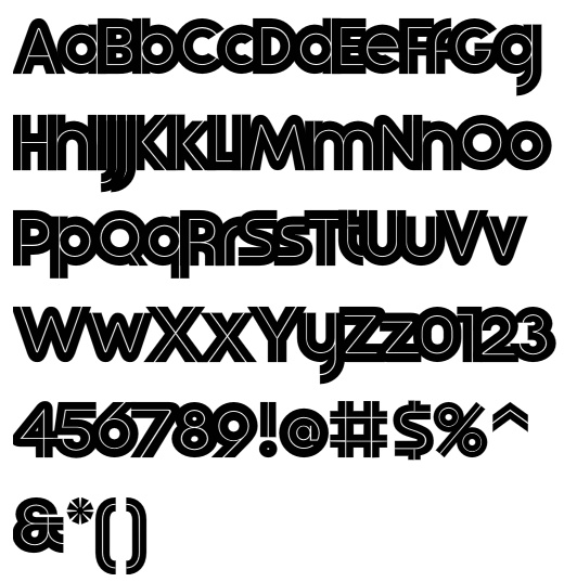
file name: Kenneth Pilo Marten Fischer Ray Larabie Goran Soderstrom Pilo Regular 2007
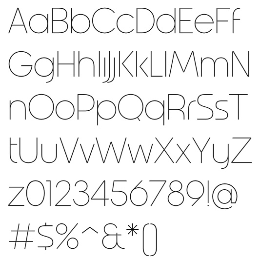
file name: Kenneth Pilo Marten Fischer Goran Soderstrom Pilo Thin 2008
| | |
|
Luc Devroye ⦿ School of Computer Science ⦿ McGill University Montreal, Canada H3A 2K6 ⦿ lucdevroye@gmail.com ⦿ https://luc.devroye.org ⦿ https://luc.devroye.org/fonts.html |