TYPE DESIGN INFORMATION PAGE last updated on Mon Jul 13 21:26:31 EDT 2026
FONT RECOGNITION VIA FONT MOOSE

|
|
|
|
The Helvetica Killer
[Bruno Maag]
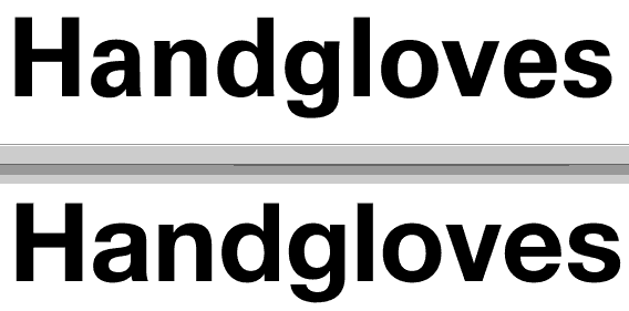
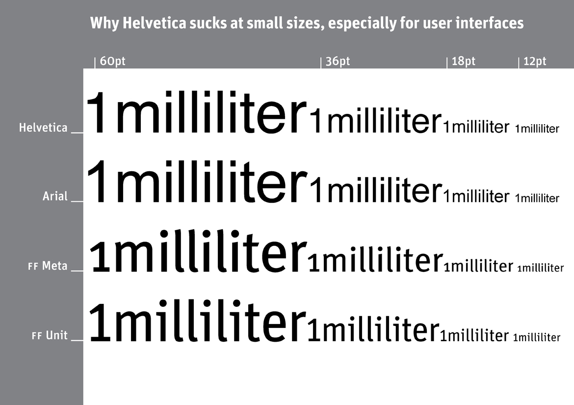
Bruno Maag gives an interview for Creative Review in 2010 in which he purges all Helvetica cells from his system. He also announces the creation of a new sans family by Ron Carpenter at Dalton Maag, Aktiv Grotesk (2010)---first he kills Helvetica, and then he creates another lookalike sans family. Excerpts: it is vanilla ice cream. In my whole career in typography, starting with my apprenticeship, I have never used Helvetica. Being a Swiss typographer, it's always been Univers. [...] Univers was released in 1956 by Deberny&Peignot, a small French foundry. Helvetica was released a year later with the full might of the Linotype marketing machine behind it. Linotype stuck it on every single typesetting machine they could and took it round the market, particularly around the New York advertising scene. And there was little Deberny&Peignot with no marketing budget. It's a fluke of marketing that Helvetica now is this incredibly popular typeface. [...] And there are a lot of things wrong in the design of Helvetica once you start going in to the detail. I can appreciate why a lot of designers like Helvetica compared to Univers - Univers has a starkness about it, it's cold. Maybe because of the antique-ness of Helvetica it has a certain charm that Univers lacks and at the same time has this neutrality, so I can see why people go for it, but if you start analysing it and going into the nitty gritty it is quite a horrendous font. It's quite poorly crafted and has become completely overused. [...] Some of the character forms in Helvetica are very ambiguous because they are so uniform. In the movie, [Erik] Spiekermann says it very well, that they are like soldiers on parade and that is detrimental to legibility. People just use Helvetica because they have heard of it, it's on everyone's computer and everyone else uses it. [...] I do find it an inferior typeface. I would choose Univers every time - it's crafted better, the proportions are better, it is a modern typeface that doesn't pretend to be something it isn't which Helvetica does. Reaction by the typophiles is swift: Some agree, most disagree partially. William Berkson compares Univers and Helvetica [Univers on top] and sums it up like this: Note how Helvetica is wider and set tighter, and Univers is narrower, and set looser. Compare the word "love" in "Handgloves" and you see the power of Helvetica. But this same quality of being "fat in the middle" as Erik Spiekermann put it in the movie, and tightly spaced, makes it horrible in text. I think it has limited use, and is so overused and wrongly used that it makes me scream, but to deny its obvious virtues it seems to me to undermine the real case against its widespread use. Univers is way better in text, but then I think Frutiger and Avenir are still better.--And I think that sans in general are limited in how good they can be for extended text. Personally, I never liked the aesthetic of Univers-too cold. But I was surprised by the warmth and attractiveness of the examples of hot metal Univers in Frutiger Typefaces: The Complete Works. It has real charm there, and is said to be Frutiger's favorite version by far. Univers Next is an effort of Frutiger and Linotype to capture that, but I don't know how well it succeeds. Finally, Erik Spiekermann compares Helvetica, Arial, FF Meta and FF Unit in a poster that show the word millimeter. His poster is entitled Helvetica Sucks. |
EXTERNAL LINKS |
| | |
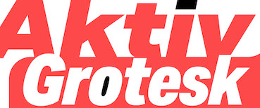
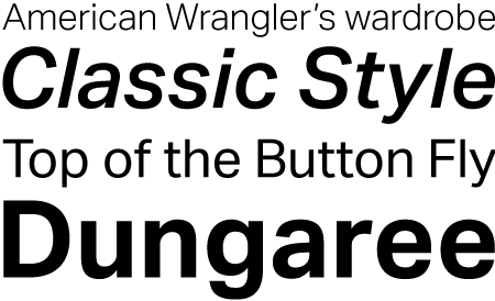
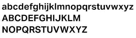
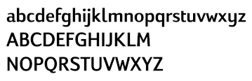
file name: Dalton Maag Aktivgrotesk 2010
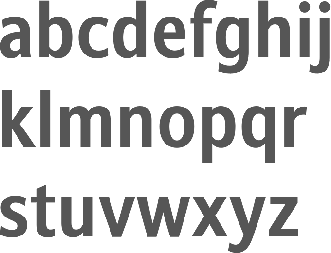
file name: Dalton Maag Aktiv Grotesk Bold 2010

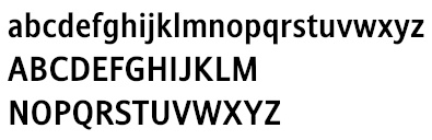
file name: Dalton Maag Aktiv Grotesk Regular 2010
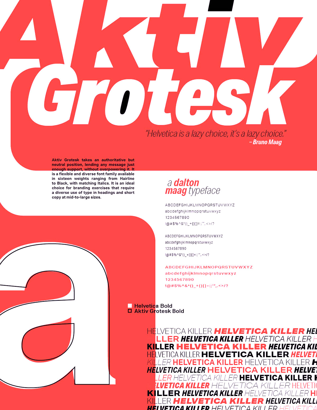
file name: Dalton Maag Aktiv Grotesk 2010 Poster by Matt Frizzell 2016
file name: Dalton Maag Stroudley Bold
file name: Bruno Maag Ron Carpenter Veronika Burian Stroudley Bold 2007
file name: Dalton Maag Viato Bold
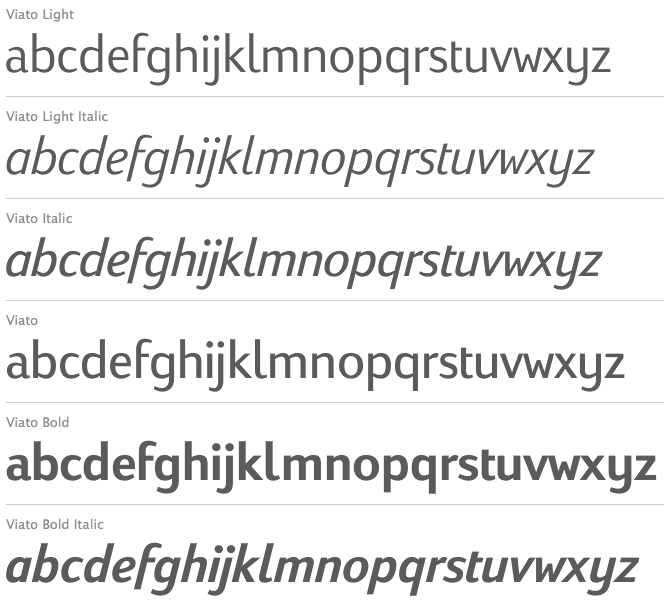
file name: Bruno Maag Ron Carpenter Viato 2007
file name: William Berkson Helvetica Univers comparison
file name: Erik Spiekermann Helvetica Sucks

file name: Bruno Maag Pic
| | |
|
Luc Devroye ⦿ School of Computer Science ⦿ McGill University Montreal, Canada H3A 2K6 ⦿ lucdevroye@gmail.com ⦿ https://luc.devroye.org ⦿ https://luc.devroye.org/fonts.html |