TYPE DESIGN INFORMATION PAGE last updated on Mon Jul 20 21:06:26 EDT 2026
FONT RECOGNITION VIA FONT MOOSE

|
|
|
|
Paul Shaw: Ten Typefaces of the Decade
[Paul Shaw]
In an article in Imprint, sure to get many reactions, Paul Shaw reveals his top ten typefaces of the decade from 2000 to 2010. He says: It is not a list of my favorite typefaces, nor is it a list of the most popular typefaces. Instead, it is a list of typefaces that have been important. Here is the list, with Shaw's own reasoning.
|
EXTERNAL LINKS |
| | |

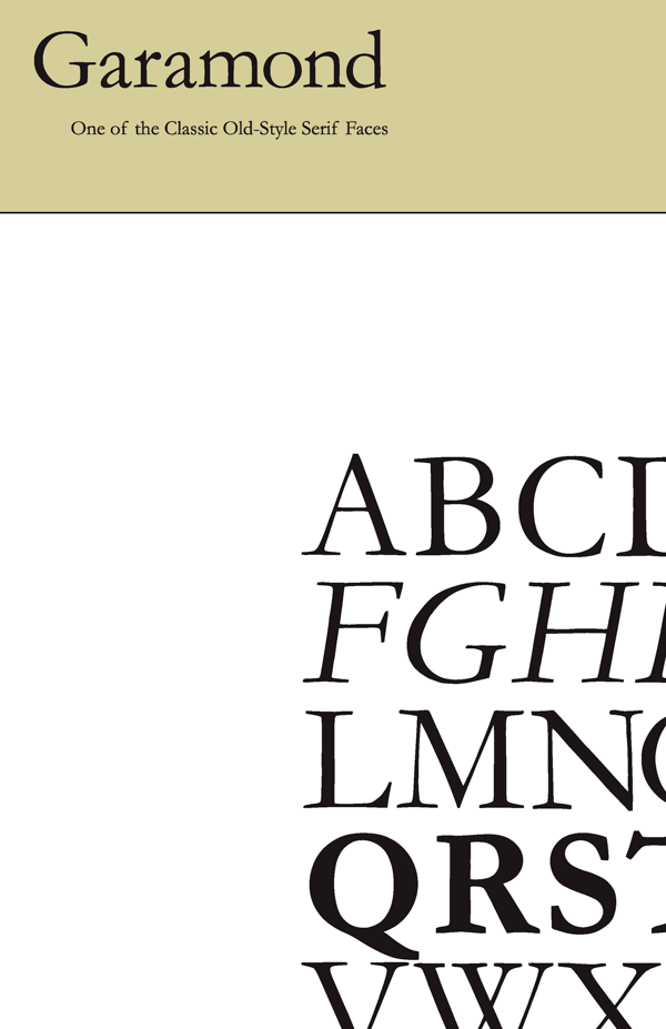
file name: T D C2006 Robert Slimbach Garamond Premier Pro
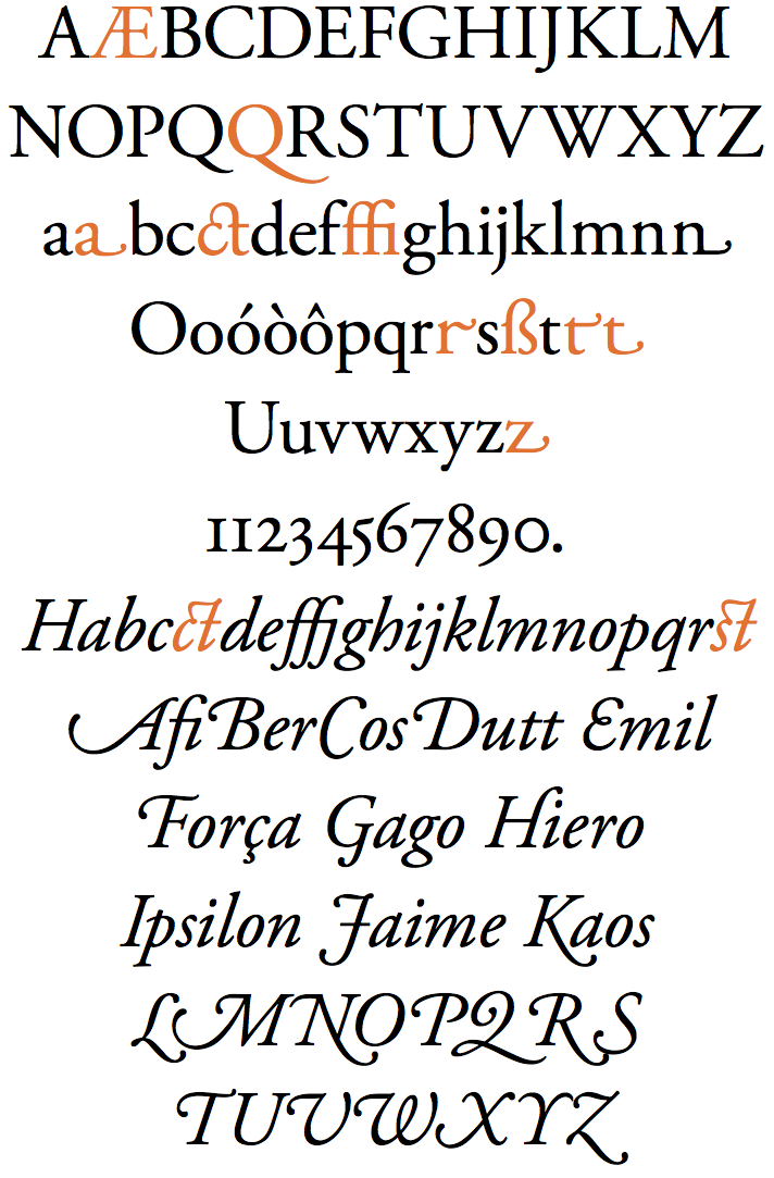
file name: Adobe Garamond Pro
file name: Robert Slimbach Garamond Premier Pro 1992 2004
file name: Robert Slimbach Garamond Premier Pro 1992 2004b

file name: Robert Slimbach Garamond Premier Pro 1992 2004d
file name: Robert Slimbach Garamond Premier Pro 1992 2004f
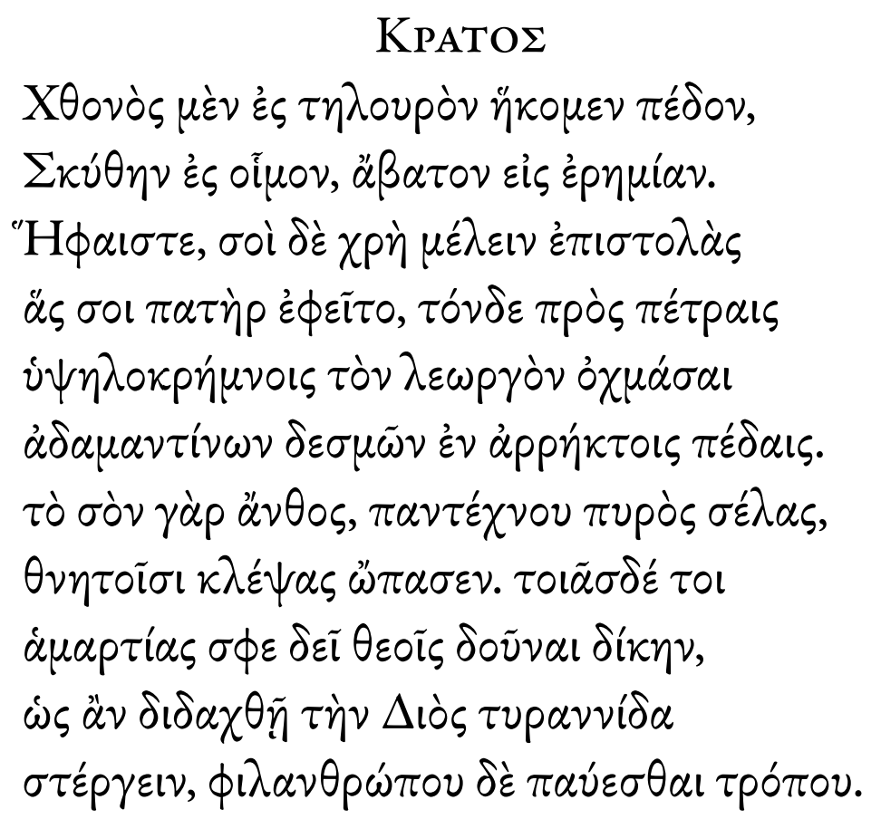
file name: Robert Slimbach Garamond Premier Pro Greek 1992 2004
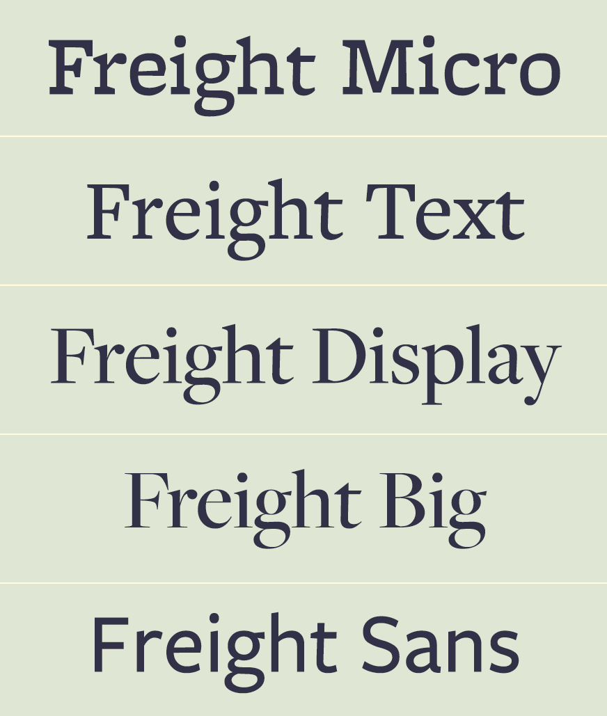
file name: Joshua Darden Freight
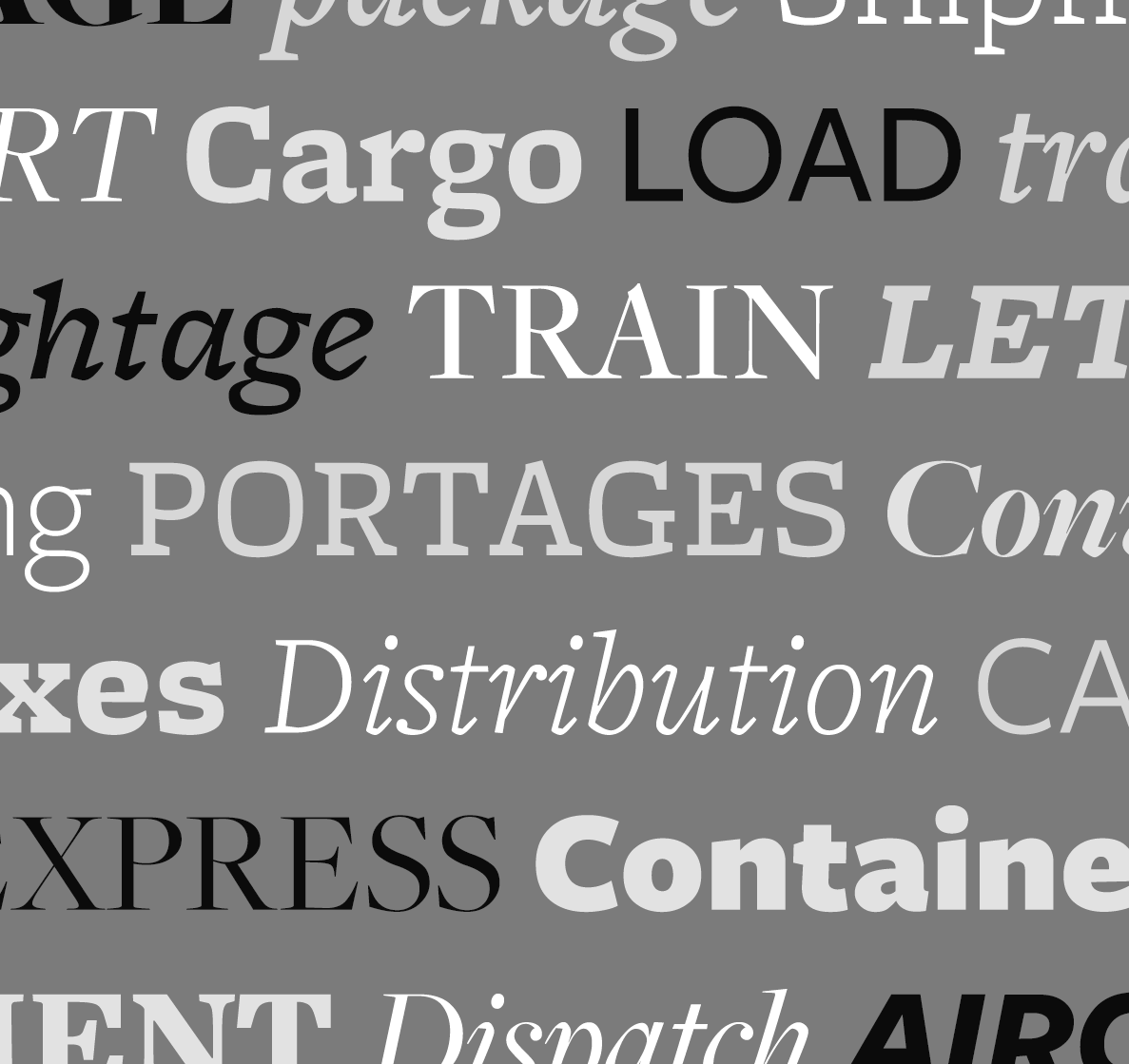
file name: Joshua Darden Freight

file name: Joshua Darden Freight
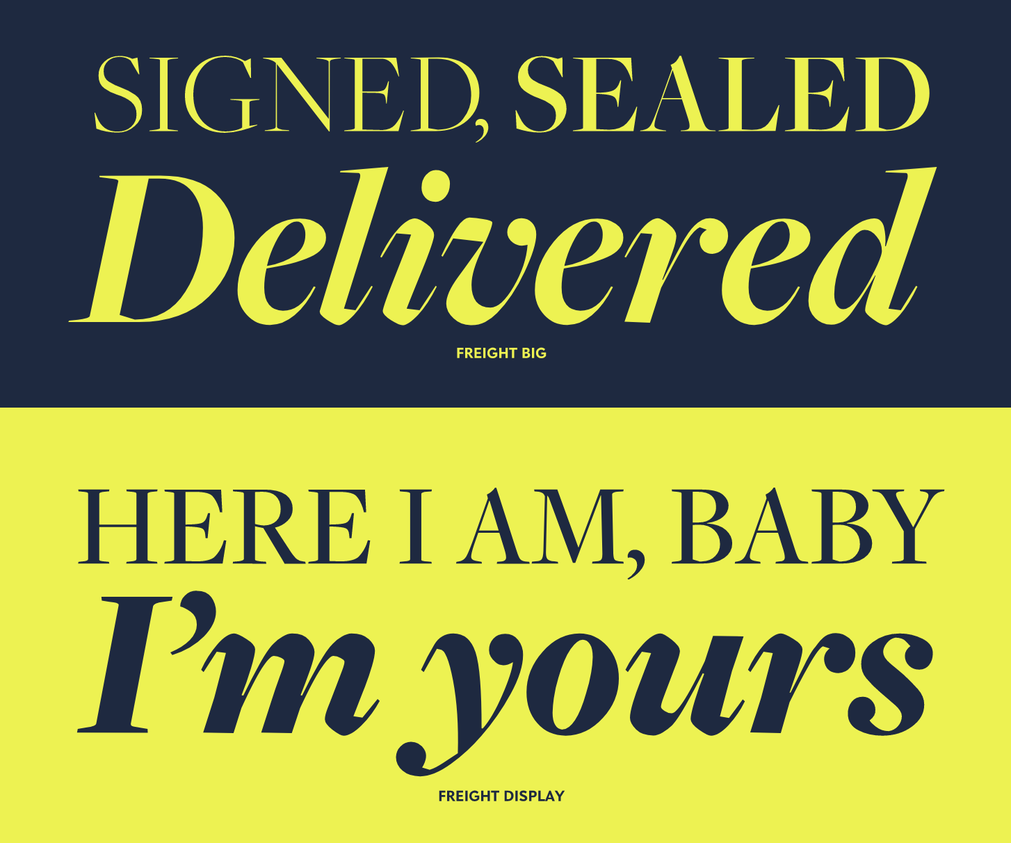
file name: Joshua Darden Freight
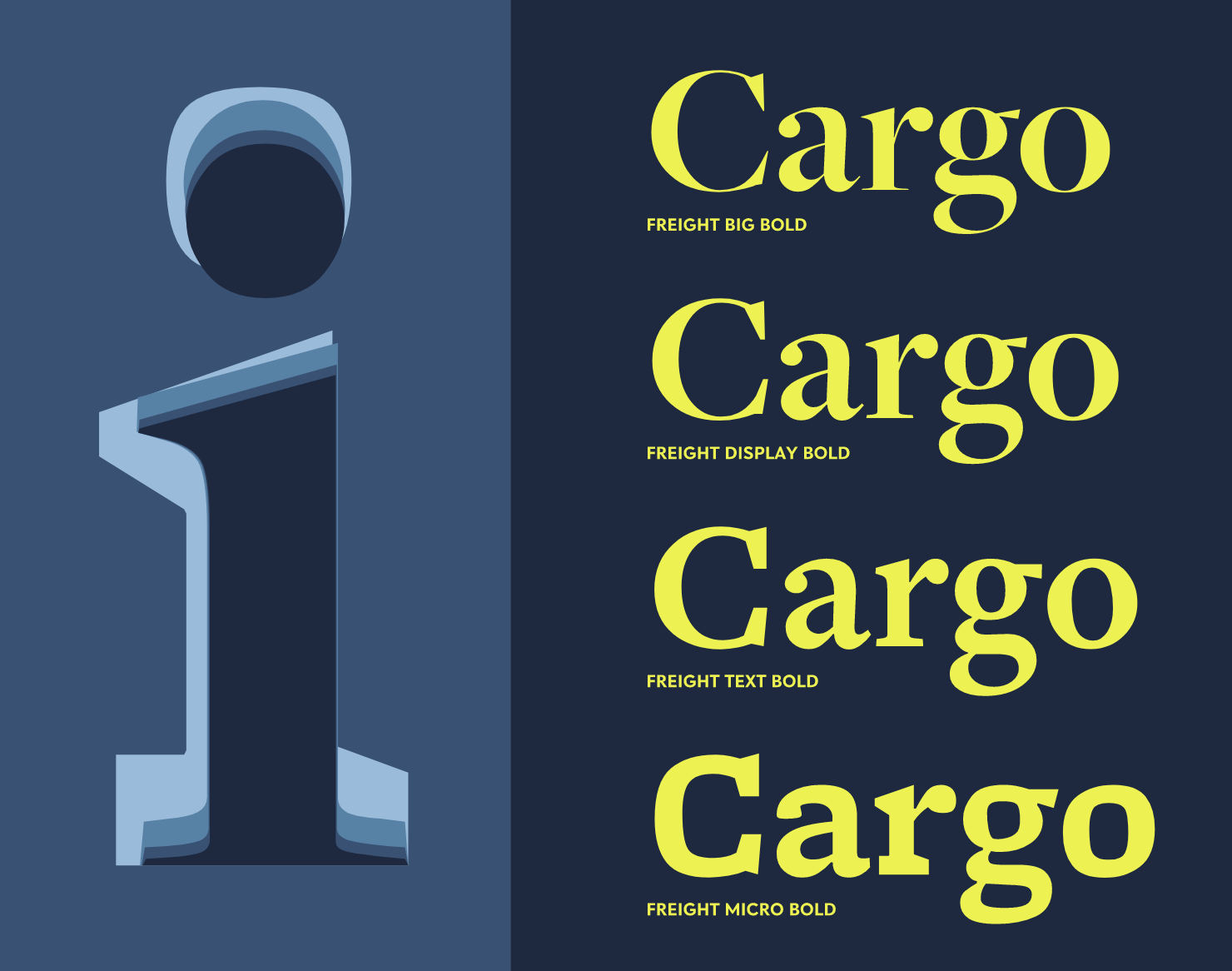
file name: Joshua Darden Freight
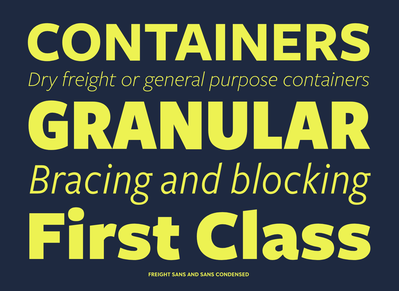
file name: Joshua Darden Freight
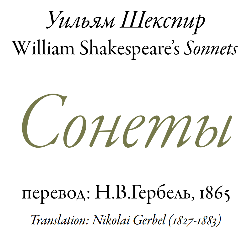
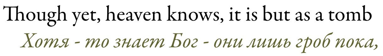
file name: Robert Slimbach Adobe Garamond 1989 2001 poster by Dayne Petera 2014
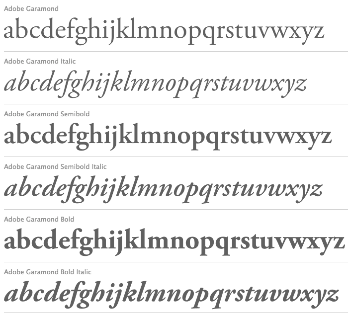
file name: Robert Slimbach Adobe Garamond 1989 2001

file name: Robert Slimbach Adobe Garamond Poster by Eva Antoinette 2015
file name: Robert Slimbach Adobe Garamond Poster by Eva Antoinette 2015b

file name: Robert Slimbach Adobe Garamond 1989 2001b
file name: Robert Slimbach Adobe Garamond 1989 2001d

file name: Robert Slimbach Adobe Garamond Bold 1989 2001
| | |
|
Luc Devroye ⦿ School of Computer Science ⦿ McGill University Montreal, Canada H3A 2K6 ⦿ lucdevroye@gmail.com ⦿ https://luc.devroye.org ⦿ https://luc.devroye.org/fonts.html |