TYPE DESIGN INFORMATION PAGE last updated on Thu Apr 16 22:08:42 EDT 2026
FONT RECOGNITION VIA FONT MOOSE

|
|
|
|
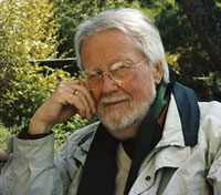
Axel Bertram
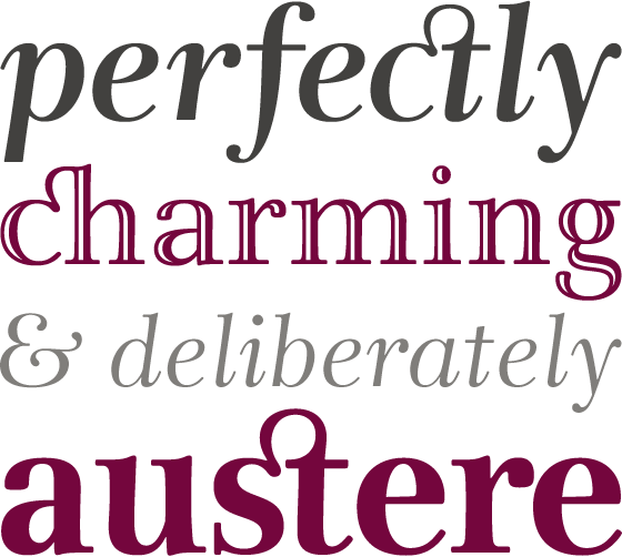
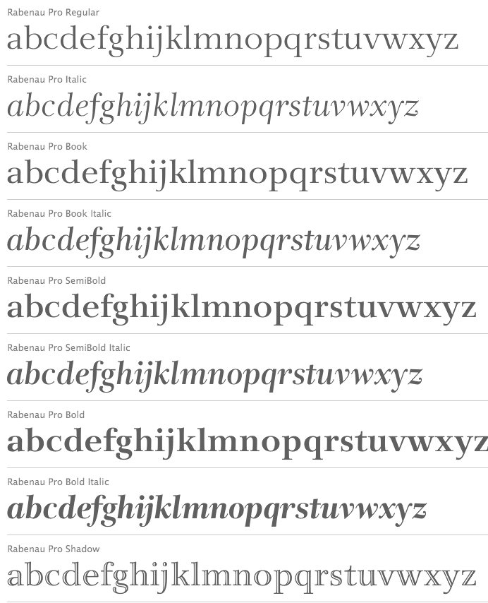
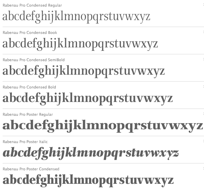
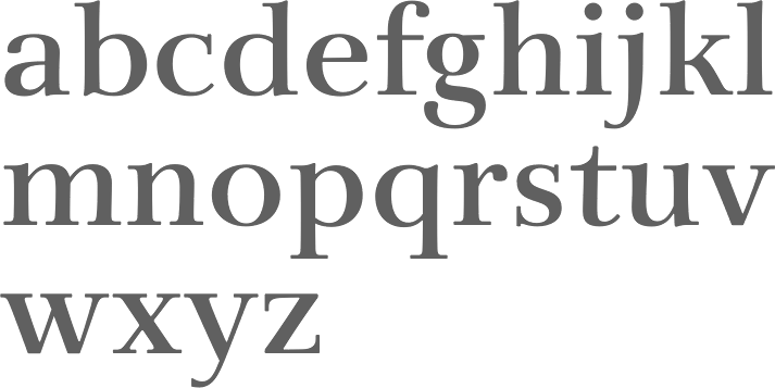
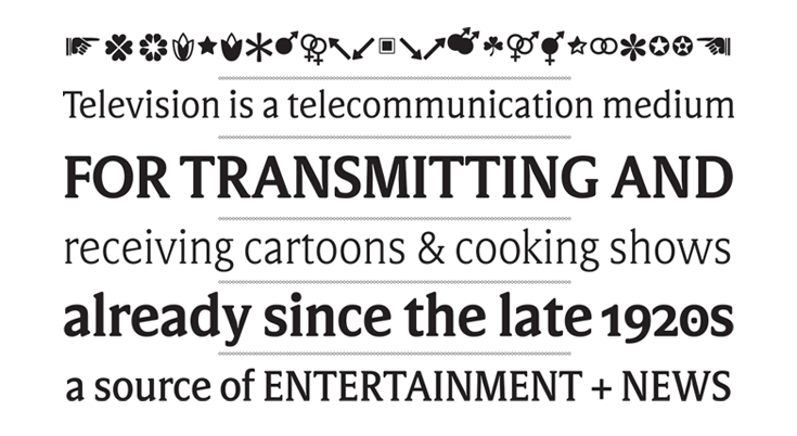
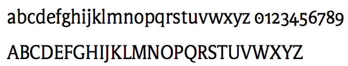
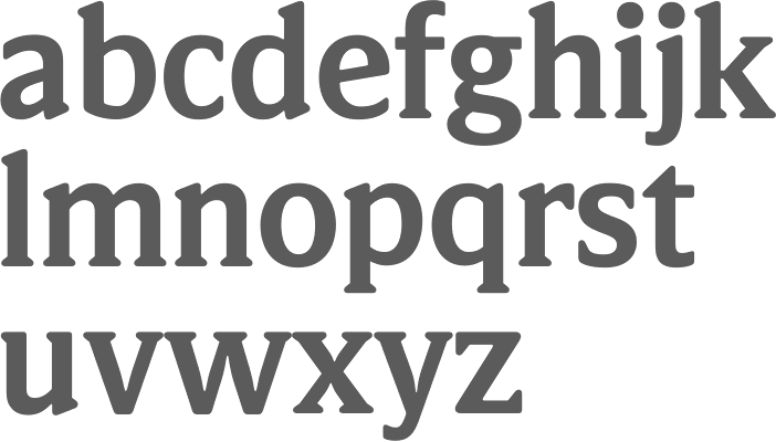
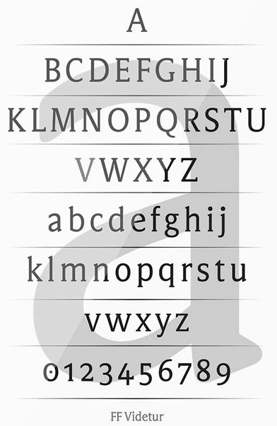
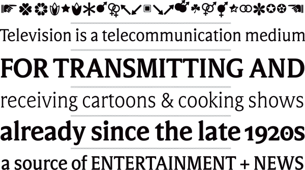
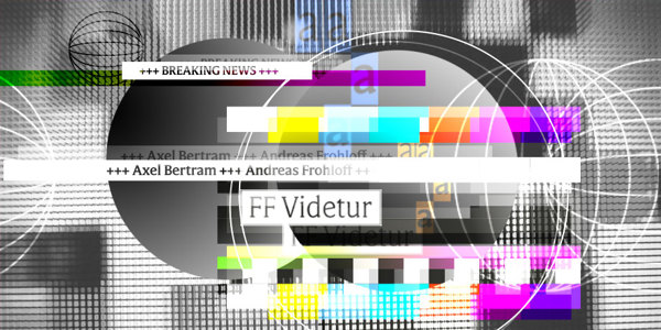
Axel Bertram was born in Dresden in 1936. He studied at the Berlin Weissensee Academy of Fine and Applied Arts. From 1972 to 1986 and from 1989 to 1992 he worked as a university lecturer in typeface and graphic design at the Berlin-Weissensee Academy of Fine and Applied Arts. He was made professor in 1977. He has been active in graphic design, publicity work, and most importantly, digital typeface design. Designer of delicately quaint Lucinde family in 16 styles (2011, Linotype), in collaboration with calligrapher and type designer Andreas Frohloff. Lucinde was later renamed Rabenau. Images: i, ii, iii. Linotype writes: In March 1999, Axel Bertram carried out the first test prints of a typeface which he had originally developed for his own use. He had been searching for an appropriate script to evoke both a significant period in the history of printing and the literary historical milieu of Berlin around 1900. His attention was drawn to Friedrich Schlegel's novel Lucinde which appeared to great acclaim in 1799 and whose ideas found great sympathy in Axel Bertram. (The novel deals with the major re-ordering of the roles between men and women, in particular arising from the lifestyle of a young Romantic. Sensibility and intellectual attraction, earthly and heavenly love were no longer to be seen as irreconcilable opposites and certainly not to be seen as being divinely pre-ordained for one sex only. This was a small historical step on the path towards equality of rights for the sexes. The novel remained an incomplete fragment and the ideas contained did not catch on in the author's lifetime. These new demands had, however, found a voice and continued to resonate.) In 1999 the new typeface was therefore dedicated to the ideals of this young Romantic with all its sublime insolence. In 2012, he published FF Videtur, together with Andreas Frohloff: The concept for FF Videtur is based on bitmap fonts Axel Bertram created for the state television broadcaster in East Germany (GDR Television) during the 1980s. Thorough research and testing led to the creation of an open, functional serif typeface with alternating contrast. Freed from yesteryear's technical restrictions, the new FF Videtur was entirely redrawn while keeping the best characteristics of the earlier forms. Despite its workmanlike appearance at first glance, its warm character is undeniable. The reasons for this are its modest stroke contrast; the open, clearly differentiated letterforms; the relatively short and rounded wedge-shaped serifs; and the consistent rhythm it sets in lines of text. |
EXTERNAL LINKS |
| | |


file name: Axel Bertram Pic

file name: Axel Bertram Andreas Frohloff Rabenau 2011
file name: Axel Bertram Andreas Frohloff Rabenau 2011b

file name: Axel Bertram Andreas Frohloff Rabenau 2011c
file name: Axel Bertram Andreas Frohloff Rabenau 2011d
file name: Axel Bertram Andreas Frohloff Rabenau 2011e
file name: Axel Bertram Andreas Frohloff Rabenau Semibold 2011
file name: Axel Bertram Andreas Frohloff F F Videtur 2012
file name: Axel Bertram Andreas Frohloff F F Videtur 2012b
file name: Axel Bertram Andreas Frohloff F F Videtur O T Bold 2012
file name: Axel Bertram Andreas Frohloff F F Videtur 2012c
file name: Axel Bertram Andreas Frohloff F F Videtur 2012d
file name: Axel Bertram Andreas Frohloff F F Videtur 2012e
| | |
|
Luc Devroye ⦿ School of Computer Science ⦿ McGill University Montreal, Canada H3A 2K6 ⦿ lucdevroye@gmail.com ⦿ https://luc.devroye.org ⦿ https://luc.devroye.org/fonts.html |