TYPE DESIGN INFORMATION PAGE last updated on Thu Apr 16 22:09:04 EDT 2026
FONT RECOGNITION VIA FONT MOOSE

|
|
|
|
Studiostudio
[Christiaan Theo Boer]
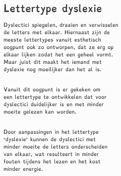
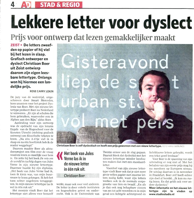
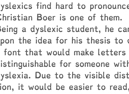
Studiostudio (The Netherlands) developed a commercial casual typeface called Dyslexie (2008) to minimize the errors perceived by dyslexics. Created by Christian Theo Boer (b. 1981; located in Zeist), the research was carried out at the University of Twente. In a research article about Dyslexie, Judith van de Vrugt writes: Dyslexia>... it is a word that many dyslexics find hard to pronounce. Christian Boer is one of them. Being a dyslexic student, he came upon the idea for his thesis to design a font that would make letters more distinguishable for someone with dyslexia. Due to the visible distinc- tion, it would be easier to read, and letters would dance less. The Dyslexie font is commercial, but a free trial version is available. |
EXTERNAL LINKS |
| | |
file name: Christiaan Theo Boer Dyslexie 2011
file name: Christiaan Theo Boer Dyslexie 2011b
file name: Christiaan De Boer Dyslexie 2009
file name: Christiaan Theo Boer Dyslexie 2008
| | |
|
Luc Devroye ⦿ School of Computer Science ⦿ McGill University Montreal, Canada H3A 2K6 ⦿ lucdevroye@gmail.com ⦿ https://luc.devroye.org ⦿ https://luc.devroye.org/fonts.html |