TYPE DESIGN INFORMATION PAGE last updated on Mon Jun 8 18:08:08 EDT 2026
FONT RECOGNITION VIA FONT MOOSE

|
|
|
|
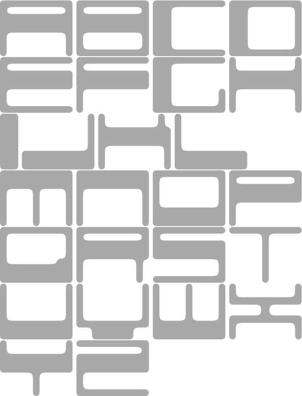
Q-BO
[Carlos Matteoli]
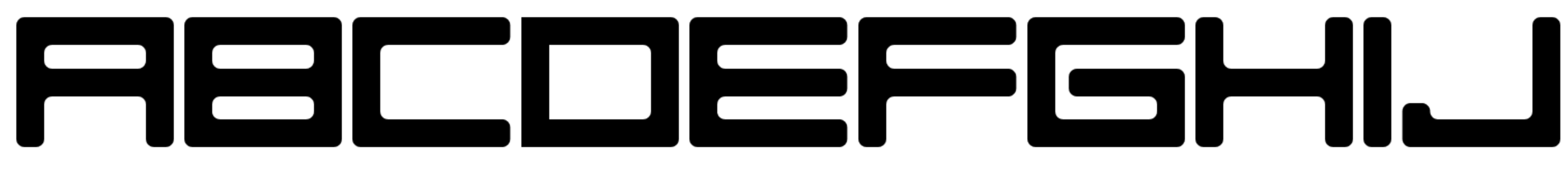
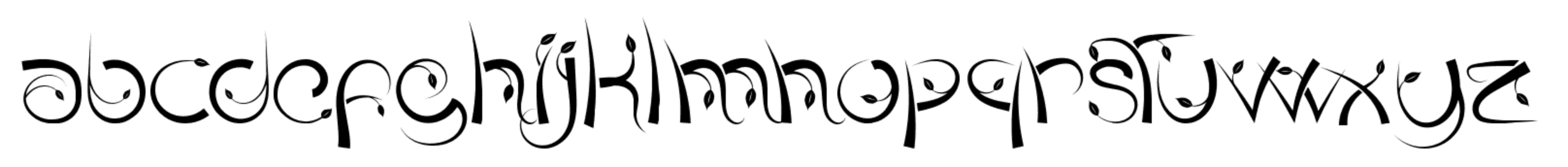
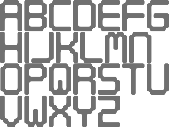
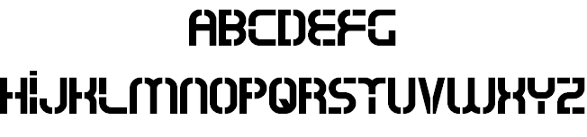
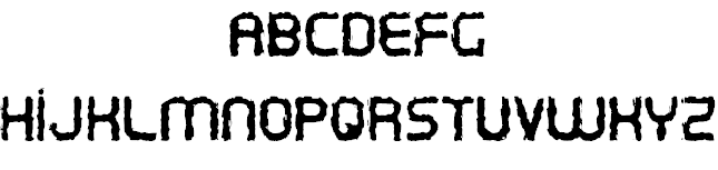
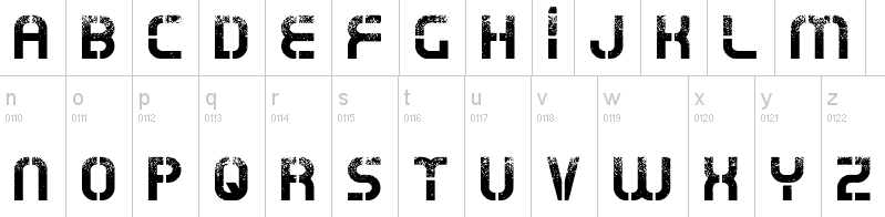
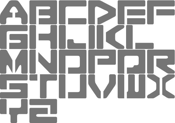
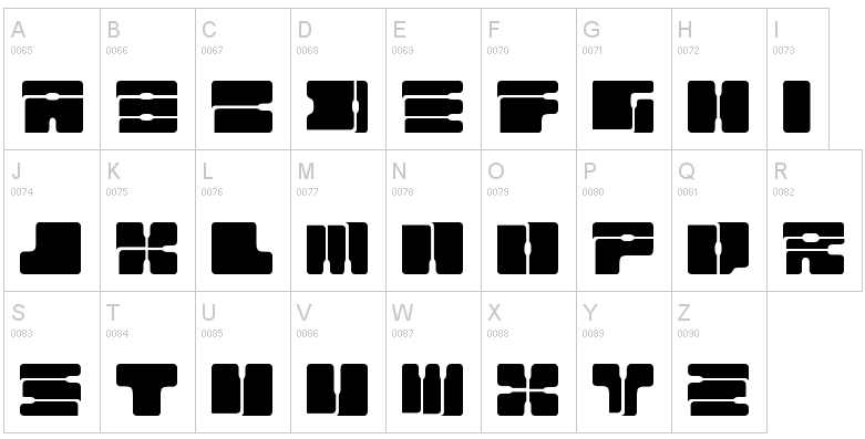
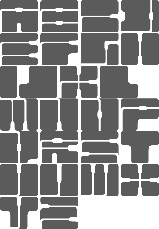
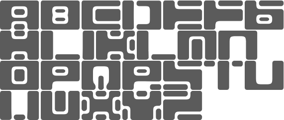
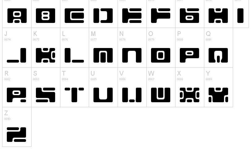
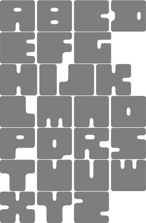
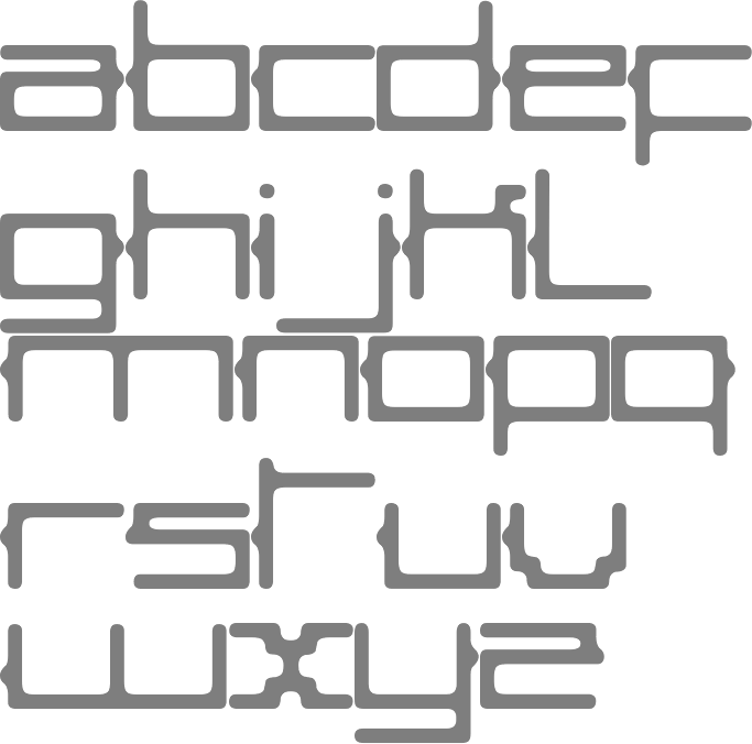
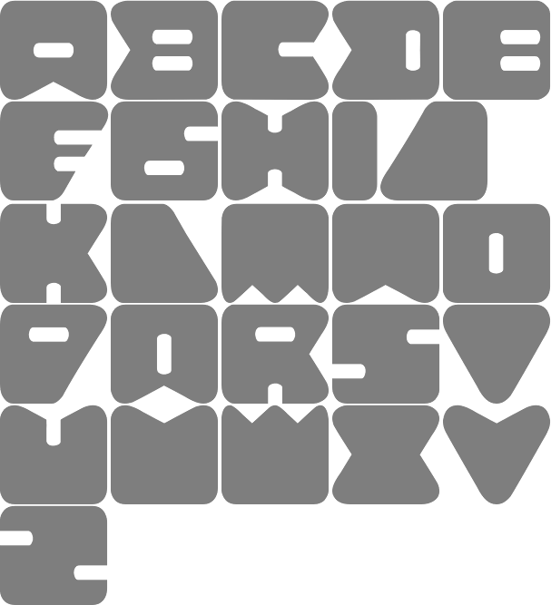
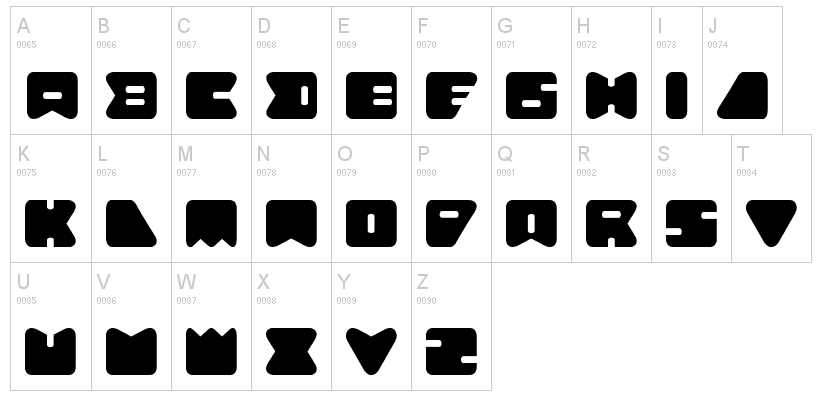
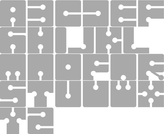
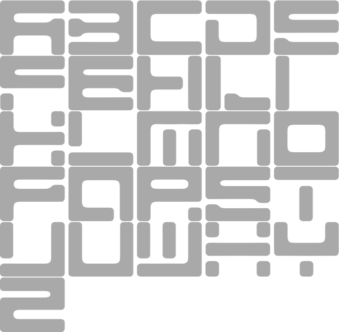
Q-BO is the foundry of Carlos Daniel Matteoli, a type designer from Santiago del Estero, Argentina, b. 1980. Old URL. His typefaces, both free and commercial, often have a sci-fi or industrial component:
|
EXTERNAL LINKS |
| | |


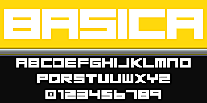
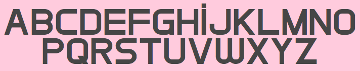
file name: Carlos Matteoli Basica 2020
file name: Carlos Matteoli Tauler 2020
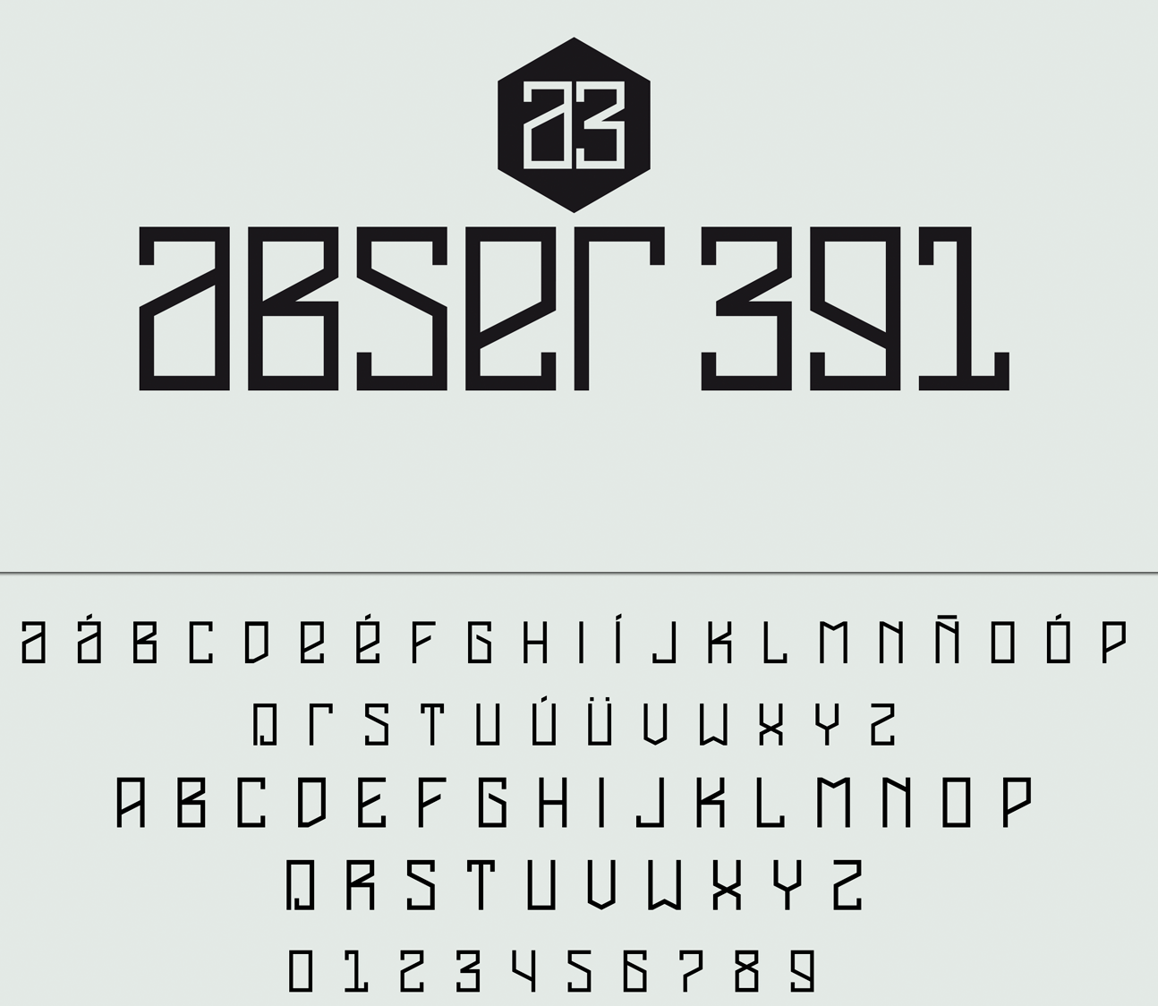
file name: Carlos Matteoli Abser391 2017b
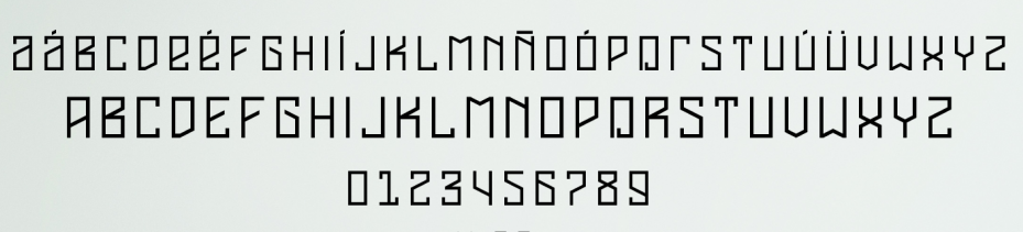
file name: Carlos Matteoli Abser391 2017
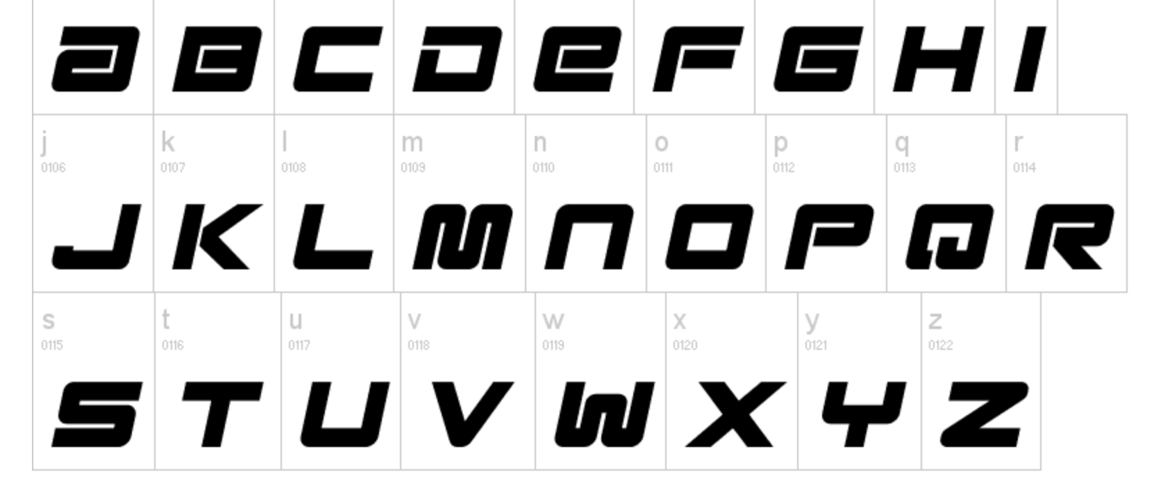
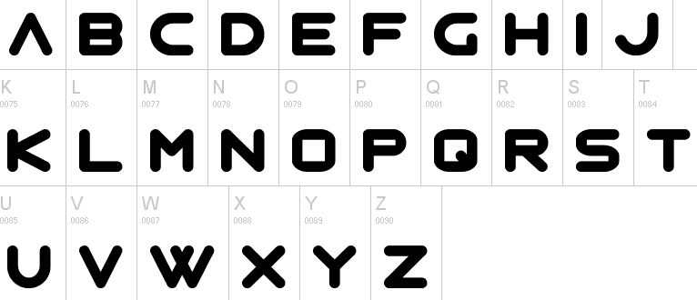
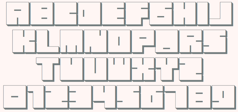
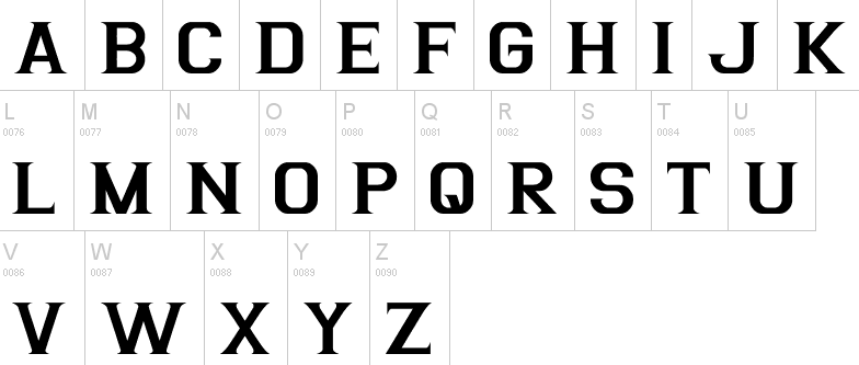
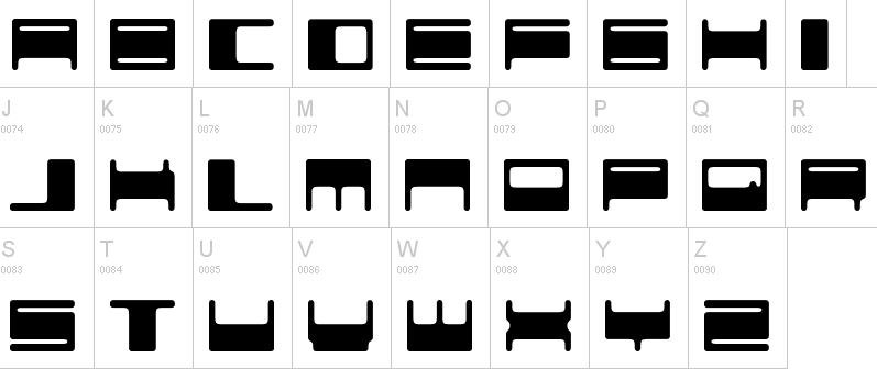
file name: Carlos Matteoli Basica Industrial 2012
file name: Carlos Matteoli Basica Cartoon 2014

file name: Carlos Matteoli Basica Cicionica 2017
file name: Carlos Matteoli Basica Cicionica 2017b
file name: Carlos Matteoli Basica 2011
file name: Carlos Matteoli Basica 2011

file name: Carlos Matteoli Basica20 2012
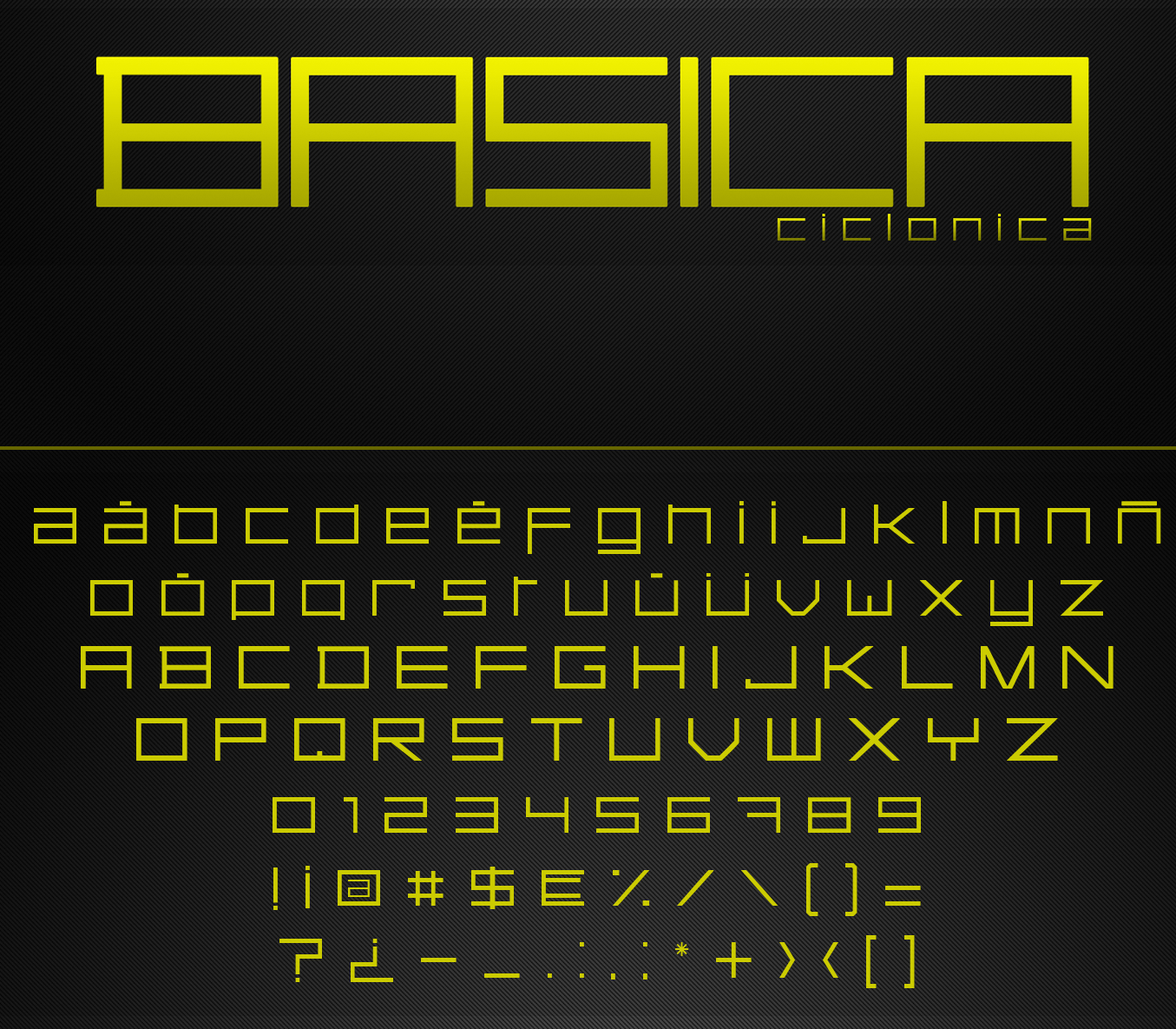
file name: Carlos Matteoli Basica Ciclonica 2017
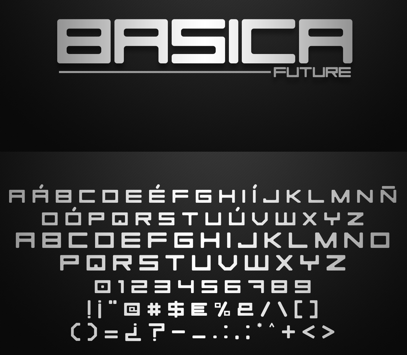
file name: Carlos Matteoli Basica Future 2017
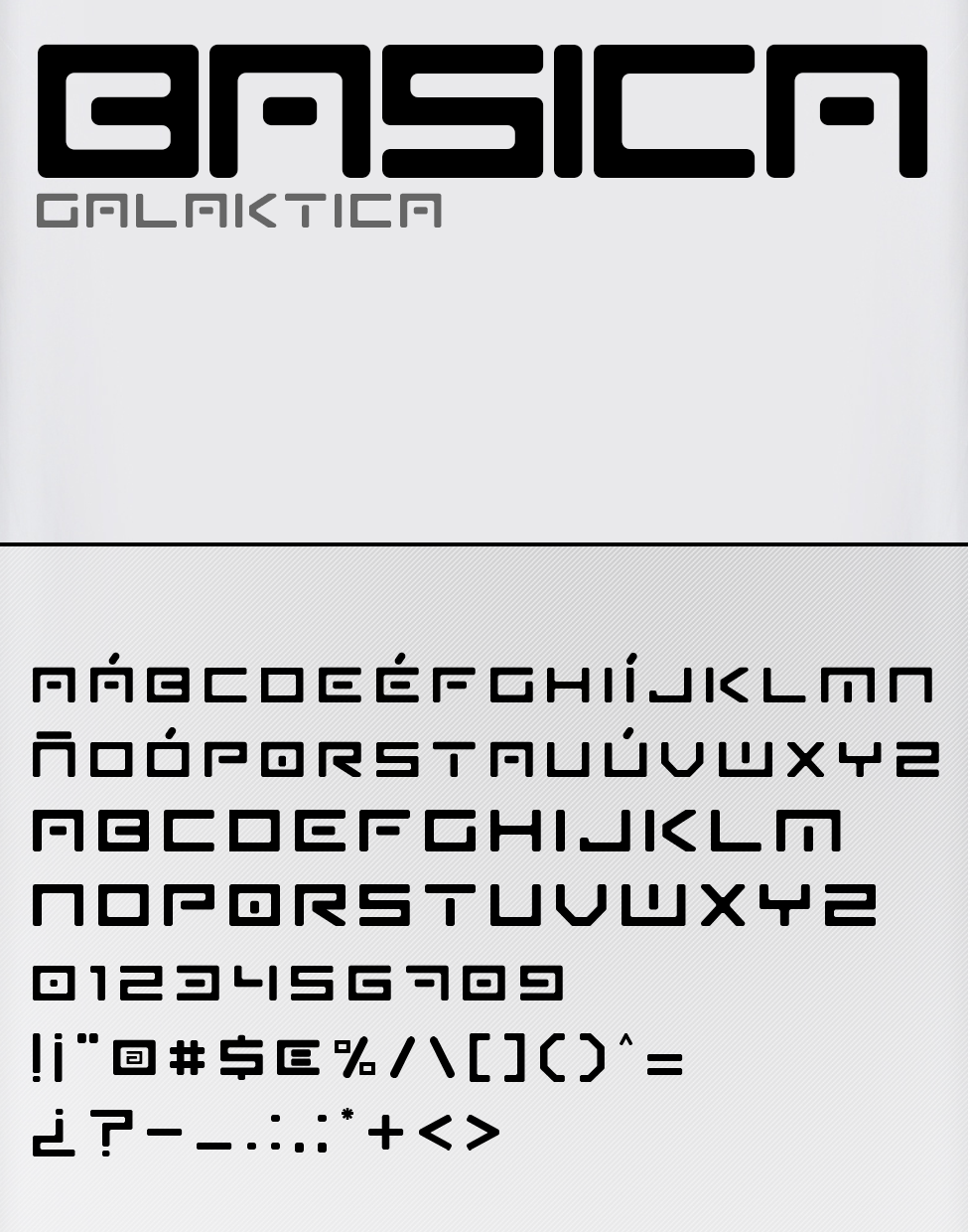
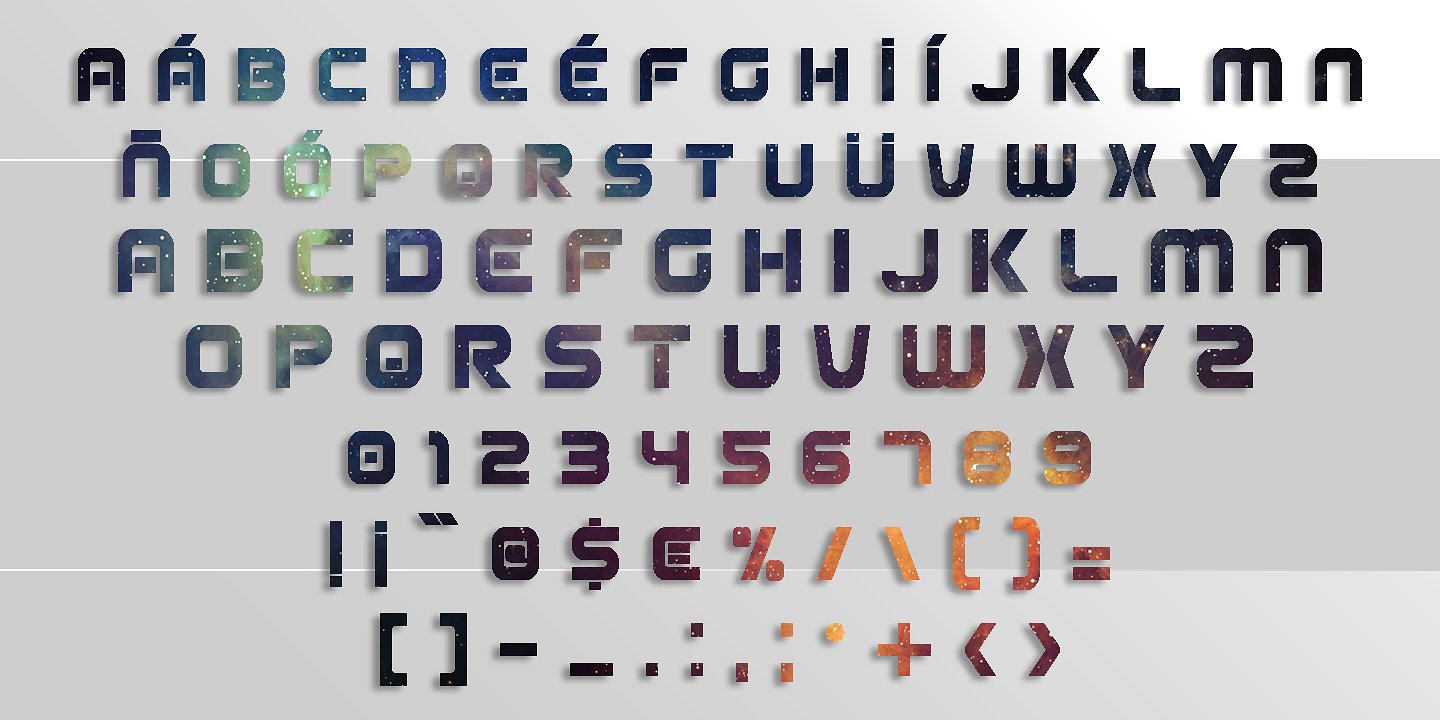
file name: Carlos Matteoli Basica Galaktica 2017
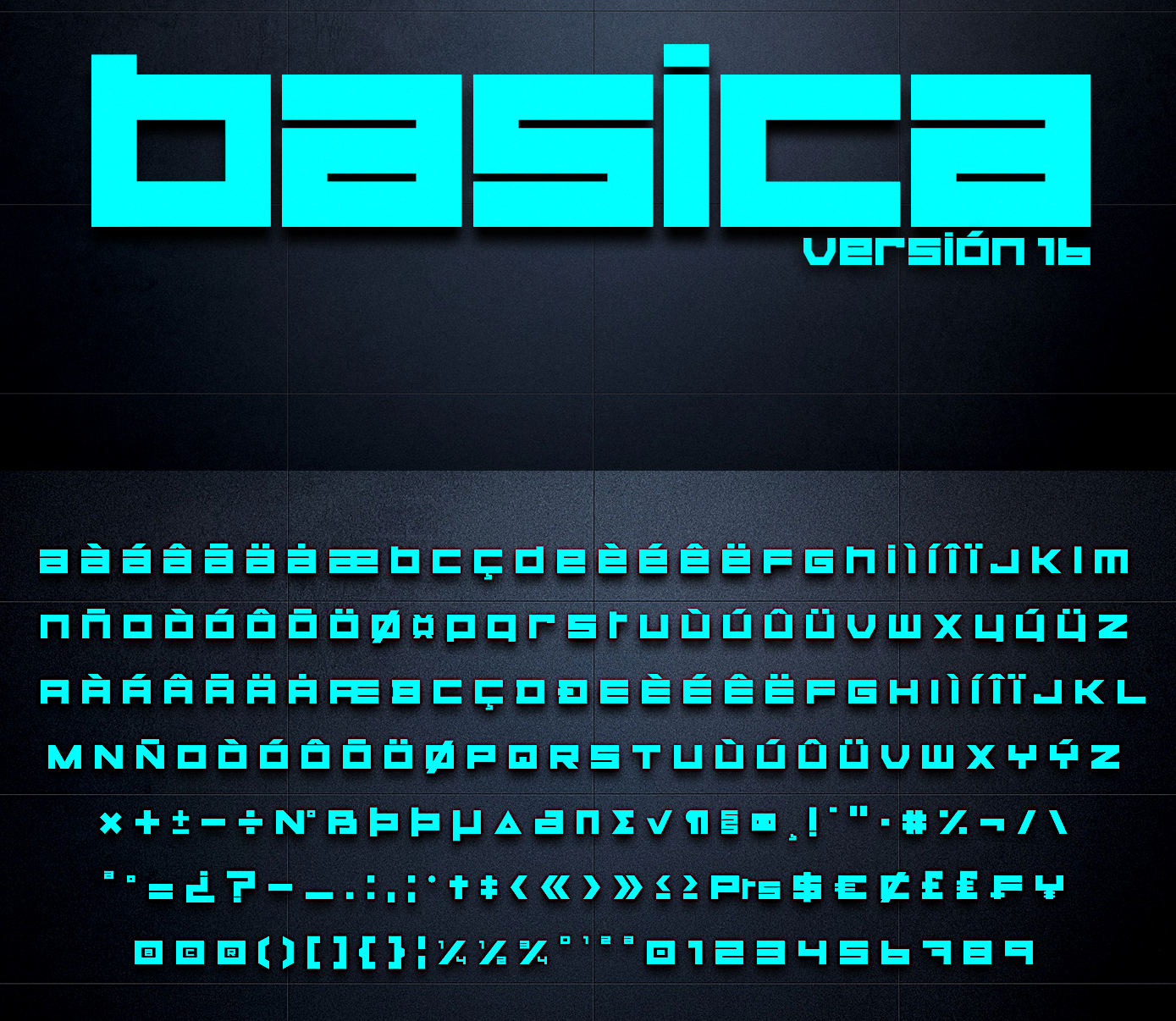
file name: Carlos Matteoli Basica Version16 2017
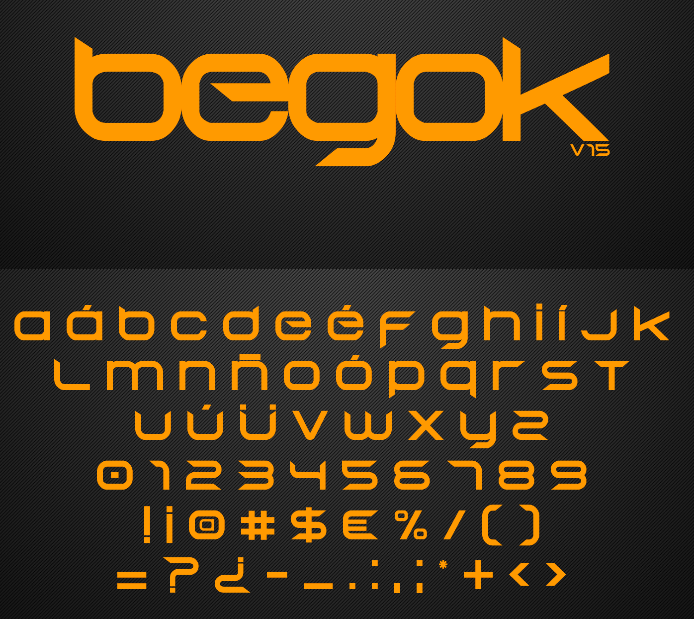
file name: Carlos Matteoli Begokv15 2016b
file name: Carlos Matteoli Begokv15 2016
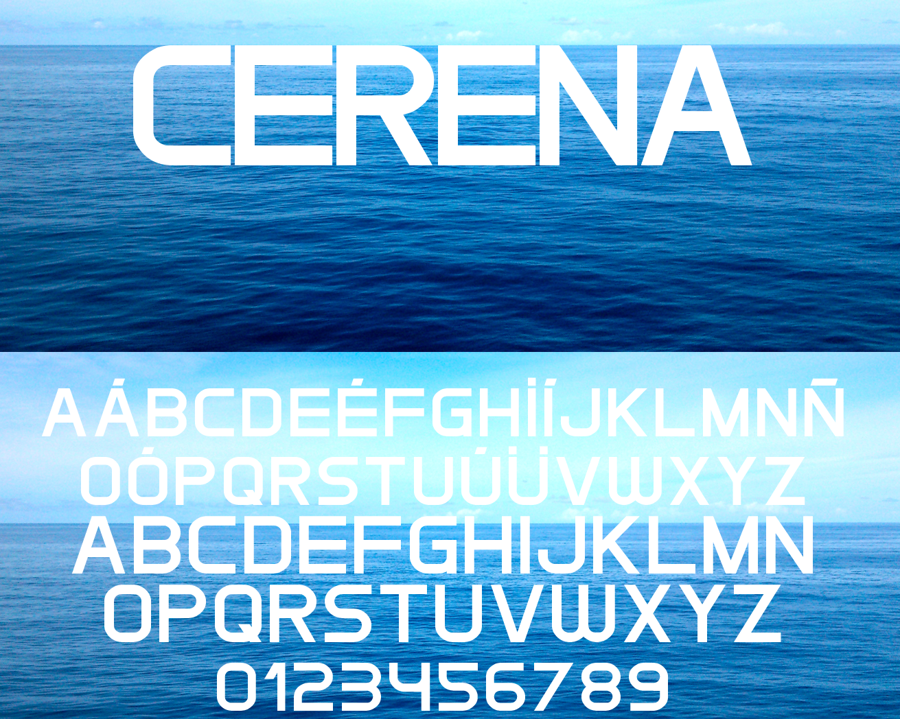
file name: Carlos Matteoli Cerena 2015b

file name: Carlos Matteoli Cerena 2015
file name: Carlos Matteoli Cerena 2015
file name: Carlos Matteoli Esba 2019

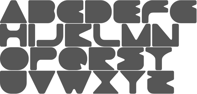
file name: Carlos Matteoli Gtek 2013
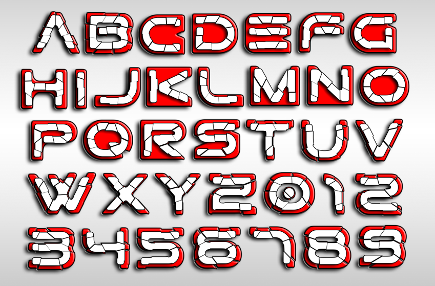
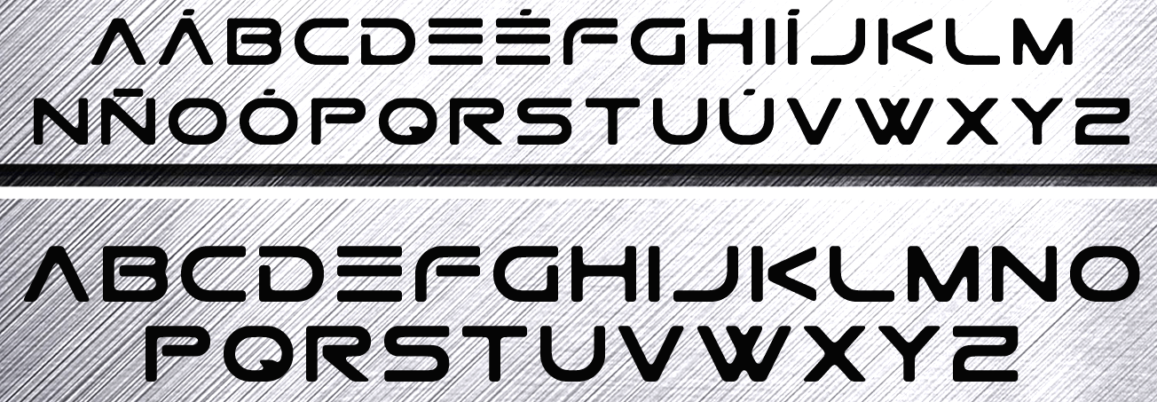
file name: Carlos Matteoli Gtek Broken 2014b
file name: Carlos Matteoli Gtek Broken 2014
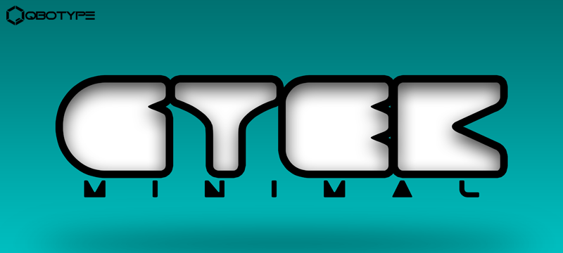
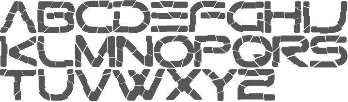
file name: Carlos Matteoli Gtek Minimal 2014
file name: Carlos Matteoli Gtek Minimal 2014
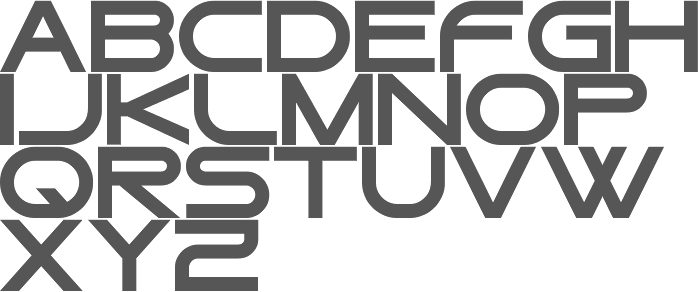
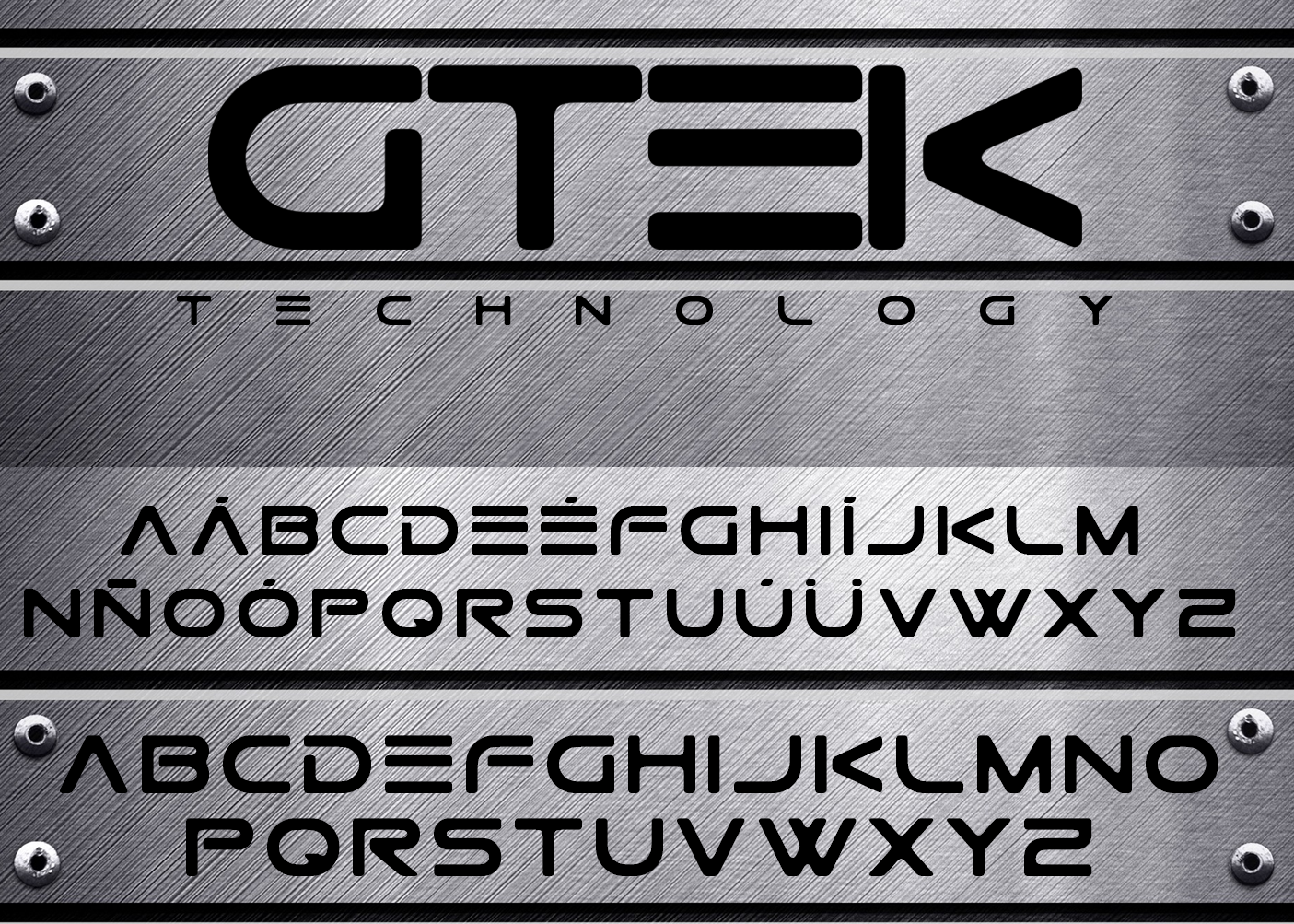
file name: Carlos Matteoli Gtek Regular 2014
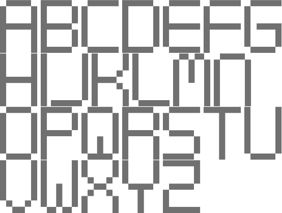
file name: Carlos Matteoli Gtek Technology 2014
file name: Carlos Matteoli Gtek 2013b
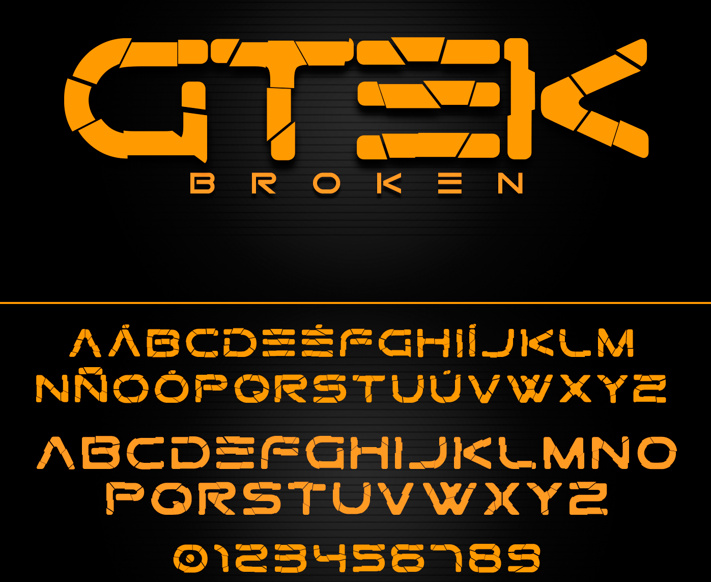
file name: Carlos Matteoli Gtek Broken 2014c
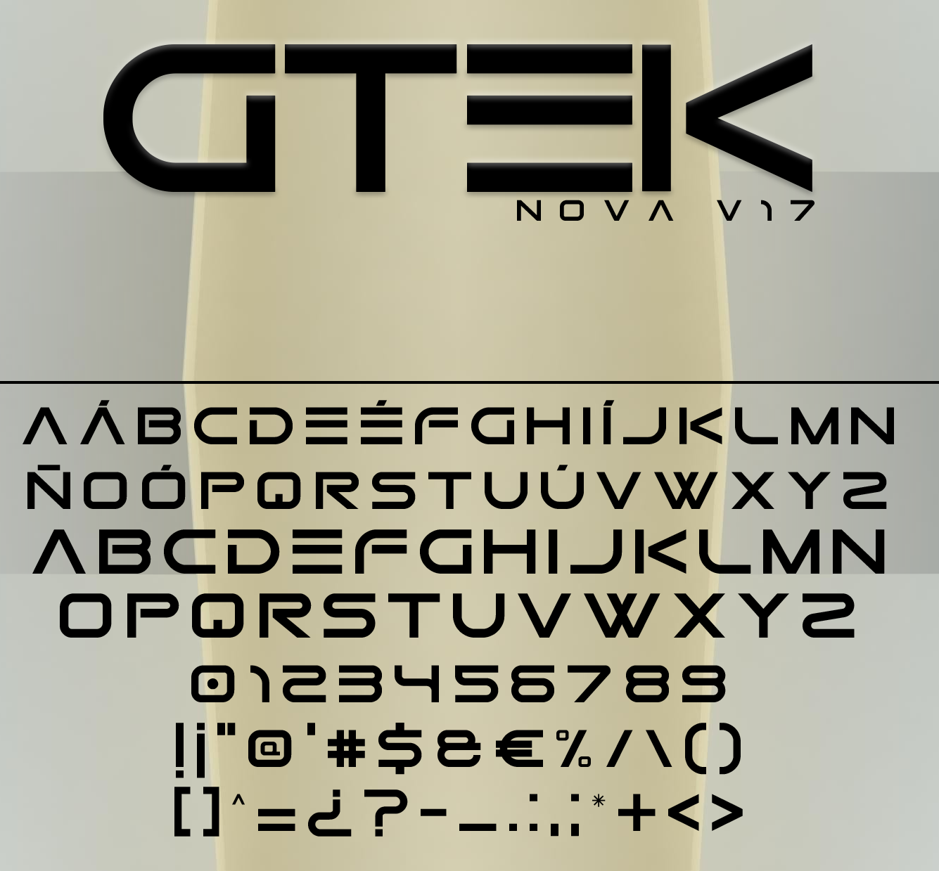
file name: Carlos Matteoli Gtek Nova V17 2013
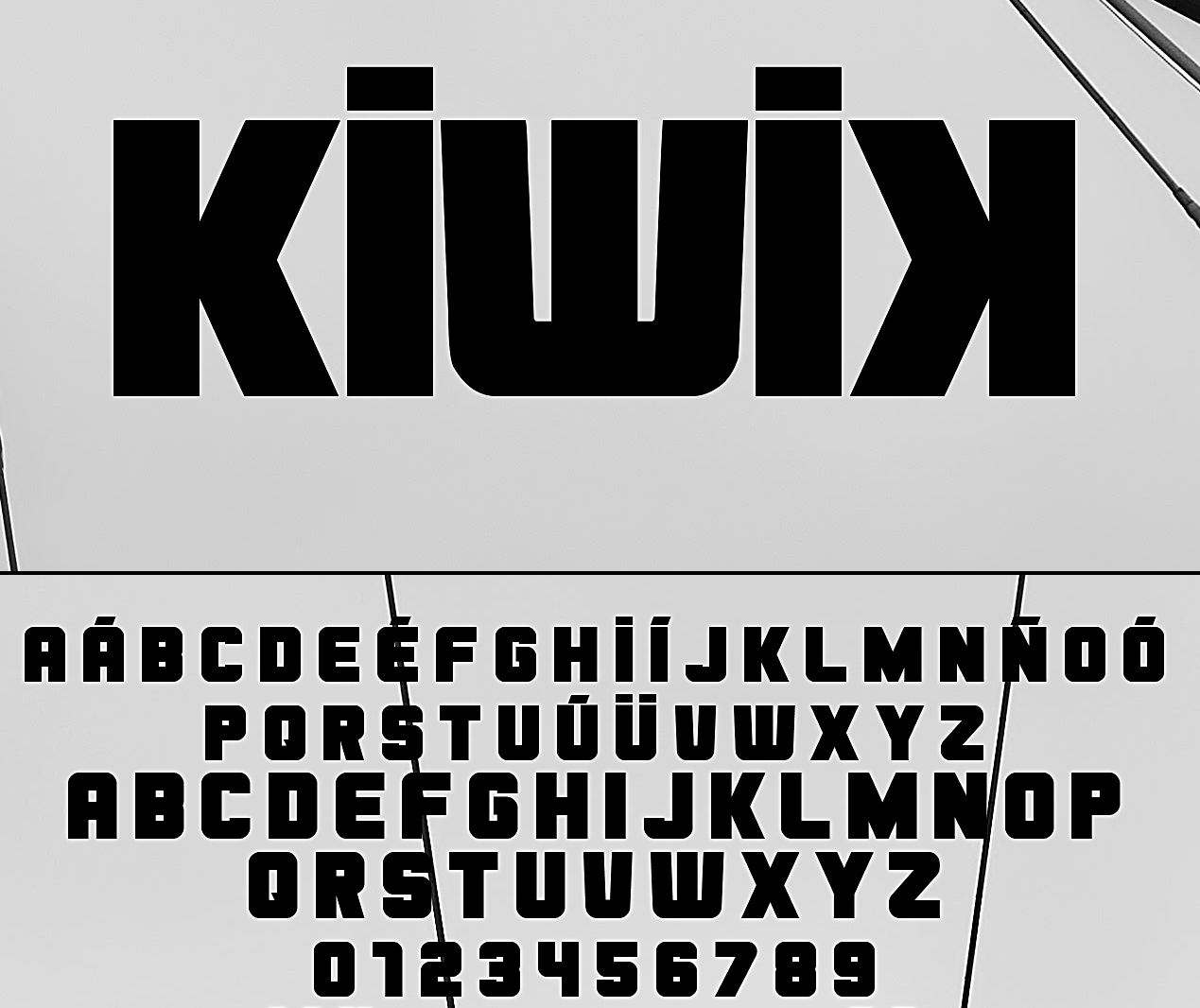
file name: Carlos Matteoli Kiwik 2017c
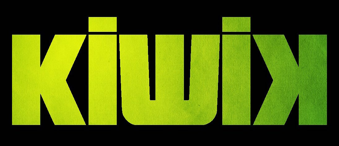
file name: Carlos Matteoli Kiwik 2017

file name: Carlos Matteoli Kiwik 2017b
file name: Carlos Matteoli Moiser 2013
file name: Carlos Matteoli Moiser Techno 2013
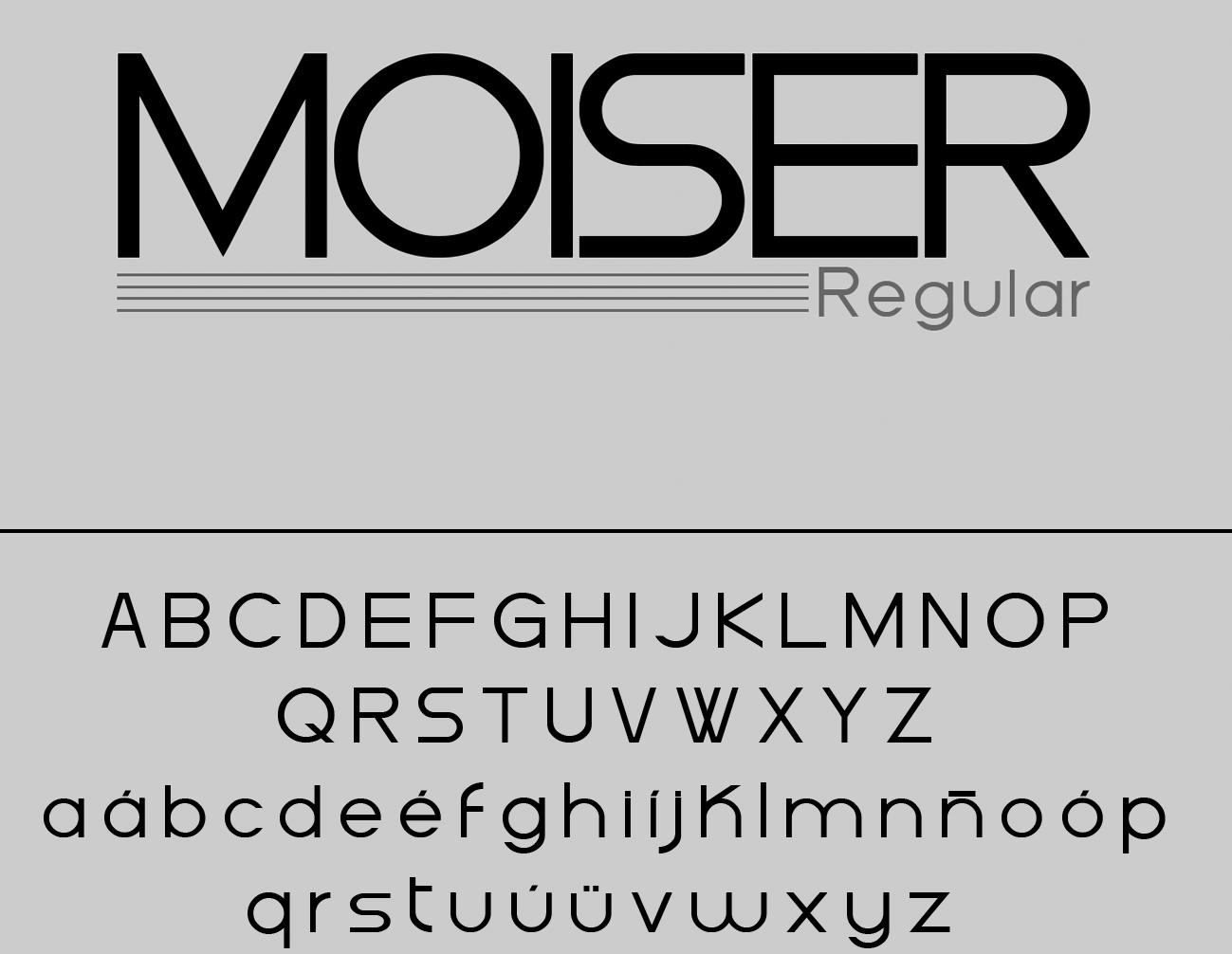
file name: Carlos Matteoli Moiser 2013b
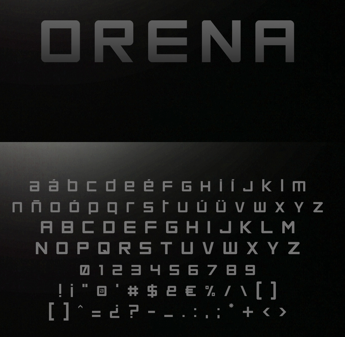
file name: Qbotype Fonts Orena 2016b
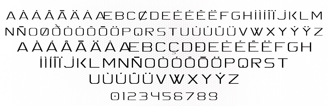
file name: Carlos Matteoli Orena 2012e
file name: Carlos Matteoli Orena 2012

file name: Carlos Matteoli Orena 2012b
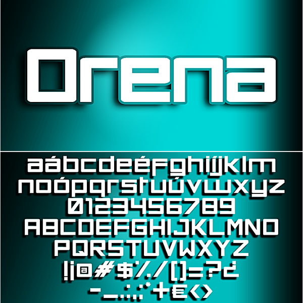
file name: Carlos Matteoli Orena 2012c
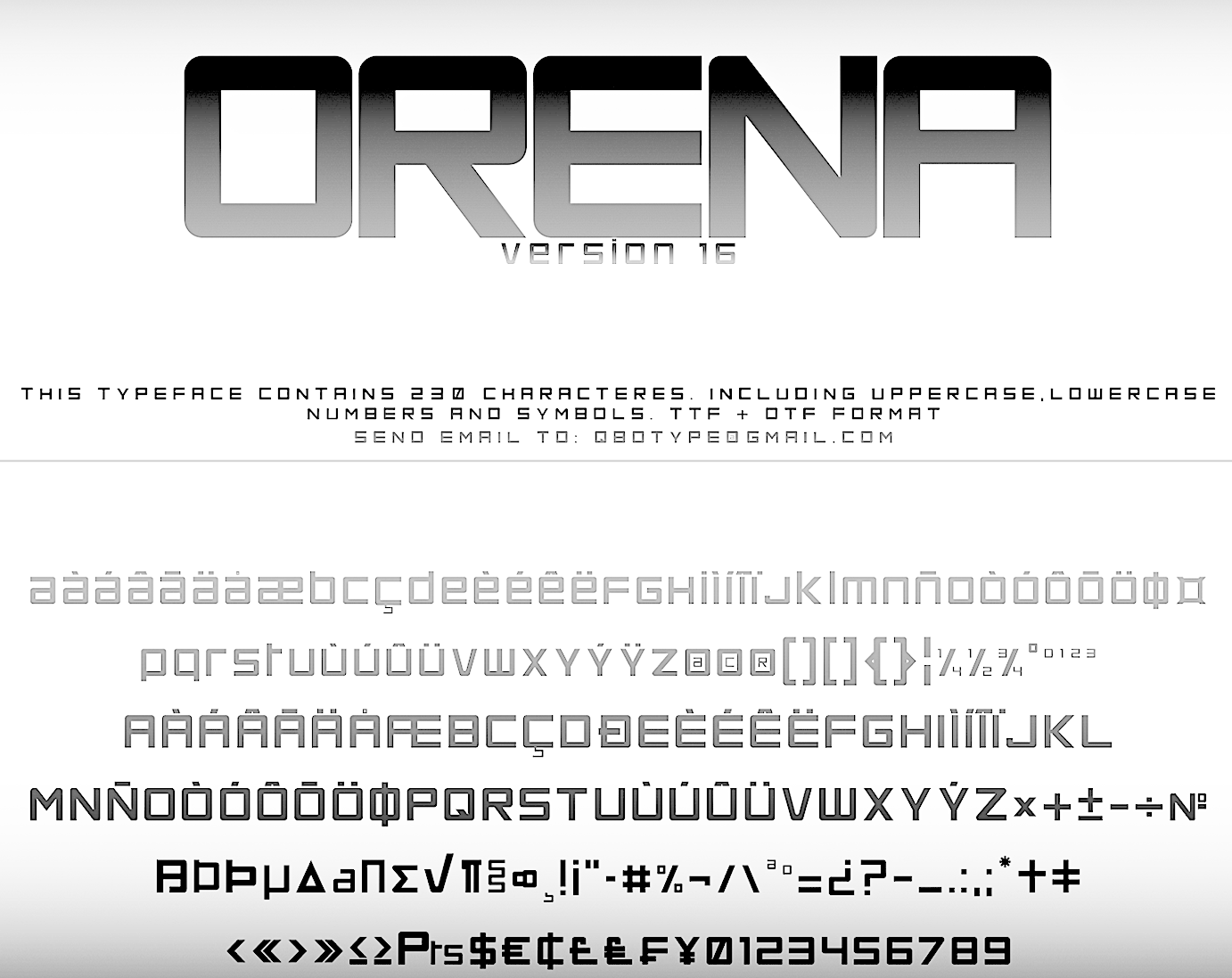
file name: Qbotype Fonts Orena 2016
file name: Carlos Matteoli Spac3 Slim 2017
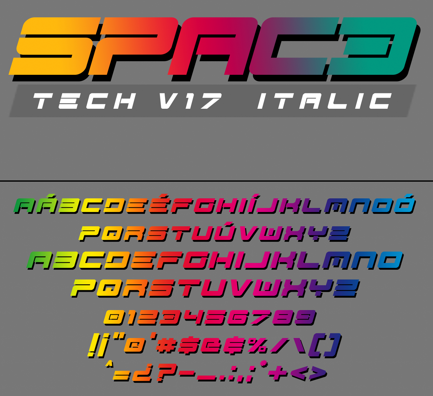
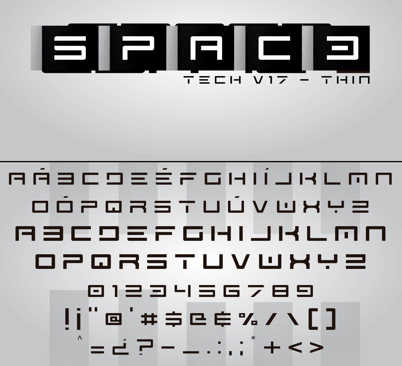
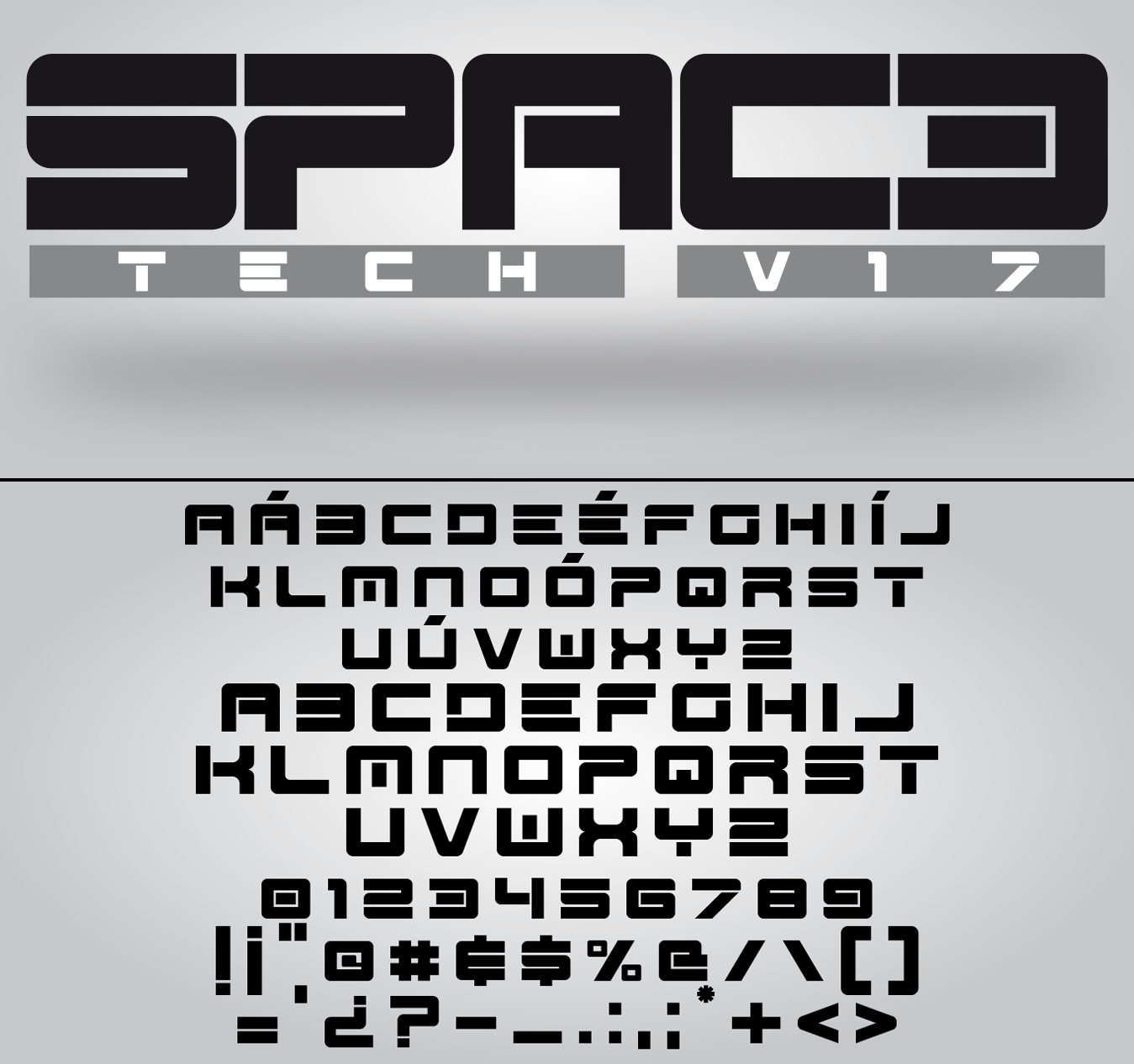
file name: Carlos Matteoli Spac3 Tech 2011
file name: Carlos Matteoli Spac3 Selenium 2014
file name: Carlos Matteoli Spac3 Halftone 2012
file name: Q B O Spac3 2011
file name: Q B O Spac3 2011b
file name: Carlos Matteoli Spac3 Neon 2011
file name: Carlos Matteoli Spac3 2014
file name: Carlos Matteoli Spac3 2014b
file name: Carlos Matteoli Spac3 2014d
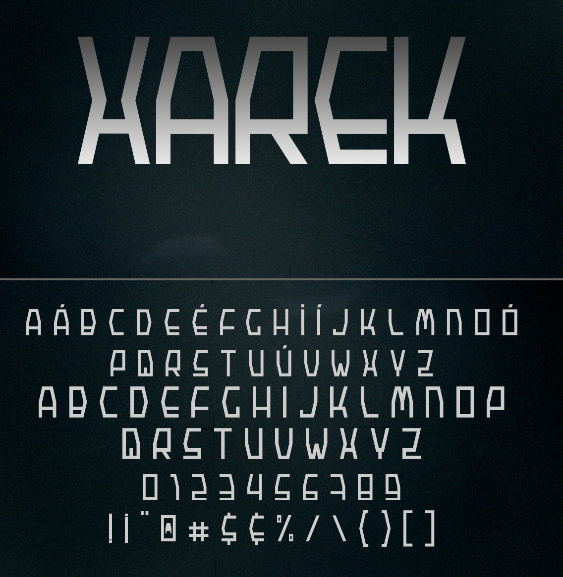
file name: Carlos Matteoli Xarek
file name: Carlos Matteoli Zian 2012

file name: Carlos Matteoli Zian V15 2015
file name: Carlos Matteoli Eertek 2017
file name: Carlos Matteoli Oki 2014
file name: Carlos Matteoli Oki 2014b

file name: Carlos Matteoli Heavy Moiser 2013

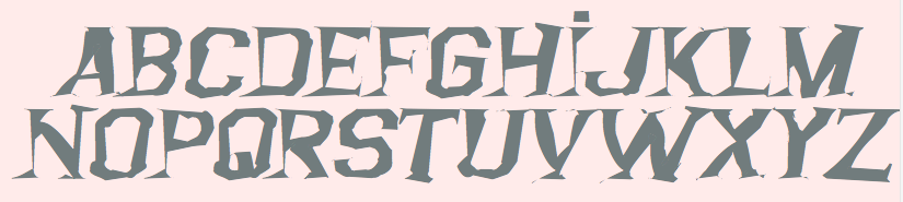
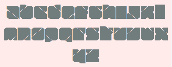
file name: Carlos Matteoli Argentina 2013
file name: Carlos Matteoli Argentina 2013b

file name: Carlos Matteoli Argentina 2013d

file name: Carlos Matteoli Argentina 2013
file name: Carlos Matteoli Argentina Austral 2014

file name: Carlos Matteoli Fiker 2014
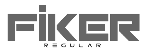
file name: Carlos Matteoli Fiker 2014b
file name: Carlos Matteoli Fiker Futura 2014
file name: Carlos Matteoli Amirox 2012

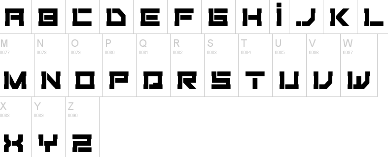
file name: Carlos Matteoli Xenik 2014
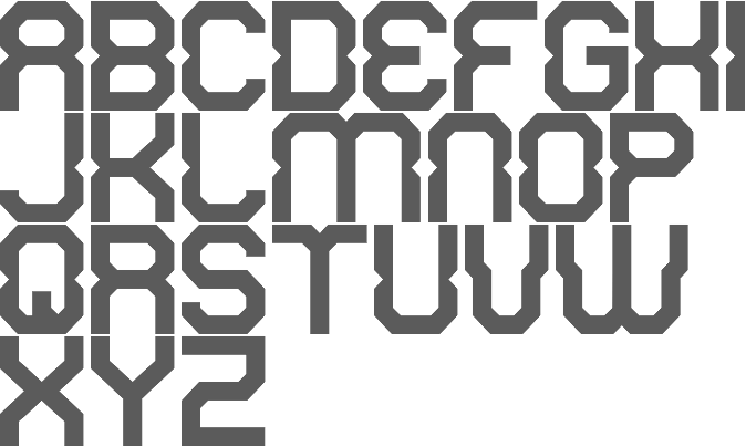
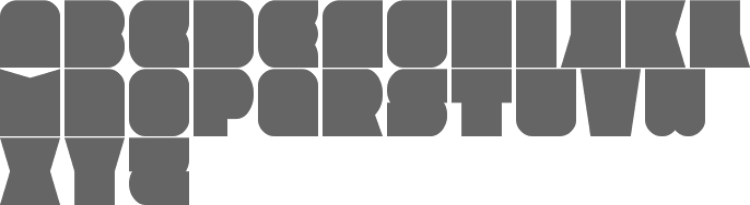
file name: Carlos Matteoli Rixon 2013
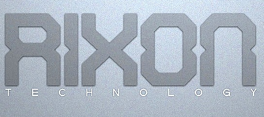
file name: Carlos Matteoli Rixon 2013b
file name: Carlos Matteoli Digital 2011
file name: Carlos Matteoli Digital Tech 2011

file name: Carlos Matteoli Oxin 2012
file name: Carlos Matteoli Oxin Army 2013
file name: Carlos Matteoli Oxin Brush 2013
file name: Carlos Matteoli Oxin War 2013

file name: Carlos Matteoli Complex 2012
file name: Carlos Matteoli Complex 2012
file name: Carlos Matteoli Complex Bruja 2012
file name: Carlos Matteoli Voker 2011
file name: Carlos Matteoli Voker Rounded 2011c
file name: Carlos Matteoli Voker Baxer 2012
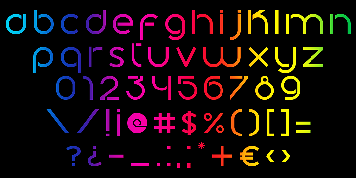
file name: Carlos Matteoli Plig 2012
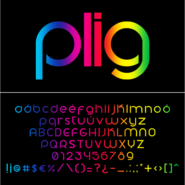
file name: Carlos Matteoli Plig 2012b

file name: Carlos Matteoli Capital 2012

file name: Carlos Matteoli Capital 2012b
file name: Carlos Matteoli Zuber Tech 2015
file name: Carlos Matteoli Zuber 2012
file name: Q B O Kram 2011
file name: Carlos Matteoli Kram Espaciada 2012

file name: Carlos Matteoli Kram Espaciada 2012b
file name: Carlos Matteoli Kram Espaciada 2012c
file name: Q B O Kram Espaciada 2011

file name: Carlos Matteoli Pic

file name: Carlos Matteoli Crakos 2011
file name: Carlos Matteoli Cable 2011
file name: Carlos Matteoli Cable 2011c
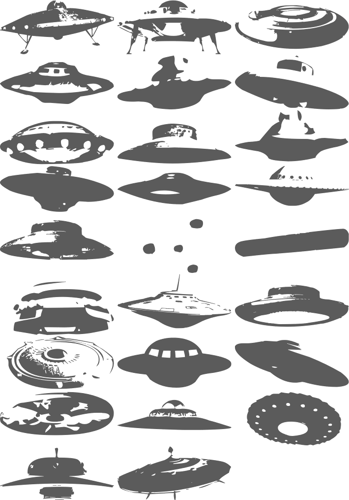
file name: Carlos Matteoli Ovnis 2011

file name: Carlos Matteoli 2 Lines 2011
file name: Carlos Matteoli Bim 2011
file name: Carlos Matteoli Bim 2011
file name: Carlos Matteoli Bim Eroded 2012
file name: Carlos Matteoli Equ 2011
file name: Q B O Equ
file name: Carlos Matteoli Equ 2011b
file name: Carlos Matteoli Q Bo 2011
file name: Carlos Matteoli Abix 2011
file name: Carlos Matteoli Ameba 2011
file name: Carlos Matteoli Ameba 2011
file name: Carlos Matteoli Sistema 2011
file name: Carlos Matteoli Teio 2011
| | |
|
Luc Devroye ⦿ School of Computer Science ⦿ McGill University Montreal, Canada H3A 2K6 ⦿ lucdevroye@gmail.com ⦿ https://luc.devroye.org ⦿ https://luc.devroye.org/fonts.html |