TYPE DESIGN INFORMATION PAGE last updated on Wed May 6 16:19:45 EDT 2026
FONT RECOGNITION VIA FONT MOOSE

|
|
|
|
MICResque Type Design
[Zach Whalen]
A part of Zach Whalen's 2008 thesis at the University of Washington touches upon the history of MICR. Excerpts: The technology necessary for MICR developed roughly parallel with OCR and addressed a similar need: inputting large amounts of information into a computer system using characters which could be read and verified by humans. In the 1950s, the growing demand of check processing demanded that a mechanized, automated solution replace the tedious methods of hand sorting, routing, and processing all personal checks. A Technical Subcommittee of the American Banker's Association convened in 1954 to address the problem, and after a series of consultations with banks, manufacturers and the Federal Reserve Bank, the committee developed a recommendation and standard for a common machine language for check processing, which was published in its final form as Document 147 of the Bank Management Commission, first published in 1959 and still in use today. The committee's use of the term language here is significant because the standards and specifications set forth in their recommendations encompass the numeric font itself, the location of MICR information on the check face, the ink quality, the system for encoding routing, transit, and account numbers, and the equipment required to process it. James McKenney's detailed narrative of the technical subcommittee is careful to note that the use of language in this context is strictly metaphorical, but the sense in which it describes the entire system strongly resembles Ferdinand de Saussure's use of langue (the complete semiologic system of any language) as a field that is distinct from parole (the singular expression of a specific language act). This analogy between langue and MICR as a "common machine language" also will help explain the means by which re-appropriated MICR fonts express associations similar to those identified with OCR-A. [...] MICR works by a recognition process similar to OCR, except that in MICR, the ink is magnetized and it is read by a magnetic tape head rather than an optical scanner. This prevents stray marks and paper degradation from interfering with reading, both of which were important problems the Technical Subcommittee had to solve. The typeface ultimately selected by the committee, E-13B, consists of simple, geometric forms adorned with asymmetrical rectangular slabs. This design conforms to the technical requirements of the MICR input devices, and the variability of the slab location among individual letterforms ensures that even degraded type will yield a sufficiently distinct magnetic waveform in order to be properly read. |
EXTERNAL LINKS |
| | |

file name: Bank Management Commission Document147 Sample of E13 B 1959
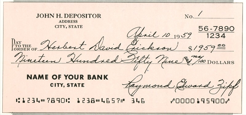
file name: Bank Management Commission Document147 Sample of E13 B 1959
| | |
|
Luc Devroye ⦿ School of Computer Science ⦿ McGill University Montreal, Canada H3A 2K6 ⦿ lucdevroye@gmail.com ⦿ https://luc.devroye.org ⦿ https://luc.devroye.org/fonts.html |