TYPE DESIGN INFORMATION PAGE last updated on Wed May 6 16:19:52 EDT 2026
FONT RECOGNITION VIA FONT MOOSE

|
|
|
|
Kilotype
[Selma Losch]
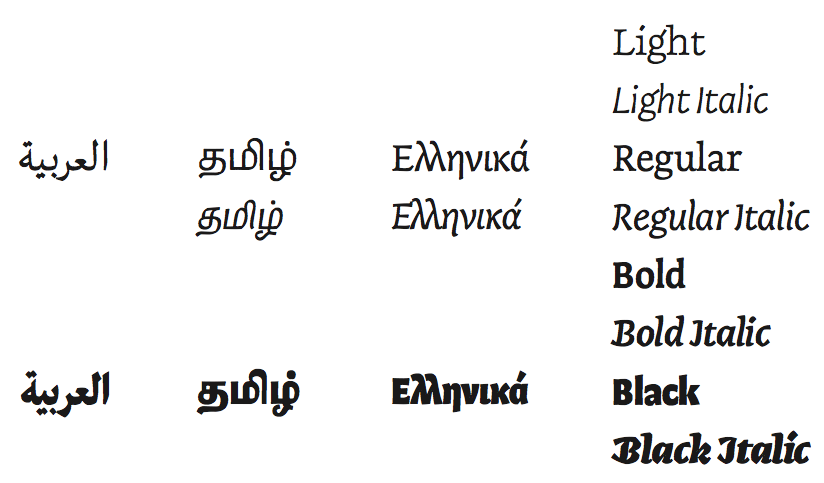
German type designer, who created the informal bouncy sans typeface Jolly in 2011. In 2013, Selma graduated from the MATD program of the University of Reading. Her graduation typeface was Teras, which she describes as follows: Teras (Greek for monster) is a kindheartedly vicious creature. It has a strong affinity for an entire range of typographic encounters, is highly articulate, slightly deformed, fierce and roughly eight feet tall. Due to its Arabic, Greek, Latin and Tamil background, every syllable it utters is a mongrel mouthful of a variety of cultural influences. It is also an exploration into the alternative type family, which in the upright mutates from a serif light weight into a sans serif black and the reversed procedure in the italics. The symbiosis of the four scripts is achieved principally by making the Latin flared, lapidary, open to conversation with its curvier peers. Bressay (Dalton Maag), a Scotch roman co-designed in 2015 by Tom Foley, Selma Losch, and Spike Spondike (design lead by Stuart Brown), won an award at TDC 2016. Aktiv Grotesk, a Dalton Maag typeface, was extended to cover Indic languages by Selma Losch and Kalapi Gajjar-Bordawekar. It won an award at Granshan 2016. In 2017, Francesca Bolognini and Selma Losch co-designed the ribbon calligraphy font Volina at Dalton Maag. Tom Foley and Selma Losch published the rounded slab serif typeface family Gelo at Dalton Maag in November 2017. She set up her own foundry, Kilotype, in 2018, and changed her name. Her fonts there include Frequenz (2018), Oldschool Grotesk (2019, by William Montrose), Queens (2019: a display type sysyem with several widths), and Sequenz (2018). In 2020, she added Queens Air (+Condensed, +Compressed). |
EXTERNAL LINKS |
| | |


file name: Selma Losch Frequenz 2018

file name: Selma Losch Frequenz 2018

file name: Selma Losch Frequenz 2018

file name: Selma Losch Frequenz 2018

file name: Selma Losch Frequenz 2018

file name: Selma Losch Queens 2019

file name: Selma Losch Queens 2019

file name: Selma Losch Queens 2019

file name: Selma Losch Queens 2019

file name: Selma Losch Queens 2019

file name: Selma Losch Queens 2019

file name: Selma Losch Queens 2019

file name: Selma Losch Queens 2019

file name: Selma Losch Queens 2019

file name: Selma Losch Queens Air 2020

file name: Selma Losch Queens Air 2020

file name: Selma Losch Queens Compressed Air 2020

file name: Selma Losch Queens Condensed Air 2020

file name: Selma Losch Queens 2019

file name: Selma Losch Queens 2019

file name: Selma Losch Queens 2019

file name: Selma Losch Queens 2019

file name: Selma Losch Queens 2019

file name: Selma Losch Queens 2019

file name: Selma Losch Queens 2019

file name: Selma Losch Sequenz 2018

file name: Selma Losch Sequenz 2018

file name: Selma Losch Sequenz 2018

file name: Selma Losch Sequenz 2018

file name: Selma Losch Sequenz 2018

file name: Selma Losch Sequenz 2018

file name: Tom Foley Selma Losch Bruno Maag Gelo 2017

file name: Tom Foley Selma Losch Bruno Maag Gelo 2017b

file name: Stuart Brown Tom Foley Selma Losch Spike Spondike Bressay 2016

file name: Stuart Brown Tom Foley Selma Losch Spike Spondike Bressay 2016b

file name: Stuart Brown Tom Foley Selma Losch Spike Spondike Bressay 2016c

file name: Stuart Brown Tom Foley Selma Losch Spike Spondike Bressay 2016 212239

file name: Stuart Brown Tom Foley Selma Losch Spike Spondike Bressay 2016 212240

file name: Stuart Brown Tom Foley Selma Losch Spike Spondike Bressay 2016 212241

file name: Stuart Brown Tom Foley Selma Losch Spike Spondike Bressay 2016

file name: Stuart Brown Tom Foley Selma Losch Spike Spondike Bressay 2016a

file name: Tom Foley Selma Losch Bruno Maag Gelo 2017c

file name: Tom Foley Selma Losch Bruno Maag Gelo 2017d

file name: Tom Foley Selma Losch Bruno Maag Gelo 2017e

file name: Tom Foley Selma Losch Bruno Maag Gelo 2017f

file name: Tom Foley Selma Losch Bruno Maag Gelo 2017g

file name: Francesca Bolognini Selma Losch Volina 2017 236225

file name: Francesca Bolognini Selma Losch Volina 2017

file name: Selma Losch Jolly 2011

file name: Selma Losch Jolly 2011 10 13
file name: Selma Losch Teras 2013

file name: Selma Losch Teras 2013b

file name: Selma Losch Teras 2013c

file name: Selma Losch Teras 2013e

file name: Selma Losch Teras 2013f

file name: Selma Losch Teras 2013g

file name: Selma Losch Teras 2013h

file name: Selma Losch Teras 2013i

file name: Selma Losch Teras 2013j

file name: Selma Losch Teras 2013k

file name: Selma Losch Teras 2013l

file name: Selma Losch Teras 2013m

file name: Selma Losch Teras 2013n

file name: Selma Losch Teras 2013o

file name: Selma Losch Teras 2013p

file name: Selma Losch Teras 2013q

file name: Selma Losch Teras 2013r

file name: Selma Losch Teras 2013s

file name: Selma Losch Teras 2013t

file name: Selma Losch Teras 2013u

file name: Selma Losch Teras 2013x
| | |
|
Luc Devroye ⦿ School of Computer Science ⦿ McGill University Montreal, Canada H3A 2K6 ⦿ lucdevroye@gmail.com ⦿ https://luc.devroye.org ⦿ https://luc.devroye.org/fonts.html |