TYPE DESIGN INFORMATION PAGE last updated on Sun Jul 12 12:33:16 EDT 2026
FONT RECOGNITION VIA FONT MOOSE

|
|
|
|
National Geographic Society
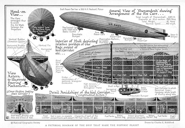
[Charles Ernest Riddiford]
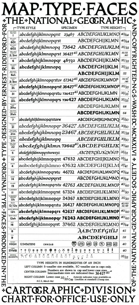
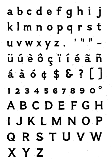
The National Geographic Society had its own photographic typefaces, which were developed by Charles Ernest Riddiford (Washington, DC), ca. 1933. Riddiford wrote about the importance of typefaces in cartography in his article On the Lettering of Maps published in the journal The Professional Geographer (Volume 4, Issue 5, pages 7-10, September 1952). Riddiford remained with National Geographic until his retirement in 1959 as its chief research cartographer. Riddiford died at the age of 71 in 1968 (Washington Post, May 15, 1968, p.B10). In 1945, he designed a slightly flared sans typeface [PDF]. Patent application. Juan Valdes (The Geographer, Director of Editorial and Research, National Geographic Maps) explains in 2012: Until the early 1930s, most of our maps were hand-lettered---a slow and tedious process requiring great patience and even greater skill. An alternate process---that of setting names in movable type, pulling an impression on gummed paper that was then pasted down on the map---often yielded less than durable or clearly readable type. The Society's first Chief Cartographer, Albert H. Bumstead, believed the answer lied in photo-graphic type. Laboring long hours in his home workshop, he discovered that existing typefaces did not lend themselves to Society standards: our map enlargement and reduction factors often caused small hairline letters to break up while larger block letters tended to fill up. To this end, he invented a machine for composing map type photographically that ultimately improved overall type legibility. Once this photolettering process was refined, it was applied to our United States map supplement in the May 1933 National Geographic. Shortly thereafter, Society cartographer Charles E. Riddiford was tasked with designing typefaces with much improved photomechanical reproductive qualities. He devised a set so attractive and legible that these typefaces are still used (in a digital format) today. These patented fonts were designed with the purpose of reflecting, as well as accentuating designated map features. If you study our reference maps and atlases closely, it's quite evident that every feature is associated with a specific typeface. Color and typographic weight (from light to bold) further adds to this distinction. |
EXTERNAL LINKS |
| | |
file name: Charles E Riddiford Illustration 1925
file name: Charles Ernest Riddiford National Geographic Typefaces 1933
file name: Charles E Riddiford Typeface 1945
| | |
|
Luc Devroye ⦿ School of Computer Science ⦿ McGill University Montreal, Canada H3A 2K6 ⦿ lucdevroye@gmail.com ⦿ https://luc.devroye.org ⦿ https://luc.devroye.org/fonts.html |