TYPE DESIGN INFORMATION PAGE last updated on Mon Jun 8 18:10:23 EDT 2026
FONT RECOGNITION VIA FONT MOOSE

|
|
|
|
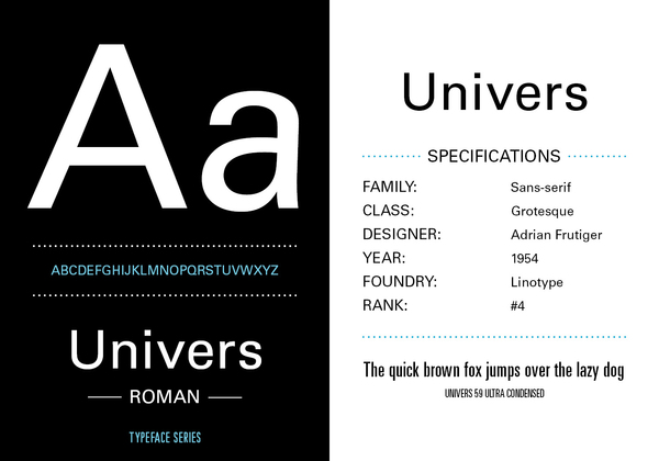
Univers
The typophiles discuss the merits of Univers, Linotype Univers, and Univers Next. Linotype itself explains the transitions Otmar Hoefer himself tells us about the various versions of Univers (metal, photo, digital). The text below is unedited: Univers was a typeface that was originally made for hotmetal at Deberny & Peignot. It had this 16 degrees slanted italic. This was at Linotype for the matrices of the hotmetal machines not possible. Therefore the type needed a lesser slant angle 11 degrees. You know the regular (55) and the italic (56) were needed on one matrice, meant they had to share the same width. The same was necessary for the bold (75) which was on the same width like the regular (55). There was also another thing that I did not understand in the beginning of my career at Stempel and Linotype. Why does the hotmetal version has such a nice et-sign and why is this dump &-sign in the fonts. Clear answer, that was based on customer requests from the US, they are used to the & sign form and could not understand what the et-ligature from Frutigers Univers mean. And therefore the fonts have this sign included. In the new versions we have the new sign, but again some US customers complained..... These fonts than needed to be compatible with our phototypesetting machines, as our former customers did not wanted to let their customers identify in print whether it was hotmetal or phototype. It needed to be width compatible. This we migrated through all our technologies until the Linotype Laserfonts. The only difference we made was that the italics were really drawn as italics. You know the differences between a slanted font and an italic form. When Linotype entered into the production with Adobe to make the Postscript library Univers was one of the first fonts and Linotype at that time did not yet had the Adobe tools to make our own digitization. So we supplied Adobe with digital data and they made the conversion into PS fonts. For italic it was at that early stage of the development the habit to just make set a slant angle into the fonts and you have an italic, which was than called oblique. Therefore Univers 55 oblique and not 56 Italic. Whan Adrian saw the digitization he was not pleased, but it was nearly similar to the Linotype version which was this mechanic restricted version, so this was transitioned into this technology. In 1996 Gerards Unger was approaching Bruno Steinert (our former MD) and me at the AtypI and explained ushis philosophy that we should extend our classic typefaces and do a similar work like with neue Helvetica and revise the Univers family to a more consistant family. We approached Frutiger with that idea and he at that time just recovered from a heart surgery with three bypasses and he was pleased that Linotype took up this idea to make a new version of the Univers family. At that time he was completely clear in his head and he was working hard on this project with our former type director Reinhard Haus. The beginning was a trial to look if we could use the exisiting data and refine just a few errors in the outllines, but we realized that this was not leading to the right result. So we scraped all this work and restarted by looking at the original prints form the hotmetal Univers. But there as you can imagine were also resulting inconsistancies in the family and weights that Adrian used the prints and used his scissors to cut and shape the letters into a form the was for his eyes pleasing. So the Linotype Univers family was developed. It was the beginning of our Platinum Collection to which Gerard Unger was the originator. There was one thing left over for many years. (the family should get small caps) and this gap was filled a few years ago and we detected that the naming of the font was not as good like all the other products form the Platinum Collection used nova or Next. And therefore we renamed the complete family into Univers Next and added the small caps to the fonts. Nothing else had been changed. Someone asked Linotype in the forum on the story of Bitstream's Zurich (a renaming of a Univers clone) and about the reason for the withdrawal by Berthold of Berthold Univers. |
EXTERNAL LINKS |
| | |
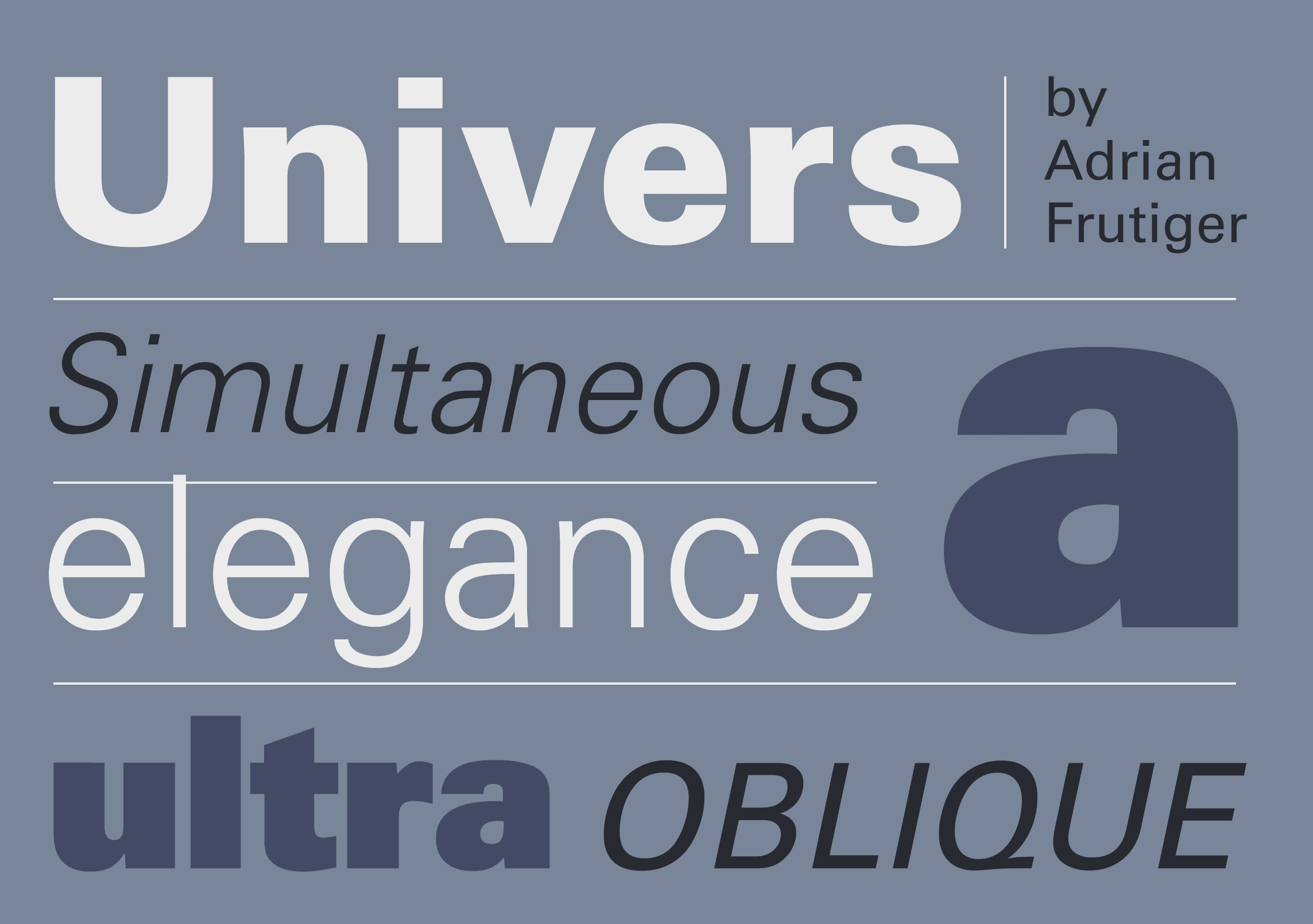
file name: Adrian Frutiger Univers 1957
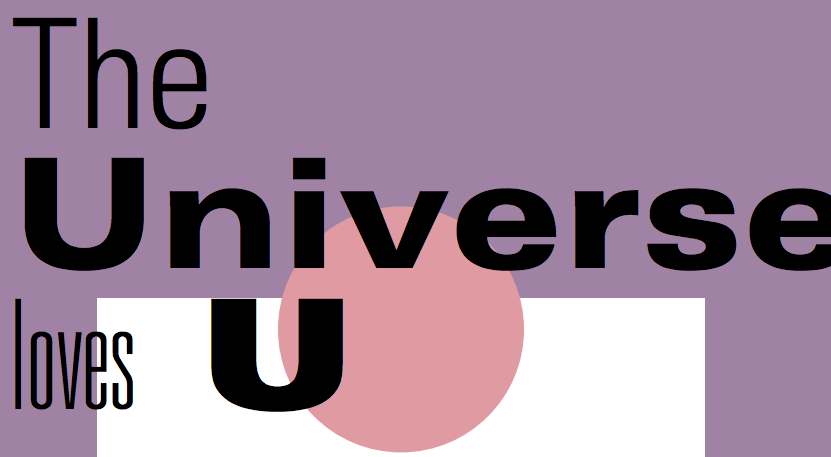
file name: Adrian Frutiger Univers Poster by Kosha Shah 2017
file name: Hunson Nguyen Univers Trading Card 2010
file name: Adrian Frutiger Univers 1957
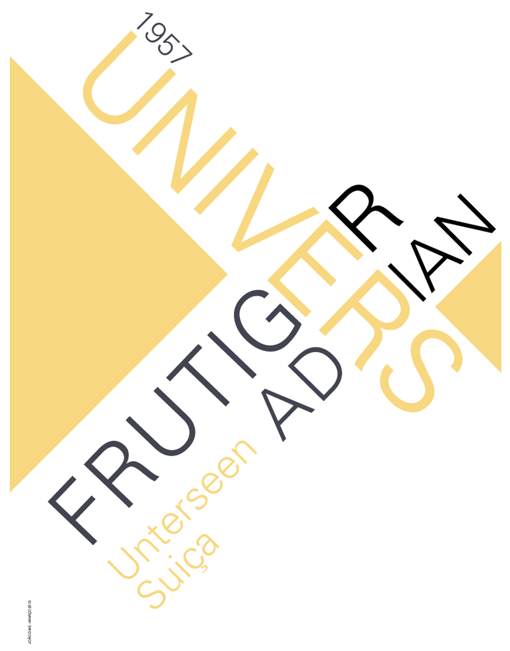
file name: Adrian Frutiger Univers 1957 Poster by Joao Diaz 2017
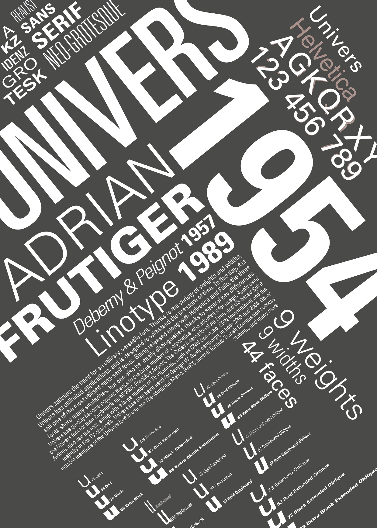
file name: Adrian Frutiger Univers 1954 Poster by Roxana Olar 2014
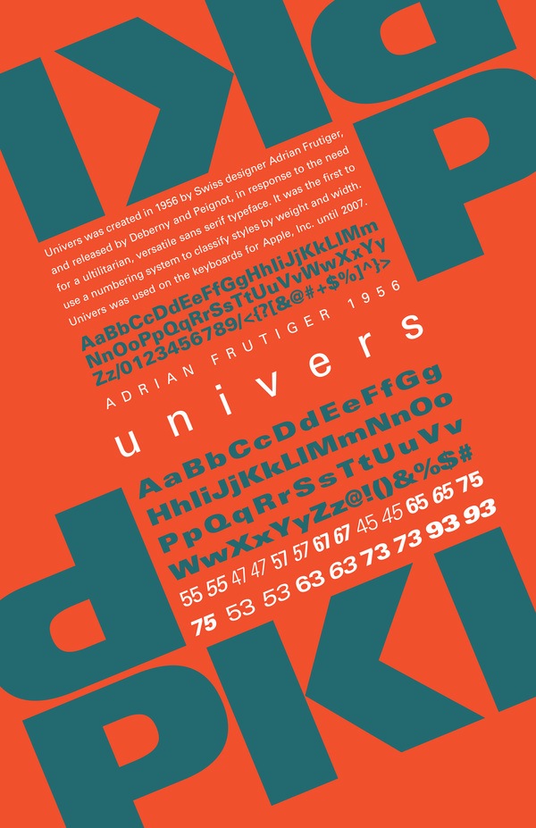
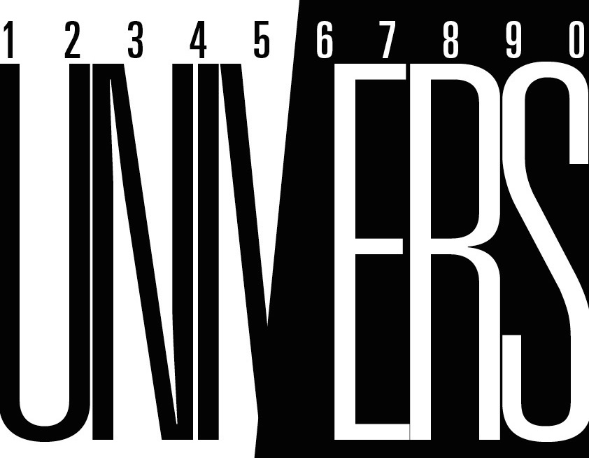
file name: Adrian Frutiger Univers 1956 Poster by Caitlin Gettinger 2014
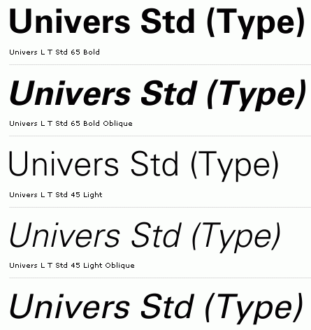
file name: Adrian Frutiger Univers Std 1957
| | |
|
Luc Devroye ⦿ School of Computer Science ⦿ McGill University Montreal, Canada H3A 2K6 ⦿ lucdevroye@gmail.com ⦿ https://luc.devroye.org ⦿ https://luc.devroye.org/fonts.html |