TYPE DESIGN INFORMATION PAGE last updated on Wed May 6 16:22:02 EDT 2026
FONT RECOGNITION VIA FONT MOOSE

|
|
|
|
Johnston's Underground Type
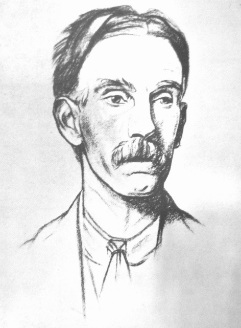
[Edward Johnston]
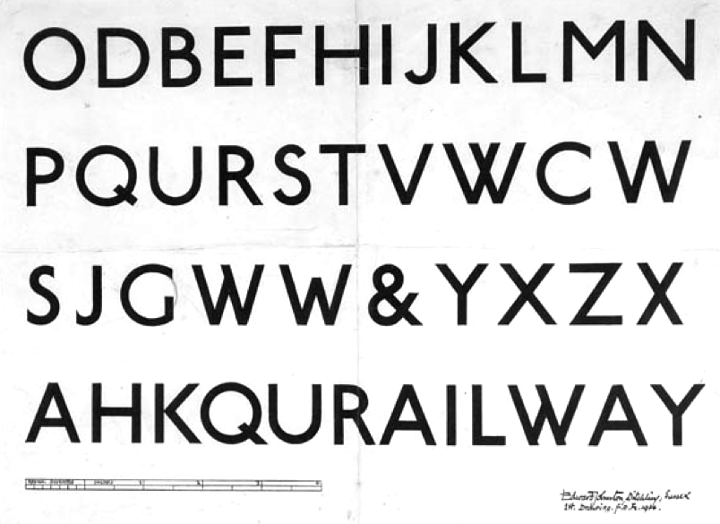
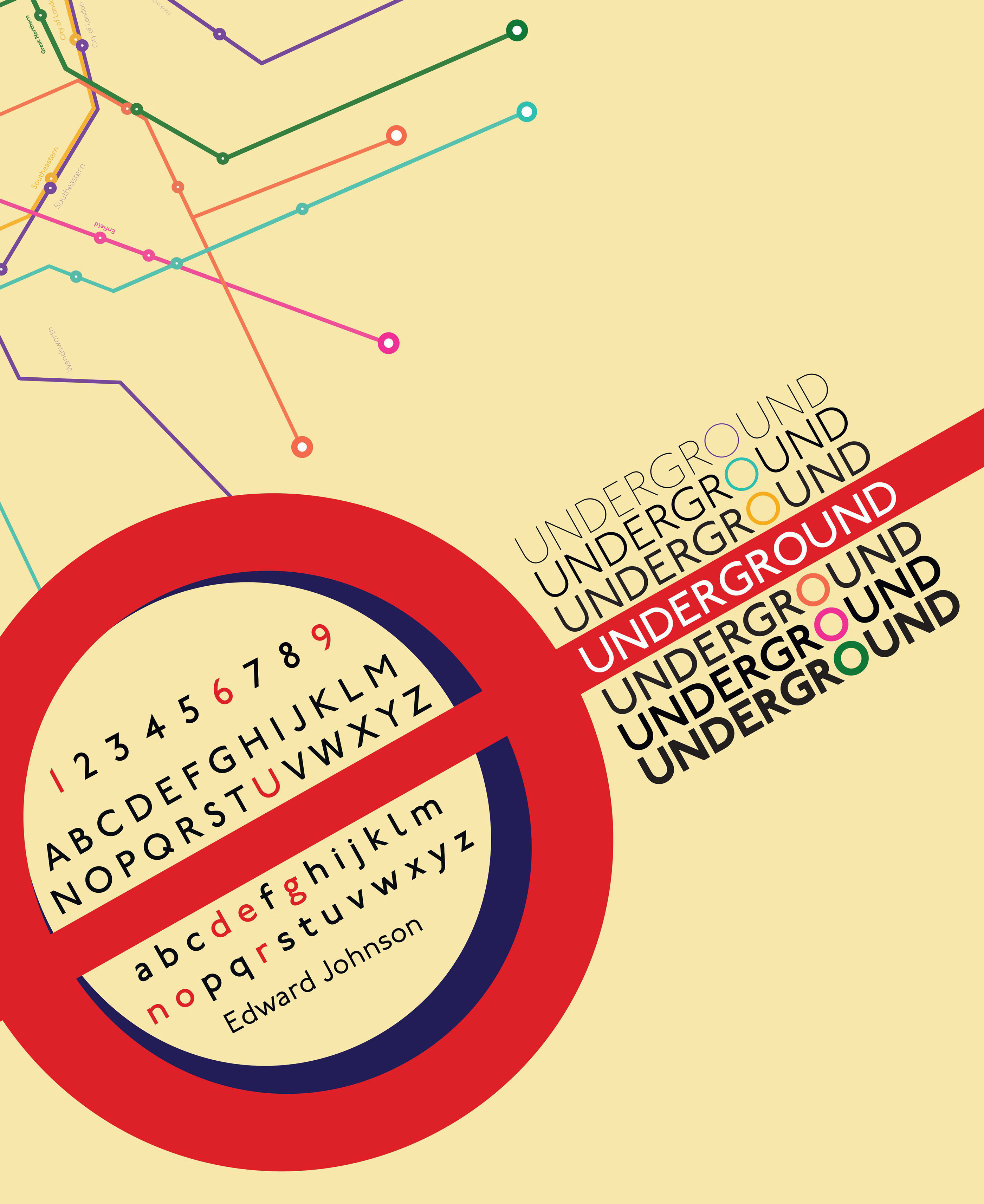
Greg Fleming, upon the publication of his open source version Railway Sans (2012) of Edward Johnston's Railway Type of 1916, recalls the history of the typeface, and adds valuable references. The text below is his. The typeface was commissioned between 1913 and 1915 by Frank Pick (1878-1941), Commercial Manager of the Underground Electric Railways Company of London, UERL, also known as The Underground Group, as part of his plan to strengthen the company's corporate identity. Frustrated at the diversity and seemingly endless variations of poor or unsuitable type- typefaces that were, at that time, in use across the system, one of his first key actions was to introduce a standardised approach to advertising and lettering. Pick's brief to Johnston was essentially that a typeface was needed that would ensure that the Underground Group's posters would not be mistaken for advertisements; it should have the bold simplicity of the authentic lettering of the finest periods and yet belong unmistakably to the twentieth century. Johnston's New Sans typeface first appeared in a poster of July 1916. Inspired by the proportions of classical Roman lettering, based on square and circular forms, it is a vehicle of bold clarity and a perfect example of typography as a powerful, authoritative information tool. It has been used, almost unchanged in essence, continuously and timelessly in signage, posters and publicity for nearly a century. In 1933, The Underground Group was absorbed by the London Passenger Transport Board and the typeface was adopted as part of the London Transport brand. The typeface was originally called Underground. It became known as Johnston's Railway Type, and later, simply, Johnston or New Johnston Sans. Today, Transport for London uses updated versions in many weights of the original face, known as New Johnston Sans. This is not commercially available, except under strict TfL license. Railway is not based on or derived from the official New Johnston Sans in current use by Transport for London. Instead, it predates New Johnston by sixty-three years. The references:
|
EXTERNAL LINKS |
| | |

file name: Greg Fleming Railway Sans 2012
file name: Edward Johnston Railway Type Design 1914
file name: Edward Johnston Underground 1916 poster by Emily Lopes Pedro Philipe 2020
file name: Edward Johnston Drawing by Sir William Rothenstein 1922
| | |
|
Luc Devroye ⦿ School of Computer Science ⦿ McGill University Montreal, Canada H3A 2K6 ⦿ lucdevroye@gmail.com ⦿ https://luc.devroye.org ⦿ https://luc.devroye.org/fonts.html |