TYPE DESIGN INFORMATION PAGE last updated on Thu Apr 16 22:11:55 EDT 2026
FONT RECOGNITION VIA FONT MOOSE

|
|
|
|
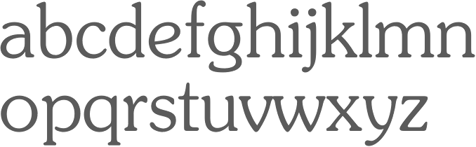
Souvenir
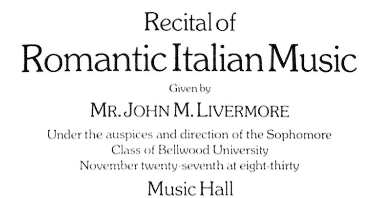
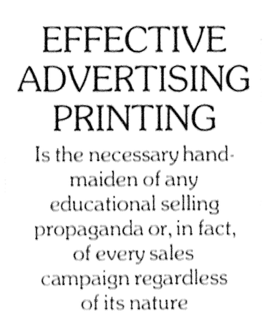
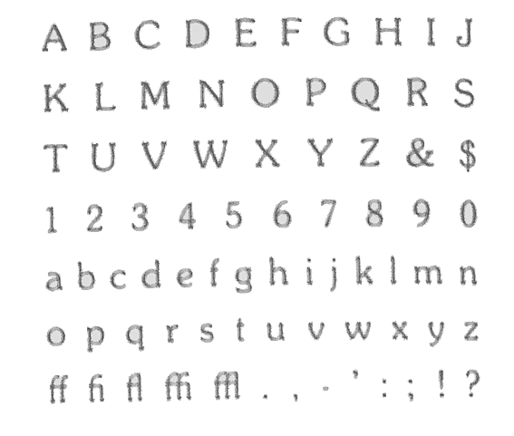
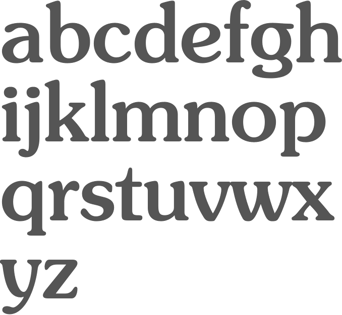
Souvenir was designed by Morris Fuller Benton in 1914 and appeared in the famous ATF catalog in 1924. It has a cuddly roundish look---which was fashionable in the 1920s era of Cooper Black and Goudy Heavyface---and became very popular in the seventies when Ed Benguiat published ITC Souvenir, after he had earlier modeled his photo typefaces Souvenir Graphic and Souvenir Balloon after Benton's Souvenir. Mac McGrew writes in his American Metal Typefaces of the Twentieth Century: Souvenir was designed by Morris F. Benton in 1914 for ATF. It is an early typeface to feature rounded serifs and a soft, rubbery look. There is only slight contrast between thick and thin strokes, and the general weight is light. In development the working title was Round Roman. Being made in only one weight, with no italic and a limited range of sizes, Souvenir achieved little popularity. With the advent of phototypesetting, two versions of matching heavier weights were made for that medium. One of these, drawn by Ed Benguiat. New York lettering artist, achieved such popularity that it was later cut on matrices for use on Linotype, by Matrotype in England, in regular and demi- bold weights with matching italics. This is one of very few instances of a phototype typeface being cut in metal. However, the success of the phototype versions prompted ATF to reissue the typeface for a short time in 1972, and some secondary sources have cast fonts of separate type from the Matrotype matrices. Paul Hunt adds in 2005: Souvenir was strongly influenced by Schelter-Antiqua and Tauchnitz-Antiqua (1906) from J.G. Schelter & Giesecke, a leading German type foundry in Leipzig. They have many distinctive features, such as the open-bottom lowercase 'g', the narrowed top aperture of the uppercase 'U', and the convex diagonals of the A that mark them as the source for Souvenir. Schelter & Giesecke had launched Schelter-Antiqua as their own original in-house design with very elaborate and beautiful specimens, an essay on its features, and a warning that they had protected it under German law (gesetzlich geschuetzt). It was intended as a very serious contender in the legibility stakes and the Schelter & Giesecke specimen contains a fascinating 4-page article on it. There is much emphasis on the care put into avoiding over-fine hairlines and achieving good spacing. Adobe writes that Benton's typeface was influenced both by Schelter-Antiqua and Schelter-Kursiv from Schelter & Giesecke. Schelter in turn is a Jugendstil-influenced hybrid of blackletter and roman. Links to digital implementations
|
EXTERNAL LINKS |
| | |

file name: Morris Fuller Benton Souvenir 1916
file name: Morris Fuller Benton Souvenir 1916b
file name: Morris Fuller Benton Souvenir 1916c
file name: Ed Benguiat I T C Souvenir Medium 1977 after Morris Fuller Benton 1914
file name: Ed Benguiat I T C Souvenir 1970s

file name: Ed Benguiat I T C Souvenir Bold 1970s
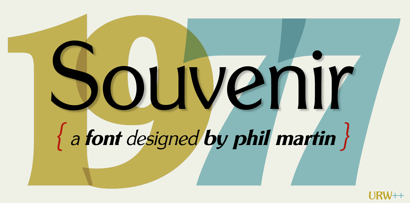
file name: Phil Martin Souvenir Gothic U R W 1977
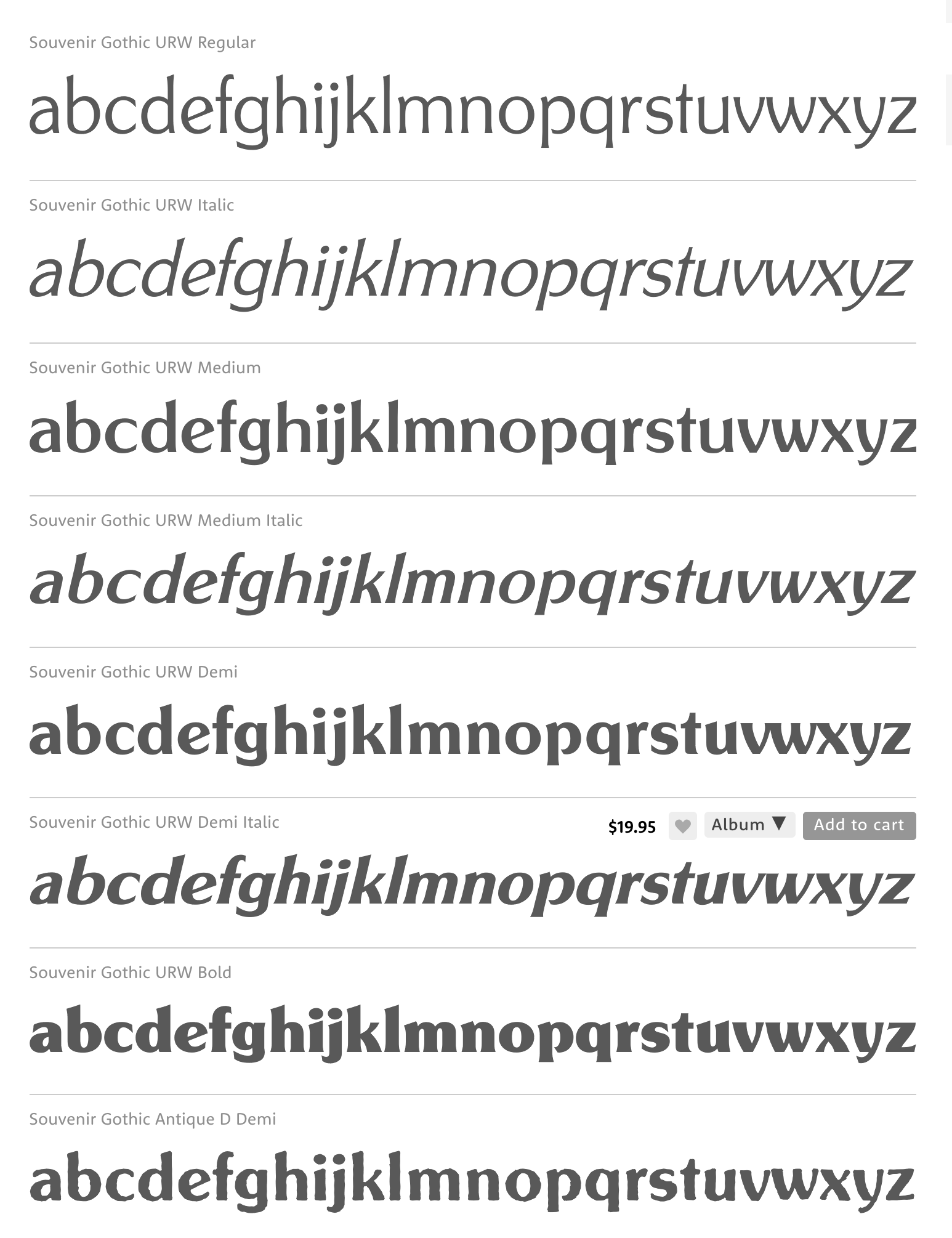
file name: Phil Martin Souvenir Gothic U R W 1977a
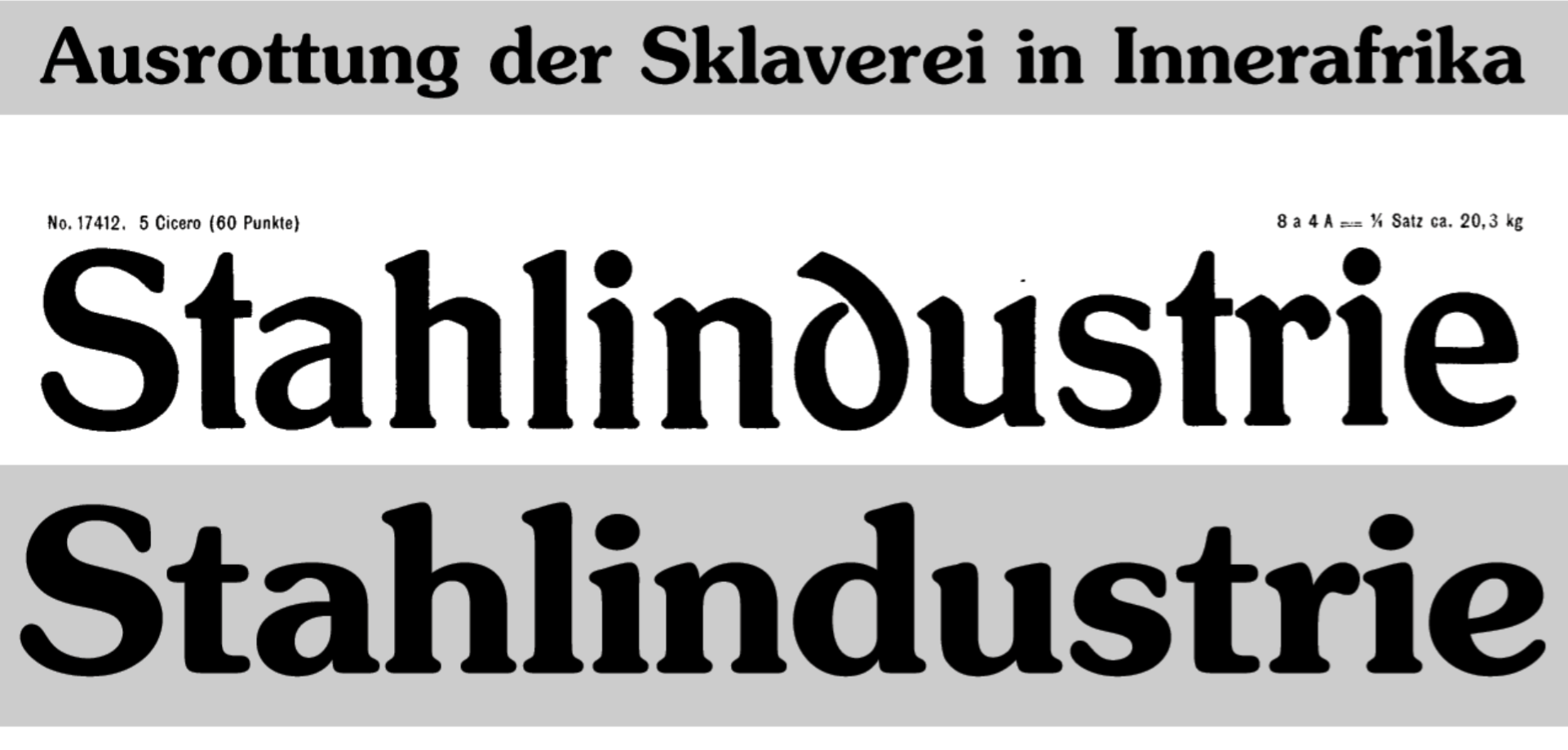
file name: Schelter Giesecke Schelter Antiqua 1906
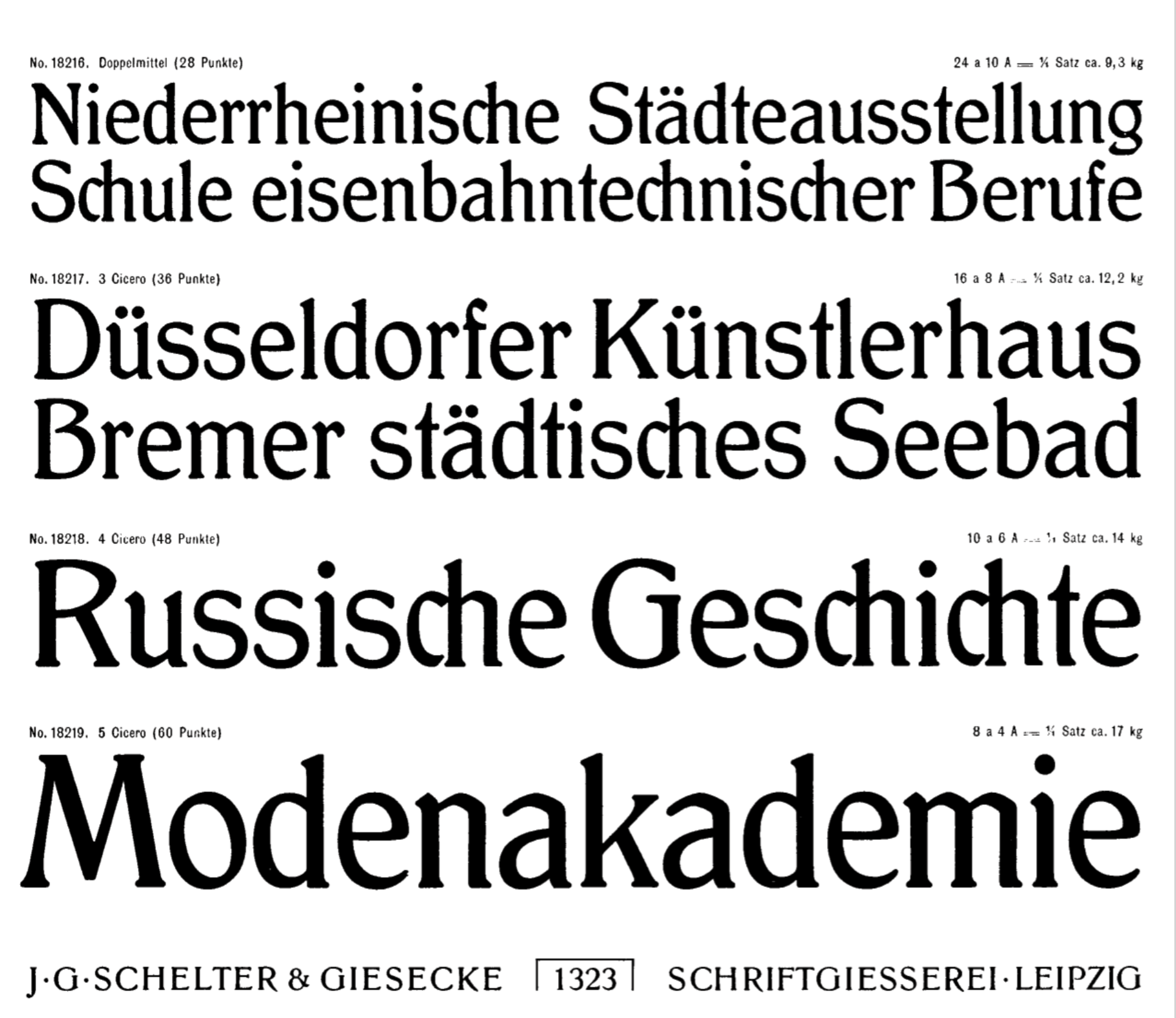
file name: Schelter Giesecke Schelter Antiqua 1906
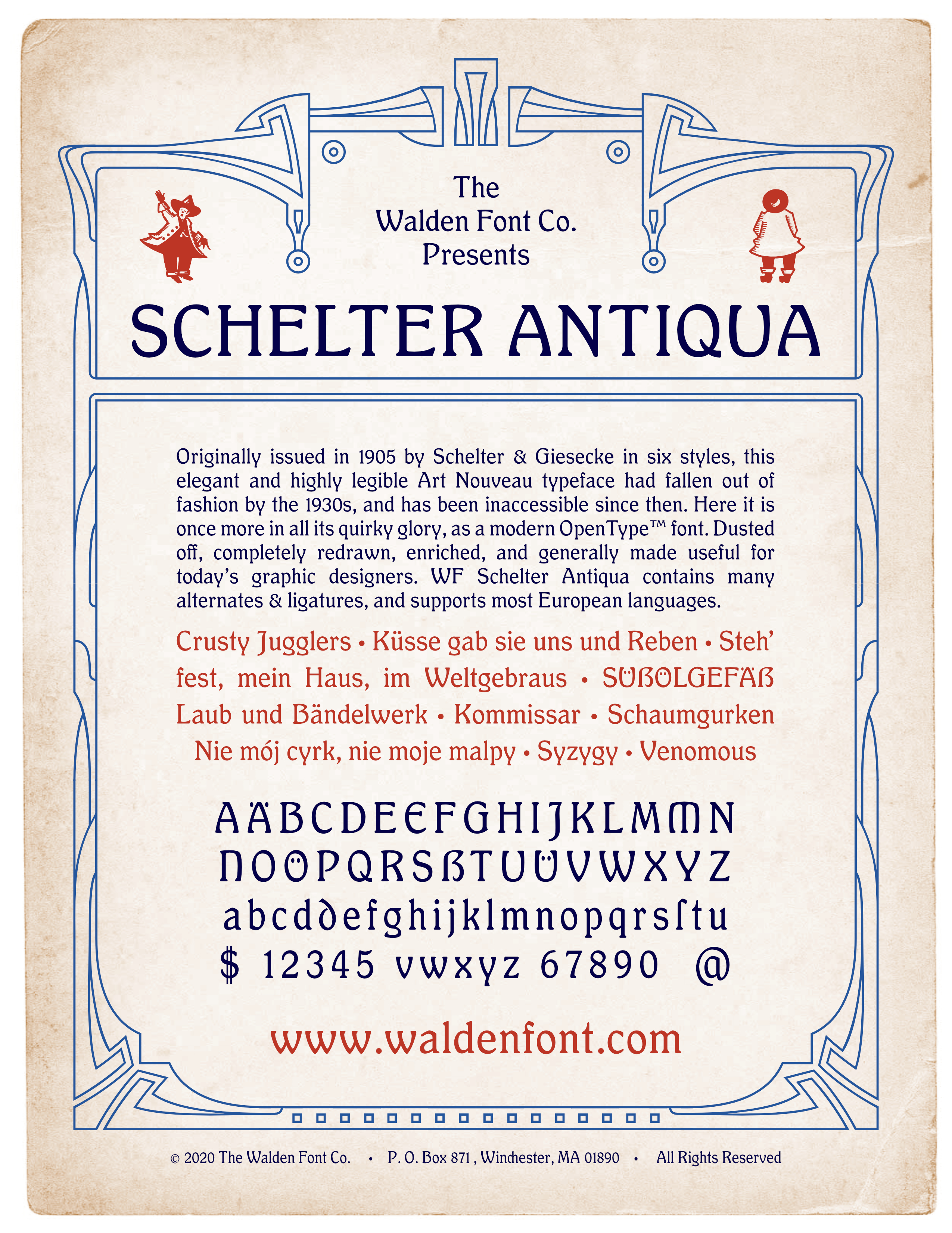
file name: Walden Font W F Schelter Antiqua 2020 after Schelter Giesecke Schelter Antiqua 1906
file name: Schelter Giesecke Schelter Kursiv 1906
| | |
|
Luc Devroye ⦿ School of Computer Science ⦿ McGill University Montreal, Canada H3A 2K6 ⦿ lucdevroye@gmail.com ⦿ https://luc.devroye.org ⦿ https://luc.devroye.org/fonts.html |