TYPE DESIGN INFORMATION PAGE last updated on Sat Jun 22 22:11:09 EDT 2024
FONT RECOGNITION VIA FONT MOOSE

|
|
|
|
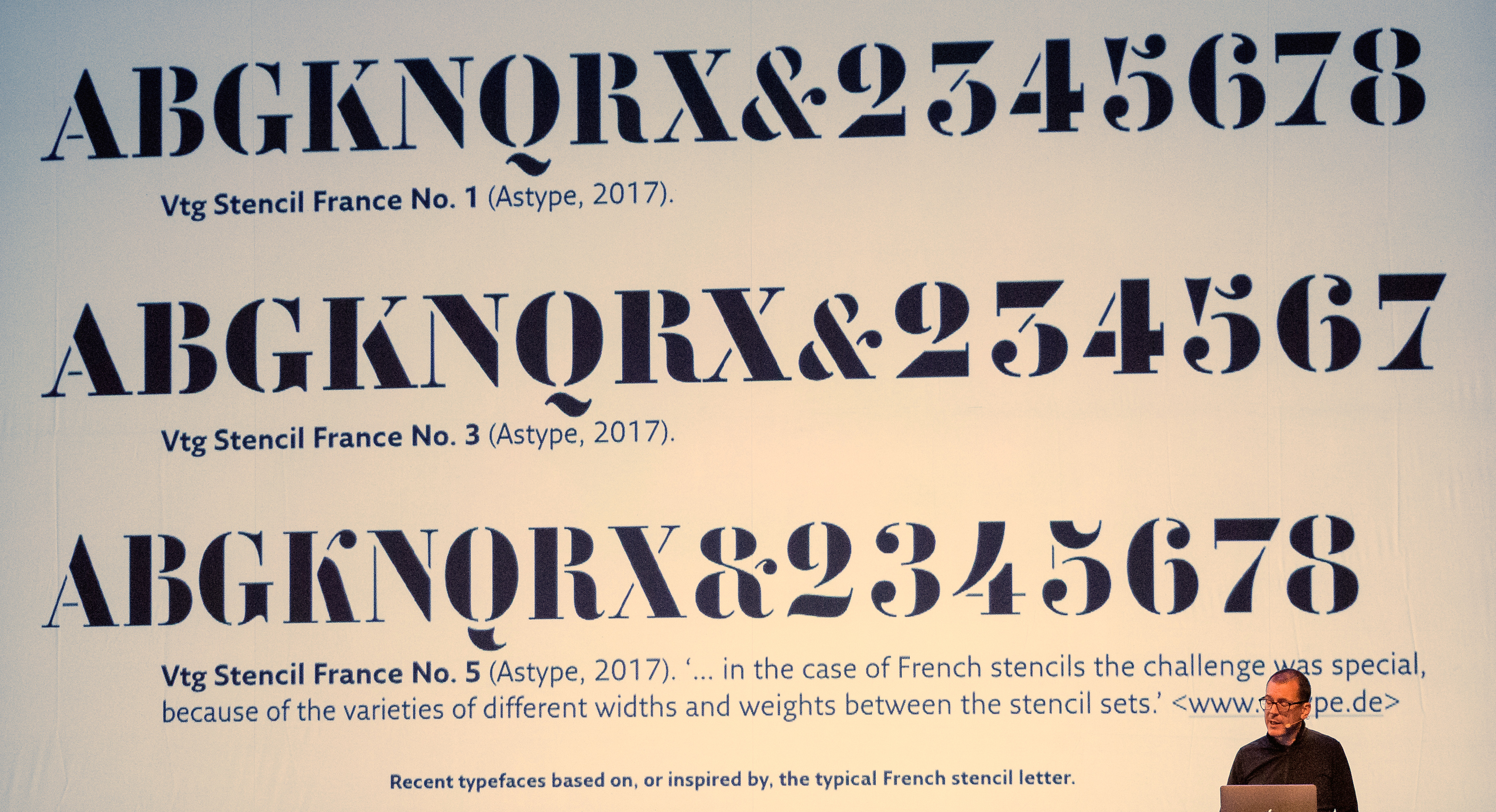
Futura Black circa 1860
[Eric Kindel]
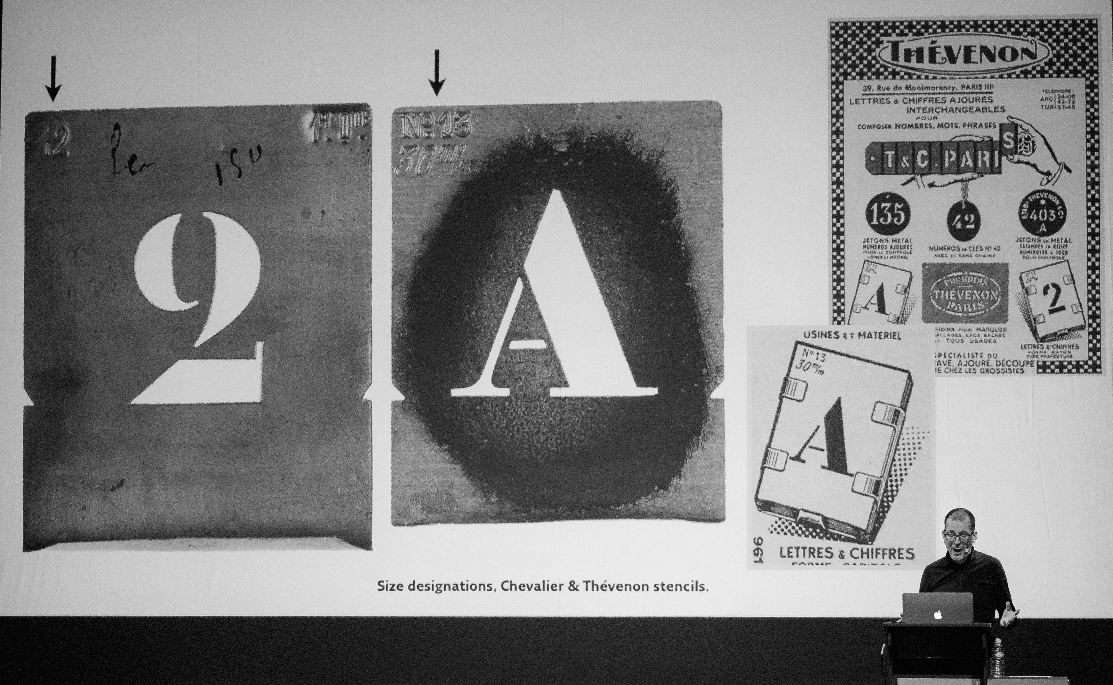
This provocative title is used by type historian Eric Kindel for his presentation at ATypI 2013 in Amsterdam. His research is captured in the abstract, which is reproduced verbatim below. Futura Black, Braggadocio, Transito, Schablone. These typefaces, variously constructed of squares, triangles and circle segments, are blunt and counterpunctual. They are a consolidation of letters (and numbers) that emerged in the work of early European modernists, among them De Souza Cardoso, Léger, Hoerle, Arntz, Berlewi, Lissitsky, Schmidt, Albers and Moholy-Nagy. The Dutch, too, found such letters to their liking: Van der Leck at first, then Sandberg, Elffers, Schrofer, Bons and many others. The letters are emblematic of the first machine age and it impulse to build from or reduce to simple geometric elements. They seem mechanistic but are not obviously made by any specific tool or machine. This presentation will trace this most modernist of letters to its mechanical origins. The trail will lead to the northeastern United States where, in the middle decades of the 19th century, a group of inventor-makers devised letters of this kind for very practical reasons. Their aim was quick and easy stencil cutting. To achieve this, stencil letter punches seemed like a good idea---and so they invented them. When it came to their manufacture, the punches acquired striking features: forms stripped of all vulnerable detail, cut with grinding wheels, hack saws and files, built to withstand relentless hammer blows, driving them through brass into hard wood. Letterform conventions were followed but only so far as manufacture and use would allow. The results were odd, perhaps ugly, but certainly purposeful. In addition to reviewing the idiosyncratic form and manufacture of these letters, the presentation will offer brief profiles of their almost unknown inventor-makers. A range of artefacts associated with stencil letter punches will be illustrated, including stencil-making outfits advertised and sold in the US after 1860, which were bought by enterprising individuals in search of a trade. Requiring only a modest outlay, some initiative and perhaps a decent pair of boots, many purchasers became canvassing stencil cutters, armed with a license, an account book and a small catalogue of designs to tempt the public. The presentation will follow the evolution of stencil letter punches through the later 19th century and into the 20th, when their letters were reborn into a bright modernist world. |
EXTERNAL LINKS |
| | |
file name: Eric Kindel A Typ I2018 photo by Michael Bundscherer
file name: Eric Kindel A Typ I2018 photo by Michael Bundscherer
file name: Eric Kindel A Typ I2018 photo by Michael Bundscherer
file name: Eric Kindel Chevalier Thevenon Stencils A Typ I2018 photo by Michael Bundscherer

file name: Eric Kindel Pic
| | |
|
Luc Devroye ⦿ School of Computer Science ⦿ McGill University Montreal, Canada H3A 2K6 ⦿ lucdevroye@gmail.com ⦿ http://luc.devroye.org ⦿ http://luc.devroye.org/fonts.html |