TYPE DESIGN INFORMATION PAGE last updated on Wed May 6 16:23:33 EDT 2026
FONT RECOGNITION VIA FONT MOOSE

|
|
|
|
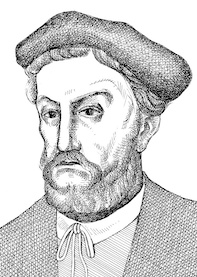
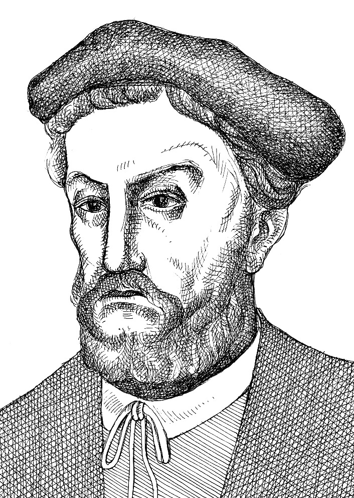
Miklós Tótfalusi Kis
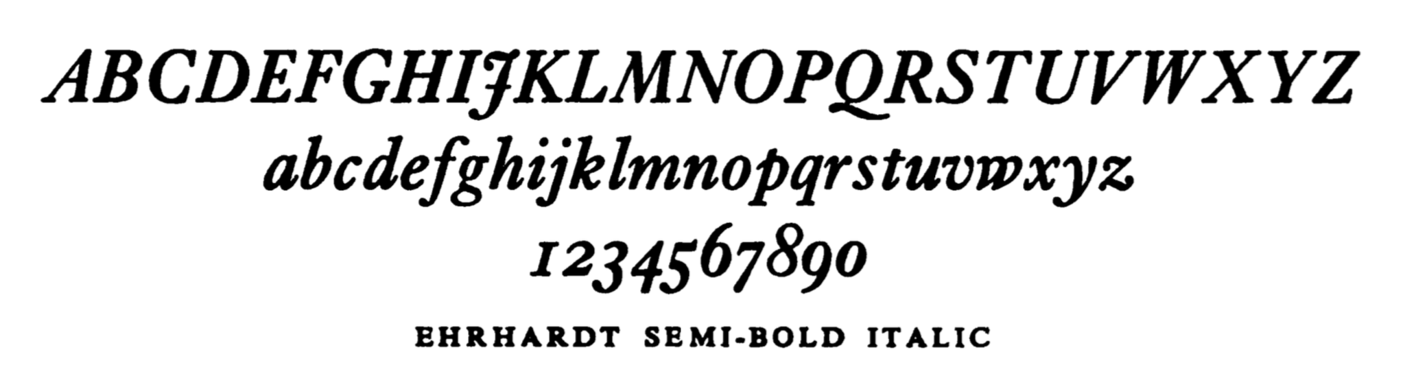
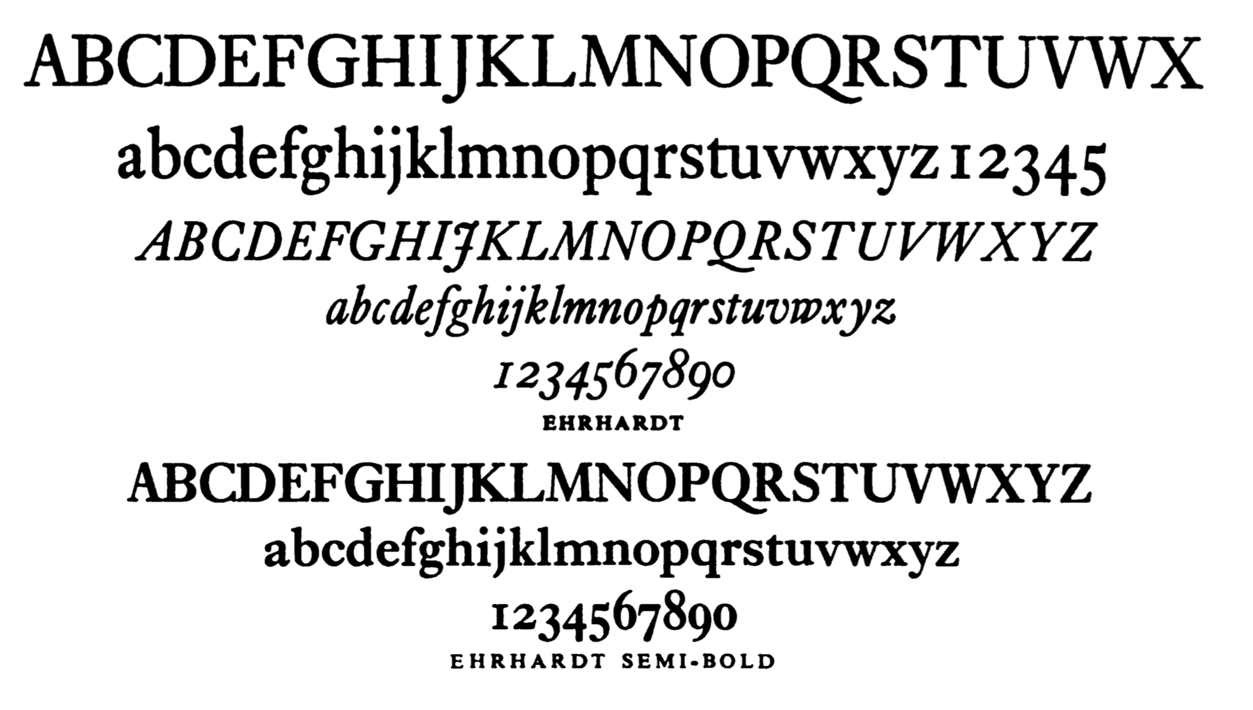
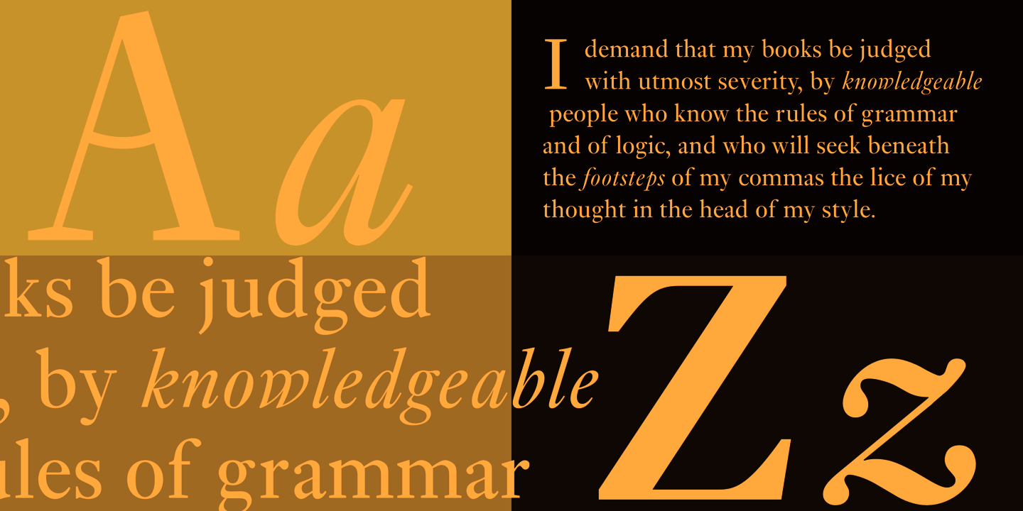
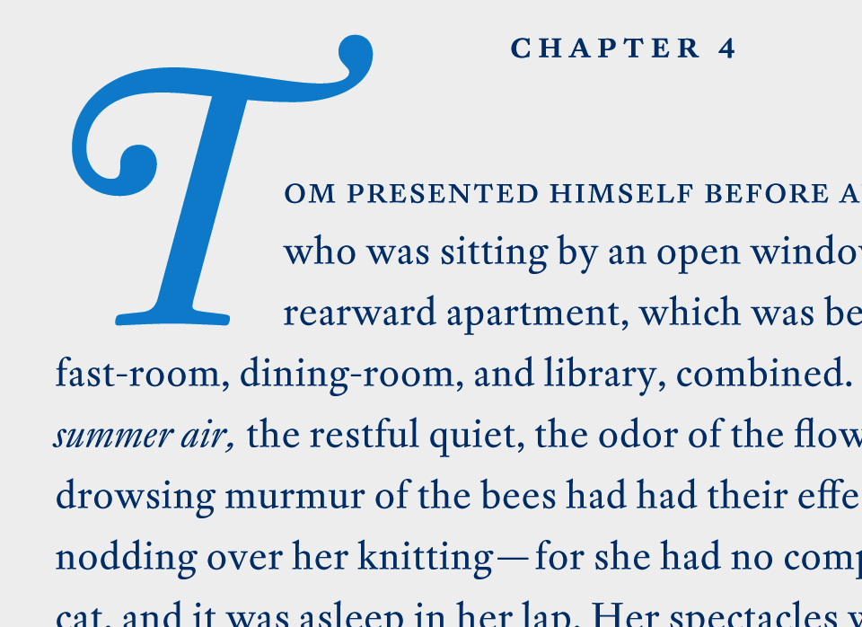
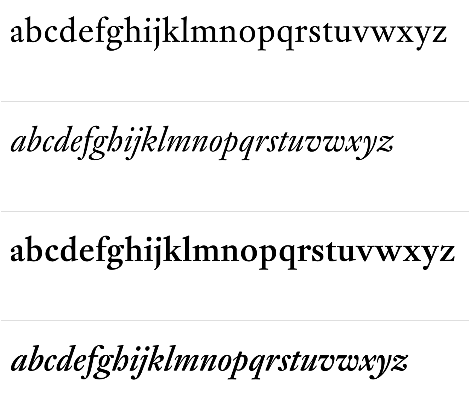
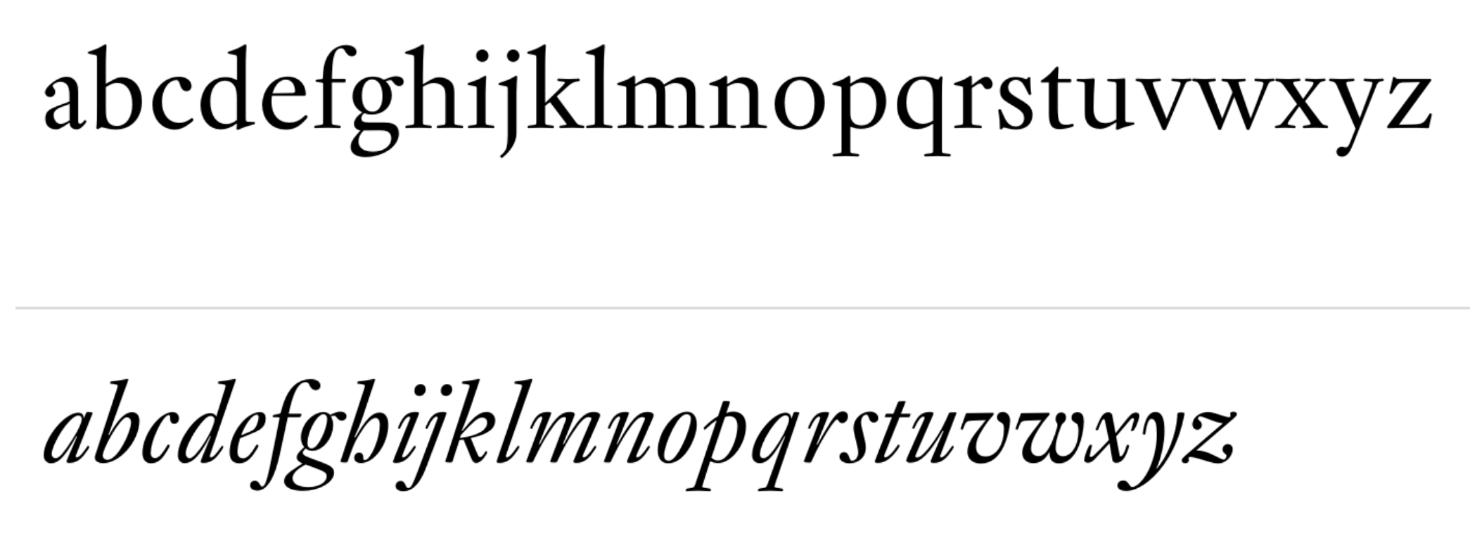
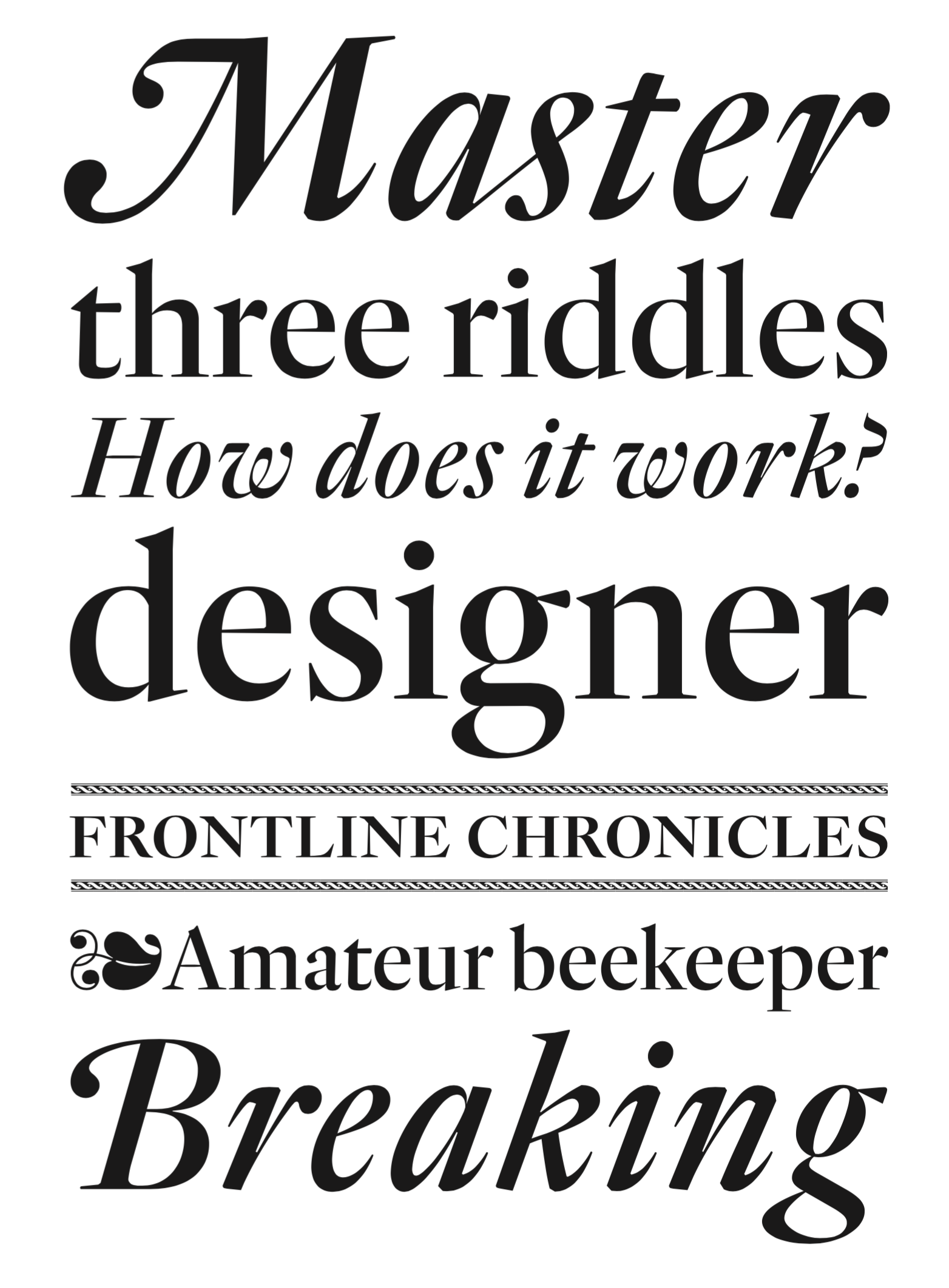
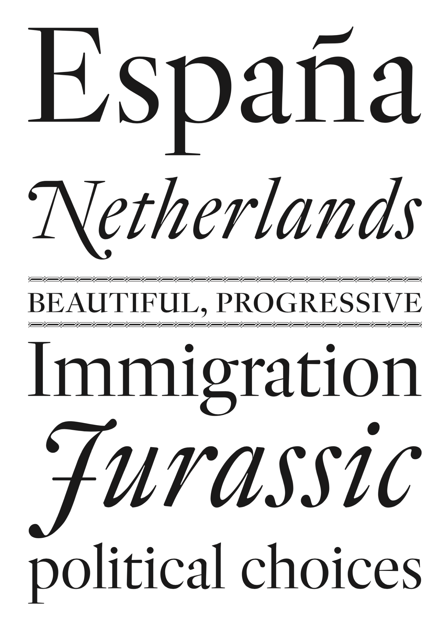
Miklós Tótfalusi Kis (Nicholas Kis) was born in Misztótfalu, Hungary, in 1650. He left for Amsterdam in 1680, where he worked on la Biblia Hungara (1685), Book of Hymns of San David (1686), and the New Testament (1687). He also published many books for children. Taught there by Dirk Voskens, he made what is now known as Janson Text around 1690. Around 1690, he made an elegant face, Nikis. He died in 1702. The story of Kis's types, now also known as Dutch types, is eloquently told by Daidala based on research by Bringhurst, Lawson, Morrison and Carter. Types influenced by him include Stempel Janson (1937, based on his original matrices), Mergenthaler Linotype Janson (1954, by Hermann Zapf; digitized in 1985), Monotype Ehrhardt (1938, named after the Ehrhardt foundry in Leipzig, where in the early 1700s his types were found), Nikis (finished by Hell Design Studio (now Linotype); see Nikis EF) and Adobe's Janson Text (based on the original matrices as well). The name Janson comes from Anton Janson, a Dutch typographer who worked in Leipzig. Janson was incorrectly credited with the designs of Kis's typefaces. Note: since 1919, Kis's original matrices are in the hands of Stempel. John Tranter recalls the Kis/Janson affair: In his book On Type Faces, published in 1923, the great typographic historian Stanley Morison describes a roman and italic typeface that he said was cut by Anton Janson, a seventeenth-century Dutch type foundry owner. By the 1920s the typeface had fallen into disuse, and when it was revived for the modern age on both Linotype and Monotype machines in 1937, it was named 'Janson' after its presumed designer. Even the German Stempel foundry, who owned the original 'Janson' punches and matrices from the 1600s, called it by that name. The typeface became more and more widely used. Robert Bringhurst (a poet as well as a typographer) refers to it as a wonderfully toothy and compact Baroque type. In the United States it is now the third most popular typeface for book composition, according to its frequency of appearance in the 'Fifty Books of the Year' annual exhibition organised by the American Institute of Graphic Arts. In 1939 Stanley Morison uncovered the embarrassing fact that the typeface had not been cut by Janson, but even he was unable to put his finger on the designer. It was not until the 1950s that Harry Carter and George Buday discovered that the man who had designed the type was a Transylvanian Hungarian named Nicholas (or Miklós) Kis, born in 1650. Kis took religious orders and became a teacher, and eventually decided to visit Holland and study typography, as those skills were needed in Hungary. He turned out to be very gifted at punchcutting, the shaping of metal type, and became so famous in his own time that Cosimo de Medici, the Grand Duke of Tuscany, offered him a position at his court. Kis declined the offer, and returned to Hungary in 1690, determined to spend the rest of his life designing and printing bibles. It was a time of religious and political upheaval in Hungary. The social turmoil, together with personal enmities, shortened his life, and Kis died in 1702, an embittered man. His reputation had to wait 250 years for proper recognition; and such is the conservative nature of the world of type that the typeface he created is still called 'Janson'. Detlef Schäfer writes in 1989 in his book Fotosatzschriften: No other printing type has ever generated as far-reaching a controversy as this typeface which Jan Tschichold called the most beautiful of all the old Antiqua types. For a long time, it was thought to have been designed by Anton Janson. In 1720 a large number of the original types were displayed in the catalog of the Ehrhardische Gycery (Ehrhardt Type foundry) in Leipzig. Recently, thanks to the research performed by Beatrice Warde and especially György Haiman, it has been proven unambiguously that the originator of this typeface was Miklós (Nicholas) Tótfalusi Kis (pronounced Kisch) who was born in 1650 in the Hungarian town of Tótfal. His calvinistic church had sent him to the Netherlands to oversee the printing of a Hungarian language bible. He studied printing and punch cutting and earned special recognition for his Armenian and Hebrew types. Upon his return to Hungary, an emergency situation forced him to sell several of his matrice sets to the Ehrhardt Type foundry in Leipzig. In Hungary he printed from his own typefaces, but religious tensions arose between him and one of his church elders. He died at an early age in 1702. The significant characteristics of the Dutch Antiqua by Kis are the larger body size, relatively small lower case letters and strong upper case letters, which show clearly defined contrasts in the stroke widths. The Kis Antiqua is less elegant than the Garamond, rather somewhat austere in a calvinistic way, but its expression is unique and full of tension. The upper and lower case serifs are only slightly concave, and the upper case O as well as the lower case o have, for the first time, a vertical axis. In the replica, sensitively and respectfully (responsibly) drawn by Hildegard Korger, these characteristics of this pleasantly readable and beautiful face have been well met. For Typoart it was clear that this typeface has to appear under its only true name Kis Antiqua. It will be used primarily in book design. Adobe writes that the model for Janson Text was mistakenly attributed to the Dutch printer Anton Janson. Bitstream explains: His types, the original matrices for which were obtained by Stempel in 1919, were revived for hot metal as Janson by C.H. Griffith for Mergenthaler Linotype (1937), and as Janson and Ehrhardt (1937) from Monotype. Good digitizations exist of Monotype Ehrhardt. Digitizations of Kis / Janson:
Bio by Nicholas Fabian. View the Janson / Kis typefaces at MyFonts. |
EXTERNAL LINKS |
| | |


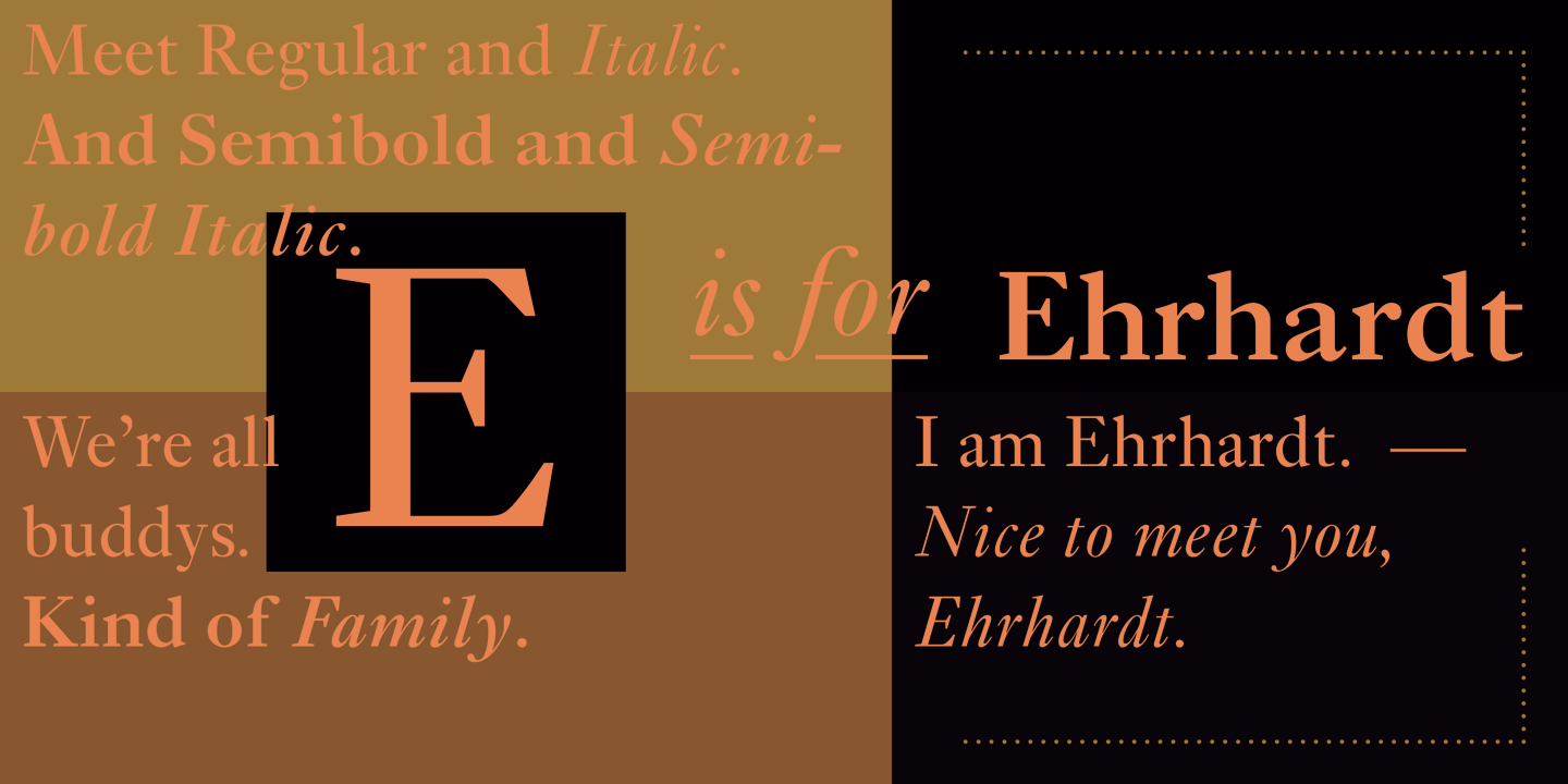
file name: Adobe Ehrhardt 2000 88231

file name: Adobe Ehrhardt 2000
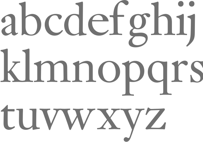
file name: Monotype Ehrhardt 1938
file name: Monotype Ehrhardt 1938
file name: Monotype Ehrhardt 2002 123156
file name: Monotype Ehrhardt 2002 123157

file name: Monotype Ehrhardt 2002
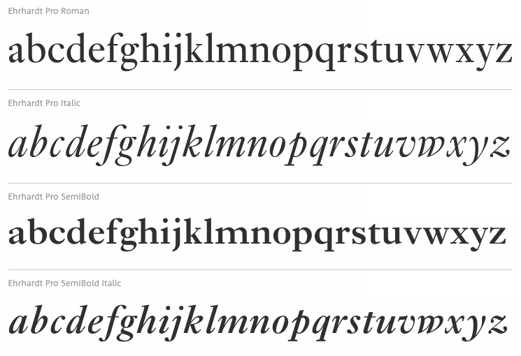
file name: Monotype Erhardt M T Pro 1991 2002
file name: Monotype Erhardt M T Semi Bold Pro 1991 2002
file name: Monotype Erhardt M T Semi Bold Pro 1991 2002b

file name: Monotype Erhardt M T Semi Bold Pro 1991 2002c
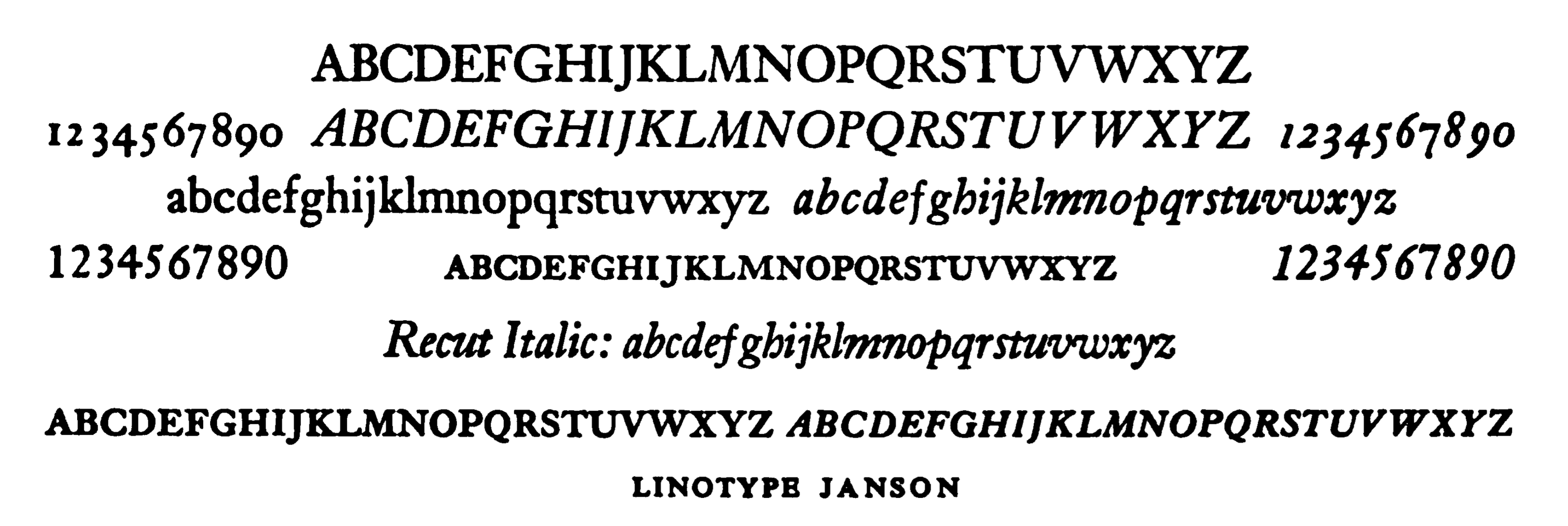
file name: Linotype Janson
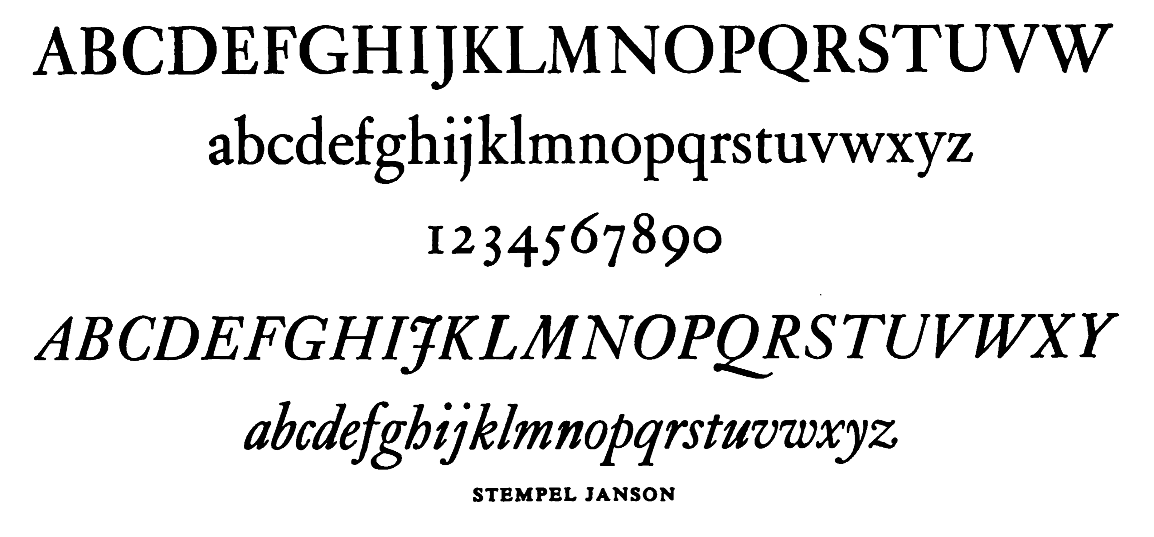
file name: Stempel Janson
file name: Linotype janson Text55 Roman 1985
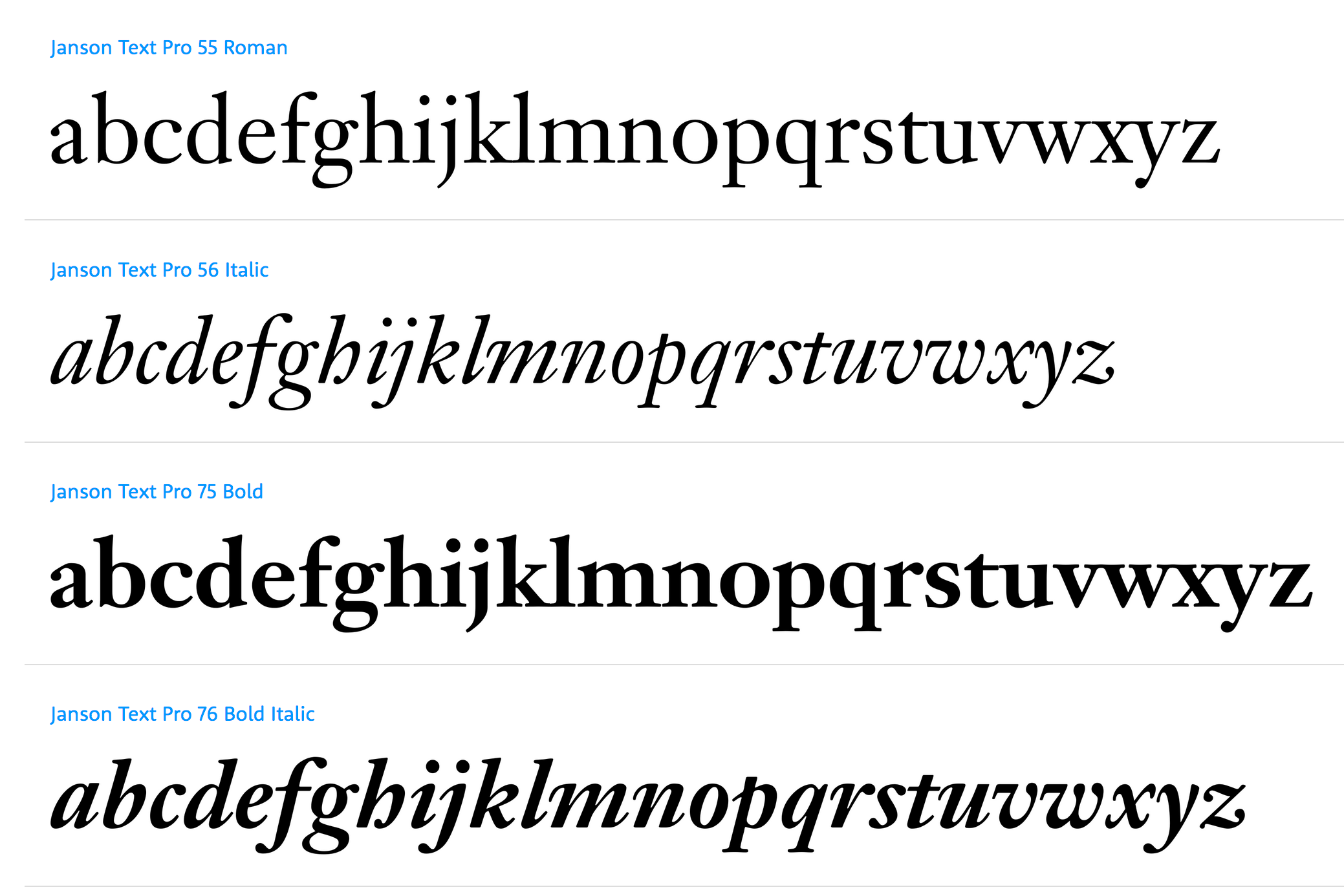
file name: Linotype Janson Text
file name: Elsner Flake Kis Antiqua Now T B Pro 2019 300171 002
file name: Elsner Flake Kis Antiqua Now T B Pro 2019 300172
file name: Elsner Flake Kis Antiqua Now T B Pro 2019 300173 002

file name: Elsner Flake Kis Antiqua Now T B Pro 2019 300174 002

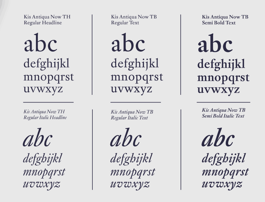
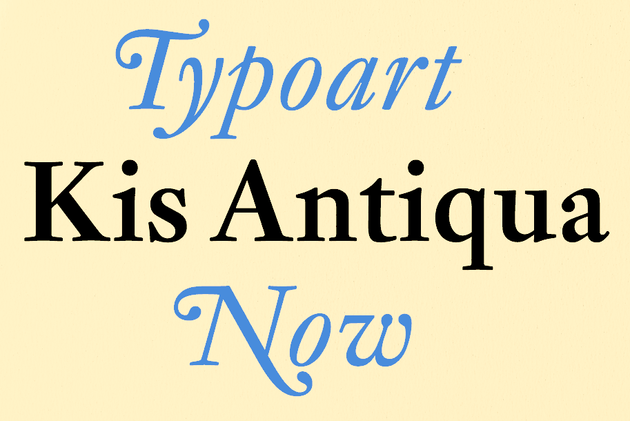
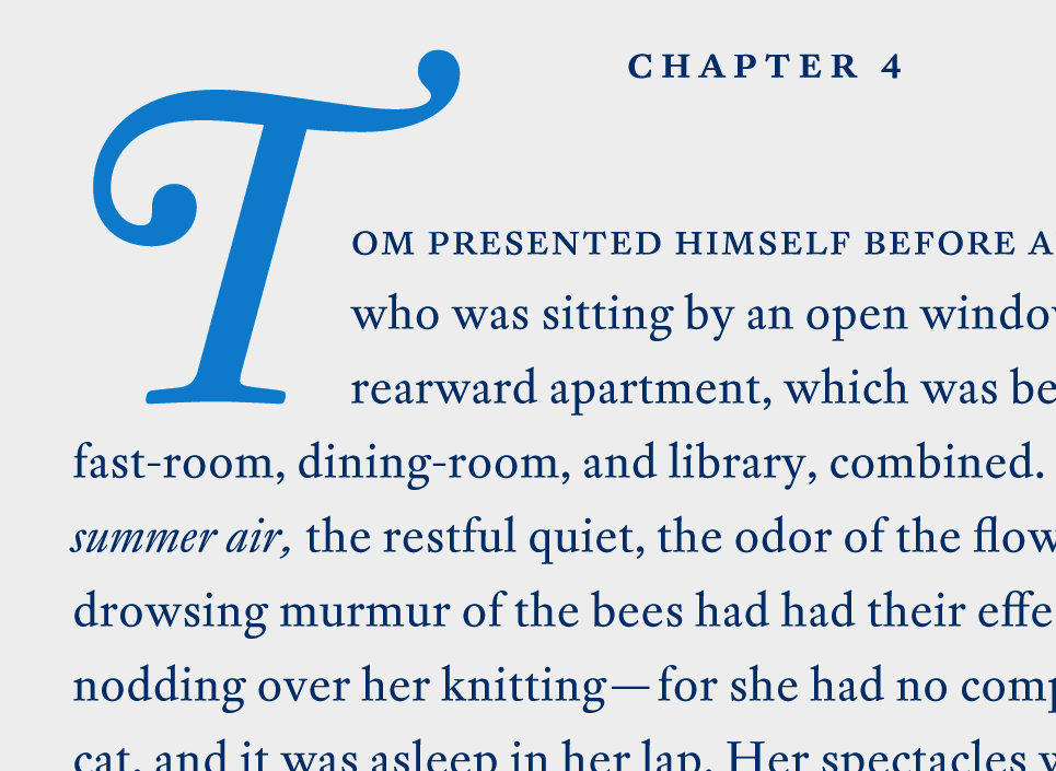
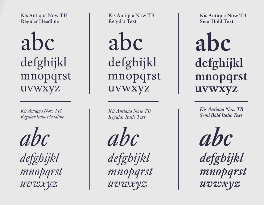
file name: Elsner Flake Kis Antiqua Now T B Pro 2019
file name: Elsner Flake Kis Antiqua Now T H Pro 2019 300146 002
file name: Elsner Flake Kis Antiqua Now T H Pro 2019 300147 002
file name: Elsner Flake Kis Antiqua Now T H Pro 2019 300148

file name: Elsner Flake Kis Antiqua Now T H Pro 2019
file name: Erhard Kaiser Elsner Flake Kis Antiqua Now T B Pro 2009
file name: Erhard Kaiser Elsner Flake Kis Antiqua Now T H Pro 2009
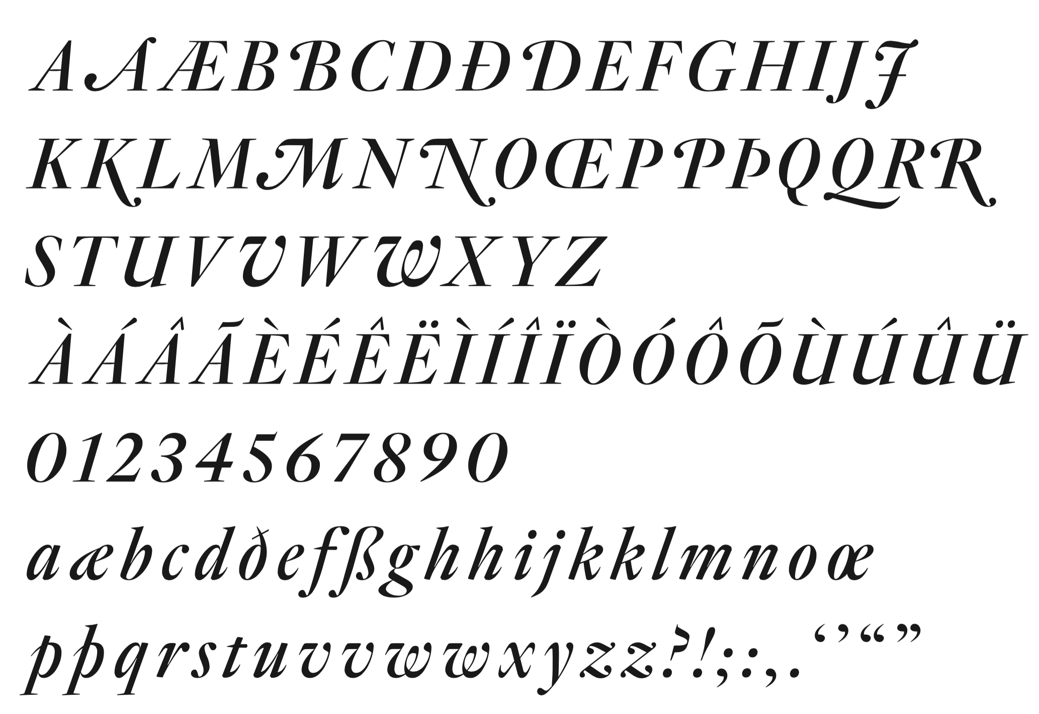
file name: Berthold Kis B Q
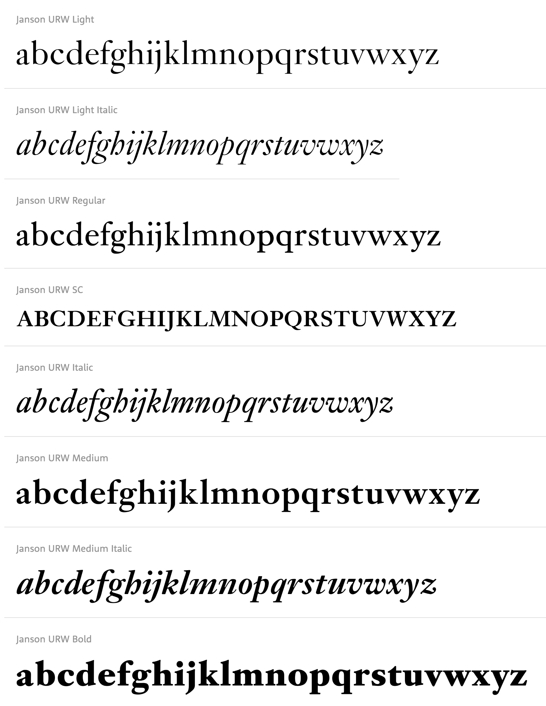
file name: U R W Janson U R W 2001

file name: Ramiro Espinoza Reiher Headline Black Black Italic 2018
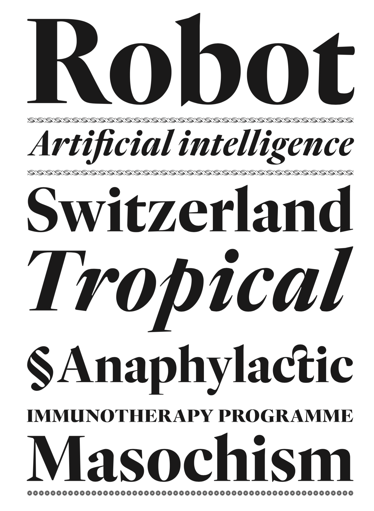
file name: Ramiro Espinoza Reiher Headline Bold Bold Italic 2018
file name: Ramiro Espinoza Reiher Headline Italic 2018
file name: Ramiro Espinoza Reiher Headline Regular Italic 2018
file name: Ramiro Espinoza Reiher Headline Light Light Italic 2018
file name: Miklos Totfalusi Kis Portrait
| | |
|
Luc Devroye ⦿ School of Computer Science ⦿ McGill University Montreal, Canada H3A 2K6 ⦿ lucdevroye@gmail.com ⦿ https://luc.devroye.org ⦿ https://luc.devroye.org/fonts.html |