TYPE DESIGN INFORMATION PAGE last updated on Tue May 5 11:54:13 EDT 2026
FONT RECOGNITION VIA FONT MOOSE
|
|
|
|
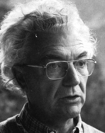
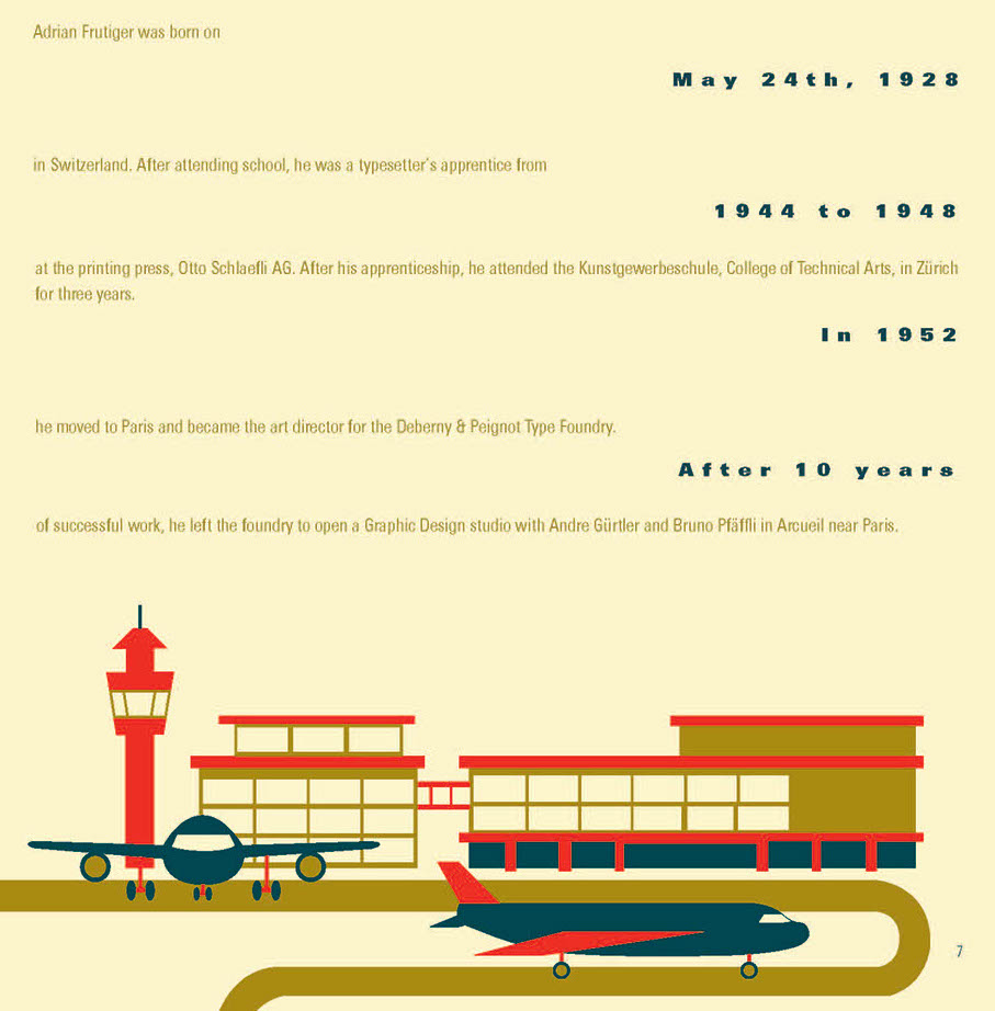
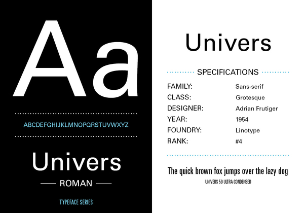
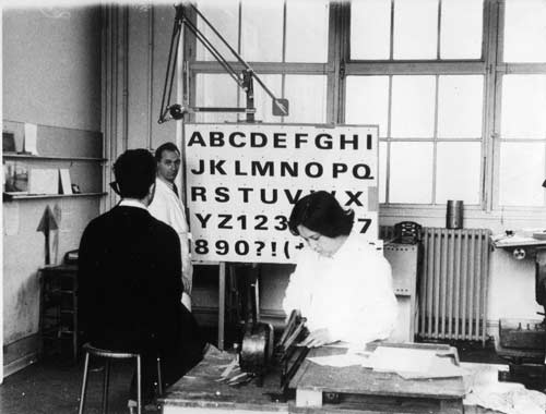
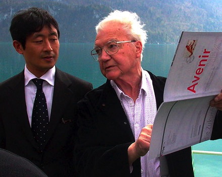
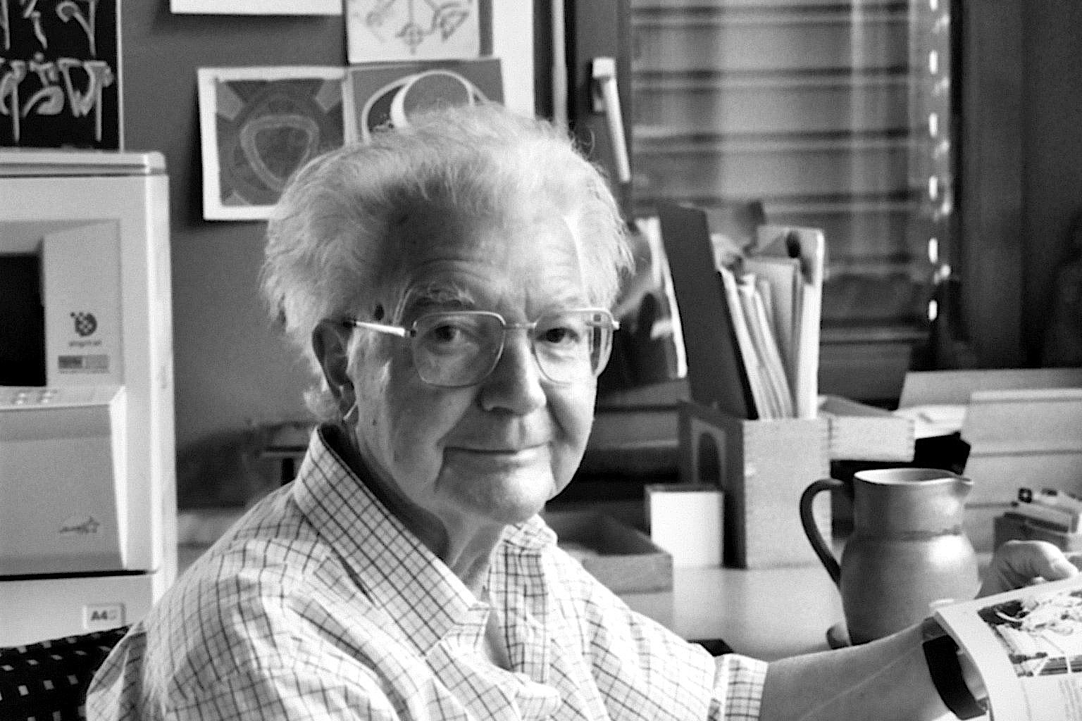
Famous type designer born in 1928 in Unterseen, Switzerland, who died in September 2015. He closely cooperated with Linotype-Hell AG, after having been artistic director at Deberny-Peignot in Paris since 1952. He established his own studio in 1962 with André Gürtler and Bruno Pfaftli. Art director for Editions Hermann, Paris 1957 to 1967. Frutiger lived near Bern, Switzerland, and was very interested in woodcuts. In 2009, Heidrun Osterer and Philipp Stamm coedited Adrian Frutiger Typefaces The Complete Works (Birkhäuser Verlag), a 460-page opus based on conversations with Frutiger himself and on extensive research in France, England, Germany, and Switzerland. Quote: Helvetica is the jeans, and Univers the dinner jacket. Helvetica is here to stay. He designed over 100 fonts. Here is a partial list:
Frutiger's books include Type Sign Symbol and Signs and Symbols. Their Design and Meaning (1989, with Andrew Bluhm, published by Studio Editions, London; Amazon link). Linotype link. FontShop link. Adrian Frutiger, sa carrière française (2008) is Adèle Houssin's graduation thesis at Estienne. Klingspor link. Wikipedia link. View Adrian Frutiger's typefaces. View some digital versions of Avenir. Vimeo movie on Frutiger by Christine Kopp and Christoph Frutiger entitled "Der Mann von Schwarz und weiss: Adrian Frutiger". More Vimeo movies. |
EXTERNAL LINKS |
| | |
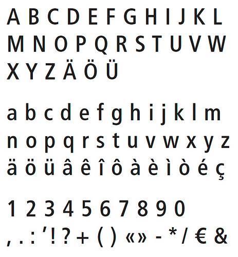
file name: Astra Frutiger Swiss Highways
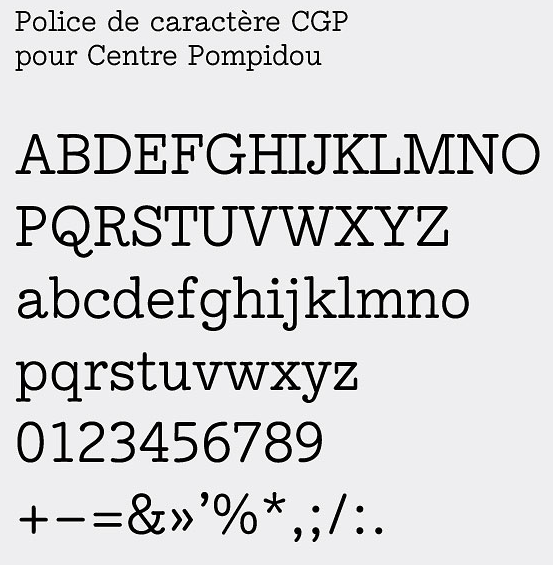
file name: Adrian Frutiger C G P Pompidou

file name: Adrian Frutiger Apollo M T 1964

file name: Adrian Frutiger Avenir Medium
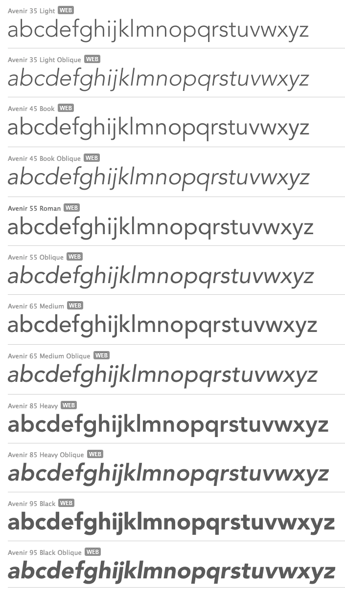
file name: Adrian Frutiger Avenir 1988

file name: Adrian Frutiger Avenir 1988 Poster by William Divineson 2017
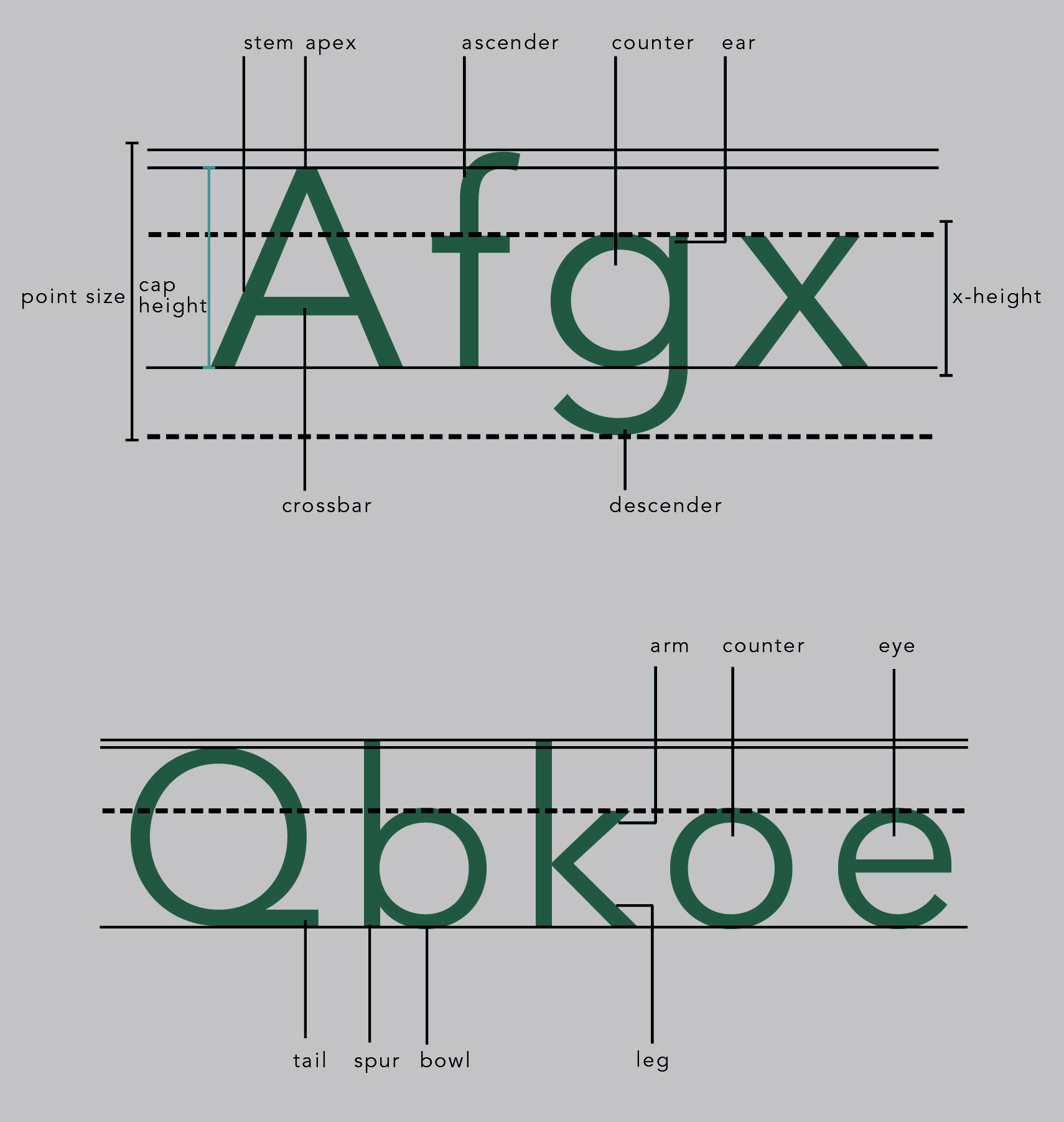
file name: Adrian Frutiger Avenir 1988 Poster by William Divineson 2017b
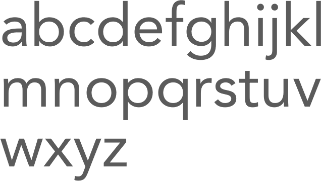
file name: Adrian Frutiger Avenir 1988b
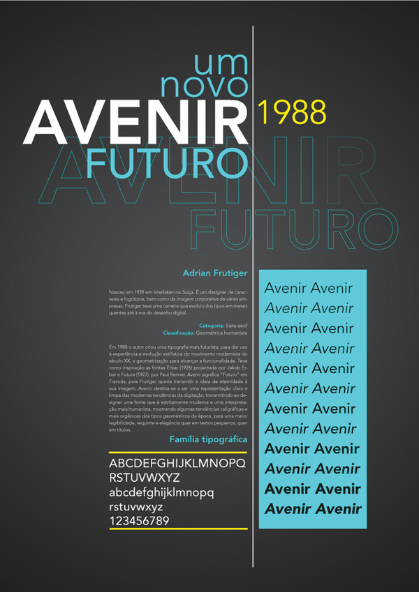
file name: Adrian Frutiger Avenir 1988 poster by Ines Vital 1988

file name: Adrian Frutiger Avenir 1988h

file name: Adrian Frutiger Avenir 1988i
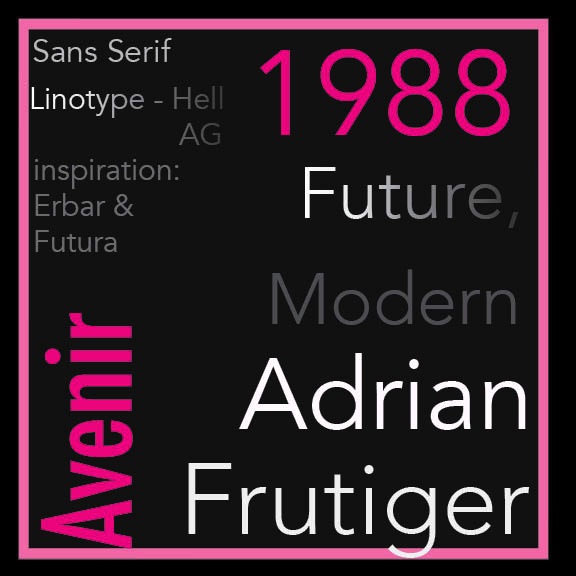
file name: Adrian Frutiger Avenir 1988 Poster by Emalie Mooren 2015
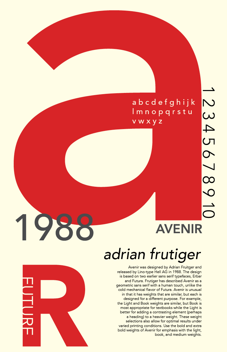
file name: Adrian Frutiger Avenir 1988 poster by Chezkalyn Lopez 2017
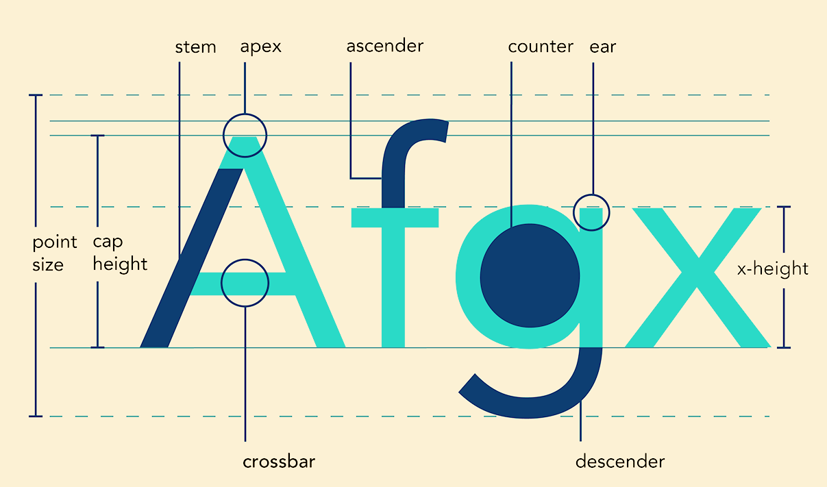
file name: Adrian Frutiger Linotype Avenir 1988 Poster by Vanessa Nguyen 2015
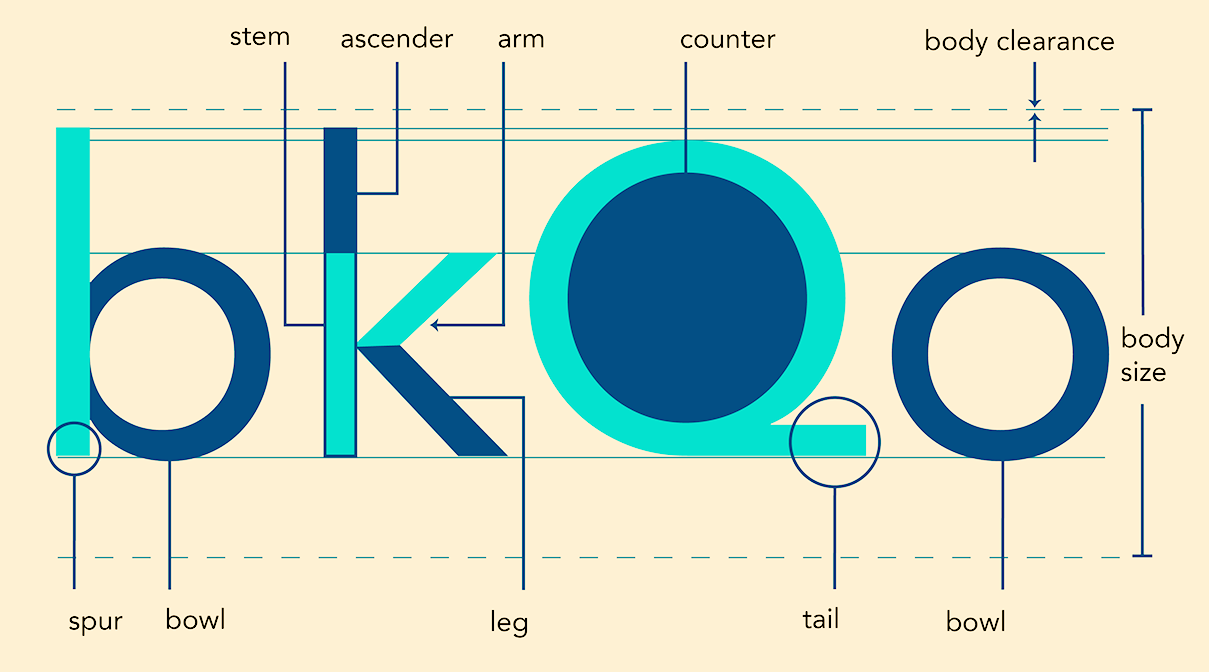
file name: Adrian Frutiger Linotype Avenir 1988 Poster by Vanessa Nguyen 2015b
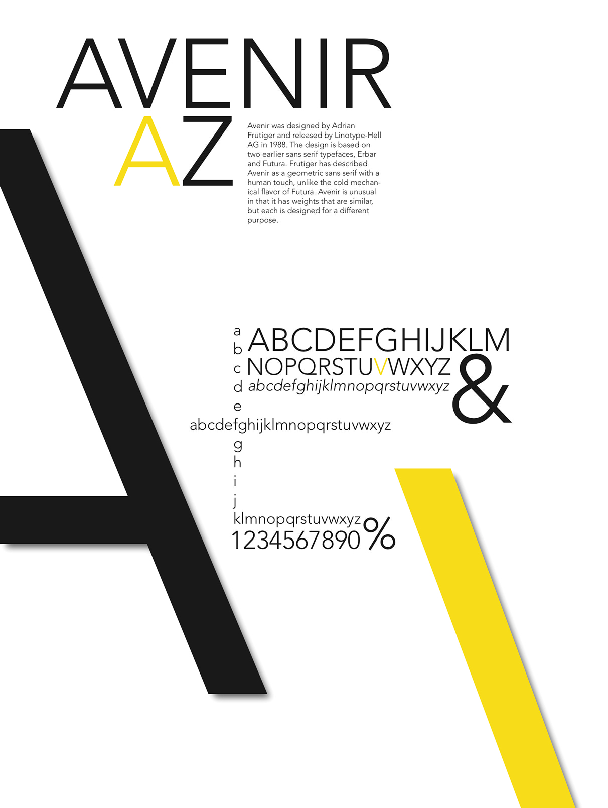
file name: Adrian Frutiger Linotype Avenir 1988 Poster by Brett Jacobsen 2015
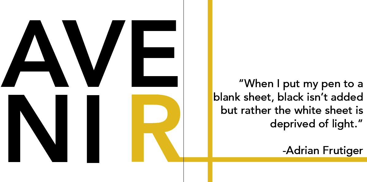
file name: Adrian Frutiger Avenir 1988 Poster by Simone Cotton 2015

file name: Adrian Frutiger Avenir 1988 Poster by Tom Hayes 2016
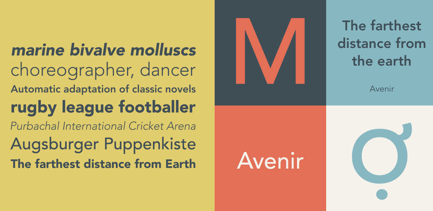
file name: Adrian Frutiger Avenir 1988 198914

file name: Adrian Frutiger Avenir 1988 Poster by Vanessa Venegas 2017
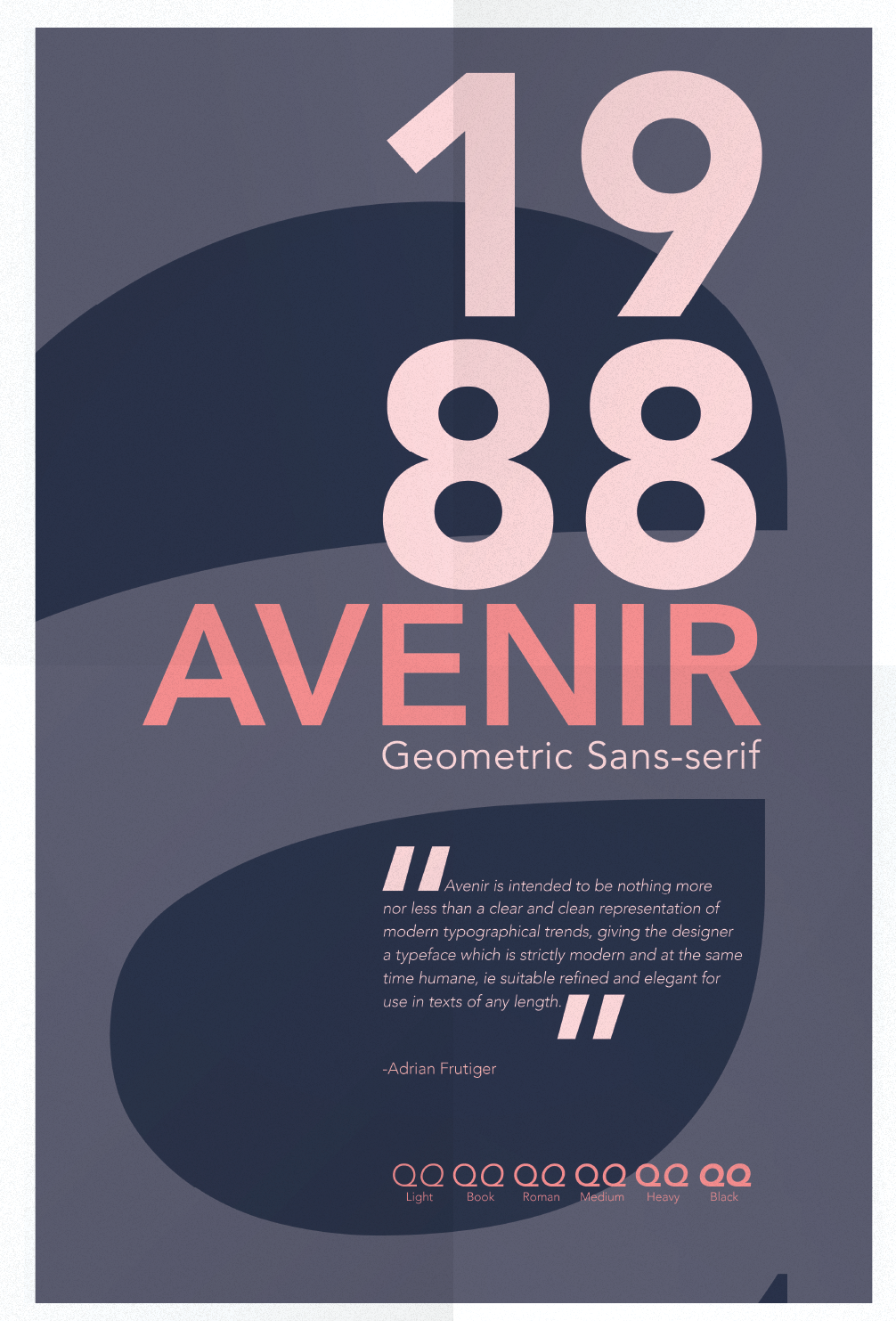
file name: Adrian Frutiger Avenir 1988 Poster by Vanessa Venegas 2017b

file name: Adrian Frutiger Avenir 1988 Poster by Vanessa Venegas 2017c

file name: Adrian Frutiger Avenir 1988 Poster by Martin Lindner 2017

file name: Adrian Frutiger Avenir 1988 poster by Catarina Carvalho 2017

file name: Adrian Frutiger Avenir 1988 Poster by Maria Miguel Pires 2018
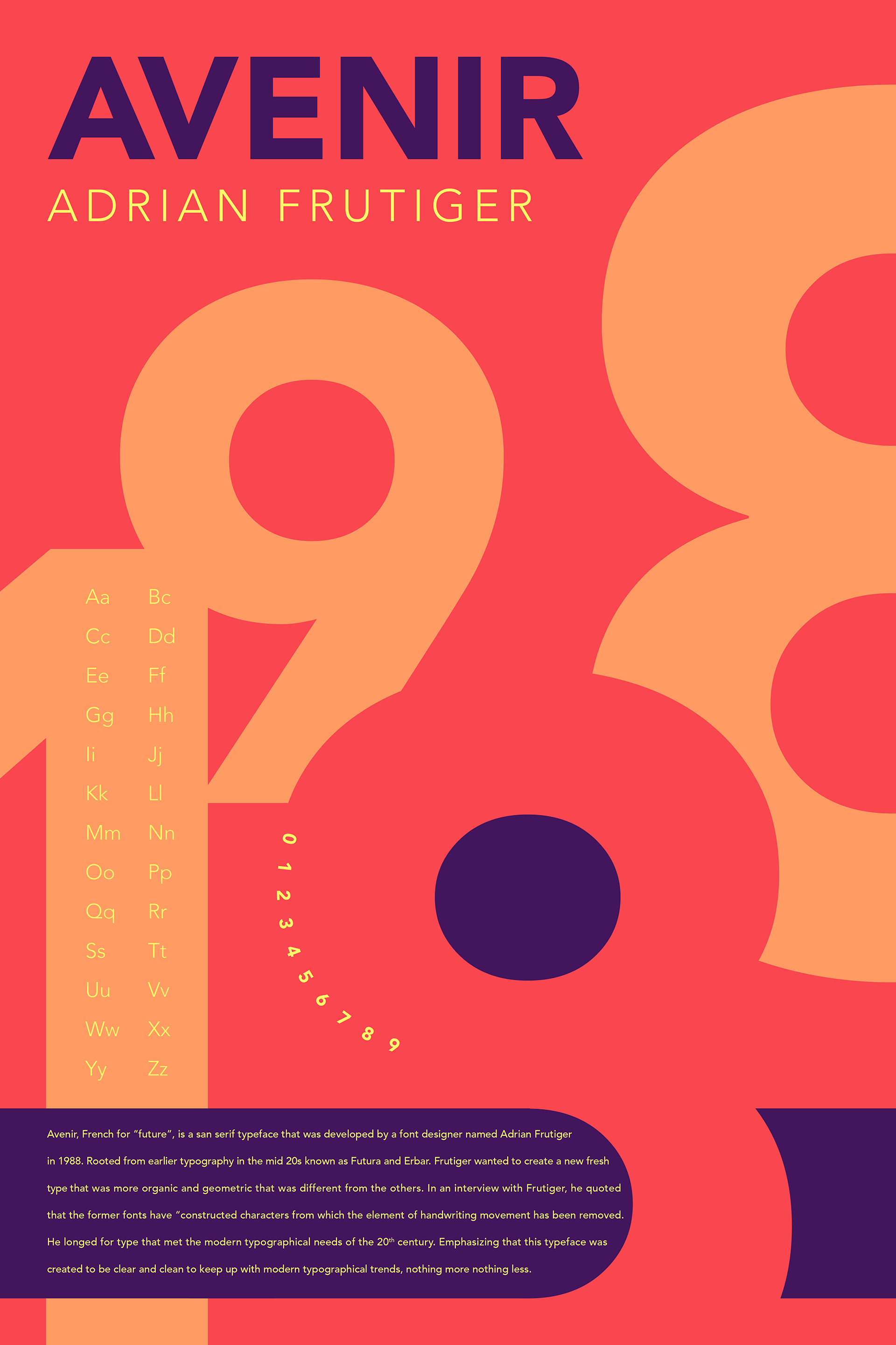
file name: Adrian Frutiger Avenir 1988 Poster by Coleman Geiger 2018
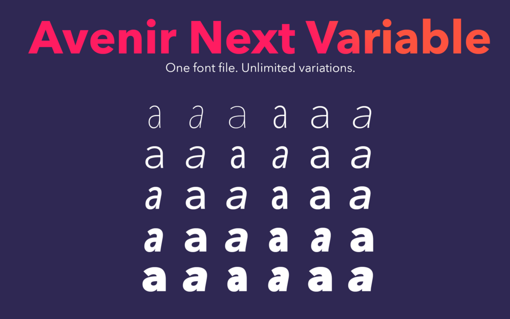
file name: Linotype Avenir Next Variable Set 2019 315809 002
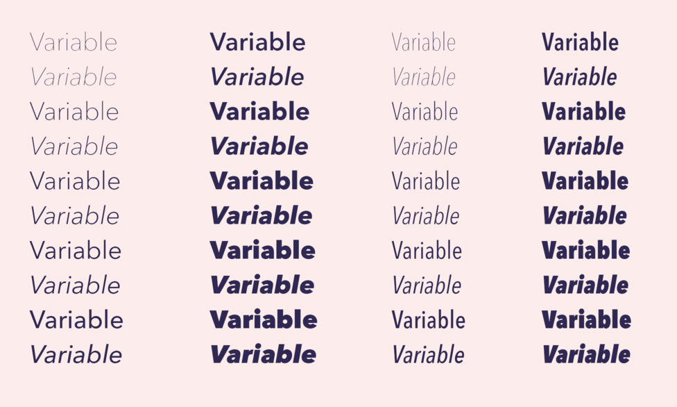
file name: Linotype Avenir Next Variable Set 2019 315810
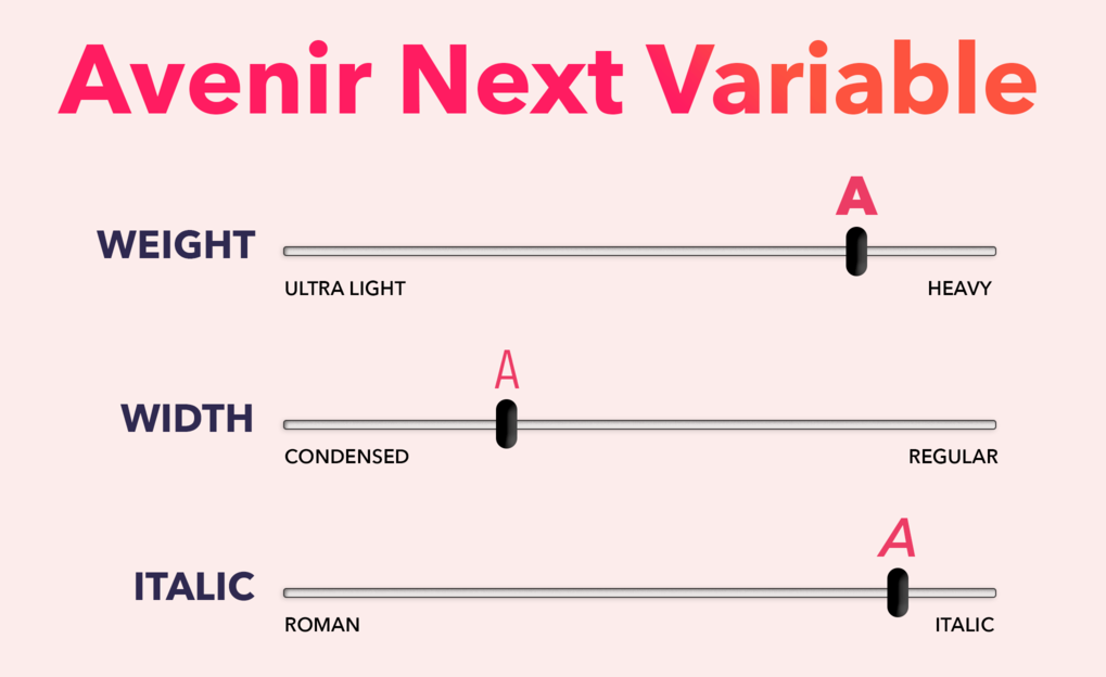
file name: Linotype Avenir Next Variable Set 2019 315811 002

file name: Linotype Avenir Next Variable Set 2019

file name: Akira Kobayashi Monotype Studio Yanek Iontef Nadine Chahine Toshi Omagari Akaki Razmadze Elena Papassissa Anuthin Wongsunkakon Avenir Next World 2021

file name: Linotype Avenir Next Paneuropean 2021 1

file name: Linotype Avenir Next Paneuropean 2021 3
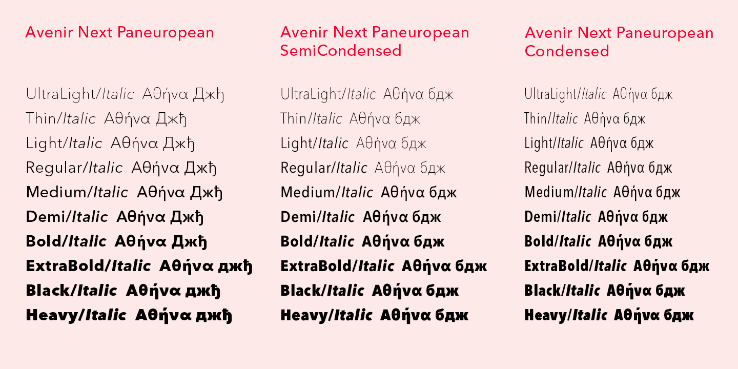
file name: Linotype Avenir Next Paneuropean 2021 4

file name: Linotype Avenir Next Paneuropean 2021 5

file name: Linotype Avenir Next Paneuropean 2021
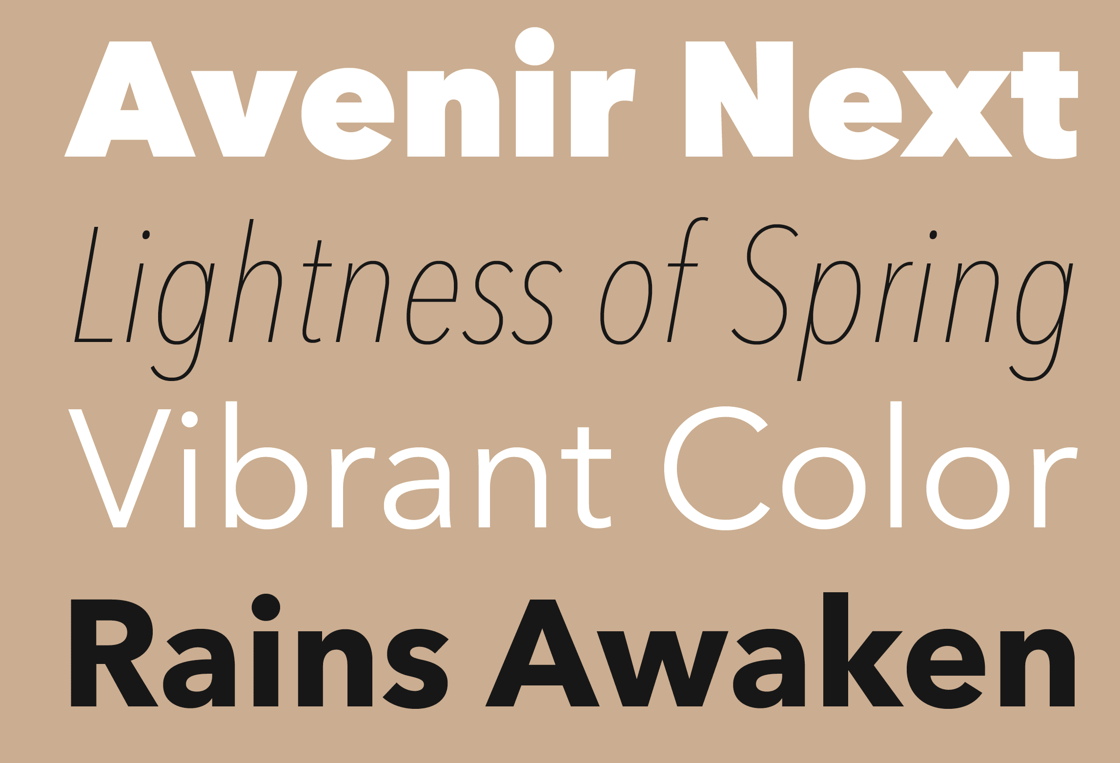
file name: Akira Kobayashi Avenir Next 2010
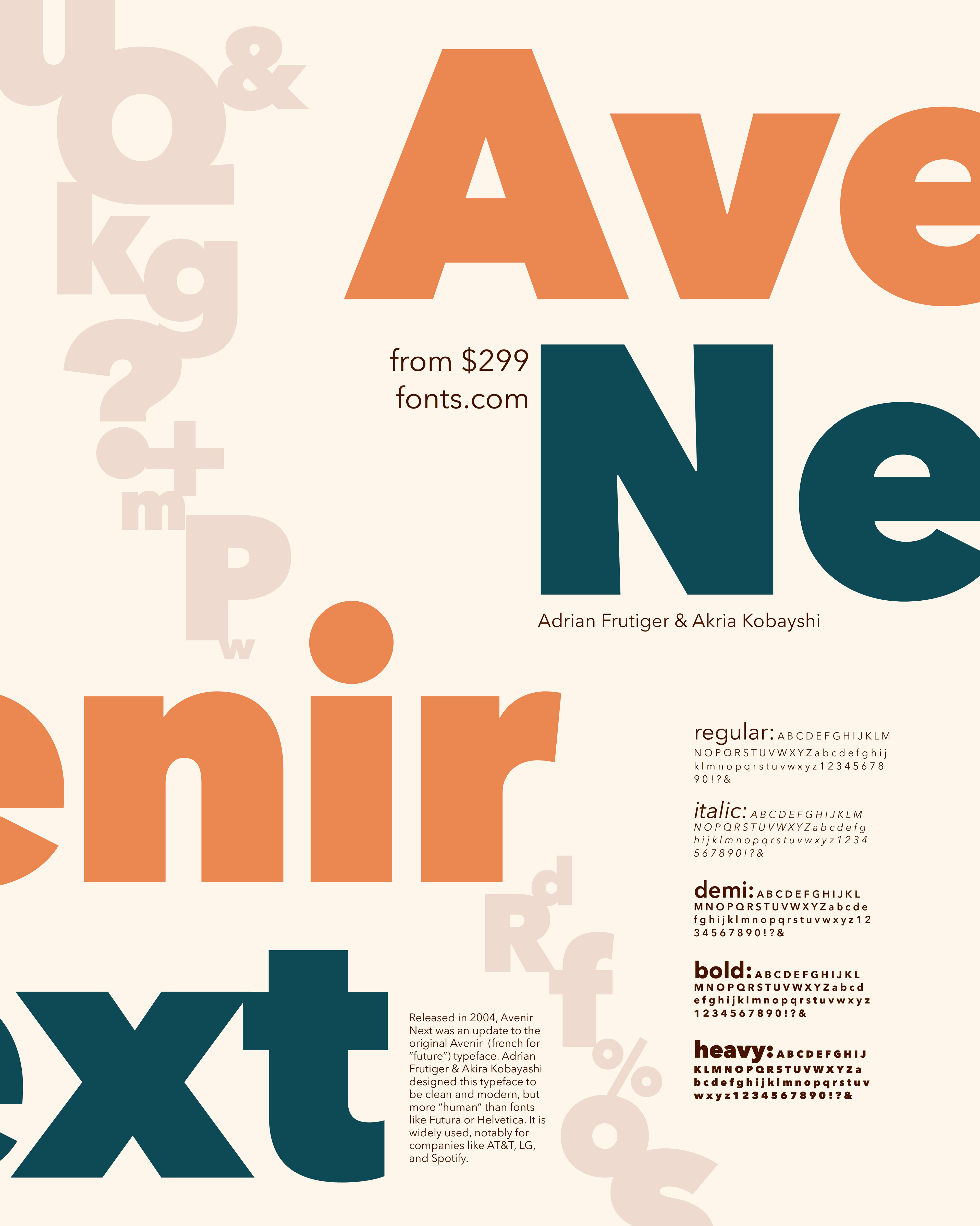
file name: Akira Kobayashi Avenir Next 2010 after Adrian Frutiger Poster by Katie Radford 2018
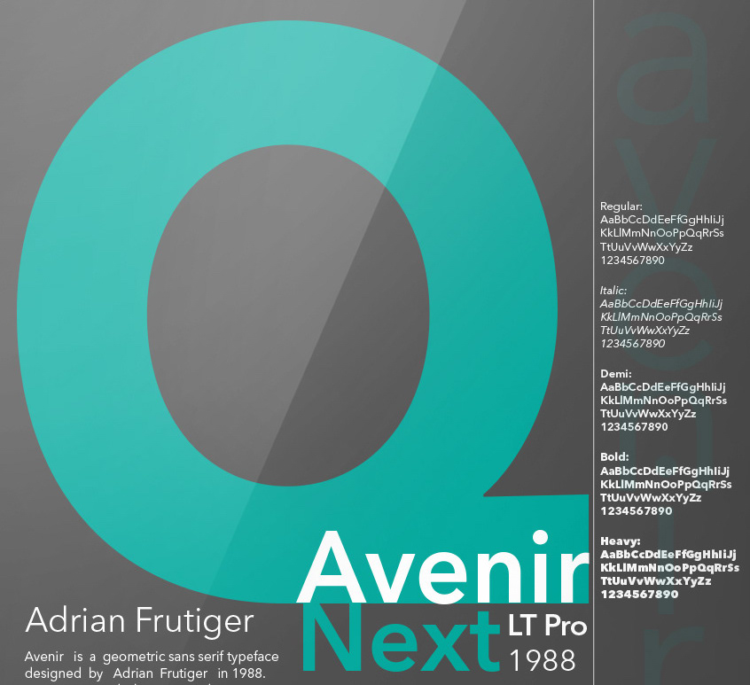
file name: Akira Kobayashi Avenir Next 2010 after Adrian Frutiger Poster by Mc Kell Shuster 2019
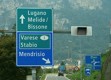
file name: Adrian Frutiger Astra Frutiger
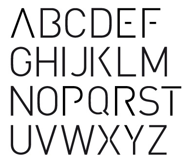
file name: Adrian Fernandez D I N Stencil 2011
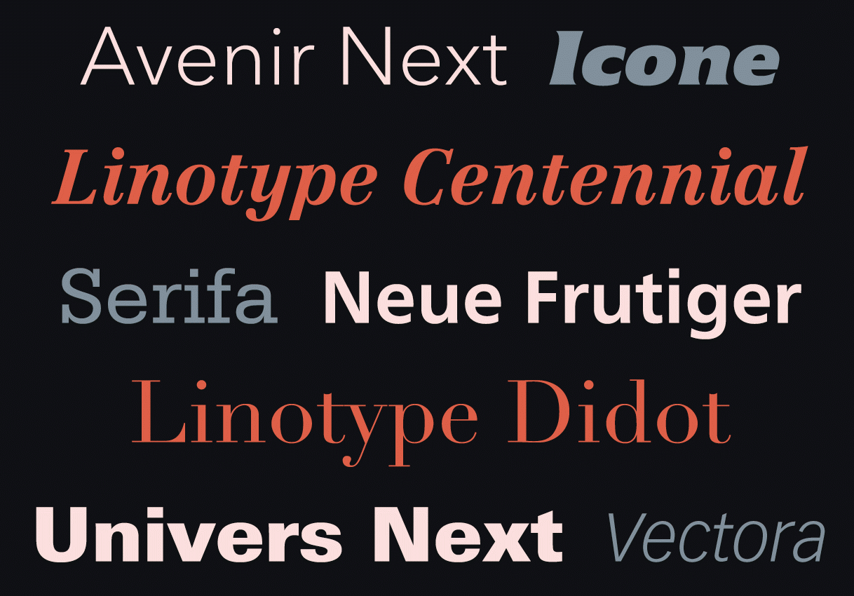
file name: Adrian Frutiger Typefaces
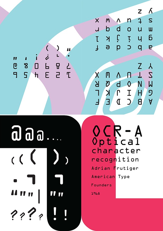
file name: Adrian Frutiger O C R A 1968 Poster by Anderson Vasconcellos 2014
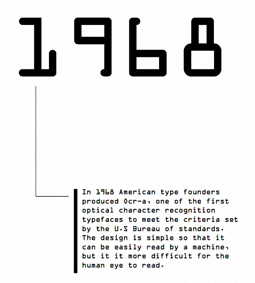
file name: American Type Founders O C R A 1968 poster by Marissa Masbasari 2018

file name: American Type Founders O C R A 1968 poster by Marissa Masbasari 2018b

file name: Adrian Frutiger Didot Etext Pro 2013

file name: Adrian Frutiger Didot Etext Pro 2013b
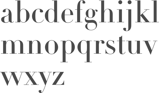
file name: Adrian Frutiger Didot L T Pro Headline 1991
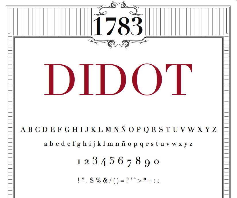
file name: Linotype Didot Poster by Martina Rodriguez Saavedra 2015
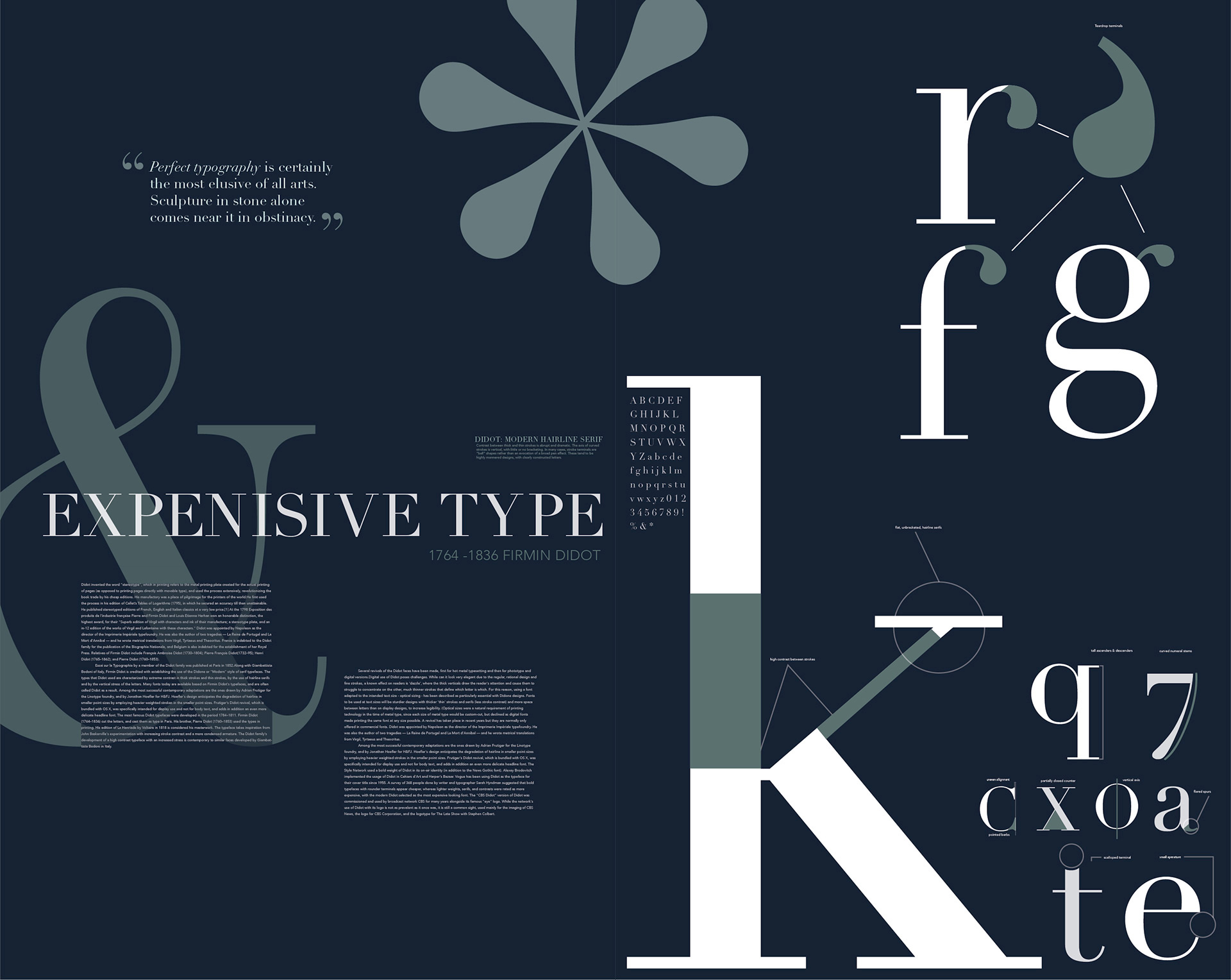
file name: Adrian Frutiger Linotype Didot 1991 Poster by Emma Froberg 2017
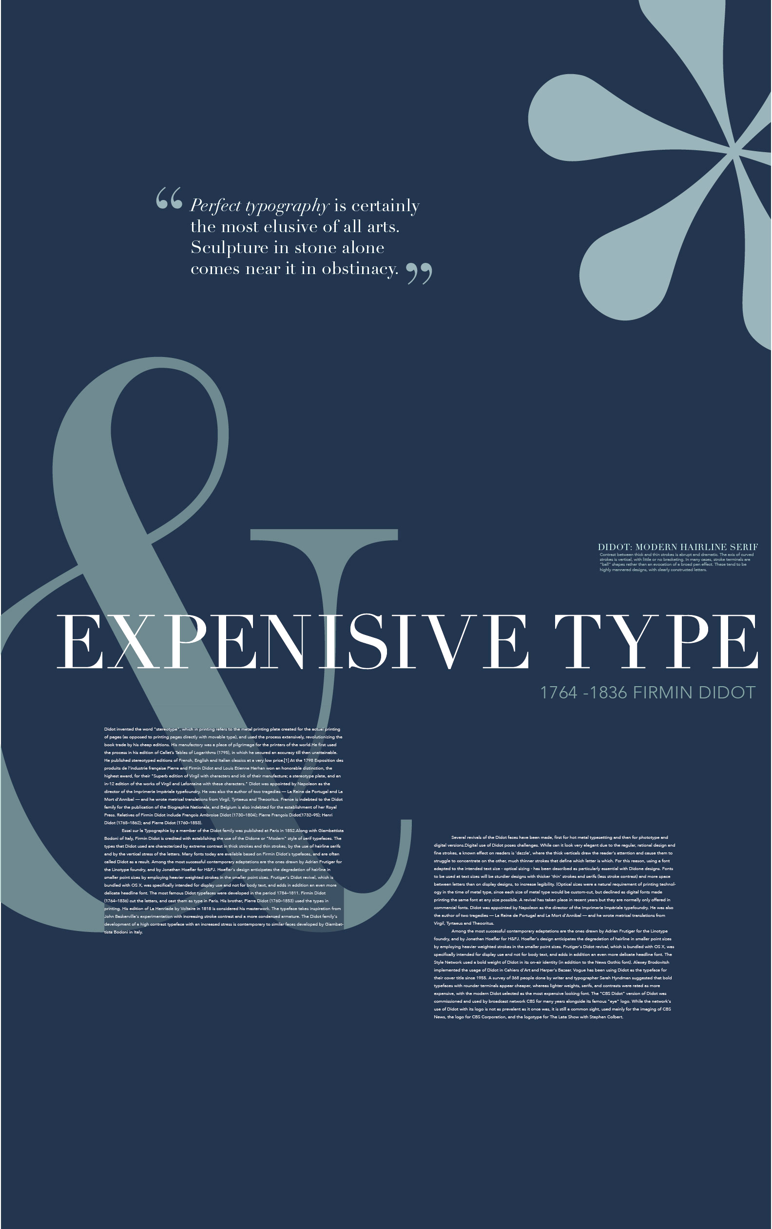
file name: Adrian Frutiger Linotype Didot 1991 Poster by Emma Froberg 2017b
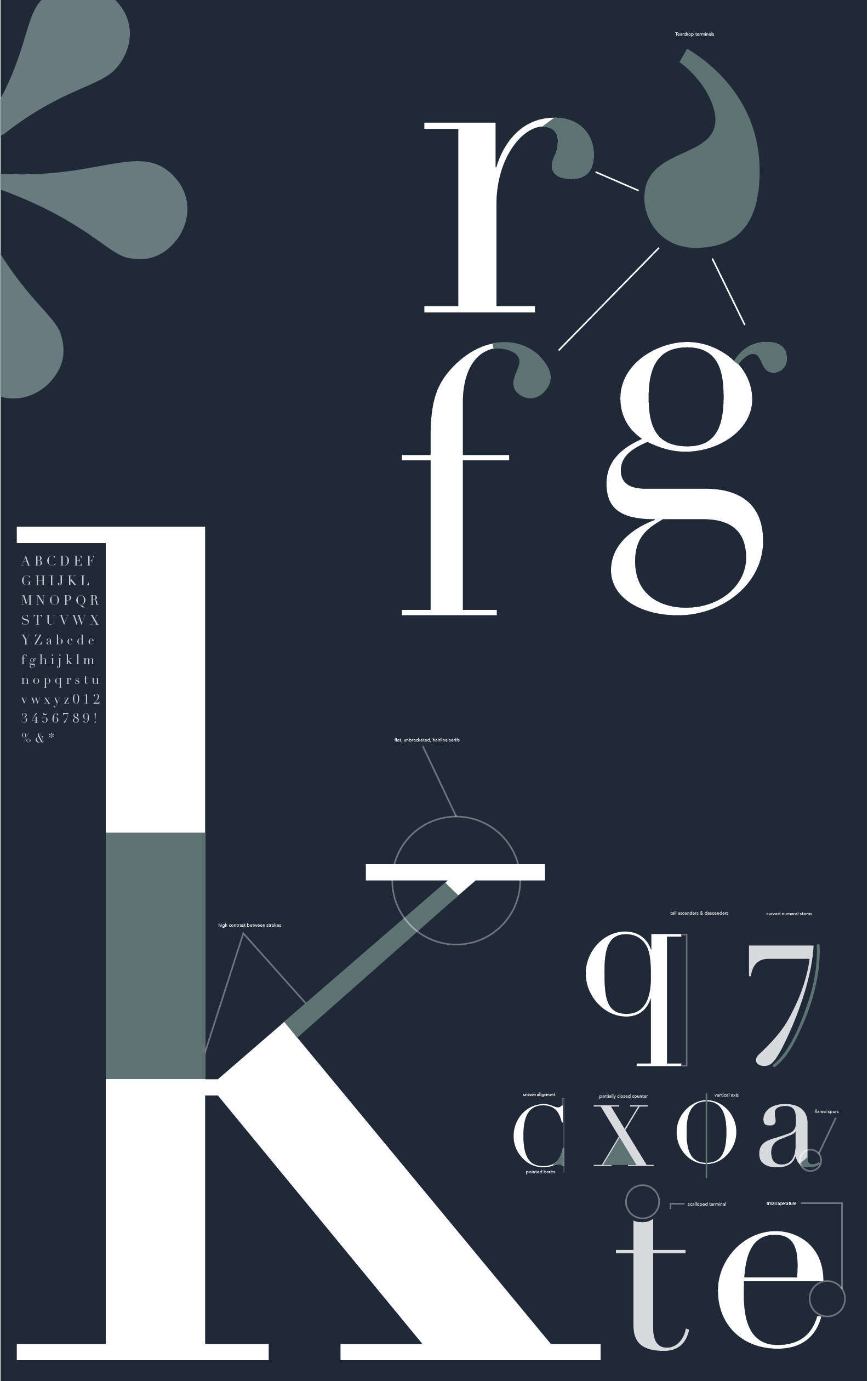
file name: Adrian Frutiger Linotype Didot 1991 Poster by Emma Froberg 2017c
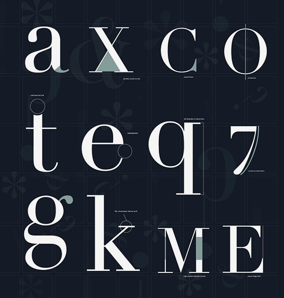
file name: Adrian Frutiger Linotype Didot 1991 Poster by Emma Froberg 2017d
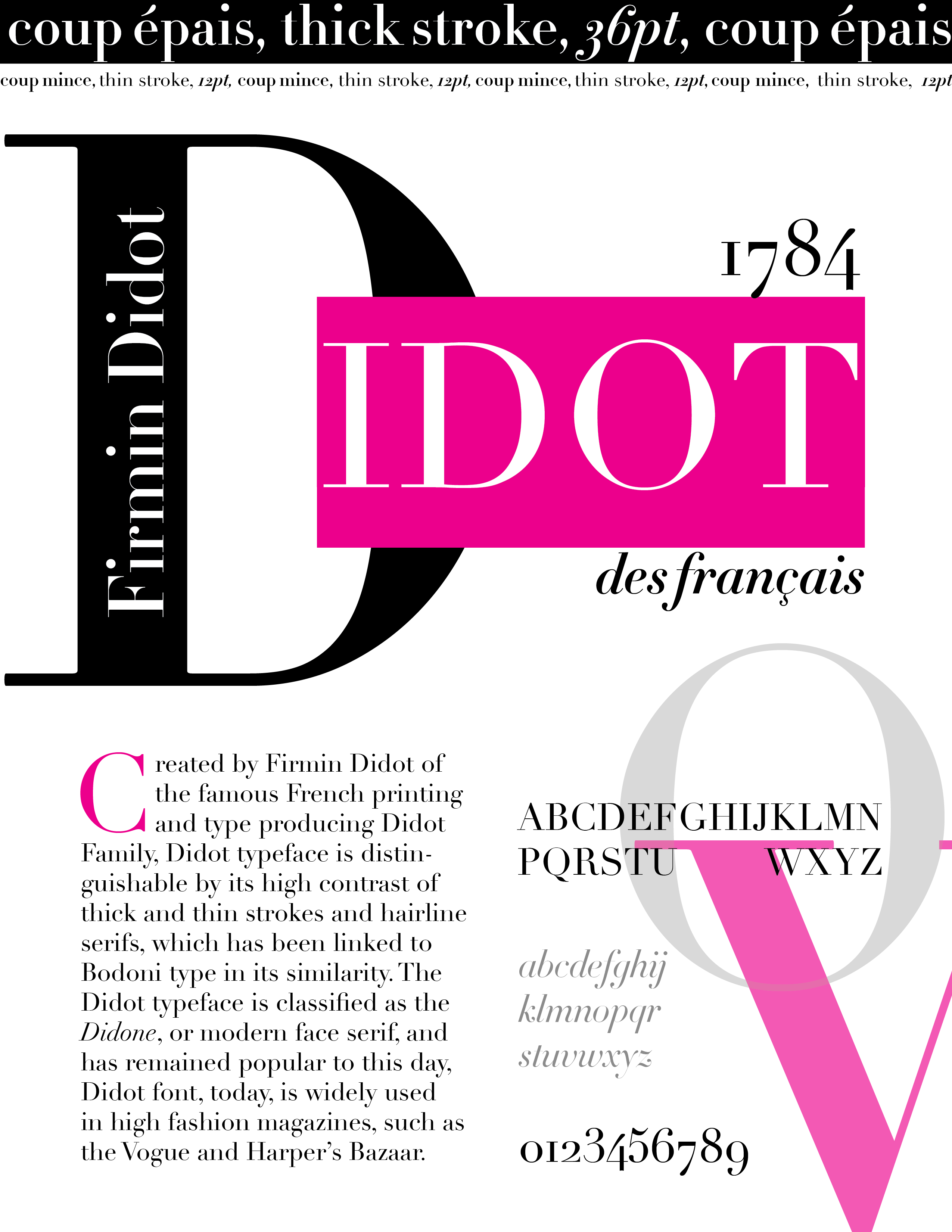
file name: Adrian Frutiger Linotype Didot 1991 Poster by Helen Ju 2017
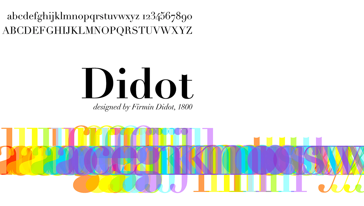
file name: Adrian Frutiger Linotype Didot 1991 Poster by James Musson 2016
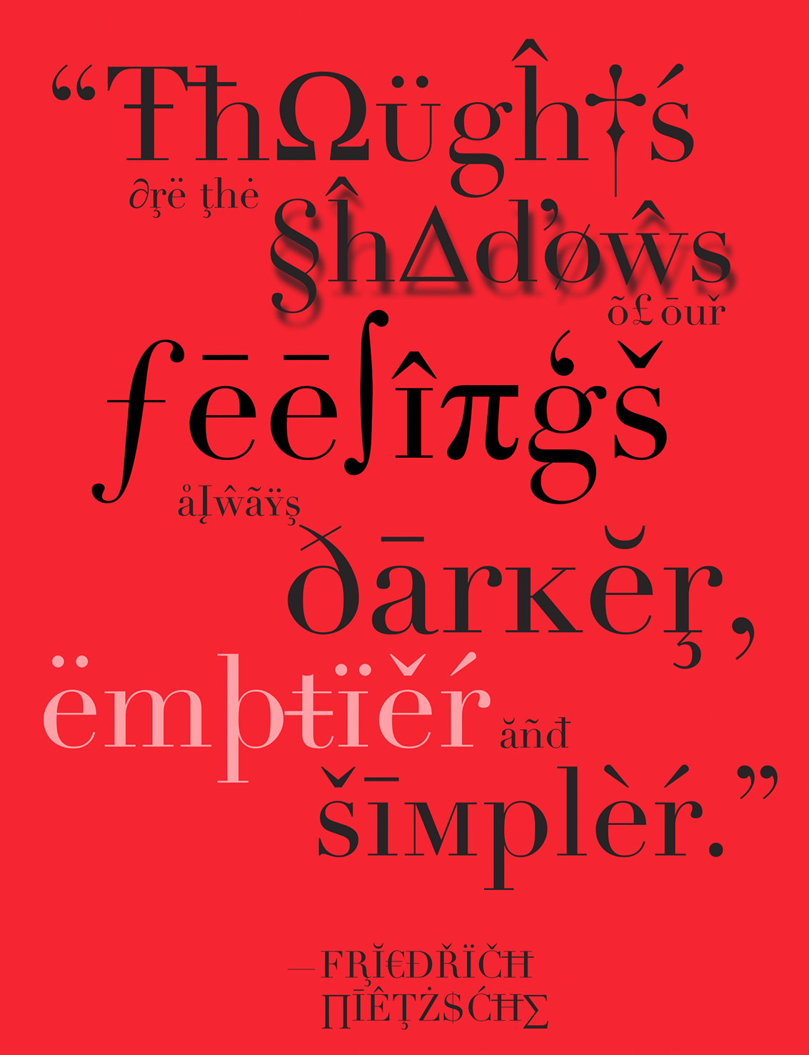
file name: Adrian Frutiger Linotype Didot 1991 Poster by Jessica Marinelli 2016
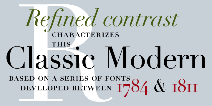
file name: Adrian Frutiger Linotype Didot 1991

file name: Adrian Frutiger Linotype Didot 1991b
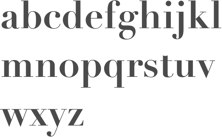
file name: Adrian Frutiger Linotype Didot Bold 1991
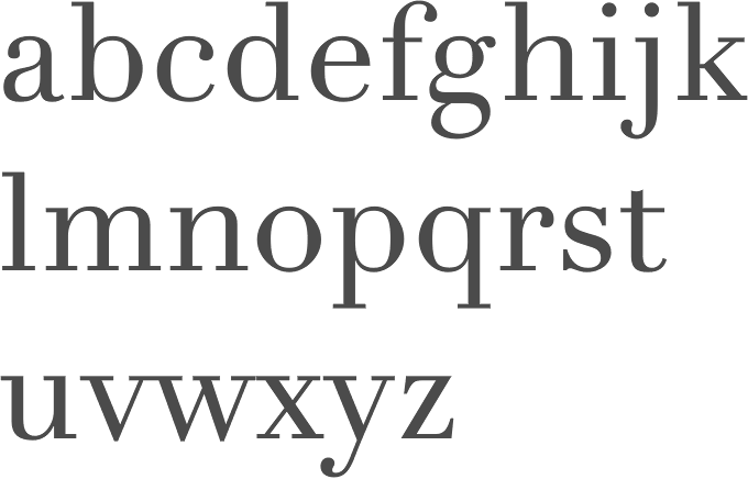
file name: Adrian Frutiger Linotype Didot Etext Pro 2013

file name: Adrian Frutiger Linotype Didot 1991 197914

file name: Adrian Frutiger Linotype Didot 1991 197914
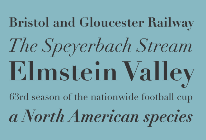
file name: Adrian Frutiger Linotype Didot 1991 198942

file name: Adrian Frutiger Linotype Didot 1991 198942
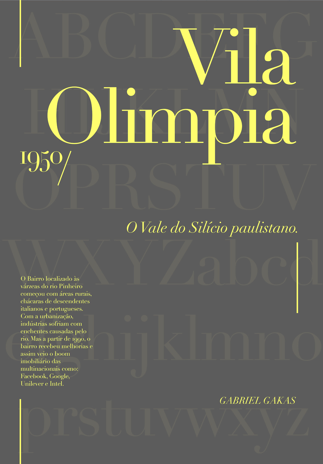
file name: Adrian Frutiger Linotype Didot 1991 Poster by Gabriel Gakas 2016
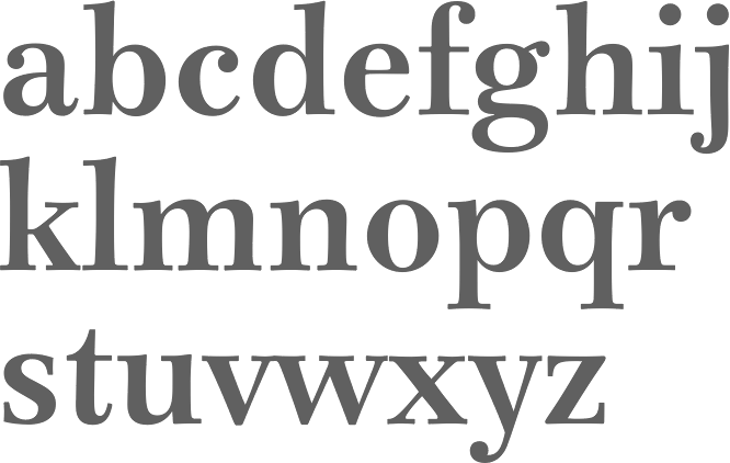
file name: Adrian Frutiger Iridium 1972 Stempel Linotype
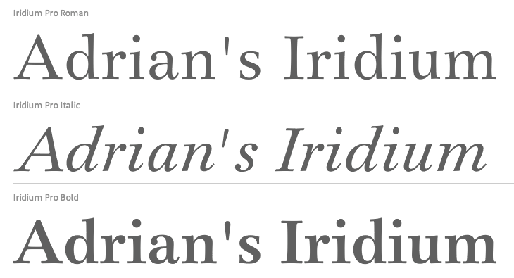
file name: Adrian Frutiger Iridium 1972 Stempel Linotypeb
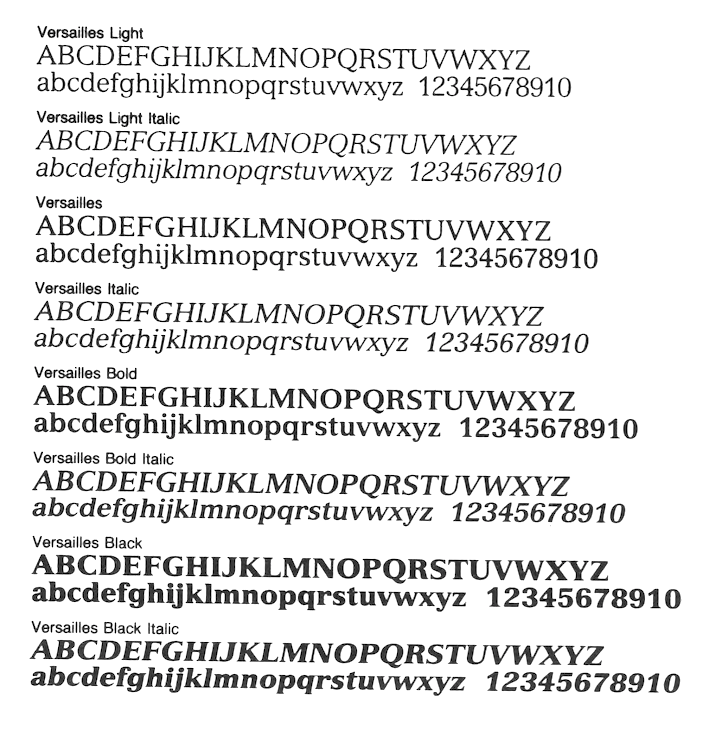
file name: Adrian Frutiger Versailles 1982
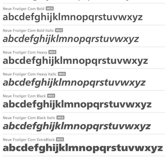
file name: Adrian Frutiger Akira Kobayashi Neue Frutiger Com 2009
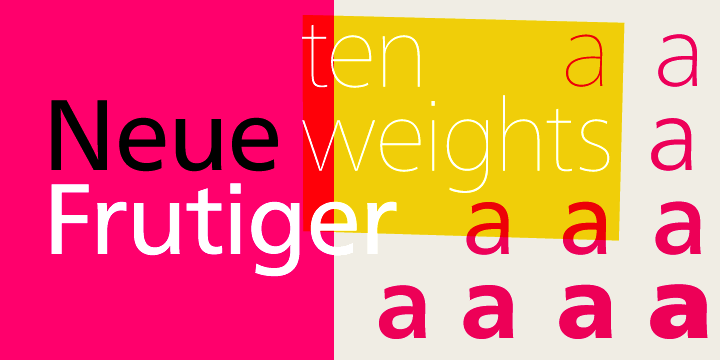
file name: Adrian Frutiger Akira Kobayashi Neue Frutiger Pro 2009d
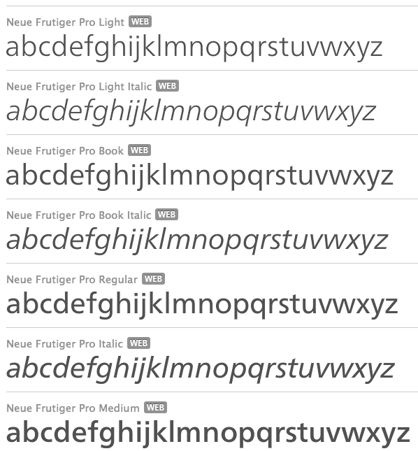
file name: Adrian Frutiger Akira Kobayashi Neue Frutiger Pro 2009

file name: Adrian Frutiger Akira Kobayashi Neue Frutiger Pro 2009b
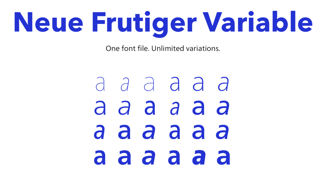
file name: Linotype Neue Frutiger Variable Set 2019 315805 002
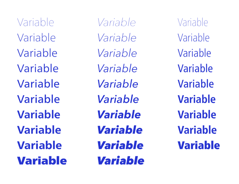
file name: Linotype Neue Frutiger Variable Set 2019 315806 002
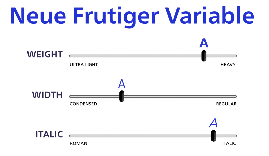
file name: Linotype Neue Frutiger Variable Set 2019 315807

file name: Linotype Neue Frutiger Variable Set 2019
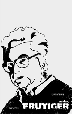
file name: Roy Rivera Frutiger Poster 2011

file name: Adrian Frutiger Frutiger 1975 Poster by Ciprian D21 2015

file name: Adrian Frutiger Frutiger Q Courtesy of Brian Mulhall 2014
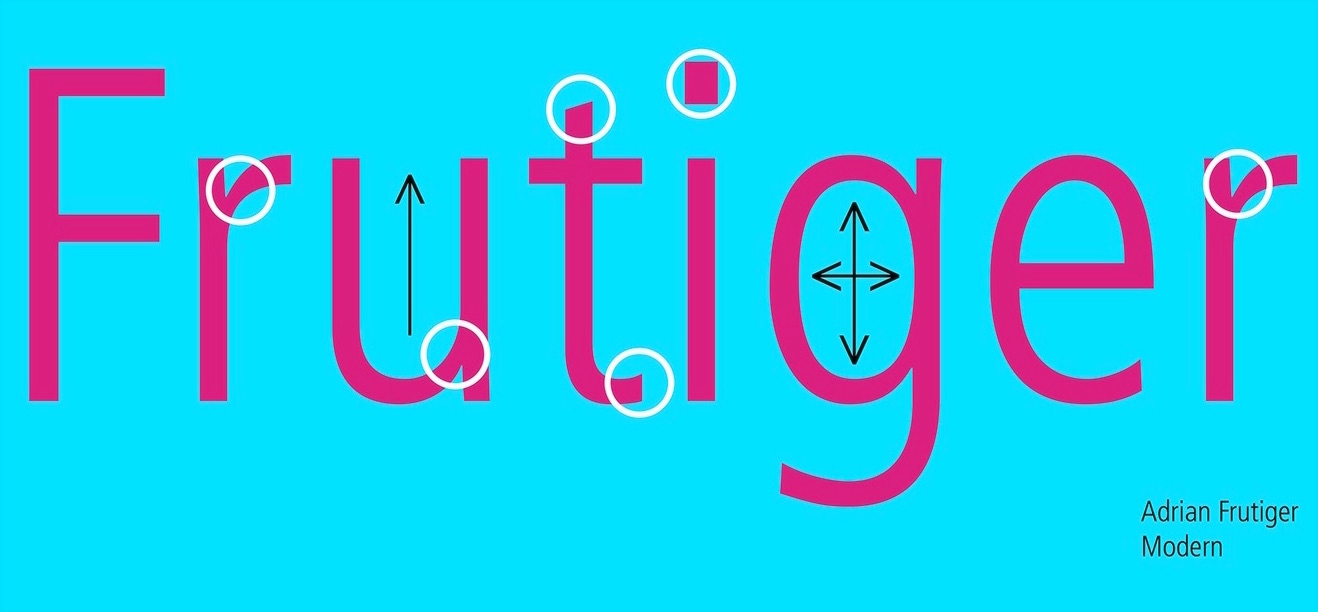
file name: Adrian Frutiger Frutiger 1975 Poster by Kelsey Coleman 2016c
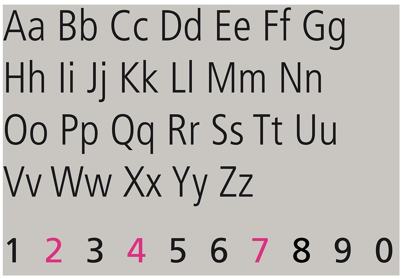
file name: Adrian Frutiger Frutiger 1975 Poster by Kelsey Coleman 2016d
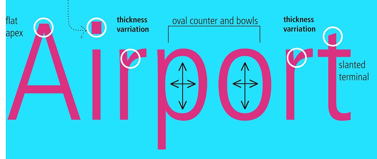
file name: Adrian Frutiger Frutiger 1975 Poster by Kelsey Coleman 2016e

file name: Adrian Frutiger Frutiger 1975 Poster by Kelsey Coleman 2016g
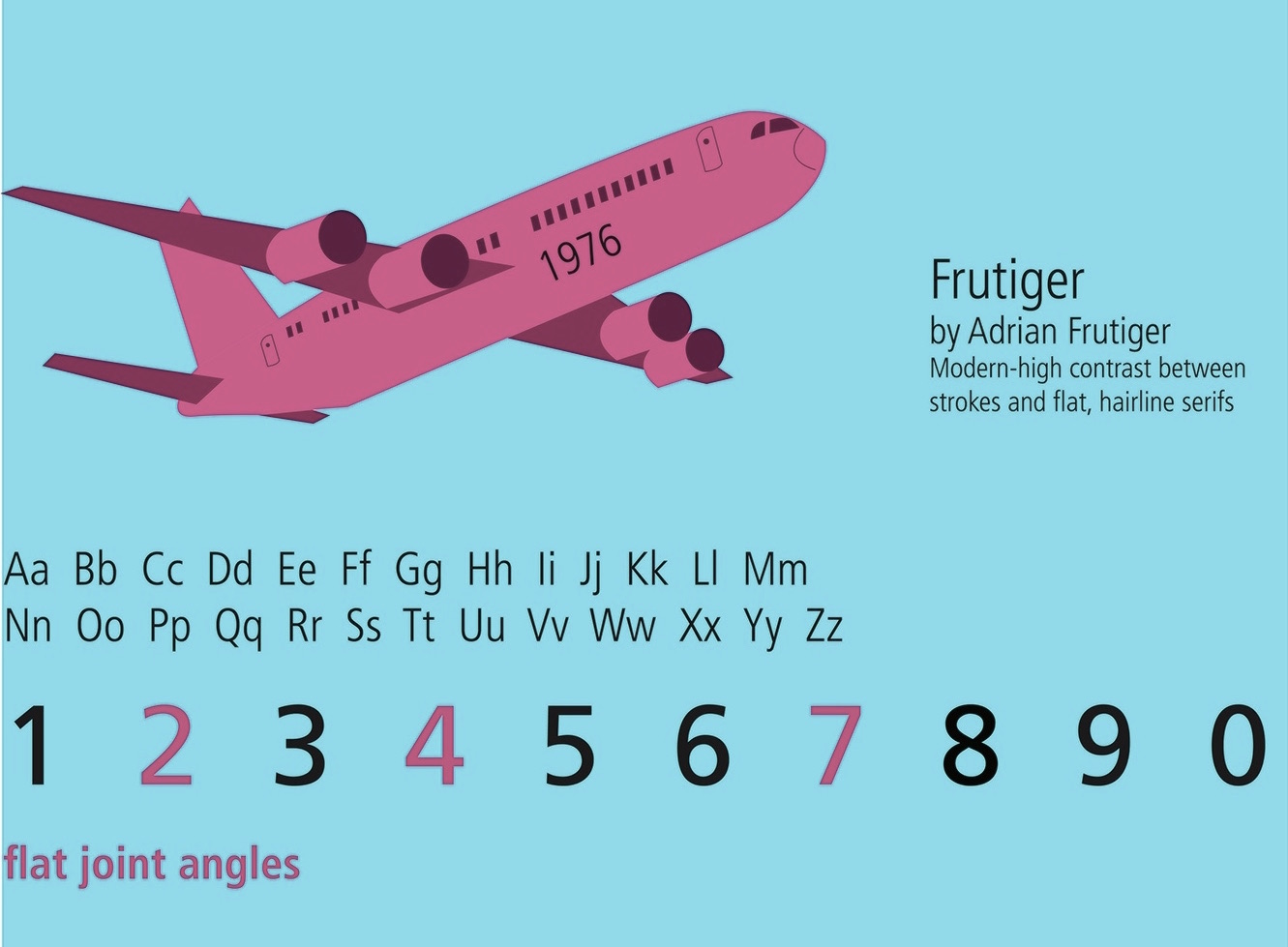
file name: Adrian Frutiger Frutiger 1975 Poster by Kelsey Coleman 2016h
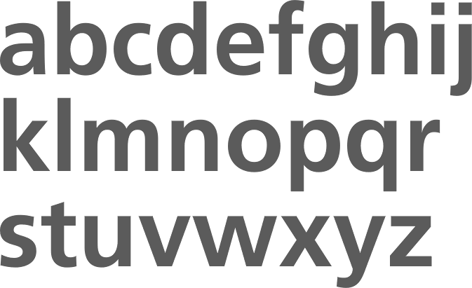
file name: Adrian Frutiger Frutiger Bold Adobe 1976
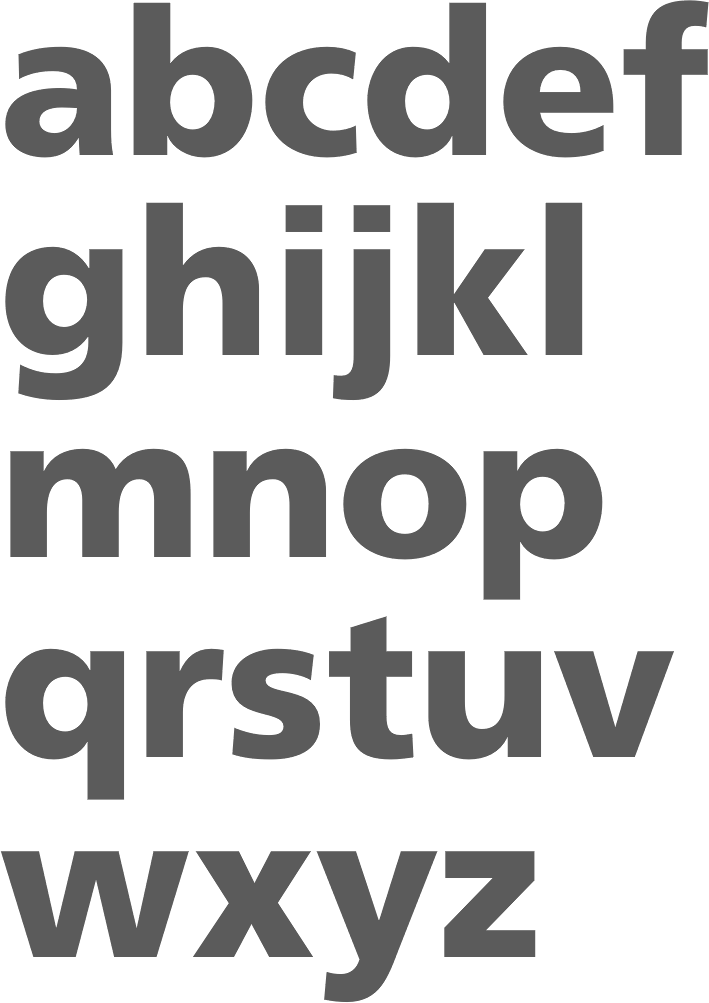
file name: Adrian Frutiger Frutiger Black Adobe 1976
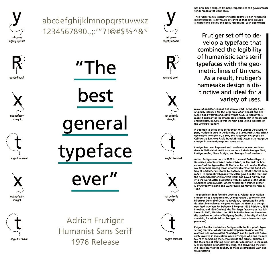
file name: Adrian Frutiger Frutiger 1976 Poster by Grace Heitmann 2015
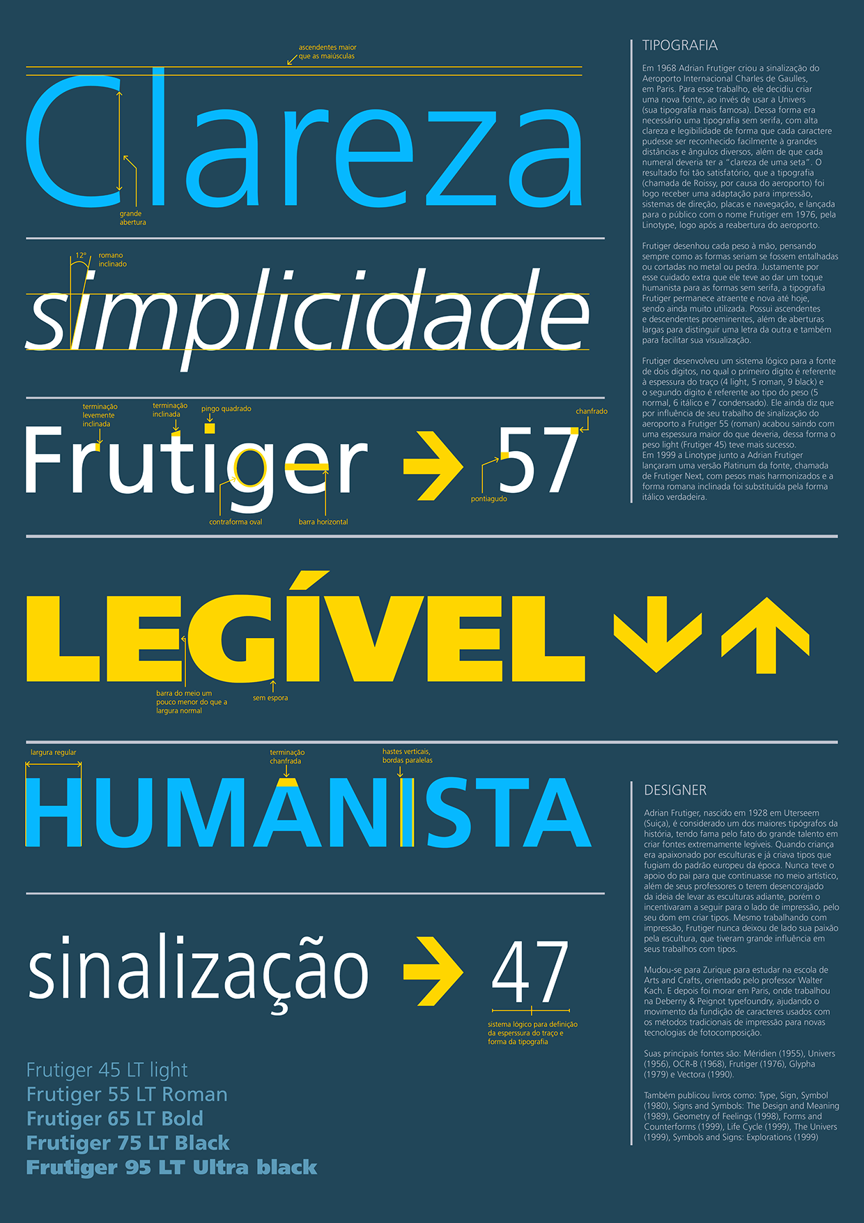
file name: Adrian Frutiger Frutiger 1976 Poster by Felipe Oliveira 2016

file name: Adrian Frutiger Frutiger 1976 Poster by Ilenia Guardigli 2016

file name: Adrian Frutiger Frutiger 1968 1976 Poster by Devin Lindsay 2013

file name: Adrian Frutiger Frutiger 1975
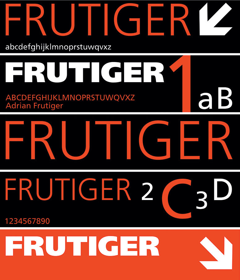
file name: Adrian Frutiger Frutiger 1968 Poster by Katarzyna Laska 2019
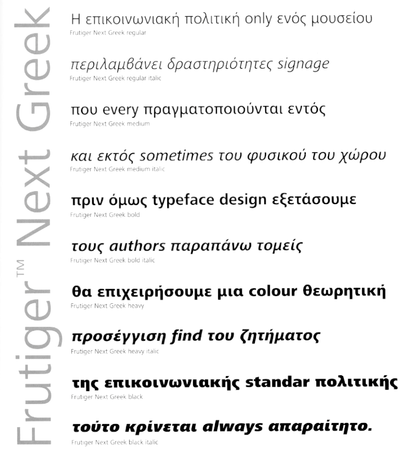
file name: T D C2006 Adrian Frutiger Eva Masoura Frutiger Next Greek

file name: Adrian Frutiger Frutiger 1968 Poster by Alexandra Larrad 2016
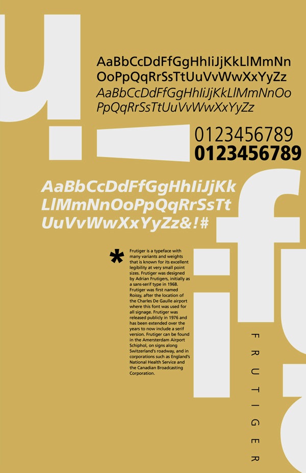
file name: Adrian Frutiger Frutiger 1968 Poster by Nevin Mizelle 2014

file name: Adrian Frutiger Ondine 1954 Linotype Version
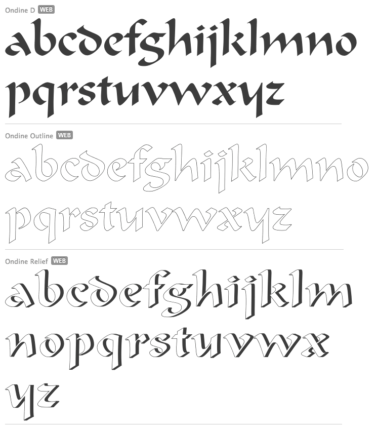
file name: Adrian Frutiger Ondine 1954 U R W Version
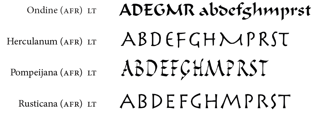
file name: Linotype Ondine Herculanum Pompeijana Rusticana

file name: Adrian Frutiger Pompeijana
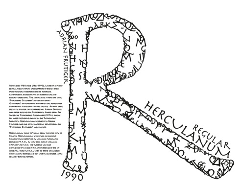
file name: Adrian Frutiger Herculanum 1989 Poster by Zach Cassidy 2013
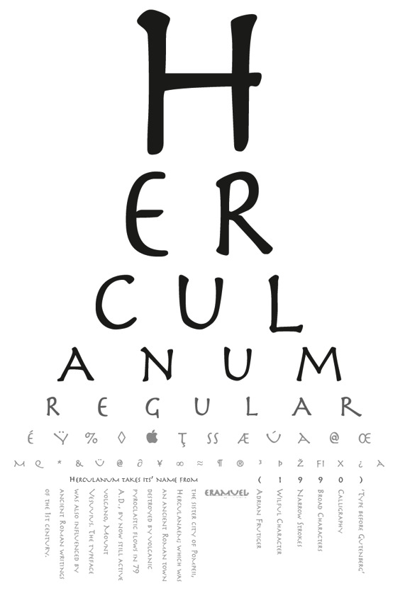
file name: Adrian Frutiger Herculanum 1989 Poster by Zach Cassidy 2013b
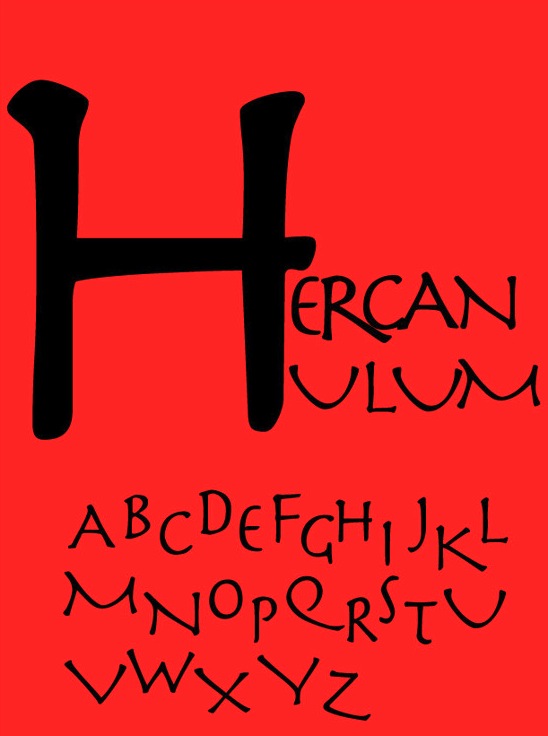
file name: Adrian Frutiger Herculanum 1990 Poster by Brandon Olson 2014
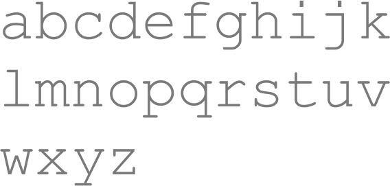
file name: Adrian Frutiger Courier New Howard Kettler Adrian Frutiger
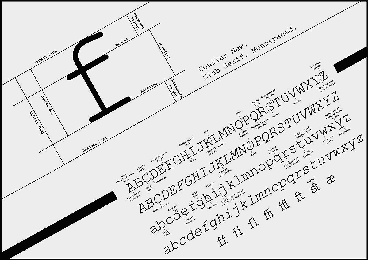
file name: Adrian Frutiger Courier New poster by Vidhi Joshi 2018
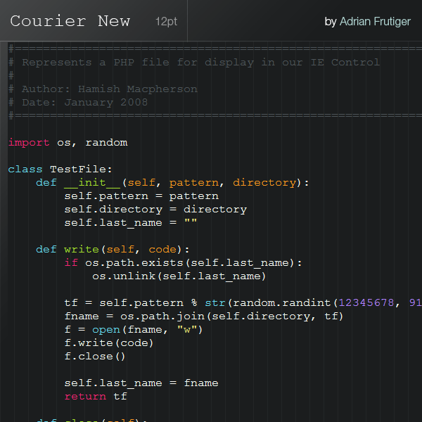
file name: Adrian Frutiger Courier New

file name: Adrian Frutiger Breughel 1982
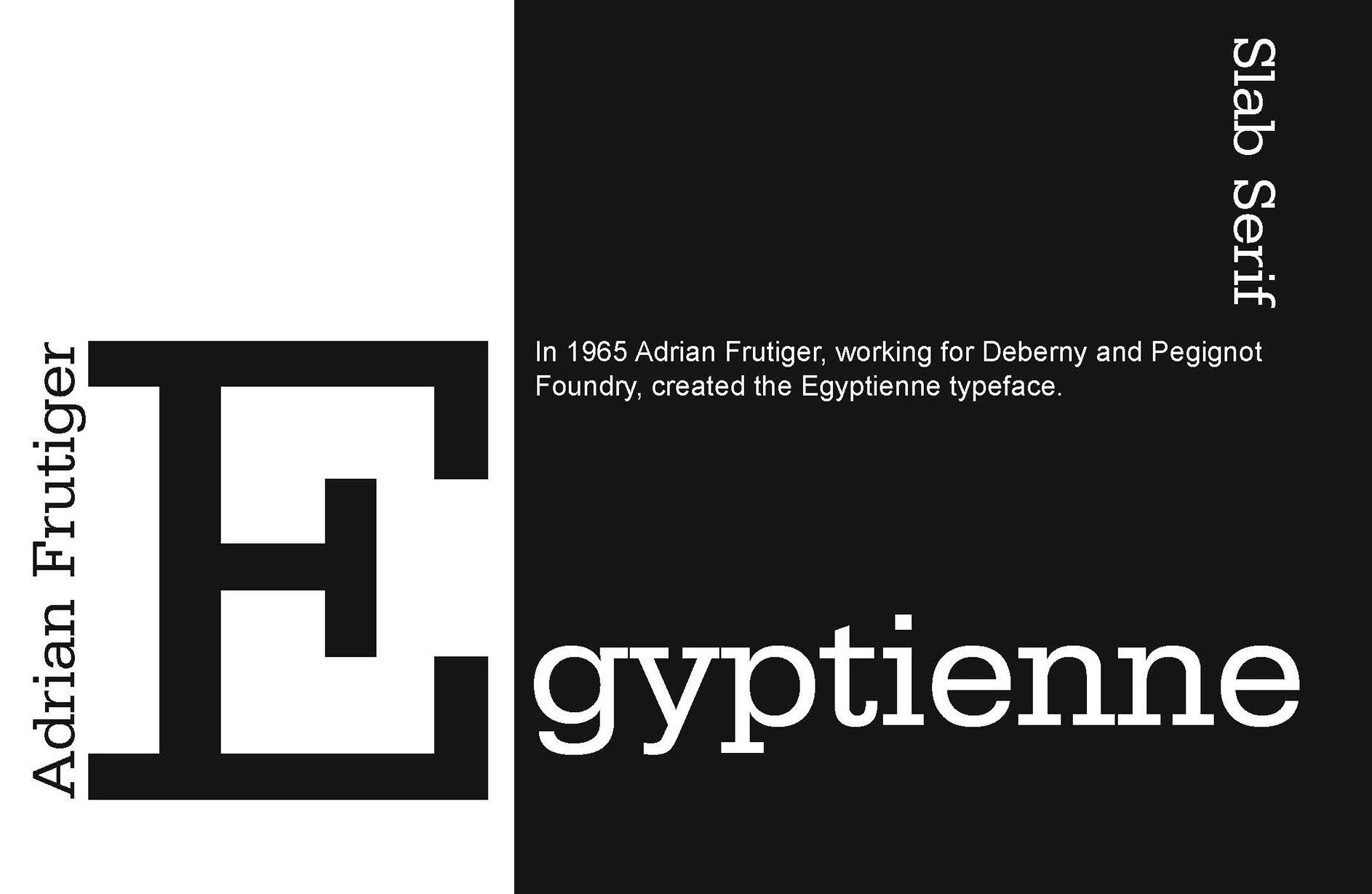
file name: Adrian Frutiger Egyptienne Deberny Linotype 1956 poster by Andrei Laptes Frangu 2020
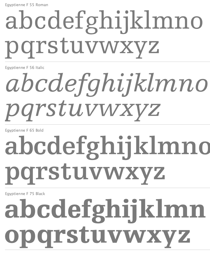
file name: Adrian Frutiger Egyptienne F Deberny Linotype 1956

file name: Adrian Frutiger Meridien Bold 1957
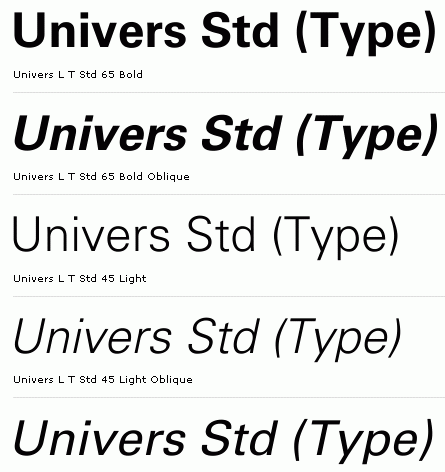
file name: Adrian Frutiger Univers Std 1957

file name: Adrian Frutiger Univers 1957

file name: Adrian Frutiger Univers55 Roman

file name: Adrian Frutiger Univers 1956 Poster by Daria Diehl 2012
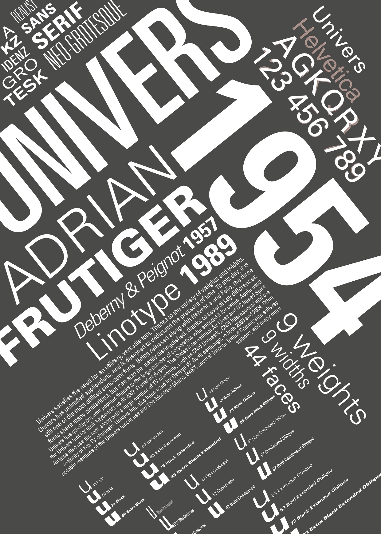
file name: Adrian Frutiger Univers 1954 Poster by Roxana Olar 2014
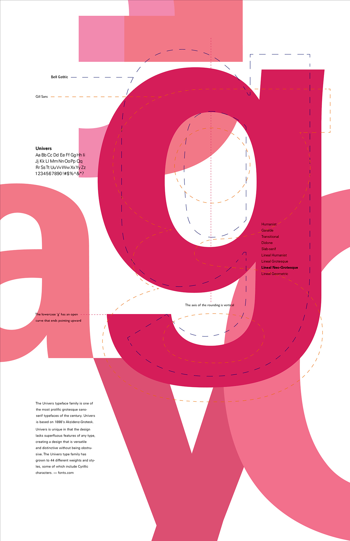
file name: Adrian Frutiger Univers 1954 Poster by Sam An 2016

file name: Adrian Frutiger Univers Extra Black
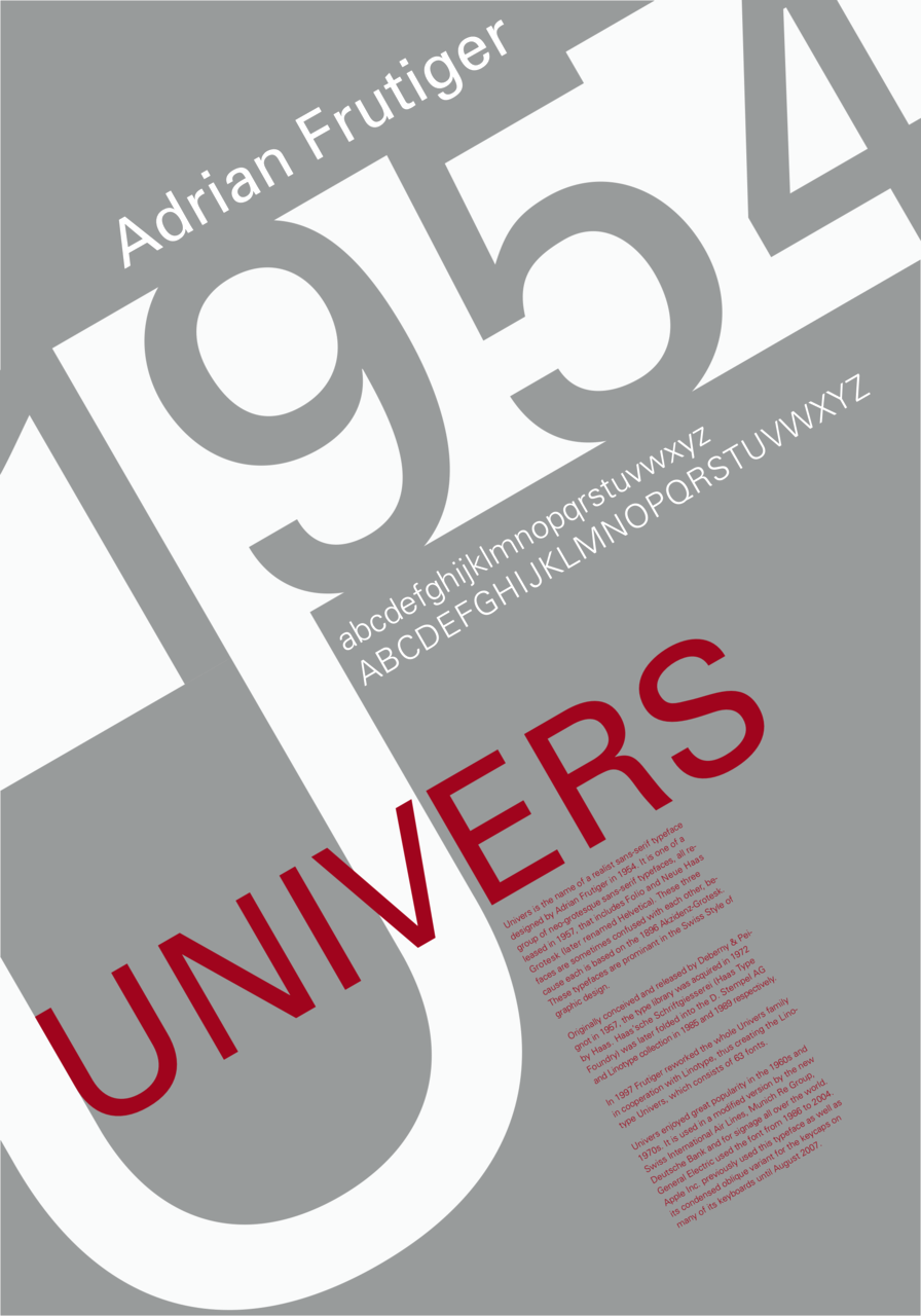
file name: Adrian Frutiger Univers 1956

file name: Adrian Frutiger Univers Deberny Peignot 1957
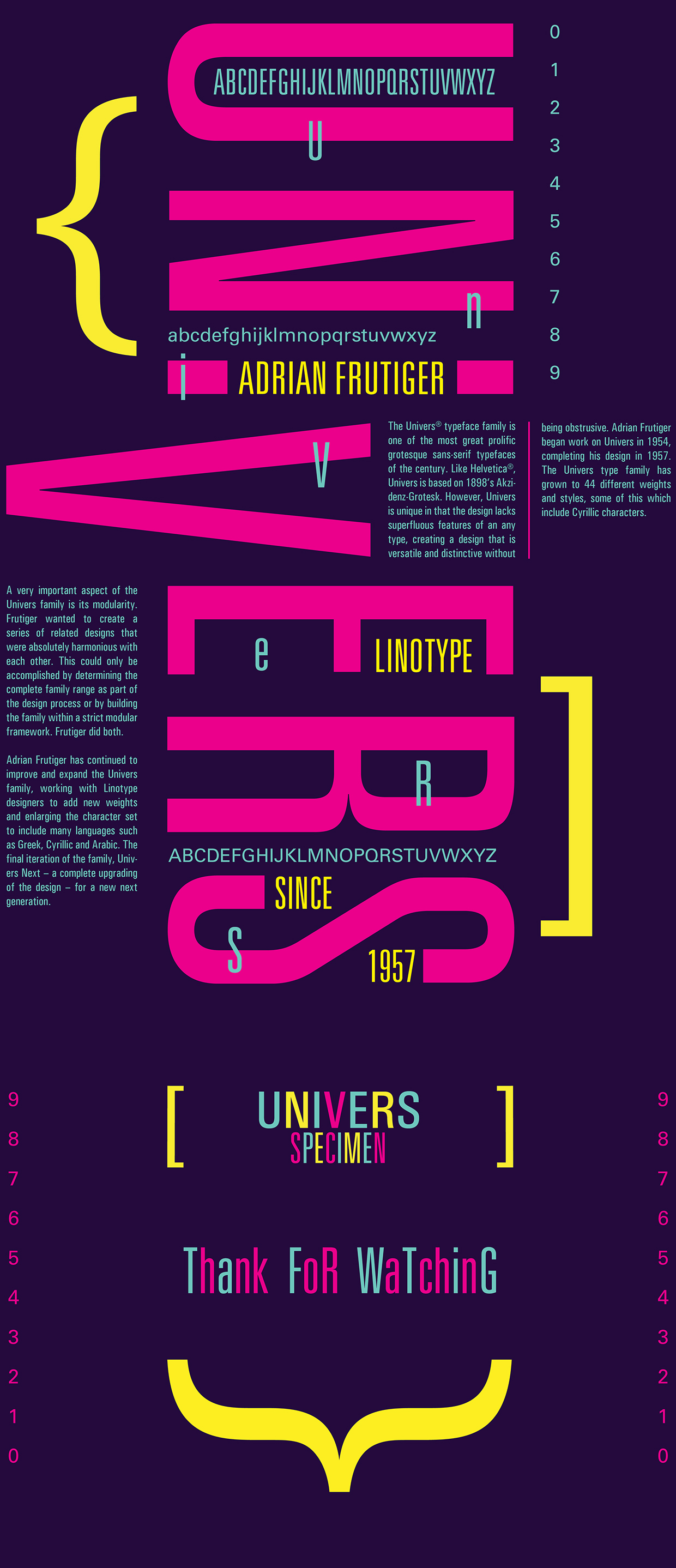
file name: Adrian Frutiger Univers Condensed Light 2015 Poster by Pa Kwan Promsri 2015
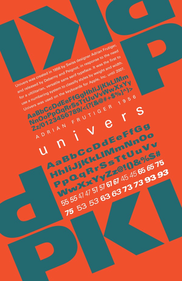
file name: Adrian Frutiger Univers 1956 Poster by Caitlin Gettinger 2014

file name: Adrian Frutiger Univers 1956 Poster by Natalia Custodio 2017
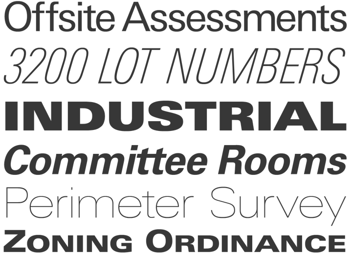
file name: Adrian Frutiger Univers 1957

file name: Adrian Frutiger Univers 1957

file name: Adrian Frutiger Univers 1957 198363

file name: Adrian Frutiger Univers 1957 198363
file name: Adrian Frutiger Univers Next Poster by Chelsea Ray 2017
file name: Hunson Nguyen Univers Trading Card 2010

file name: Adrian Frutiger Univers 1957

file name: Adrian Frutiger Univers 1957 Poster by Joao Diaz 2017
file name: Adrian Frutiger Univers Poster by Kosha Shah 2017

file name: Linotype Univers Next Typewriter 2019

file name: Adrian Frutiger Univers Next Typewriter Pro Bold 2018

file name: Adrian Frutiger Univers Next Typewriter Pro Bold 2018
file name: Linotype Univers Next Variable Set 2019 315801
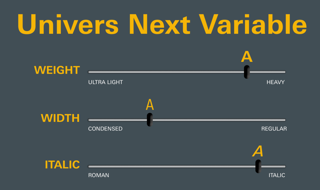
file name: Linotype Univers Next Variable Set 2019 315803

file name: Linotype Univers Next Variable Set 2019
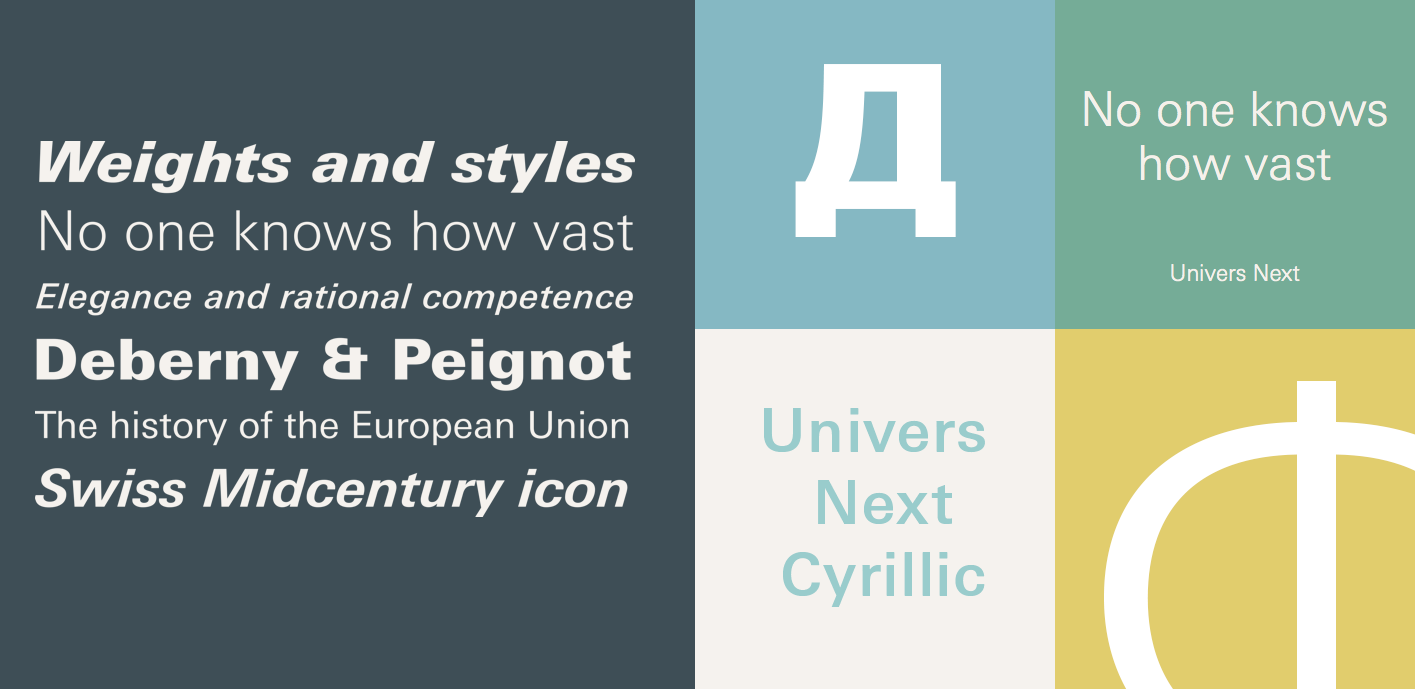
file name: Linotype Univers Next Cyrillic 2020 1

file name: Linotype Univers Next Paneuropean 2020 1

file name: Linotype Univers Next Paneuropean 2020 5

file name: Linotype Univers Next Paneuropean 2020
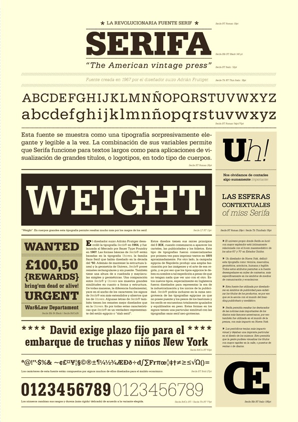
file name: Adrian Frutiger Serifa 1967 1968 Poster by Maria Eugenia Godoy 2014

file name: Adrian Frutiger Serifa 1964 Poster by Lauren Murphy 2017
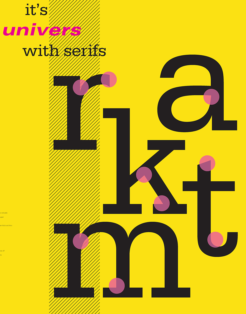
file name: Adrian Frutiger Serifa 1964 Poster by Lauren Murphy 2017b

file name: Adrian Frutiger Serifa 1964 Poster by Macarena Gimenez Natale 2016
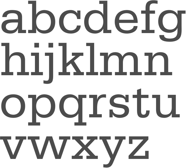
file name: Adrian Frutiger Serifa55 Roman 1967 1968
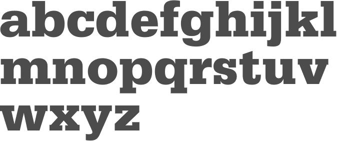
file name: Adrian Frutiger Serifa75 Black 1967 1968
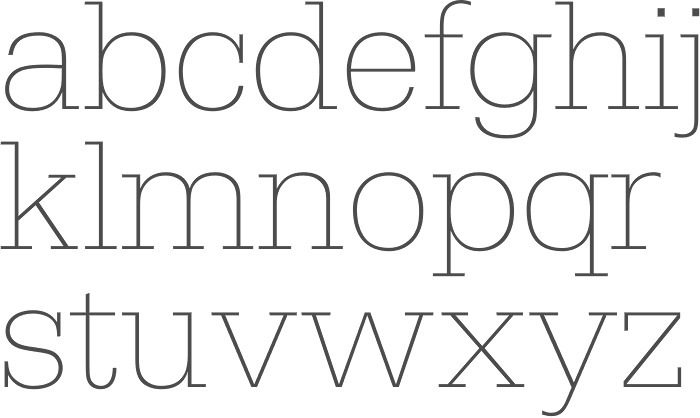
file name: Adrian Frutiger Serifa B E F X Light 1967 1968

file name: Adrian Frutiger Serifa 1966 Poster by Elizabeth Villarreal 2015
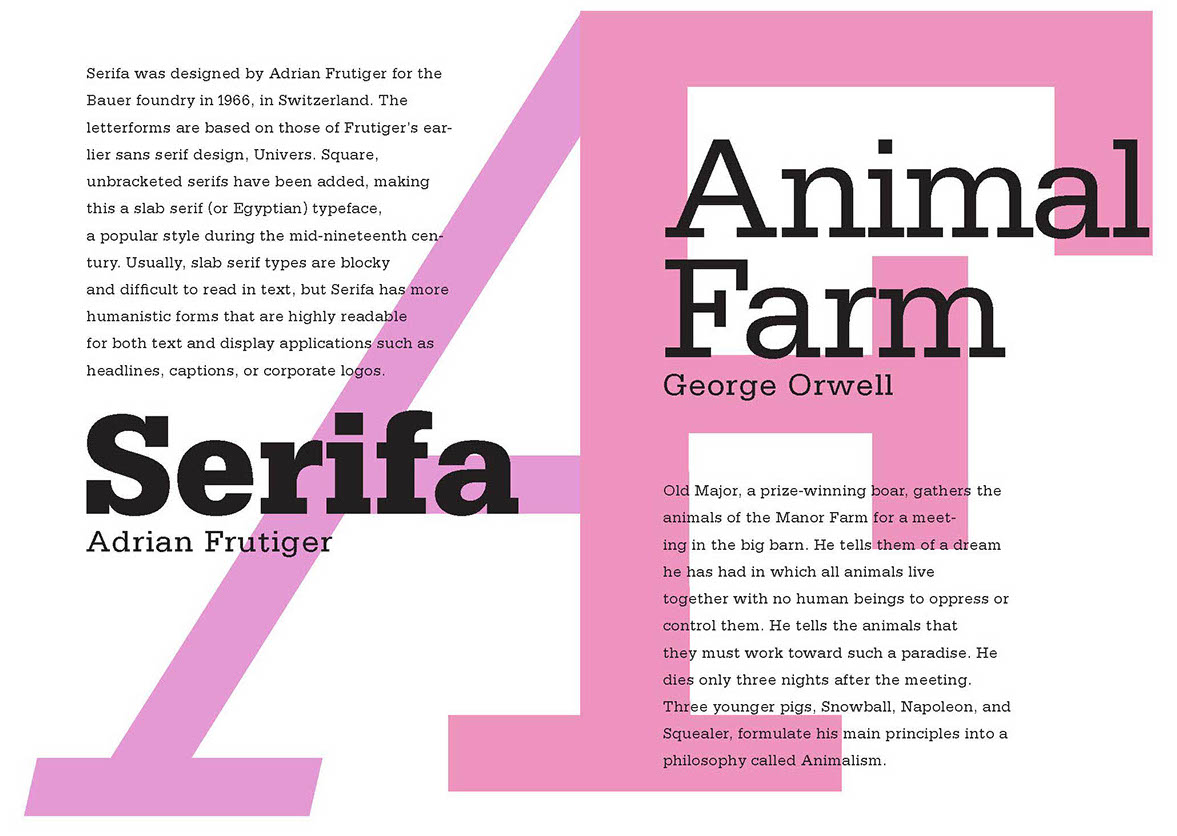
file name: Adrian Frutiger Serifa 1966 Poster by Elizabeth Villarreal 2015b
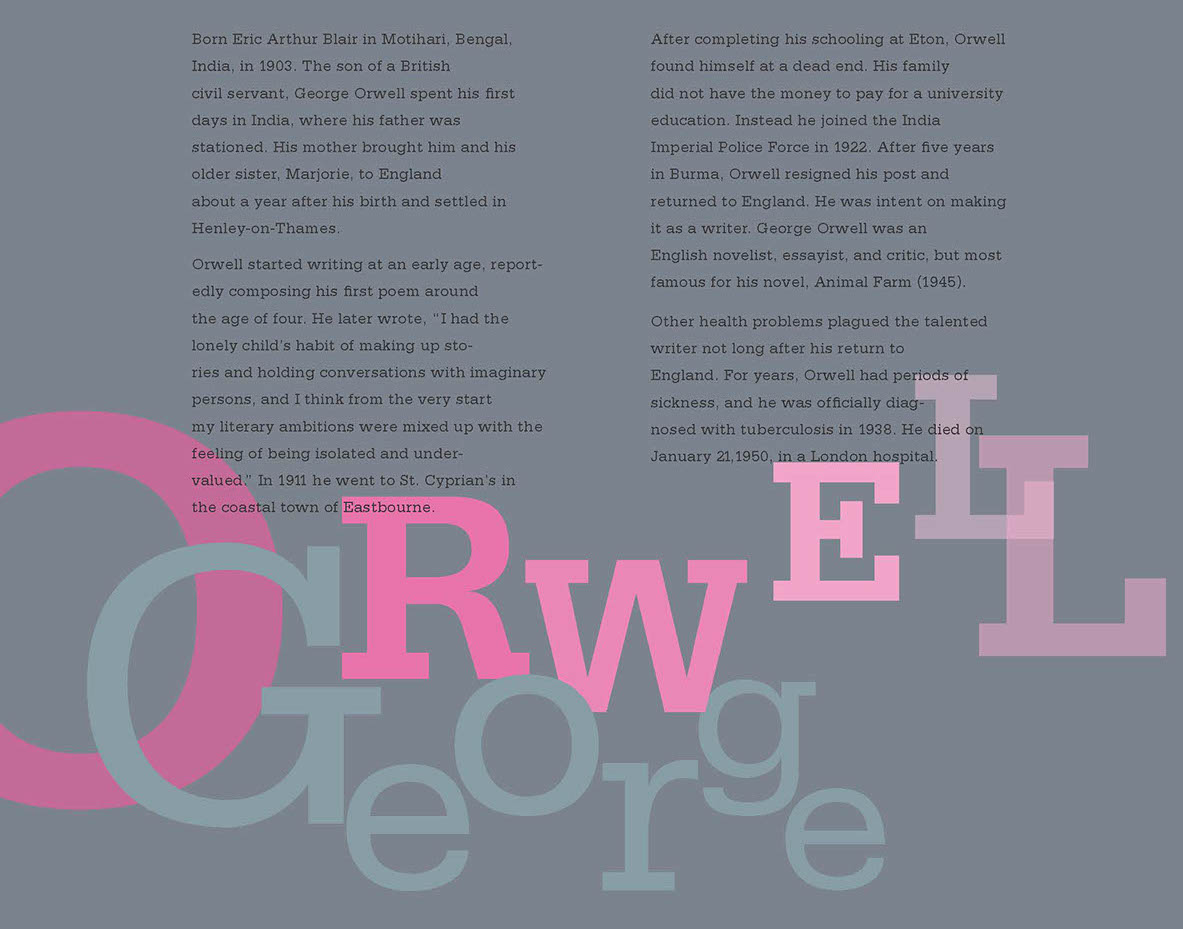
file name: Adrian Frutiger Serifa 1966 Poster by Elizabeth Villarreal 2015c
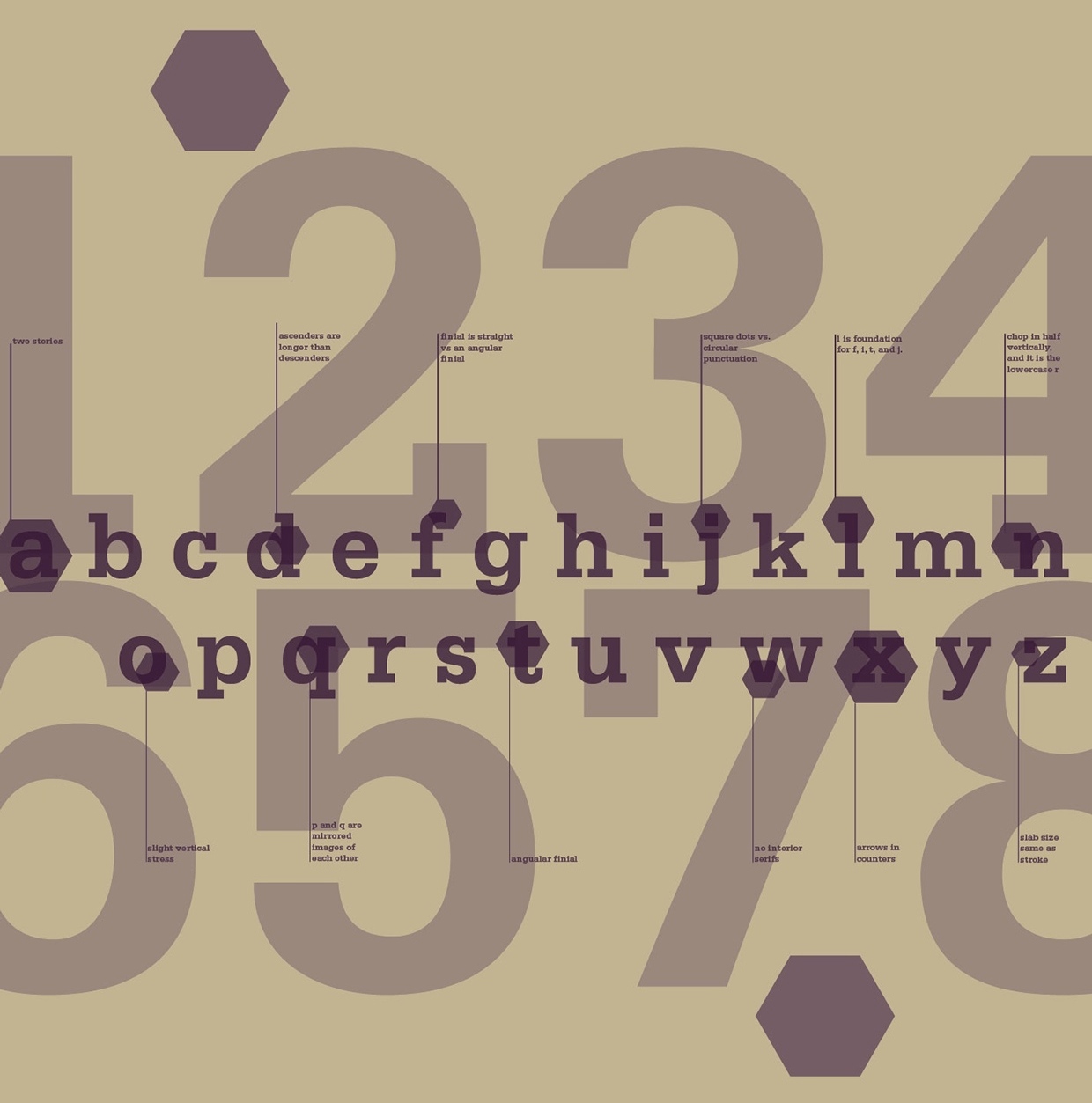
file name: Adrian Frutiger Serifa 1964 Poster by Amy Brown 2014.b
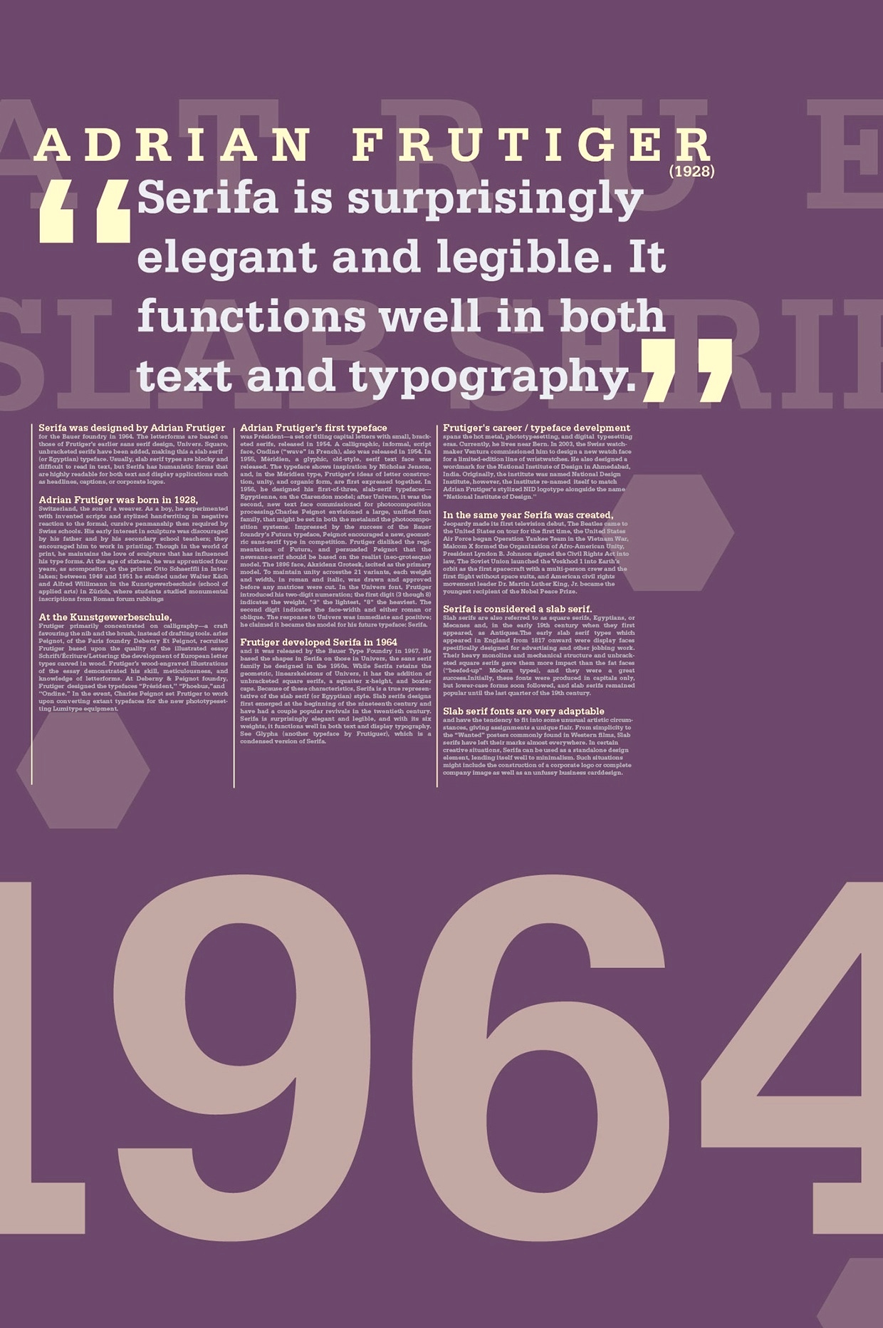
file name: Adrian Frutiger Serifa 1964 Poster by Amy Brown 2014.c
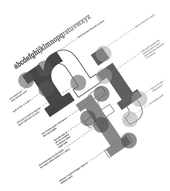
file name: Adrian Frutiger Serifa 1964 Poster by Amy Brown 2014.d
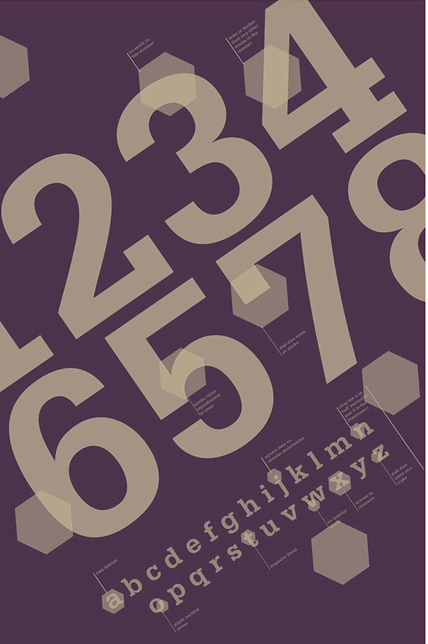
file name: Adrian Frutiger Serifa 1964 Poster by Amy Brown 2014.e
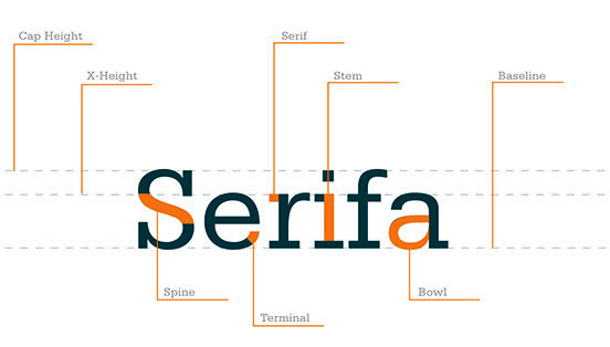
file name: Adrian Frutiger Serifa 1964 Poster by Chelsey Reusch 2017
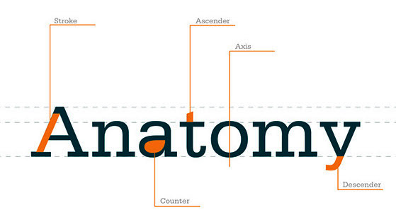
file name: Adrian Frutiger Serifa 1964 Poster by Chelsey Reusch 2017
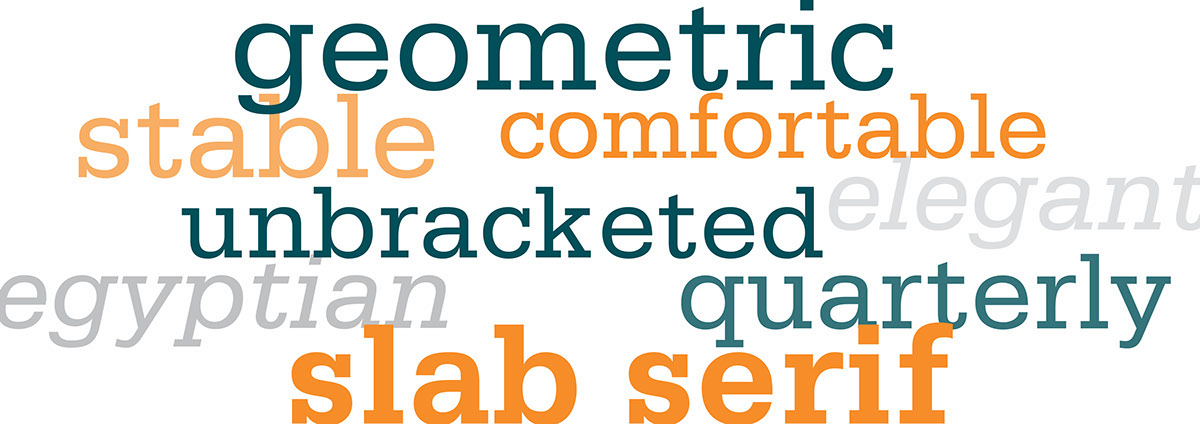
file name: Adrian Frutiger Serifa 1964 Poster by Chelsey Reusch 2017b

file name: Adrian Frutiger Serifa 1964 Poster by Chelsey Reusch 2017c

file name: Frutiger Typeplay
file name: Pic Mandel Frutiger 1956

file name: Adrian Frutiger Linotype Centennial 1986 197911

file name: Adrian Frutiger Linotype Centennial 1986 197911

file name: Adrian Frutiger Linotype Centennial 1986 198941

file name: Adrian Frutiger Linotype Centennial 1986 198941
file name: Adrian Frutiger Linotype Centennial 1986a

file name: Adrian Frutiger Linotype Centennial 1986b
file name: Adrian Frutiger Akira Kobayashi Pic 2004

file name: Adrian Frutiger 2006 Pic by Adam Twardoch

file name: Adrian Frutiger Pic
file name: Adrian Frutiger Pic by Henk Gianotten
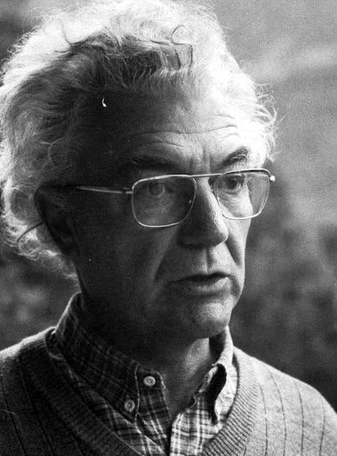
file name: Adrian Frutiger Pic
| | |
|
Luc Devroye ⦿ School of Computer Science ⦿ McGill University Montreal, Canada H3A 2K6 ⦿ lucdevroye@gmail.com ⦿ https://luc.devroye.org ⦿ https://luc.devroye.org/fonts.html |

