TYPE DESIGN INFORMATION PAGE last updated on Wed May 6 16:23:40 EDT 2026
FONT RECOGNITION VIA FONT MOOSE

|
|
|
|
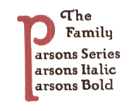
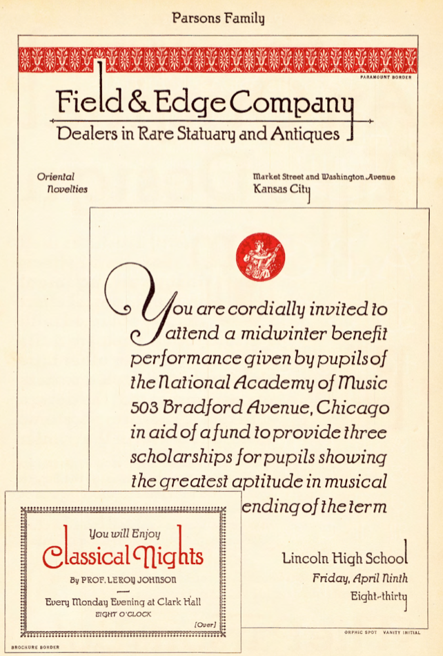
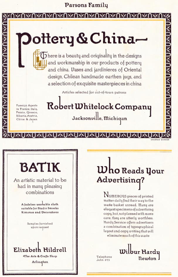
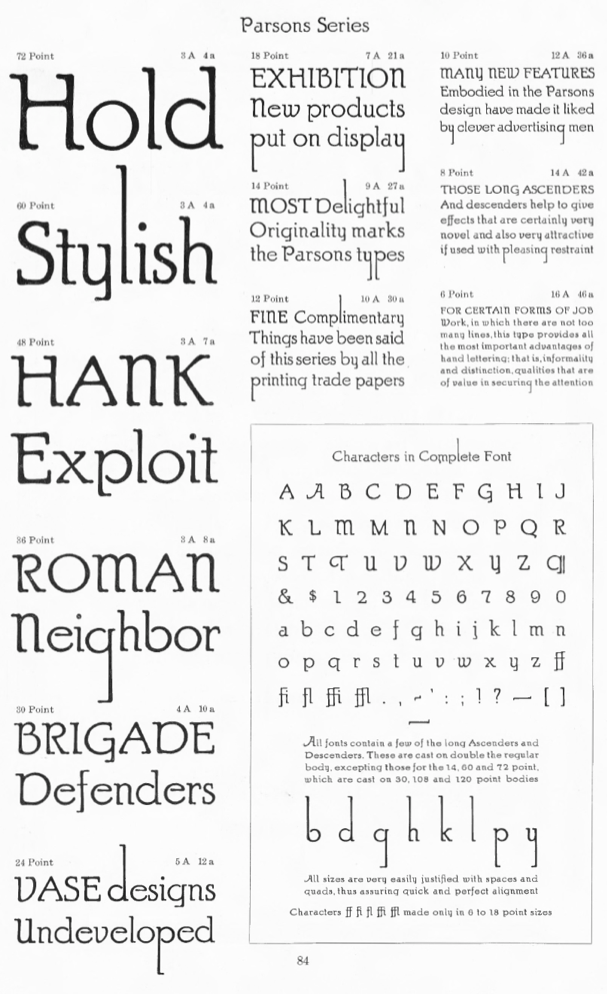
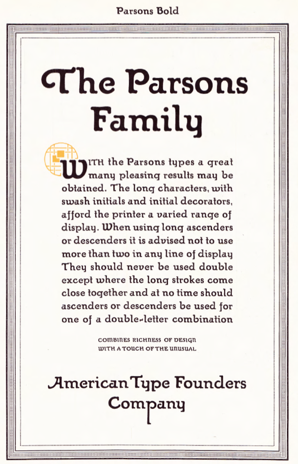
ATF 1923 Catalog: Parsons
[Will Ransom]
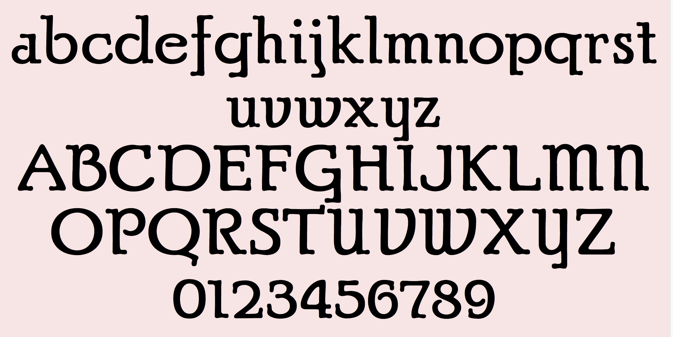
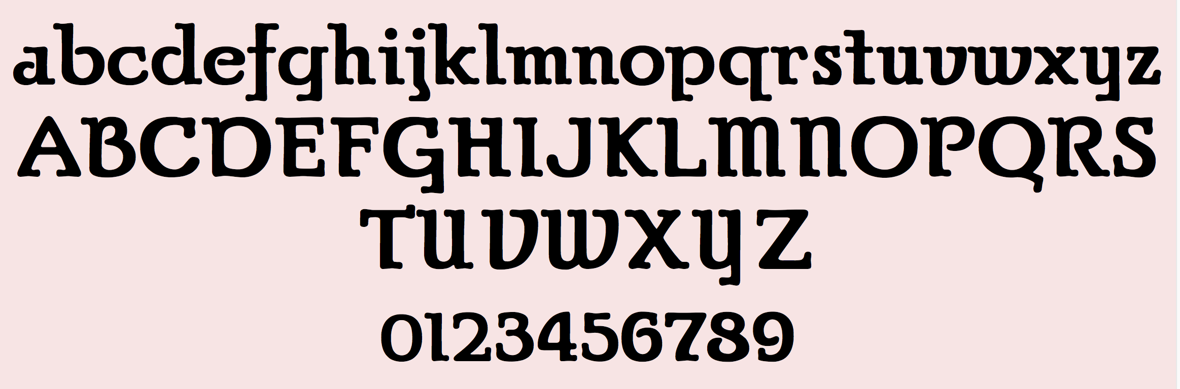
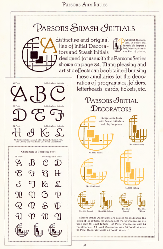
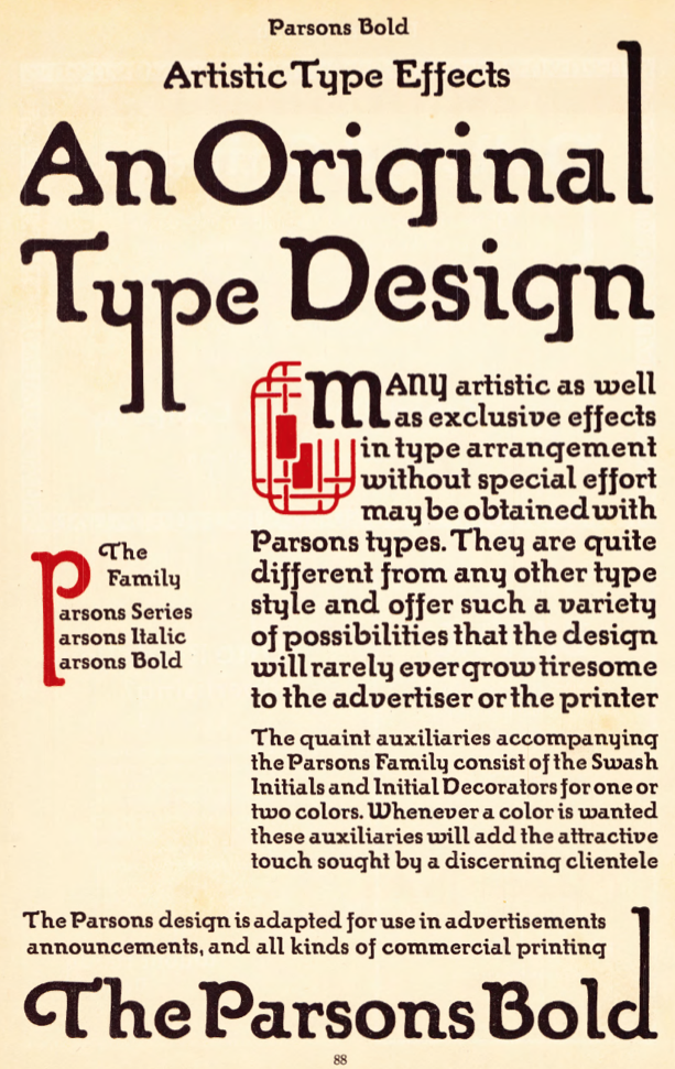
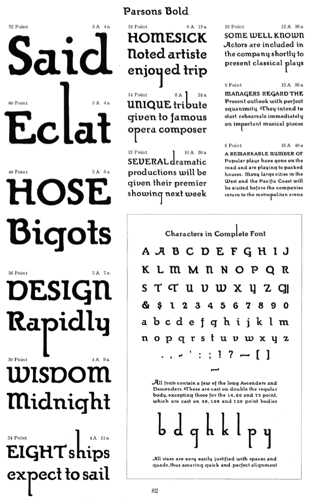
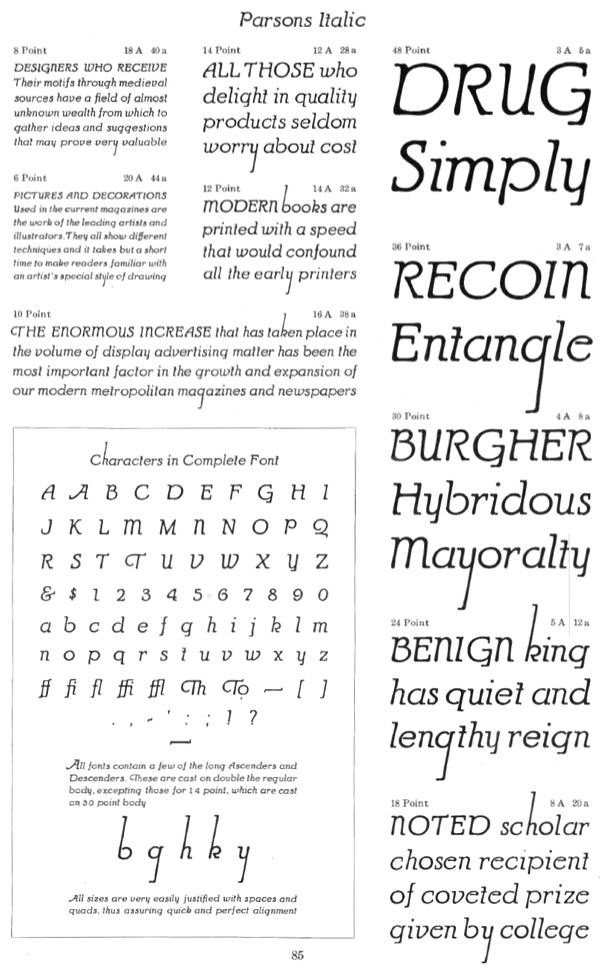
Showcasing the best pages from the Parsons Series in the ATF 1923 Catalog. This is an original ATF display typeface (via its acquisition of BB&S) with a hand-drawn almost art nouveau look. Created in 1918 by Will Ransom for Barnhart Brothers&Spindler, it was named after the artistic director of a Chicago-based department store. Mac McGrew: Parsons was designed for BB&S in 1917 by Will Ransom, Chicago artist based on the distinctive style of lettering he had been doing for advertisers in that city, and was named for I. R. Parsons, advertising manager of a Chicago department store. It is nearly monotone, but with a hand-lettered quality. It has unusual half-serifs and unique forms to a number of letters. The caps MNUY have a lowercase design, but at the insistence of users a more conventional form of M and N was added by the foundry, to the distress of the designer. Parsons Italic and Parsons Bold were added in 1918 by the same artist. Oversize ascenders and descenders are one of the most notable features of this type, but Ransom was reluctant to let the foundry cut them. At his insistence the foundry included with specimens a warning that generally only one such letter should be used in a line, and suggesting other restrictions. The type was a great success but the suggestions were commonly ignored, and advertising bristled with groves of tall letters. It is said that this display of bad taste in the use of his design dismayed Ransom so much that he abandoned the idea of designing other typefaces. Only Clearcut Shaded Capitals, in 1924, are later credited to him, aside from decorative material. Parsons is believed to be the first typeface to feature long characters of this sort although several artists had used them in distinctive hand-lettering. At least one typeface---Pencraft (q.v.)---had earlier supplied flourishes which could be added to special ascenders and descenders. Stymie Bold (q.v.) resurrected the idea later but less successfully. The Parsons long characters were included in all fonts; f-ligatures were made for all sizes of italic, but only up to 18-point in the roman and not at all for the bold. Monotype lists "Parson's Bold" in some of its literature; this is presumed to be the same typeface but no confirmation or specimen has been found. Parsons Swash Initials were designed by Sidney Gaunt; some of them were not approved by Ransom but were cast anyway. Digitizations include AIParsons (1994) by Inna Gertsberg and Susan Everett at Alphabets Inc. Nick Curtis' Parsnip family (2004) is based on Parsons. Jess Latham also digitized Parsons. See also OPTI Puritan Bold Flair in the Castcraft collection. Finally, Dieter Steffmann converted the Gertsberg / Everett revival in 1999 to truetype while keeping the name AI Parsons. |
EXTERNAL LINKS |
| | |
file name: Inna Gertsberg Susan Everett A I Parsons 1994 based on Will Ransom Parsons 1920s converted to ttf by Dieter Steffmann 1999
file name: A T F1923 Parsons c
file name: A T F1923 Parsons d
file name: A T F1923 Parsons
file name: Dieter Steffmann Parsons Heavy 2000 after Bill Ransom 1918
file name: A T F1923 Parsons Auxiliaries
file name: A T F1923 Parsons Bold b
file name: A T F1923 Parsons Bold c
file name: A T F1923 Parsons Bold
file name: A T F1923 Parsons Italic
| | |
|
Luc Devroye ⦿ School of Computer Science ⦿ McGill University Montreal, Canada H3A 2K6 ⦿ lucdevroye@gmail.com ⦿ https://luc.devroye.org ⦿ https://luc.devroye.org/fonts.html |