TYPE DESIGN INFORMATION PAGE last updated on Sun Jul 12 12:35:34 EDT 2026
FONT RECOGNITION VIA FONT MOOSE

|
|
|
|
ATF 1923 Catalog: Cheltenham
[Morris Fuller Benton]
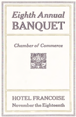
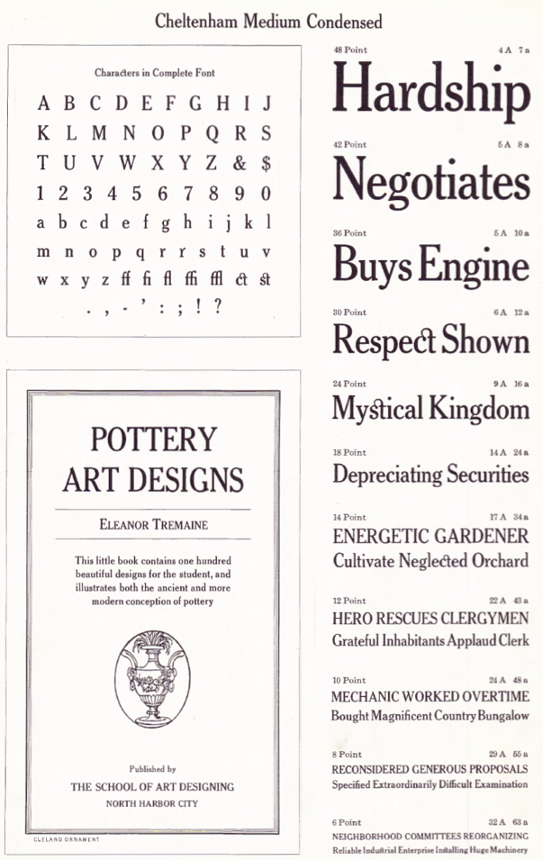
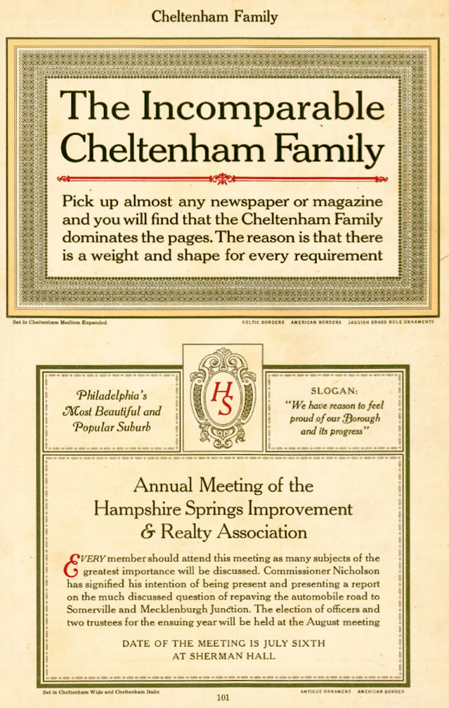
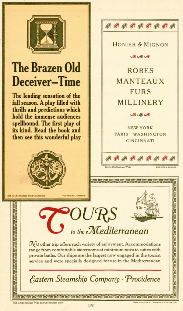
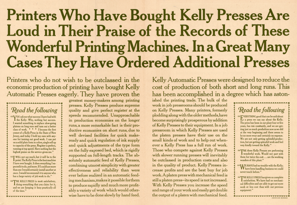
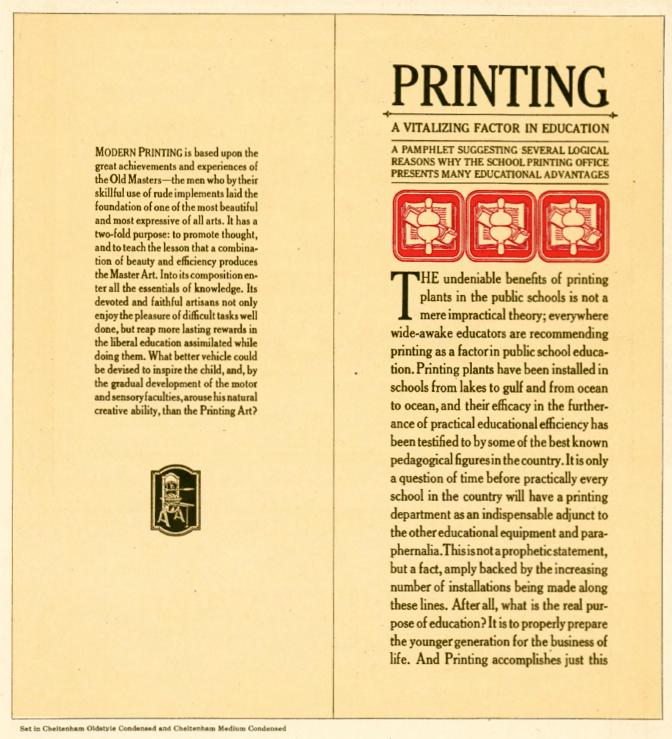
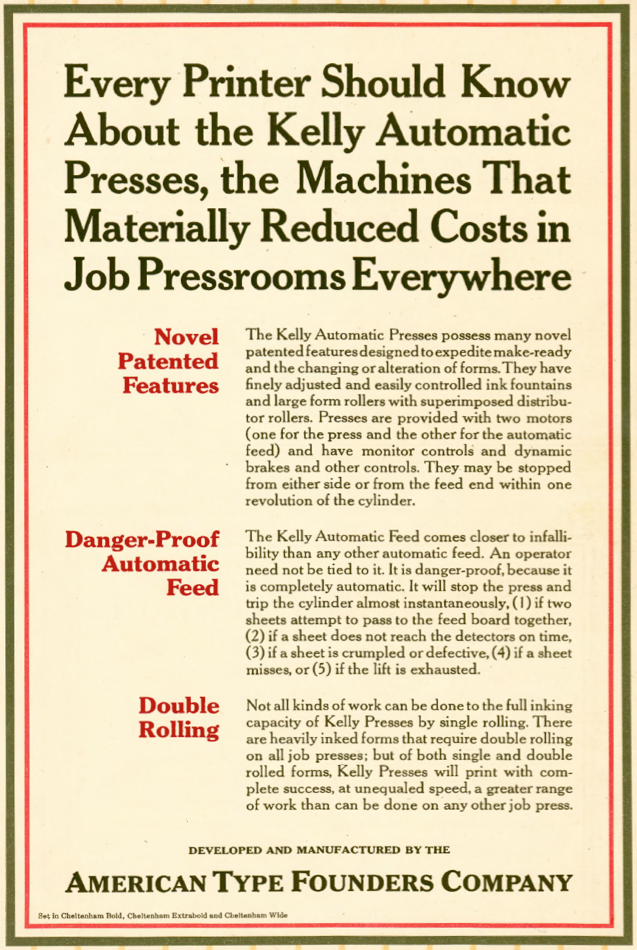
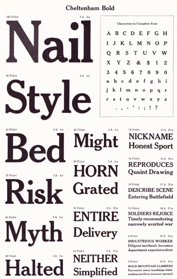
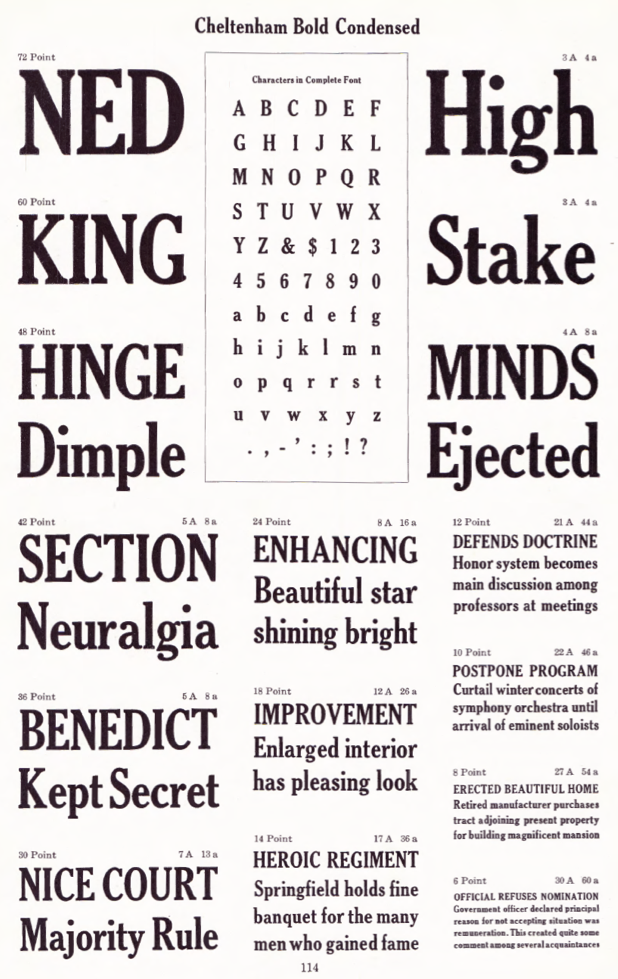
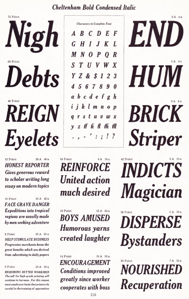
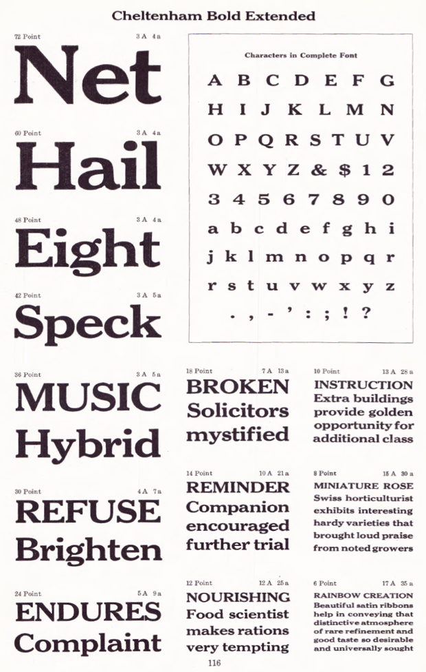
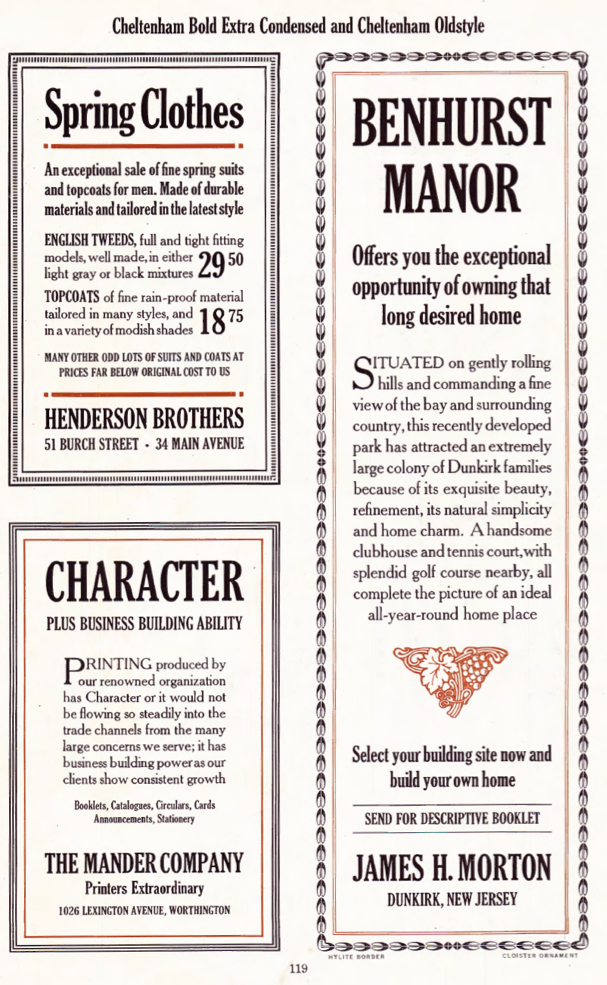
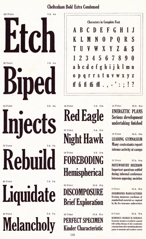
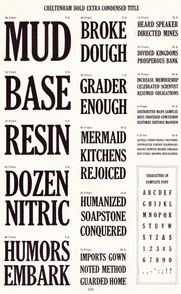
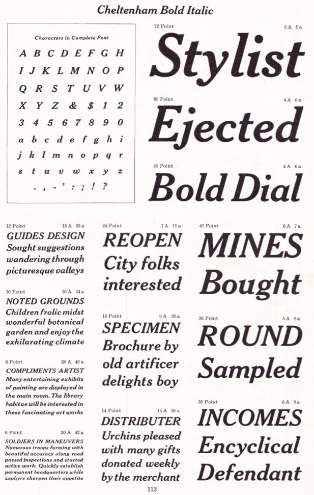
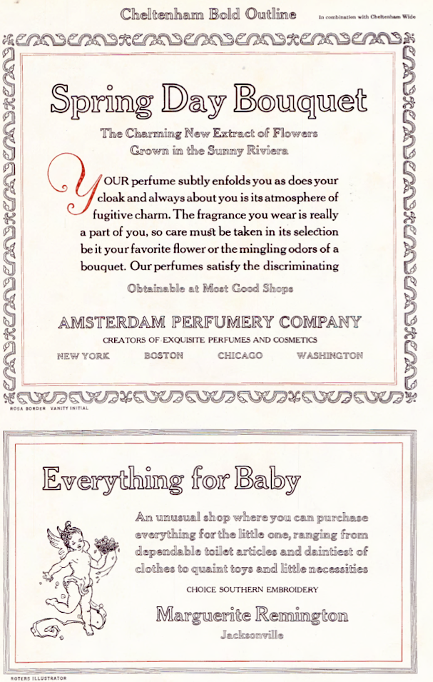
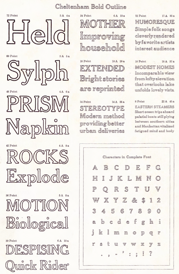
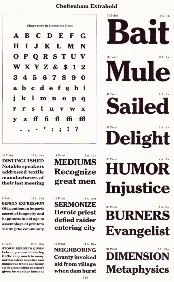
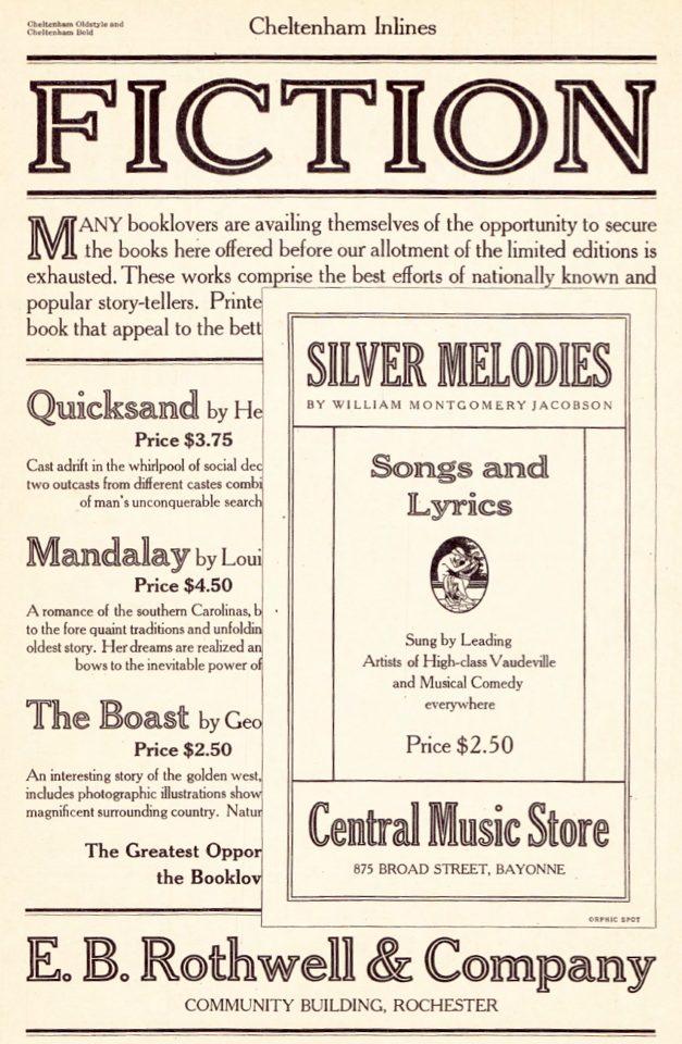
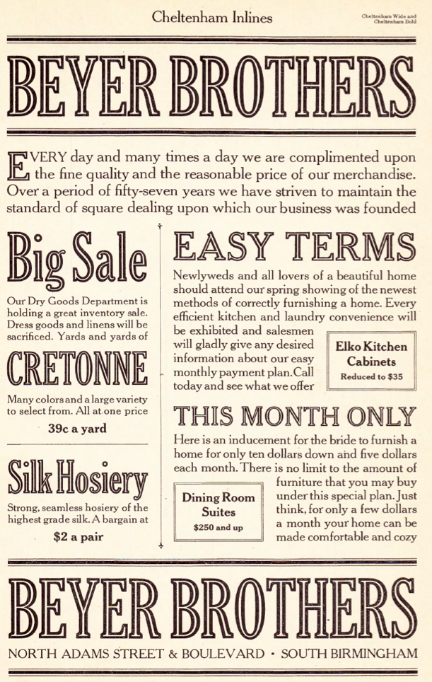
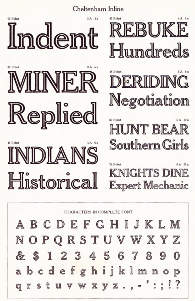
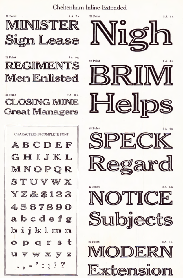
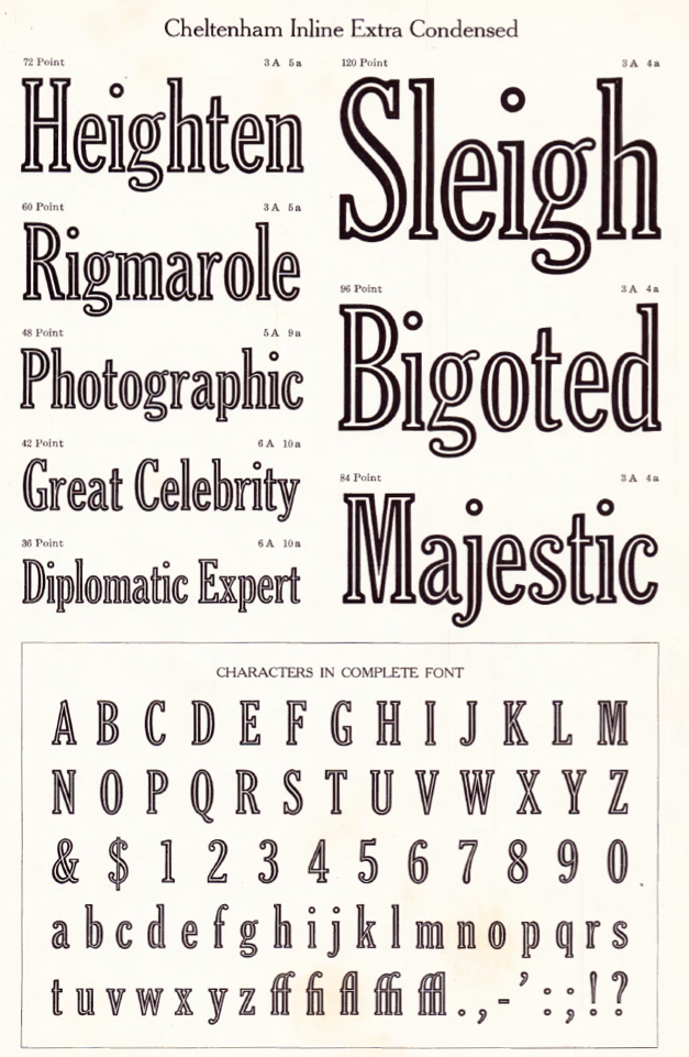
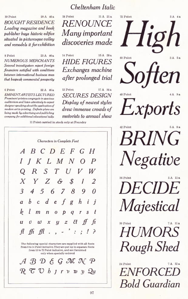
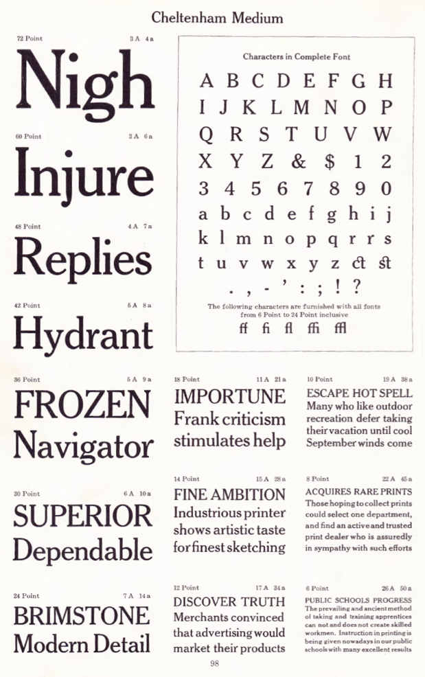
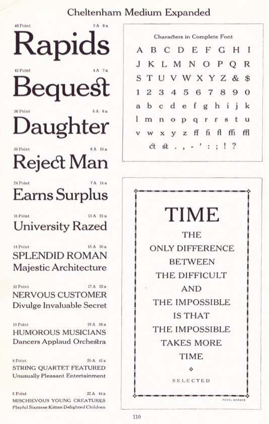
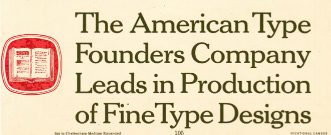
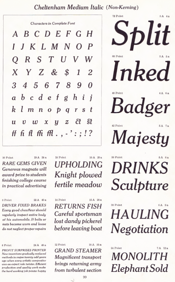
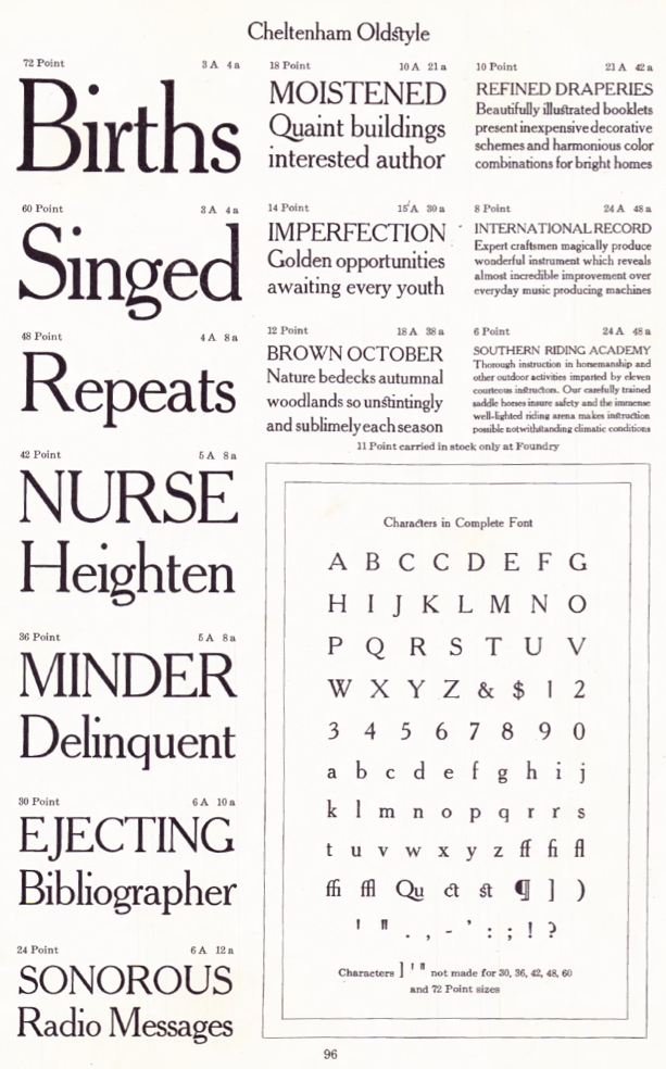
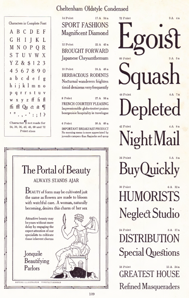
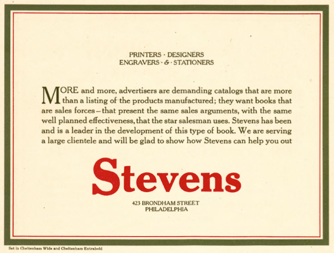
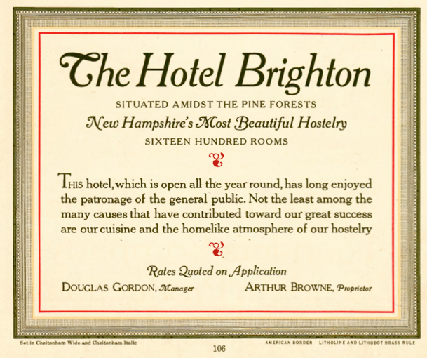
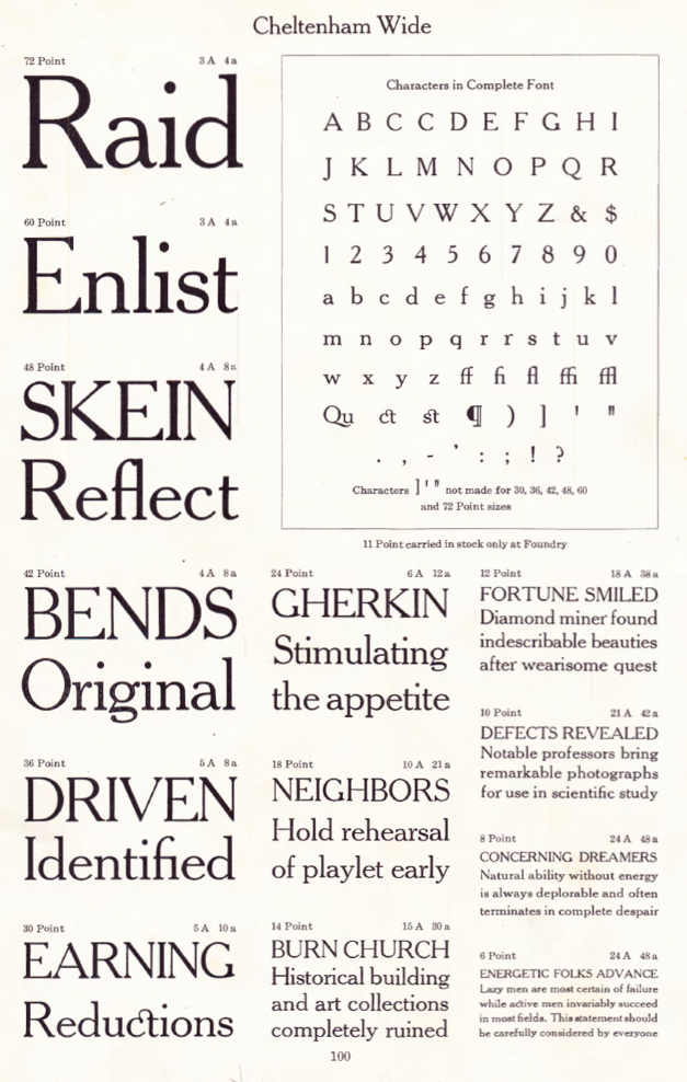
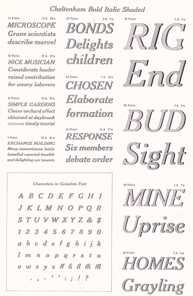
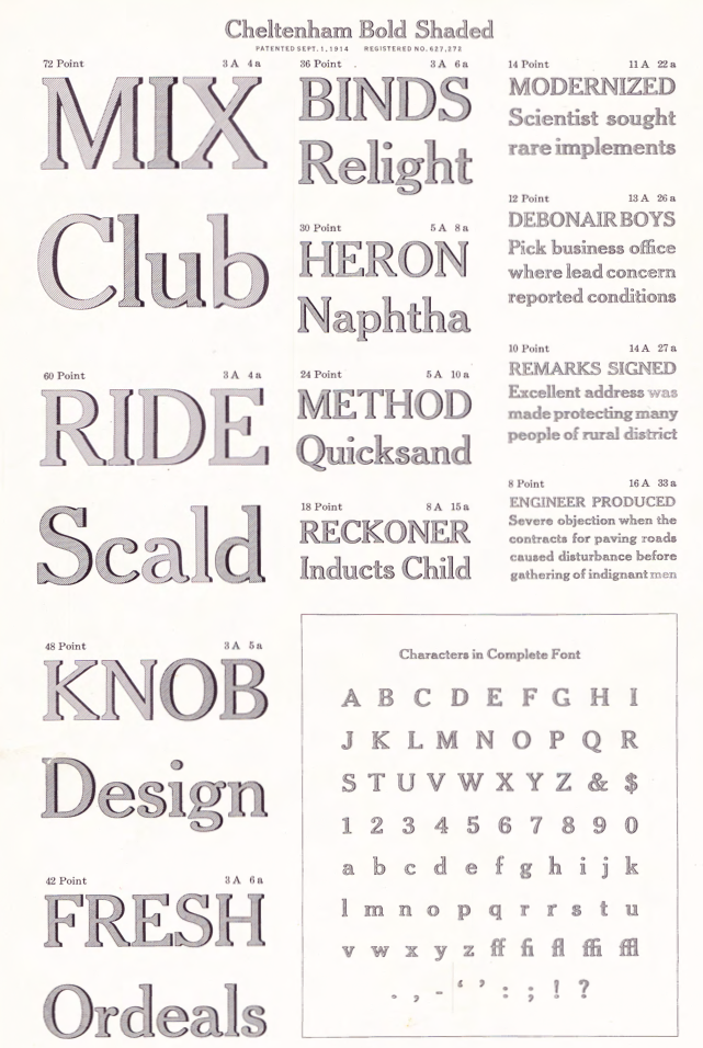
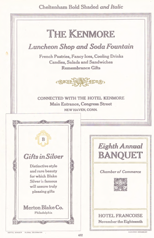
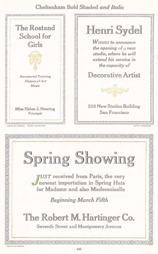
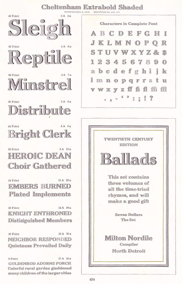
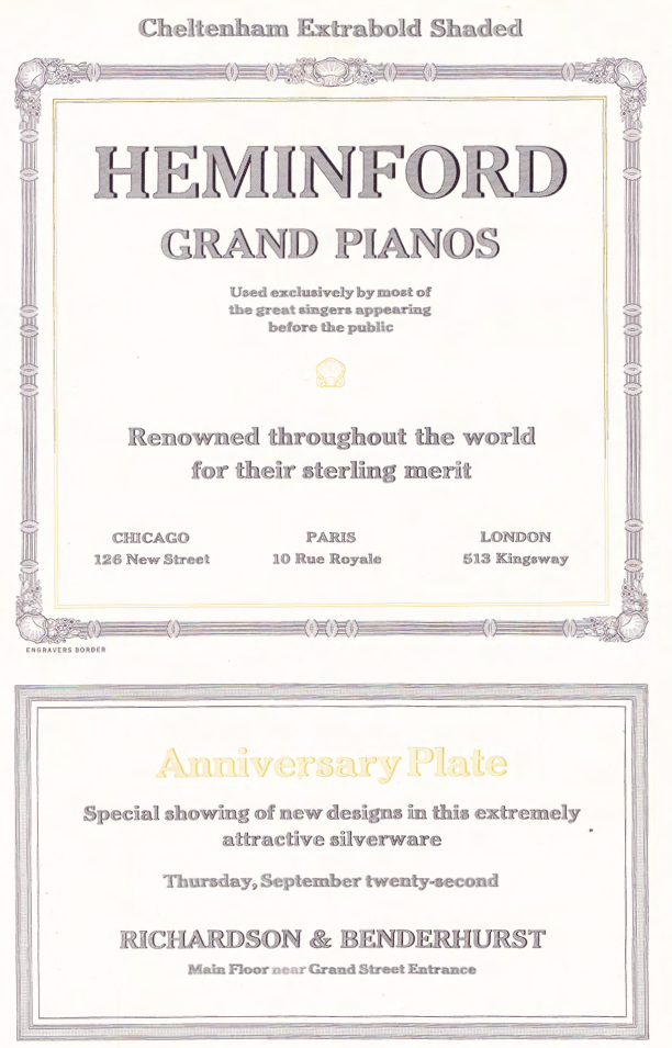
Showcasing the best pages from the Cheltenham Series in the ATF 1923 Catalog. Cheltenham was designed by Bertram Grosvenor Goodhue, but the Cheltenham in the ATF catalog is a reworking by Morris Fuller Benton. Mac McGrew explains: The design of Cheltenham Oldstyle and Italic is credited to Bertram Grosvenor Goodhue, an architect who had previously designed Merrymount, a private press type. For Cheltenham he had the assistance of Ingalls Kimball, director of the Cheltenham Press in New York City, who suggested and supervised the face. Original drawings were made about 14 ' inches high, and were subjected to much experimentation and revision. Further modification of the design was done by the manufacturers. Some historians credit this modification or refinement to Morris F. Benton; another source says it was done at the Boston branch of ATF, which suggests that the work may have been done by Joseph W. Phinney. In fact, Steve Watts says the typeface was first known as Boston Oldstyle. Mergenthaler Linotype also claims credit for developing the face, but it was first marketed by ATF. Trial cuttings were made as early as 1899, but it was not completed until about 1902, and patented in 1904 by Kimball. It was one of the first scientifically designed typefaces. The thin lines were strengthened to avoid the emaciated look of many types of the period. It is almost a monotone, but with just enough difference between light and heavy lines to avoid monotony. The small serifs and short, compact lowercase make a high character count. Ascenders are unusually long, while descenders are quite short. This was done as a result of studies that showed the greater importance of the upper half of a line of type in creating readily recognizable word shapes and result ing readability. The typeface has had much adverse criticism, especially because of its short descenders and the unusual design of several characters---notably A with the extension of its thick stroke at the top, G with the curve extended at the bottom, and g with its angular, unclosed tail. The alternate form of r, with its arm raised above x-height, has also been criticized, but this is mostly the result of misuse. It is disturbing within a word, but adds a bit of grace at the end of a word. Oddly, original fonts had only this form, with the more regular r added later; most fonts for handsetting include both forms of r, but those for machine setting include only the normal form or in a few cases only the more exotic form. Morris Benton, ATF's chief designer, produced Cheltenham Bold in 1904 and a score of variations up to 1913, methodically exploring the possibilities of various combinations of weight and width, and making this the first true large type family. Benton's variations include Cheltenham Bold Condensed, 1904; Cheltenham Bold Italic, Cheltenham Bold Condensed Italic, Cheltenham Wide and Cheltenham Bold Outline, 1905; Cheltenham Bold Extra Condensed and Cheltenham Bold Extended, 1906; Cheltenham Inline, Inline Extra Condensed and Inline Extended, 1907; Cheltenham Oldstyle Condensed, (Cheltenham continues) 1909; Cheltenham Medium, 1909; Medium Italic, 1910; Cheltenham Extrabold, 1910; Cheltenham Bold Shaded, Bold Italic Shaded and Extrabold Shaded, 1912; and Cheltenham Medium Condensed and Expanded, 1913. Linotype, Monotype, and Ludlow each have duplicates of a dozen or more Cheltenhams, while Intertype has the same under the name Cheltonian. Nearly all of these are essentially the same, except for the addition of ligatures and diphthongs in some display fonts (as shown for Cheltenham Bold), and the modification of keyboard sizes to fit mechanical requirements, but this is substantial in some cases. A curious exception is C heltenham Bold Outline; in the original foundry version it is cut from the same patterns as Bold so they will register for two-color work, while Monotype display sizes have several characters rather crudely redesigned---note H, P, R, e, h, u shown separately. Some of these other sources have also added versions of their own, notably Cheltenham Cursive, designed by Robert H. Middleton for Ludlow, and Cheltenham Wide Italic on Monotype, probably designed by Sol Hess. The latter carries the modifications required for machine-set sizes into display sizes as well. There are several oddities in the Cheltenham family. Cheltenham Wide is identical with Cheltenham Oldstyle except for the lowercase, in handset fonts. The same figures and punctuation marks from these two typefaces are also shared by Cheltenham Oldstyle Condensed, again in handset fonts. In the specimens shown here, compare Oldstyle and Wide. The former, set in ATF type, has two forms of cap C, which that foundry supplied with both typefaces, while the latter, set in Monotype, has two forms of cap W, which that company made only for that face. The unusual paragraph, prime and double prime marks, as well as parentheses and brackets, were made by ATF in some sizes of all three typefaces, but by Monotype only in Cheltenham Oldstyle. There is no Cheltenham Condensed Italic, but Linotype has a Cheltenham Extra Condensed Italic (so-called), which is actually a little wider than Cheltenham Condensed (roman)---why it is called extra condensed is not known. It suffers from adaptation to straight matrices, with annoying gaps between some letter combinations. But Cheltenham Medium Italic was designed more successfully by Benton to fit straight type bodies without kerns. Figures in the medium, bold, and extrabold weights differ from those of the Oldstyle; also notice how the x-height increases with weight. Ludlow Cheltenham is distinguished by the greater slant of some of its italics, and by the rounder top on the roman lowercase a and the rounder lower spur on capital G, as shown in some of the specimens. Western Type Foundry copied several members of this family as Chesterfield. Hansen had the Craftsman series, differing most noticeably in the few characters shown; and other foundries around the world copied it under a variety of names. Also see Kenilworth, Lowell, Venetian. |
EXTERNAL LINKS |
| | |
file name: A T F1923 Cheltenha Medium Condensed
file name: A T F1923 Cheltenham b
file name: A T F1923 Cheltenham c
file name: A T F1923 Cheltenham d
file name: A T F1923 Cheltenham e
file name: A T F1923 Cheltenham Bold Extrabold Wide
file name: A T F1923 Cheltenham Bold
file name: A T F1923 Cheltenham Bold Condensed
file name: A T F1923 Cheltenham Bold Condensed Italic
file name: A T F1923 Cheltenham Bold Extended
file name: A T F1923 Cheltenham Bold Extra Condensed Oldstyle
file name: A T F1923 Cheltenham Bold Extra Condensed
file name: A T F1923 Cheltenham Bold Extra Condensed Title
file name: A T F1923 Cheltenham Bold Italic
file name: A T F1923 Cheltenham Bold Outline b
file name: A T F1923 Cheltenham Bold Outline
file name: A T F1923 Cheltenham Extrabold
file name: A T F1923 Cheltenham Inline b
file name: A T F1923 Cheltenham Inline c
file name: A T F1923 Cheltenham Inline d
file name: A T F1923 Cheltenham Inline e
file name: A T F1923 Cheltenham Inline
file name: A T F1923 Cheltenham Inline Extended
file name: A T F1923 Cheltenham Inline Extra Condensed
file name: A T F1923 Cheltenham Italic
file name: A T F1923 Cheltenham Medium b
file name: A T F1923 Cheltenham Medium
file name: A T F1923 Cheltenham Medium Expanded b
file name: A T F1923 Cheltenham Medium Expanded
file name: A T F1923 Cheltenham Medium Italic
file name: A T F1923 Cheltenham Oldstyle
file name: A T F1923 Cheltenham Oldstyle Condensed
file name: A T F1923 Cheltenham Wide Extrabold
file name: A T F1923 Cheltenham Wide Italic
file name: A T F1923 Cheltenham Wide b
file name: A T F1923 Cheltenham Wide
file name: Morris Fuller Benton Cheltenham Bold Italic Shaded 1912
file name: Morris Fuller Benton Cheltenham Bold Shaded 1912
file name: Morris Fuller Benton Cheltenham Bold Shaded 1912b
file name: Morris Fuller Benton Cheltenham Bold Shaded 1912c
file name: Morris Fuller Benton Cheltenham Extrabold Shaded 1912
file name: Morris Fuller Benton Cheltenham Extrabold Shaded 1912b
| | |
|
Luc Devroye ⦿ School of Computer Science ⦿ McGill University Montreal, Canada H3A 2K6 ⦿ lucdevroye@gmail.com ⦿ https://luc.devroye.org ⦿ https://luc.devroye.org/fonts.html |