|
ATF 1923 Catalog: Caslon typefaces
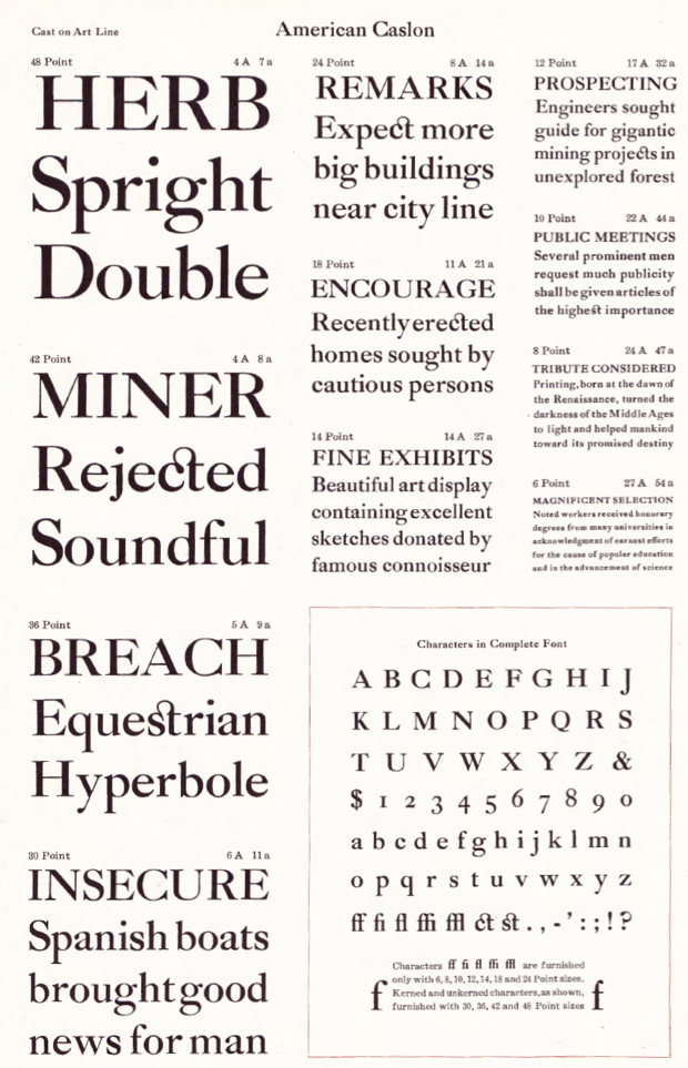
The Caslon typefaces in the ATF catalog from 2013 include the following: - American Caslon (Morris Fuller Benton), and American Caslon Italic.
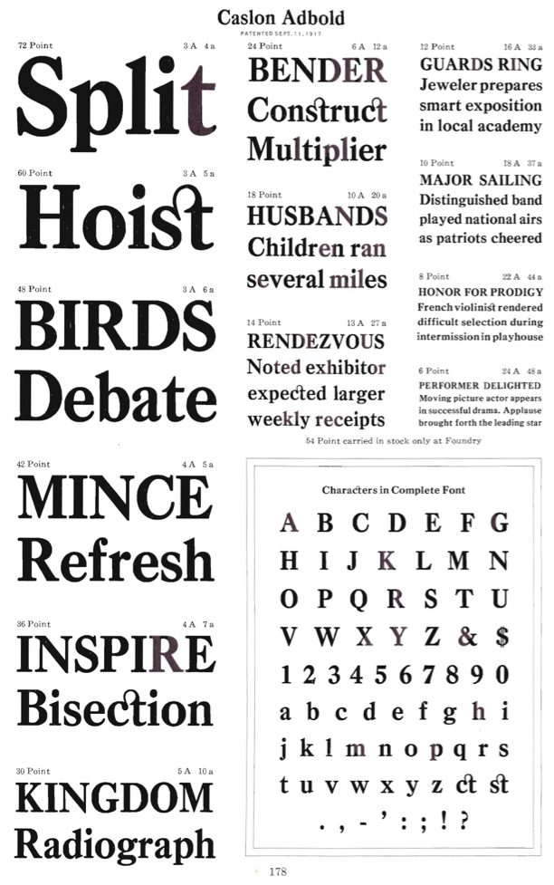
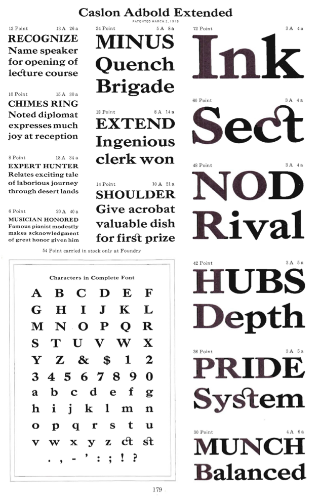
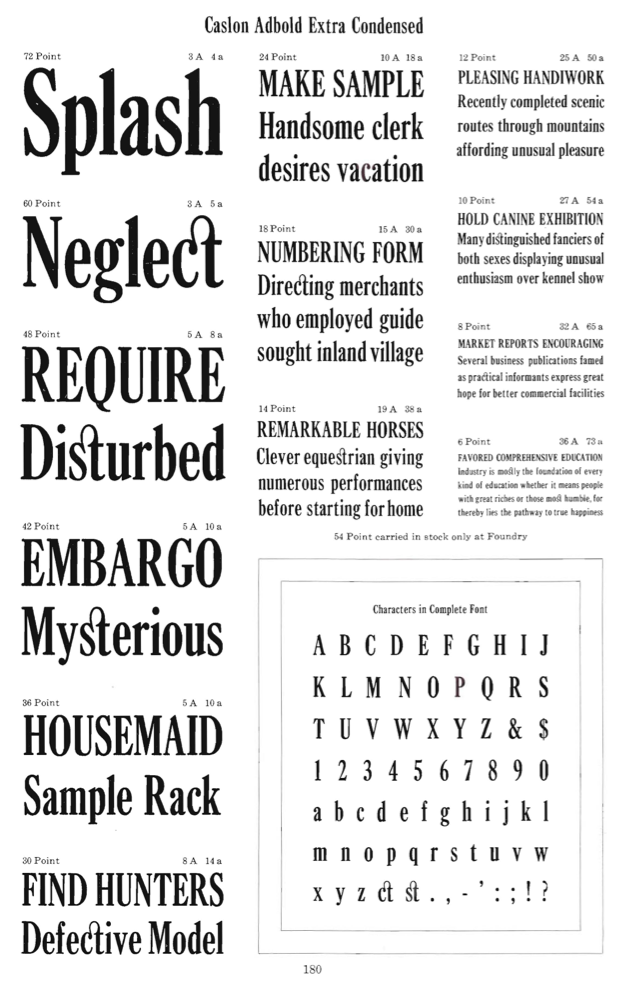
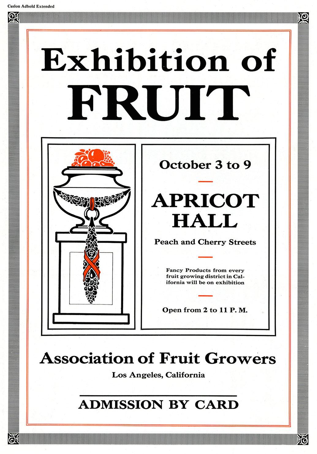
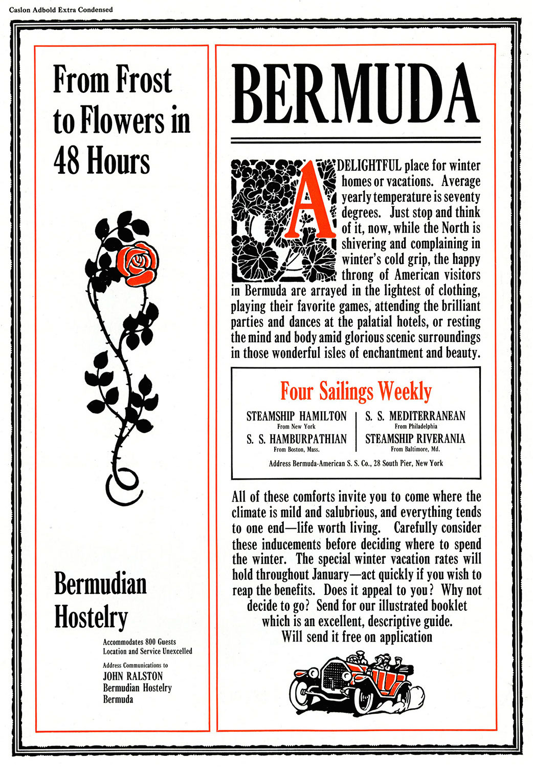
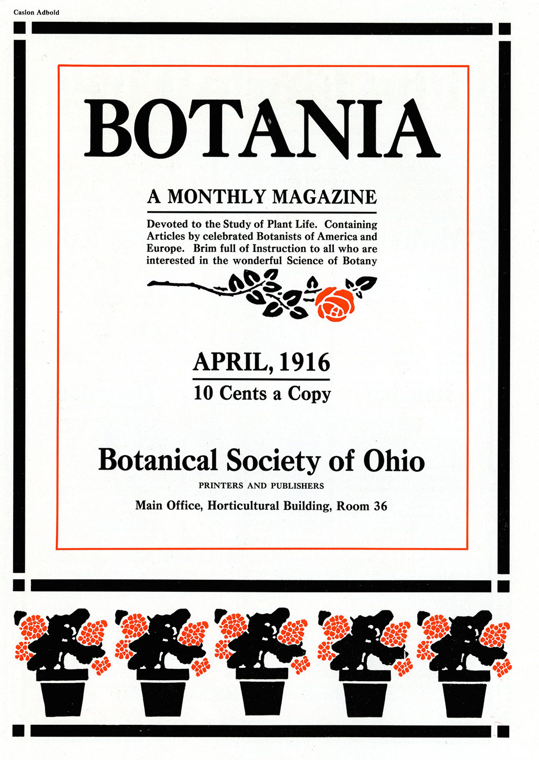
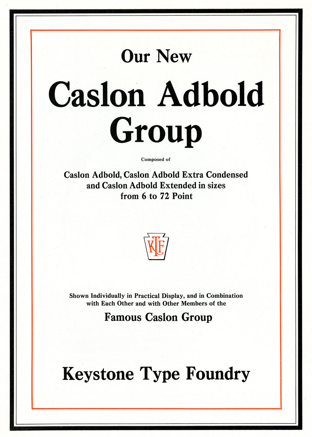
- Caslon Adbold. Mac McGrew: Caslon Adbold, originating with Keystone in 1913, is characterized by heavier strokes throughout; Extended and Extra Condensed versions followed in 1915 to 1917; all were patented and presumably designed by R. F. Burfeind.
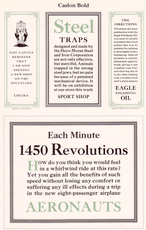
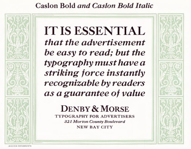
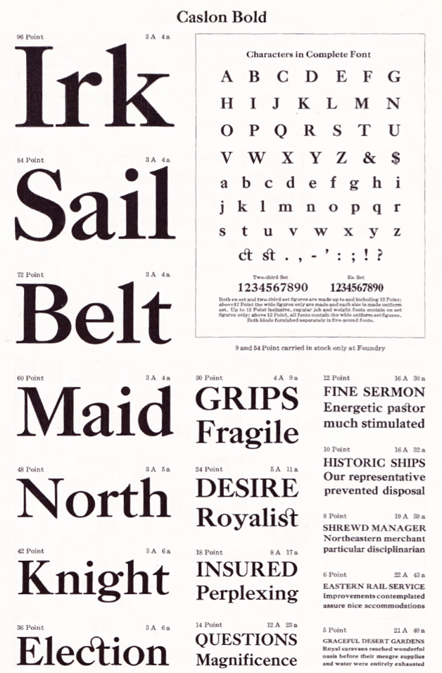
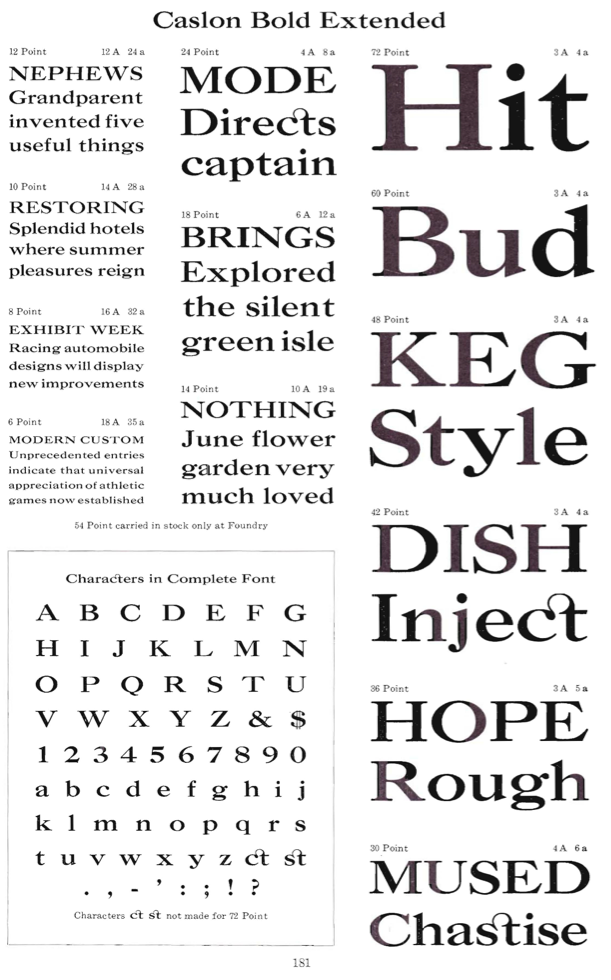
- Caslon Bold. Mac McGrew: The most popular Caslon Bold was introduced by Keystone Type Foundry in 1905, followed by Italic in 1906 and Condensed and Extended versions about 1911; this is the version made by ATF and in regular widths by Monotype. Monotype keyboard sizes (including large composition to 18-point) are modified considerably to fit standard arrangements, but the only apparent difference in display sizes is the redrawn T and g shown separately in the specimen alphabet and the addition of ligatures and diphthongs on Linotype and Intertype.
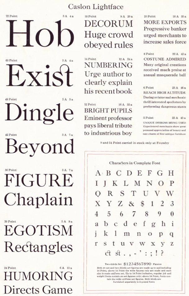
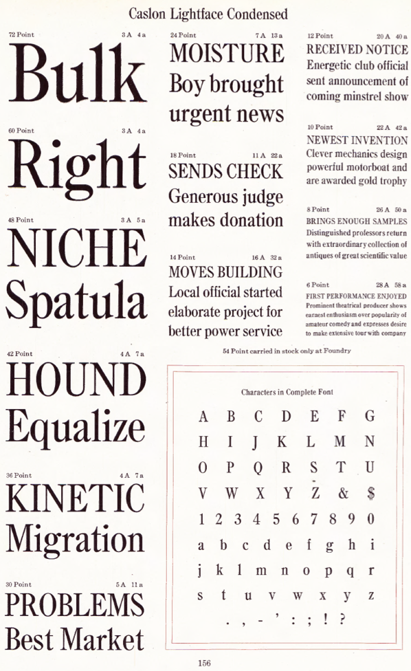
- Caslon Lightface (Keystone, 1910-1912).
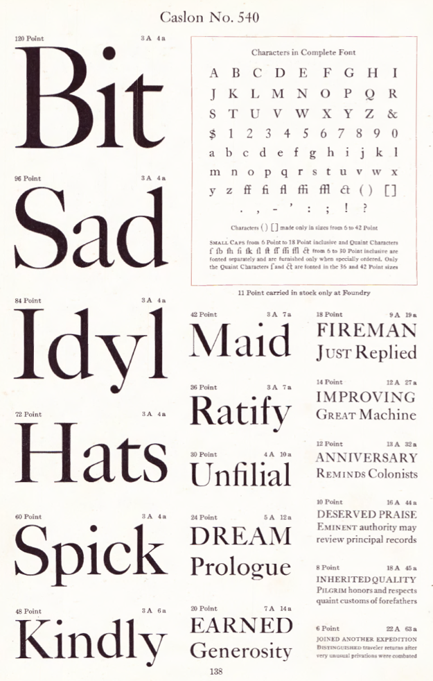
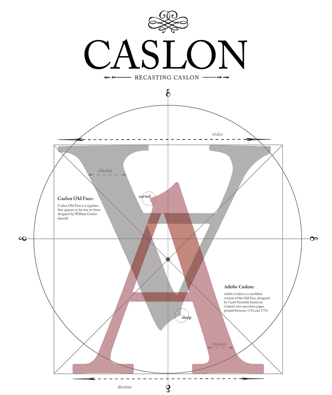
- Caslon No. 540. Mac McGrew: Inland Type Foundry, St. Louis, advertised its own version of Caslon Old Style in 1901, with the claim. "We have obtained the sole right from the originating house to manufacture this series in the United States. Inland is the only type foundry which casts this typeface on standard line. ..." This meant that they had considerably shortened the descending letters; they had also redesigned the italic extensively. ATF countered with Caslon No. 540, with similarly shortened descenders but essentially the original roman and italic designs otherwise. Several other foundries, including BB&S, Hansen, and Keystone, produced similar Caslons. One of the most noticeable features of Caslon is its lack of uniformity from one size to another. This is due to the fact that all the original characters were cut by hand, before the invention of precise mechanical systems for enlarging and reducing drawings. In Caslon 540, each size is the equivalent of the next larger size of 471, including some obsolete odd sizes. Thus 14-point 540 is equivalent to 18-point 471,18 to 22, 20 to 24, etc. The difference is primarily in the descenders, very unattractively shortened in some sizes of 540; lining figures replace the hanging style, and a few other slight changes have been made. The additional large sizes are an attractive generalized design.
- Caslon Italic No. 540.
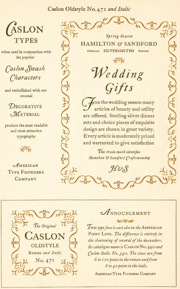
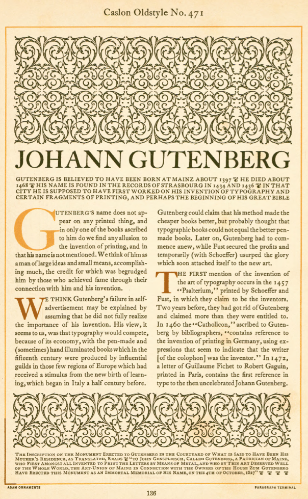
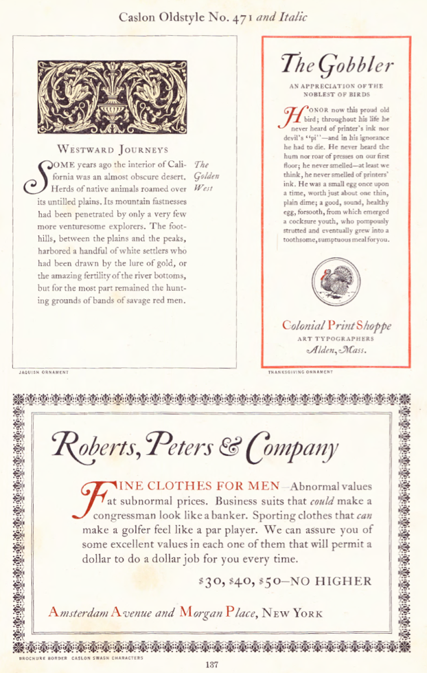
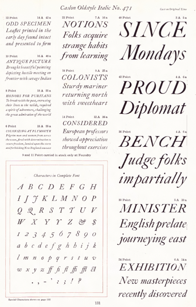
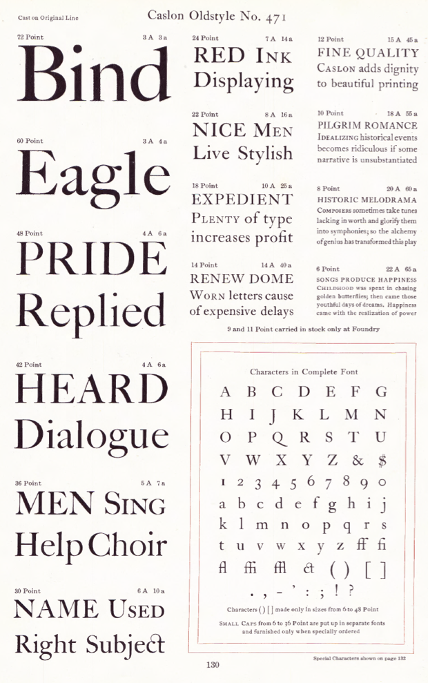
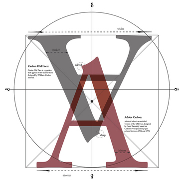
- Caslon Oldstyle No. 471. Mac McGrew: In 1858, Laurence Johnson, a prominent Philadelphia typefounder, visited London and arranged with the successors to William Caslon to duplicate the Caslon types. There are several accounts of how this was done; some say Johnson had fonts specially cast, from which he made electrotype matrices. Another account says he had strikes--unfinished matrices--made from the original punches, while a third account says he obtained the original matrices. The latter account is most unlikely, but the other two possibilities are interestingly credible. Many of the mats still available at ATF, successors to Johnson, are electrotypes-but then, mats wear out anyway, and are commonly replaced by electrotyping existing virgin cast type when patterns or punches are not available. If strikes were finished in this country-the usual process of accurately fitting them for width and position on the type body--this would allow for the fact that some sizes, especially in the 14- to 24-point range, are more loosely fitted here than in England. Otherwise there is virtually no difference between the American and English versions, except for later additions such as dollar mark and various swash letters--the latter are discussed later. Johnson simply called the typeface Old Style, as family names were a later development. When Johnson's foundry merged with MacKellar Smiths&Jordan foundry, the typeface was designated Original Old Style, to distinguish it from other typefaces in the same category. MS&J was part of the great merger that formed ATF in 1892, and the typeface became Old Style No. 71. When ATF's first specimen book was being prepared in 1897, the advertising manager. Henry Lewis Bullen, renamed the series Caslon Old Style. Later "No. 471" was added, the "4" designating typefaces obtained from MS&J.
- Caslon Oldstyle. Mac McGrew: Inland Type Foundry, St. Louis, advertised its own version of Caslon Old Style in 1901, with the claim. "We have obtained the sole right from the originating house to manufacture this series in the United States. Inland is the only type foundry which casts this typeface on standard line. ..." This meant that they had considerably shortened the descending letters; they had also redesigned the italic extensively. ATF countered with Caslon No. 540, with similarly shortened descenders but essentially the original roman and italic designs otherwise.
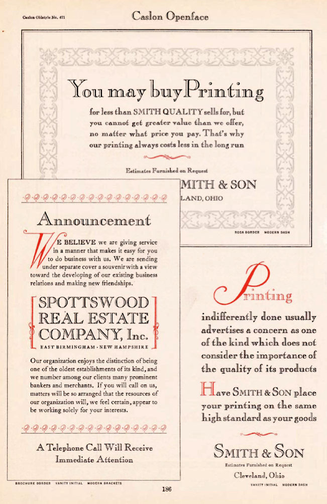
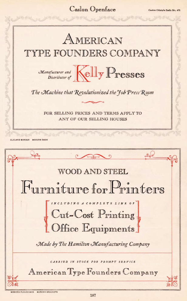
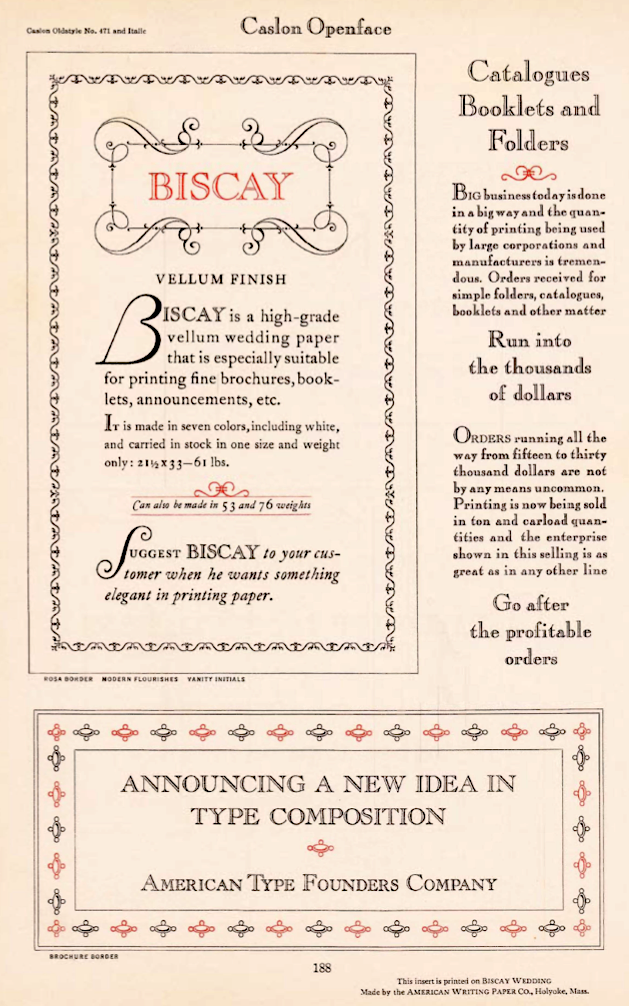
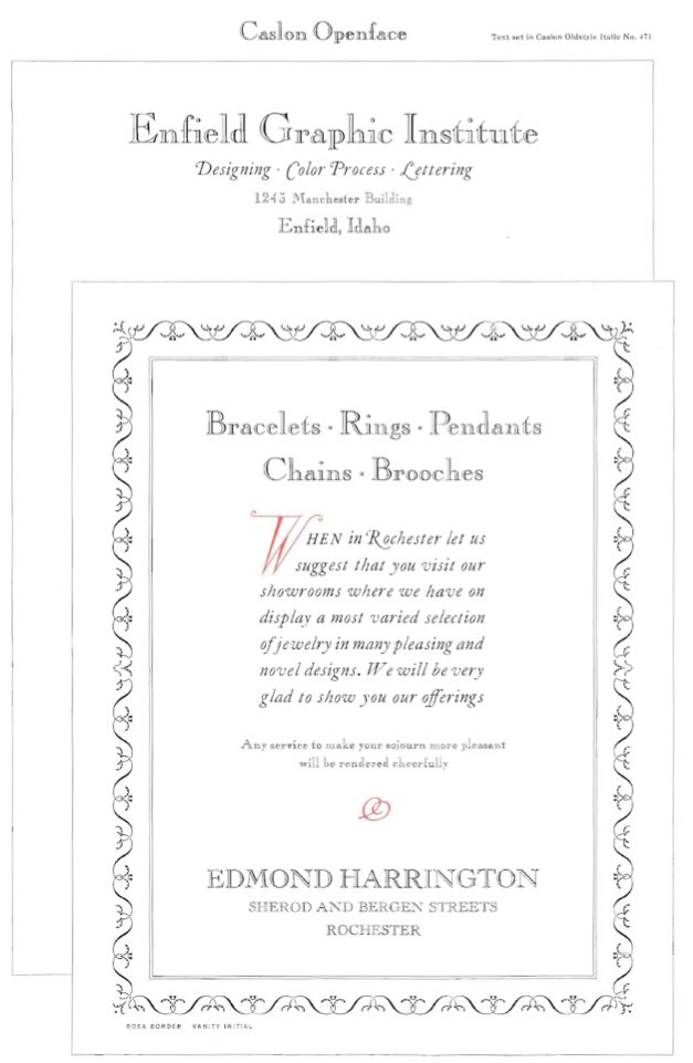
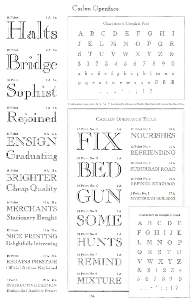
- Caslon Openface. Mac McGrew: Caslon Openface was originated by BB&S in 1915, where it was first called College Oldstyle. It started out as a reproduction of a delicate 18th-century French typeface known as Le Moreau le Jeune, by the foundry of G. Peignot&Son, but in the American version some strokes are heavier. In a later ad, BB&S said, "Placing it in the Caslon group of types is taking a liberty, but it assuredly 'belongs.' " Actually it has somewhat more affinity for the Cochin types.
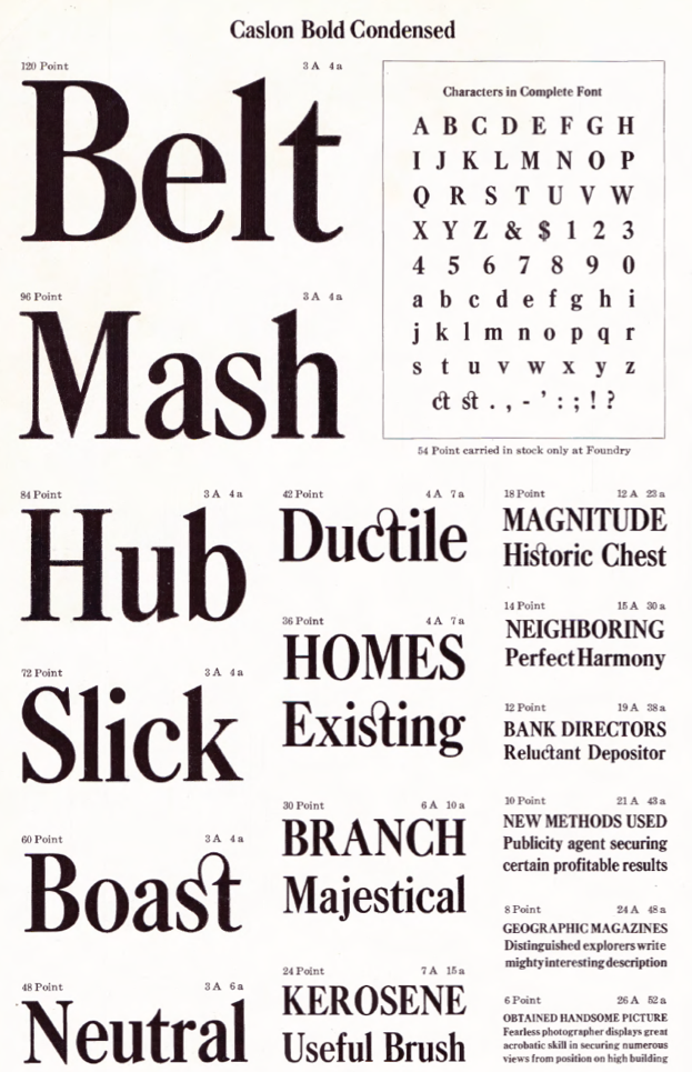
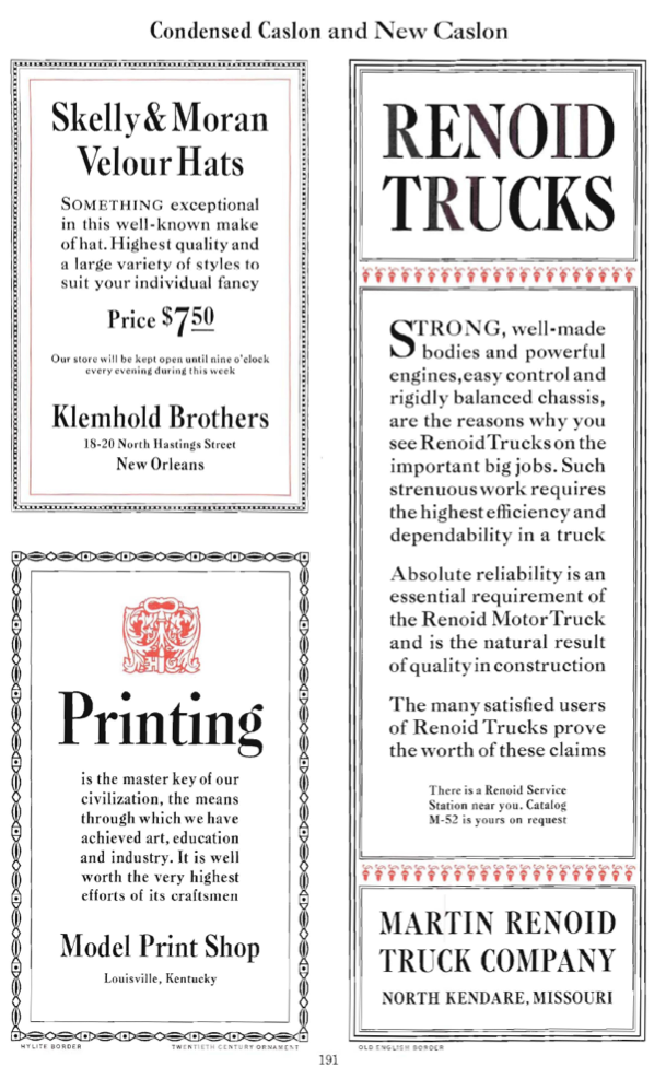
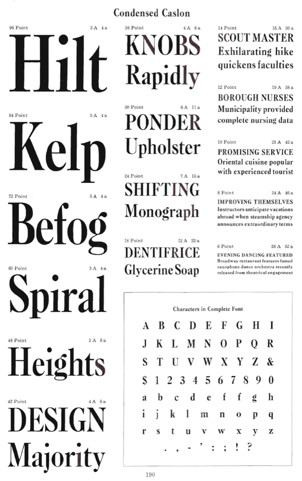
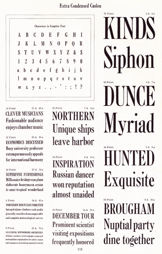
- Condensed Caslon. Mac McGrew: Condensed Caslon is a modification of New Caslon, by Inland in 1907; it was inherited by ATF and copied by Monotype, both of which gave it the same series number (the only such incidence); printers often but incorrectly call it Caslon Bold Condensed. Caslon Extra Condensed is also derived from New Caslon, sometime between 1912 and 1917.
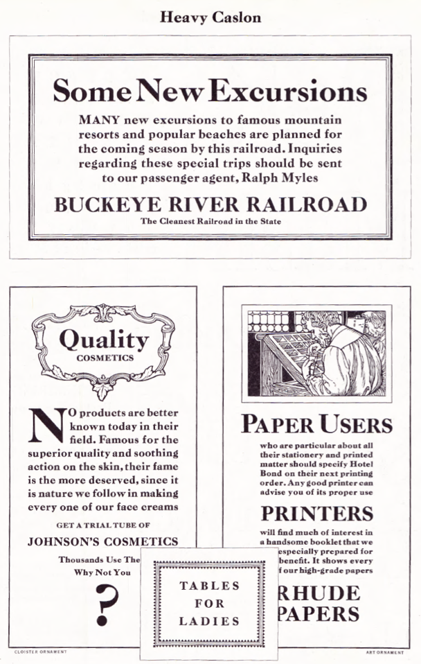
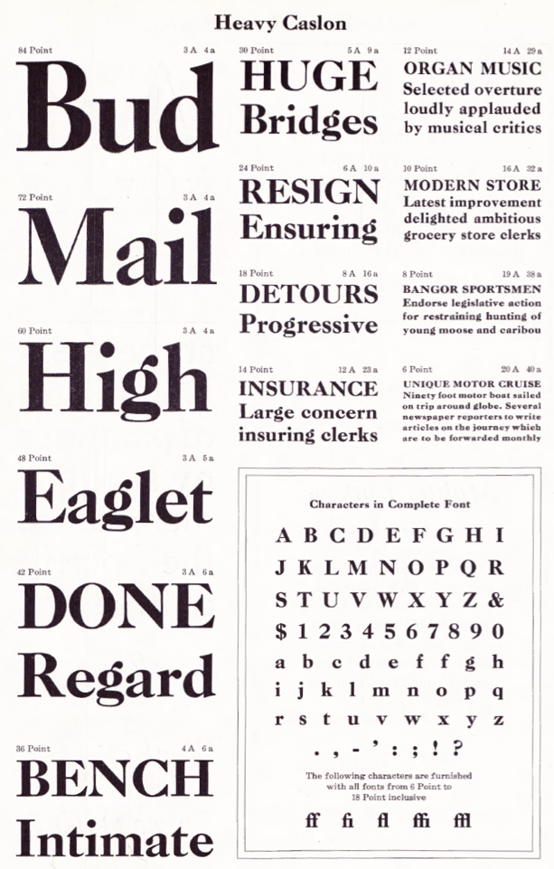
- Heavy Caslon. Mac McGrew: Heavy Caslon was issued by Inland in 1906 or earlier; Ludlow copied it as Caslon Old Face Heavy in 1925 and Intertype in 1937. Ludlow has a companion italic, while Intertype's italic is a sloped roman design. See Caslon Shaded..
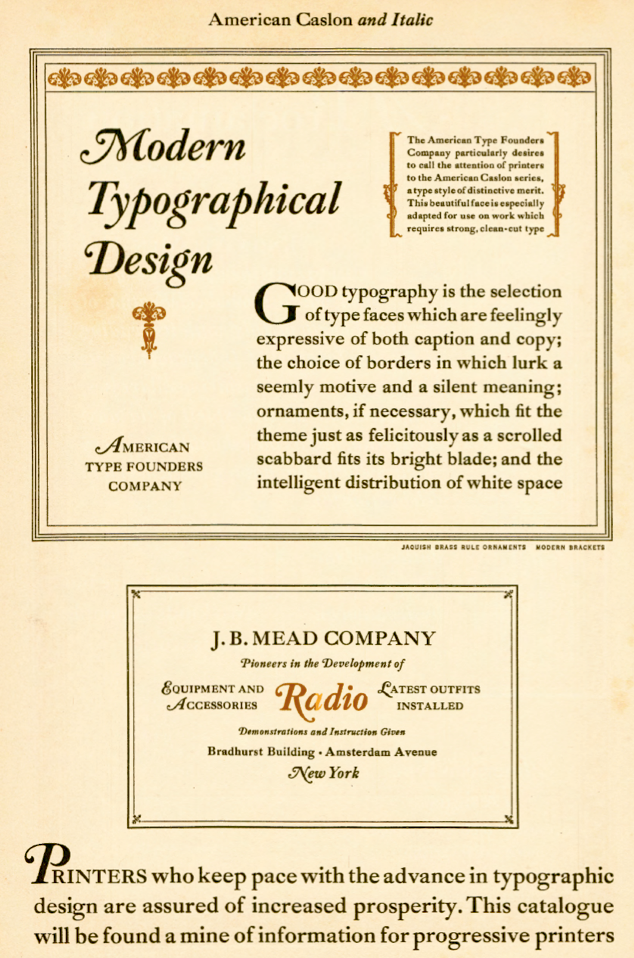
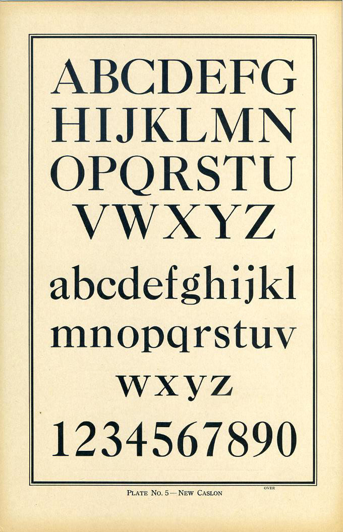
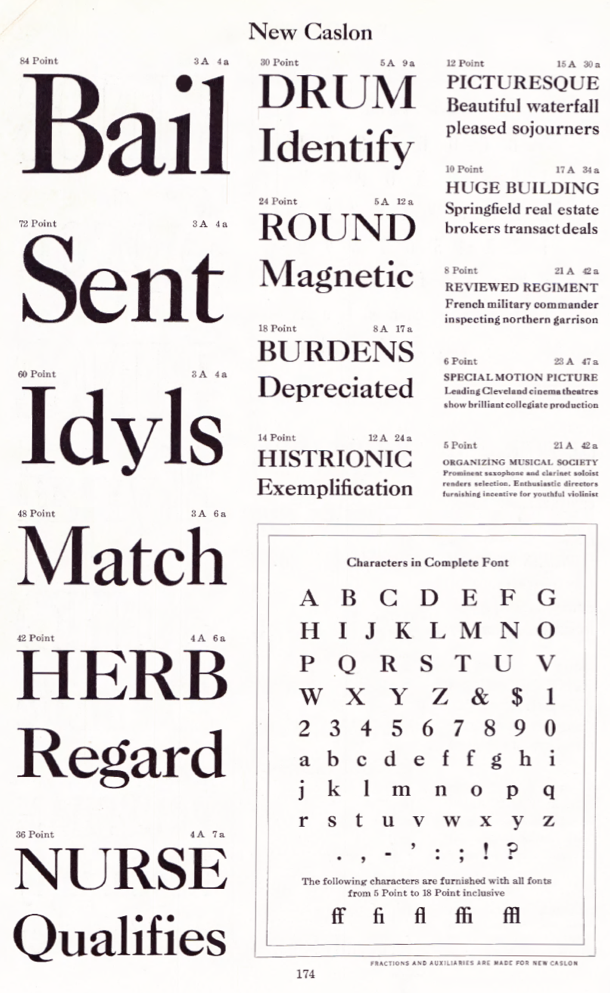
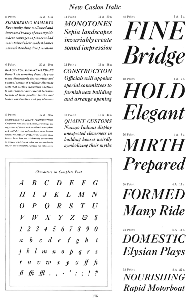
- New Caslon. Mac McGrew: New Caslon, introduced in 1905 by Inland, was the most successful of these attempts. In addition to eliminating irregularities, the aim of this typeface was to strengthen the design so that under modern printing conditions it would more closely resemble the effect of the original Caslon when printed heavily on dampened rough paper, as was commonly done in the eighteenth century. The italic followed in 1906. In 1919 ATF (successor to Inland) reversed the descender-shortening trend with the design by Morris Benton of long descenders, oldstyle figures, and italic swash characters as American Caslon; otherwise this typeface and New Caslon are identical. New Caslon was adapted to Linotype and Intertype as Caslon No.3, which some users call Caslon Bold, although it was not intended to be a bold face. However, in 18-point and larger, Caslon No.3 and Italic are copies of Caslon Bold rather than New Caslon.
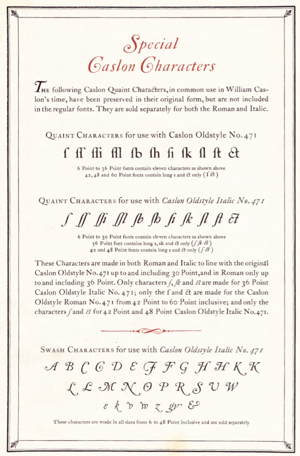
Mac McGrew describes the situation of Caslon in the era of metal type. All text below is quoted. Caslon is "the oldest living typeface," having survived in almost exactly its original form since every character was hand-cut by William Caslon more than 250 years ago. Virtually the same design is still available, along with a myriad of imitations, derivatives, and attempts at improvement. Altogether, they form a number of families, for there is little or no compatibility between many typefaces which now bear the name Caslon. In fact, Caslon is perhaps the hardest set of types to group into reasonable categories; therefore some of the following classifications are arbitrary. - The original Caslon. Prior to 1722 English typefounding was at a low ebb. and most printers in that country used Dutch types. But in that year William Caslon completed the first sizes of his new style, which quickly gained dominance over the Dutch types. This new English style was also extensively exported to other countries, including the American Colonies, where it was popular before the Revolution. In fact, the Declaration of Independence of the new United States was first printed in Caslon's types. Benjamin Franklin met Caslon in London, admired and recommended his types, and used them extensively in his printshop. Caslon's types have gone through several periods of decline and revival. In America they died out by about 1800, and had little or no further use for nearly sixty years. In 1858, Laurence Johnson, a prominent Philadelphia typefounder, visited London and arranged with the successors to William Caslon to duplicate the Caslon types. There are several accounts of how this was done; some say Johnson had fonts specially cast, from which he made electrotype matrices. Another account says he had strikes--unfinished matrices--made from the original punches, while a third account says he obtained the original matrices. The latter account is most unlikely, but the other two possibilities are interestingly credible. Many of the mats still available at ATF, successors to Johnson, are electrotypes-but then, mats wear out anyway, and are commonly replaced by electrotyping existing virgin cast type when patterns or punches are not available. If strikes were finished in this country-the usual process of accurately fitting them for width and position on the type body--this would allow for the fact that some sizes, especially in the 14- to 24-point range, are more loosely fitted here than in England. Otherwise there is virtually no difference between the American and English versions, except for later additions such as dollar mark and various swash letters--the latter are discussed later. Johnson simply called the typeface Old Style, as family names were a later development. When Johnson's foundry merged with MacKellar Smiths&Jordan foundry, the typeface was designated Original Old Style, to distinguish it from other typefaces in the same category. MS&J was part of the great merger that formed ATF in 1892, and the typeface became Old Style No. 71. When ATF's first specimen book was being prepared in 1897, the advertising manager. Henry Lewis Bullen, renamed the series Caslon Old Style. Later "No. 471" was added, the "4" designating typefaces obtained from MS&J. Meanwhile, a prominent New York printer, Walter Gilliss, had promoted the adoption of Caslon for setting Vogue magazine, a fashion and art journal which was started in 1892, and the typeface quickly returned to popularity. A. D. Farmer&Son copied the typeface under the name Knickerbocker Old Style. But this was the time when standard alignment was being heavily pro- moted, necessitating the shortening of descenders. Inland Type Foundry, St. Louis, advertised its own version of Caslon Old Style in 1901, with the claim. "We have obtained the sole right from the originating house to manufacture this series in the United States. Inland is the only type foundry which casts this typeface on standard line. ..." This meant that they had considerably shortened the descending letters; they had also redesigned the italic extensively. ATF countered with Caslon No. 540, with similarly shortened descenders but essentially the original roman and italic designs otherwise. Several other foundries, including BB&S, Hansen, and Keystone, produced similar Caslons. One of the most noticeable features of Caslon is its lack of uniformity from one size to another. This is due to the fact that all the original characters were cut by hand, before the invention of precise mechanical systems for enlarging and reducing drawings. In Caslon 540, each size is the equivalent of the next larger size of 471, including some obsolete odd sizes. Thus 14-point 540 is equivalent to 18-point 471,18 to 22, 20 to 24, etc. The difference is primarily in the descenders, very unattractively shortened in some sizes of 540; lining figures replace the hanging style, and a few other slight changes have been made. The additional large sizes are an attractive generalized design. To overcome objections to the wide fitting of some sizes of Caslon Oldstyle No. 471, ATF brought out Caslon Oldstyle No. 472 in 1932; the design is identical but it is fitted more closely. It is made only in 18-, 22- and 24-point sizes. In the specimens shown here, notice the small caps shown with Caslon OldstyleNo. 471, for which they are made up to 36-point-one of the very few typefaces to include such letters above 14- or 18-point. Most of these appear to be cut separately, rather than being regular caps of a smaller size. Long-s characters and combinations have also been made for Caslon Oldstyle roman and italic by ATF and Monotype, and for Caslon No. 540 roman by ATF; they are called Quaint Characters.
- Swash versions of the Caslon Oldstyle Italic capitals J, Q, T, and Y, also lowercase h with the final stroke turned inward, were the only forms shown in Caslon's original specimen sheet, although other similar swash letters were made for Dutch types at least a century earlier. Later, plain versions of these letters were added, and both forms are included in some fonts. About 1920, Thomas M. Cleland designed a dozen swash letters to be used with Caslon Oldstyle Italic No. 471, and a dozen more were designed in 1923 for Curtis Publishing Company, perhaps by another designer. These were cast in regular molds, with some letters having long, delicate kerns. By 1927 most of these letters, plus a few others, were being made for Caslon Italic No. 540. These were cast with mortises where necessary, greatly reducing the problem of breakage. Thereafter the larger sizes of Caslon No. 471 Italic were also adapted to mortise molds. Lowercase swash letters e, k, v, w, andz are part of the swash font for both 471 and 540 italics. Vowels are also cast on smaller bodies to fit within the mortises. Compare Scotch Open Shaded Italic. About 1927 an ATF specimen said, "The five largest sizes of CaslonItalic No. 540 are the equivalent of 60-, 72-, 84-, 96-, and 120-point Caslon Oldstyle Italic No. 471. Some of the Swash Capitals are cast on these bodies and long descenders cast on these larger bodies will be ready shortly, which will give the full effect of the popular No.4 71 Italic." No evidence has been found that this was ever completed. In the specimen of Caslon Oldstyle Italic No. 471 Swash shown here, these characters are shown on the first line; these are made in all sizes of the face. Caslon Italic No. 540 includes-only in sizes from 36-point up-many of these letters plus the I and U shown separately; fullface letters in this series are cast on the next larger body and thus are identical to 471. Incidentally, the swash J in these fonts is identical when inverted to the pound sterling mark furnished with English fonts. Ludlow True-Cut Caslon Italic also includes many of the 471 swash letters. Monotype Caslon Old Style Italic No. 3371 includes some of the same, plus the W shown separately. Monotype Caslon Old Style Italic No. 4371, which was copied from Stephenson Blake's Caslon Old Face in the 42- to 72-point sizes, has a different set of swash letters as shown on the latter part of the second line. Linotype Caslon Old Face Italic has a similar set of swash letters, only some of which are shown in the specimen. Linotype Caslon Italic (not Old Face) has no swash letters but the otherwise identical Intertype typeface does, as shown, including the peculiarly reversed T, which was later corrected. Also note the swash letters shown with some following Caslon italics. Caslon Italic Specials are swash letters of a completely different sort, designed by Carl S. Junge in 1924 for BB&S, for use with that foundry's Caslon Italic and various similar typefaces.
- Monotype produced an adaptation of Caslon to its mechanical restrictions as early as 1903, when Sol Hess drew English Caslon Old Style No. 37 at the request of the Gilliss Press in Boston. (Two years later Monotype adopted a new set of matrix and other mechanical improvements which required redesigning nearly all its typefaces.) Display sizes of this typeface were also drawn by Hess, presumably adapted from the original English face, as the italic has several swash letters similar to the English version. Otherwise display sizes of this roman and italic are very similar to Inland Type Foundry's short-descender adaptation of the original Caslon. On Linotype and Intertype. Caslon No.4 is essentially the same. Monotype also has Inland Caslon Old Style No. 137, presumably adapted from the Inland typeface mentioned above, but the italic seems identical to that of No. 37. Linotype has a copy of Caslon No. 137 under that name. About 1915 Monotype cut yet another version of Caslon Old Style-No. 337, designated "MacKellar Caslon" in some early literature because it is closer to the original typeface associated with that foundry. Display sizes are virtually an exact copy of No. 471. Composition sizes are well adapted, though necessarily modified to fit the standard arrangement; they are made with short descenders on standard alignment, but were the first Monotype typeface with alternate long descenders. Oddly, all three Monotype Caslons---37, 137, and 337---are the same set width---letter for letter---in all keyboard sizes made, which means that any given character is precisely the same width from one typeface to another in any composition size. In addition, 12-point No. 337, which with long descenders must be cast on 13- or 14-point body, is essentiallythe same size and width as 14-point of the same face. Sizes of this typeface above 36-point were later copied from Stephenson Blake's Caslon Old Face and called Caslon Old Style No. 437, as previously noted. Linotype and Intertype have Caslon and Italic, similar to Caslon No. 540 and cut about 1903; long descenders are available in place of the regular short descenders, making a fair approximation of Caslon Oldstyle No. 471; this Caslon Italic in 18- to 30-point sizes is more regularized as shown, similar to Caslon Light Italic. Linotype also has Caslon No.2, a copy of Monotype Caslon No. 37, also with alternate long descenders; and the previously mentioned Caslon No. 137, cut in 1936. For greatest authenticity, Linotype went back to the English original in 1923 for its Caslon Old Face; the roman is almost indistinguishable, but the italic is necessarily modified considerably. Most smaller sizes have both long and short alternate descenders avail- able. Intertype offers the same face, roman only, in 18- to 30-point. Ludlow's True-Cut Caslon and Italic, cut in 1922 and 1928 respectively, are close copies of Caslon Oldstyle No. 471 and Italic.
- Several attempts have been made to regularize Caslon and improve its so-called faults, but these have generally lost much of the character of the face. and have seldom achieved widespread use. They include
- Recut Caslon (Inland 1907).
- Caslon Lightface (Keystone 1910-12).
- Clearface Caslon (Robert Wiebking for Western 1913), etc., all with italics and some with condensed versions; Caslon Lightface Italic is non-kerning.
- New Caslon, introduced in 1905 by Inland, was the most successful of these attempts. In addition to eliminating irregularities, the aim of this typeface was to strengthen the design so that under modern printing conditions it would more closely resemble the effect of the original Caslon when printed heavily on dampened rough paper, as was commonly done in the eighteenth century. The italic followed in 1906. In 1919 ATF (successor to Inland) reversed the descender-shortening trend with the design by Morris Benton of long descenders, oldstyle figures, and italic swash characters as American Caslon; otherwise this typeface and New Caslon are identical. New Caslon was adapted to Linotype and Intertype as Caslon No.3, which some users call Caslon Bold, although it was not intended to be a bold face. However, in 18-point and larger, Caslon No.3 and Italic are copies of Caslon Bold rather than New Caslon.
- Condensed Caslon is a modification of New Caslon, by Inland in 1907; it was inherited by ATF and copied by Monotype, both of which gave it the same series number (the only such incidence); printers often but incorrectly call it Caslon Bold Condensed.
- Caslon Extra Condensed is also derived from New Caslon, sometime between 1912 and 1917.
- Caslon Catalog, with heavied hairlines, was designed by Robert Wiebking for his Advance Type Foundry in 1913 under the name of Caslon Antique (not to be confused with a later use of this name); it was also shown by Laclede, and was renamed when BB&S acquired it.
- Caslon Medium and Italic, as the name implies, are somewhat heavier versions, offered by BB&S as Modern Caslon and Italic about 1924---the roman at least was shown by Western Type Foundry in the mid-teens. However, the italic appears to be identical to Ludlow's Caslon Light Italic, also credited to Wiebking but advertised as early as 1922; it was the first typeface cut for Ludlow's development of italic matrices which permitted kerning designs without the fragility of the kerns on single types. Strangely, though, Ludlow Caslon Light (roman) matches Caslon Clearface.
- The newest Caslon was designed in 1965, when ATF commissioned a "beefed up" version of Caslon No. 540, by Frank Bartuska. The result was Caslon No. 641, an arbitrary number. It is a handsome face, reflecting the best of 540, but without the latter's variations from one size to another. It also includes all the ancillary characters of ATF's later creations as shown, in- cluding percent and pound marks, a variety of quotation marks, and center dot, hyphen, and dash in two positions to center on caps or lowercase. An italic was started but never completed. This typeface has considerable similarity to Caslon Medium, for which ATF still had mats when the new typeface was commissioned.
- Boldface Caslons have been made by several sources.
- The most popular Caslon Bold was introduced by Keystone Type Foundry in 1905, followed by Italic in 1906 and Condensed and Extended versions about 1911; this is the version made by ATF and in regular widths by Monotype. Monotype keyboard sizes (including large composition to 18-point) are modified considerably to fit standard arrangements, but the only apparent difference in display sizes is the redrawn T and g shown separately in the specimen alphabet and the addition of ligatures and diphthongs on Linotype and Intertype.
- Caslon No.3 matches ATF Caslon Bold from 18-point up, although smaller sizes match New Caslon.
- Hansen's Caslon Fullface and Caslon Fullface Condensed were close copies of Caslon Bold and Caslon Bold Condensed, differing most apparently in the characters shown (A Gas, condensed AG), but Hansen's Caslon Fullface Italic matches New Caslon Italic.
- A somewhat different Caslon Bold series is made by Ludlow.
- A Caslon Black series by BB&S, from Western Type Foundry in the mid-teens.
- Caslon Adbold, originating with Keystone in 1913, is characterized by heavier strokes throughout; Extended and Extra Condensed versions followed in 1915 to 1917; all were patented and presumably designed by R. F. Burfeind.
- Heavy Caslon was issued by Inland in 1906 or earlier; Ludlow copied it as Caslon Old Face Heavy in 1925 and Intertype in 1937. Ludlow has a companion italic, while Intertype's italic is a sloped roman design. See Caslon Shaded.
- Caslon Openface was originated by BB&S in 1915, where it was first called College Oldstyle. It started out as a reproduction of a delicate 18th-century French typeface known as Le Moreau le Jeune, by the foundry of G. Peignot&Son, but in the American version some strokes are heavier. In a later ad, BB&S said, "Placing it in the Caslon group of types is taking a liberty, but it assuredly 'belongs.' " Actually it has somewhat more affinity for the Cochin types.
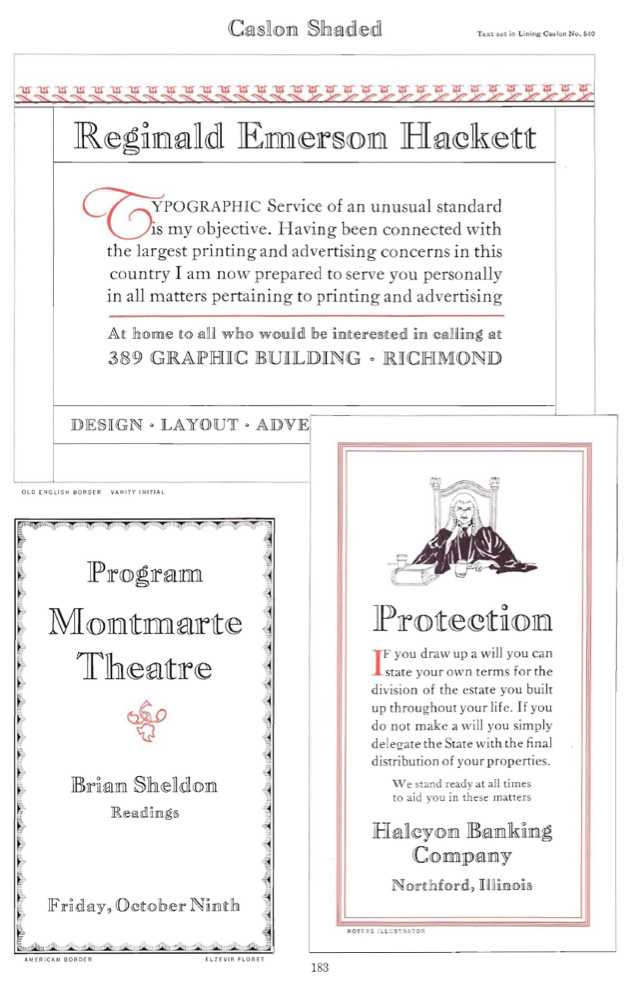
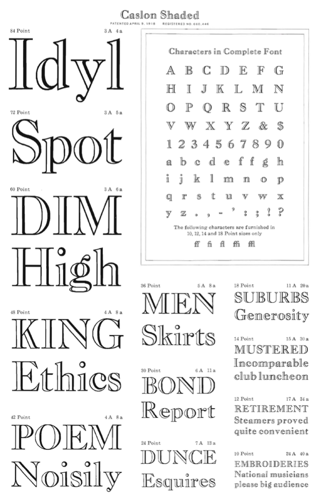
- Caslon Shaded was adapted by ATF from Heavy Caslon in 1917, by W. F. Capitaine. Caslon Shadow Title was adapted from Caslon Bold by Monotype about 1928. Compare Cameo, Cochin Open, Gravure, Narciss.
- Caslons in name only.
- Caslon Antique and Italic were designed by Berne Nadall and brought out by BB&S in 1896-98 as Fifteenth Century (XV Century in one early announcement) and Italic. Although they aren't really representative of types of that time, being a poor copy of a crude early typeface cut about 1475 in Venice, they have become popular for the simulation of supposedly quaint American types of the eighteenth and nineteenth centuries. Disregarding the usual practice of increasing the proportionate width of a typeface as the size decreases, Caslon Antique maintains uniform proportions in all sizes, and thus appears narrow and cramped in small sizes. Caslon Antique is also the original (1913) name of Advance Type Foundry's Caslon Catalog, mentioned earlier, while in the early 1920s Laclede Type Foundry applied that name to "a brand-new, entirely machine-cut typeface of Old Style Antique," a duplicate of the Advance face.
- Caslon Old Roman is discussed later under its original name, Old Roman.
- Caslon Text originated with William Caslon in 1734. Inland Type brought out a reproduction of it in 1899 as part of their agreement with the Caslon Type Foundry in England. It later became the property of ATF, and was copied by Linotype. Being handcut originally, it shows the expected varia- tions from one size to another, but some characters show decidedly different forms in some sizes. See Cloister Black and Engravers Old English, which are derived from this face.
|
EXTERNAL LINKS
MyFonts search
Monotype search
Fontspring search
Google search
INTERNAL LINKS
Caslon ⦿
Morris Fuller Benton ⦿
|
