TYPE DESIGN INFORMATION PAGE last updated on Wed Nov 20 11:55:09 EST 2024
FONT RECOGNITION VIA FONT MOOSE

|
|
|
|
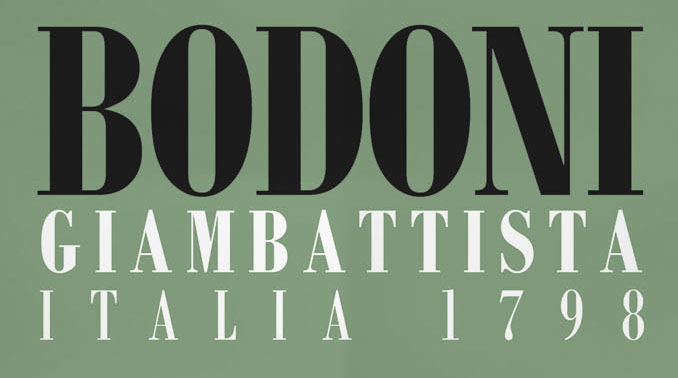
American metal versions of Bodoni
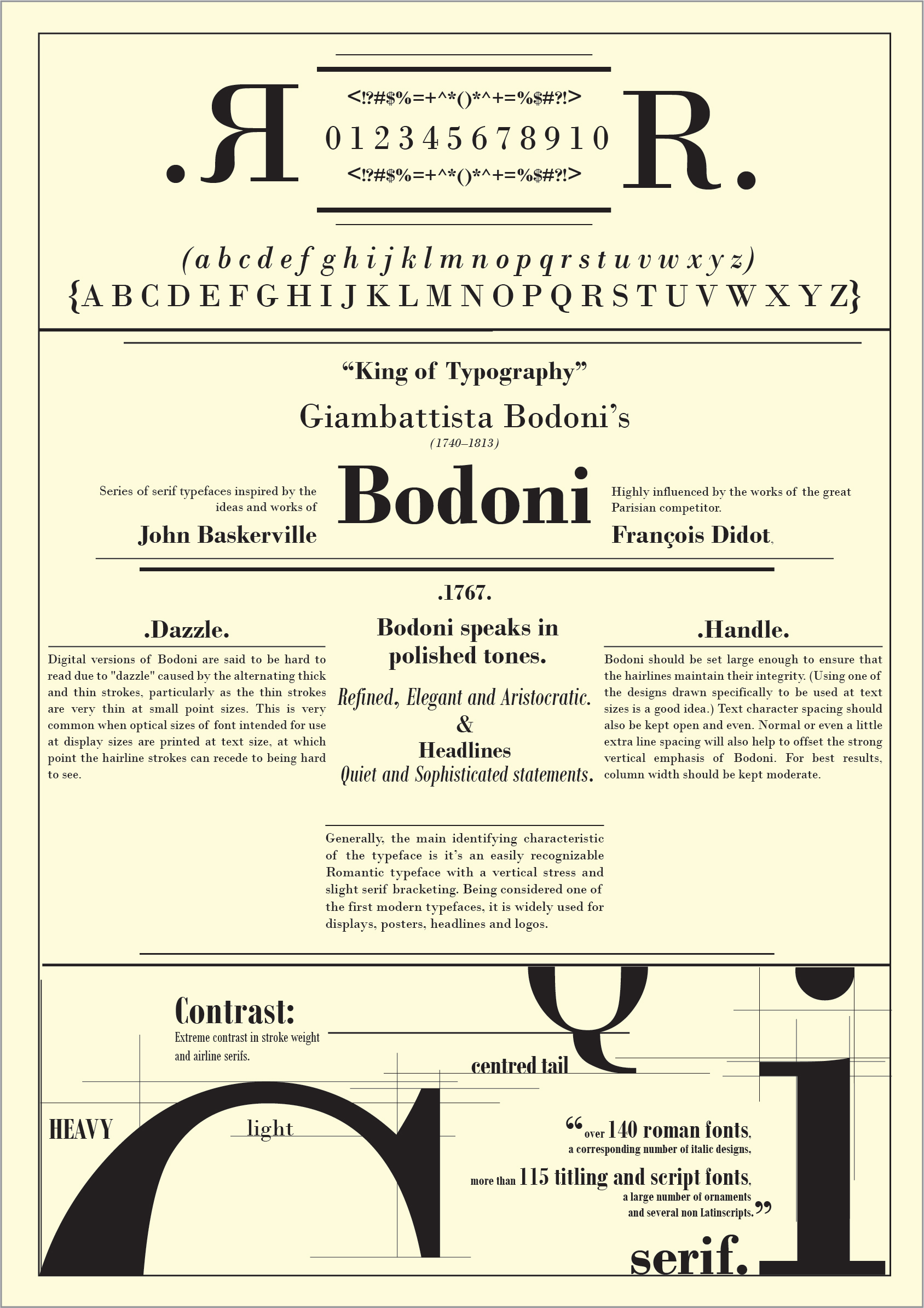
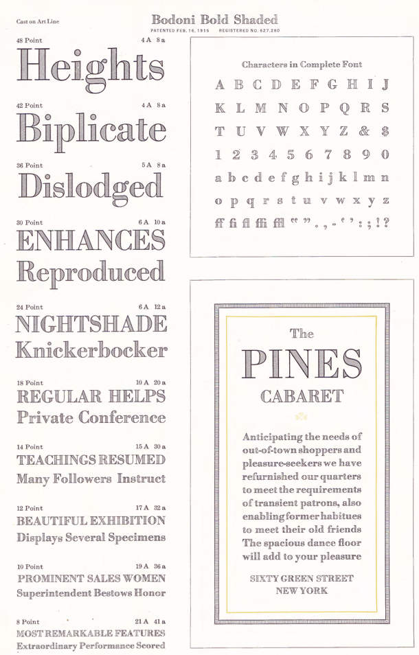
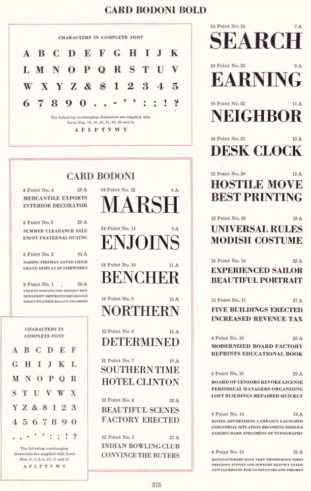
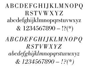
All 19th and early 20th century versions of Bodoni can be traced back to Giambattista Bodoni, the pater familias of the modern rational style of typeface. Mac McGrew: There have been numerous interpretations of Bodoni's typefaces, but the most popular in America are those drawn by Morris F. Benton for ATF or adapted from his work by other manufacturers. His Bodoni, Bodoni Italic. Bodoni Book and Italic, and Bodoni Bold and Italic, introduced by ATF in 1910-11, have been duplicated by several sources, as detailed below. The ATF Bodoni series, with its long descenders, was the first new creation to successfully counter the popularity of standard alignment, introduced around the turn of the century. However, it was inspired by the successful revival of the original version of Caslon Oldstyle. Henry L. Bullen encouraged the resurrection of the Bodoni design, first of a series of such recreations, while his Typographic Library at ATF provided the resources for research into the works of the historic master designers. Monotype published its own interpretation of Bodoni and Italic in 1911. Mac McGrew: This is its No. 175 series, also based on historic Bodoni types but differing in many details from Benton's design. Notice especially the alternate French oldstyle figures, which depart from the usual style of oldstyle figures; ATF Bodoni also has similar alternate figures in small sizes, although they are rarely seen. In 1930 Monotype adapted Benton's Bodoni design as its No. 375 series. Neither 175 nor 375 suffers from the mechanical restrictions of Monotype's standard arrangement, but because Bodoni Bold and Italic required considerable reproportioning as first cut for that machine, Monotype later brought out Recut Bodoni Bold and Italic, which by means of a special arrangement are very close to ATF's original design. Bodoni Book and Italic were adapted to Monotype after special arrangements became more common. Notice the alternate v and w shown in the specimen of Bodoni Italic; these letters were made by ATF in all three weights of italic but not copied by any other source except Monotype Bodoni Book Italic. Perhaps because of the lighter Bodoni Book, some users apply the name "Bodoni Medium" to the regular weight. For newsprint, there were special designs with shorter descenders. McGrew: ATF's Newspaper Bodoni Bold is the same as Bodoni Bold, but with descenders (gjpqy,;Q as shown after the Bodoni Bold specimen) substantially shortened to permit casting each size on a smaller body, from 36/30 (36-point typeface on 30-point body) to 144/120. Ludlow Bodoni Bold offers similarly short- ened descenders in large sizes. ATF Bodoni Bold Italic was cast for a while in the 1960s with greatly shortened descenders though not on smaller bodies. Apparently the intention was to reduce the size of kerns and the chance of breakage. Not to be left behind, Ludlow entered the arena. McGrew: Ludlow's first offering in this family was Bodoni Light and Italic, designed by Robert Wiebking and introduced in 1923; it was similar to Monotype Bodoni No. 175 but lighter. Five years later Ludlow brought out True-Cut Bodoni and Italic, designed by Wiebking from original Bodoni works in Chicago's Newberry Library. The serifs and hairlines of this typeface turned out: to be too delicate for practical use, so in 1936 Robert H. Middleton modified the design and it was reissued as Bodoni Modern and Italic. The basic design is the same except for a few redrawn letters, but it is recut a little narrower and with slightly more strength to the hairlines. This is probably the most faithful recreation of Giambattista Bodoni's original types. The third lines of specimens of the latter face, both roman and italic, show some of the original True-Cut Bodoni characters before they were redesigned. Ludlow Bodoni Bold and Italic, cut by Wiebking before 1930, were replaced by Bodoni Trueface Bold and Italic, close copies of the Benton face. Bodoni Trueface and Italic in the regular weight were also added. About some condensed versions, McGrew has this to say: Bodoni Bold Condensed was drawn by Sol Hess for Monotype in 1934, and other versions were designed independently by some other sources; such a typeface was drawn by the ATF staff in 1933 but not produced. The basic Bodoni designs were narrowed by Linotype and Intertype in the larger sizes to fit early mechanical restrictions; when later machines permitted full width typefaces in these sizes, the narrow versions were renamed Bodoni Condensed and Bodoni Book Extra Condensed. Intertype also cut Bodoni Bold Extra Condensed and Slim Bodoni. ATF's Card Bodoni and Card Bodoni Bold were drawn by Benton in 1912-16. These are adaptations of the standard typefaces to all-caps fonts, with several sizes cast on 6- and 12-point and larger bodies for use on stationery and forms; notice the redrawn J, Q, comma, and semicolon [quote from McGrew]. Engravers Bodoni is a wide version of Bodoni Bold made the same way. It was drawn by Benton in 1926 but apparently not introduced until 1933. Bodoni Bold Shaded was designed by Benton in 1912 for ATF. McGrew: Bodoni Open, also by Benton in 1918, was discontinued after a time and reintroduced in 1930. Bodoni Bold Panelled was designed by Sol Hess for Monotype in 1928; it has no lowercase, points or figures, only the basic characters shown. All three typefaces are adaptations of Bodoni Bold. The most striking Bodonis are the very fat ones. McGrew explains the situation in this way: Ultra Bodoni and its variations are now well established under the Bodoni name, but historically they hardly belong here, being more closely related to the nineteenth-century English "fat" typefaces. One reviewer called Ultra Bodoni "an old Bruce typeface with a few redrawn characters." Actually it was entirely redrawn, but the resemblance is there. The Ultra Bodonis do not have the long ascenders and descenders of other Bodonis, and the transition from thick to thin is more abrupt. Ultra Bodoni and Italic, designed by Morris Benton in 1928 for ATF, were also made by Monotype; Intertype made them as Bodoni Modern and Italic. Linotype has Poster Bodoni and Italic, similar to Ultra Bodoni but with somewhat heavier hairlines, designed by C. H. Griffith. Ludlow's Bodoni Black and Italic, designed by Robert H. Middleton in 1930, are distinctly different but generally comparable; a later Condensed version was also designed by Middleton. ATF's Ultra Bodoni Condensed, drawn by Benton in 1930, is rarely seen but his Ultra Bodoni Extra Condensed of 1933 has enjoyed some limited use. Onyx, called Poster Bodoni Compressed by Linotype, is comparable. Ludlow's Bodoni Campanile (called Palisade on Intertype) and Italic are somewhat similar to Onyx, but less formal; they were designed by Middleton in 1936 and 1942 respectively. Finally, McGrew draws the attention to Bartlett, Damon Type Foundry's name for its copy of the Bodoni series. He writes: Compare Louvaine, French Round Face, Suburban French. Also see Bauer Bodoni. |
EXTERNAL LINKS |
| | |

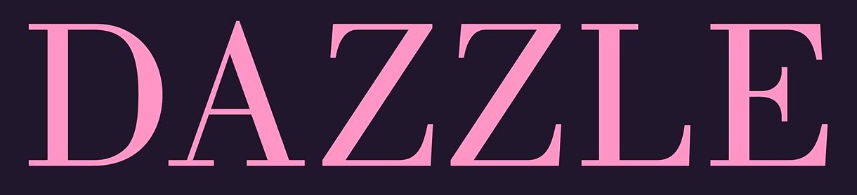
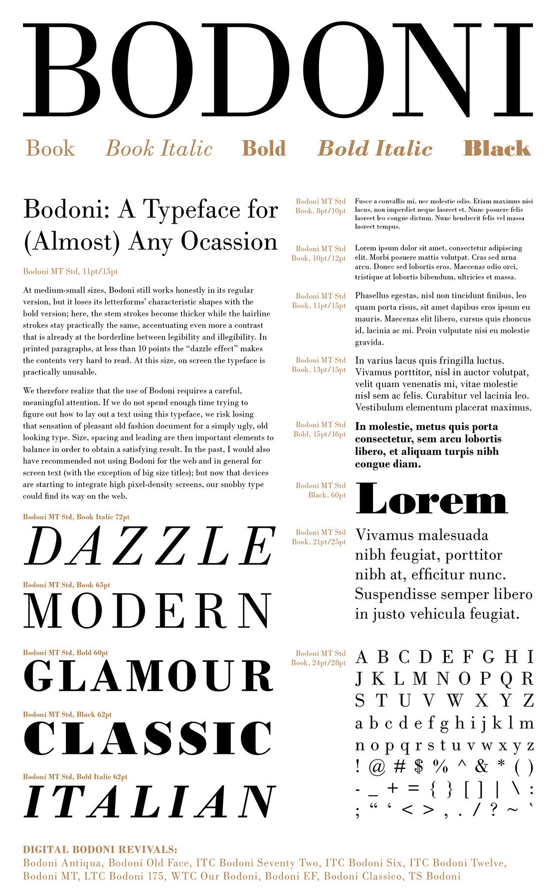
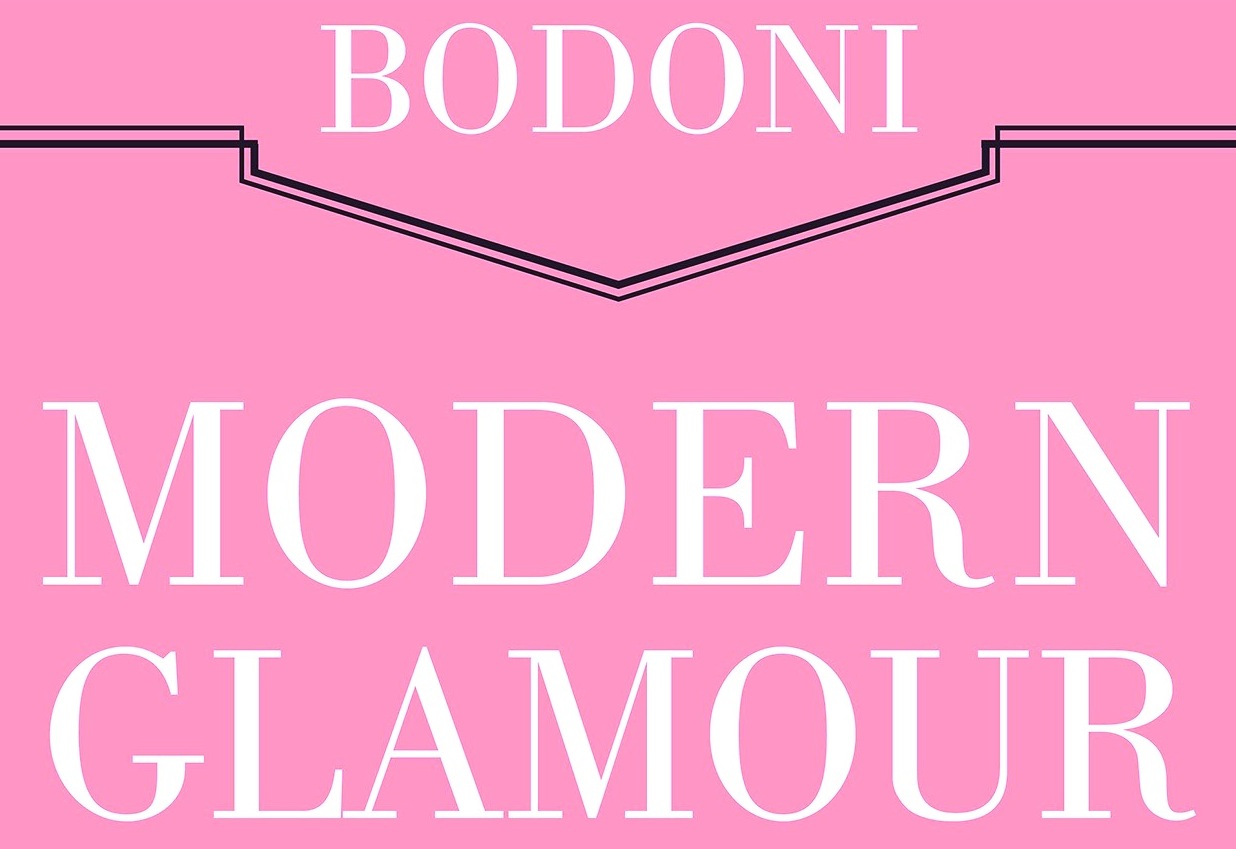
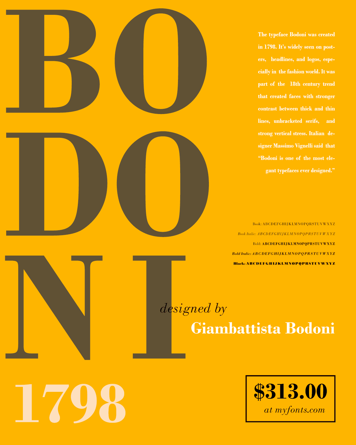
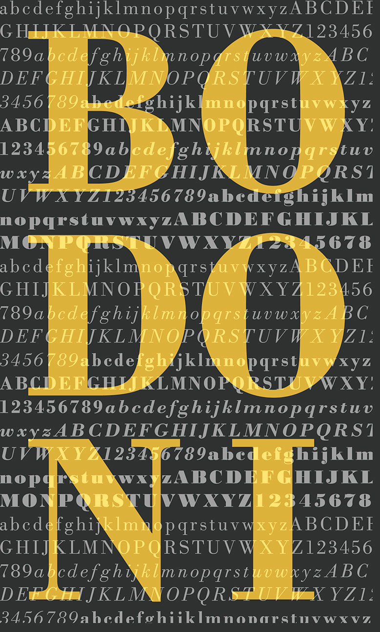
file name: Monotype Bodoni M T Poster by Alisa Flaherty 2015
file name: Monotype Bodoni M T Poster by Alisa Flaherty 2015b
file name: Monotype Bodoni M T Poster by Alisa Flaherty 2015c
file name: Monotype Bodoni M T Bold Poster by Megan Woolf 2016
file name: Monotype Bodoni M T Poster by Hannah Taylor 2017
file name: Monotype Bodoni Poster by Eniyan S K 2017
file name: Bodoni M T Condensed Bold Poster by Evelyn Gonzalez 2017

file name: Bodoni M T Condensed Bold Poster by Evelyn Gonzalez 2017c
file name: Bodoni M T Condensed Bold Poster by Evelyn Gonzalez 2017d
file name: Bodoni M T Condensed Bold Poster by Evelyn Gonzalez 2017e

file name: Adobe Bodoni Poster 2007

file name: Adobe Bodoni Poster 2007b

file name: Adobe Bodoni Poster 2007d

file name: Adobe Bodoni Poster 2007e

file name: Adobe Bodoni Poster 2007f
file name: Adobe Bodoni Poster 2007g
file name: Linotype Poster Bodoni after Chauncey Griffith 1929 Poster by Melisa Rivas 2015
file name: Morris Fuller Benton Bodoni Bold Shaded 1912
file name: Morris Fuller Benton Card Bodoni Bold 1912 1916
file name: Morris Fuller Benton Bodoni Std A T F 1908 1915b
file name: Morris Fuller Benton Bodoni Std A T F 1908 1915
| | |
|
Luc Devroye ⦿ School of Computer Science ⦿ McGill University Montreal, Canada H3A 2K6 ⦿ lucdevroye@gmail.com ⦿ https://luc.devroye.org ⦿ https://luc.devroye.org/fonts.html |