TYPE DESIGN INFORMATION PAGE last updated on Mon Jun 8 18:12:41 EDT 2026
FONT RECOGNITION VIA FONT MOOSE

|
|
|
|
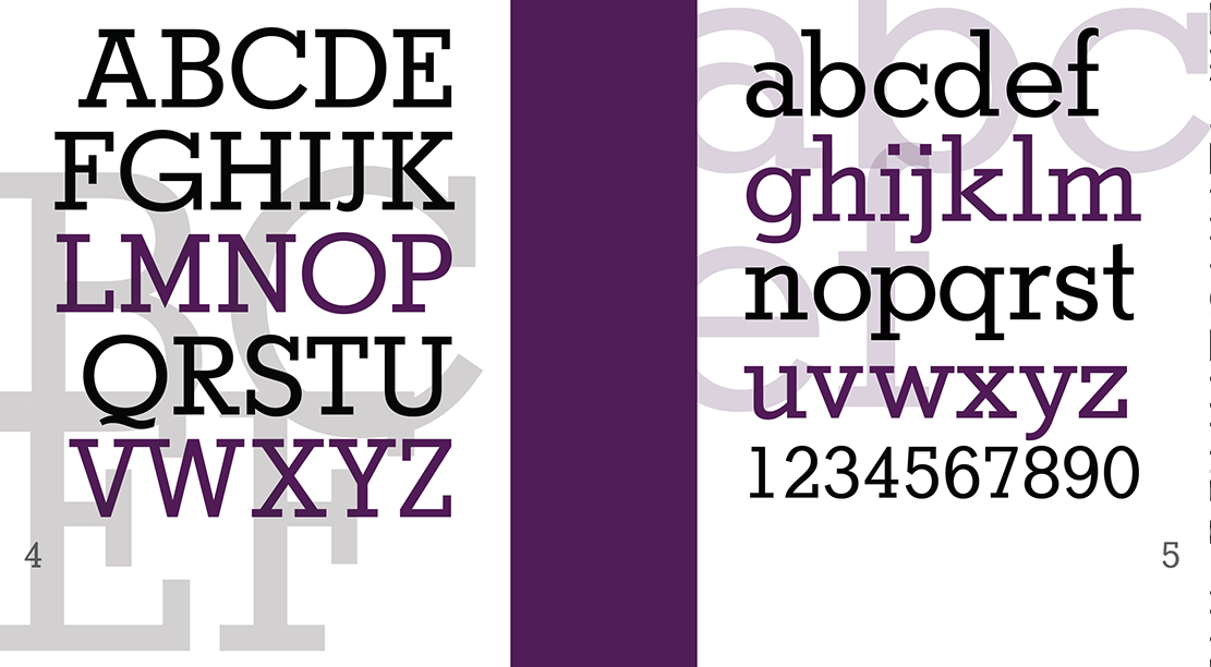
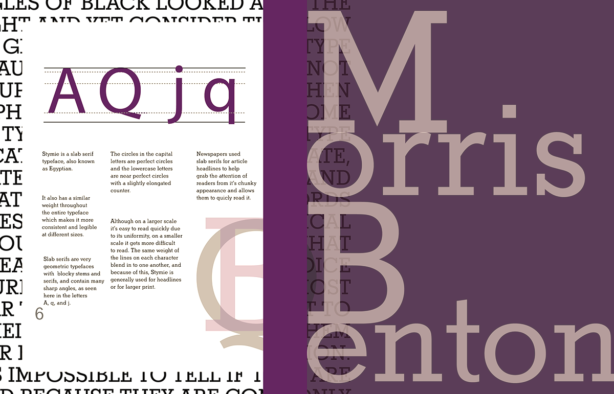
Stymie
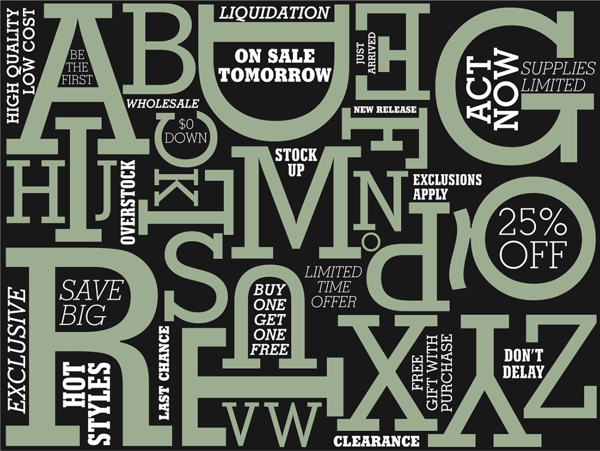
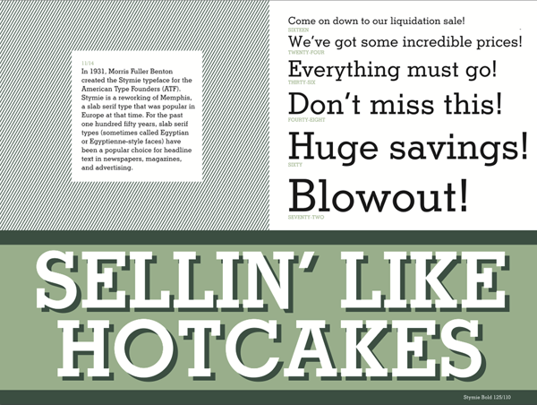
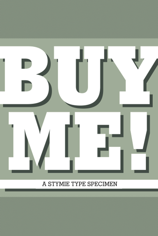
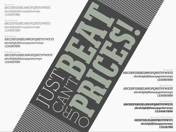
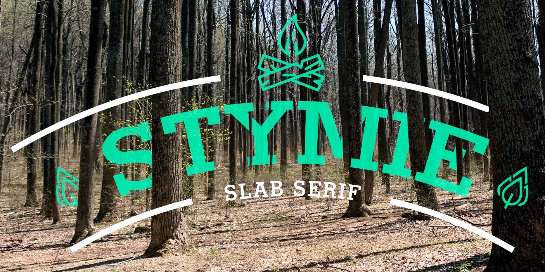
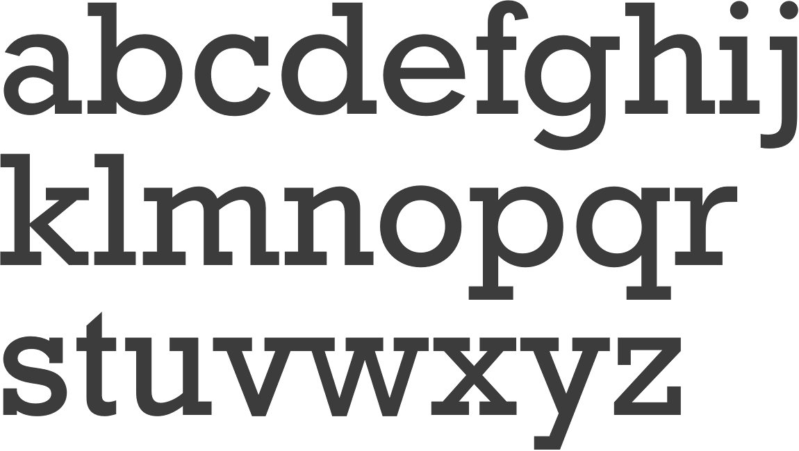
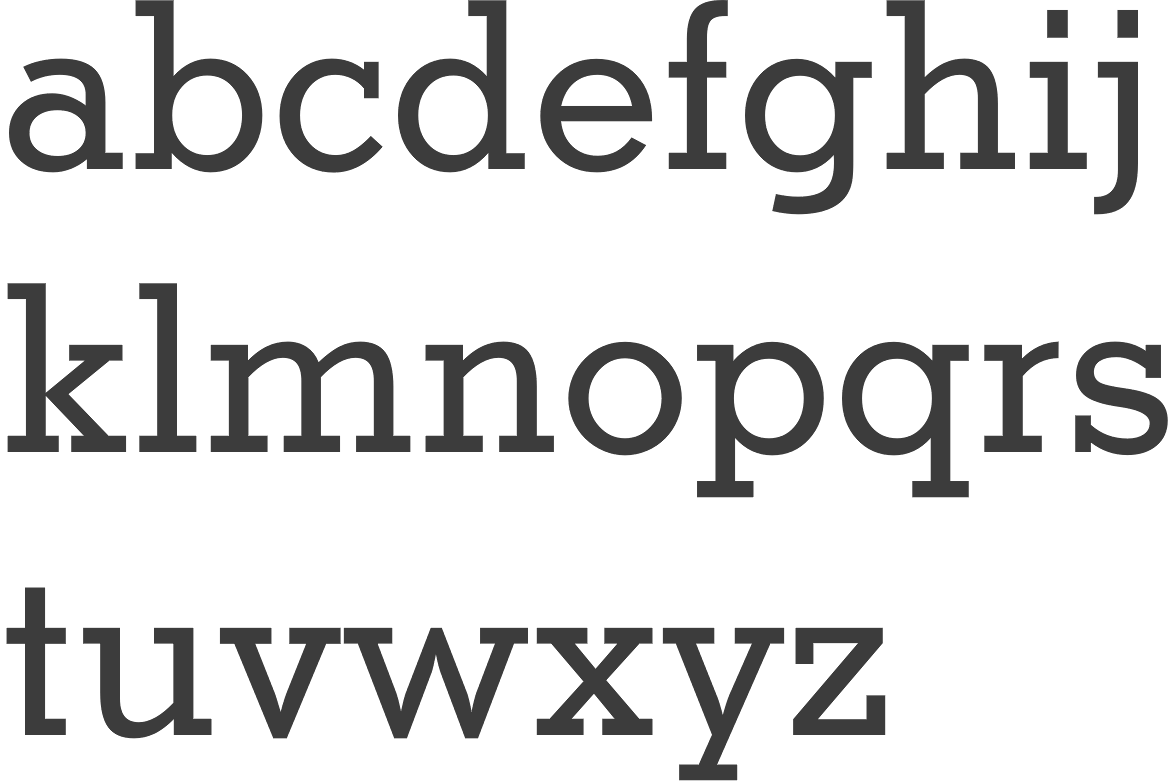
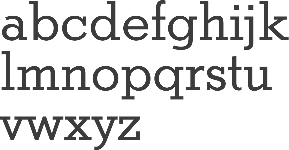
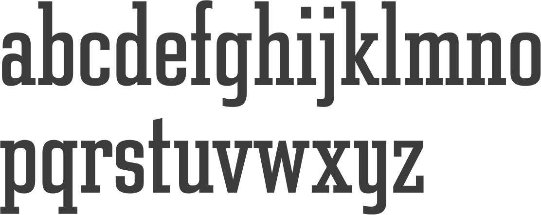
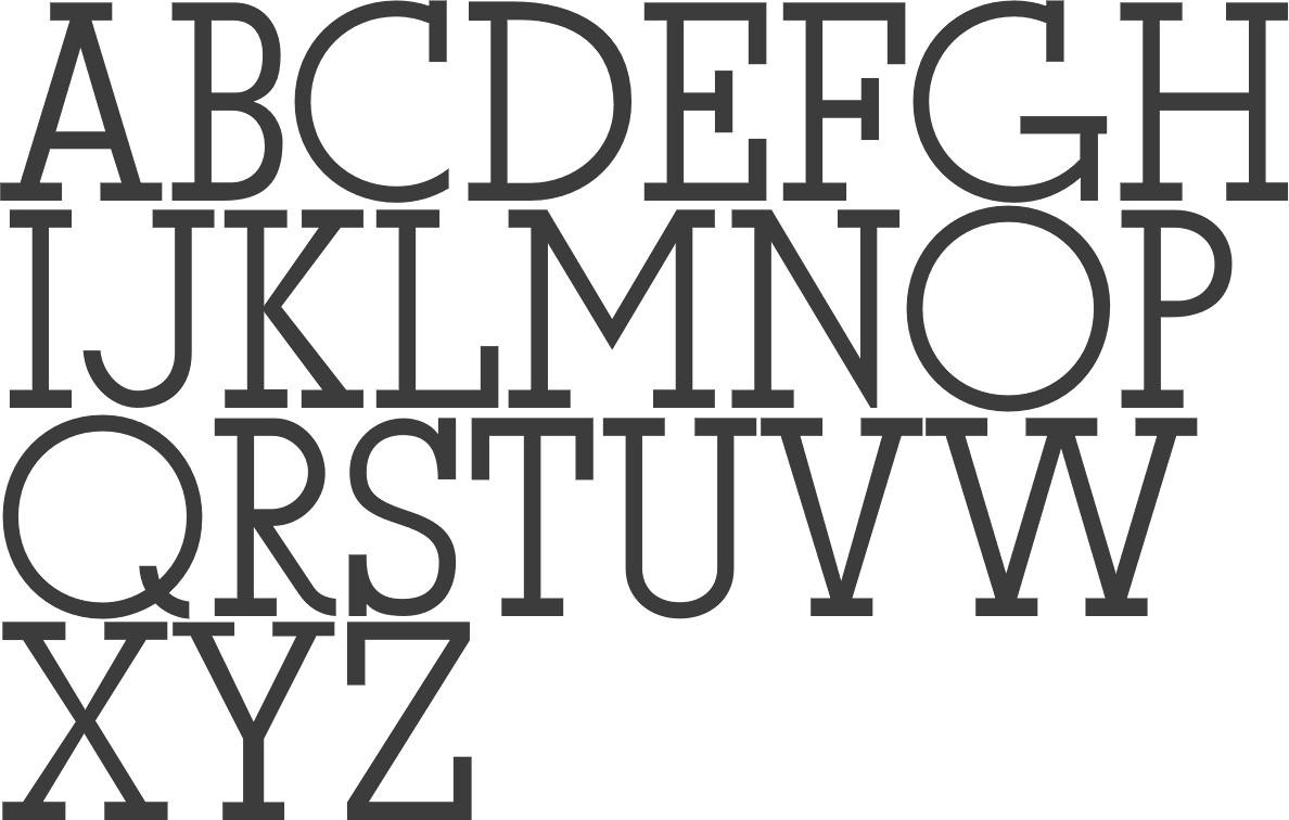
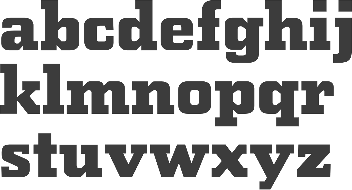
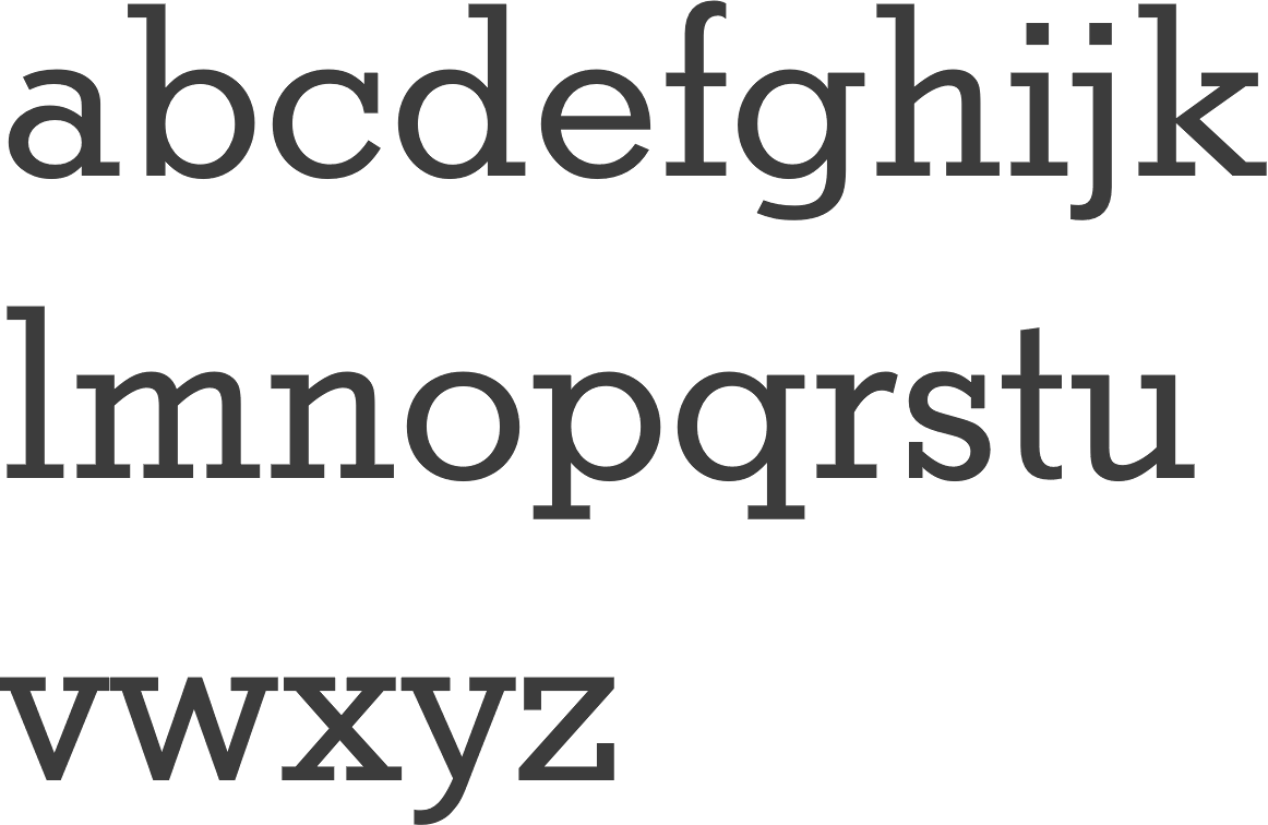
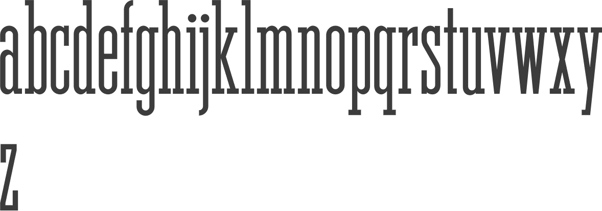
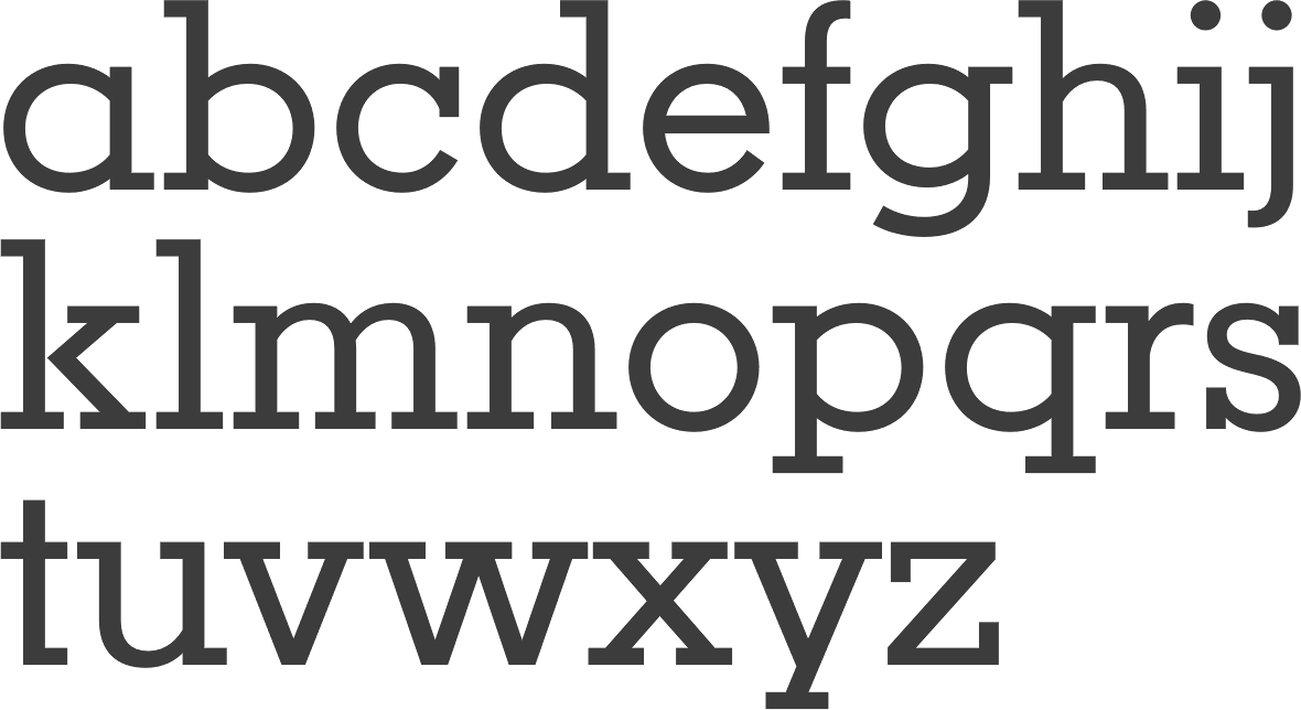
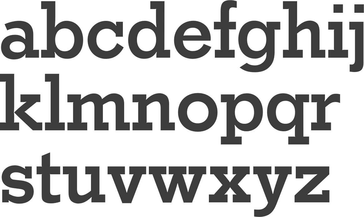
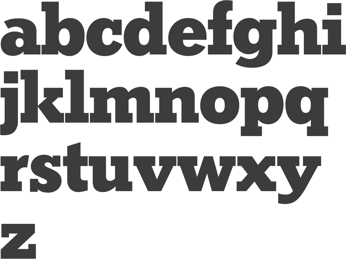
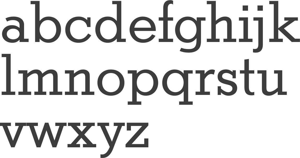
Various digital revivals of the slab serif typeface Stymie (1931, Morris Fuller Benton) are shown here and here. These include: Adobe (Rockwell), Bitstream (Stymie), Elsner+Flake (StymieEF), Font Bureau (Constructa), Jeff Levine (CrownHeightsJNL and Eastport JNL (2019)), Lanston Type Company (LTC Squareface), Linotype (Stymie), Nicks Fonts (KenotaphNF), Red Rooster Collection (Karnak Pro), Scangraphic Digital Type Collection (StymieSB), Scangraphic Digital Type Collection (StymieSH), URW++ (Stymie). The green posters below are by Sean Gabay (2013). Mac McGrew on the ATF contribution from 1931: Stymie Bold is a redesign of Rockwell Antique (q. v.), which in turn was a reissue of Litho Antique, introduced by Inland Type Foundry in 1910. Rockwell appeared in 1931, but Morris Benton redesigned it as Stymie Bold in the same year, refining some characters and generally tightening the fit. Stymie Light and Medium and their Italics were also drawn by Benton in 1931, and the series quickly became very popular. Stymie Bold Italic followed a bit later. Elongated Ascenders and Descenders for Stymie Light, Medium, and Bold are a whimsical idea borrowed from the Parsons series (q.v.). Eleven characters as shown are offered for each weight from 15-point up, but there are actually only nine different characters, with an extra band in each set to invert for p and q. The ascenders are cast to proper alignment for reasonably easy use, but the descenders must be carefully justified vertically. They were short-lived. Monotype exercised its option to copy ATF typefaces soon after the introduction of these typefaces---too soon, in fact, because they copied Rockwell and in some literature called it Stymie Bold, and there has been confusion between the two typefaces ever since, with some Monotype users applying the latter name to the older face. The actual Stymie Bold was duplicated by Monotype about 1936. The Monotype contributions: Monotype did its part in expanding the family. Sol Hess designed Stymie Extrabold in 1934, a year before Morris Benton drew Stymie Black. These heavy versions differ slightly from each other and from the lighter typefaces. It's a matter of opinion as to which is more compatible with other Stymies. Sol Hess and Monotype also produced Stymie Light Condensed, Medium Condensed, and Extrabold Condensed, in 1935 and 1936. Gerry Powell drew the last major member of the family in 1937, with Stymie Bold Condensed, which departs a little more than the others from family characteristics. Trials of a medium condensed version at ATF were abandoned in favor of Tower (q.v.). Along the way Powell had also engineered the production in 1936 of Stymie Light Title and Stymie Medium Title, all-cap versions of their respective weights with several sizes cast on 6- and 12-point bodies in the manner of Copperplate Gothic. Back to supersized Stymie versions at ATF. McGrew: But there is more to the Stymie story. Shortly after the introduction of the family, perhaps as early as 1932, ATF undertook a program of producing type (Stymie continues) in extra-large sizes. Some of the Stymies were cast up to 144-point, along with a number of other designs, but even that was not enough. Stymie Compressed was cast in 288-point from drawings by Wadsworth A. Parker, head of the ATF specimen department. This is believed to be the largest complete font ever cast in regular type molds. However, apparently there never was a 288- point mold. Instead, all characters are designed to cast the long way in smaller molds, from 30-point for the I to 144-point for the W, each 288 points "wide." Round letters were virtually flush to the edges of the body-4 inches high! Fonts included capitals, figures, and ampersand, with an undersize dollar mark on 120-point body; for punctuation marks the foundry recom- mended using available sizes of Stymie Bold or Medium. One type each of all 38 characters weighed about 47 pounds, and sold originally for $28.05. The cap W alone weighed about 2 pounds! Stymie Stylus, the second largest type font, followed. It is an experimental font, with each character including lowercase cast on the minimum body with no unnecessary metal. There are five different body sizes in the one font, ranging from 96-point for lowercase letters without ascenders or descenders to 180-point for caps and 204-point for lowercase j. Like the previous face, these characters were cast sideways in smaller molds. Specimens said, "The letters justify quickly with point spacing material." This specimen has type bodies indicated for several letters. !?) were the only punctuation marks. And apparently this was the last of the giant typefaces produced. Stymie Inline Title was designed by Parker about 1931. It follows the basic Stymie Bold pattern but is cast full face, without lowercase. ATF literature lists a Stymie Open, but no specimen or other evidence of it has been found. Stymie Intaglio Figures are the Stymie Bold design reversed on black squares. Stymie Bold Open as offered by Baltimore is a copy of Beton Open from Germany, while Baltimore's Stymie Bold Open Condensed is a modifica- tion by pantagraph of the same face, offered in 1948. Stymie Shaded or Rockwell Shaded as offered by some secondary sources is Antique Shaded (q.v.). ATF offered alternate, condensed figures for Stymie Bold, but these were actually Foster Condensed (q.v.), with only a general similarity. Sixty-point Litho Antique as cast by Inland was oversize by about 5 points. This peculiarity is carried over into members of the Stymie family-even on Monotype. But in some versions of ATF Stymie, 60-point after a time was replaced by 66/60-point, wherein descenders are cast on the larger body. Compare Beton, Cairo, Karnak, Memphis. |
EXTERNAL LINKS |
| | |

file name: Sean Gabay Stymie Poster 2013

file name: Sean Gabay Stymie Poster 2013b
file name: Sean Gabay Stymie Poster 2013c
file name: Sean Gabay Stymie Poster 2013cd
file name: Sean Gabay Stymie Poster 2013d
file name: Morris Fuller Benton Stymie 1931d
file name: Morris Fuller Benton Stymie 1931 poster by Rachel Sitler 2016
file name: Morris Fuller Benton Stymie 1931 poster by Rachel Sitler 2016b
file name: Morris Fuller Benton Stymie 1931 poster by Rachel Sitler 2016c
file name: Adobe Rockwell
file name: Bitstream Stymie
file name: Elsner Flake Stymie E F
file name: Font Bureau Constructa
file name: Jeff Levine Crown Heights J N L
file name: Lanston Type Company L T C Squareface
file name: Linotype Stymie
file name: Nicks Fonts Kenotaph N F
file name: Red Rooster Collection Karnak Pro
file name: Scangraphic Digital Type Collection Stymie S B
file name: Scangraphic Digital Type Collection Stymie S H
file name: U R W Stymie
| | |
|
Luc Devroye ⦿ School of Computer Science ⦿ McGill University Montreal, Canada H3A 2K6 ⦿ lucdevroye@gmail.com ⦿ https://luc.devroye.org ⦿ https://luc.devroye.org/fonts.html |