TYPE DESIGN INFORMATION PAGE last updated on Thu Apr 16 22:14:00 EDT 2026
FONT RECOGNITION VIA FONT MOOSE

|
|
|
|
Dyslexia: Article by Albert-Jan Pool
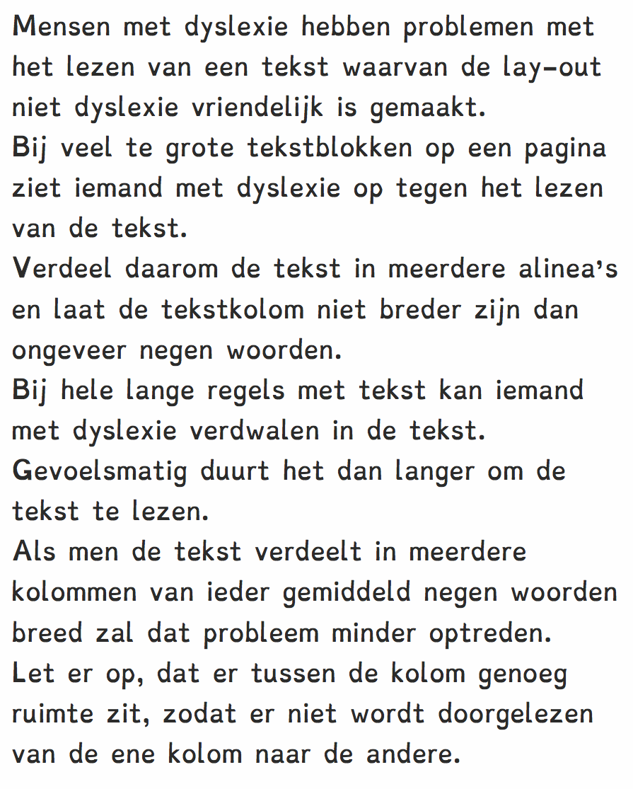
Albert-Jan Pool discusses the lack of scientific research that went into specially designed typefaces such as Dyslexie, Open Dyslectic, and Sylexiad. He supports well-tested experiments that compare many typefaces in controlled tests. In particular, he points out the work in the Ph.D. dissertation of Ann Bessemans at the University of Leiden, who (in Albert-Jan's words) scientifically tested modified versions of Frutiger and DTL Documenta that were distorted in ways that are similar to those in Dyslexia [the typeface] against the non-distorted versions of these typefaces. It was proved that none of this kind of distortions were of any help. The only kind of distortion that seems to help is one in which she changed the horizontal proportions by widening and narrowing some of the characters. But this was only of help for children who are beginning to read, it did not seem to be of any help for children with more reading experience. |
EXTERNAL LINKS |
| | |
file name: Christiaan De Boer Dyslexie 2009
| | |
|
Luc Devroye ⦿ School of Computer Science ⦿ McGill University Montreal, Canada H3A 2K6 ⦿ lucdevroye@gmail.com ⦿ https://luc.devroye.org ⦿ https://luc.devroye.org/fonts.html |