TYPE DESIGN INFORMATION PAGE last updated on Mon Jul 20 21:13:17 EDT 2026
FONT RECOGNITION VIA FONT MOOSE

|
|
|
|
Maria Selezeneva
[Maria Kharlamova]
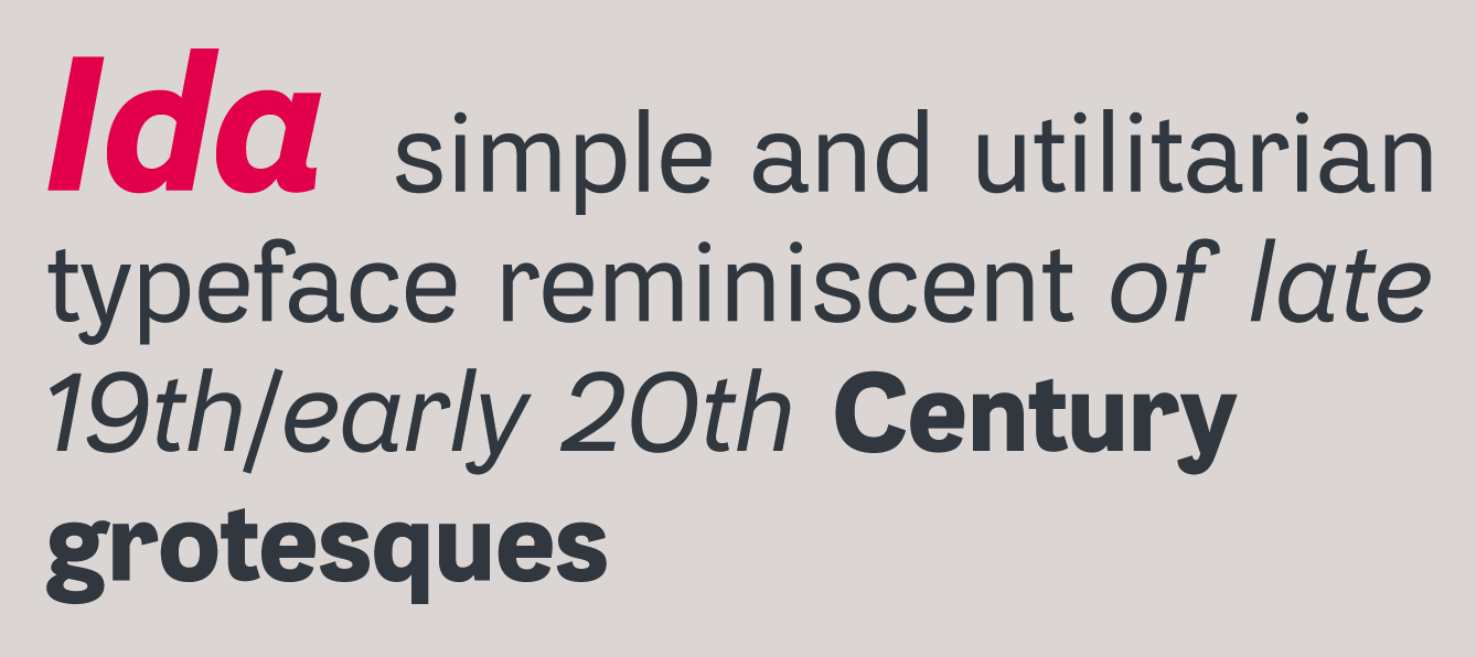
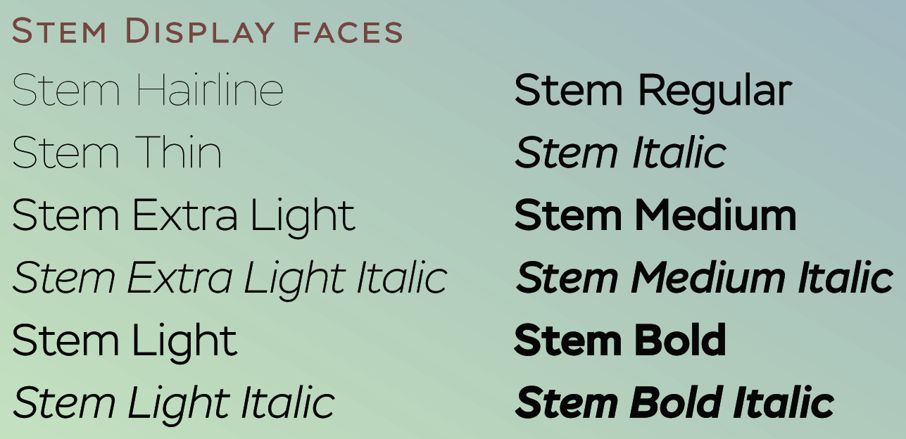
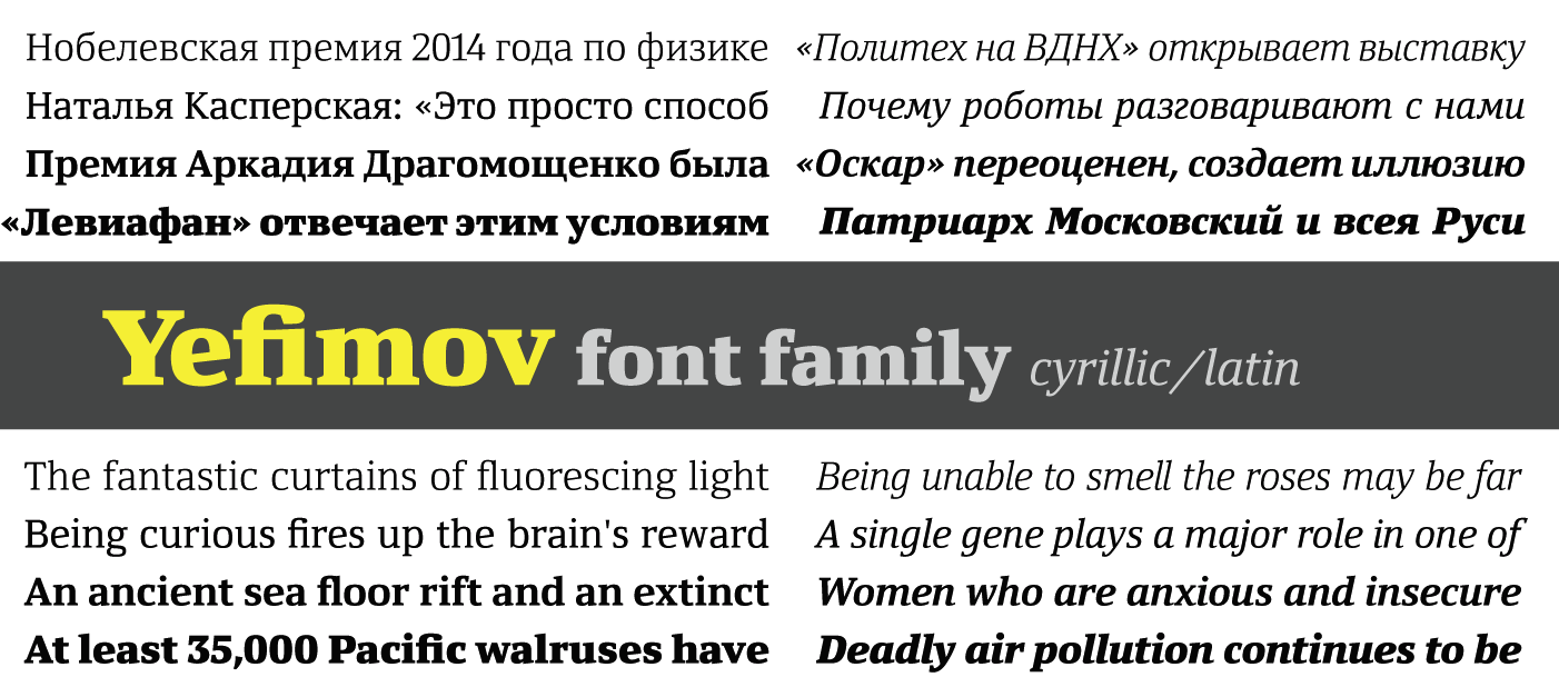
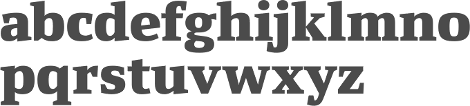
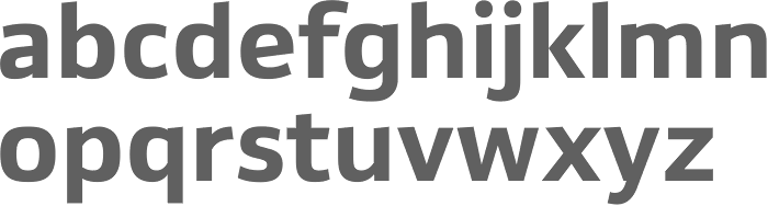
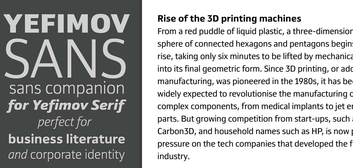
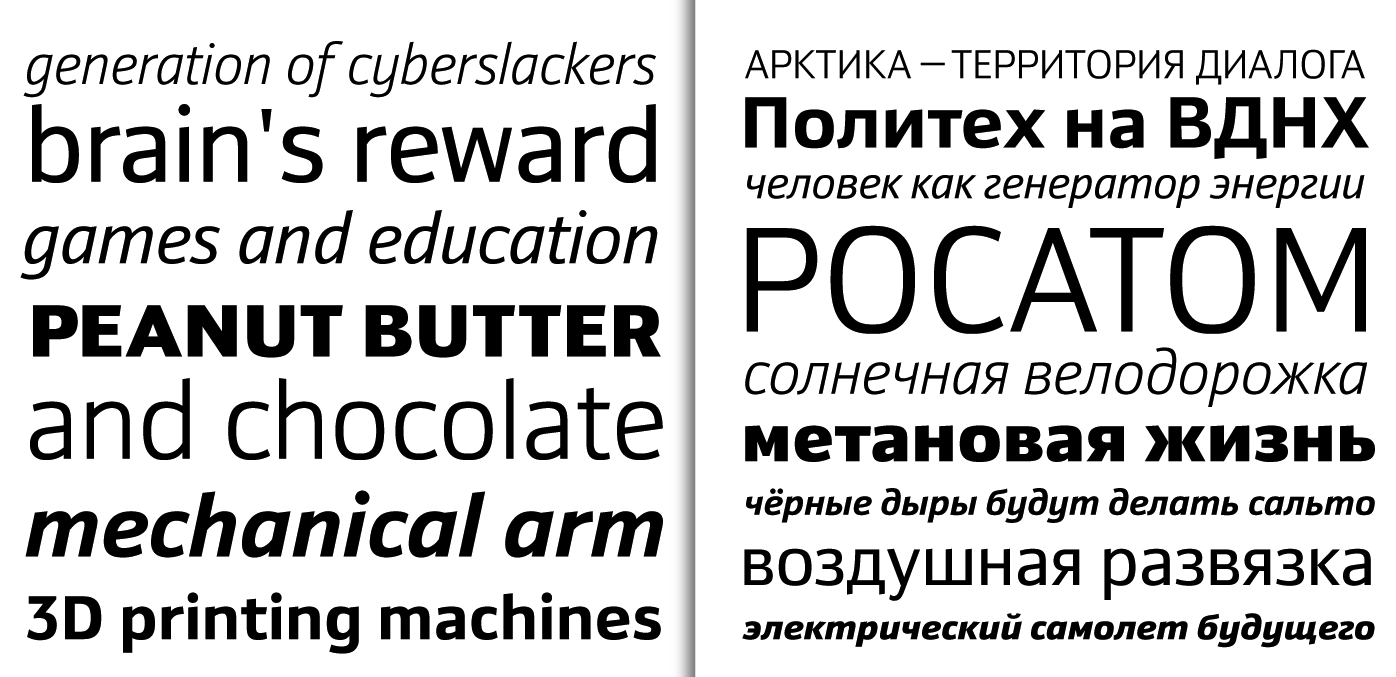
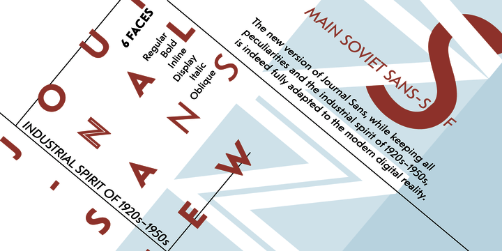
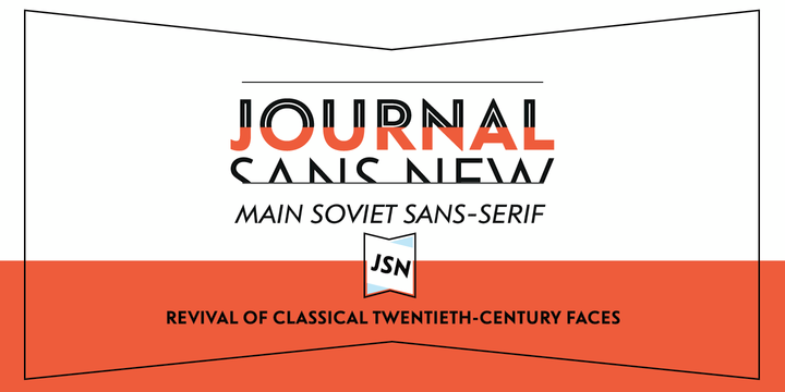
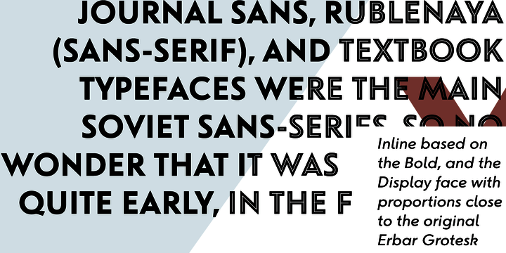
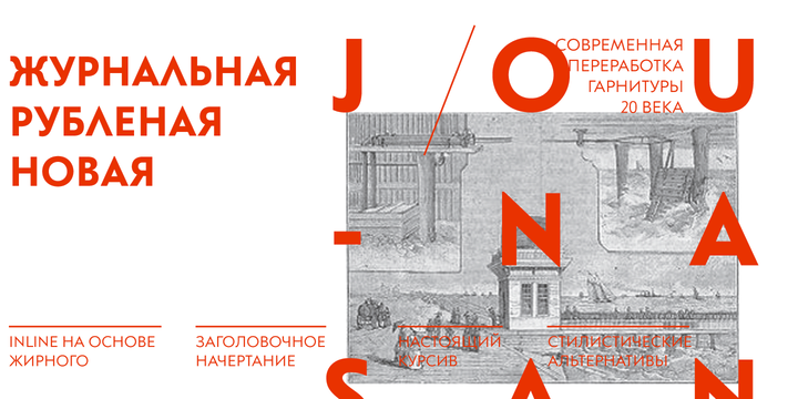
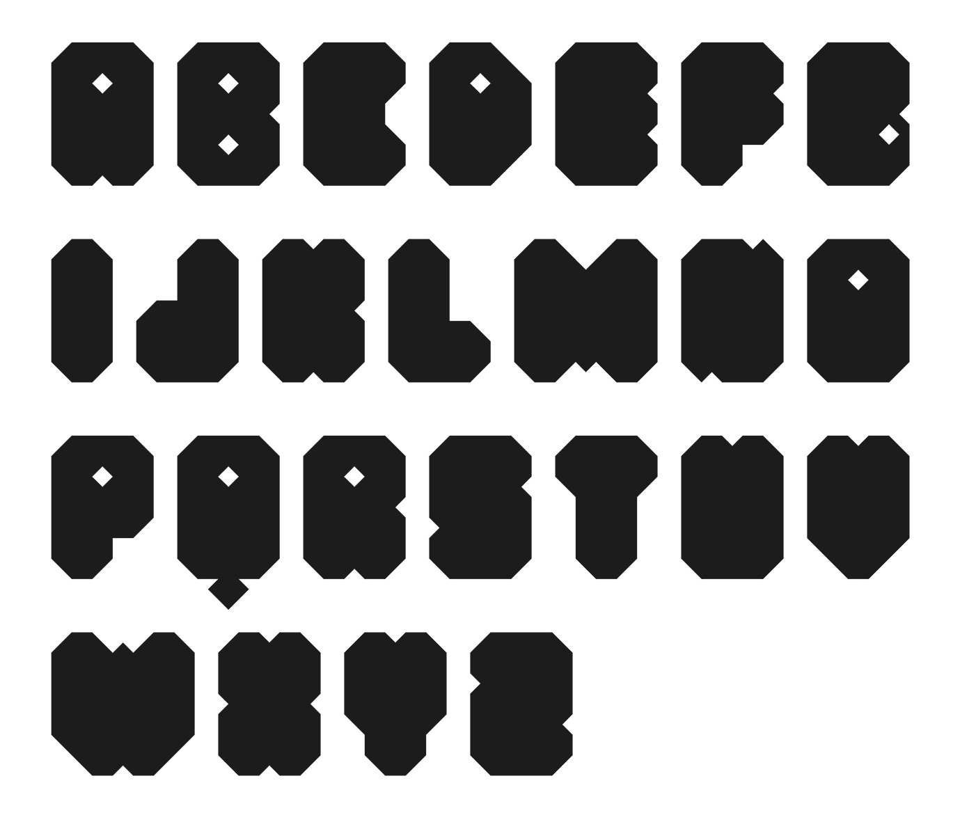
Moscow-based type designer, known first as Maria Selezeneva, and then as Maria Kharlamova. In 2014, she cooperated with Alexandra Korolkova on a revamped Journal Sans typeface at Paratype, called Journal Sans New (Latin and Cyrillic). This is a major extension as explained by Paratype: The Journal Sans typeface was developed in the Type Design Department of SPA of Printing Machinery in Moscow in 1940-1956 by the group of designers under Anatoly Shchukin. It was based on Erbar Grotesk by Jacob Erbar and Metro Sans by William A. Dwiggins, the geometric sans-serifs of the 1920s with the pronounced industrial spirit. Journal Sans, Rublenaya (Sans-Serif), and Textbook typefaces were the main Soviet sans-serifs. So no wonder that it was digitized quite early, in the first half of 1990s. Until recently, Journal Sans consisted of three typefaces and retained all the problems of early digitization, such as inaccurate curves or side-bearings copied straight from metal-type version. The years of 2013 and 2014 made "irregular" geometric sans-serifs trendy, and that fact affected Journal Sans. In the old version curves were corrected and the character set was expanded by Olexa Volochay. In the new release, besides minor improvements, a substantial work has been carried out to make the old typeface work better in digital typography and contemporary design practice. Maria Selezeneva significantly worked over the design of some glyphs, expanded the character set, added some alternatives, completely changed the side-bearings and kerning. Also, the Journal Sans New has several new typefaces, such as true italic (the older font had slanted version for the italic), an Inline typeface based on the Bold, and the Display typeface with proportions close to the original Erbar Grotesk. The new version of Journal Sans, while keeping all peculiarities and the industrial spirit of 1920s-1950s, is indeed fully adapted to the modern digital reality. It can be useful either for bringing historical spirit into design or for modern and trendy typography, both in print and on screen. Her second project from 2014 was Stem, a geometric large x-height Latin / Cyrillic sans serif with optical sizing co-designed with Alexandra Korolkova and Isabella Chaeva at Paratype. This was followed in 2015 by Stem Text. Still in 2014, she designed Yefimov Serif: Yefimov Serif is a contemporary serif face, with low contrast, squarish shapes of round glyphs and emphasized businesslike nature. It is one of the last original typefaces by Vladimir Yefimov. Yefimov Serif will suit perfectly for business texts, periodicals and corporate identity. In 2017, she designed a very heavy (Latin) octagonal typeface, and the utilitarian sans typeface family Ida (2017, Paratype). Behance link. |
EXTERNAL LINKS |
| | |


file name: Maria Kharlamova Ida 2017 252831
file name: Maria Kharlamova Ida 2017 252831
file name: Maria Kharlamova Ida 2017 252832
file name: Maria Kharlamova Ida 2017 252834
file name: Maria Kharlamova Ida 2017 252836
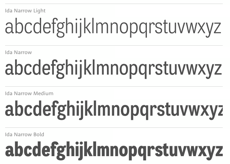
file name: Maria Kharlamova Ida Narrow 2017
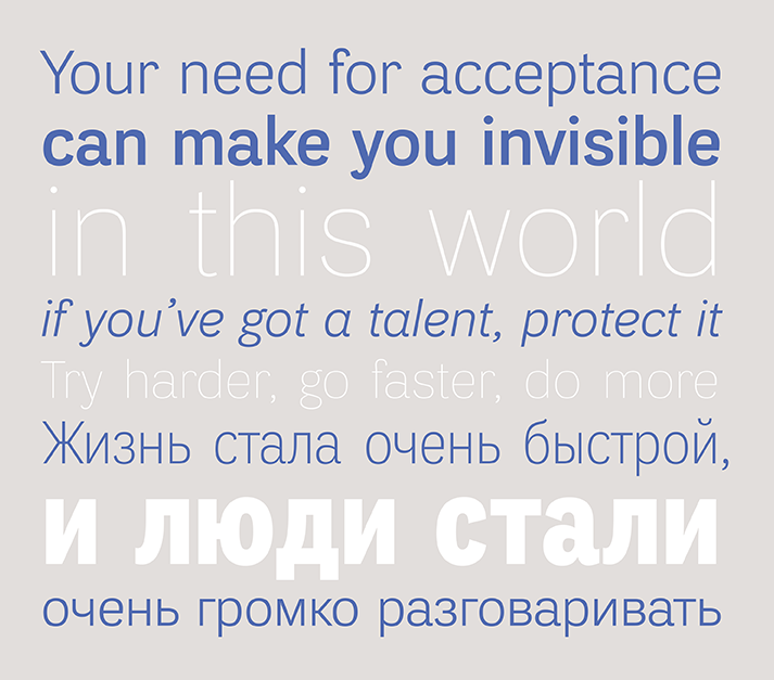
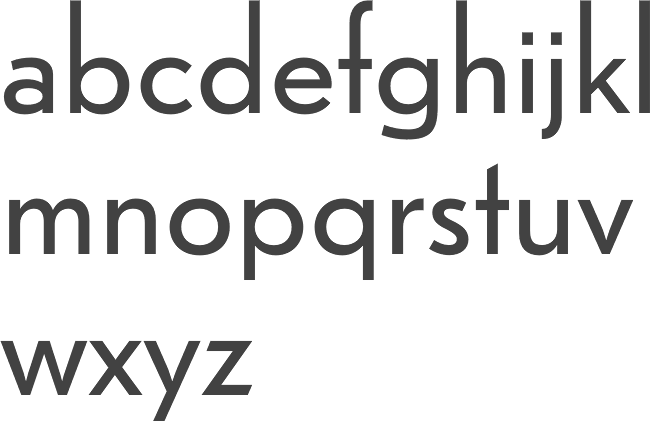
file name: Alexandra Korolkova Maria Selezeneva Isabella Chaeva Stem 2014
file name: Alexandra Korolkova Maria Selezeneva Isabella Chaeva Stem Medium 2015
file name: Alexandra Korolkova Maria Selezeneva Isabella Chaeva Stem 2014b
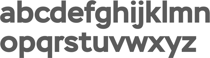
file name: Alexandra Korolkova Maria Selezeneva Isabella Chaeva Stem 2014c
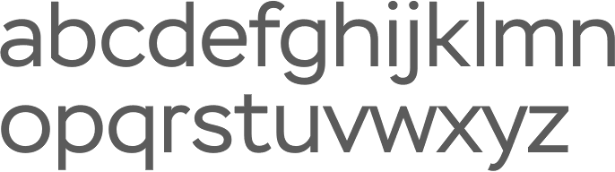
file name: Alexandra Korolkova Maria Selezeneva Isabella Chaeva Stem 2014d
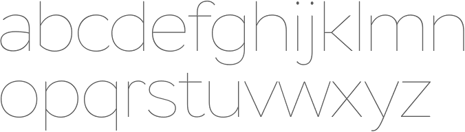
file name: Alexandra Korolkova Maria Selezeneva Isabella Chaeva Stem Hairline 2014

file name: Alexandra Korolkova Maria Selezeneva Isabella Chaeva Stem Text 2015
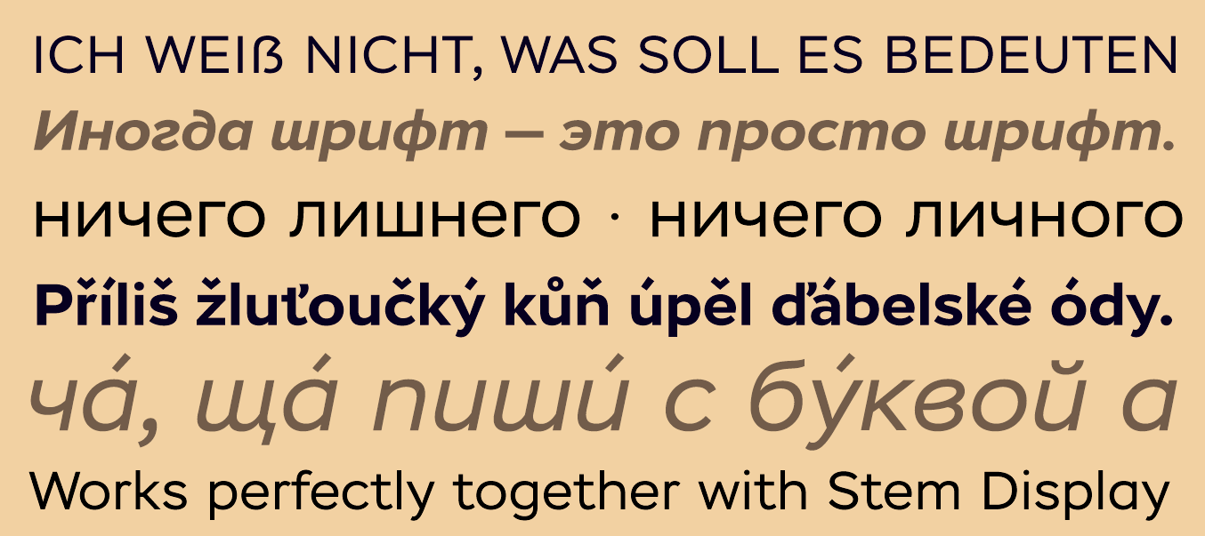
file name: Alexandra Korolkova Maria Selezeneva Isabella Chaeva Stem Text 2015 197212
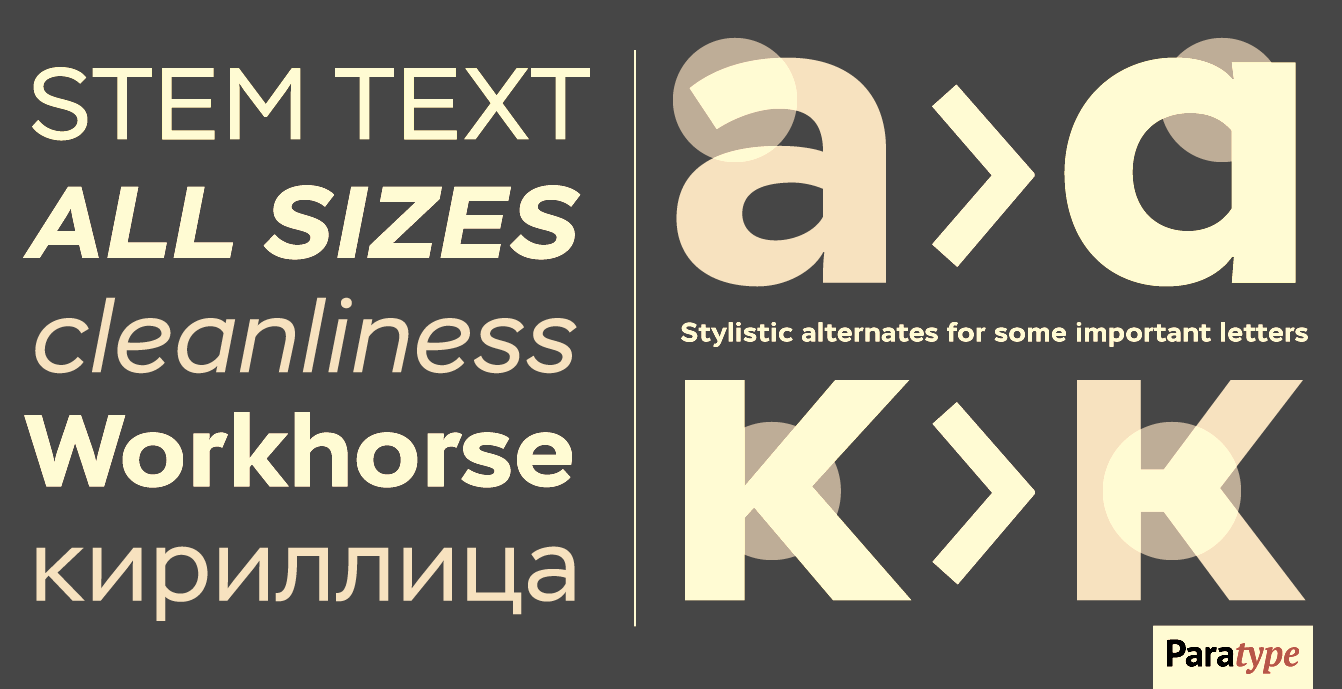
file name: Alexandra Korolkova Maria Selezeneva Isabella Chaeva Stem Text 2015 197213
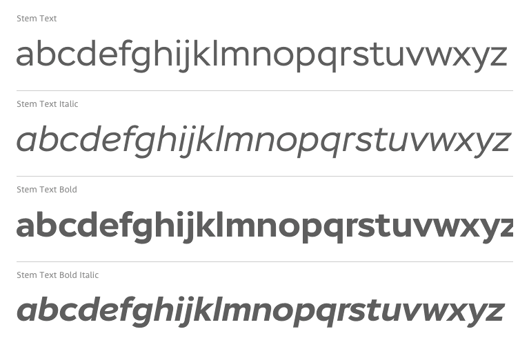
file name: Alexandra Korolkova Maria Selezeneva Isabella Chaeva Stem Text 2015b
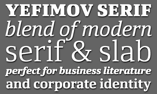
file name: Maria Selezeneva Yefimov Serif 2014
file name: Maria Selezeneva Vladimir Yefimov Yefimov Serif 2014b
file name: Maria Selezeneva Vladimir Yefimov Yefimov Serif 2014c
file name: Maria Selezeneva Vladimir Yefimov Yefimov Serif Black 2014
file name: Maria Selezeneva Alexandra Korolkova Vladimir Yefimov Yefimov Sans 2015
file name: Maria Selezeneva Alexandra Korolkova Vladimir Yefimov Yefimov Sans 2015b
file name: Maria Selezeneva Alexandra Korolkova Vladimir Yefimov Yefimov Sans 2015c
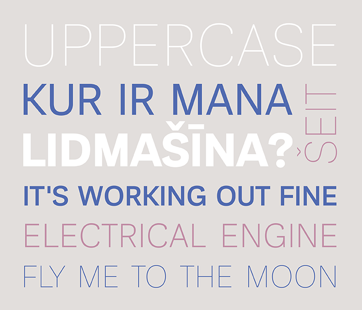
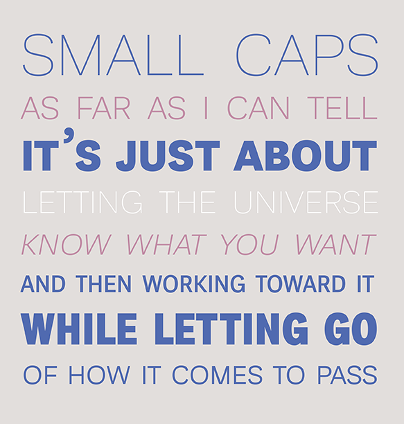
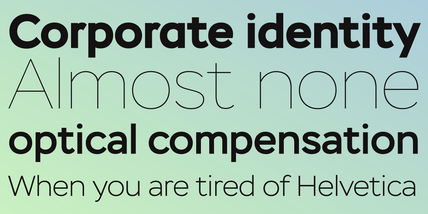
file name: Alexandra Korolkova Maria Selezeneva Journal Sans New 2014
file name: Alexandra Korolkova Maria Selezeneva Journal Sans New 2014a
file name: Alexandra Korolkova Maria Selezeneva Journal Sans New 2014b
file name: Alexandra Korolkova Maria Selezeneva Journal Sans New 2014c
file name: Alexandra Korolkova Maria Selezeneva Journal Sans New 2014d
file name: Alexandra Korolkova Maria Selezeneva Journal Sans New Bold 2014
file name: Alexandra Korolkova Maria Selezeneva Journal Sans New Display 2014
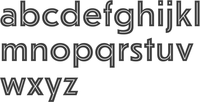
file name: Alexandra Korolkova Maria Selezeneva Journal Sans New Inline 2014
file name: Maria Kharlamova Typeface 2017
file name: Maria Kharlamova Typeface 2017e
| | |
|
Luc Devroye ⦿ School of Computer Science ⦿ McGill University Montreal, Canada H3A 2K6 ⦿ lucdevroye@gmail.com ⦿ https://luc.devroye.org ⦿ https://luc.devroye.org/fonts.html |