TYPE DESIGN INFORMATION PAGE last updated on Thu Apr 16 22:15:10 EDT 2026
FONT RECOGNITION VIA FONT MOOSE

|
|
|
|
Maître Constantin
Maître Constantin is responsible, according to research carried out by Stan Knight and published in Historical Types (From Gutenberg to Ashendene) (Oak Knoll Press, 2012) for the original Garamond types. I quote a passage written by Alastair Johnston in his review of that book: Fortunately we have James Mosley, who teaches at Reading, Charlottesville (Virginia) & London Universities, formerly the Librarian of Saint Bride's in London, as a guiding light in the search for typographic truth. Mosley has been blogging about such matters since 2006. His "typefoundry" blog has been a great resource for Knight, particularly in the untangling of Jannon versus Garamond, the actual spelling of Garamont's name, and other details. Many documents have appeared to further the historical discussion, from the series of Type Specimen Facsimiles (under the editorship of John Dreyfus from 1963 onward), to the exemplary Enschedé (1993) & Plantin-Moretus (2004) facsimiles edited by John Lane. Some of the older facsimile works could be revisited with the new approach heralded by Knight, for example the 1592 Egenolff-Berner specimen sheet which was reproduced in 1920 by Gustav Mori in collotype. That sheet was the first specimen broadside to clearly identify Garamond and Granjon as cutters of their types and, as it was printed from newly cast type, was the best possible source for modern interpretations: Adobe Garamond by Robert Slimbach (among others) was drawn from it. But for most of the twentieth century Garamond revivals (and there have been roughly a zillion of them) were based on the wrong type: a poor imitation cut by Jean Jannon in the French province of Sedan in the 1620s. This typographic Lady Gaga, a tragi-comic homage to classic typefaces, should have been left in the dustbin of history but accidentally gained an important place in the story of type development, so Knight has included it. Also included is a text debunking many of the myths about Jannon and Garamond (thanks to Mosley's research). One of the most fanciful stories has Cardinal Richelieu's troops looting Jannon's types to bring them back to the Imprimerie nationale in Paris. This yarn was first spun by Beatrice Warde in 1926 and picked up by Warren Chappell in his Short History of the Printed Word. As late as 1999 Canadian poet Robert Bringhurst was embroidering the fable in his edition of Chappell's book (p. 148), saying that after Richelieu’s armies seized Jannon’s type they felt bad about it so they reimbursed him for them! As technology improves it greatly assists us in seeing what we are looking at (though collotype mentioned above is hard to beat). Up to now many books on type have used small illustrations of large pages shrunk down, printed from line blocks. In the end you cannot see any details. So the next step is to do more books of this kind that show, as closely as possible, the impression and the texture of the paper, and more specialized books. Knight's previous book was Historical Scripts (also from Oak Knoll) with a similar hyper-visual approach to the history of calligraphy. Hendrik Vervliet's recent three volumes on the Paleotypography of the French Renaissance have illustrations from Xerox copies and photostats. Vervliet's images (many composites to show full character sets) were painstakingly assembled over decades and often Xerox was the only service available. It would be a useful task for someone to give the blow-up treatment (shot in high resolution with raking light to show the impression, as well as the paper surface) to his studies (now that we have the key data assembled), and then move into the following centuries. Nevertheless Vervliet's work is the major contribution to the field in the last half century. So it's great to see late-breaking news from the sixteenth century when Knight reproduces a page of revolutionary new type from Henri Estienne (previously attributed to Garamond [see top illustration]) and, thanks to Vervliet, we now have to acknowledge the shadowy Maître Constantin for this massive step-forward in the Aldine style which revolutionized roman letterforms across Europe. |
EXTERNAL LINKS |
| | |
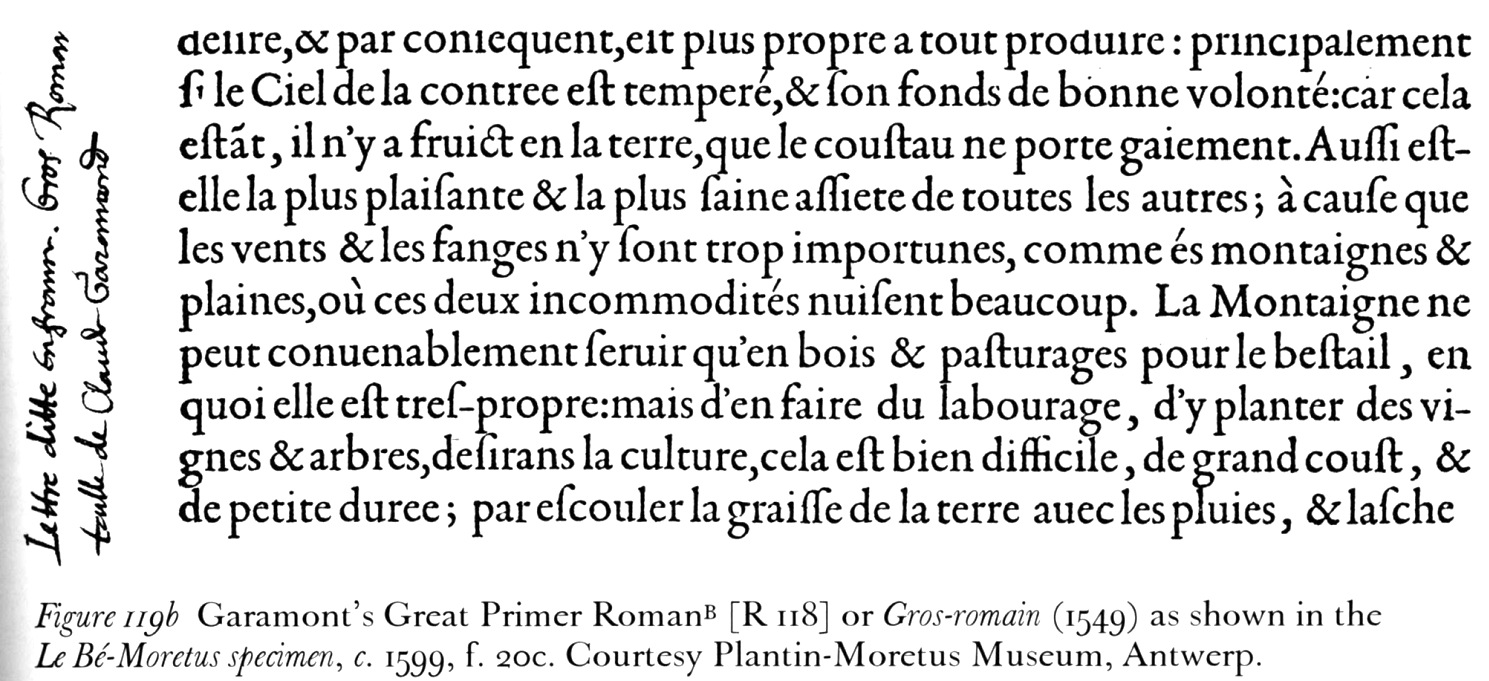
file name: Claude Garamont Gros Romain 1549 in Le Be Moretus Specimen 1599
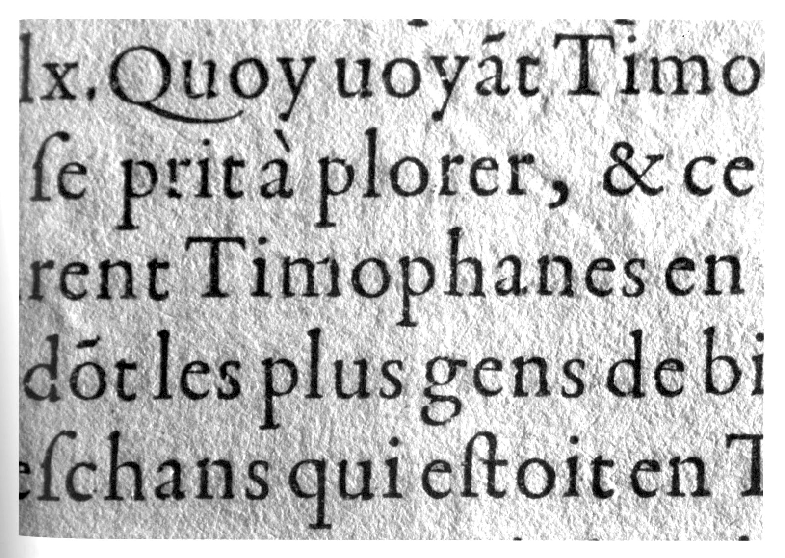
file name: Claude Garamont Gros Romain 1559 from Les Vies Des Hommes Illustres
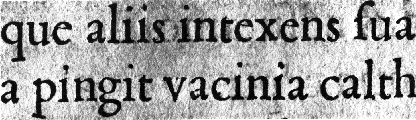
file name: Maitre Constantin Gros Romain 1530 in Opera Virgil Paris Robert Estienne 1532
| | |
|
Luc Devroye ⦿ School of Computer Science ⦿ McGill University Montreal, Canada H3A 2K6 ⦿ lucdevroye@gmail.com ⦿ https://luc.devroye.org ⦿ https://luc.devroye.org/fonts.html |