TYPE DESIGN INFORMATION PAGE last updated on Mon Jun 8 18:14:24 EDT 2026
FONT RECOGNITION VIA FONT MOOSE

|
|
|
|
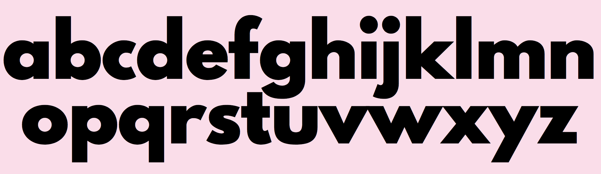
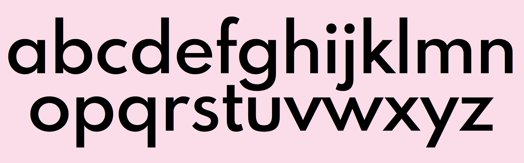
Spartan
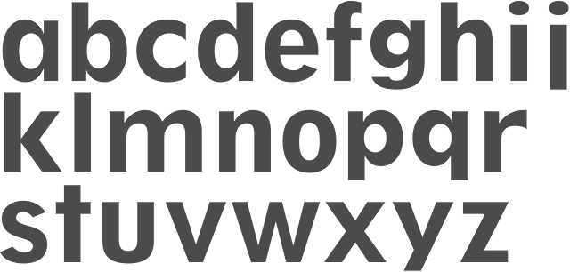
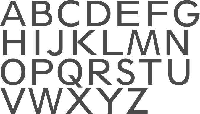
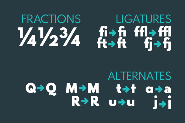
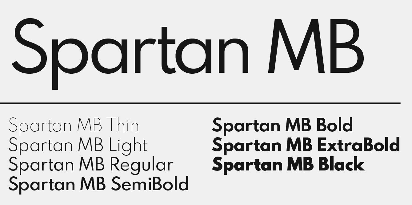
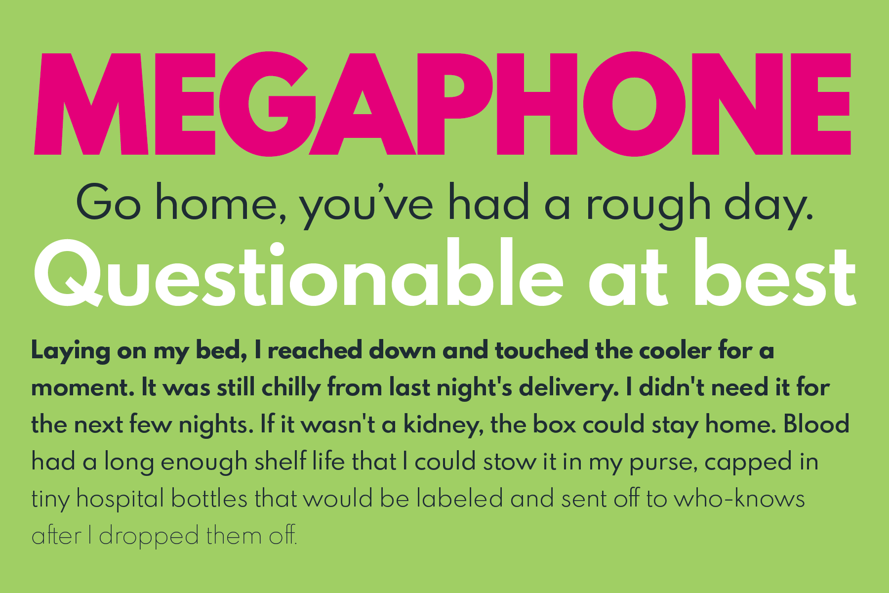
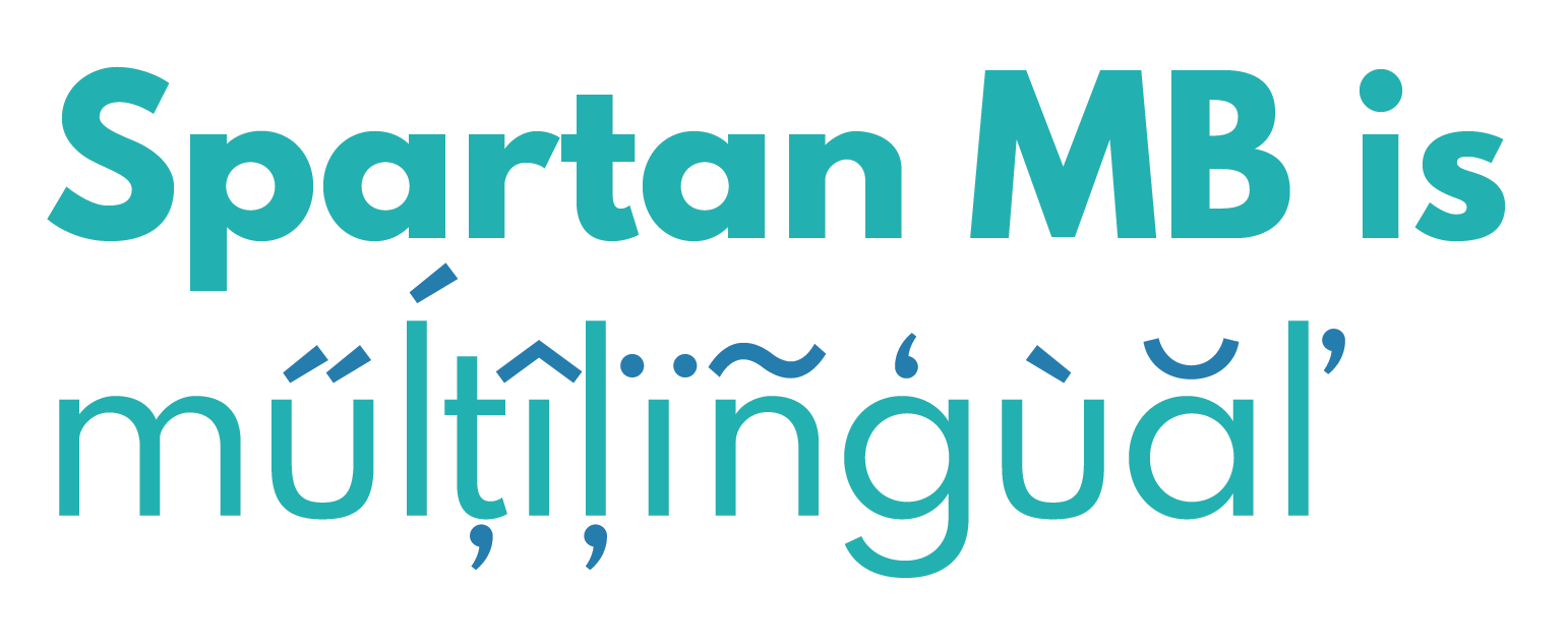
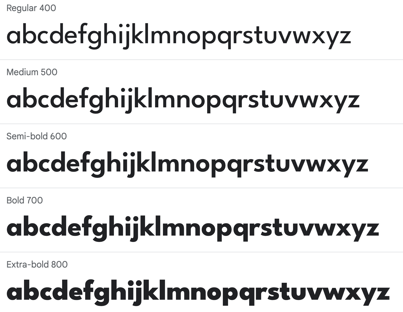
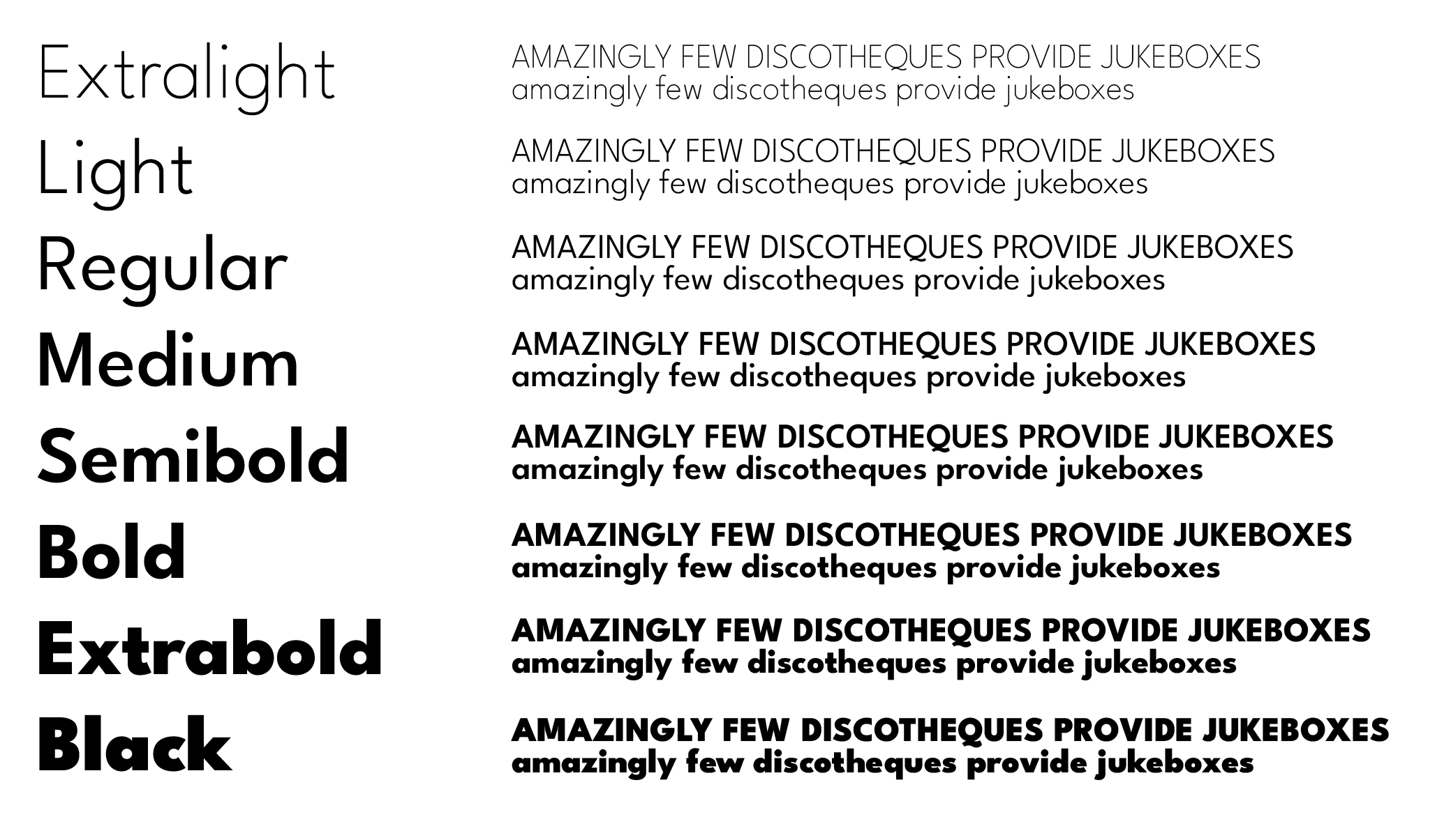
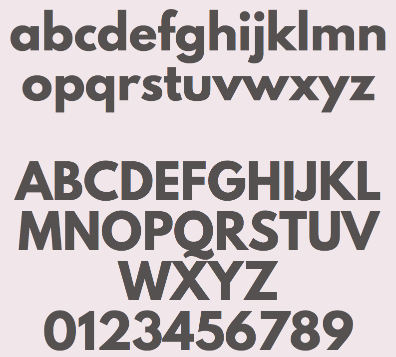
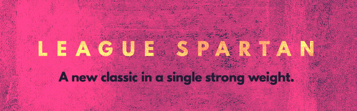
A famous geometric sans style started at ATF in 1936, now know as Linotype's answer to Futura. Mac McGrew writes: Spartan as produced by Linotype and ATF is equivalent to Futura (q.v.). Although it is claimed to have been derived from several similar European typefaces, the differences between it and Futura are so slight that for most practical purposes they are almost interchangeable. Linotype announced Sanserif 52 and Italic early in 1939; later in the same year these typefaces were offered as Spartan Black, along with light, medium, and heavy weights, all with italics. In 1941 ATF cut some of these typefaces; by arrangement with Mergenthaler the small sizes were cut to match. Over the following dozen years or more, additional weights and widths were drawn by Bud Renshaw and Gerry Powell for ATF, and by Linotype staff designers. Renshaw's Spartan Medium Condensed, drawn in 1953, is wider than the corresponding typefaces in other families. In 1955 Linotype announced Spartan Bold, "the latest member of the Spartan family; slightly larger on the body than Spartan Heavy and more compactly fitted." Spartan Extra Black is heavier than the comparable typefaces from other sources. ATF made supplementary Advertising Figures, Decimal Figures, and Fractions for several weights of Spartan. Spartan Circuit and Spartan Circuit Heavy are 1964 adaptations of the design by Linotype for Teletypesetter use, requiring modification of character widths. Compare Erbar Bold. Also see Classified Display, Tempo Alternate, Twentieth Century. Digital descendants abound:
|
EXTERNAL LINKS |
| | |

file name: Linotype Spartan 1951
file name: Adobe Spartan L T Sd Book Class
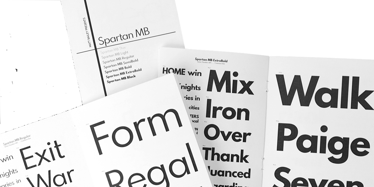
file name: Matt Bailey Spartan M B 2017
file name: Matt Bailey Spartan M B 2017b
file name: Matt Bailey Spartan M B 2017d
file name: Matt Bailey Spartan M B 2017f
file name: Matt Bailey Spartan M B 2017g
file name: Matt Bailey Spartan M B 2017h
file name: Matt Bailey Spartan M B 2017i
file name: Matt Bailey Spartan M B 2017j

file name: Matt Bailey Spartan M B 2017k
file name: Matt Bailey Spartan M B Black 2017
file name: Matt Bailey Spartan M B Semi Bold 2017
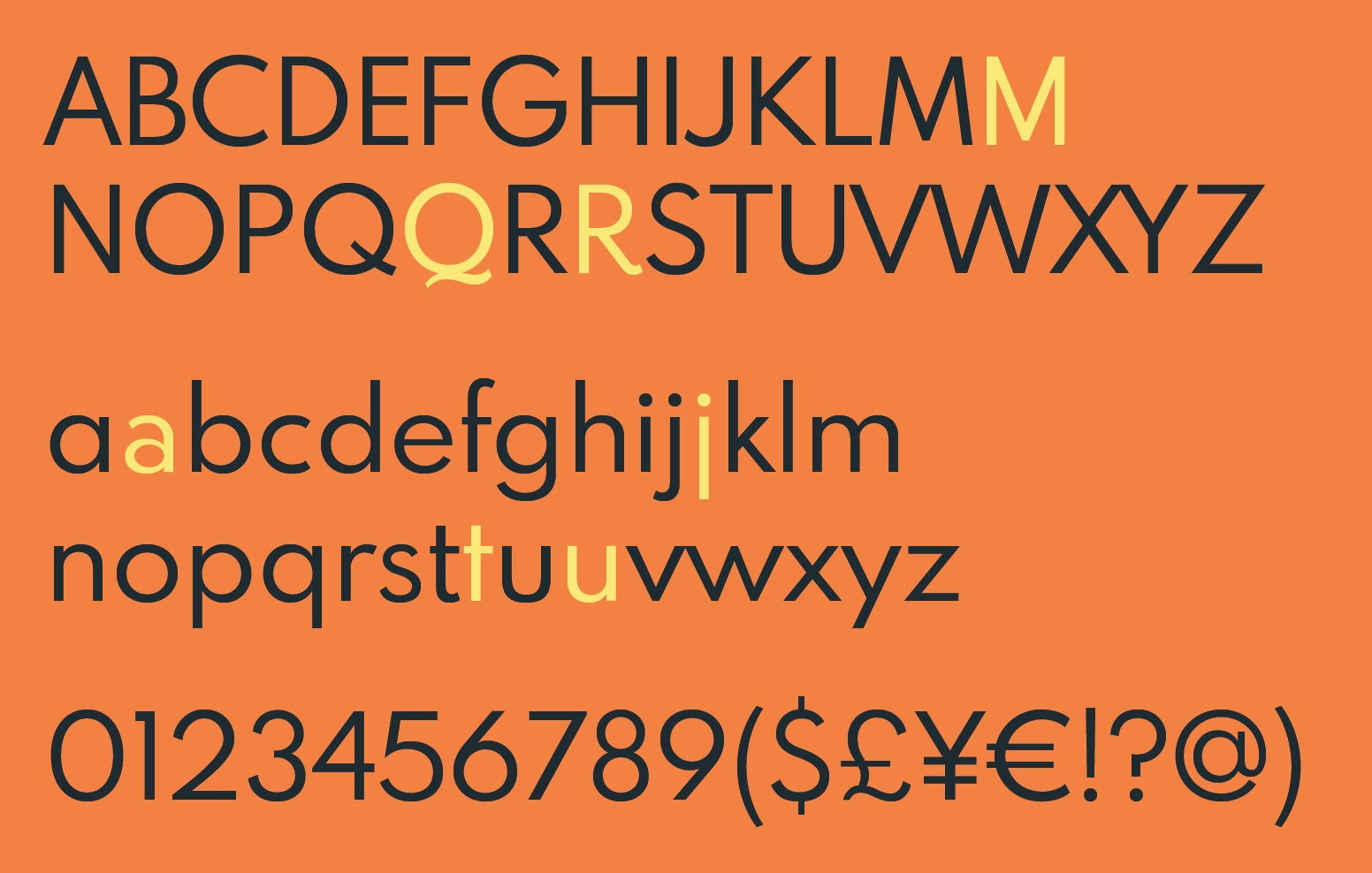
file name: Matt Bailey Tyler Finck League Spartan
file name: Tyler Finck Micah Rich League Spartan Variable 2020
file name: The Leagueof Moveable Type League Spartan Bold 2014
file name: The Leagueof Moveable Type League Spartan Bold 2014b
| | |
|
Luc Devroye ⦿ School of Computer Science ⦿ McGill University Montreal, Canada H3A 2K6 ⦿ lucdevroye@gmail.com ⦿ https://luc.devroye.org ⦿ https://luc.devroye.org/fonts.html |