TYPE DESIGN INFORMATION PAGE last updated on Thu Apr 16 22:15:52 EDT 2026
FONT RECOGNITION VIA FONT MOOSE

|
|
|
|
Renske de Leeuw
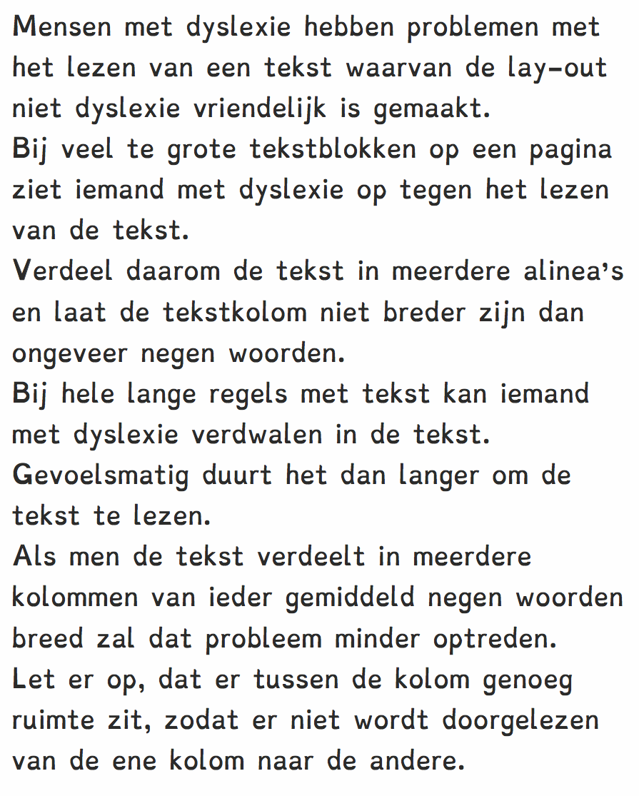
Dutch researcher whose Masters thesis at the University of Twente in 2010 is entitled Special fonts for Dyslexia?. She compared Christiaan de Boer's Dyslexie typeface with Arial. Two of her followers wrote theses on similar subjects, Tineke Pijpker (2013, University of Twente)'s Dyslexie letters en kleurcontrast, and Liane van Someren (2014, University of Amsterdam)'s Aanwijzingen waarom dyslectici meer accuraat lezen met het lettertype Dyslexie. All three theses are refuted by typographic journalist Henk Gianotten in Dyslexie, letters en dwalingen (2014, De Boekenwereld, vol. 30, No. 4, pp. 92-93). Gianotten points out that Arial's x-height exceeds that of Dyslexie, contradicting de Leeuw's claim. He also complains about the lack of a scientific method. In Gianotten's view, three key things are needed for readability---larger letters, more spacing between letters, and more interline space. For dyslexics, he also recommends using columns not more than nine words wide. |
EXTERNAL LINKS |
| | |
file name: Christiaan De Boer Dyslexie 2009
| | |
|
Luc Devroye ⦿ School of Computer Science ⦿ McGill University Montreal, Canada H3A 2K6 ⦿ lucdevroye@gmail.com ⦿ https://luc.devroye.org ⦿ https://luc.devroye.org/fonts.html |