|
Pierre Huyghebaert
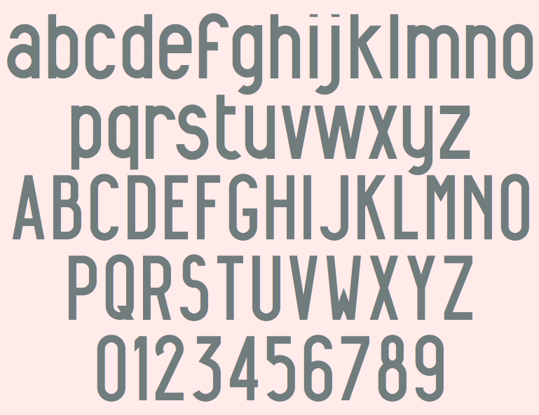
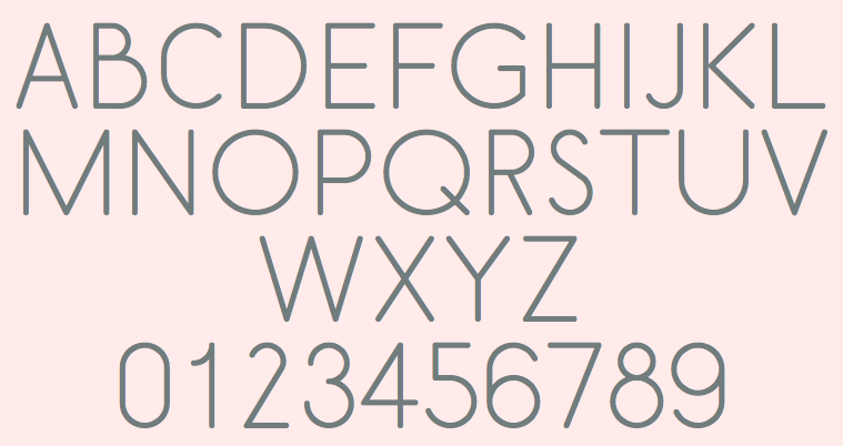
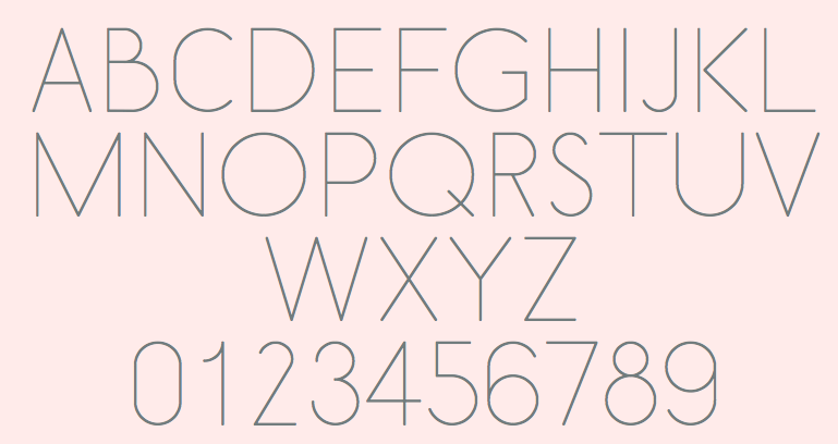
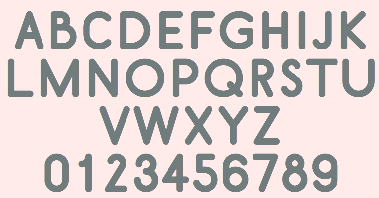
Belgian type designer, font software expert, and defender of the principle of Open Source publishing. He had a hand in many typefaces at OSP Foundry. His work includes - Belgika (2014-2015). A great set of sans capital typefaces based on skeletal strokes, also known as stroke fonts. From heavy to hairline weights. The fonts starting from a vector format and were developed using FontForge into OpenType and Type 3. OSP link. Open Font Library link.
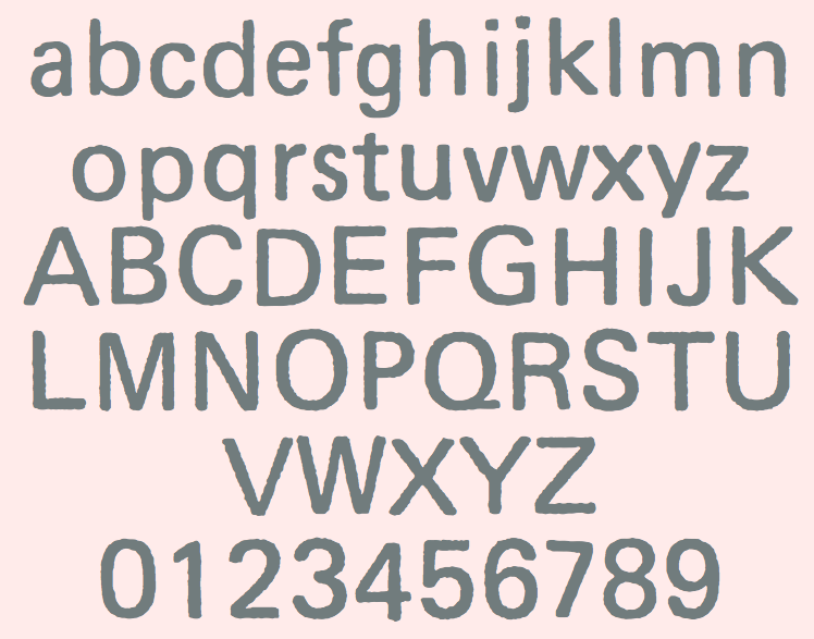
- Crickx (2011, by Pierre under the label Speculoos, and the OSP crew). A digital reinterpretation of a set of adhesive letters. In Regular, Droite, Rush and SharkCut styles. Open Font Library link.
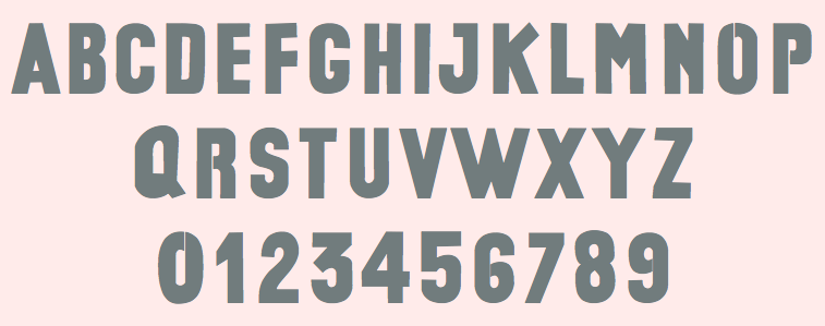
- Univers Else (2010). They write: Univers Else is an experiment, a first attempt to escape the post-80 era of geometrical purity that is so typical of Postscript vector based font drawing. The shapes of Univers Else were obtained from scanning printed textpages that were optically composed by cheap phototypesetting machines in the sixties and seventies. Some of Univers Else beautiful features are: round angles, floating baselines, erratic kerning. More precisely in this case, George Maciunas of the Fluxus group used an IBM composer (probably a Selectric typewriter) for most of his own work, and as a former designer, for all Fluxus work. In the 1988 book Fluxus Codex, kindly given to Pierre Huyghebaert by Sylvie Eyberg, the body text is typeset in a charmingly rounded and dancing Univers that seems to smile playfully at its dry Swiss creator. Collaborators: Pierre Huyghebaert (Typography, initiative, testing), Pierre Marchand (Development and typography, Fonzie software), Delphine Platteeuw (Design and testing), Gregoire Vigneron (Scanning and assembling).
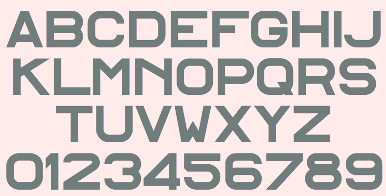
- Alfphabet (2007). The Alfphabet family is based on the Belgian road signage called Alphabet in French and Alfabet in Flemish. It was introduced in 1945 by 3M system working for the Marshall plan after the end of the war. In 1975, it was replaced by the Swiss SNV fonts, but is still in used randomly by the Belgian railroad and Charleroi's metro. In the early nineties, Pierre Huyghebaert was able to copy the original plates just before the split of the national office of the roads (Fond des Routes) in three regional entities and the burial of the documents deep into regional archives. Alfphabet Condensed is a rough merge between Alfphabet II (condensed caps only) and Alfphabet III (semi-condensed lowercase only!). It was redrawn in various occasions by Karl Bassil and Pierre under Hammerfonts umbrella in Brussels, then completed at Mind the gap studio in Beirut by Karl with the help of Nadim Zablit in the late nineties. The contrast between uppercase and lowercase is still quite non-typographic, and lot’s of diacritics need improvement. Alfphabet IV was redrawn by Pierre Huyghebaert and Ludi Loiseau at Speculoos studio in 2007. By Hammerfonts and OSP, 1992-2014: Karl Bassil, Nadim Zablit, Pierre Huyghebaert, Ludi Loiseau.
|
EXTERNAL LINKS
Pierre Huyghebaert
MyFonts search
Monotype search
Fontspring search
Google search
INTERNAL LINKS
Sites with only a few free fonts ⦿
Open source fonts ⦿
Type designers ⦿
Type designers ⦿
The Belgian type scene ⦿
Type 3 Font Software ⦿
|