|
Childers, Gristci and Leben
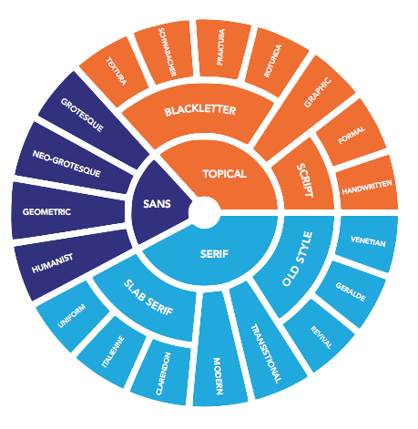
In 2013, Taylor Childers, Jessica Griscti and Liberty Leben wrote the type classification survey paper 25 Systems for Classifying Typography: A Study in Naming Frequency in Parsons Journal for Information Mapping. They conclude with their own proposal, which I summarize here (text below quoted from the article). - Serif There are four main categories of serif typefaces: Old Style, Transitional, Modern, and Slab Serif. Our subclasses of Old Style typefaces, can be described as follows. Venetian types are humanist serif typefaces developed in the 15th century. These type are characterized by short, thick, bracketed serifs, and ascenders with slanted serifs. There is little contrast between horizontals and verticals, and the lowercase e often has a stylized slanted cross stroke. Examples are Bembo and Jenson. Gerald is a term coined by Maximilien Vox, a nod to Claude Garamond and Aldus Manutius, two prolific typographers who practiced in the fifteenth and sixteenth centuries. The category could also have been called French, but we felt that was too limiting to its intention. The section meant to hold typefaces made in the Gerald style, rather than only those that were cut in France. Geralde typefaces have more contrast between the thickness and thinness of strokes and more delicate proportions than the Venetian types. The axis of the curve in most letters is oblique as compared to the vertical axis of the next movement in old style typography, the Transitionals. Eighteenth century Transitional types like Deberny & Peignot's Baskerville had an even stronger contrast between thick and thin strokes, so much so that the letters almost glitter on the page. These typefaces marked the difference between the Geralde and Modern didone typography. At the time that they were cutting types, typographers wouldn't have considered themselves in a transitional period. The term was only given to those typefaces after the beginning of Modern typography. As such, many find issue with the name. However, the alternate name for these types, Realist, never caught on with the same fervor that Transitional did, and so here, we revert to the most popular name. We've also included a section for Revival Old Style typefaces, for those types designed post 19th century in the style of either Venetian, Geralde, or Transitional typefaces. Modern typography started with typographers Giambattista Bodoni and Firmin Didot. Modern typography has almost become synonymous with Didone typography, which is of course takes its name from Didot and Bodoni. Modern types have the strongest contrast between thick and thin lines. The serifs are hairline thin and unbracketed. The final category in serif typefaces is Slab Serifs. These typefaces grew out of Modern typefaces. Slab serifs are heavy, often rectilinear serifs a thick or thicker than the rest of the letter. Clarendon slabs are of similar or smaller size to the body of the letter, and they are bracketed. Italienne slabs are also bracketed, but thicker than the body of the letter. We created the category Uniform Slab Serifs to cover slab typefaces that are of similar weight to the body of the letter, but left unbracketed.
- Sans. These four Sans Serif subcategories have been standard since the Vox ATypI system in 1961. Grotesques, like Berthold's Azkidenz Grotesk were the first sans serif typeface. They originated in the nineteenth century, and therefore have some holdover from their predecessors; there is a degree of contrast between thick and thin strokes. From there, the Neo-Grotesque typefaces evolved in the 1950s. They were cleaner, and more mechanical than the Grotesques. The Neo-Grotesque was a large part of Swiss typography; in the beginning, they were used as display typefaces. Their stroke contrast was minimal, the letters were set wider and the x-height was raised. Many grotesque typefaces, like Helvetica, have been drawn with a great degree of varying weights and widths to accommo- date for their different uses in display design. Geometric Sans Serifs left behind all of their historical connotations. They were the most mechanical of all of the sans serifs, made to look as if they were developed by machine. The body of the letters are constructed from simple geometric shapes, often they are monoline, and there is little differentiation between each letter. Whereas the geometric abandons all notion of being derived from earlier typography, the humanist sans serif draws from the classical manuscript hand. The design is often informed by the classical Roman letter, and informs the decisions the designer makes to his fresh, monoline letter. The most celebrated humanist sans serif is Eric Gill's Gill Sans.
- Topicals. While in the days of Johannes Gutenberg, the blackletter was the most common text face, now, as a modern civiliza- tion, we are no longer trained to read letters so dense and alligraphic. Therefore, blackletter typefaces are now regarded as decorative. Textura is the most calligraphic form of blackletter. The letters are tall, narrow, and drawn with sharp, angular lines. Textura was used in France, England, and parts of Germany. Schwabacher blackletters are the earliest German print typefaces. It is closer to the manu- script handwriting that the Textura face. By 1530, it was replaced by the Fraktur, as the most oft-used text face in Germany. Fraktur typefaces were so common that almost all German blackletters of the time carried Fraktur somewhere in their name. The capital letters are created from a rounded C-shape, and S-shaped strokes. Rotunda, also know as Cursiva, blackletters is much like modern script, there are no real standards except that the letters run together. Scholars of all sorts have pulled the Script typefaces out of the general display sections because they can be qualified, classified and separated from display typography. Formal scripts are based on the writing of calligraphy masters. The letters are drawn either with a metal pen nib or quill. Handwritten scripts come from the more active modern hand. Strokes vary in width, and are generally not created with pen nib or quill. The most difficult task any typo- graphic scholar has set out to do is classify the display types, and every scholar fails, whether because he has chosen to attempt classification or ignore the types entirely. We felt that neither solution was acceptable. Display typefaces are becoming more and more popular, and as we march father into Open Type, only more are expected to appear. There are simply too many typefaces to qualify, and far too many typefaces to leave them absent from our system. So we’ve carved out a place for them in our Graphic category. Graphic, because Display is a tired term that has failed too many times before. These typefaces often reference the style of something else, they are bold, statement pieces that aren't meant for paragraphs of text, and so they need a bold category.
|
EXTERNAL LINKS
MyFonts search
Monotype search
Fontspring search
Google search
INTERNAL LINKS
Childers, Gristci and Leben
Typeface Classification ⦿
Type scene in New York ⦿
|
