TYPE DESIGN INFORMATION PAGE last updated on Mon Jul 20 21:16:20 EDT 2026
FONT RECOGNITION VIA FONT MOOSE

|
|
|
|
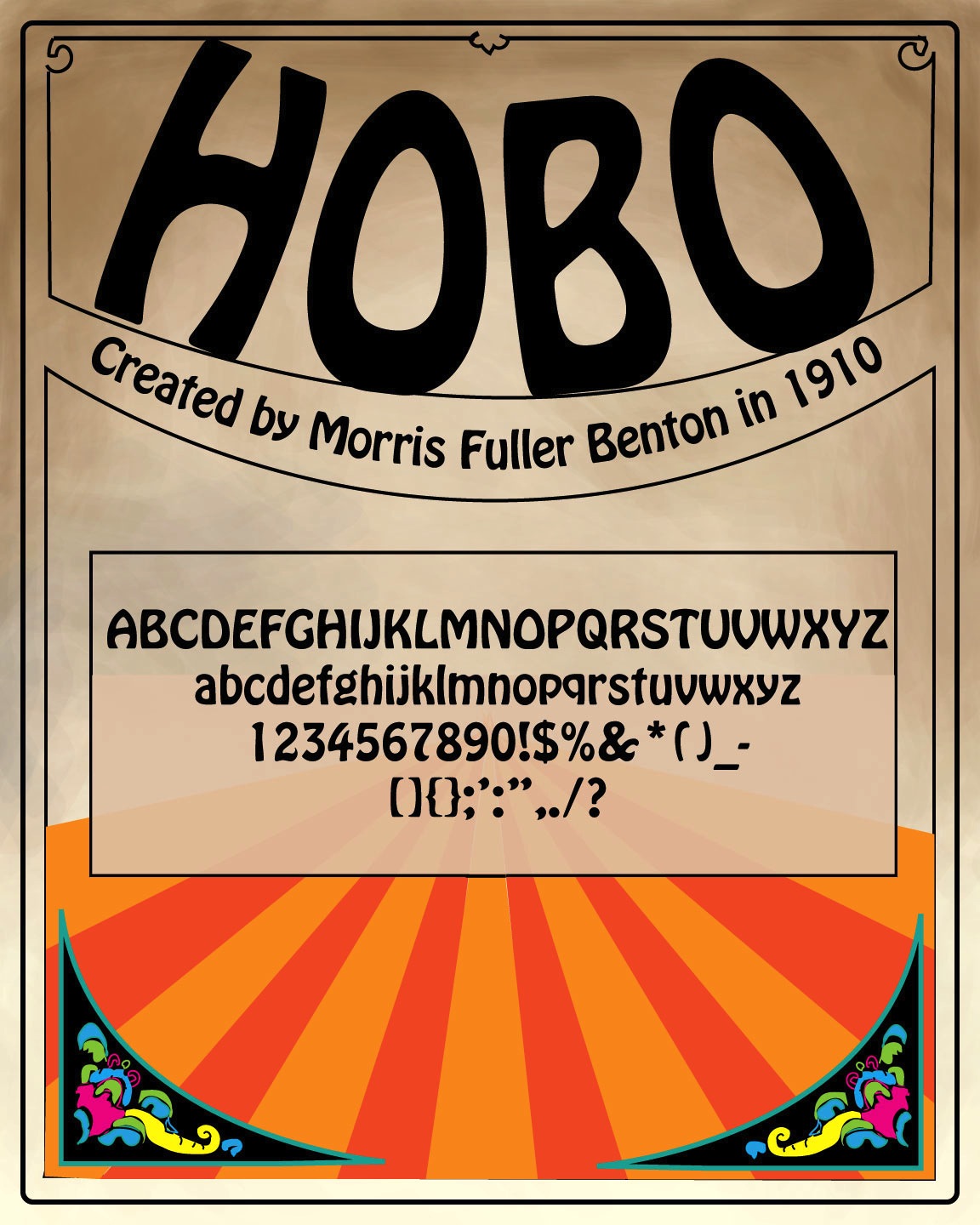
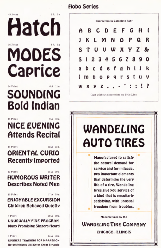
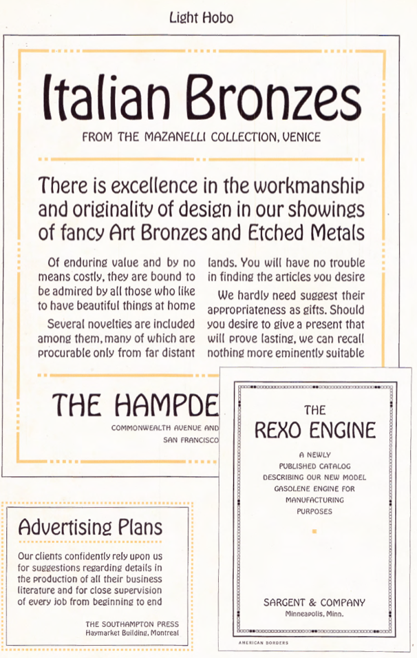
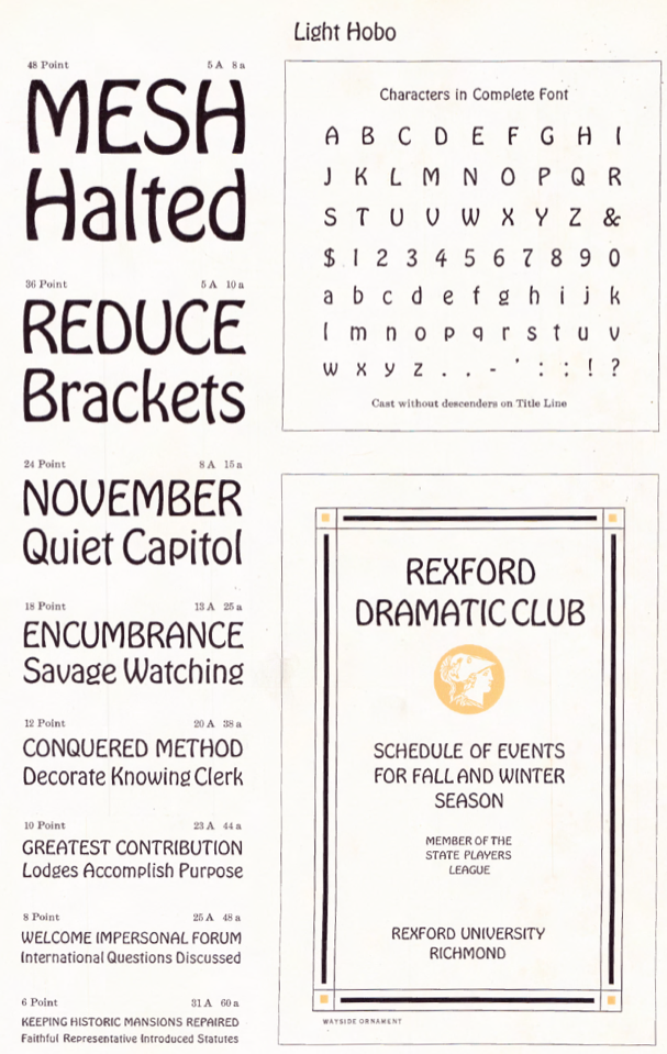
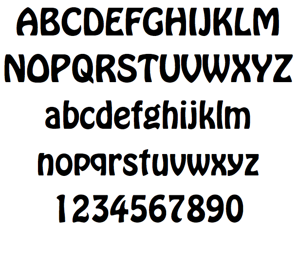
Hobo
[Peter Zelchenko]
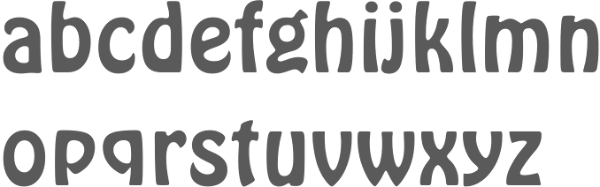
Peter Zelchenko, a master trade typographer in Chicago in the 1980s and 1990s, gave me permission to tell his story about the origins of Hobo---both the name and the typeface. He contradicts Mac McGrew, but his explanation is more likely than all others that have been proposed. So here we go (all text below by Peter). (Thanks to Boston’s Bill Ricker and Dick Miller for coaxing me to cough this story up finally. I originally mentioned it in comp.fonts about 20 years ago, but the “O” situation, recently discovered, offers incontrovertible proof of the theory.) As a master trade typographer in Chicago in the 1980’s and 1990’s, I was the last of the breed here before desktop publishing finally made our race extinct. I imagine there were only two or three of us in that generation. Among the very few others in Chicago were Adam Kallish and Jason Pickleman, who both were working for the irascible Harvey Hunt, a Berthold guy, when he closed down his Typographic Resource and moved to Mac. (Harvey and his wife inherited ownership of the Berthold font collection. For decades Berthold was a top-quality typesetting platform.) I was working upstairs from them during the storied heyday of InfoComm, a pioneering PostScript service bureau, at 213 W. Institute Pl., site of the early Schwinn bicycle factory. You can still see thousands of bicycle screws embedded in the wood floors of that building. We were young and, with proficiency in computers, were able to bridge old and new technologies easily. We were also font whores. Most kids in those days used to save their money up for model airplanes or blow it all on Twinkies. When we were children, my brother Greg and I used to haunt Chicago art stores, scraping up money for Zipatone dry-transfer, or “rub-down,” lettering. Our favorites were things like Calypso, Mistral, and others by Roger Excoffon, Herb Lubalin, Ed Benguiat, Rosmarie Tissi, and the many other designers of that prolific period. I also did a lot of calligraphy. I still do work with flat and pointed pen as well as flat and pointed brush (a devotee of Father Catich to the end). In later life I was briefly president of the Chicago Calligraphy Collective. Despite my skills and interest, I was never admitted into the higher church: East Coast: Ephram “Ed” Benguiat had me out for a tongue-lashing. The famous Jewish cigar-chomping dean of New York letters walked me around the labyrinth of Photo-Lettering, Inc., his huge Manhattan shop. Stopping at various stations to introduce me to his team, he would pointedly ask each guy how long they’d been working for him. “I’ve been on this very Staromat in this very darkroom for 25 years,” I remember one of them saying. (I was a VGC Typositor guy myself, thanks in part to the support of my beloved mentor, Al Blitz of Photofont.) Then he introduced me to the sub-basement, where I met Marco, an art student almost ten years younger than I. “You still wanna to work here?” Ed challenged me. “Marco’s my new right-hand.” And he stubbed out his cigar in one of the shop’s numerous overflowing ashtrays. Apparently this trip was just for him to show me that if I wanted to move to Manhattan to be his apprentice, I’d have to work in the basement for years, getting behind even young Marco, who after three years was still making $6 an hour touching up the edges of Ed’s drawings. West Coast: David Lemon of Adobe flew me out for a lavish two-day interview session with the type staff. I remember getting to know Linnea Lindquist, Bob Slimbach, Carol Twombly, and this really nice guy who had worked for the inimitable Dan X. Solo. I knew he and I would be best friends when I moved out there, but I never got the call. I think I was too crude for them, not an artist like most of them, just some schmuck without much flair, trained in the many nameless shops. Back home: The market was getting too tight. Dean of Chicago of lettering Charlie Hughes (designer of Indy and, coincidentally, of the Benton variant Century Nova) chose calligrapher Eliza Schulte over me as his apprentice. Holly Dickens, for her part, though I know she loves me dearly, was never the type to take on help. George Lee before he died told me that I already had too much experience to be anyone’s apprentice, but I knew I was also far too unsophisticated and too inept at business to forge out without first getting a leg up. It didn’t help that I was stranded in the Windy City (a bygone typographic center, former home of much that we can be proud of), circumstantially unable to move to one of the coasts, where the action really was. The best we had here by then was Castcraft, widely felt by respectable industry to be the worst font plagiarists in history. Anyone who is friendly with the Kreiter family would still never consider their shady world a place for a skilled young designer to hang one’s hat for a career. It would have been even more pathetic for me to take Boomie Kreiter up on his frequent offers than to wait for young Marco to free up his naugahyde seat in Benguiat’s dusty office. I would never get a job at Adobe or Font Bureau with that on my resume. Despite heading toward that dead end, I did become the guy in Chicago who knew fonts. I probably can’t tell Helvetica from Helios these days; it’s been 30 years since I’ve had to compare them. But wherever I worked, my reputation followed me. Every few days, at one or another type shop, someone would yell out: “Pete. Someone just called, wants you to identify a font.” Soon I’d see coming in on the fax machine a request from some designer, or from another mope at another harried River North type shop, asking me to identify some obscure font sample. For about 10 years, everyone in town apparently knew that if anyone could figure out which foundry and font they were trying to match, I could. There were times when I would do no more than glance at the sample, and then call them back: “It’s Stempel Garamond; you can tell by the cipher.” “Gosh, Pete. We really appreciate it. What do you want for this?” “Just send me a check with lots of Stempel Garamond zeroes. Better yet, buy me a drink at the Redhead Friday night. We’ve got a massive annual report to finish, but we may get off before midnight.” Other times I’d pore over a stack of thick books from VGC, Photo-Lettering Inc., and Castcraft before I finally found the match. But I could not easily be stumped. I could quickly tell a Benguiat brush script from knock-offs, and I knew when I’d have to pull out VGC’s or Castcraft’s massive tomes and start flipping pages for 15 or 20 minutes. And then there was the ponderous TypEncyclopedia, whose sheer weight could kill a grown man. This was the heyday of the proliferation of advertising design and numerous competing typographic platforms, each with a knock-off and variants of a popular font. This was the high-water mark in American typographic activity. There were dozens of foundries and tens of thousands of fonts. And it all came crashing down as quickly, and today I have no memory, and everything is all washed away, and I wonder how I could have wasted so much of my life on so profitless a pursuit. Nobody remembers me, and no one cares. Even in Chicago I was just a fax number to most famous designers, just someone somewhere who could help them make a quicker profit a few minutes sooner. And I always did it gratis. But in that day font substitution was done only as a last resort, so I had to do it. * * * In those days, to pass the time lovers of letters would walk up and down the streets of their cities and simply name fonts they saw in windows, sometimes self-righteously adding the designer’s name and perhaps the approximate year of the design. “You’re wrong, that’s not Helvetica Bold, it’s Vladimir Andrich’s Claro Bold.” In those days as ever, Hobo was everywhere. It is one of the two or three best-known and most-used display fonts in history, and it has long enjoyed a kind of cult following. But while one of the easiest of fonts to identify, no typophile will dispute that the mystery of its name is easily one of the most rampantly speculated typographic questions over the last century. A few years ago, my pal Kibo and I came up with the answer to this century-old mystery, as well as an insight into the design of this odd Art Deco font. Morris Fuller Benton was the contented son of Linn Boyd Benton, the latter one of the most influential figures of all time in the graphic arts, arguably ranking somewhere near the pantheon among Gutenberg and Bi Sheng. Through the 19th century, the Wyeths did painting, the Brontës did writing---and the Bentons did type. Every industry in every age has its salon powerhouses, those titans whose magic could rub off on you if you could only get near enough. But of course unless you actually were family, often nothing was bound to happen. Grandpa Benton, as it happens, owned the Milwaukee Daily News and also became a congressmen, and his father in turn was a prominent East Coast physician. In fact, Grandpa was under consideration as a presidential candidate but lost out to Stephen Douglas. Patricia Cost wrote a wonderful history about the Benton family that tells even more. But, nepotism aside, Morris Fuller became quite a prolific and celebrated type designer in his own right, surpassed by only a few others in the number of iconic font designs to his name.  The two main stories behind the naming of Hobo are both probably apocryphal. The first is that the bow-legged shape of the letters suggested the legs of a hobo. The second is more creative, but it too lacks much support. According to one writer, Emil Klumpp of ATF gave a talk at the APA Wayzgoose conference in 1977 and mentioned the origin of the name. In his 1993 book American Metal Typefaces of the Twentieth Century, historian Mac McGrew apparently summarizes Klumpp’s report: “One story is that it was drawn in the early 1900s [when Art Nouveau was still in fashion] and sent to the foundry without a name…but further work on it was continually pushed aside, until it became known as ‘that old hobo’ because it hung around so long without results.” * * * McGrew died a few years ago, as did Emil Klumpp, but I wish they were still alive so that we could debate these facts. Both were born long after the font. There is absolutely no evidence that the font’s design was begun earlier than 1910; that speculation may well owe itself only to its convenience to the story itself. Something just doesn’t seem to add up. We have, however, harder facts. The quintessential nerd, James “Kibo” Parry worked on the Atari 2600 design team. He became a household name on the early Internet by haunting Usenet newsgroups and contriving numerous online larks to amuse the digital populace, which at the time did not yet number 50,000 or so worldwide. Kibo once had a two-page feature all to himself in Wired magazine. He had a religion called Kibology named after himself, with a bizarrely popular online discussion group of thousands of subscribers. Kibo was even immortalized in the Geek Code, an early Internet fad that one would put in the signature of one’s e-mails and online posts to indicate level of geekiness and hence high-tech social status. There were several indicators, such as how well you knew the C language, or whether you were Unix (good) or MS-DOS (bad). The number of pluses after a letter code indicates the level of accomplishment. C is, predictably, C, and the Unix/Windows letter codes are U and w. There is even a flag for how close one is to Kibo. At the top end, it included: “K++++ I’ve met Kibo,” “K+++++ I’ve had sex with Kibo,” and “K++++++ I am Kibo.” At the bottom are several negative indicators, such as “K–” I dislike Kibo. I have the dubious distinction of being somewhere close to the K+++++ category, because technically I’ve, uh, slept with Kibo---well, at least I’ve shared his bedroom. Here is Kibo’s own e-mail signature which, although over 1,000 lines long, does not include a Geek Code. But it does give you an idea of the strange humor that is Kibo. Apart from all of this, Kibo is also a lover of type, and very knowledgeable about it. He and I were wandering around downtown Boston sometime around 1992, the morning after a rather snooty ATypI wine-tasting event hosted by David Berlow’s Font Bureau, celebrating Matthew Carter. Seeing the well-dressed and well-paid scions chatting and sipping red wine, it was impossible to picture us really fitting in there. And, of course, nobody paid the least attention to us. Another time, in 1994 in San Francisco, ATypI met, and the pushy, competitive nature of the nascent PostScript font industry took a more direct form. The Dutch youth, Erik van Blokland, Luc de Groot, and brothers Just and Guido van Rossum, had crossed the pond. There was a kind of technical mosh pit established as a playground for us 15 or so “youngsters” in which to create the show daily. This playground was billed as a social collaborative activity. But I recall the four Dutchmen muscling over this and other activities with equal, shall we say, zeal. A couple of less pushy participants raised a stink to the elders and yet the rebellion was discreetly put down. As is the case in such societies, most of us budding young craftsmen were hoping for some attention, but we were not nearly as forward about it as these tough Europeans. To be sure, they had talent. But we, at least, were aware that our eyes and minds and skills were as ready as theirs. I recall Luc de Groot simply drawing the nameplate for the publication, without any discussion from anyone else. An arguably enviable post that he had simply arrogated to himself. My recollection is that his skills were not much up to the task that day and I was pretty certain that I could have done better. Again, that year, nobody paid any attention to us.  [The shot of Kibo used for the Wired article – he’s not quite as exciting as all this, no red aura in real life.] [The shot of Kibo used for the Wired article – he’s not quite as exciting as all this, no red aura in real life.]Kibo and I were bored out of our skulls that morning after the Font Bureau affair in Boston, and probably a bit hung over and cynical. Presumably, we were already heading toward failure in the type world. Kibo lived right across from the Commons, in a cockroach-infested flat dotted with empty carry-out containers. I had slept on the floor. Walking somberly through the streets of old Boston, Kibo showed me how to pick locks with the metal bristle from a street-cleaning truck’s brushes, which bristles, to my amazement, can be found near the curb of almost any street in the world. We shared work horror stories. We sneered at the cult of personality that was the typographic design world in those high-flying days. Frankly, we were probably a bit jealous. And of course we showed off by pointing at signs and identifying many fonts. We also stopped in at several bookshops. At one particularly cozy little shop, I was flipping through a Russian poster art book, surveying a nice Art Nouveau poster for Duchess Tobacco. Kibo, looking over my shoulder, asked me what the poster said. I said it was for the “new and wonderful” Duchess Tobacco, 1/4 pound for 40 kopecks, from tobacconists Kolobova and Bobrova of St. Petersburg. I think Kibo said something like, “Huh. Why does it say ‘Hobo’ at the top? Those guys don’t look like hobos.” Indeed, the two characters pictured helping themselves to a box of the Eastern-style cigarettes known as papirosi were young Russian gentlemen. But I explained to Kibo that HOBO was the Cyrillic spelling of the word novo (“New!”). It was then that we both noticed that the poster was drawn in something very like the font Hobo. Of course, this was hand-lettered, but it was certainly in that Art Nouveau splayed style. That led to speculation that Benton could have seen this poster or one like it in a Russian neighborhood. Certainly the four-by-five–foot poster in a window of a Russian tobacco shop or grocer would have been amusing to non-Russians seeing the word “HOBO!” at the top, and it could very well have inspired any talented type designer to throw together a font in its honor.  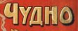 The Russian word “Chudno” (above) means “wondrous.” What’s really wondrous is the unique similarity of Benton’s majuscule O and the one drawn at the poster’s extreme right. The shape of the letters in the word “HOBO!” don’t hurt the argument, and of course the name buttresses it. To me, the striking coincidence of this single “O” letterform crowns the argument and should lay to rest the mystery of Hobo. This evidence shows that Morris Fuller Benton must have seen this poster somewhere. Perhaps he was somehow reluctant to admit that the source of his inspiration came from outside his famously insecure mind? The Russian word “Chudno” (above) means “wondrous.” What’s really wondrous is the unique similarity of Benton’s majuscule O and the one drawn at the poster’s extreme right. The shape of the letters in the word “HOBO!” don’t hurt the argument, and of course the name buttresses it. To me, the striking coincidence of this single “O” letterform crowns the argument and should lay to rest the mystery of Hobo. This evidence shows that Morris Fuller Benton must have seen this poster somewhere. Perhaps he was somehow reluctant to admit that the source of his inspiration came from outside his famously insecure mind?In fact, the “O” in the word “Чудно!” at the far right side of the poster looks as if it could have been traced by Benton as the model for his Hobo majuscule O. In fact, it is so close that it would arguably be more of a coincidence if this were not the case. The characters “HOBO” at the top of the poster, their general design formula, and the identical shape of that O, I feel, lay to rest the hundred-year mystery of the source of both the font’s name and design formula. There was also motive, method, and opportunity. This is far better substantiation than what we have from the two chief theories that have circulated all these decades. Moreover, what this suggests is that the original inspiration for Hobo probably was not Benton’s own mind, but the pen of an unknown graphic artist at the world-renowned Wefers lithographic press in St. Petersburg. It is not some great scandal that Benton failed to mention this, but it is true that Benton was famously insecure. Admitting that the source of the design of this font was something so pedestrian was not, and is still not, a common part of the ethical standard of the creative industry. It’s one thing for Carol Twombly (who once admitted to me that she didn’t know one end of a flat brush from the other) to acknowledge, even revere, the origins of Trajan. This is another thing entirely. In this case, you would think with such a cute origin, Benton would have been sharing the anecdotal pun with his pals at ATF. Perhaps he did and that history has been lost. Finally, if we believe the connection of the Hobo font to this Russian poster, then Benton’s naming of the font was very deliberately tied to Benton’s use of the poster as his exemplar. I bought the book and gave it to my uncle Boris and aunt Tanya in Boston, and they probably still have it. The poster included details on the date, but I recall it was around 1903 or 1905, and that agrees with the design style. As David Berlow has remarked, Morris Benton and his father often lived together and over the years would commute between home and the various locations of the ATF foundry in New York, later in Jersey City, and still later in Elizabeth. In fact, the northeastern New Jersey area where the Bentons lived, worked, and presumably played at the time had over 300,000 Russian Jews. We also know that at that time corner stores literally were at almost every street corner. I don’t know for certain whether the Bentons’ travels went through any of the Russian neighborhoods. It seems that for the period in question they were probably living in Plainfield and commuting more than 20 miles, probably by car, to Jersey City. They may well have seen this poster at some point. Possibly they saw it in another place. Or perhaps Morris Fuller might have taken a trip to Russia around that time. That part is speculation. Perhaps Benton historian Patricia Cost could illuminate a bit. In any event, while the type snobs were sipping fine wine, slapping one another on the back, and tooling around Boston in their nice cars, all paid by typography, a couple of bums momentarily came from out of nowhere, and went nowhere in particular. While there, they quietly and unceremoniously found a plausible solution to a celebrated typographic mystery, that of the origin of the Hobo font. * * * I know it’s speculated that Morris Fuller Benton was controlled by his father. No one can actually say if he was truly contented or not, and it seems he may have been one poor sap. But clearly his family had a good deal to do with his success. My own father would have been 100 today, March 21, 2014. I recently turned half that. It would have been nice to have gotten a leg up. My father could do nothing for me; in general, he could do little for himself. Actually, he and I worked together in a small print shop once, one of the many odd jobs he had. He was rather skilled on the offset press. But he couldn’t even manage to get me through high school. My brother and I had to take care of both of our parents in our father’s last few years, and that put a big dent in our own midlife plans; we fought so bitterly over how to do it that we spent over a year in court on it. I am past my prime and am doing other things, having no further time for typography. I don’t even care that much about letterforms anymore. That work is chiefly for the quality children of quality people; over the years I have long been elbowed aside by such creatures. Whether employing ambition, birthright, or actual talent, the competition has been fiercer than one would expect for what was once a very humble craft. I will note that David Berlow’s son Sam, who really had nothing to do with type in his youth, is now in the stable at Font Bureau. Just sayin’. I suppose I may be one of Fred Warde’s typographically shipwrecked mariners. I have to hustle in the meantime on other business. Right now, I’m working 60 hours a week designing a 3D printer for mass production, for two young and impetuous entrepreneurs of some wealth. I really didn’t have time for this story. I do not know if I got much of it right, but in any event each of us should hope to make little contributions to our little worlds, and this is one of mine. |
EXTERNAL LINKS |
| | |


file name: Morris Fuller Benton Hobo 1910 Bitstream Version
file name: Morris Fuller Benton Hobo 1910 Poster by Tracy Samuelson 2015
file name: Morris Fuller Benton Hobo 1910 Poster by Amanda Concors 2015
file name: Morris Fuller Benton Hobo 1910
file name: A T F1923 Hobo b
file name: A T F1923 Hobo c
file name: A T F1923 Hobo
file name: A T F1923 Light Hobo b
file name: A T F1923 Light Hobo
file name: Hobo Std
| | |
|
Luc Devroye ⦿ School of Computer Science ⦿ McGill University Montreal, Canada H3A 2K6 ⦿ lucdevroye@gmail.com ⦿ https://luc.devroye.org ⦿ https://luc.devroye.org/fonts.html |