TYPE DESIGN INFORMATION PAGE last updated on Mon May 5 20:05:19 EDT 2025
FONT RECOGNITION VIA FONT MOOSE

|
|
|
|
The Metropolitan Museum of Art - The Met
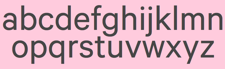
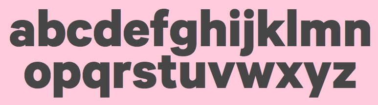
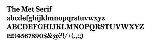
Museum in New York City. In 2015, Klim was commissioned by them to make a typeface family for their identity. This custom version of Klim Metric is called The Met Sans. Review by Mark Kingsley of the logo and identity by Wolff Olins. Armin Vit about the new logo: The first time I saw it, my gut reaction was to smash the banana I was eating into my eyes and then put my face in front of a hungry monkey. The Met Serif, in contrast, is nearly equal to Commercial Type's Austin Text. The museum itself put some weights of these fonts up for free download: The Met Serif Web-Roman, The Met Serif Web-Italic, The Met Serif Web-Semibold, The Met Serif Web-Bold. |
EXTERNAL LINKS |
| | |
file name: Klim The Met Sans 2015
file name: Klim The Met Sans Bold 2015
file name: The Met Serif
file name: The Met Logo
| | |
|
Luc Devroye ⦿ School of Computer Science ⦿ McGill University Montreal, Canada H3A 2K6 ⦿ lucdevroye@gmail.com ⦿ https://luc.devroye.org ⦿ https://luc.devroye.org/fonts.html |