TYPE DESIGN INFORMATION PAGE last updated on Sat May 16 08:45:23 EDT 2026
FONT RECOGNITION VIA FONT MOOSE

|
|
|
|
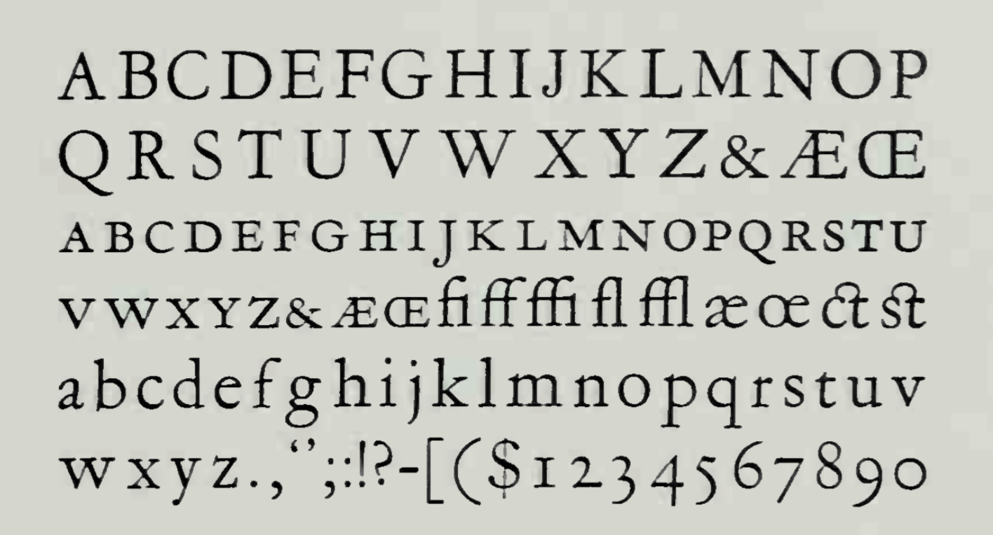
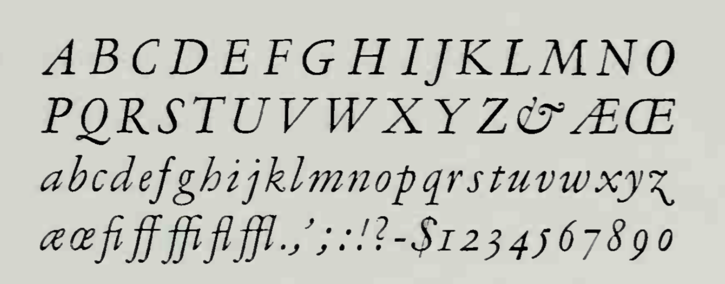
Garamont and Garamont Italic
A typeface designed by Frederic Goudy in 1921 for Monotype. D.J.R. Bruckner: Perhaps too much has been written about this type ever since it first appeared. Stanley Morison, who had persuaded the English Monotype Company to produce its own version of Claude Garamond's type, and disliked Goudy's terribly, wrote Updike that he assumed Goudy had simply reproduced the letters found at the end of F. A. Duprat's "Histoire de l'Imprimerie Imperiale de France". In fact, they came from the four-volume edition of Claudin's "Histoire de l'Imprimerie en France au XV et XVI Siècle", so Morison's guess was close enough. Goudy's supporters at the time caused considerable irritation in the world of printers by writing extravagant appraisals of the face, which, they claimed, showed all kinds of interesting Goudyesque variations on the Garamond. Frederic Goudy said that Its final form as drawn by me was not the result of inspiration or genius on my part, but was merely the result of an attempt to reproduce as nearly as possible the form and spirit of the "Garamond" letter. I made no attempt to eliminate the mannerisms or deficiencies of his famous type, realizing that they came not by intention, but rather through the punch-cutter's handling, to his lack of tools of precision and his crude materials.... Digital versions: LTC Garamont (Lanston Type Company). Mac McGrew: When Frederic W. Goudy joined Monotype as art advisor-in 1920, he persuaded the company to cut its own version of the types attributed to Claude Garamond, rather than copying the foundry face. The result was named Garamont, also at Goudy's suggestion, to preserve the distinction between the different renderings. Both spellings of the name had been used in Garamond's lifetime. A comparison of ATF Garamond and Monotype Garamont, especially in the small sizes, demonstrates opposing views of two outstanding type designers, although the two typefaces are very similar in many ways. In most typefaces, the proportionate width increases as the size decreases, to overcome optical illusions and maintain legibility. Benton carried this idea beyond usual practice; his 6-point Garamond is a little more than one third the width of 24-point. But Goudy believed in strict proportions; his 6-point Garamont is only very slightly more than one fourth (26 percent) the width of 24-point; thus in 6- and 8-point sizes Garamont seems smaller than Garamond. This, incidentally, is what makes it impossible to combine Garamont with Garamond Bold for typesetting in one operation. Note also the characters EF JL in Garamont, which are closer to Benton's original Garamond designs than to Cleland's revision. Garamont has the short J in display sizes, but a long one in keyboard sizes. In the Garamont specimens, the last group of characters, both roman and italic, was obtained from a different source and is proofed much more heavily; actually the weight is uniform with the rest of the font. |
EXTERNAL LINKS |
| | |
file name: Frederic Goudy Garamont 1921
file name: Frederic Goudy Garamont 1921c
file name: Frederic Goudy Garamont Italic 1921
| | |
|
Luc Devroye ⦿ School of Computer Science ⦿ McGill University Montreal, Canada H3A 2K6 ⦿ lucdevroye@gmail.com ⦿ https://luc.devroye.org ⦿ https://luc.devroye.org/fonts.html |