TYPE DESIGN INFORMATION PAGE last updated on Thu Apr 24 18:32:33 EDT 2025
FONT RECOGNITION VIA FONT MOOSE

|
|
|
|
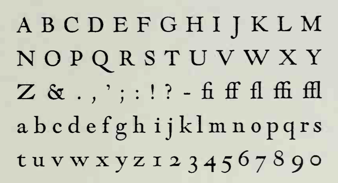
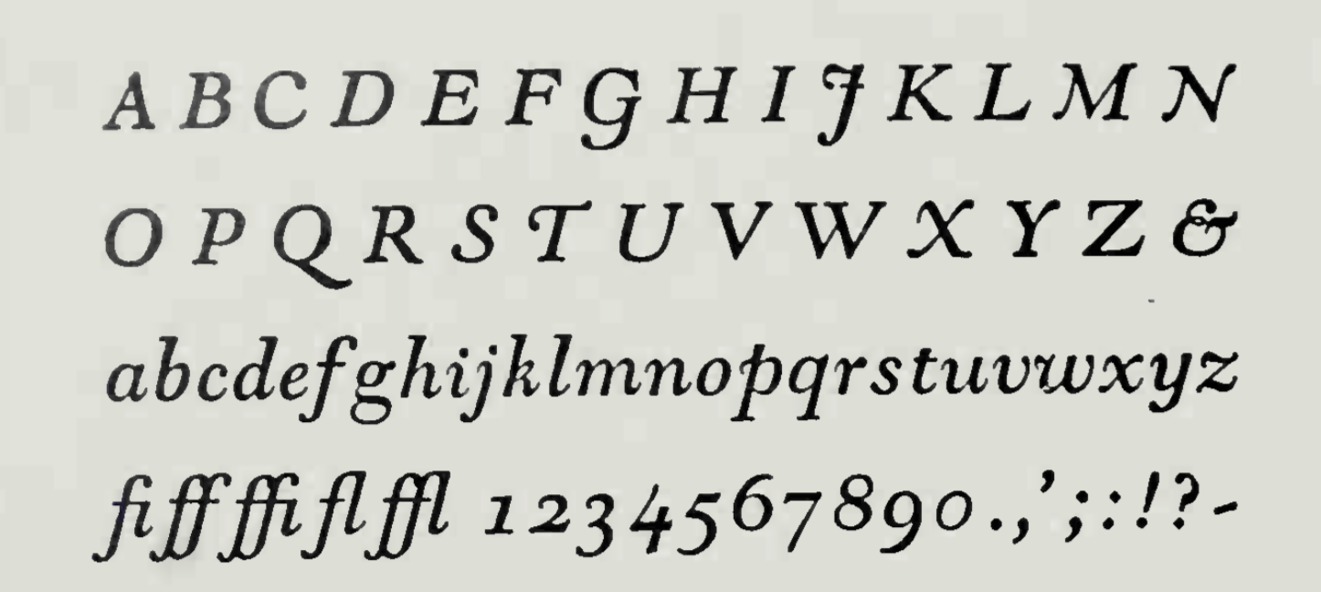
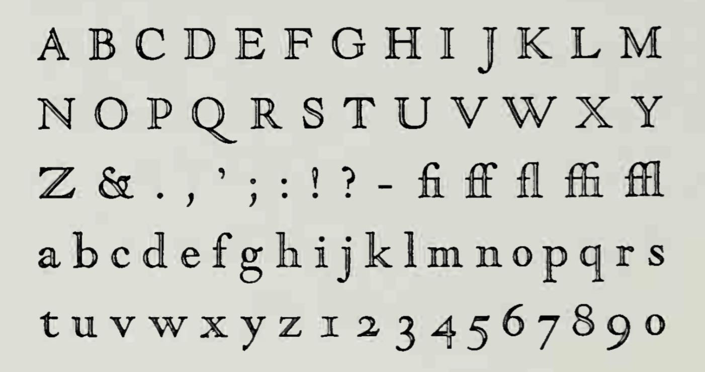
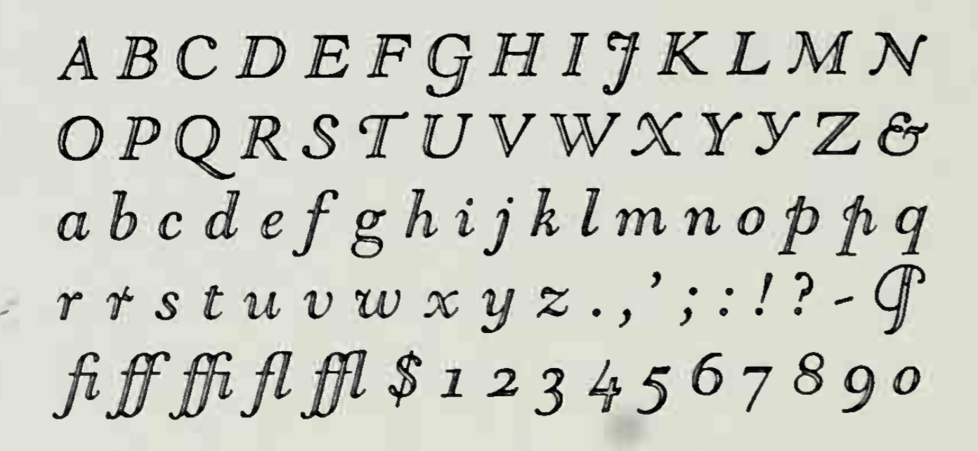
Goudy Modern and Goudy Open
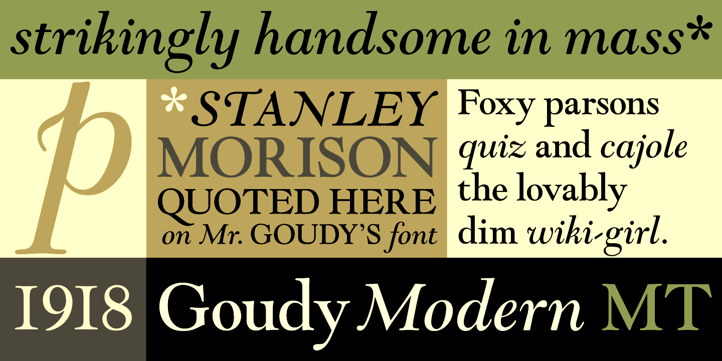
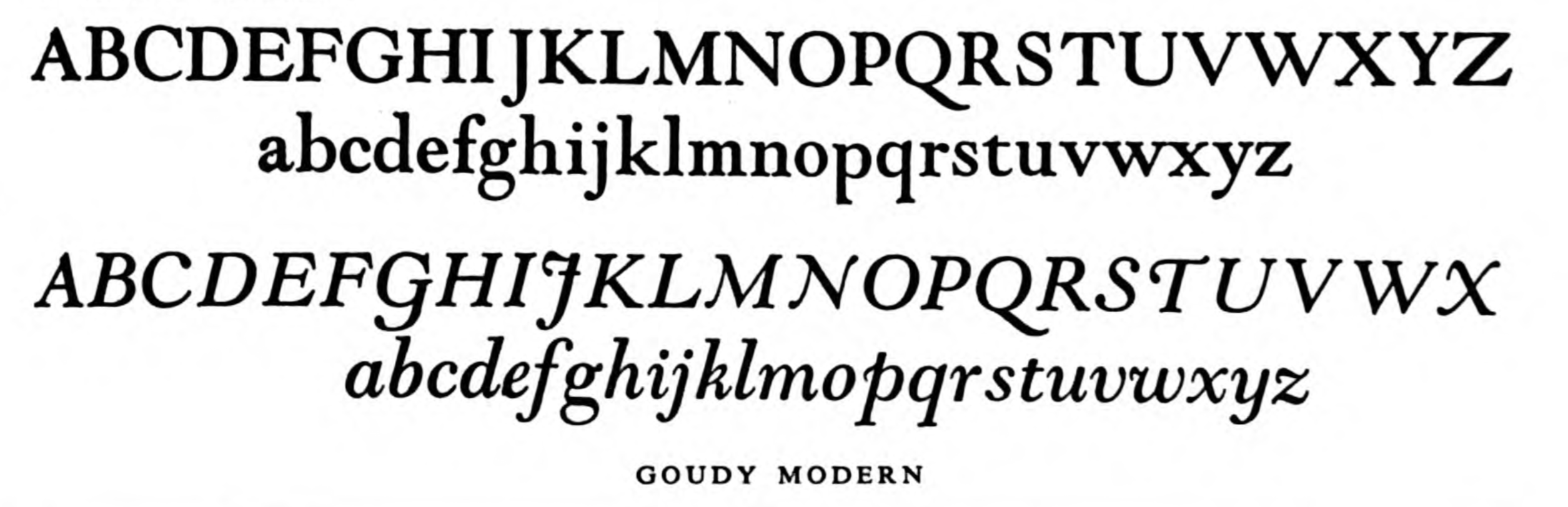
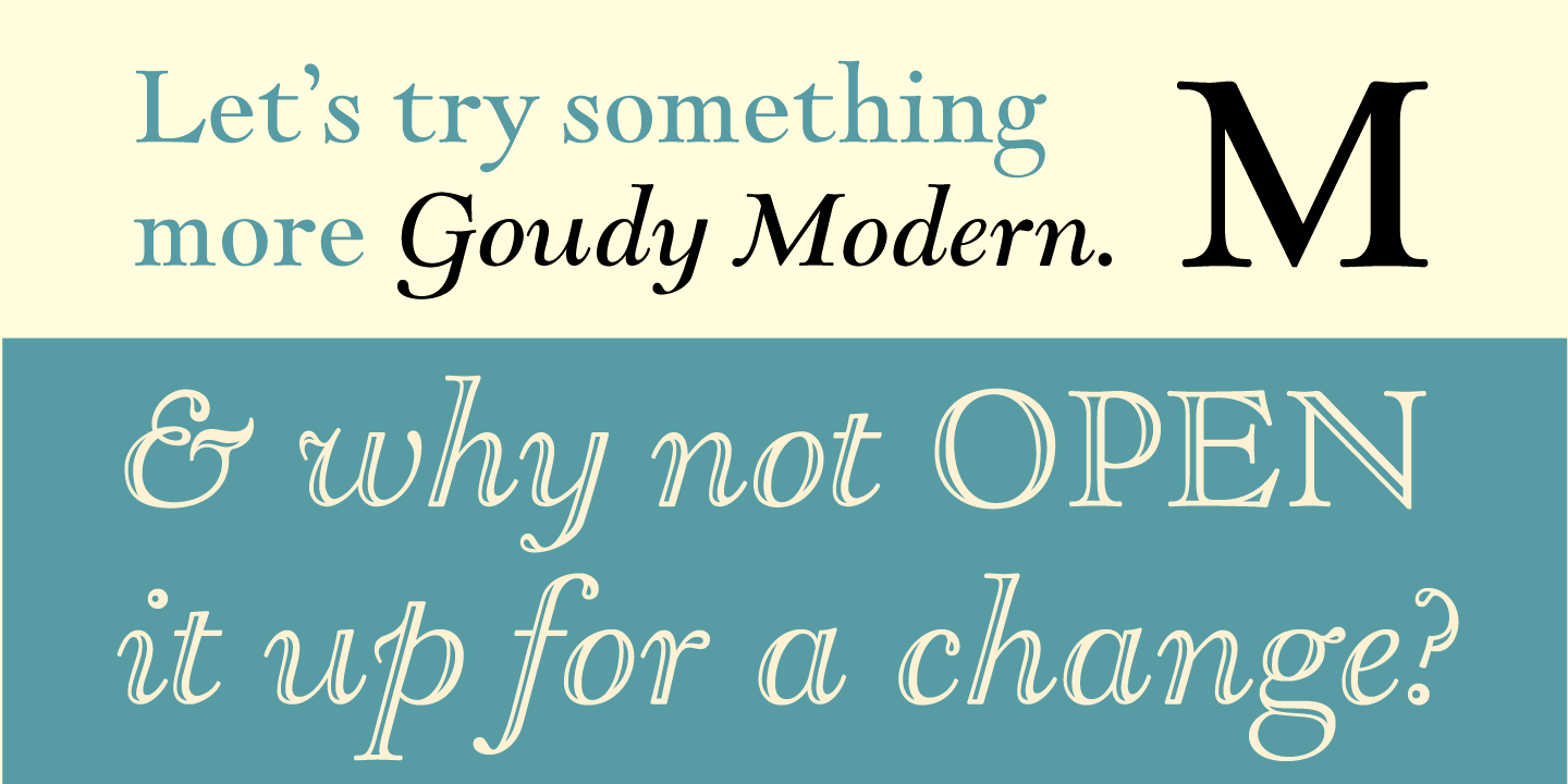
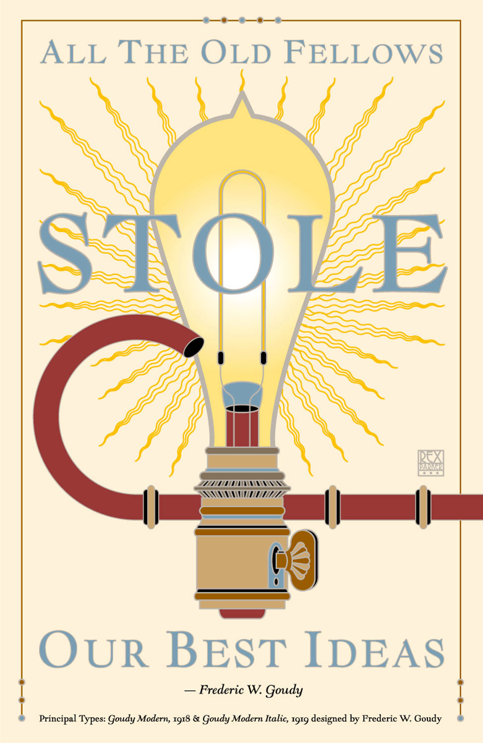
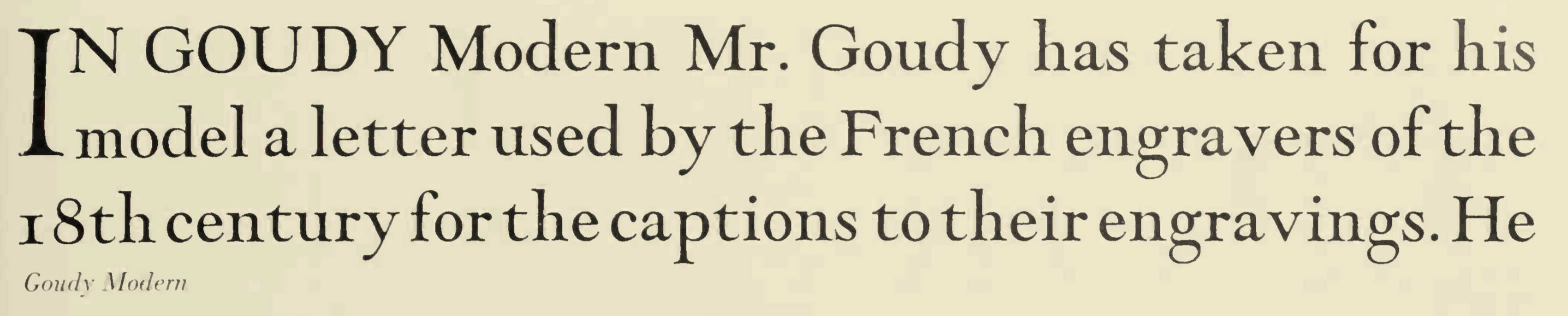
The first of these types designed by Frederic Goudy was Goudy Open (1918), which Goudy says was suggested by the caption of a French engraving. MacMcGrew: The letter forms have a modern feeling, something the designer had not attempted before, but without the formal rigidity of modern types such as Bodoni. Serifs are slightly bracketed and curves are more generous, suggestive of more traditional forms. After the Open roman was produced, Goudy experimented with filling in the white line; the effect pleased him, so he ordered the cutting of a solid face from the same patterns. The result is Goudy Modern. Both of these typefaces were designed in 1918, matrices were cut by Robert Wiebking, and type was cast by Goudy's Village Letter Foundery. Both typefaces were copied by Monotype in 1924. Goudy Modern Italic was designed the following year to accompany the roman face; in this case the solid typeface was made first. Goudy Open Italic was also made in 1919; it is identical to the Modern Italic except for the white line. In these italics, cap C and S have the lowercase form, with ball shapes instead of serifs. In the specimens, only the Modern Italic is not quite complete. Note the redesigned J and Q of 60-point Goudy Open; the 60- and 72-point sizes have caps only, practically full body size-no lowercase or figures. Also see Goethe. D.J.R. Bruckner on the French engraving that inspired Goudy for Goudy Open: Goudy said the face was suggested by the caption on a French engraving used as a frontispiece to Alfred Pollard's "Fine Books". Walter Tracy has shrewdly suggested that the inspiration for going to such a source was the success of the Cochin type, issued bv Lanston Monotype in 1916, adapted from the Cochin issued in Paris in 1912 by Deberny and Peignot, based on lettering in eighteenth-century French engravings. He also points out that there are only seventeen lower case letters and four capitals in the inscription in the Pollard book, so the rest of the Goudy face must have been his own. Berry, Johnson and Jaspert give the dates 1918 (at lanston Monotype), 1928 (at Monotype) and 1929 (at Caslon). Digital versions: Goudy Modern MT (Adobe), Goudy Modern MT (Monotype), LTC Goudy Modern (Lanston Type Company), Goudy Modern 94 (Franko Luin, 1994). |
EXTERNAL LINKS |
| | |

file name: Adobe Goudy Modern M T 2000 88233

file name: Adobe Goudy Modern M T 2000

file name: Monotype Goudy Modern M T 2002
file name: Frederic Goudy Goudy Modern 1918

file name: Lanston Type Company L T C Goudy Modern 2006
file name: Lanston Type Company L T C Goudy Open 2006 123213

file name: Lanston Type Company L T C Goudy Open 2006
file name: Frederic Goudy Goudy Modern 1918 Goudy Modern Italic 1919 Poster by Rex Parker 2018
file name: Frederic Goudy Goudy Modern 1918
file name: Frederic Goudy Goudy Modern 1918
file name: Frederic Goudy Goudy Modern Italic 1919
file name: Frederic Goudy Goudy Open 1918
file name: Frederic Goudy Goudy Open Italic 1919
| | |
|
Luc Devroye ⦿ School of Computer Science ⦿ McGill University Montreal, Canada H3A 2K6 ⦿ lucdevroye@gmail.com ⦿ https://luc.devroye.org ⦿ https://luc.devroye.org/fonts.html |