TYPE DESIGN INFORMATION PAGE last updated on Sat Jun 22 22:27:51 EDT 2024
FONT RECOGNITION VIA FONT MOOSE

|
|
|
|
Hadriano
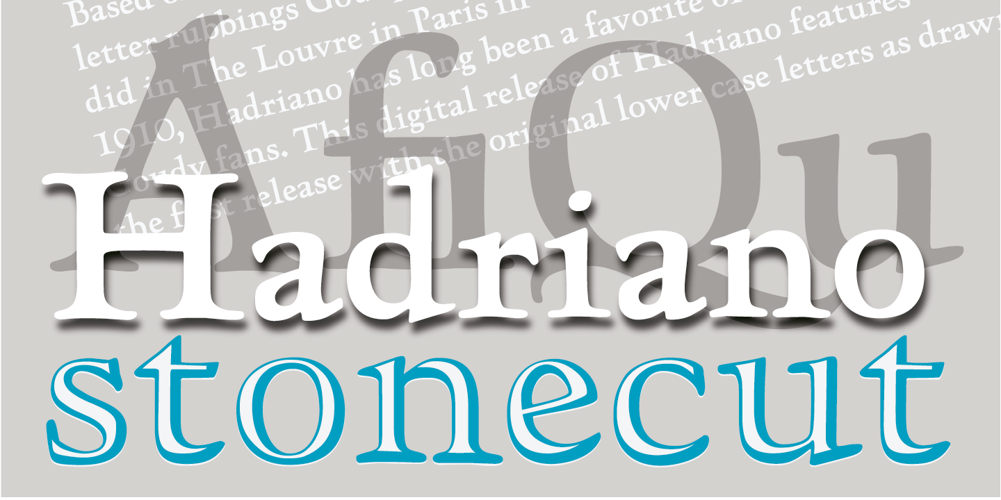
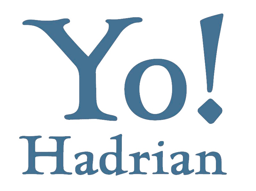
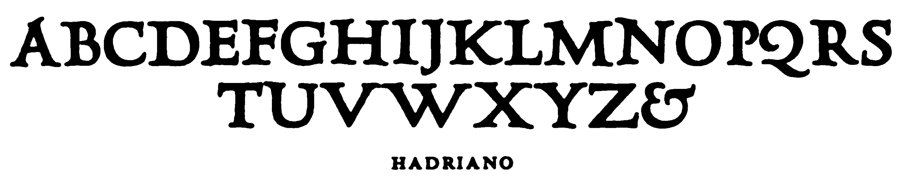
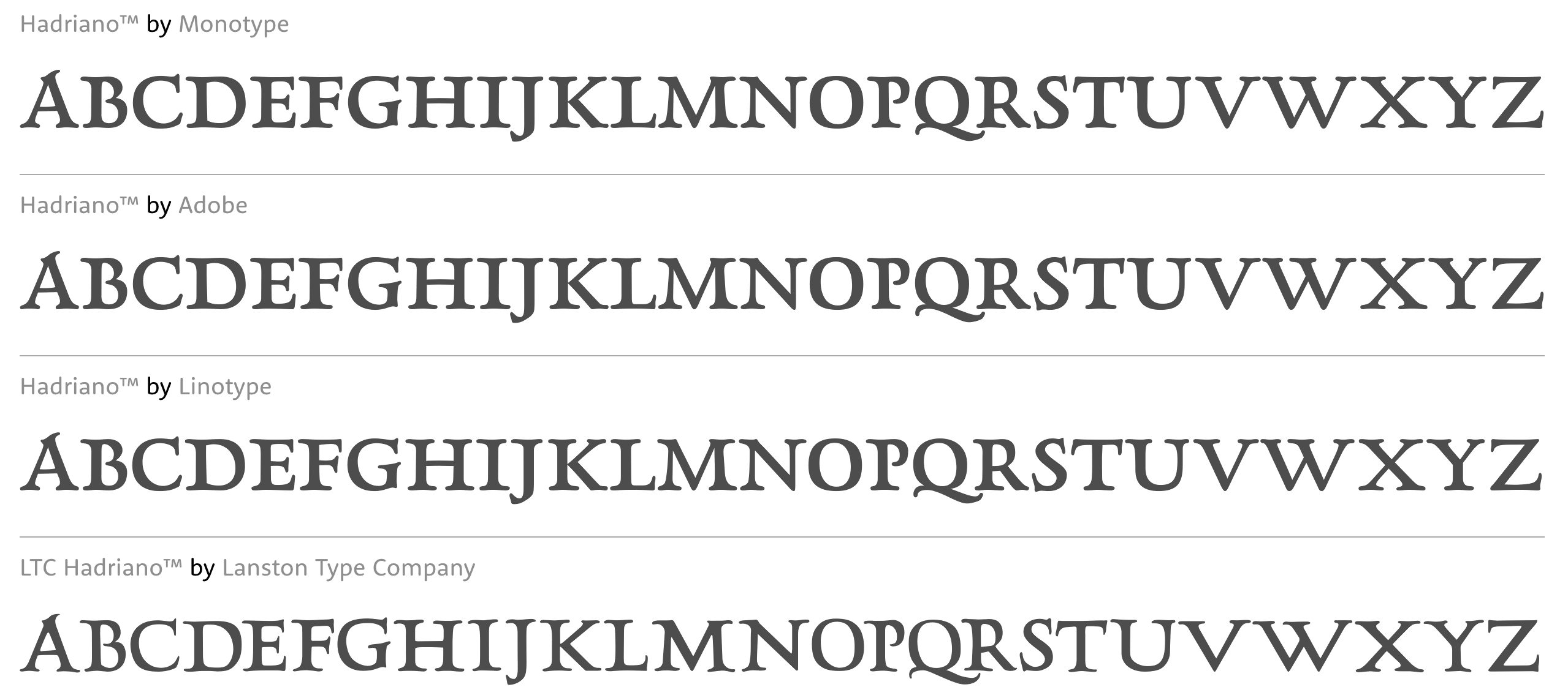
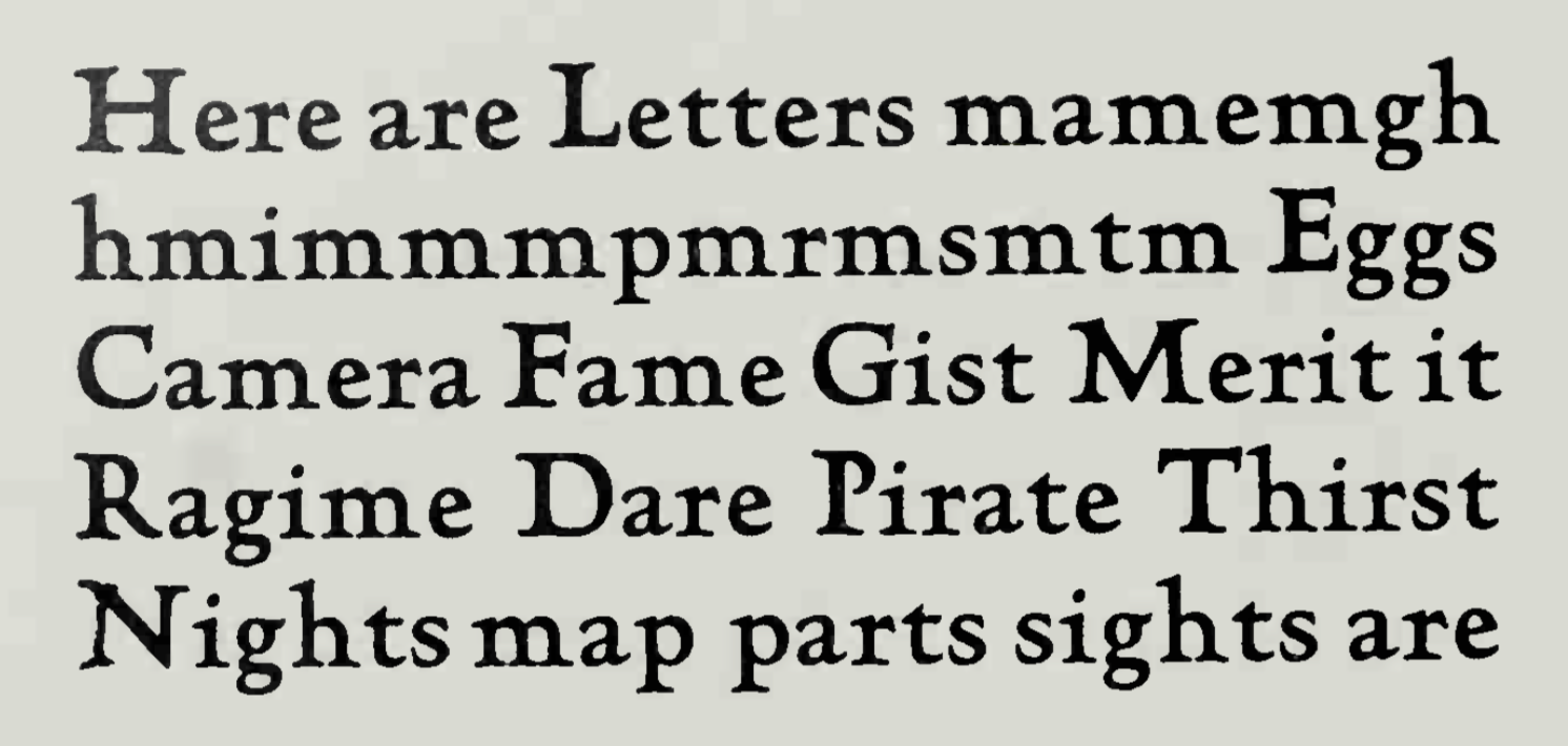
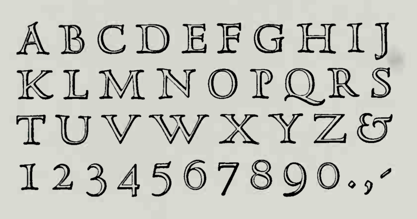
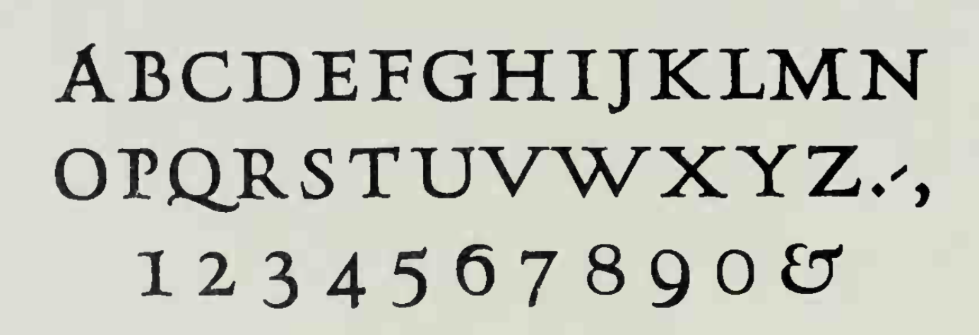
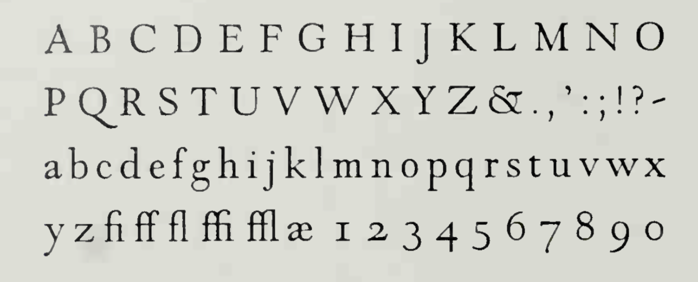
A typeface designed by Frederic Goudy. Berry, Johnson and Jaspert write: A set of capitals of heavier weights than Forum, designed by F.W. Goudy for the Continental Typefounders Association after a Roman inscription seen in the Louvre. The A has an extended apex, the M is unusually wide and the Q has the swash form. The serifs, here large, have the usual Goudy pen qualities. In 1930 Goudy cut a lower case for these capitals. It is No. 71A in his A Half Century of Type Design. There is also an outline called Hadriano Stone Cut. Mac McGrew: While visiting the Louvre in Paris, Frederic W. Goudy was impressed by an inscription in marble from the first or second century A.D., and made a rubbing of the letters P, E, and R. Several years later, in 1918, he drew a set of capitals to harmonize with those three letters. The name "Hadriano" was part of the original inscription, and this became the name of Goudy's type, for which matrices were cut by Robert Wiebking. In 1930 Monotype asked him to add a lowercase. Goudy says, "I did not want to attempt a lowercase for a purely inscriptional letter, but the foundries say printers ask for lowercase regardless of the esthetics, and I allowed myself to be persuaded. I made what I thought was a good companion for the capitals, but the type looked entirely too much like Kennerley Bold. I cut one size only and turned the type over to the Monotype. I do not think anything was ever done with it---praise be!" Apparently nothing was done with that lowercase, but in 1932 Monotype issued Hadriano with the actual Kennerley Bold lowercase, which is not quite the same. The capitals alone are quite distinctive; with lowercase the typeface is much less impressive. About 1932 Sol Hess at Monotype tried the experiment of cutting a white line through each of the caps of the design, making Hadriano Stone Cut. Goudy says, "A proof of the changed letters pleased me so much that immediately gave permission to issue matrices of the characters." Digital versions: Hadriano (Monotype; between 1977 and 1981, Compugraphic added new weights and regularized the 1930 Monotype version of Hadriano somewhat), Hadriano (Adobe), Hadriano (Linotype), LTC Hadriano (Lanston Type Company). |
EXTERNAL LINKS |
| | |

file name: Lanston L T C Hadriano Pro Stone Cut
file name: Lanston Type Company L T C Hadriano L T C Hadriano Stone Cut 2005 123232
file name: Lanston Type Company L T C Hadriano 2005 131067

file name: Lanston Type Company L T C Hadriano 2005

file name: Linotype Hadriano 2000
file name: Frederic Goudy Hadriano 1918

file name: Monotype Hadriano 2000
file name: Frederic Goudy Hadriano Digital Versions

file name: Adobe Hadriano 2000
file name: Frederic Goudy Hadriano Lower Case 1930
file name: Frederic Goudy Hadriano Stone Cut 1934
file name: Frederic Goudy Hadriano Title 1918
file name: Frederic Goudy Hadriano Title 1932
| | |
|
Luc Devroye ⦿ School of Computer Science ⦿ McGill University Montreal, Canada H3A 2K6 ⦿ lucdevroye@gmail.com ⦿ http://luc.devroye.org ⦿ http://luc.devroye.org/fonts.html |