TYPE DESIGN INFORMATION PAGE last updated on Sat Jun 22 22:28:05 EDT 2024
FONT RECOGNITION VIA FONT MOOSE

|
|
|
|
Powell
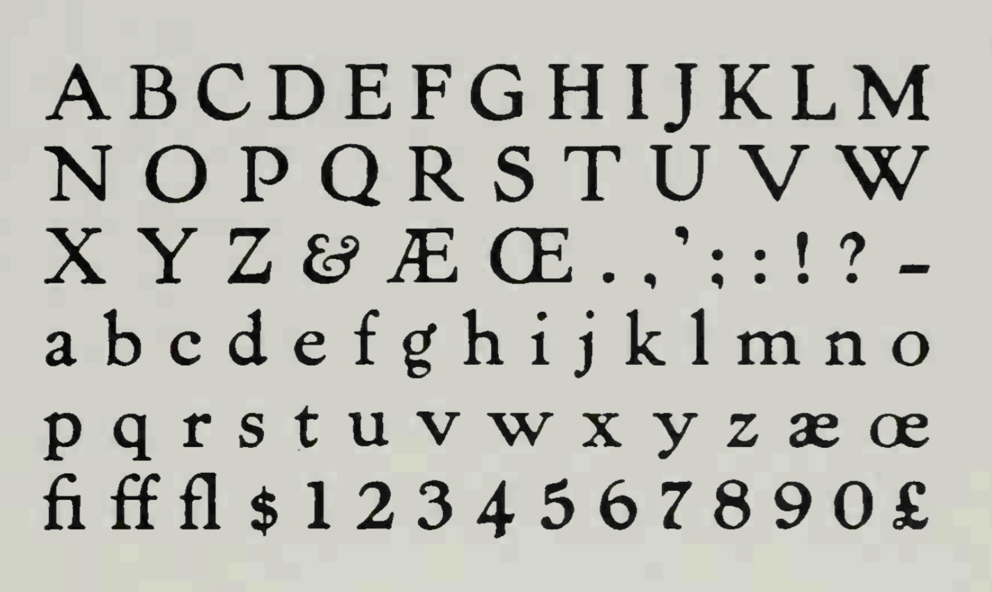
A typeface designed by Frederic Goudy in 1903. D.J.R. Bruckner writes: Mr. Powell was Goudy's first Kennerley, obviously. Five years after he had been midwife and more to the Pabst, he moved to the Mandel Brothers department store in Chicago and commissioned this type Mac McGrew: Shortly after the successful introduction of Pabst Oldstyle, the department store advertising manager who had commissioned that type---a Mr. Powell---left that store and became ad manager of another large store. Again he approached Frederic W. Goudy to design a type for him, similar to Pabst but necessarily somewhat different. The result this time was named Powell. Caps are much like those of Pabst, but the lowercase, instead of being very small with long ascenders as in that face, is larger with more normal ascenders. Powell was cut by Keystone Type Foundry and released in 1903. Compare Pabst, Hearst. The foundry later designed a companion italic, ignoring Goudy's suggestion that he do so. Powell Italic was advertised in June 1908 as the first "non-kerning" italic, in which no characters overhang the rectangular type body. Favorable reception to this idea encouraged the foundry to cut several other non-kerning series. Digital revivals: LTC Powell (Lanston Type Company). |
EXTERNAL LINKS |
| | |

file name: Lanston L T C Powell 2005
file name: Frederic Goudy Powell 1907
| | |
|
Luc Devroye ⦿ School of Computer Science ⦿ McGill University Montreal, Canada H3A 2K6 ⦿ lucdevroye@gmail.com ⦿ http://luc.devroye.org ⦿ http://luc.devroye.org/fonts.html |