TYPE DESIGN INFORMATION PAGE last updated on Sat Jul 20 14:50:56 EDT 2024
FONT RECOGNITION VIA FONT MOOSE

|
|
|
|
Antonia Cornelius
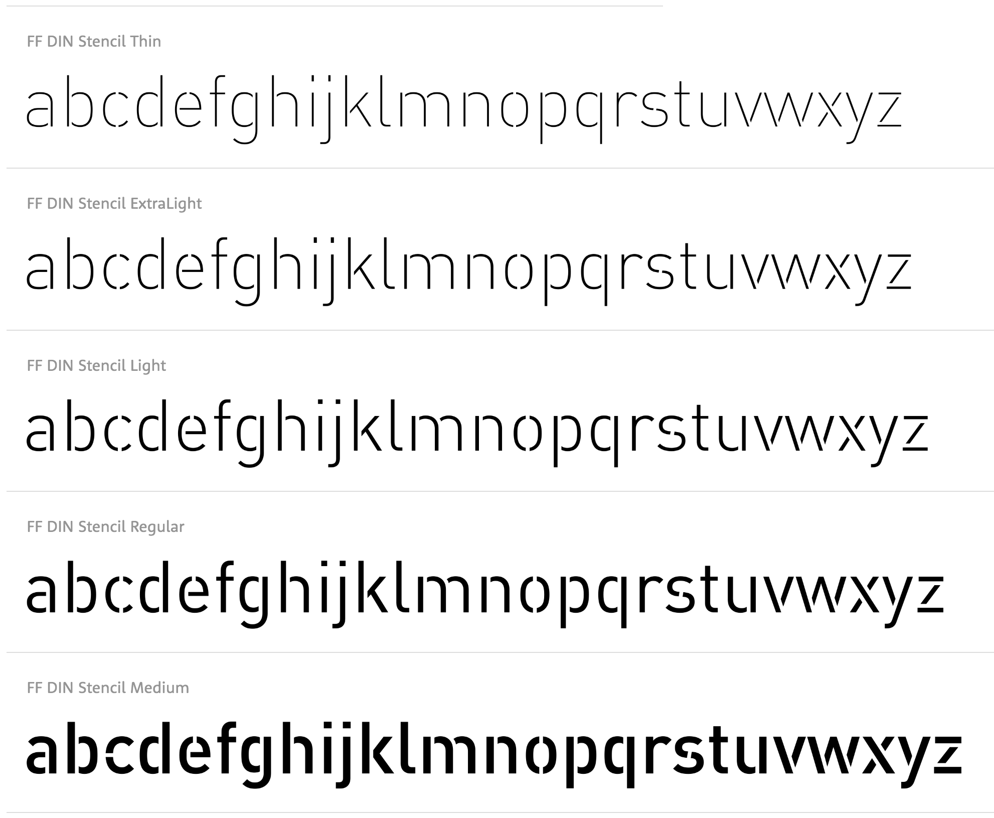
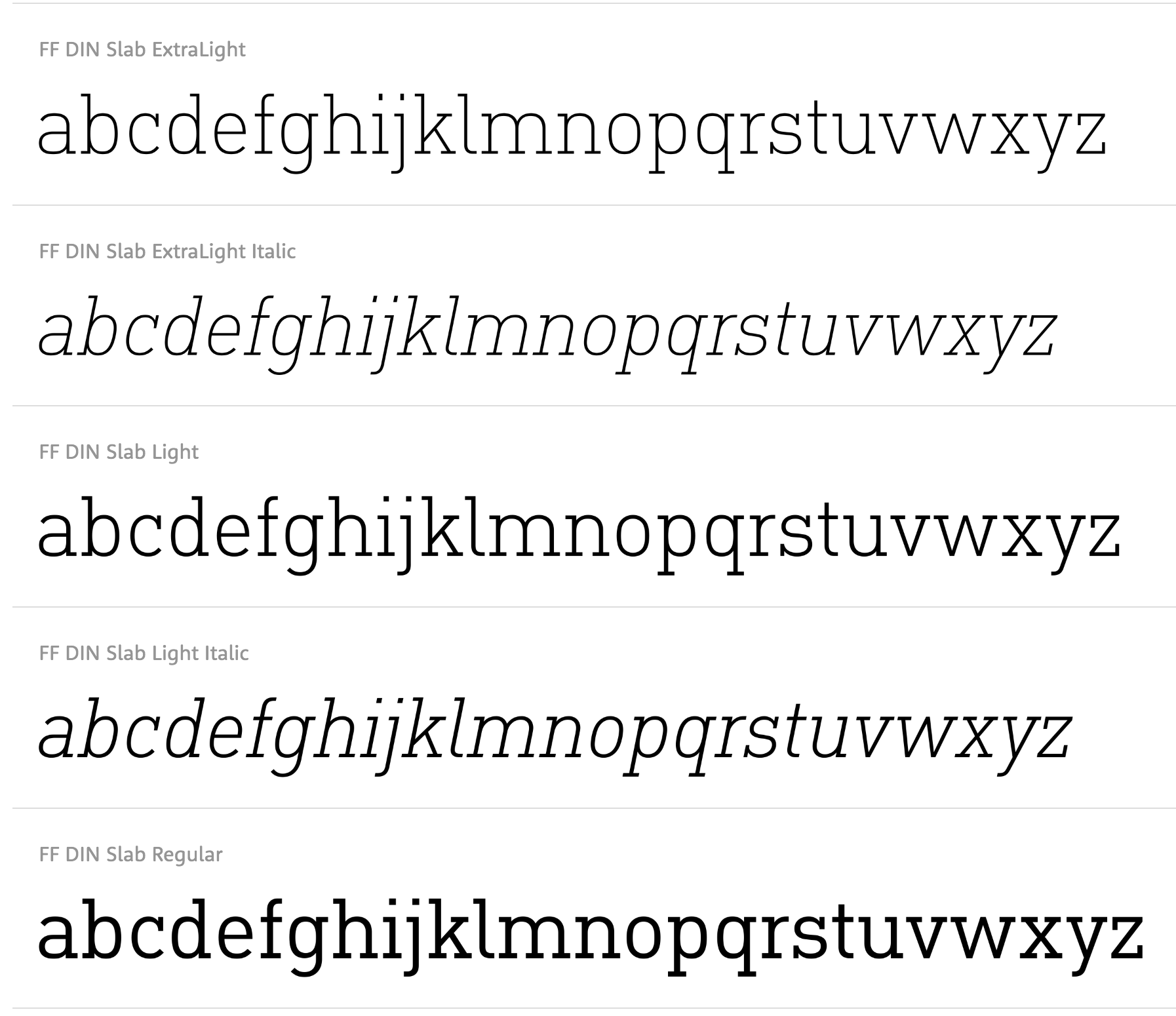
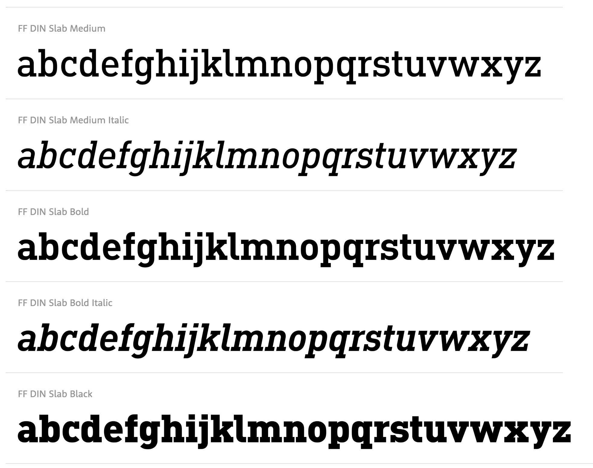
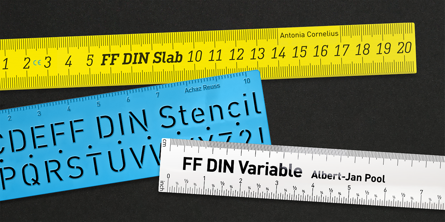
German type and communication designer, lecturer and researcher with a special interest in legibility and readability (b. 1989). She obtained a Bachelor's in communication design with Jovica Veljovic at Hamburg University of Applied Science, where her thesis was entitled The Letters in my Head. What Creatives should know about reading processes in order to design joyful reading experiences. She also did a Master's with Veljovic, which led to her Legilux typeface family (a transitional serif with optical sizes as well as a sans serif) and further research on legibility. She graduated in 2017. Antonia joined Dutch Design in 2017 and extended the FF DIN family to FF DIN Slab. Furthermore, she re-engineered the whole FF DIN family itself to make variable fonts; she also added Bulgarian Cyrillic and other characters; finally, she also made FF DIN Stencil into a functional three axis variable font. Since 2018, she teaches type design at Muthesius University of Fine Arts and Design in Kiel. Her typefaces:
Antonia Cornelius won the People's Choice award for Legilux in 2016 at the Morisawa Type Design Competition 2016. Speaker at ATypI 2018 in Antwerp on the topic of legibility: Typeface designers Antonia Cornelius and Björn Schumacher conducted a preliminary study for their final master's projects. They set up a reading-speed test by reverting to well-tried test material, which they set in their new typefaces Legilux and Text Type as well as the common Walbaum Standard. Focusing on the effect of the optical scaling method, the typefaces were tested in two sizes: 1.5 mm and 1 mm x-height. The results tend to show a positive effect for optical adjustments in type designs. |
EXTERNAL LINKS |
| | |


file name: Albert Jan Pool Antonia Cornelius Achaz Reuss F F Din Stencil 2022
file name: Albert Jan Pool Antonia Cornelius F F Din Slab 2022
file name: Albert Jan Pool Antonia Cornelius F F Din Slab 2022

file name: Albert Jan Pool Antonia Cornelius F F Din Variable 2022
file name: Albert Jan Pool Antonia Cornelius F F Din Variable 2022

file name: Font Font F F D I N Paneuropean 2022

file name: Font Font F F D I N Slab 2022

file name: Antonia Cornelius Legilux 2016
| | |
|
Luc Devroye ⦿ School of Computer Science ⦿ McGill University Montreal, Canada H3A 2K6 ⦿ lucdevroye@gmail.com ⦿ http://luc.devroye.org ⦿ http://luc.devroye.org/fonts.html |