TYPE DESIGN INFORMATION PAGE last updated on Fri Apr 10 09:57:22 EDT 2026
FONT RECOGNITION VIA FONT MOOSE
|
|
|
|
Romain du roi
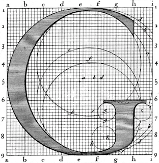
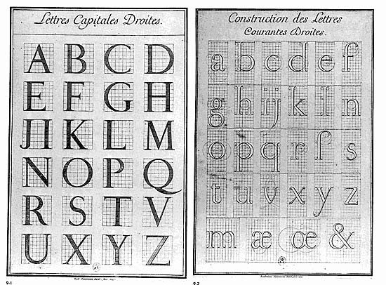
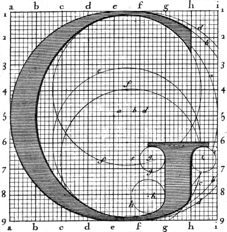
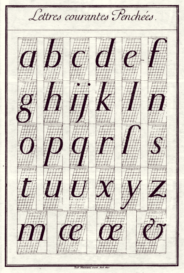
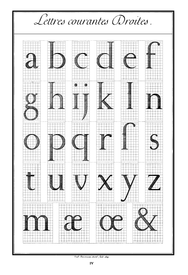
The Romain du Roi, or king's roman, was a typeface developed in France beginning in 1692. The name refers to Louis XIV who commissioned the design of the new typeface for use by the Royal Print Office. The Romain du Roi was the result of rational design---the letterforms were mapped on grids by compass and ruler before being cut into metal. The Romain du Roi was not the first "constructed alphabet". Felice Feliciano was the first to recreate geometrically the alphabet of roman inscriptions, and published it in 1463 as Alphabetum Romanum Codex Vaticanus 6852. The Romain du Roi emphasizes verticality and increased contrast between thick and thin elements---a style that influenced the transitional typefaces of Pierre Simon Fournier and John Baskerville later in the 18th century, and these in turn would lead the ultimate rational typefaces of Bodoni and Didot at the end of that century. The design of the letterforms was the work of the Royal Academy's Bignon Commission as part of its investigation of French typography and printing for the compilation of the Description of the Arts and Trades of France. The committee's designs were engraved by Louis Simonneau. Punches for the metal type were cut by Philippe Grandjean, who took some liberty with his type, to moderate the cold geometry. The type was first used for Médailles sur les principaux événements du règne de Louis le Grand (1702). |
EXTERNAL LINKS |
| | |
file name: Romain Du Roi 1692
file name: Romain Du Roi 1692 G
file name: Romain Du Roi 1692c
file name: Romain Du Roi 1692d
| | |
|
Luc Devroye ⦿ School of Computer Science ⦿ McGill University Montreal, Canada H3A 2K6 ⦿ lucdevroye@gmail.com ⦿ https://luc.devroye.org ⦿ https://luc.devroye.org/fonts.html |

