|
Soirée Typo
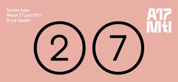
Soirée Typo (Type Evening) was held in the Sid Lee building in Montreal on June 27, 2017. Organized as a warm-up event for the annual ATypI Conference scheduled for September in Montreal, it attracted a crowd of over 200 typophiles. Alexandre Saumier Demers lined up eight talks that painted a great picture of the typographic scene in Montreal today. Alessandro Colizzi, who heads the local organizing team for this Fall's ATypI meeting, was ecstatic at the end of this relaxed, yet intense and information-packed, evening. 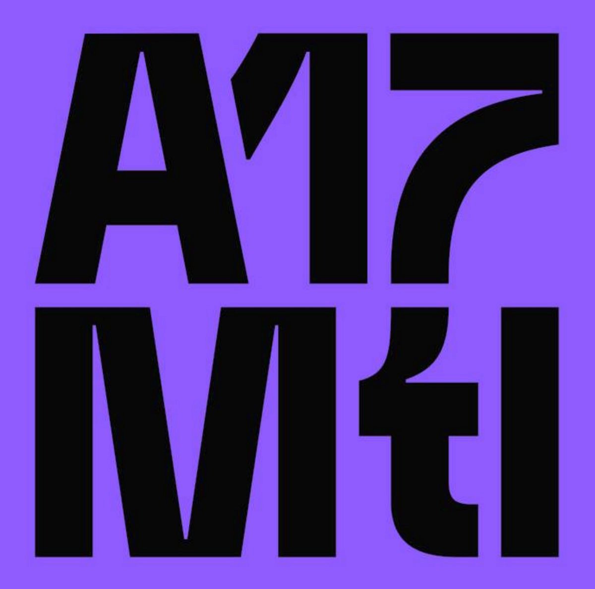 Julien Hébert was selected to design the identity for this year's ATypI conference. Julien works as a graphic designer at Paprika in Montreal. There were oohs and aahs in the room when he presented his work, starting with a fascinating rose / orange / deep purple color palette that is meant to draw the attention and shock, in keeping with the theme of the meeting, atypique. Julien Hébert was selected to design the identity for this year's ATypI conference. Julien works as a graphic designer at Paprika in Montreal. There were oohs and aahs in the room when he presented his work, starting with a fascinating rose / orange / deep purple color palette that is meant to draw the attention and shock, in keeping with the theme of the meeting, atypique.  His next move made him lots of friends in Montreal---he selected a locally developed typeface, Guillon (by Feed Type and Coppers and Brasses), for most documents. Finally, to push the motto of atypique to its logical limit, he sprinkled some gorgeous conference posters on the screen, all draped in his wonderful color palette. His next move made him lots of friends in Montreal---he selected a locally developed typeface, Guillon (by Feed Type and Coppers and Brasses), for most documents. Finally, to push the motto of atypique to its logical limit, he sprinkled some gorgeous conference posters on the screen, all draped in his wonderful color palette.
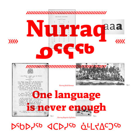 The second speaker was Etienne Aubert-Bonn, a local super-talent who graduated from the Type and Media program at KABK in The Hague, The Netherlands. Since 2012, he works as a type designer at Coppers and Brasses, a foundry he set up with Alexandre Saumier Demers. His presentation was smooth and informative. In just ten minutes, he taught the audience the history and finer details of the Inuktitut syllabary, and its challenges for the type designer, especially when producing documents that have Latin and Inuktitut side by side. He had a first stab at this problem in his KABK graduation typeface, Nurraq (2013). The second speaker was Etienne Aubert-Bonn, a local super-talent who graduated from the Type and Media program at KABK in The Hague, The Netherlands. Since 2012, he works as a type designer at Coppers and Brasses, a foundry he set up with Alexandre Saumier Demers. His presentation was smooth and informative. In just ten minutes, he taught the audience the history and finer details of the Inuktitut syllabary, and its challenges for the type designer, especially when producing documents that have Latin and Inuktitut side by side. He had a first stab at this problem in his KABK graduation typeface, Nurraq (2013). 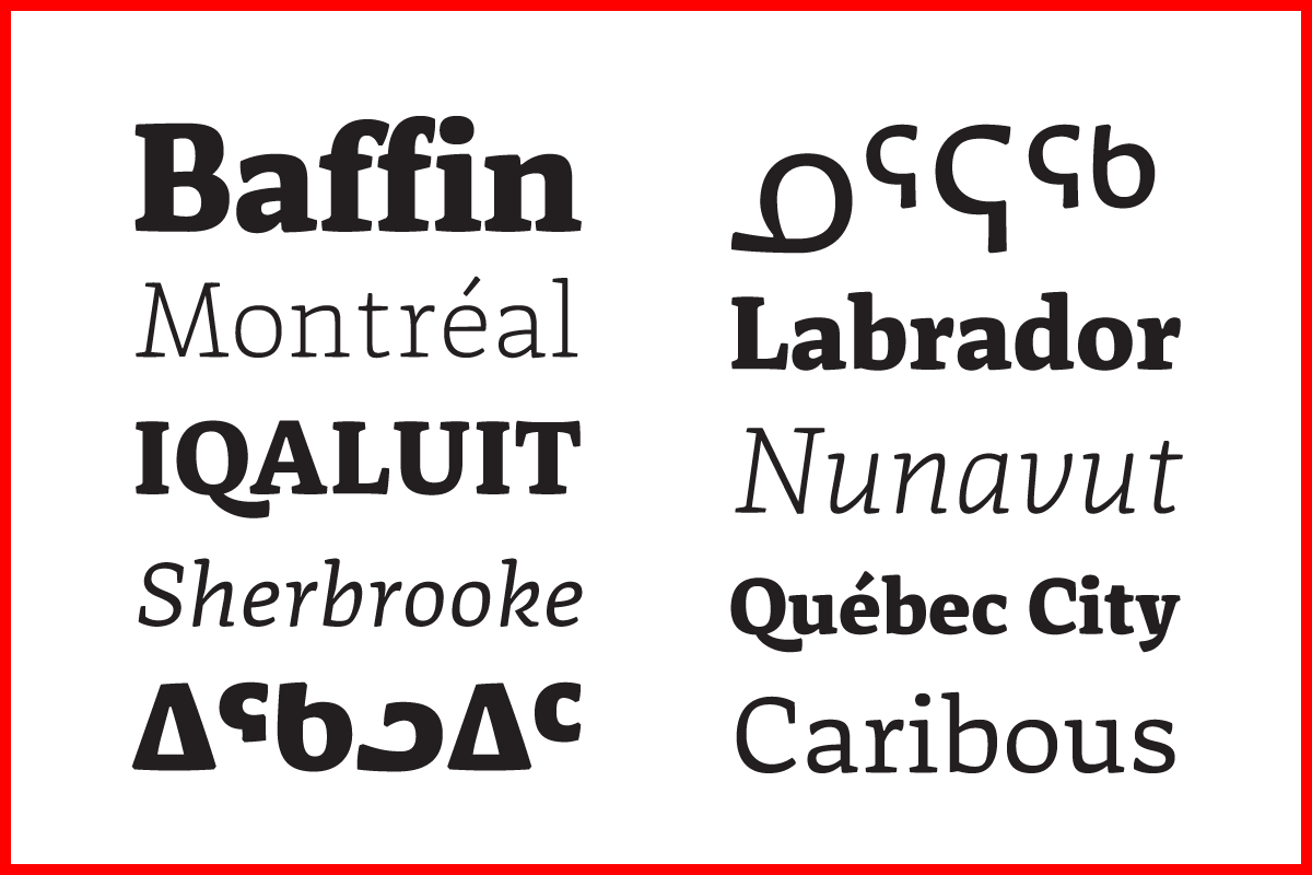 It is a noble and charitable effort---here is one of the world's top designers spending countless hours fine-tuning and developing Inuktitut fonts for a readership of not more than 30,000 people. It is a noble and charitable effort---here is one of the world's top designers spending countless hours fine-tuning and developing Inuktitut fonts for a readership of not more than 30,000 people.
 For a change of pace, Christian Bélanger, a calligrapher and musician who started out as a graffiti artist, gave us an overview of his life's work. Now professor at Cegep Marie-Victorin in Montreal, his path has not always been easy. For a change of pace, Christian Bélanger, a calligrapher and musician who started out as a graffiti artist, gave us an overview of his life's work. Now professor at Cegep Marie-Victorin in Montreal, his path has not always been easy. 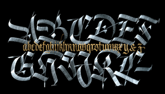 After his lively delivery, straight from the heart, he urged all of us to disconnect from our computers and devices and enjoy writing, drawing and creating. After his lively delivery, straight from the heart, he urged all of us to disconnect from our computers and devices and enjoy writing, drawing and creating.
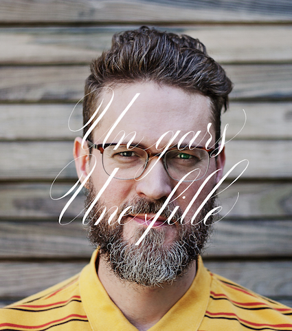
 Les Hommes de Lettres is a group of three local lettering artists who made a name by lettering garbage cans, walls, and odd objects. They moved into the avant-garde lettering sphere when they did some stunning work for local businesses such as C2 Montreal and La Cabane des Eclusiers. Les Hommes de Lettres is a group of three local lettering artists who made a name by lettering garbage cans, walls, and odd objects. They moved into the avant-garde lettering sphere when they did some stunning work for local businesses such as C2 Montreal and La Cabane des Eclusiers. 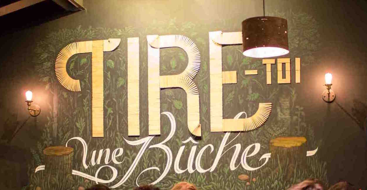
 Alexandre Saumier Demers set up Coppers and Brasses in 2012 with Etienne Aubert-Bonn but spends most of his time at Type Network, where he works on variable fonts, the newest thing in opentype. The idea of fonts with multiple axes for continuous interpolation has been around since Apple's GX technology from which it borrows most of its genetic material. Alexandre's current projects at Type Network include the extension of Font Bureau's FB Agency into a variable font family. Alexandre Saumier Demers set up Coppers and Brasses in 2012 with Etienne Aubert-Bonn but spends most of his time at Type Network, where he works on variable fonts, the newest thing in opentype. The idea of fonts with multiple axes for continuous interpolation has been around since Apple's GX technology from which it borrows most of its genetic material. Alexandre's current projects at Type Network include the extension of Font Bureau's FB Agency into a variable font family.
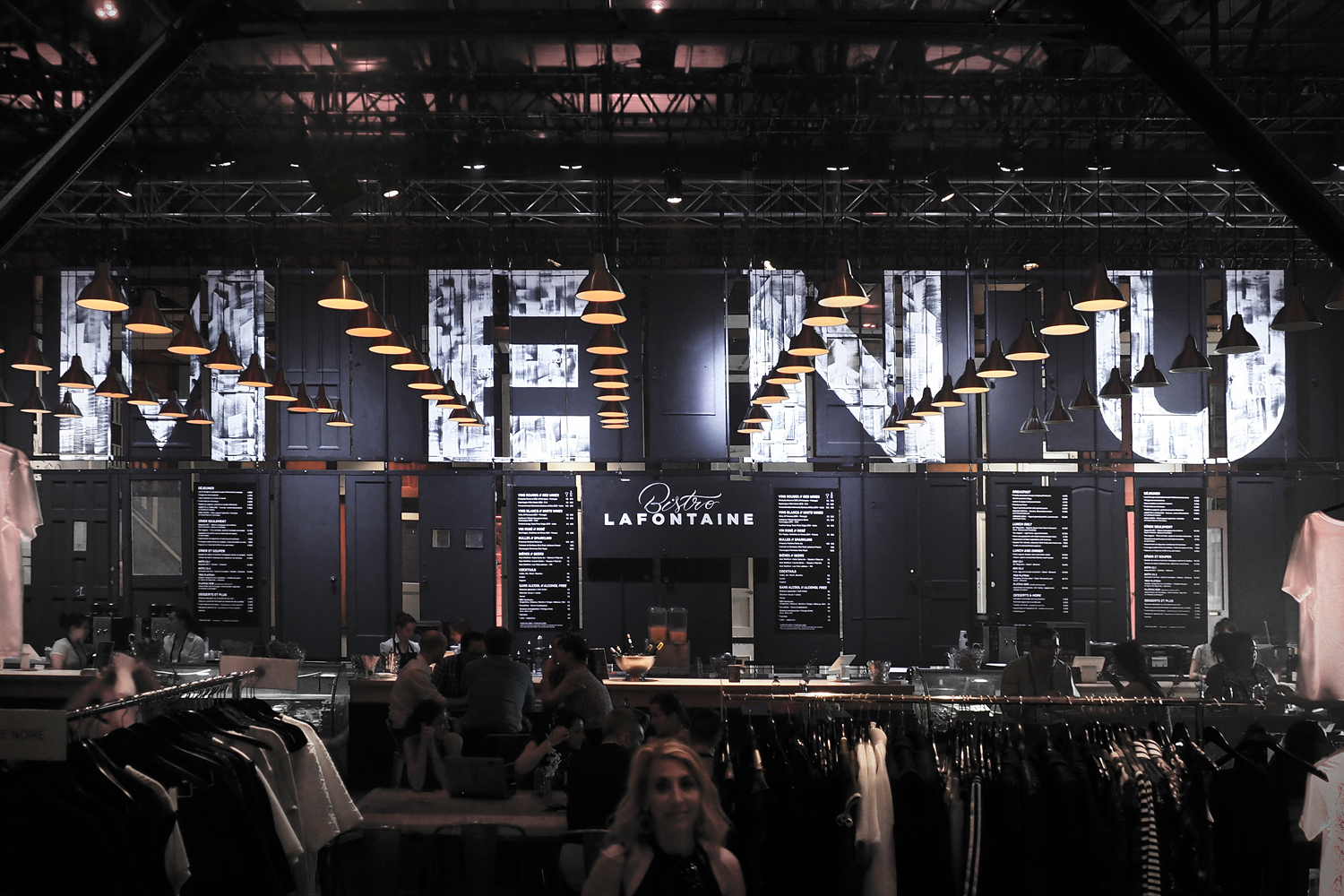
 Lucie Lacava, the next speaker, specializes in newspaper design. She delighted an already happy room of type aficionados with two of her newspaper projects. In each case, she relied on Canadian type designer Patrick Giasson for typeface work. The most difficult job she ever had, so she said, was the redesign of the Al Ittihad paper in Abu Dhabi. She uncluttered the layout and introduced three fonts designed by Patrick Giasson. Lucie Lacava, the next speaker, specializes in newspaper design. She delighted an already happy room of type aficionados with two of her newspaper projects. In each case, she relied on Canadian type designer Patrick Giasson for typeface work. The most difficult job she ever had, so she said, was the redesign of the Al Ittihad paper in Abu Dhabi. She uncluttered the layout and introduced three fonts designed by Patrick Giasson. 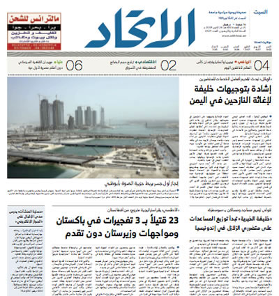 The section flag font, and the two weights of display, are in the Kufi style, which is the oldest form of Arabic calligraphy, while the cursive text is designed in a contemporary Naskh style. The redesign of Singapore's The Straits Times, a multi-platform project, won her several global awards. In addition, Giasson's custom typeface Selane medaled at the Ed Awards in 2016. The section flag font, and the two weights of display, are in the Kufi style, which is the oldest form of Arabic calligraphy, while the cursive text is designed in a contemporary Naskh style. The redesign of Singapore's The Straits Times, a multi-platform project, won her several global awards. In addition, Giasson's custom typeface Selane medaled at the Ed Awards in 2016. 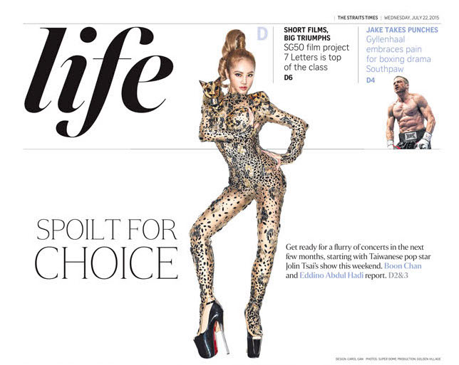 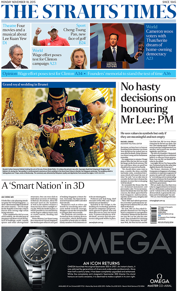
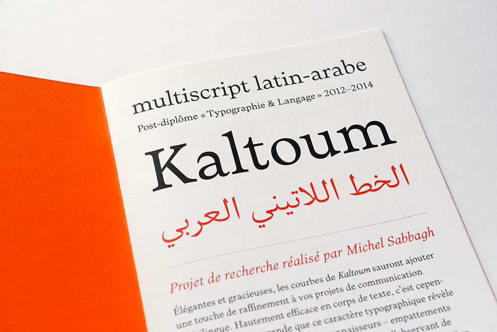 Michel (Mike) Sabbagh is a Montreal-based type designer who did the postgraduate course in type design at ESAD in Amiens, France, and has been working diligently for many years on the Latin / Arabic text typeface Kaltoum, which is named after the great opera singer Umm Kulthum (d. 1975), the Maria Callas of the Arab world. Kaltoum is balanced and sensitive, very beautiful in its tranquility, and does not try to force Arabic writing into a Latin mould. He promised that it will be published soon. Michel (Mike) Sabbagh is a Montreal-based type designer who did the postgraduate course in type design at ESAD in Amiens, France, and has been working diligently for many years on the Latin / Arabic text typeface Kaltoum, which is named after the great opera singer Umm Kulthum (d. 1975), the Maria Callas of the Arab world. Kaltoum is balanced and sensitive, very beautiful in its tranquility, and does not try to force Arabic writing into a Latin mould. He promised that it will be published soon.  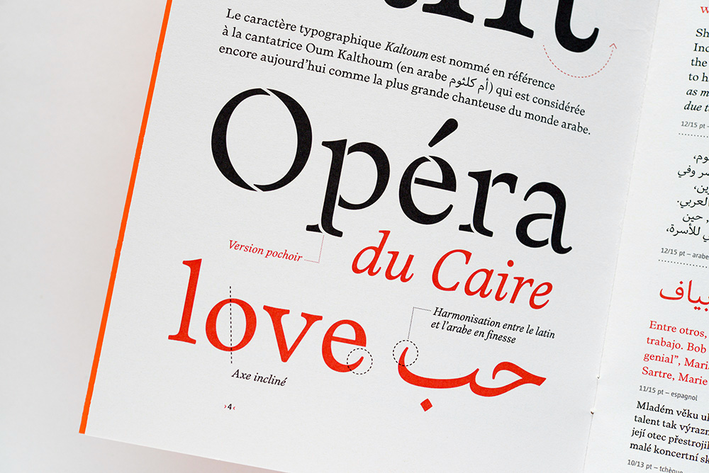
 Judith Poirier is professor at UQAM in Montreal. In her talk, she first focused on Latitude, a modular wood-based system that she developed in 2014 for the inuktitut syllabary. Then she told us about the research and production of Two Weeks Two Minutes (2013), a short film that won the Canadian Film Institute Award for Best Canadian Animation at the Ottawa International Animation Festival. The idea is very clever---just transfer letterpress directly to 35mm film stock. The hallucinating images are like noisy movie fragments in post-Hitchcockian thrillers. Watch her movie here. Judith Poirier is professor at UQAM in Montreal. In her talk, she first focused on Latitude, a modular wood-based system that she developed in 2014 for the inuktitut syllabary. Then she told us about the research and production of Two Weeks Two Minutes (2013), a short film that won the Canadian Film Institute Award for Best Canadian Animation at the Ottawa International Animation Festival. The idea is very clever---just transfer letterpress directly to 35mm film stock. The hallucinating images are like noisy movie fragments in post-Hitchcockian thrillers. Watch her movie here.
|
EXTERNAL LINKS
Soirée Typo
MyFonts search
Monotype search
Fontspring search
Google search
INTERNAL LINKS
Type design in Quebec ⦿
Native-American fonts ⦿
|
