TYPE DESIGN INFORMATION PAGE last updated on Sat Jul 20 14:54:25 EDT 2024
FONT RECOGNITION VIA FONT MOOSE

|
|
|
|
P.T. Barnum
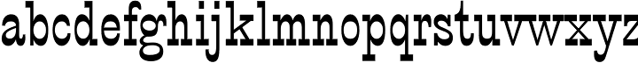
One of the original circus fonts. Mac McGrew: P. T. Barnum is the re-release, in 1933 and again in 1949, of French Clarendon, inherited by ATF from one of its predecessors, Marder, Luse & Company. It is a nineteenth-century design which several foundries offered in the same or similar cuttings, under the same name or various other names including Italian Condensed. It is an unusual display letter, featuring greatly emphasized horizontal strokes at the top and bottom of the characters, and is named for Phineas Taylor Barnum, the flamboyant showman, probably because similar styles were commonly used for circus posters. Some intermediate sizes are more condensed than other sizes, and appear to be the same as Bruce's Italian Condensed No. 341. Some report that it was cut at Barnhart Brothers & Spindler in Chicago about 1880, and passed on via ATF. Immediate degital descendants include Bitstream's P.T. Barnum. |
EXTERNAL LINKS |
| | |

file name: Bitstream P T Barnum
| | |
|
Luc Devroye ⦿ School of Computer Science ⦿ McGill University Montreal, Canada H3A 2K6 ⦿ lucdevroye@gmail.com ⦿ http://luc.devroye.org ⦿ http://luc.devroye.org/fonts.html |