TYPE DESIGN INFORMATION PAGE last updated on Tue Oct 1 16:59:09 EDT 2024
FONT RECOGNITION VIA FONT MOOSE

|
|
|
|
Fotura
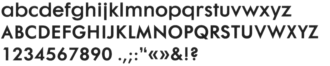
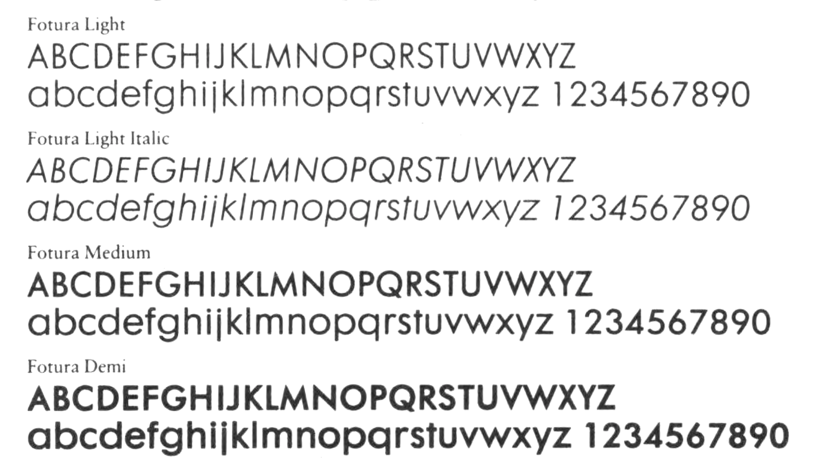
In 1983, U&LC showed Fotura in the Mergenthaler / Linotype / Stempel line-up. That font family was an obvious rip-off of Futura, Paul Renner's successful typeface from 1927. No one seemed to care about the advertisement of Fotura and many other blatant copies. The 1980s were a free-for-all. Ulrich Stiehl (Sanskrit web) points out that Linotype also had further Futura lookalikes, Spartan and Tempo. But Fotura takes the crown, in my view. Today, in 2017, we can ask Why didn't anyone speak up? To make matters worse, the same people who marketed Fotura and other rip-offs, Bruno Steinert and the Linotype management, were sending cease-and-desist letters to young designers whose font names were a bit too close to Helvetica or other Linotype names. The irony! Why did the editors of a respected publication like U&LC say nothing? Why did they accept ads for Fotura in their publication? Has anyone apologized? |
EXTERNAL LINKS |
| | |
file name: Linotype Fotura 1983b
file name: Linotype Fotura 1983
| | |
|
Luc Devroye ⦿ School of Computer Science ⦿ McGill University Montreal, Canada H3A 2K6 ⦿ lucdevroye@gmail.com ⦿ http://luc.devroye.org ⦿ http://luc.devroye.org/fonts.html |