|
Emfoundry
[Jon Melton]
Emfoundry is the micro font foundry of type designer Jon Melton, whose first degree in art dates back to 1984. It was created originally as part of his MA in Typographic Design postgraduate studies at the Cambridge School of Art within Anglia Ruskin University in 2007. Jon Melton is course leader for BA (Hons) Graphic Design at the CSA. His academic research as a senior lecturer at this university informs his work that focuses upon key moments in type design evolution. His typefaces are not commercially available, They inclde: - Fount Sans 1756 (2018), a revival typeface of the 18th century, the legacy for all the countless sans serif fonts today. Speaker at ATypI 2018 in Antwerp, where he explains that revival: The search for the origin of today's commercial sans serif typography has become something of a holy grail for type historians. The earliest known example of a deliberately geometrical serifless letterform was confirmed back in the late 1990s, on a plan-drawing title block for a new parliamentary building. It was produced whilst on the grand tour by the architect John Soane. Duly exhibited at the Royal Academy in 1779, it marked the start of Soane's utilising this then-radical letterform on his design drawings and for inscriptions on buildings. Prior to Soane's exhibited "Design for a British Senate House," there is a void. Scholars are aware that the sans serif originates within the letterforms of Greece and the informal inscriptions of the Roman Empire. But what inspired Sir John Soane to use it, for what appears to be the very first time?
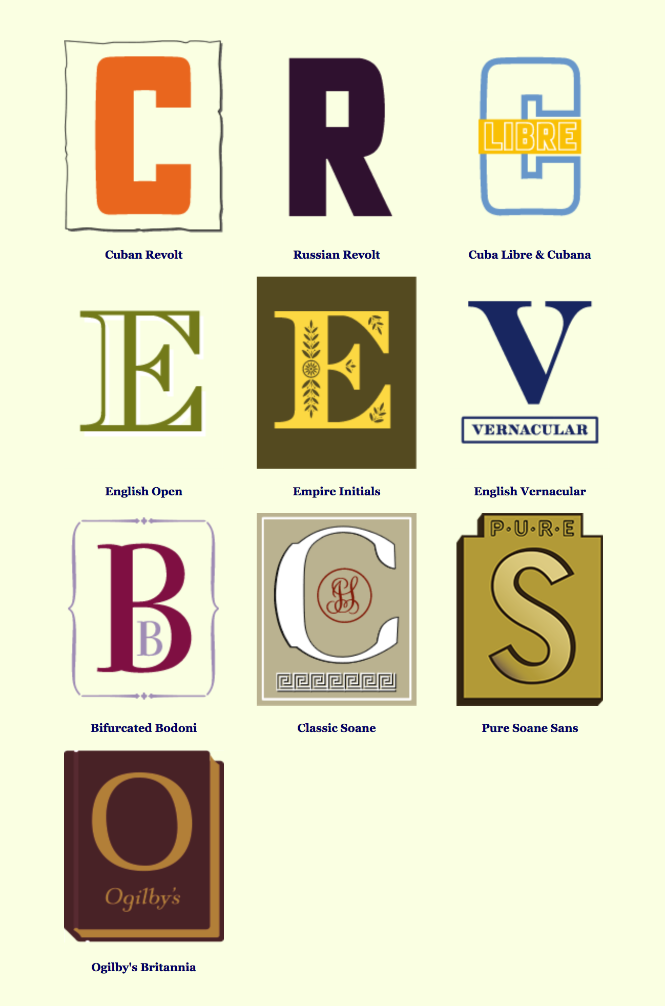
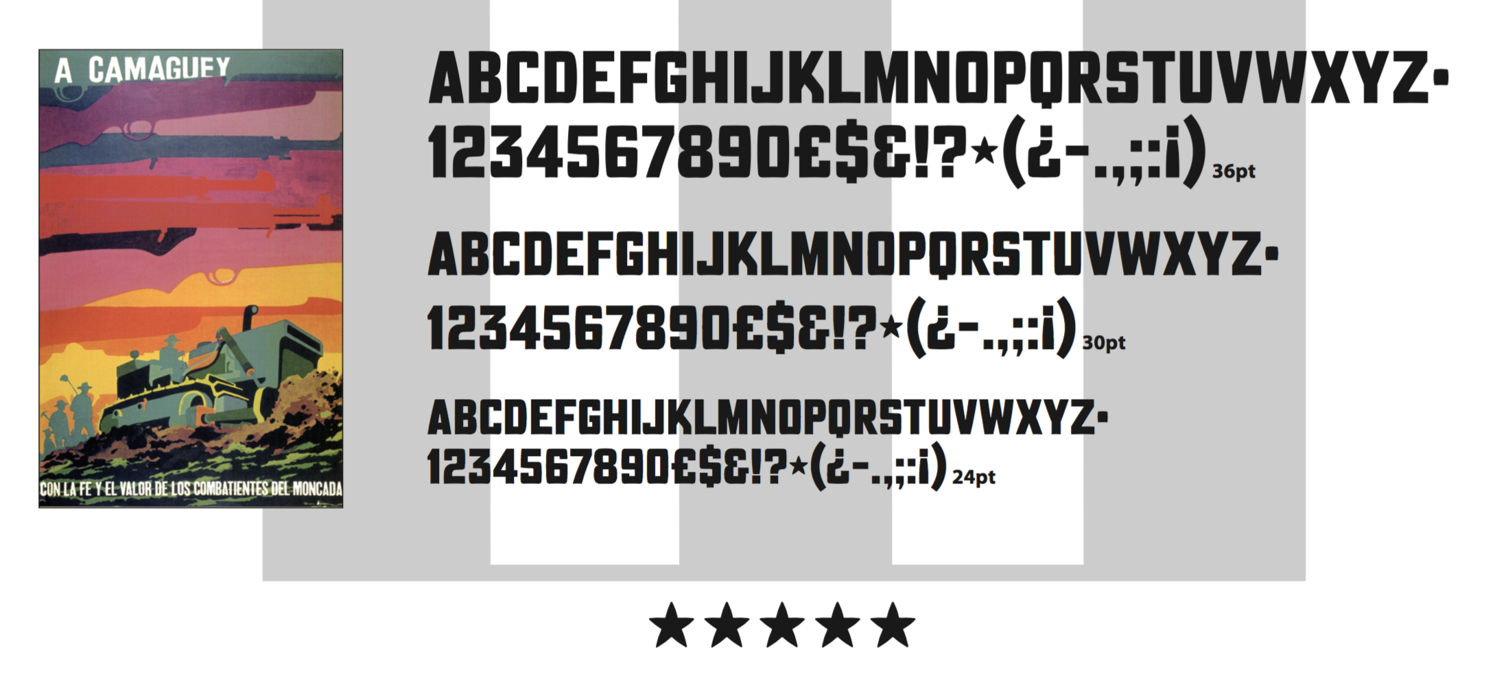
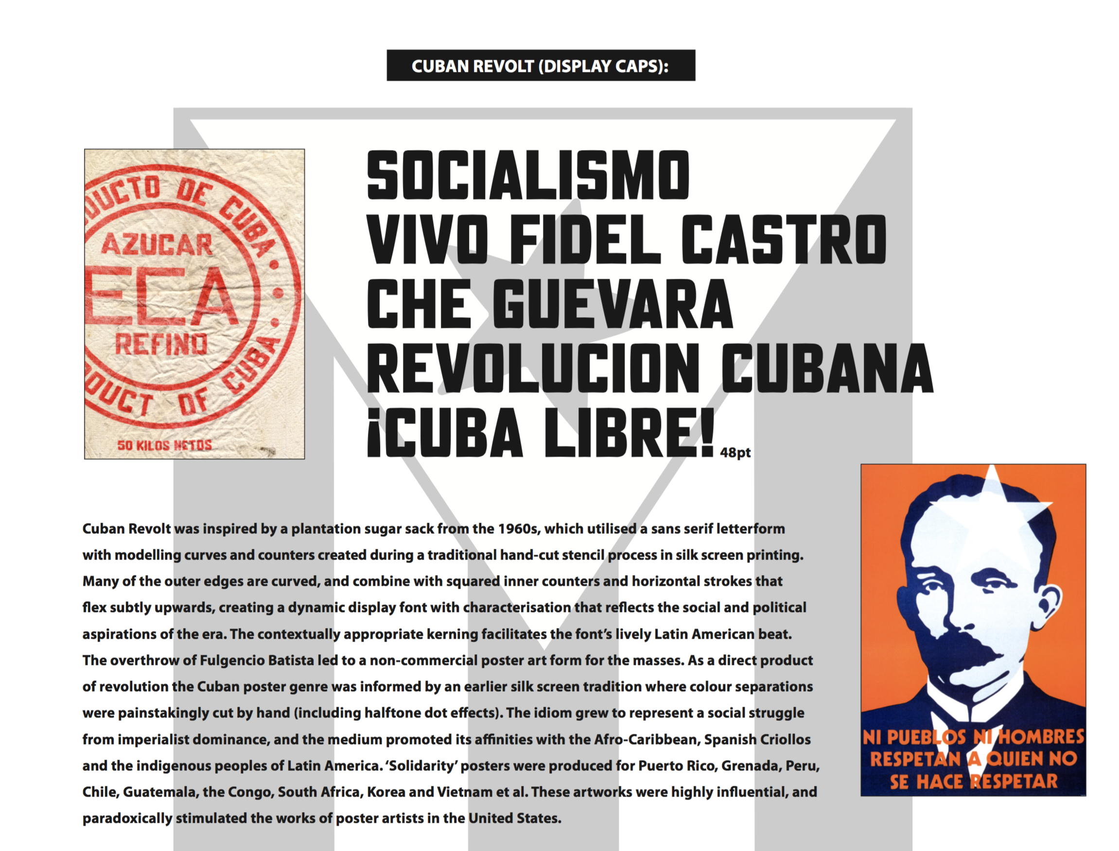
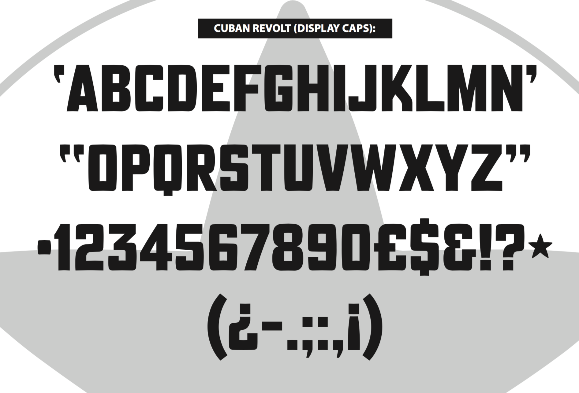
- Cuban Revolt. Cuban Revolt was inspired by a plantation sugar sack from the 1960s, which utilised a sans serif letterform with modeling curves and counters created during a traditional hand-cut stencil process in silk screen printing. It has a constructivist feel.
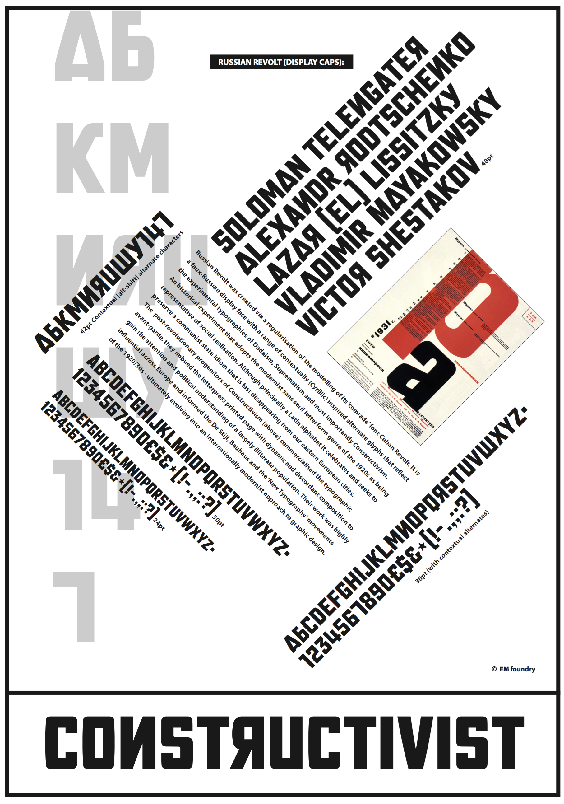
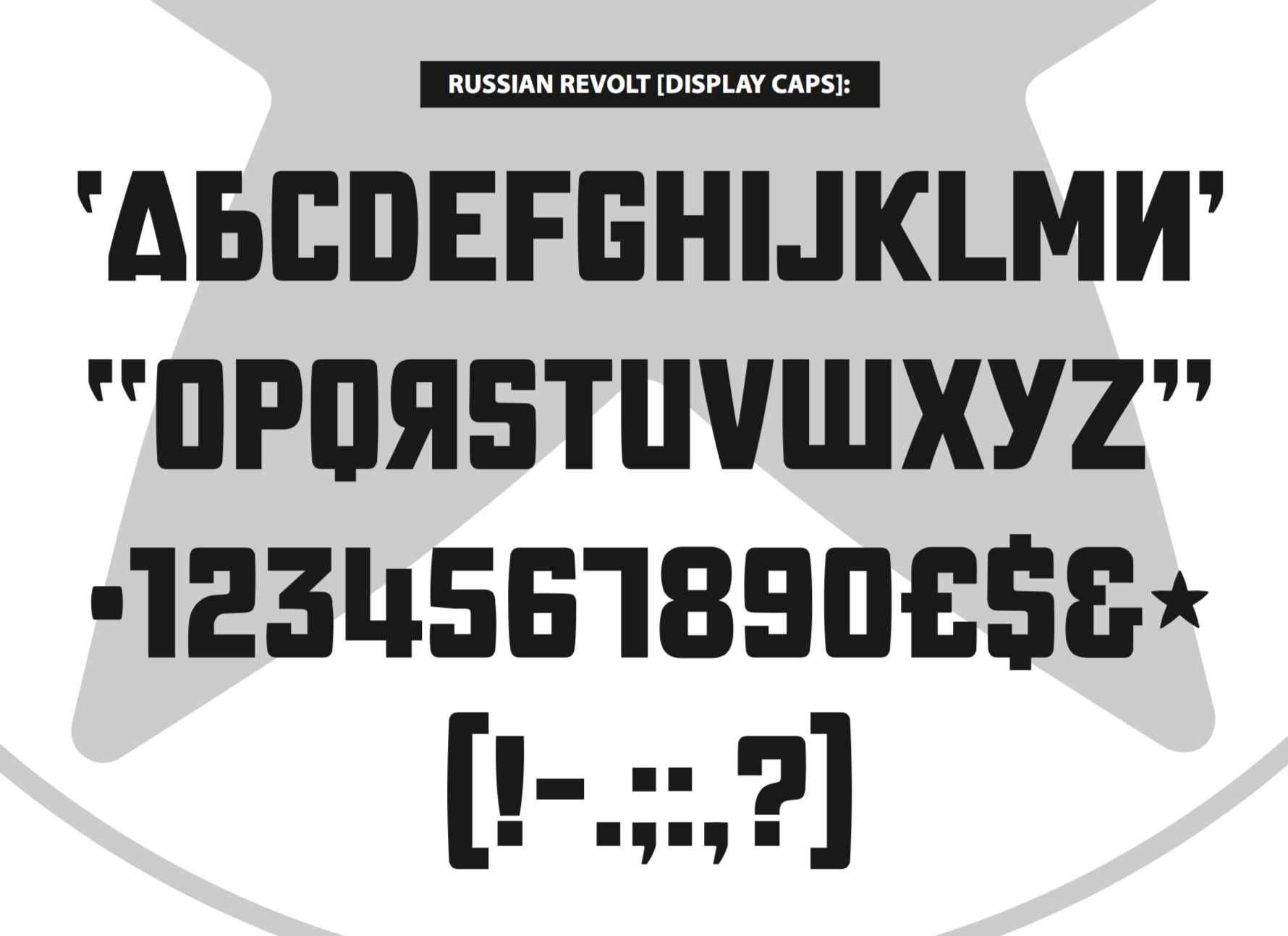
- Russian Revolt. Russian Revolt was created via a regularization of the modeling of its comrade font Cuban Revolt. It is a faux-Russian display face with a range of contextually (Cyrillic) inspired alternate glyphs that reflect the experimental typography of dadaism, suprematism and constructivism.
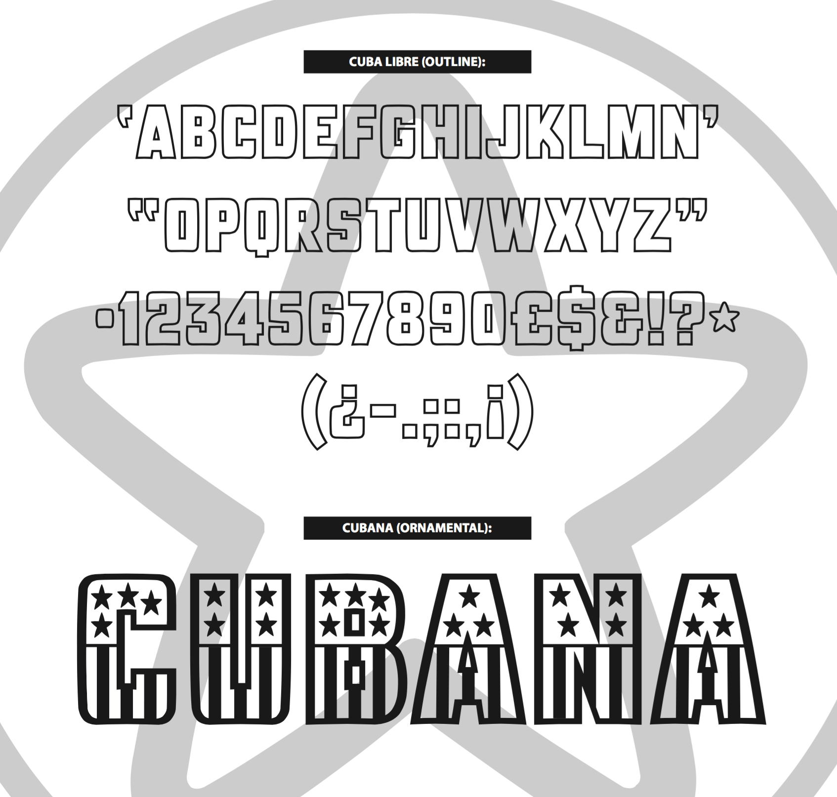
- Cuba Libre & Cubana.
- English Open, or "Georgian English Open Initials & Titling". English Open was derived from the letterforms of metal engravers, and examples of these are readily found on armorial silver and maps produced over one hundred years earlier than the first available open typeface specimens. Its character follows the steel and copper plate engravers of the 18th century, and is ultimately informed by the open types of the period such as Cocaine, Moreau-Le-Jeune, Fournier, Fournier Le Jeune and Rosart.
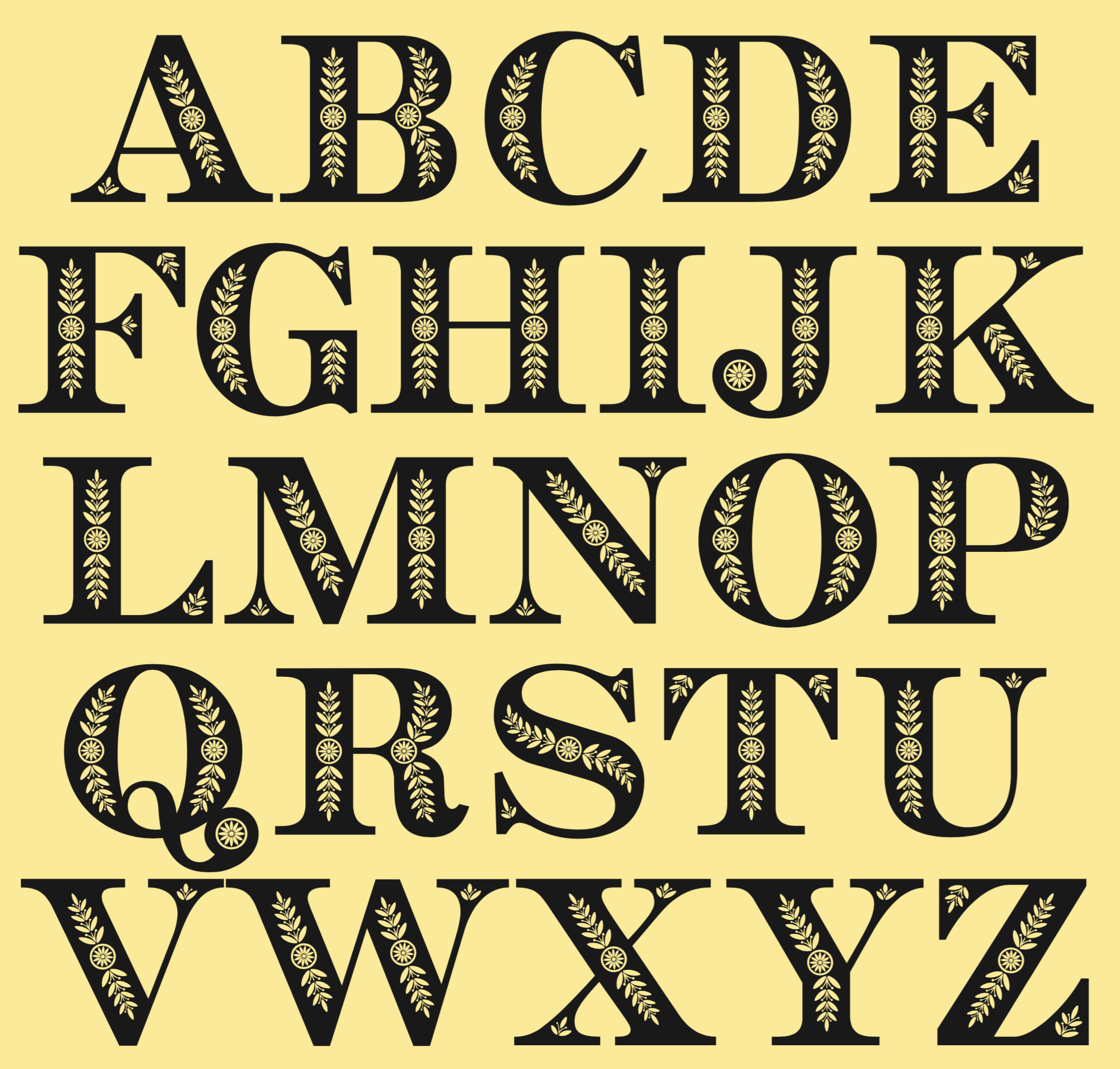
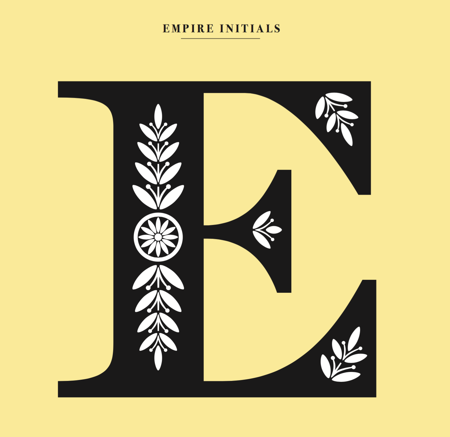
- Empire Initials, Empire Initials mark the end of informed neoclassical and revivalist ornamentation, and the beginnings of ostentation and the over-adornment so representative of Victorian eclecticism. White-out decorated fat types were produced within a very short Late Regency period, from the 1820s-40s, of fevered expression within the decorative arts.
- English Vernacular. The letter is informed by generations of 17th and 18th century armorial silver and goldsmiths, glass engravers, topographic and political print gravurists, signwriters and our provincial stone carvers who developed English vernacular, the Georgian artisan letter.
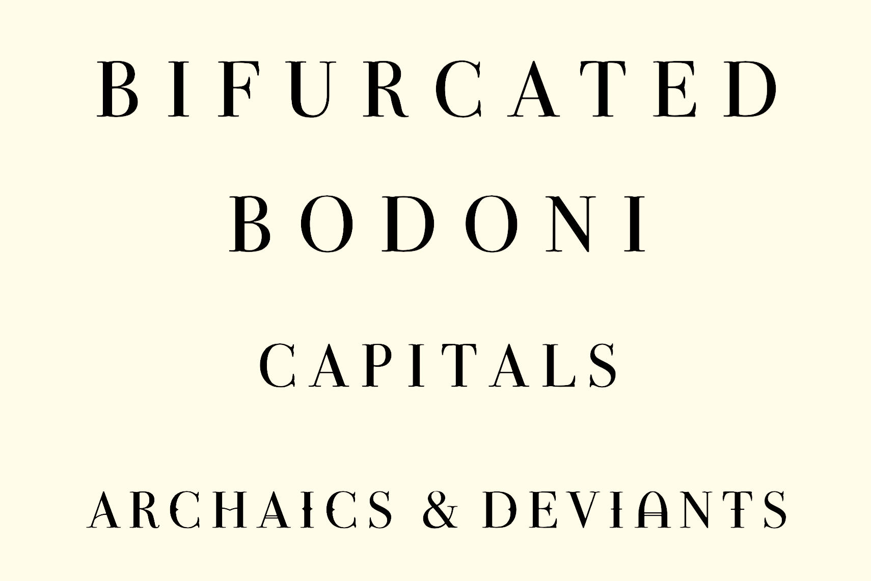
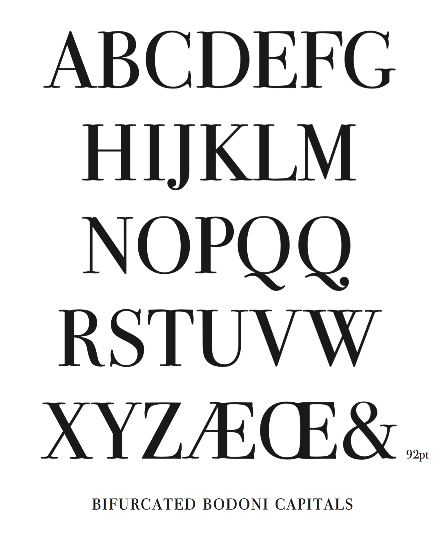
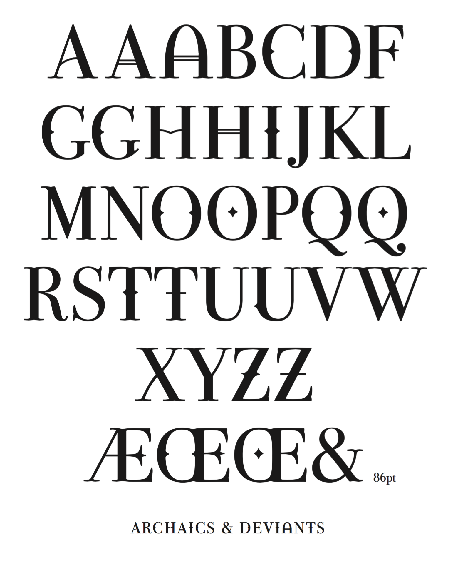
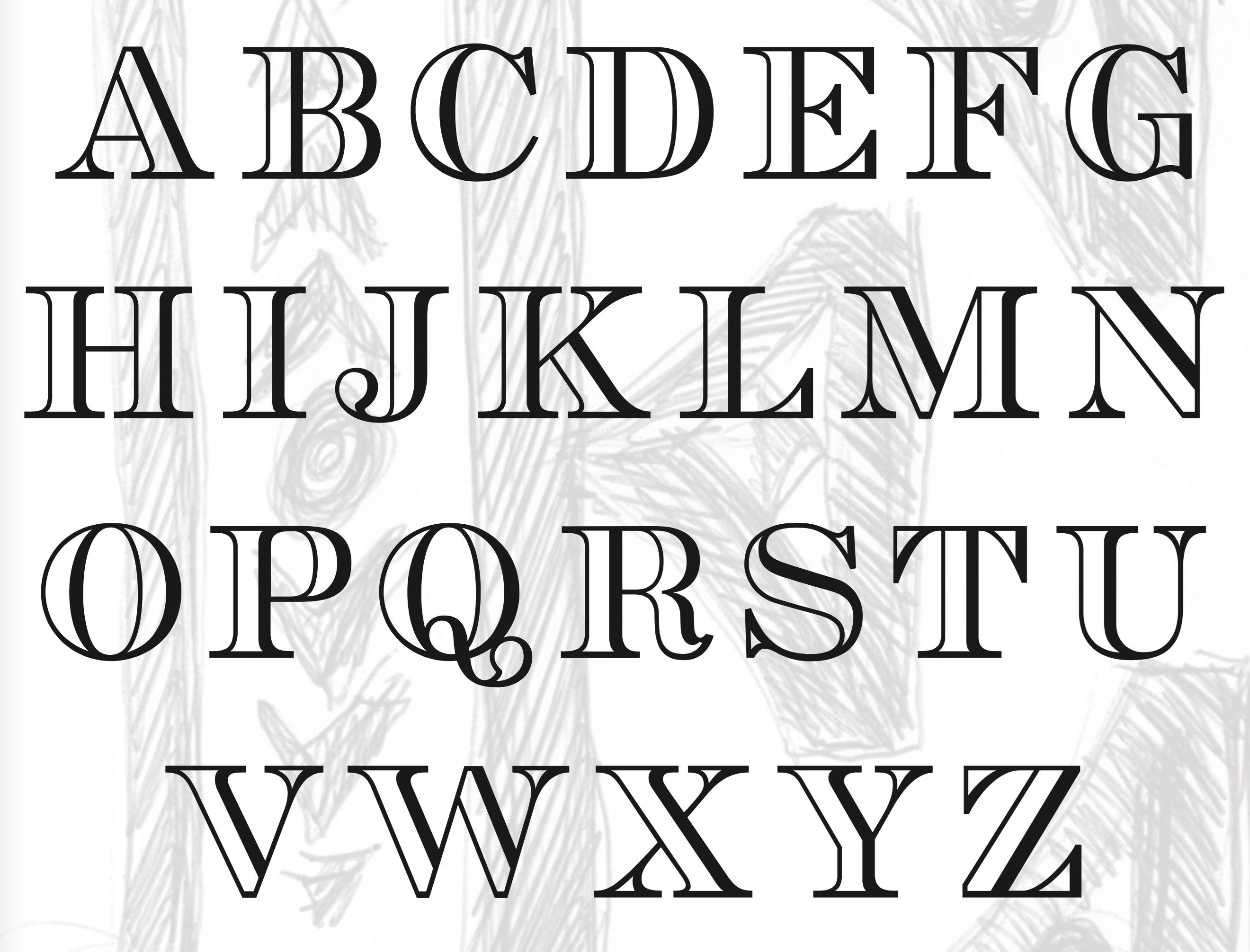
- Bifurcated Bodoni. EM Bifurcated Bodoni represents a missing piece of the typographic evolutionary puzzle, with its Archaic and Deviant alternates exhibiting tentative and restrained characters and ornamentation, such as median decoration, internal tracery cusping and Romanesque letter formations. [...] The transition has been increased and the proportions expanded pointing towards the predominant display Fat Faces of the period; while the serif bifurcates subtly to represent early tentative experiments within what became known as the Tuscan form.
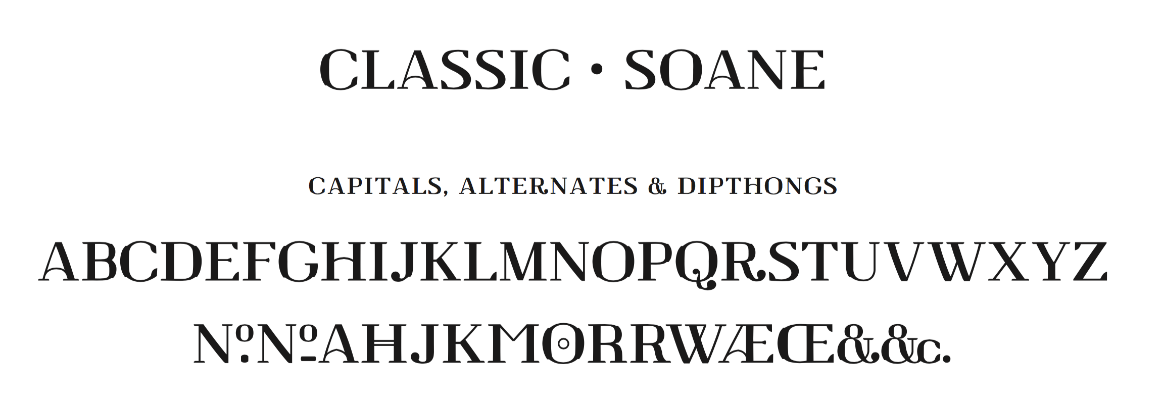
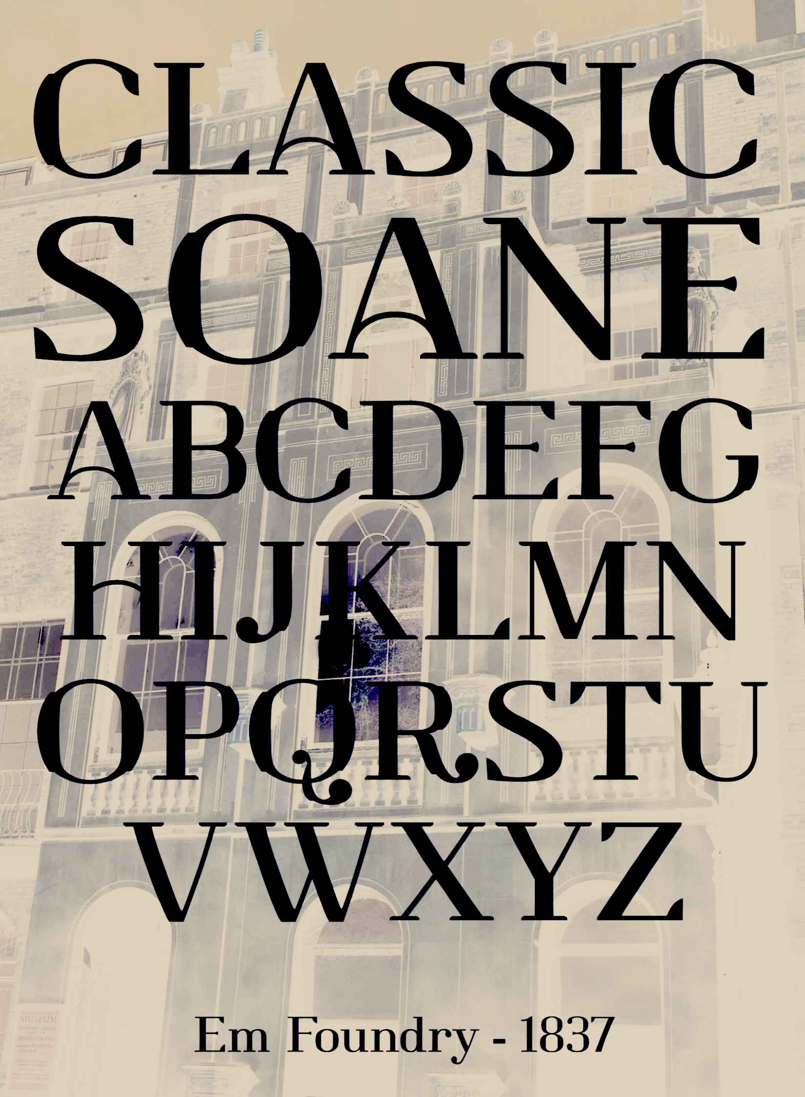
- Classic Soane: Classic Soane is created in homage to the Regency architect Sir John Soane and his refined classical vernacular.
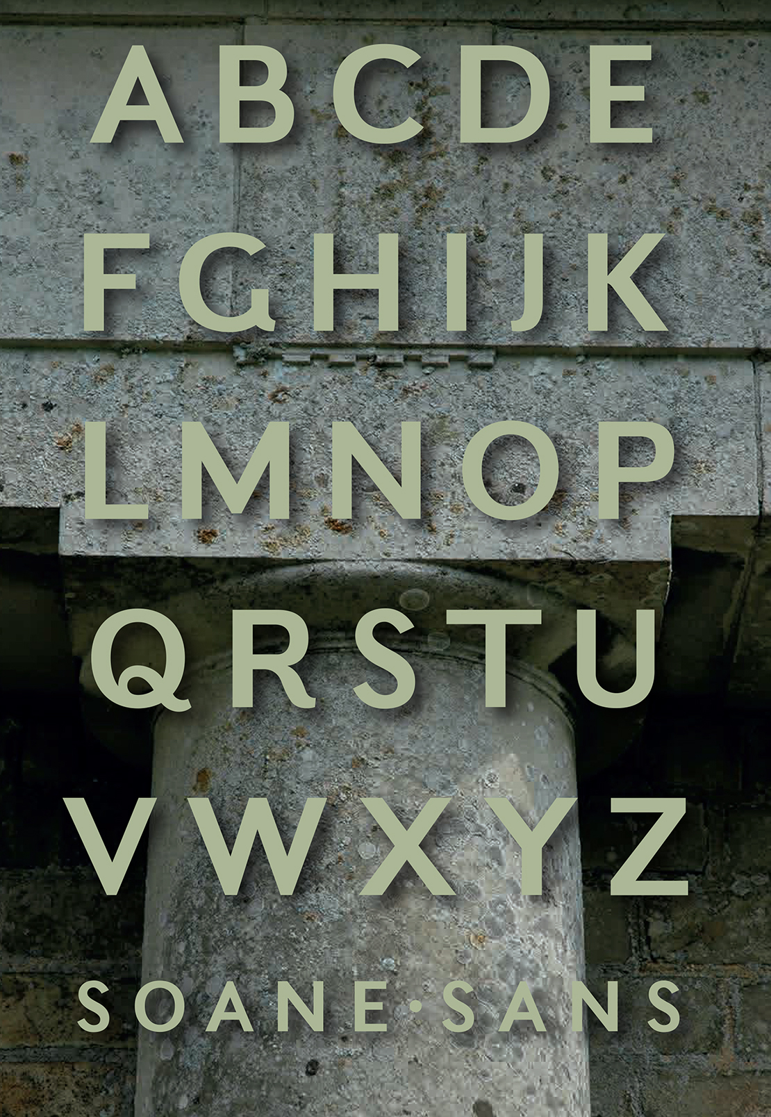
- Pure Soane Sans. Melton explains this inscriptional sans:,i>Pure Soane Sans forms part of a reappraisal of the Regency architects intensions for inscriptional letterforms following a recent discovery of an overlooked early Sans serif letter on a pair of gate houses in Norfolk. These buildings were recorded as erected between 1790-92 with two Greyhound statues including inscriptional motos on stone plynths contemporary to the building. The letters have distinctive widths and features, particularly the 'G' and 'J' which shares an idiosyncratic partial serif that is also seen on Soane's titling on the better known drawings for his proposed Norwich (Castle) Gaol. These features have provided the clues to a new Sans Serif Typeface firmly based upon the 18thC origin of the seref-less letter.
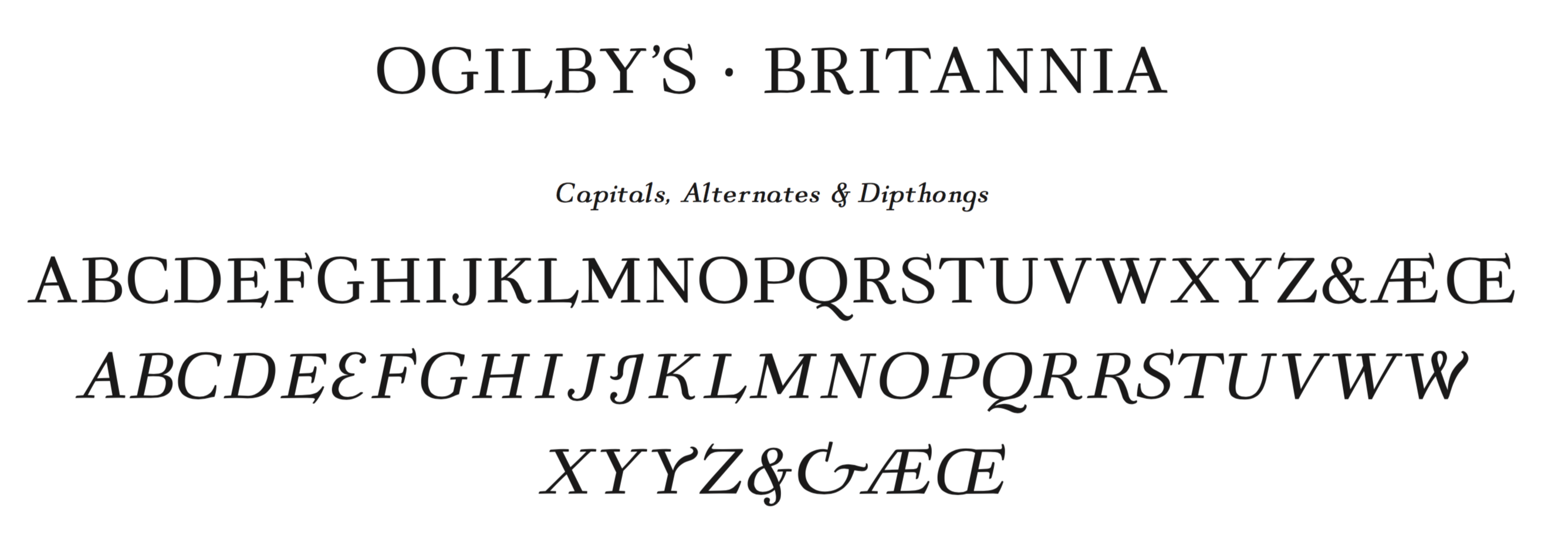
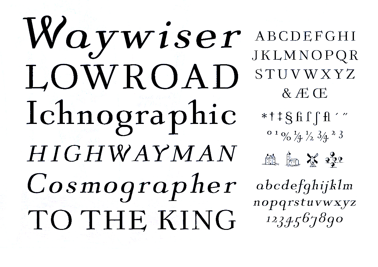
- Ogilby's Britannia (Britannia Regular, Britannia Italics, Britannia Swashes): Ogilby's Britannia reflects the engraved letterforms published in Britain's first Road Atlas published in 1675. John Ogilby employed numerous Surveyors, Weywisers (measuring wheel), Cartographers, Plate Engravers and Printers in the production of his revolutionary book. This typeface seeks to capture the engraver's vernacular of the 17th century, utilising the ichnographic ornaments and cartographic letterforms used on Ogilby's post roads strip maps, which applied a standardised unit mile for the very first time.
|
EXTERNAL LINKS
Emfoundry
MyFonts search
Monotype search
Fontspring search
Google search
INTERNAL LINKS
Type designers ⦿
Type designers ⦿
Type design in the United Kingdom ⦿
History of type ⦿
Type design and constructivism ⦿
Cyrillic simulation fonts ⦿
Type in Cuba ⦿
Victorian typefaces ⦿
Modern style [Bodoni, Didot, Walbaum, Thorowgood, Computer Modern, etc.] ⦿
Tuscan fonts ⦿
|