TYPE DESIGN INFORMATION PAGE last updated on Thu Aug 15 19:14:51 EDT 2024
FONT RECOGNITION VIA FONT MOOSE

|
|
|
|
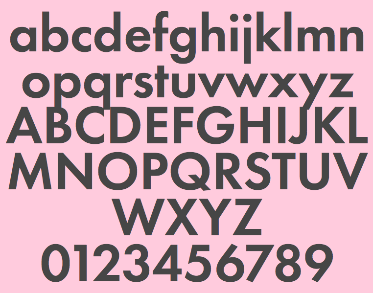
Futura PT
Futura was designed for Bauer company in 1927 by Paul Renner. A geometric sans serif, it is representative of the German Bauhaus school of the 1920s and 1930s. Issued by the Bauer Foundry in a wide range of weights and widths, Futura became a very popular choice for text and display. The original Cyrillic version had eight styles and was developed at ParaType (ParaGraph) in 1995 by Vladimir Yefimov. Additional Cyrillic styles were developed in 2007-2009 by Isabella Chaeva. Simultaneously the old eight styles were partly revised to match the whole family. Now the new Futura is a uniform type system consisting of seven weights with corresponding obliques plus eight condensed styles. Four free styles are here. |
EXTERNAL LINKS |
| | |
file name: Vladimir Yefimov Isabella Chaeva Futura P T Demi 1995 2013
| | |
|
Luc Devroye ⦿ School of Computer Science ⦿ McGill University Montreal, Canada H3A 2K6 ⦿ lucdevroye@gmail.com ⦿ http://luc.devroye.org ⦿ http://luc.devroye.org/fonts.html |