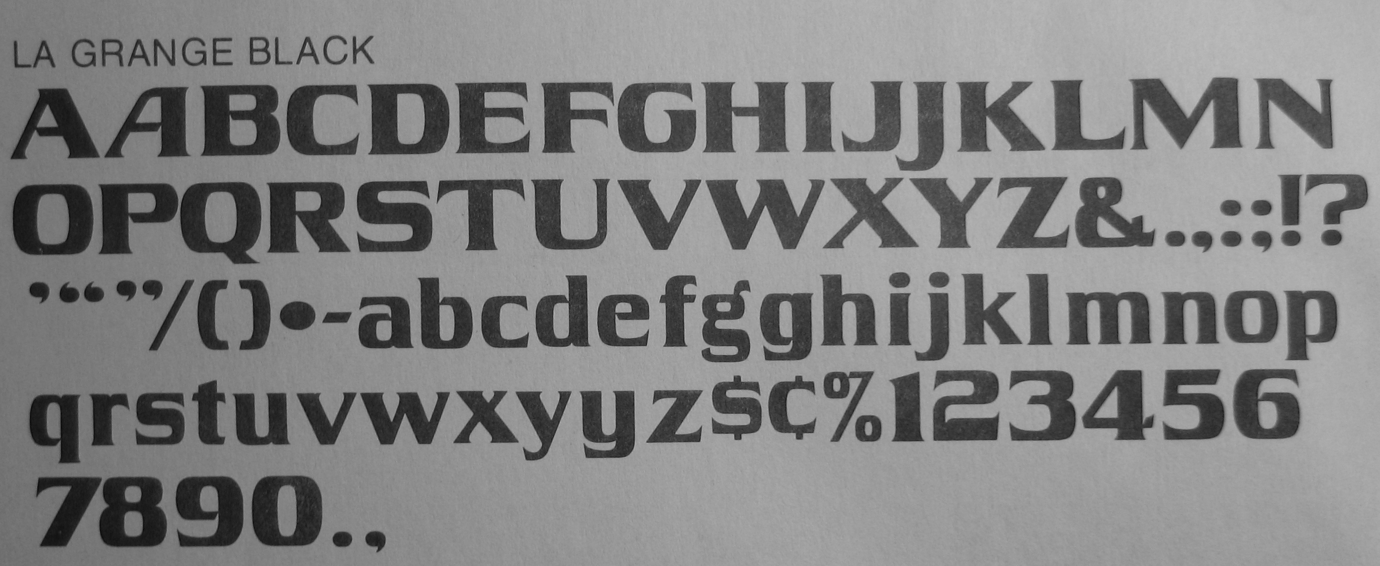
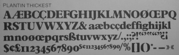
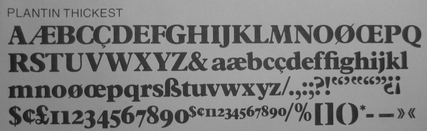
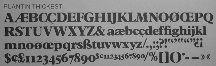
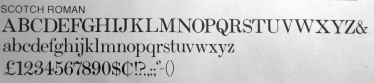
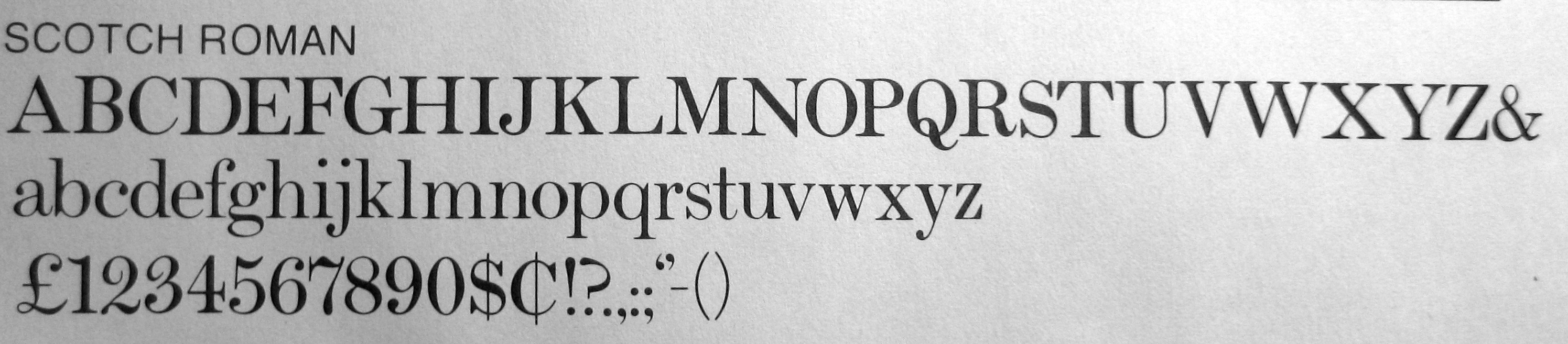
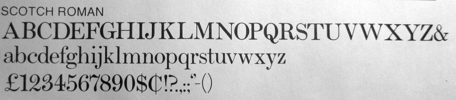
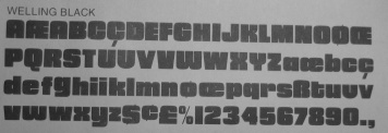
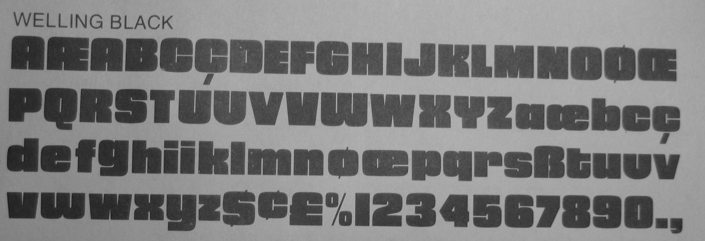
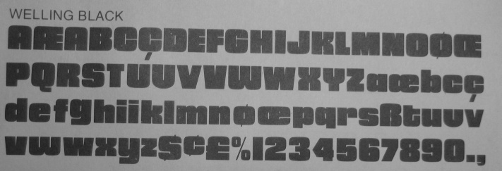
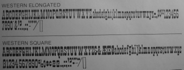
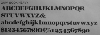
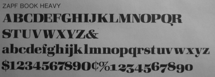
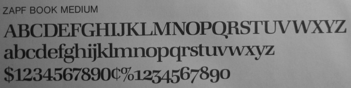
 FotoStar
was a Los Angeles-based company that distributed a large library of
two-inch film fonts, including many original designs by
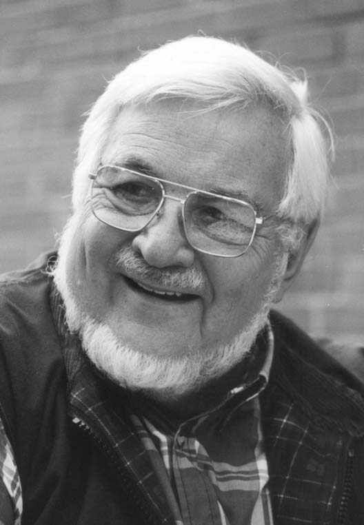
Robert Trogman (b. August 1928),
a graphic designer now living in Palm Springs, CA, where he runs Trogman Signs
and has a etterpress hobby studio that includes Linotype, Ludlow and polymer platemaking.
He still digitizes fonts for his own satisfaction.
He is a graduate from the University of California at Santa Barbara.
FotoStar
was a Los Angeles-based company that distributed a large library of
two-inch film fonts, including many original designs by
Robert Trogman (b. August 1928),
a graphic designer now living in Palm Springs, CA, where he runs Trogman Signs
and has a etterpress hobby studio that includes Linotype, Ludlow and polymer platemaking.
He still digitizes fonts for his own satisfaction.
He is a graduate from the University of California at Santa Barbara.
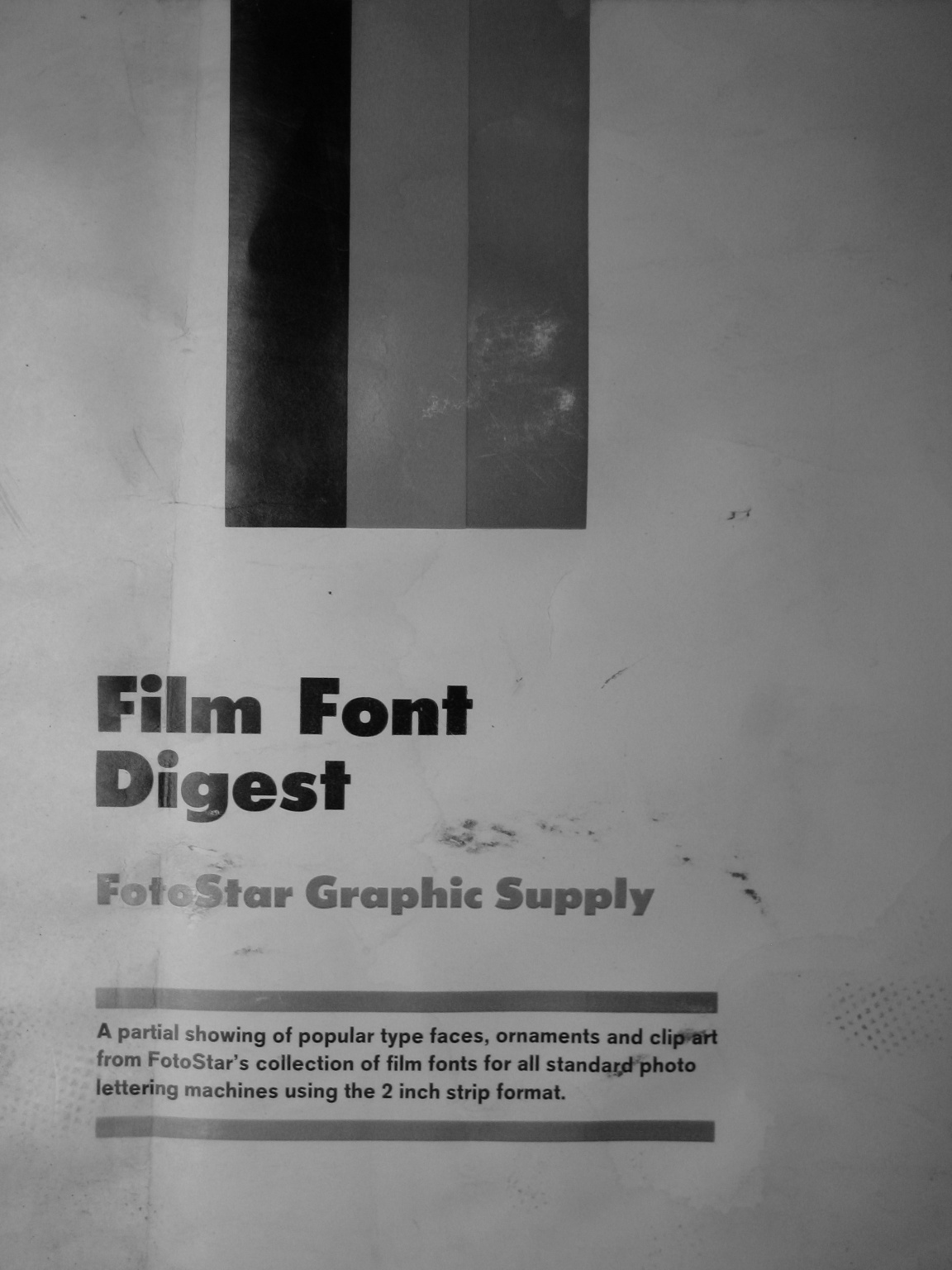
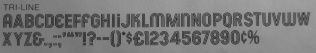
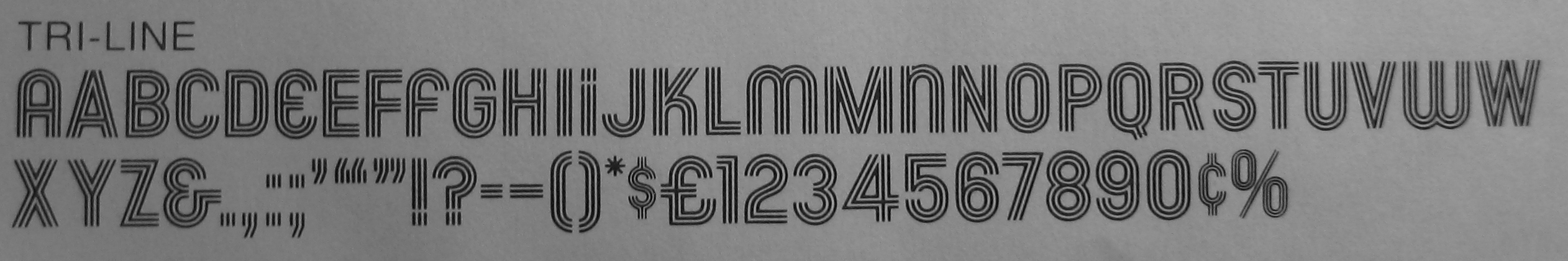
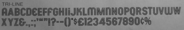
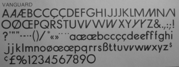
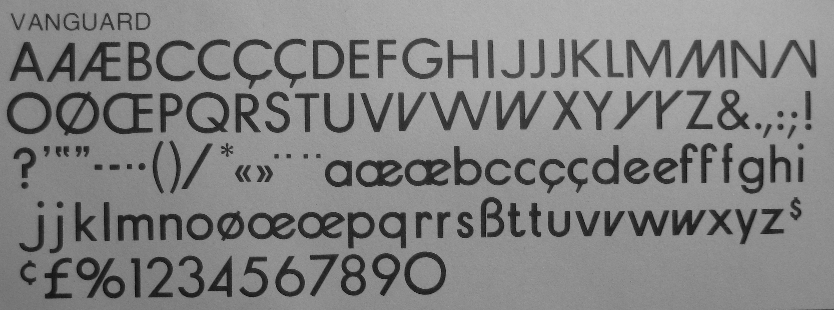
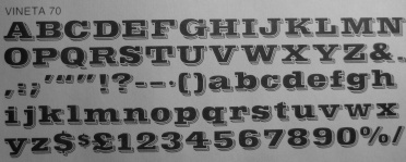
In the prime days of phototypesetting, they published
a juicy catalog, Film Font digest FotoStar Graphic Supply.
Robert kindly sent me a copy---some of the thousands of typefaces
showcased in that book are shown here.
FotoStar (FotoStar Graphics) folded in 1985.
Facsimile Fonts
is Trogman's current foundry.
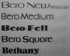
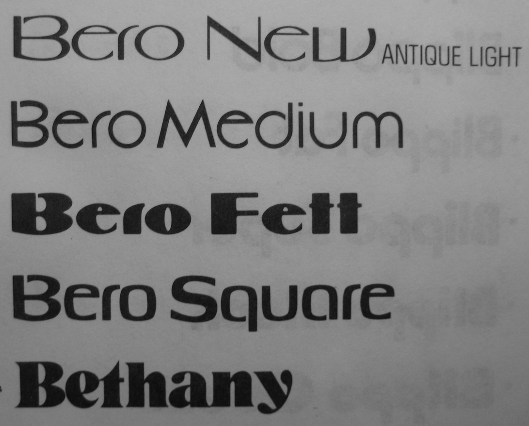
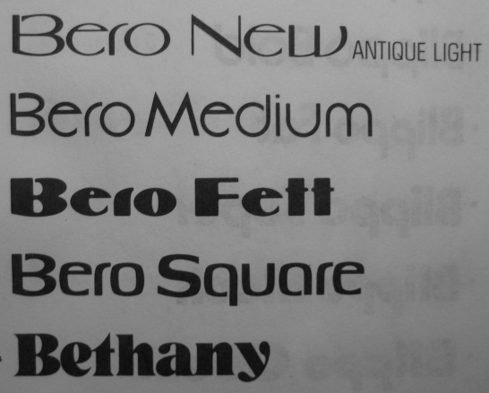
Trogman's original designs include
- Buxom (3d face).
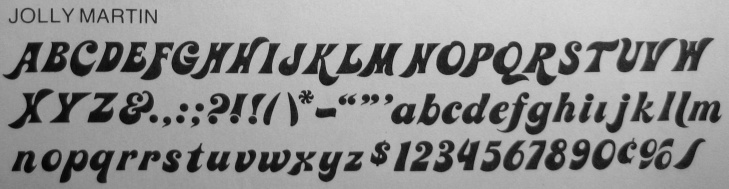
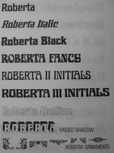
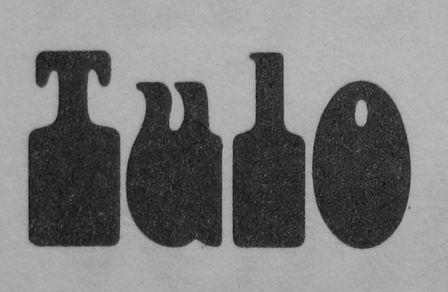
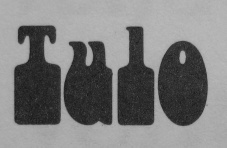
- Roberta (1962, FotoStar: an art nouveau face).
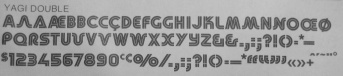
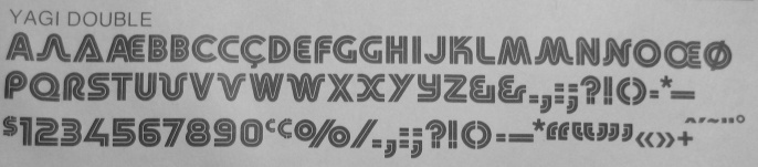
- Yagi Double (the CNN Logo).
- Binner (art deco).
- Blippo (display)
- Handel Gothic (sans).
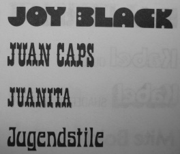
He says about himself: My career began in 1942 as an apprentice in the composing room. Because of WWII I was able to get several jobs; working at the College Press under the tutiledge of Richard Hoffman and a night job at LA Type casting the first arrival of Times Roman. Because of the pursuit of the alphabet it led to working with some of the best in the busines: Saul Bass, Herb Rosenthal and Charles Eames. My commercial career began in the early 1960s with the revival of Jugenstill fonts and becoming an agent for Bertold. I was able to bring on the photolettering market many original designs under the name of Facsimile Fonts and later FotoStar International.
In total, he made over five thousand film fonts under the name of Facsimile Fonts and FotoStar International. He writes for Recognition Review as Dr. Type and gives seminars on typographic design. A type consultant, he was at one point lecturer on typographic layout and design for California State University at Los Angeles.
|
|
|
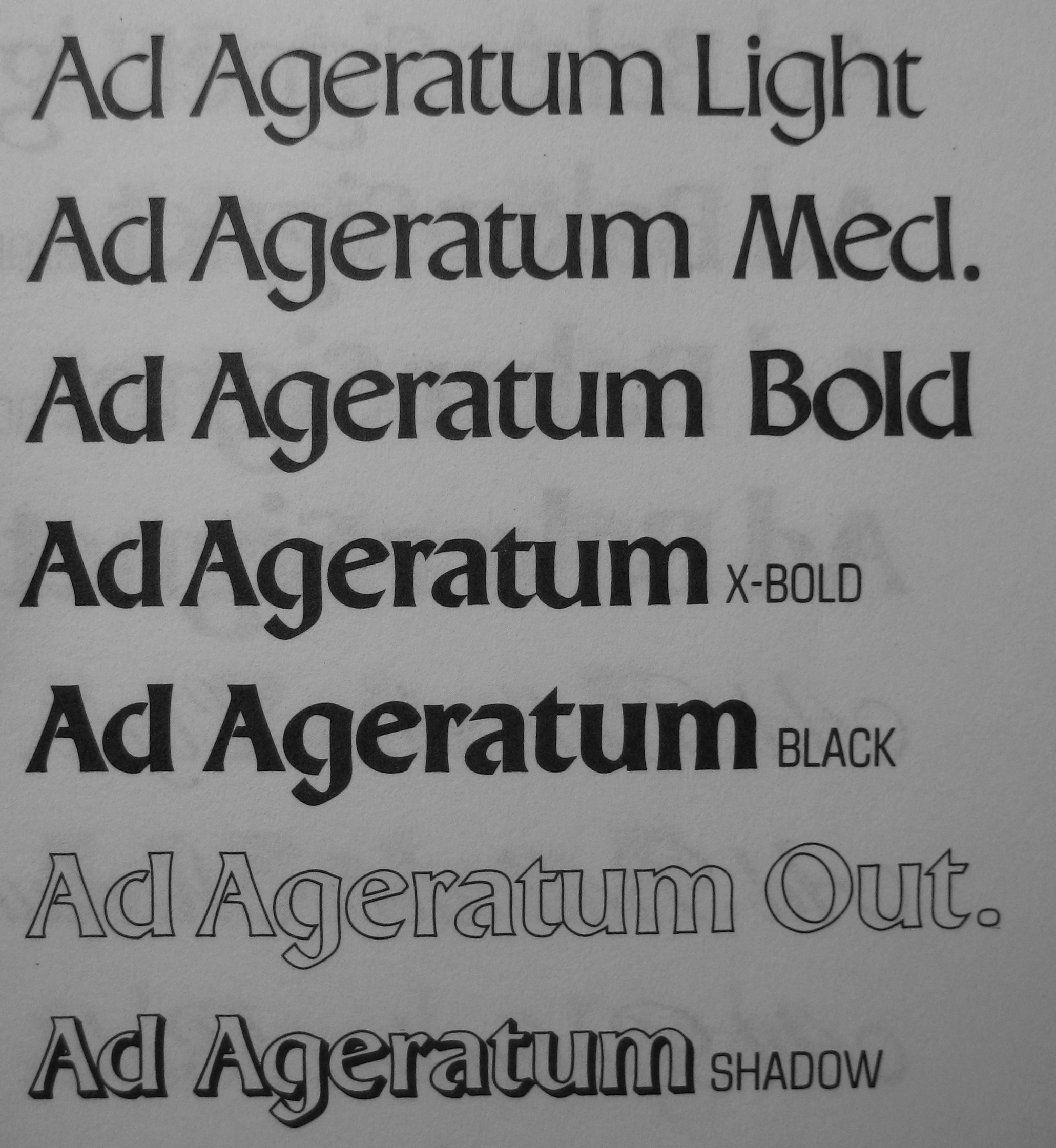
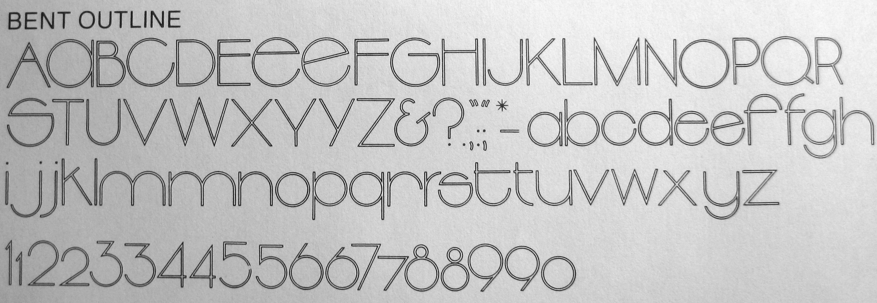
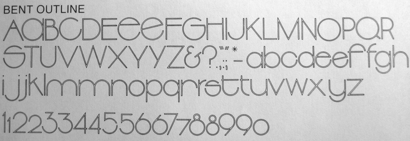
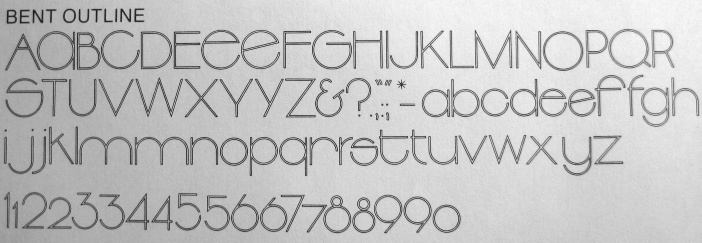
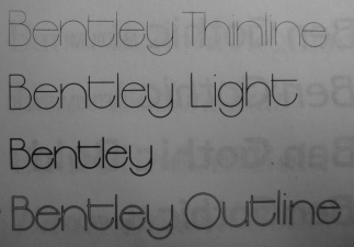
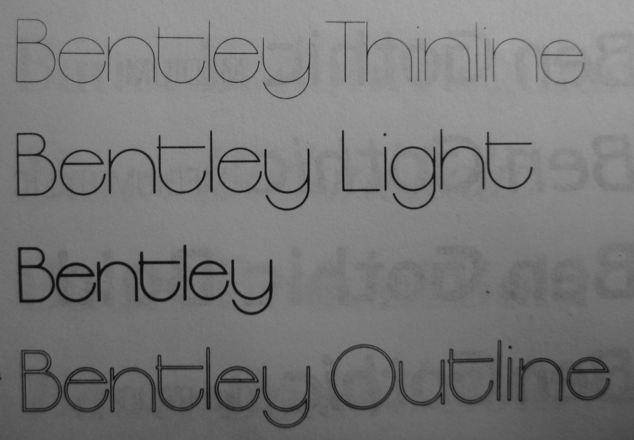
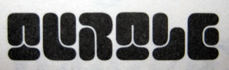
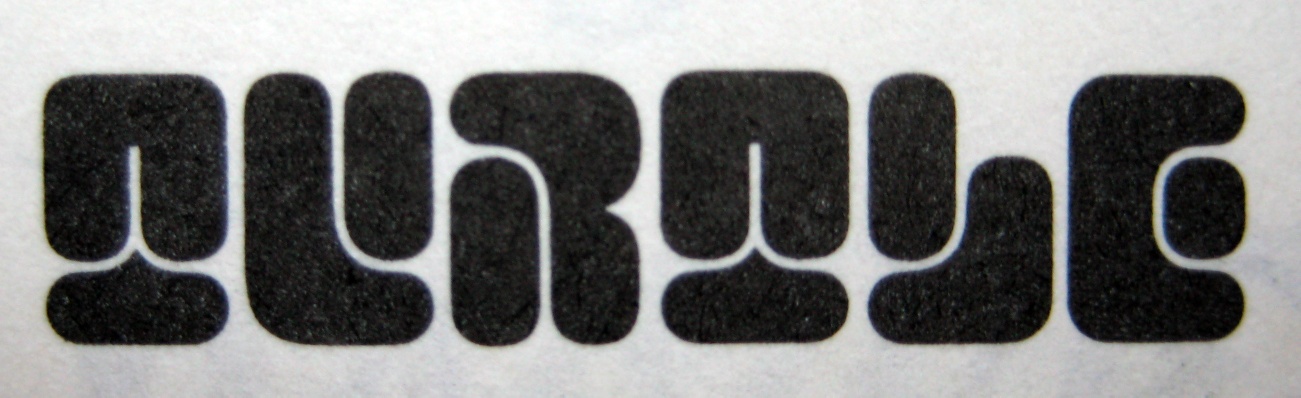
The hairlined and exaggerated geometric family Bentley is another favorite,
very representative of the seventies, the excesses of Avant Garde, and
other Lubalinventions.
|
|
|
|
|
|
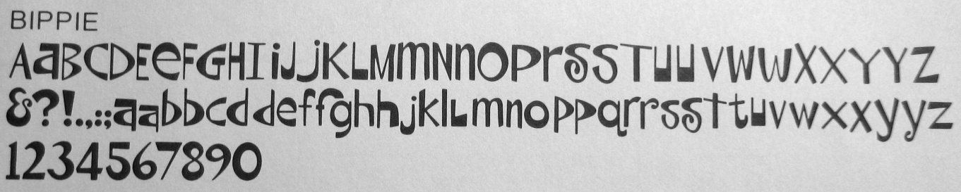
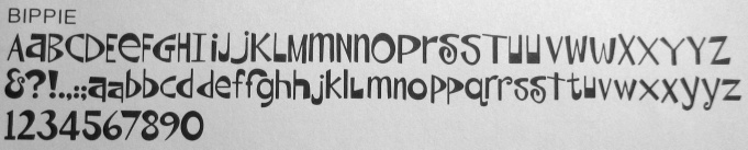
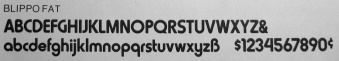
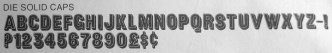
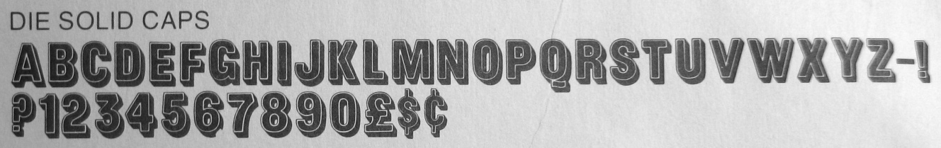
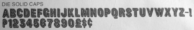
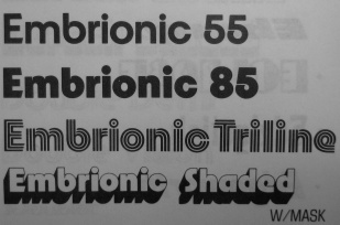
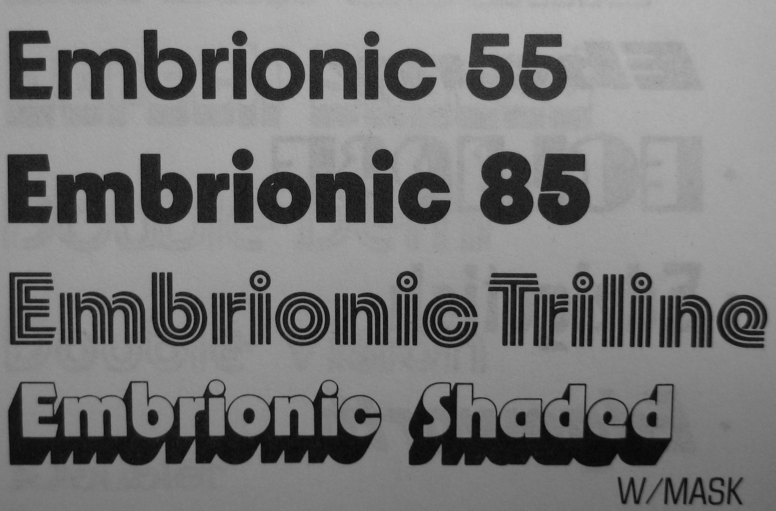
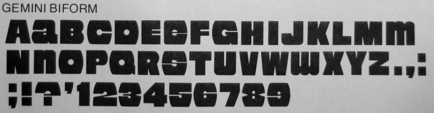
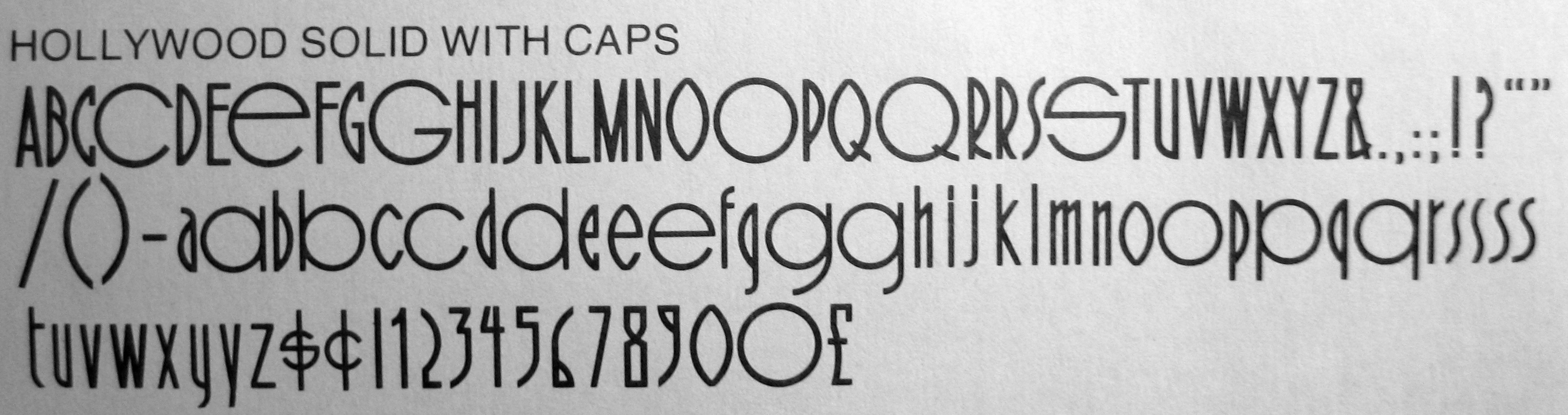
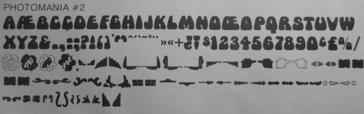
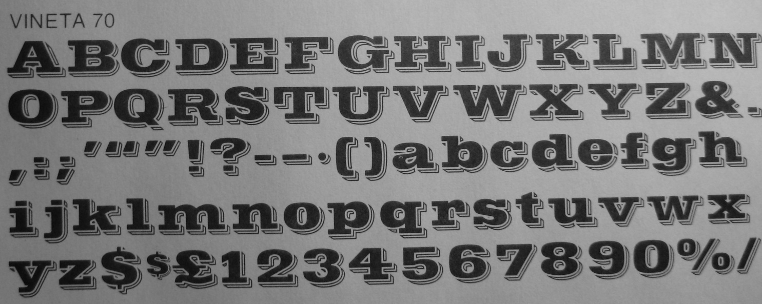
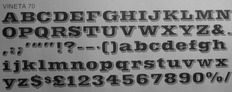
Blippo (1970) is Trogman's celebrated and often-copied geometric display typeface.
Success is largely measured by the intensity of the cloning efforts:
Blippo clones include
Bauhaus 93,
C Blippo (Predrag Milivojevic),
Blippo Black BT (Bitstream),
Blippo Black (URW),
EF Blippo Black (Elsner & Flake),
Blipper,
Blippo Black and Blippo Stencil (Linotype),
Brandish (Brandish Regular),
Graphics,
Celesti Display (SSI),
MN Blippo Black (Mecanorma),
and Bilbao (megafont.de).
According to Identifont,
Blippo was designed by Joe Taylor. That surely is an error.
|
|
|
|
|
|
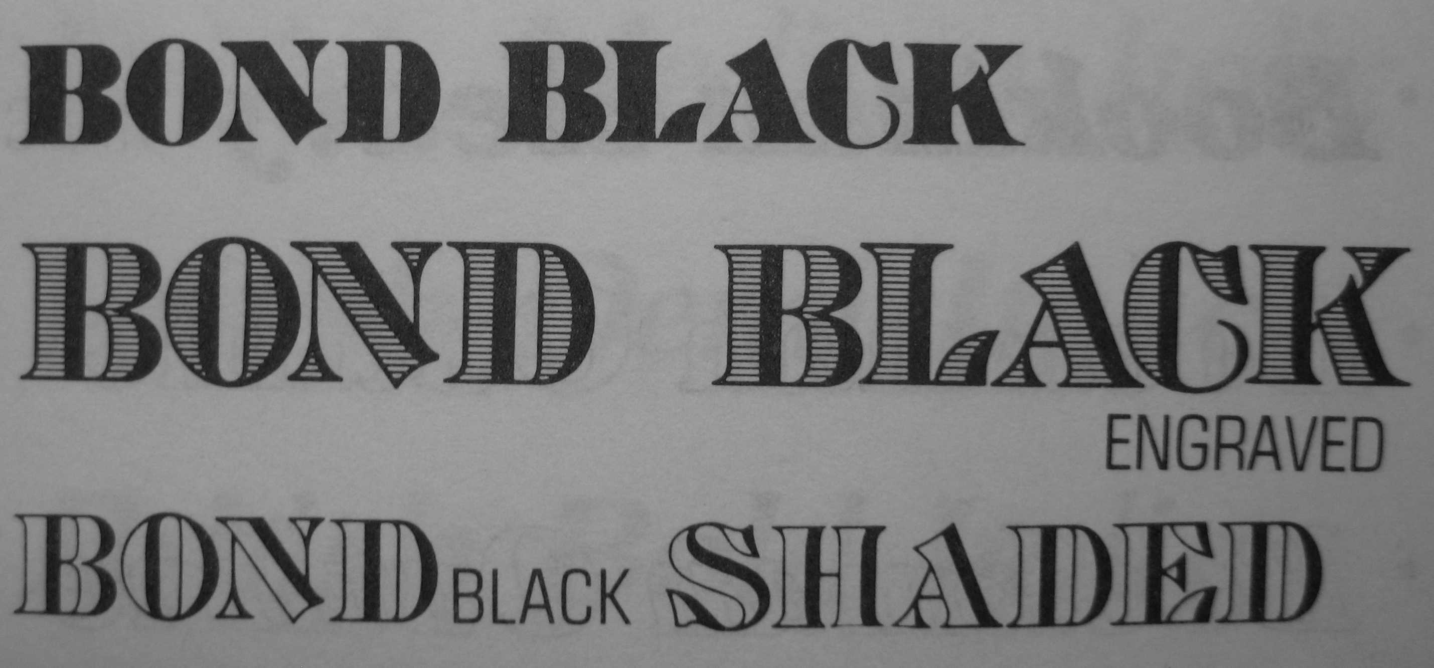
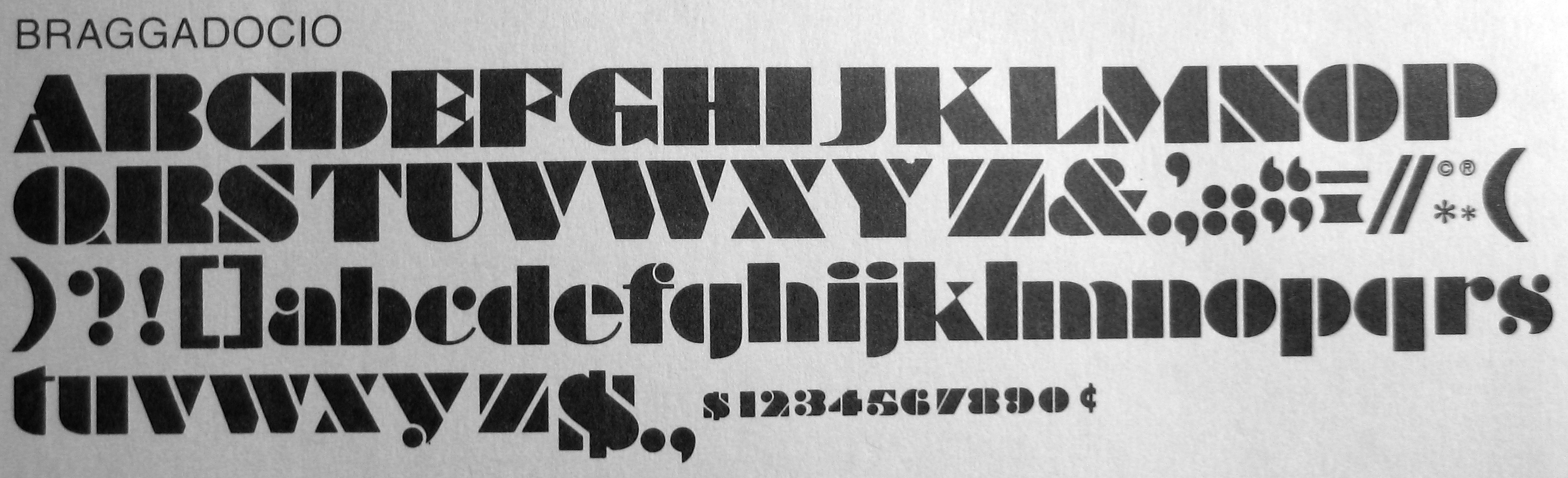
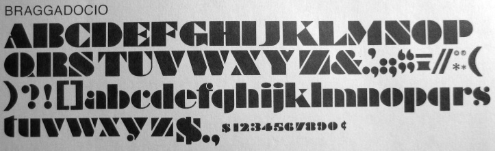
Braggadocio is originally due to William A. Woolley (Monotype, 1930).
It has many descendants, such as OL Braggadocio (Dennis Ortiz-Lopez).
|
|
|
|
|
|
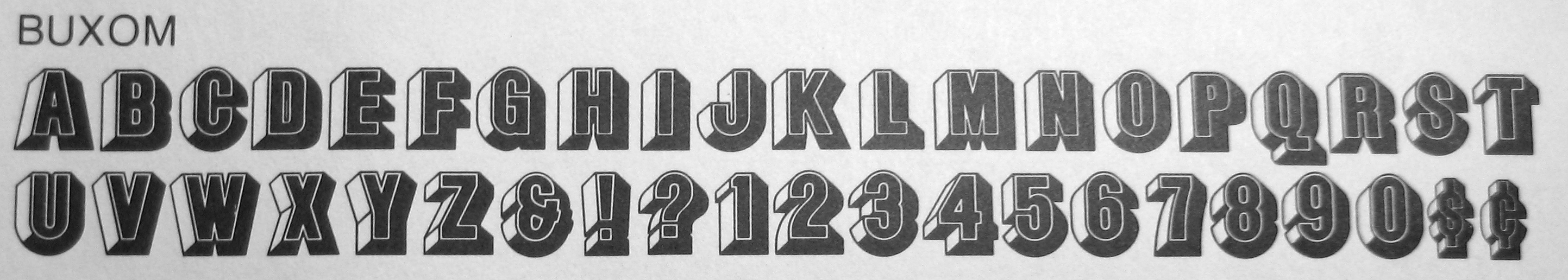
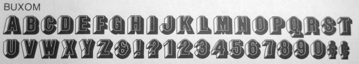
Buxom, a 3d-athletic lettering face, has been marketed by places like Linotype
and Elsner & Flake,
but non-Trogman authorized versions exist as well, such as
BuxomD (URW, 1994) and QHS Zeradesht (QHS Soft).
|
|
|
|
|
|
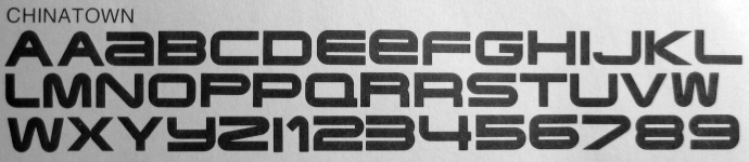
I think that Chinatown must be a misprint.
|
|
|
|
|
|
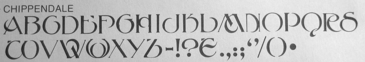
J. Naylor was a staff compositor in the London Office of Stephenson and Blake who designed Chippendale Initials, to go with the Stephenson and Blake typeface Chippendale (1915). FotoStar has a film type version of this.
|
|
|
|
|
|
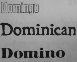
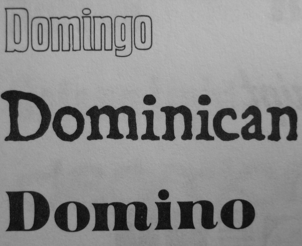
Dominican can be called a coffee bean bag font. For a digital version, see a font by that name due to Harold Lohner.
|
|
|
|
|
|
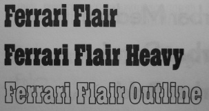
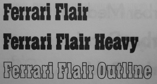
Not afraid of trademarks, many fonts in the FotoStar collection have
famous brand names. I especially like the ultra-slabbed ferrari family.
|
|
|
|
|
|
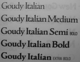
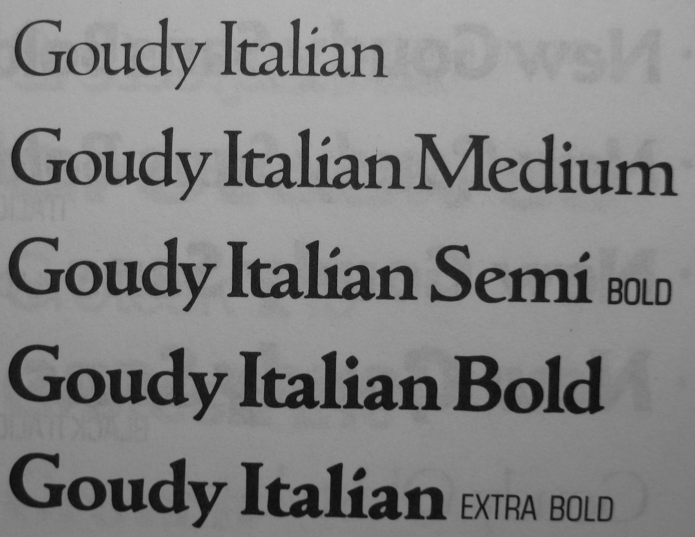
There is a lot of Goudy in the collection, always stylish.
|
|
|
|
|
|
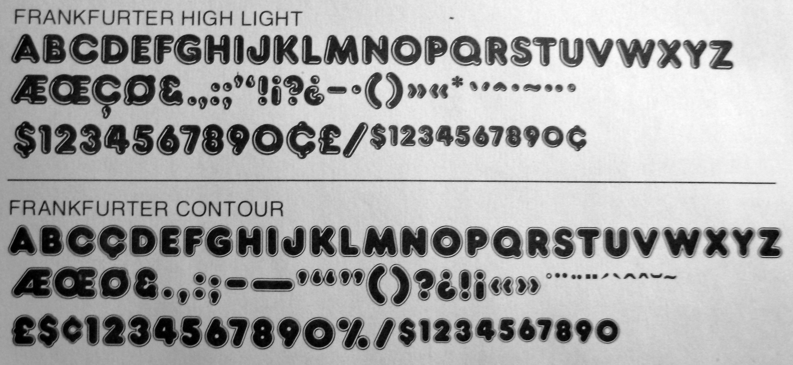
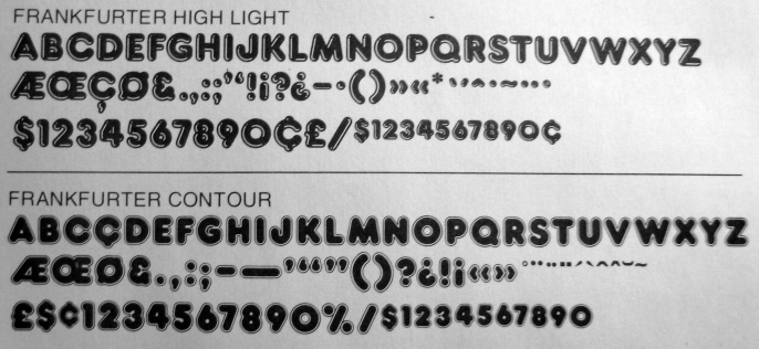
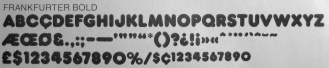
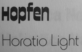
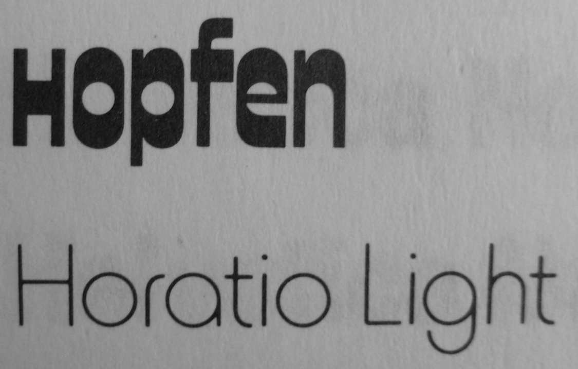
Bob Newman
is most famous for his Data Seventy (1970, Esselte/Letraset), a display typeface that emulates the shapes of the early computer types [see Data EF at Elsner and Flake, and for a free knock-off, Westminster]. Other designs of his include Odin and Frankfurter (1970), [Linotype] Horatio (see also Horatio Light at Elsner & Flake), and Pump [EF and Linotype versions]. Not to be outdone, URW has a 1994 clone of Horatio, HoratioDMed.
|
|
|
|
|
|
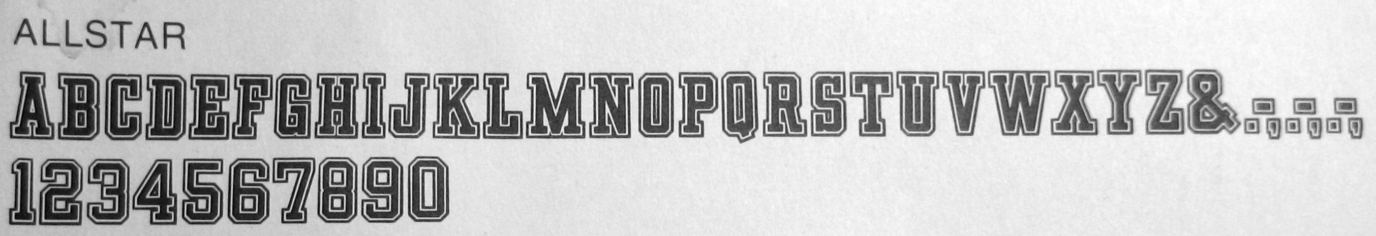
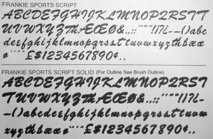
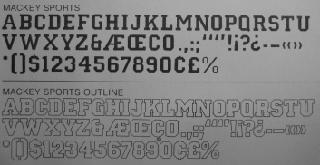
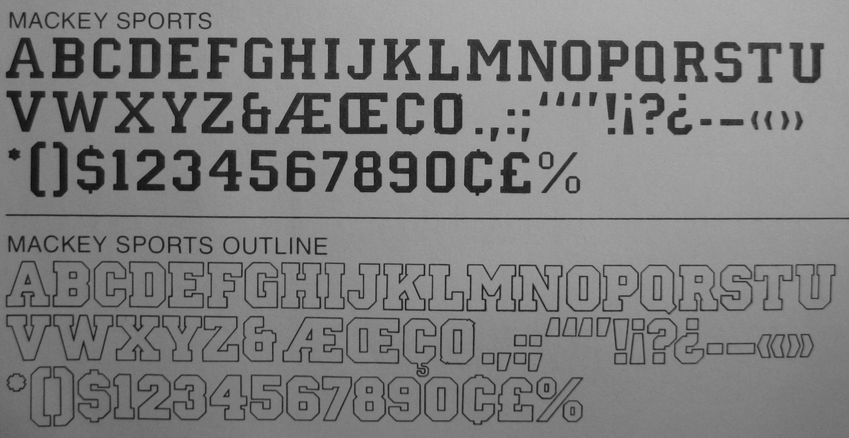
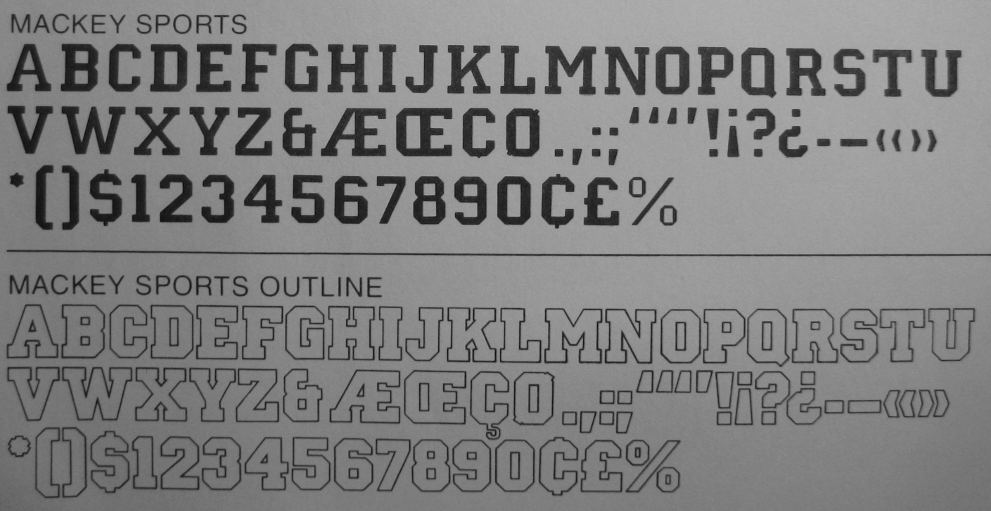
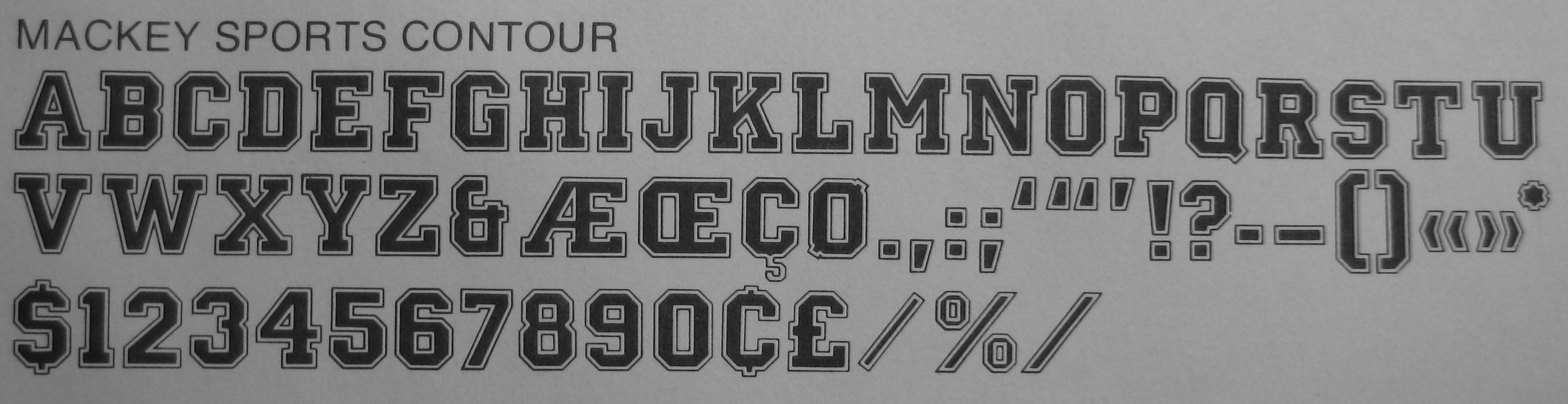
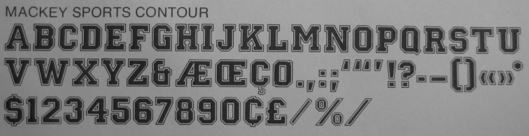
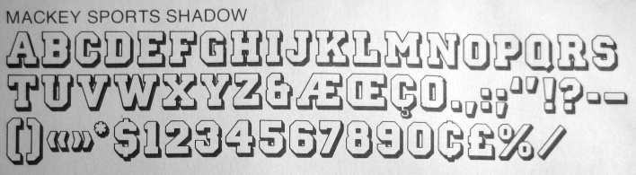
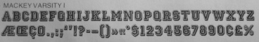
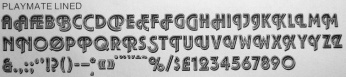
Mackey is a versatile sports lettering type family.
|
|
|
|
|
|
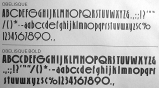
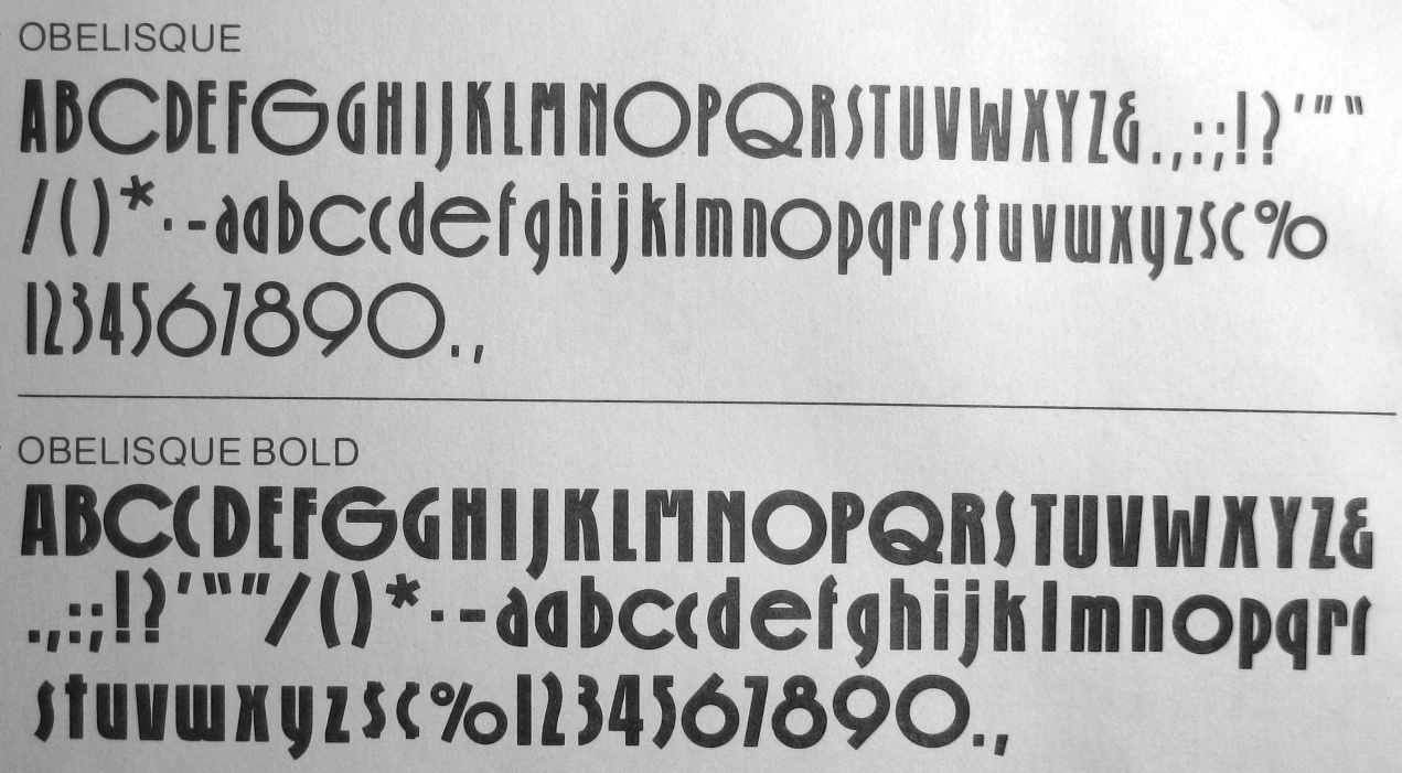
Obelisque is more Lubalinish geometry.
|
|
|
|
|
|
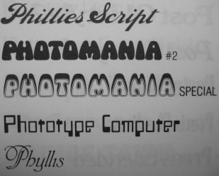
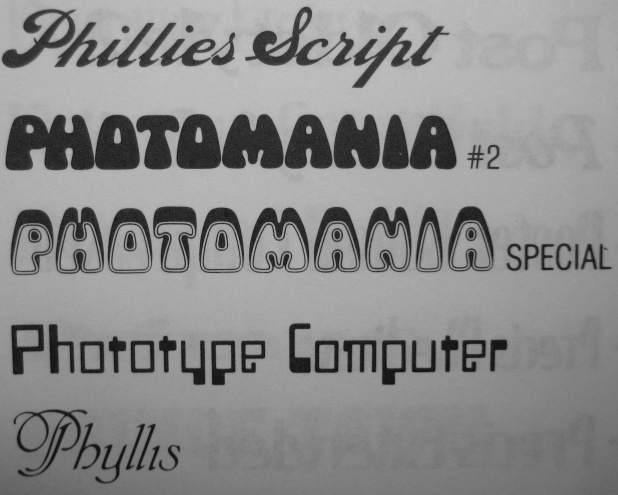
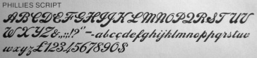
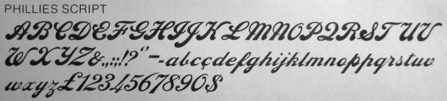
Phyllis Script was made in 1911 by Heinrich Wieynck
for the Bauersche Giesserei.
It has many digital versions and is sometimes called Wieynck Kursio.
Notable implementaions were done by Miles (later Agfa and then Monotype)
and by URW.
|
|
|
|
|
|
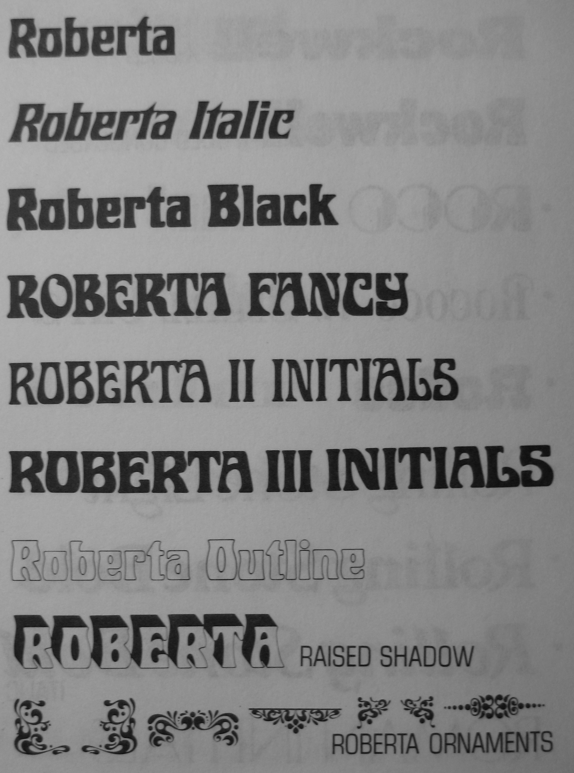
Trogman explains to Harold Lohner about Roberta: I originally hand cut this font in 1962. It is based on a Belgian restaurant sign. I named it after my daughter Roberta. Many Mexican food companies used this font, but they didn't know it was from Europe. Dan Solo was going to digitize it for me, but he retired from the font business last year. Just give me credit for the design and it is all yours to do what you want.
Roberta D was remade by Ralph M. Unger in 2003 for URW. Trogman, however, is upset with URW: URW++ has been warned by me to stop selling typefaces I originally licensed to Berthold Fototype, Stempel, Bitstream, Mecanorma and Letraset. They have never responded to my accusation of piracy.
|
|
|
|
|
|
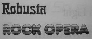
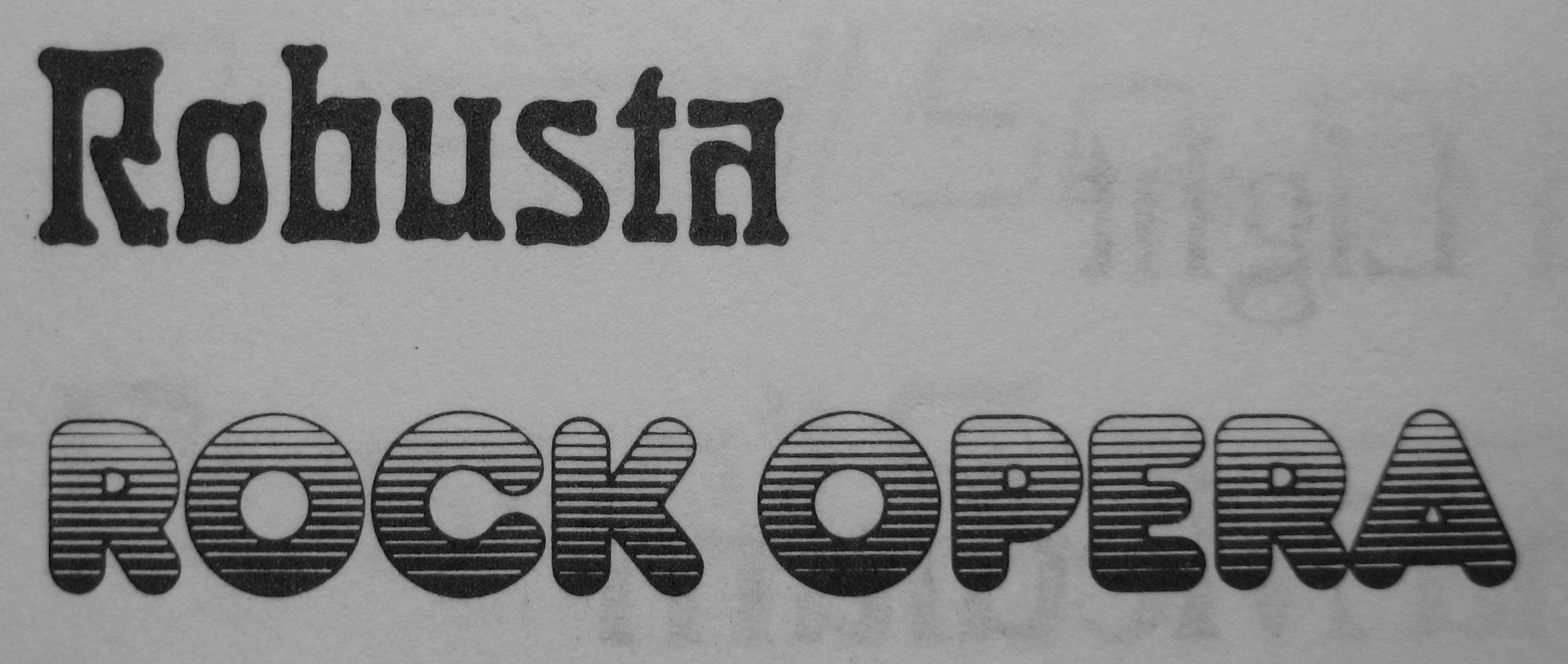
Robusta is an art nouveau face of the Benjamin Krebs foundry.
|
|
|
|
|
|
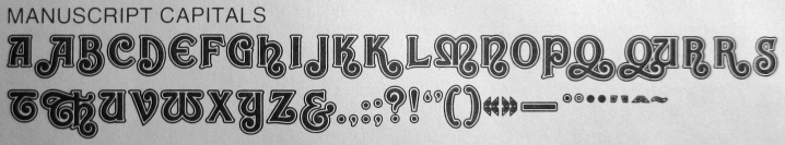
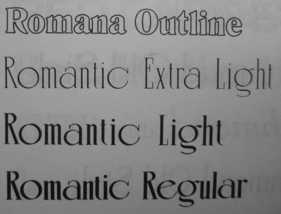
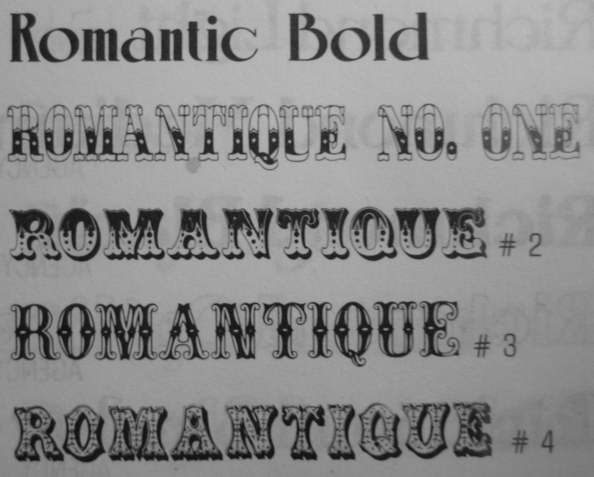
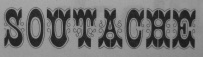
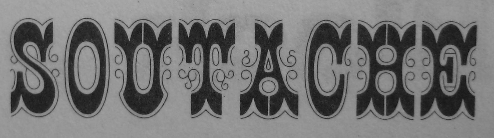
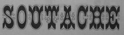
Romantique No. 1 through No. 5 are Victorian decorated capitals typical of many French foundries in the 19th cenrtury, such as Fonderie Française.
|
|
|
|
|
|
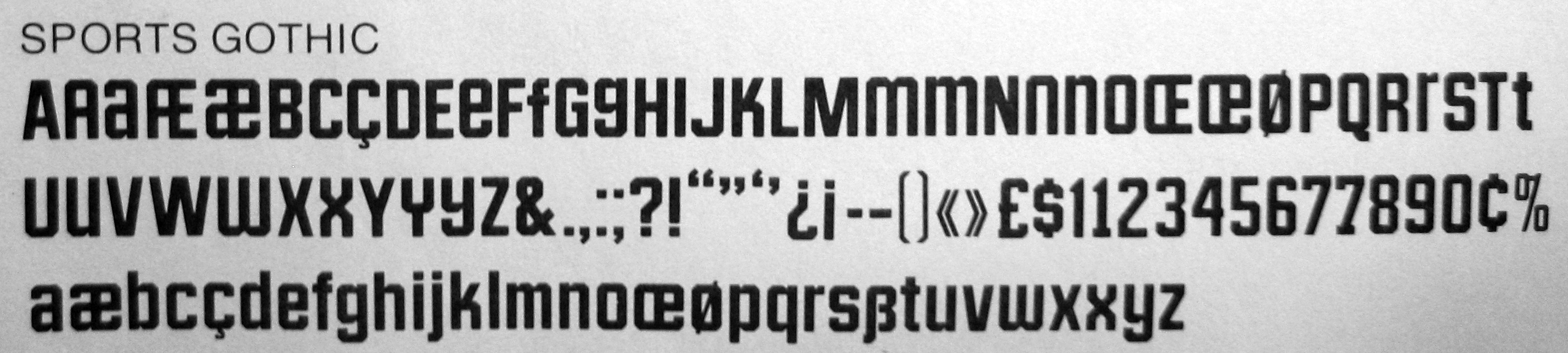
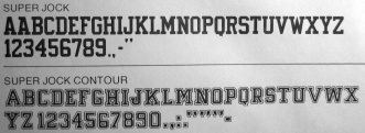
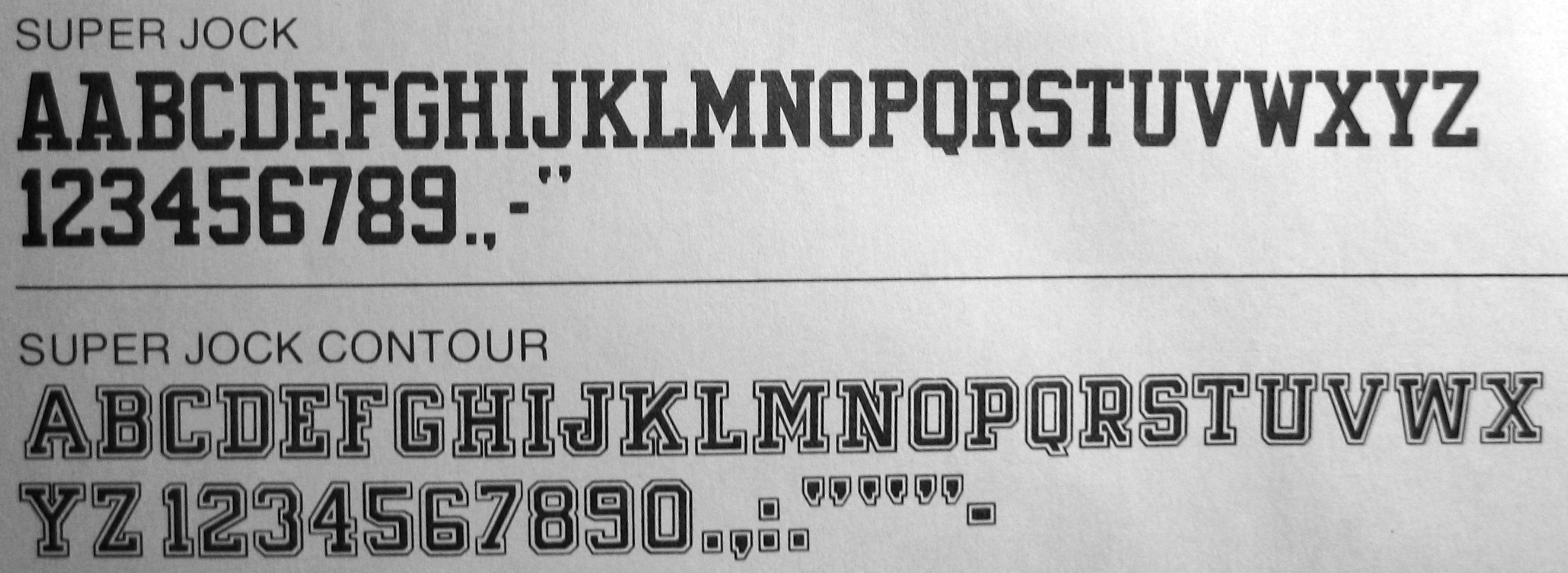
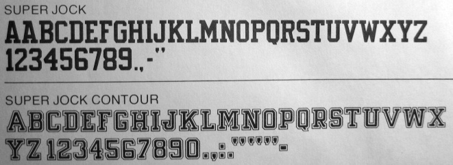
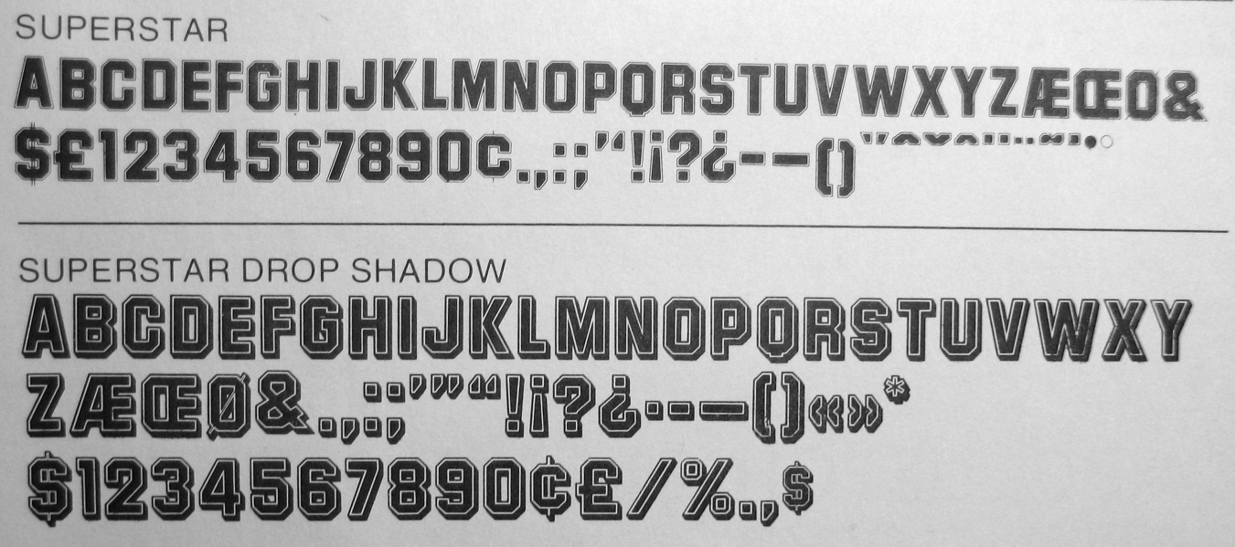
SuperJock and SuperStar are just two of the many typefaces suitable
for athletic lettering. See also the large Mackey Sports family.
|
|
|
|
|
|
Everyone recognizes in Yagi the CNN logo font.
|
|
|