
Commentary
December 16, 2002
Hansen Type Foundry
History

When the American Type Founders consolidation was organized in 1892, there were five type foundries in Boston, the Dickinson Type Founders, Boston Type Foundry, New England Type
Foundry, Curtis & Mitchell Type Foundry, and the H. C. Hansen
Type Foundry. The New England and Curtis & Mitchell
foundries soon disappeared. The Dickinson and Boston foundries were absorbed
by ATF. And that left just one independent foundry, H.C. Hansen.
H.C. Hansen brought his two sons, L. A. and H. Alfred Hansen,
into the business.
They published many catalogs and specimen books, the main one
being
"A book of types, borders, ornaments, brass rule, printing materials and the like for printerdom" (1909).
Maurice Annenberg writes about it:
"Their type catalog of 1909 is rated one of the best that has ever been produced, comparable to the American Type Founders Company and Barnhart Brothers & Spindler."
Unfortunately, H.C. Hansen was dismantled around 1922.
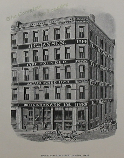
The H.C. Hansen Type Foundry was located in Boston
and existed from 1872 until about 1922.
Hansen was born in Norway in 1845,
went through a mechanical schooling in Norway,
Denmark, Germany and England, before arriving
in Boston in 1868 to work for the Dickinson Type Foundry.
He remained there until 1872, the
date of the big Boston fire, when
Dickinson and all other foundries
of Boston were destroyed.
Hansen worked very hard and his mechanical
training and sharp mind allowed him to start
a foundry by the end of 1872.
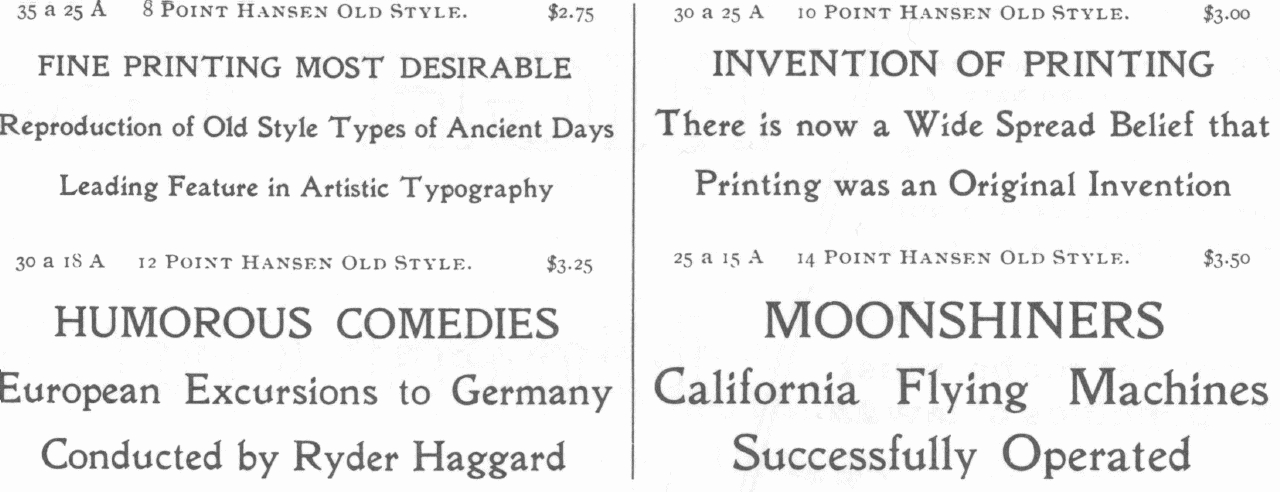
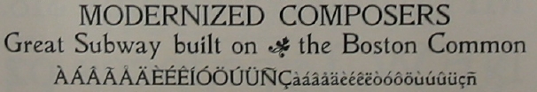
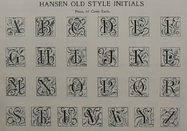
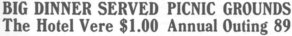
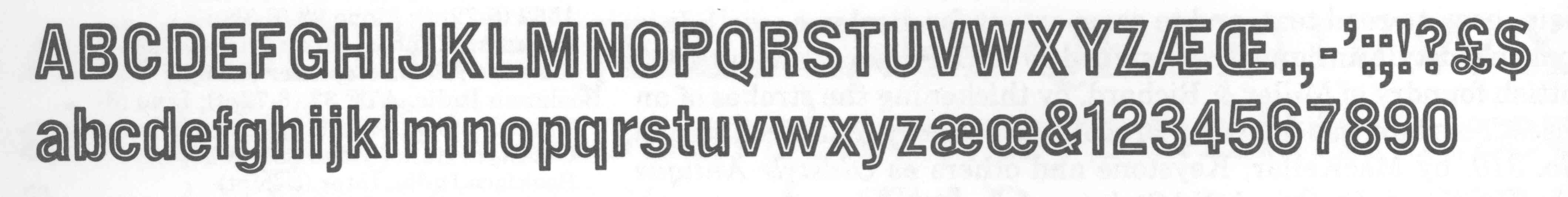
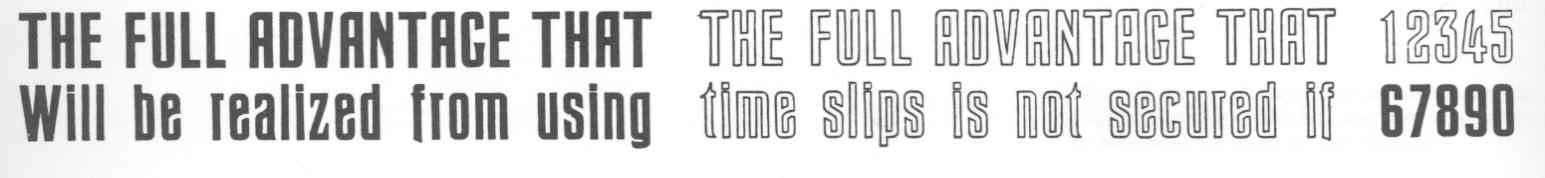
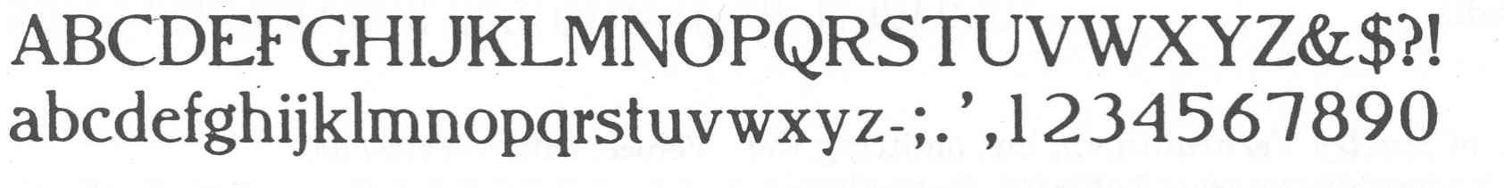
Hansen OldStyle
Hansen Old Style. Hansen Old Style. Hansen Old Style Initials.
The Hansen catalogs have most of the standard typefaces,
and quite a few original faces. With a few exceptions,
these faces are small modifications of
existing typefaces. We will list a few of them
on this page.
The only face with their name explicitly attached to
it is Hansen Oldstyle.
Mac McGrew writes about this:
"Hansen Old Style No. 30 was basically the same as Jenson, but had
pointed serifs instead of square ones. The roman appeared early in the century,
the italic about 1909. Hansen Old Style No. 40 is a duplicate of Jenson."
Some samples of that family are shown here.
Buffalo
Buffalo has wood type influences.
Citing Mac McGrew:
"Buffalo was the Hansen Type Foundry's answer to such popular boldface
types with irregular edges as Blanchard, Post, and Roycroft, introduced in
1902 or earlier, including an Outline version. Buffalo Italic was shown in
1903; it is quite similar to Blanchard Italic, especially in the lowercase. The
specimen shows an apparent duplicate cast by Kelsey when that supplier had
its own typefoundry."
Buffalo Italic. McGrew writes: "Buffalo Italic was shown in 1903; it is quite similar to Blanchard Italic, especially in the lowercase. The specimen shows an apparent duplicate cast by Kelsey when that supplier had its own typefoundry." Buffalo Condensed. Buffalo Outline. Poster Buffalo


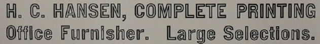
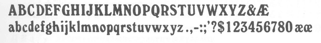
Boston Gothic
Boston Gothic.
McGrew writes:
"Boston Gothic is an inline version of Medium Gothic No.7, which was
produced by Hansen in 1903 or earlier as a copy of Mid-Gothic. The solid
form is reasonably good in a commonplace sort of way but the inline is
awkward in places." Boston Italic.
According to McGrew,
Boston Italic is an inline version, produced by Hansen in 1909, of
Gothic Italic, which Hansen copied earlier from Doric Italic. Boston Gothic in action.

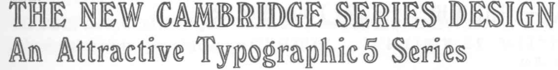
Cambridge
McGrew writes:
"Cambridge was Hansen Type Foundry's copy of Windsor Condensed,
drawn early in the century by Elisha Pechey for the Stephenson, Blake
foundry in England."
McGrew's comments on New Cambridge:
"New Cambridge, cut in 1909, was an inline version of the
same face, apparently originated by Hansen. Some other versions of Windsor
are shown under Popular Imports in the Appendix."
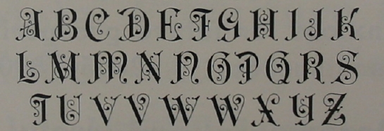
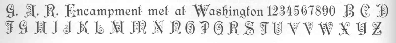
Congress
McGrew writes:
"Congress is a fancy face shown by Hansen in 1909 or earlier. It was sold
as fonts of initials, caps only, for which it seems more suited, or as complete
fonts with lowercase, figures and points."
In 2007, a digital version of Congress was crafted by Nick Curtis:
Filibuster NF
(2007).
Copperplate Roman
An interesting case, this Copperplate Roman. It is very
different from any other Copperplate Roman, and is a true Hansen
original.

Fourteenth Century
Fourteenth Century is a one-weight typeface produced around 1909.

Hampton
Hampton (ca. 1908) is similar to John Hancock but it has pointed instead of square
serifs.

Heading
Heading and Heading Outline.
Hunnewell
Hunnewell was produced by Hansen Type Foundry in 1907 or earlier.
According to McGrew, it
is very similar to Cushing No.2, but the roman lowercase is a little
narrower.
Lafayette Text
McGrew writes:
"Lafayette Text was shown by Hansen in 1908. It is very similar to
Engravers Old English, differing most noticeably in the fine vertical line that
drops below the base line in some of the capitals.
Engravers Old English is a plain, sturdy rendition of the Blackletter style, commonly known as Old English. It was designed in 1901 by Morris
Benton and another person identified by A TF only as Cowan, but has also
been ascribed to Joseph W. Phinney. It is a modernization of Caslon Text, and
has been widely used. Engravers Old English Open was produced by ATF in
1902. Sidney Gaunt designed Engravers Old Black, very similar to Engravers
Old English, for BB&S in 1910, but BB&S later produced Engravers English,
a copy of Engravers Old English. It has also been copied by Intertype, and by
Ludlow as Old English. Hansen's Lafayette Text (q.v.) was very similar.
Engravers Old English Bold was designed by Morris Benton for ATF in 1910.
The unfamiliar characters of Old English types are often misused, and the
alternate forms of some letters add to the confusion. I and J are particularly
subject to mix-up, because they were originally the same letter, and never
developed as definite a distinction in these styles as in roman letters. In
Ludlow Old English, cap I is comparable to the one in the Bold weight, but
this style has not been found elsewhere in the regular weight. Curiously, in
the Engravers Old English Bold specimen shown [in McGrew's book], the letters appear as the
Monotype copy presents them; however, Monotype's I and J are respectively
the second and first forms of I as originally designed, while the specimen here
[in McGrew's book] shows separately the original foundry J, which Monotype does not make,
along with the alternate H.
Compare Wedding Text, a similar design in lighter weight; also Cloister
Black; Shaw Text; Lafayette Text."

Masterman
According to McGrew agin:
"Masterman was put on Monotype in 1909, but it originated with Hansen
some time before that. It is a modification of earlier faces known generally as
Title before type names as we know them became common, and is similar to
some of the faces in the Engravers and Litho families (q. v.). The characters
have high contrast, and lowercase has fairly long ascenders. The basic character is a plain, severe roman shape. It was popular as an early advertising
display face.
Mastodon
This seems to be a Hansen original.

Stratford Old Style
Stratford Old Style is Hansen's version of the Old Style Antique
face which was the predecessor of Bookman, but has different swash characters from other versions.
McGrew writes:
"Bookman Old Style has become a lastingly popular "workhorse" design for plain, easy-to-read text, and to some extent for display as well. It is
derived from an oldstyle antique face designed by A. C. Phemister about 1860
for the Scottish foundry of Miller & Richard, by thickening the strokes of an
oldstyle series. This face was copied by Bruce Type Foundry in this country as
Antique No. 310, by MacKellar, Keystone and others as Oldstyle Antique
(q.v.), and by Hansen as Stratford Old Style (q.v.). In 1901 Bruce brought out
Bartlet Oldstyle, based on the small sizes of their older face, refitted and
otherwIse Improved. In that year Bruce was taken over by ATF, which
thought well of Bartlett but changed the name to Bookman Oldstyle; it was
cast at the Bruce foundry under both names until the plants were actually
combined in 1906."
Stratford Old Style in action.


Tokio
McGrew mentions that Tokio
was copied as Romantic by the Universal Typefoundry in Hong
Kong. The specimen shown here is Romantic.
University Old Style
McGrew:
"University Old Style was issued by Hansen in the early to mid-1910s. It is very similar to ATF's Century Oldstyle, differing most apparently
in the serif treatments of CEFG and details of ags in the roman and CGg in
the italic."

Vertical Script
McGrew:
"Vertical Script is a simple-almost childish-monotone upright
script design, produced by Hansen in 1897. Although letters connect, they are
widely spaced. The Boston foundry of ATF introduced a similar Vertical
Writing, shown in 1897 and patented in 1898 by Joseph W. Phinney. Both are
oversize for the body, with kerned descenders."

Victoria Italic
McGrew writes:
"Victoria Italic
is a nineteenth-century design that retained its
popularity for many years, and has been made under several names by a number
sources. ATF's Central Type Foundry branch showed it as early as 1893,
in usual form without lowercase, but with several sizes on each of several
bodies in the manner of Copperplate Gothic. In 1898 the Pacific States Type
Foundry in San Francisco showed the face with lowercase as Pacific Victoria
Italic, and about the same time ATF showed Regal Italic with essentially the
same lowercase. Victoria Italic without lowercase has also been shown by
Keystone and Hansen, as well as Monotype and Ludlow. It is a wide, monotone design with thin, pointed serifs, and was popular for a time for business
forms and stationery as well as general printing. Compare Paragon Plate
talic. Keystone also had Keystone Victoria, a similar upright design, without
lowercase."


Viking
McGrew:
"Viking was cut by John F. Cumming for Hansen in 1899. It is a medium-weight roman in a popular style of the day, with filleted curves within the
letters where strokes meet. Compare Mission."
Viking-Italic.

Obvious copies
Among the faces that Mac McGrew calls blatant copies,
he cites:
Copyright © 2002
Luc Devroye
School of Computer Science
McGill University
Montreal, Canada H3A 2K6
lucdevroye@gmail.com
http://luc.devroye.org