TYPE DESIGN INFORMATION PAGE last updated on Mon Jun 8 17:43:26 EDT 2026
FONT RECOGNITION VIA FONT MOOSE

|
|
|
|
|
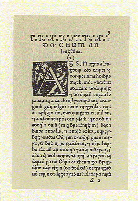
Type in Ireland | ||
|
|
|
|
SWITCH TO INDEX FILE
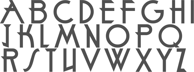
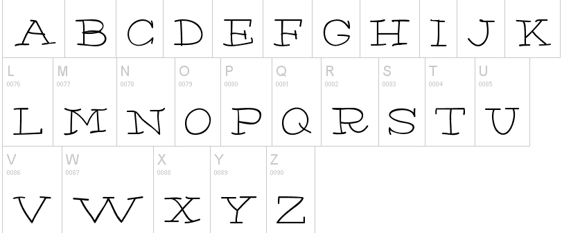
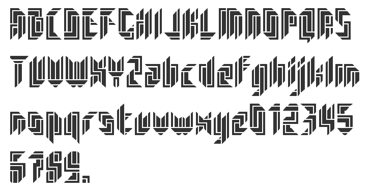
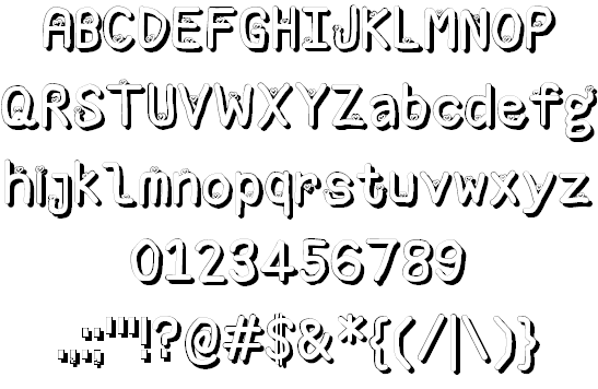
Aaron Patrick Ryan
| |
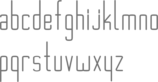
Digital artist from Limerick, Ireland. Devian tart link. At FontStruct, he created the ultra thin squarish typeface Lithe (2010). In 2011, he created the thread-themed experimental alphabet I Hate Thread. [Google] [More] ⦿ | |
Adult Human Male
|
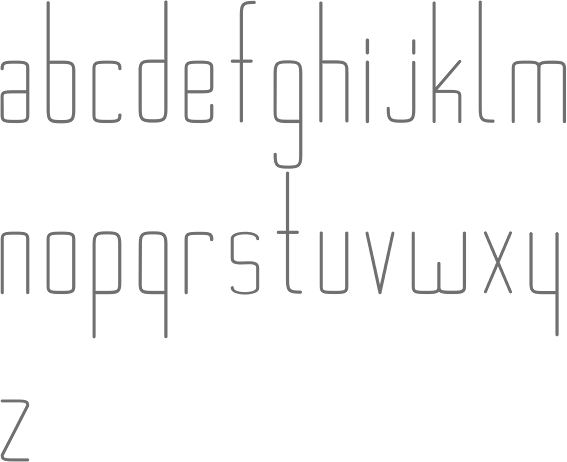
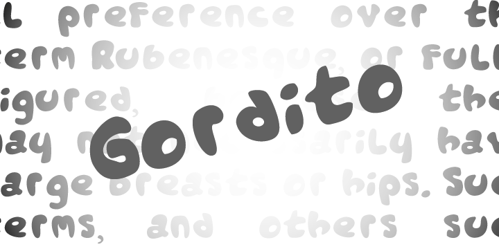
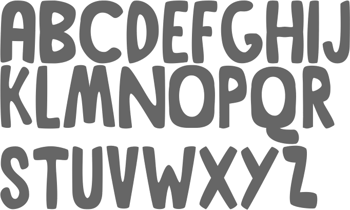
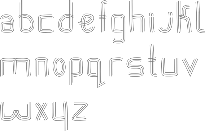
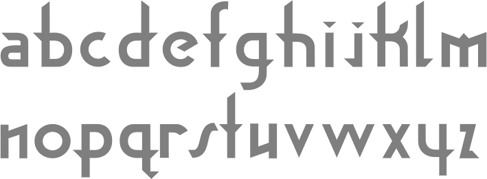
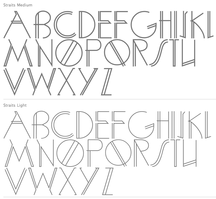
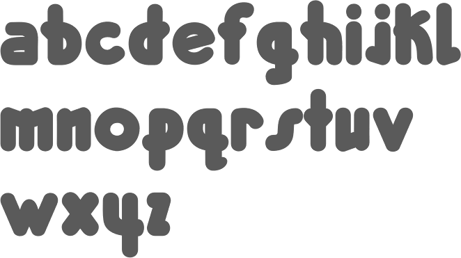
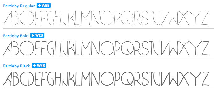
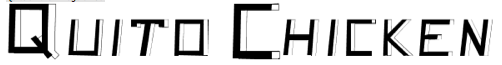
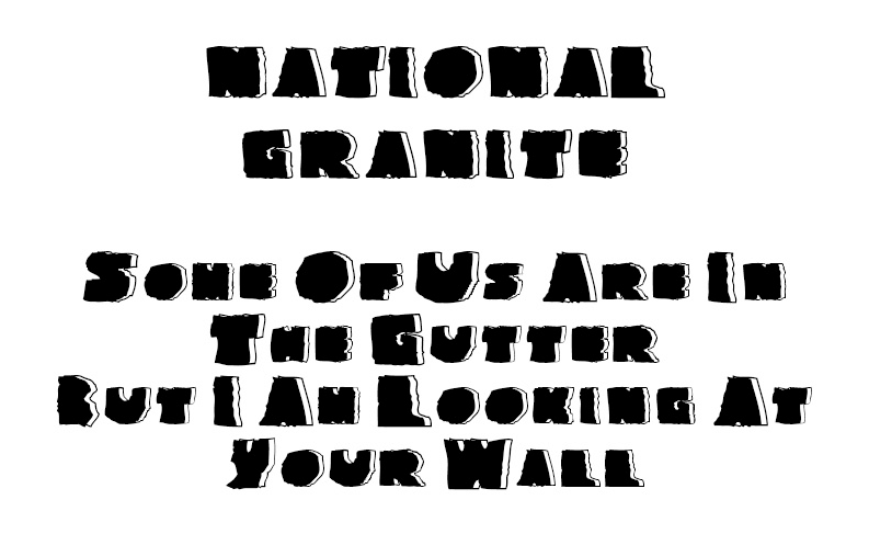
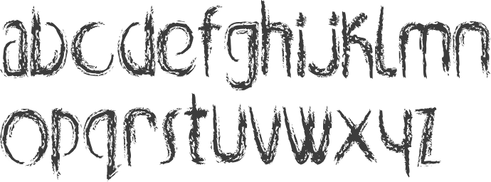
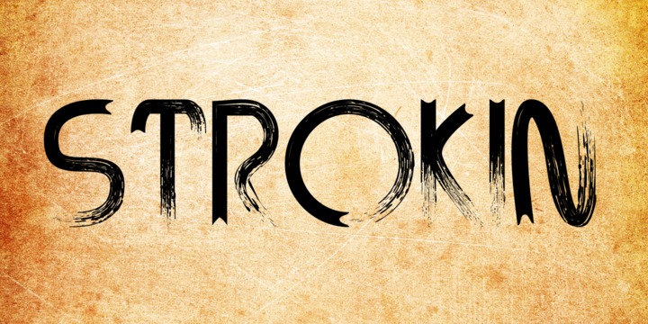
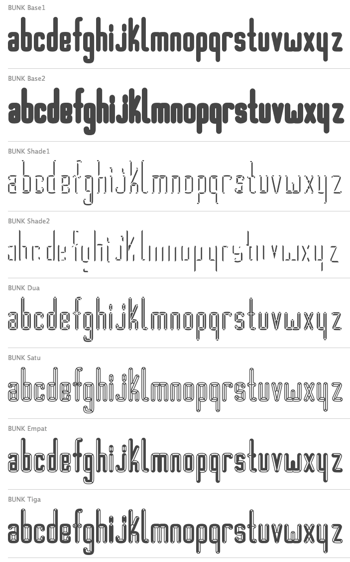
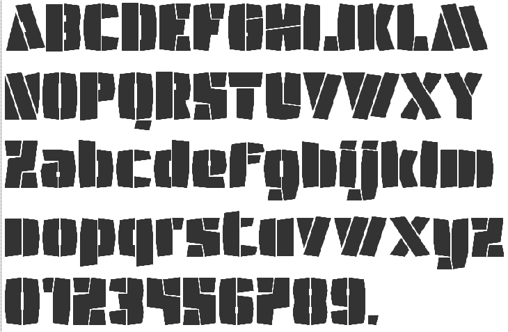
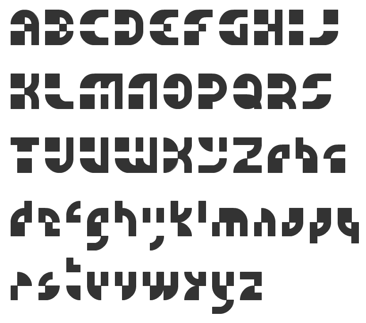
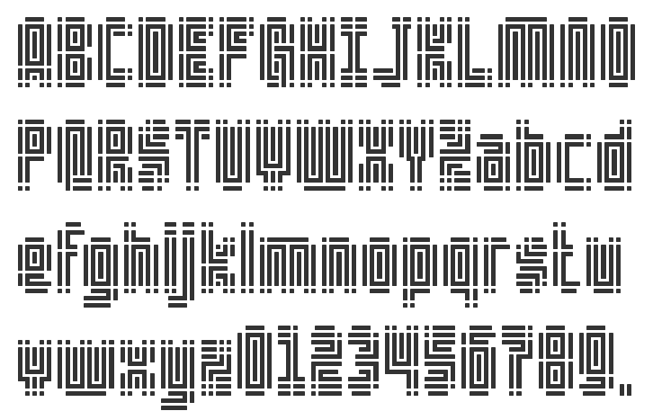
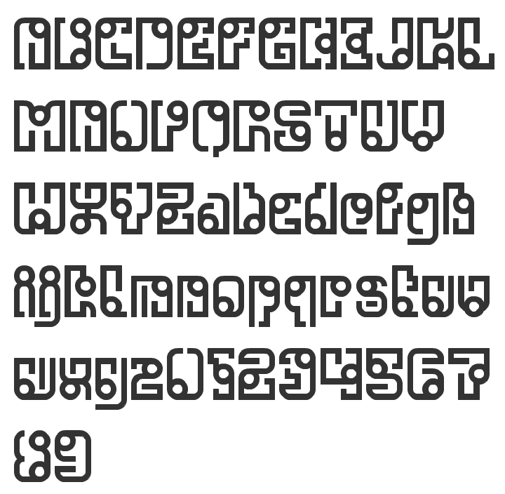
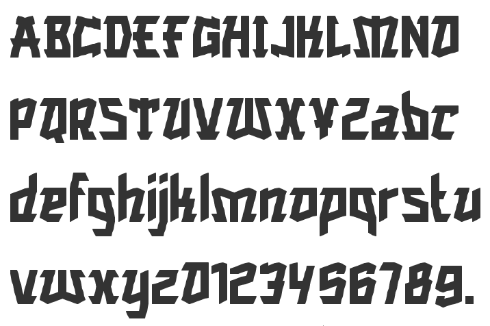
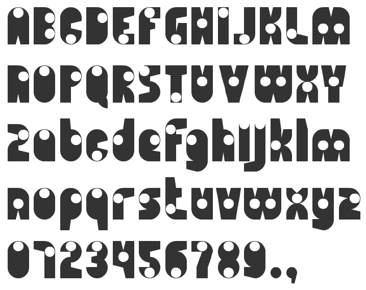
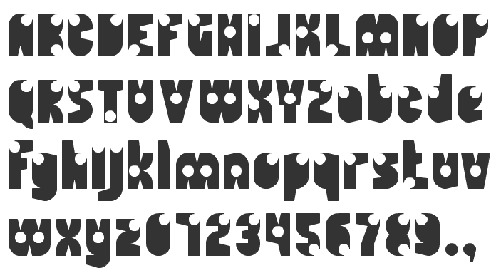
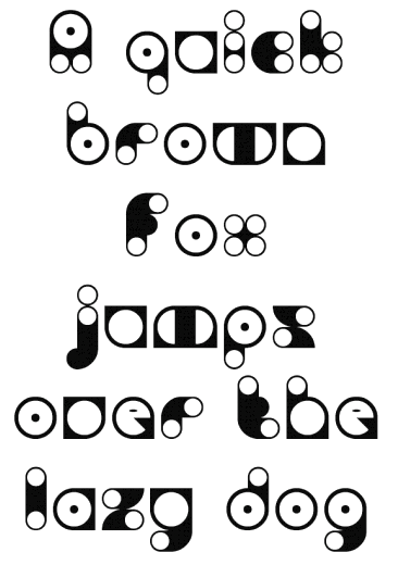
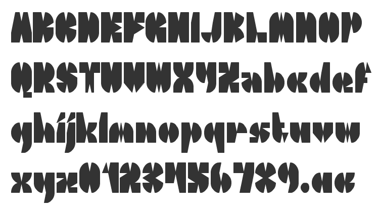
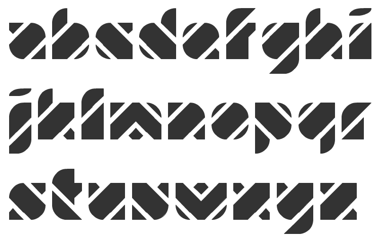
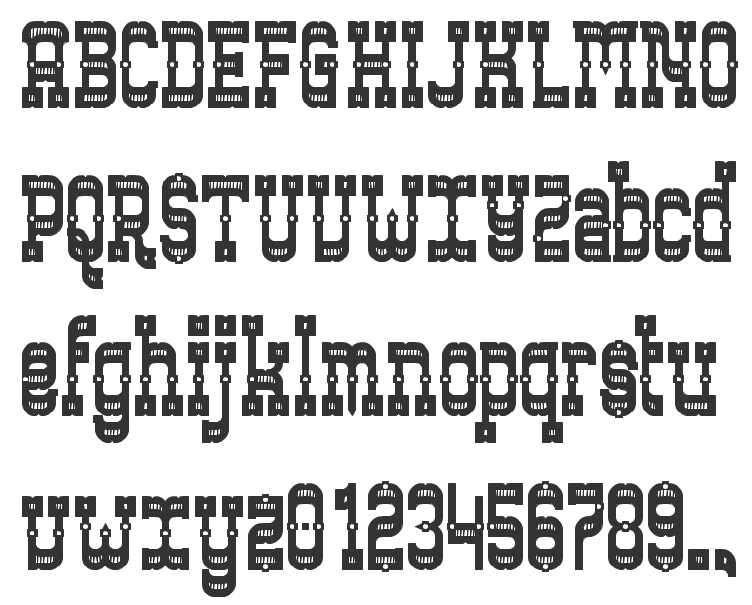
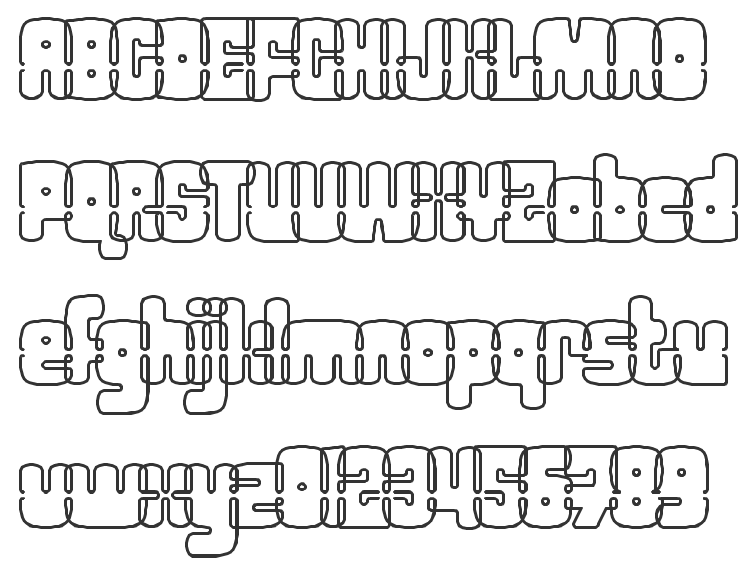
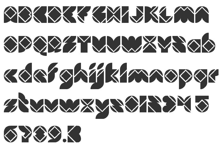
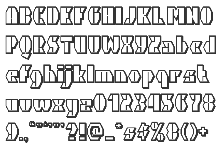
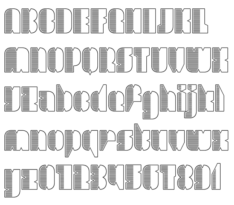
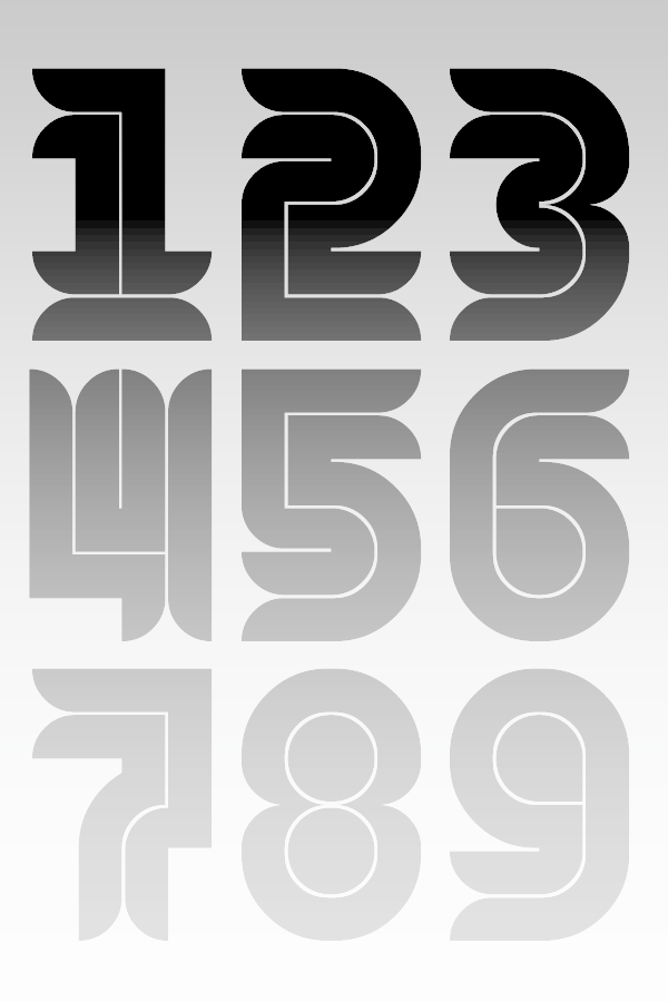
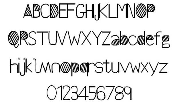
The commercial Alex created the grunge stencil typeface Butterworth (2011), the hand-drawn Teksi (2011), the monoline squarish family Ebdus (2011), Valis (2011, futuristic), and the thin avant garde monoline typeface New Slang (2011). Gordito (2011) is a graffiti style bubble font that says Smurf. In 2012, Alex published the poster caps typeface Areaman, Stink Lines (multilined typeface) and Penang (art deco signage typeface seen on Penang by the creator). Straights Light is a beautiful pair of bilined all caps typefaces. Dale Kids is a children's book typeface. Hokkien (2012) is an art deco typeface with Chinese influences. Mister Mustard is a chubby rounded art deco typeface. Barkley (2012) is a textured caps typeface with a chalk board feel. Liner Notes (2012) is a bilined hand-drawn typeface. Bartleby (2012) is a hand-drawn all caps display font. The free font foundry Squack has the hand-printed typefaces Barker Allcaps (2012), Scrapist (2012, sketched), Billy Boy (2011, 3d), Quito Chicken (2011, 3d), Fred Wild West (2011, a grungy western face), Coolock Black (2011), Zapftig (2011), Ringworm (2011), Suicide Draft (2011), National Granite (2011, a 3d stone chisel face), Whiskey Fingers (2010), Wank Hands (2010) and Middle Man (2010), and the irregular typefaces Zapftig (2011), Shock Corridor, Pollo Asado, Middle Woman, Ghost Words, Late Puberty, Parrannoyed (2010, ransom note face), the hairline typeface Rexic (2011), Black Grapes (2012), Chump (2012, hand-printed capitals), Areman OT (2012), and the grungy Skidmarks (2012). Typefaces from 2013: Salas (a chunky cartoon face), Rabid (a crayon font), Strokin (a great brush face---part charcoal part paint strokes), Bevel Hands, Bunk (a layered beveled type system absed on a monoline fat rounded sans, Bunk Base 2), Spengler (inline face), Vastra (Bauhaus style, organic), Swingers (curly and cartoonish), Chump Change, Treves Sans (crayon face), Quincey (2017). We read that the fonts are designed by EircomTest. Aka Squack, MiddleMan and Alex H. Dafont link. Creative Market link. Twitter link. Behance link. [Google] [MyFonts] [More] ⦿ |
During her studies in Limerick, Ireland, Agata Kociubajlo designed the Galaxy font (2012, FontStruct). [Google] [More] ⦿ | |
Dublin, Ireland-based designer of the manicured display typeface Femmina (2016). [Google] [More] ⦿ | |
In 2017, he designed the commercial typefaces Lagu Sans and Lagu Serif, which feature large x-heights and open counterforms. Typefaces from 2020: Pani Sans (which takes inspiration from Italian rationalist and art deco genres, and includes variable types). Open Font Library link. Fontspring link. Fontown link. [Google] [MyFonts] [More] ⦿ | |
Alex Hy
| |
Dublin-based creator of the roman Gaelic typeface Hogan (1891). He also made the Gaelic Modern round typeface Petrie C (also known as Thom) ca. 1856. [Google] [More] ⦿ | |
Dublin-based creator of the pixelish typeface Personal (2013). [Google] [More] ⦿ | |
During her studies in Limerick, Ireland, Amy O'Donnell created Gothic Steeple (2013, FontStruct) and Flying Buttress (2013, FontStruct). [Google] [More] ⦿ | |
Andreas Stötzner
| |
Dublin, Ireland-based creator of a custom sans typeface for the Memento Circus Museum in 2013. In 2015, he designed the DIN-like typeface Persona. Behance link. [Google] [More] ⦿ | |
Andrew Walsh
| |
Andrzej Poniatowski (Dublin, Ireland) created the bitmap typeface Prototype (2012). [Google] [More] ⦿ | |
During his studies in Dublin, Ireland, Andrzej Wasilewski designed the decorative caps typeface Asymmetrical (2017). [Google] [More] ⦿ | |
Dublin, Ireland-based designer of the floral typeface Overgrown (2013). [Google] [More] ⦿ | |
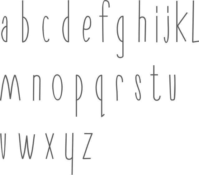
She designed Magnimo while at Reading. Aoife writes: from the Latin Magna, meaning great or large, and the Indic Anima, meaning spirit or soul. Magnimo is a big-hearted typeface with many moods and voices. I am quite impressed by this three-style typeface (Regular, Italic, Upright Italic), which, with its lively angular design, seems just right for green party and energy drink magazines. All the extra features expected of a 2010 typeface are there, including a matching and nicely balanced Greek, and coverage of most European diacritics. Additional scans: i, ii, iii. In 2016, she published the free Google Font family BioRhyme (+Expanded). See also Open Font Library. Speaker at ATypI 2016 in Warsaw on Synoptic Translations. Speaker at ATypI 2017 Montreal, where she entertained the crowd with socially relevant typography and type for dissenting voices. Speaker at ATypI 2018 in Antwerp. [Google] [More] ⦿ | |
In 2016, he designed the blocky ultra-fat typeface Blammo. Another download link. Behance link. [Google] [More] ⦿ | |
Arys Design
| Graphic designer in Dublin, Ireland. His typefaces in 2014 include Tipsy Script, Sketch Up, Woods Woods, Chiply Script, Exuber (a condensed didone), Coplex, Adelaide, Denise, Amalia (a condensed formal script), Paradise (a ronde script), Aberdeen (a vintage handmade typeface) and the extensive typeface family Vernon Sans. In 2015, he created Broondy Serif (a didone typeface with wedge serifs), Volare (vintage family), Ellington, Adamina Script (a sturdy connected signage script). Creative Market link. [Google] [More] ⦿ |
| |
Barlow type
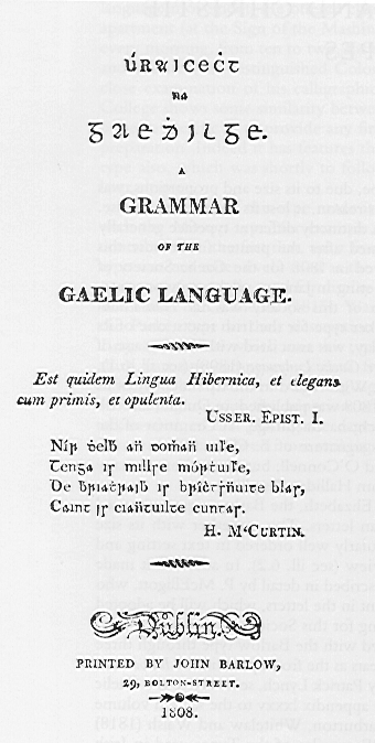
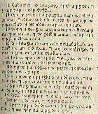
| Early transitional Gaelic typeface prepared by the Gaelic Society of Dublin in 1808-1821, which, just as the very early Queen Elizabeth type, used some roman characters, in part to draw in people to study the Irish language. Sample from a grammar book published by John Barlow in 1808. [Google] [More] ⦿ |
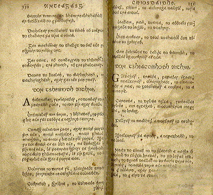
Irish guardian of a Franciscan monastery in Louvain, Belgium, where he died in 1614. He is credited with the first authentic Irish character type, the Louvain type. Brendan Leen writes about him: "One of a group that had sought refuge on the continent of Europe in the aftermath of the pillage of a Donegal monastery in the late sixteenth century, Bonaventure O Hussey entered the Franciscan monastic college at Louvain, Belgium, on 1 November 1601 and died as its guardian on 15 November 1614; it is for the printing of An Teagasc Criosdaidhe by O Hussey that the first authentic Irish type was cut. On 15 April 1614, O Hussey had petitioned for permission to print Irish material at Louvain." Another sample of Louvain. [Google] [More] ⦿ | |
Brendan Leen
| |
Creator of Yafit (2013), a Celtic /uncial/ gaelic / insular typeface. [Google] [More] ⦿ | |
Graphic designer from Ballina, Ireland, b. 1995.He made a basic geometric typeface called We Have A Future (2010). Devian Tart link. [Google] [More] ⦿ | |
During her studies at Limerick School of Art & Design, Ennis, Ireland-based Cassandra Walsh created a few typefaces over at FontStruct. These include Arkular (2014, octagonal) and Seeing Double (2014, bilined). [Google] [More] ⦿ | |
Celtic Fonts by the Celtic Lady
| Original Gaelic fonts. Designer Susan Kathryn Zalusky sells California Uncial for 20 dollars. She also gives away for free a simple Gaeilge (Irish Celtic) font, Celtic Gaelige UNICODE (1997). [Google] [More] ⦿ |
Dublin-based typographer, and creator of the modern angular Gaelic typeface Reed (ca. 1874), modeled after Newman. [Google] [More] ⦿ | |
During her studies at National College of Art and Design (Dublin, Ireland), Chloe Ryan designed Laundromat Mobile (2017, FontStruct). FontStruct link. [Google] [More] ⦿ | |
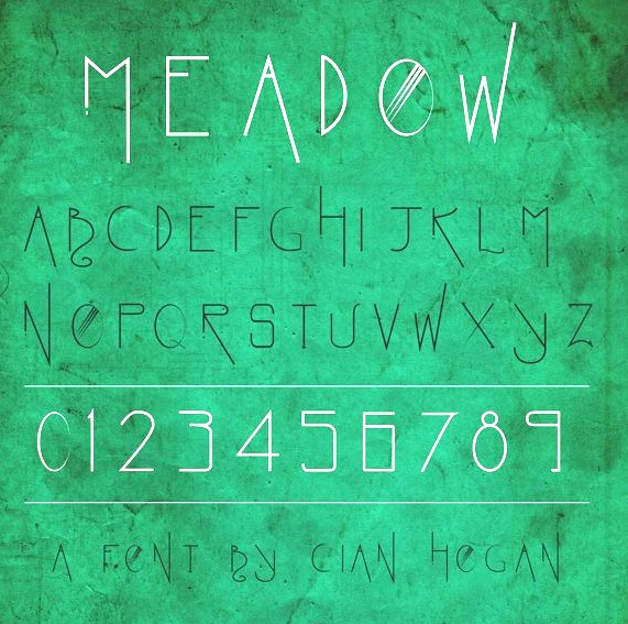
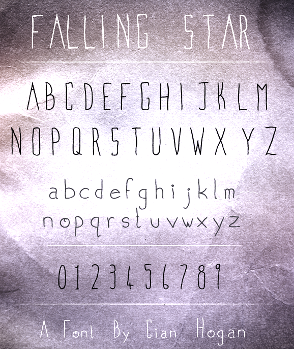
During his studies at SDublin City University, Galway, Ireland-based Cian Hogan designed Meadow (2013) and Falling Star (2013, hand-printed). Behance link. [Google] [More] ⦿ | |
Gaelic fonts for Windows expertly categorized and explained by Ciarán Ó Duibhín. A great jump page. One can find opinions on choices of fonts. For example, on the choice of a Gaelic uncial, we find this paragraph: I find it useful to classify uncial fonts on a three-point scale of ornateness. The fonts at each point may then be compared on the extent to which their unciality is affected by minuscule or by Latin influences. | |
Irish designer of the ultra-fat modular typeface Blockage (2010, FontStruct). [Google] [More] ⦿ | |
Clare Bell received a BA degree from Central Saint Martins College of Art & Design in London in 1999 after working as a designer in Dublin for eight years. She also worked in the design department of the Guardian newspaper for five years before returning to Dublin where she is undertaking a PhD entitled Typography, Culture & Society: An analysis of the visual representation of the Irish language in Northern Ireland at the Dublin Institute of Design and Technology, where she is a typography tutor. At ATypI 2005 she spoke on Typographic tales from the edge of empire, and deals mainly with the story of uncial, from the Book of Kells to present day murals in West Belfast. She co-organized ATypI in Dublin in 2010. Currently, she is Associate Researcher at the Graduate School of Creative Arts and Media. Speaker at ATypI 2018 in Antwerp. [Google] [More] ⦿ | |
John Kearney was a typefounder from Dublin (?) who, some time in the period 1571-1658, made the Gaelic typeface Queen Elisabeth. A draft digitization by Cois Life is mentioned. [Google] [More] ⦿ | |
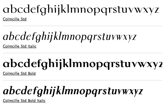
Typographer and printer who in 1926 founded Three Candles Press, b. Dublin, 1892, d. 1972. Creator of the typeface Baoithín (1932), based on Victor Hammer's Hammerschrift. Digitized as Loch Garman (1999, with Michael Everson). He and Karl Uhlemann are responsible for Colum Cille, a modern round Gaelic typeface named after the sixth-century Irish saint, Colmcille (1936, Monotype Series 121, see here). Digitized in 1993 by his son Dara Ó\0Lochlainn, it is now available from Monotype. Colum Cille (or Colmcille) was not commercially popular. Three Candles, the only printing press to offer the typeface, went under, and Irish typography came to a halt until the digital age. Linotype link. FontShop link. [Google] [More] ⦿ | |
Con Kennedy (Dublin, Ireland) holds a Masters Degree in Professional Design Practice and a Bachelors degree in Design & Visual Communications both from the Dublin Institute of Technology. He has worked for a number of high profile creative agencies befdore starting his own graphic design studio. He created some free original Irish fonts, such as Cinnéide, Oireachtas (1997), Uachtar´n (1997), Uachtar´n Outline, Uachtara´ Sans, and Uachtar´n Fade. In 2014, he created the wide typeface Vector Sans. Klingspor link. Behance link. [Google] [More] ⦿ | |
Conor Design
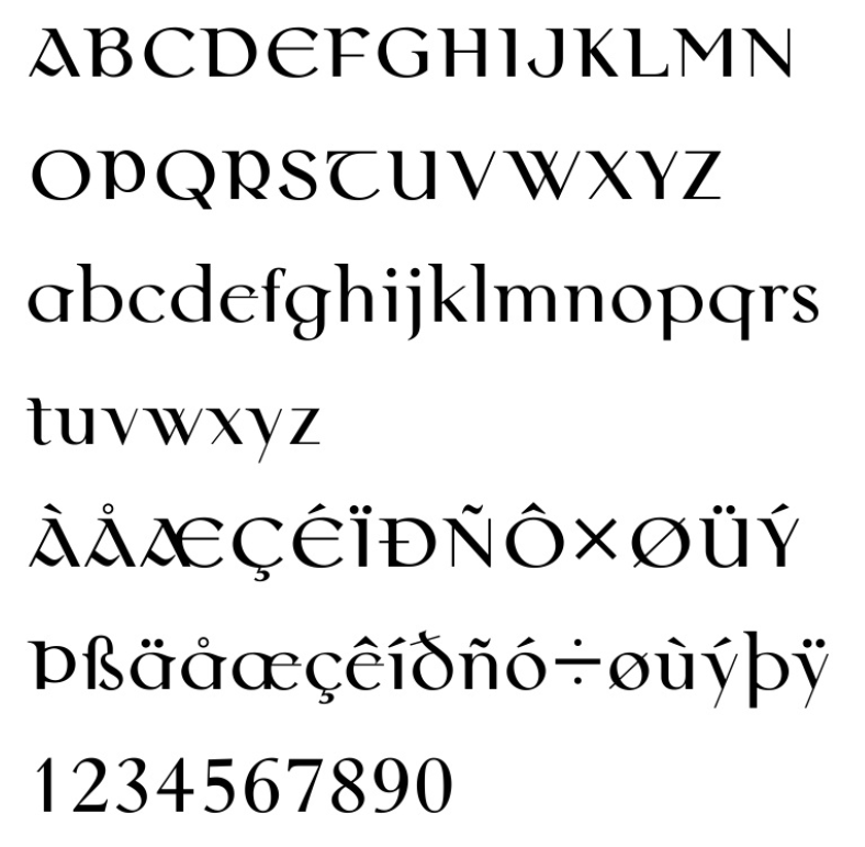
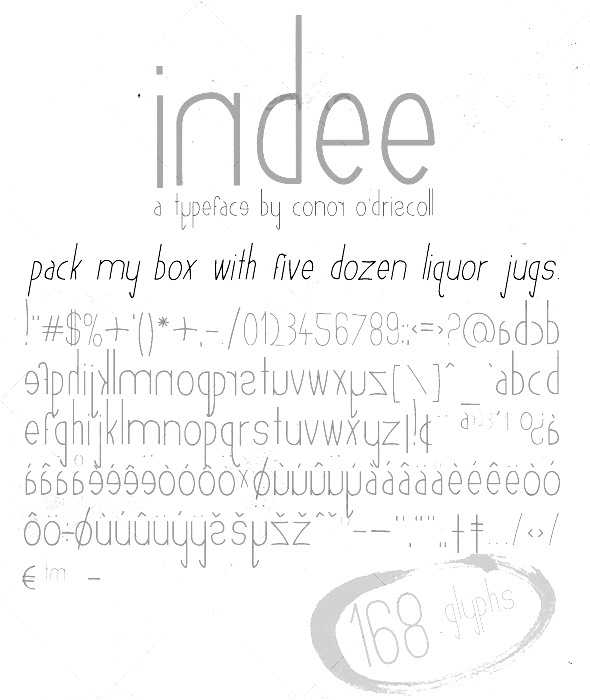
| Based in Cork, Ireland, Conor O'Driscoll (Conor Design) made the commercial typefaces Indee and Brushd in 2010. In 2011, he added Gardener. [Google] [More] ⦿ |
Conor Nolan
| |
Conor O'Driscoll
| |
CriCreation
| Dublin-based designer of the handcrafted typeface Handica (2017). [Google] [More] ⦿ |
| |
Son of famous Irish typographer and printer, Colm Ó\0Lochlainn, who designed the Celtic font Colmcille (1936, Monotype Series 121). Dara digitized this in 1993. FontShop link. [Google] [More] ⦿ | |
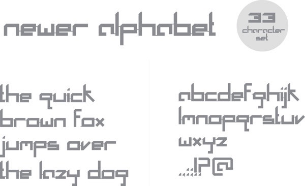
Graduate of the National College of Art and Design in Dublin. In 2013, he obtained an MDes from the Glasgow School of Art, specializing in animation. Now based in London, he designed Newer Alphabet (2013), which was inspired by Wim Crouwel's unicase proposal New Alphabet (1967). [Google] [More] ⦿ | |
David Delahunty
| |
During his studies in Dublin, Ireland, Declan Behan designed Brathair (2017). Behance link. [Google] [More] ⦿ | |
During his studies in Dublin, Ireland, Declan Behan designed the multiline display typeface Lockup (2015) and the display typeface Brathair (2017). He explains: Brathair is a typeface that combines the characteristics of An Clo Gaelach (Gaelic type) with Slovak typography used on street signs, billboards and shopfronts during the Socialist period, particularly during the period of normalisation between 1960 and 1990. The typeface was created during my Erasmus semester at the Academy of Fine Arts and Design in Bratislava.Behance link. [Google] [More] ⦿ | |
Researcher at the National Print Museum in Dublin, and one of the world's top experts on Irish type design. Author of Irish Type Design: a history of printing types in the Irish character (Blackrock: Irish Academic Press, 1992). He obtained a doctorate from Trinity College Dublin for work completed on the subject of the Irish Character in Print. He was Art Director of the University of Iowa Press for a number of years before returning to Ireland. He was a lecturer in design at the Dublin Institute of Technology, where he held the position of Head of the Departments of Visual Communication and Fine Art. At ATypI in 2003, he spoke about Irish type design: the Canadian connection. Speaker at ATypI 2010 in Dublin. Speaker at ATypI 2011 in Reykjavik. [Google] [More] ⦿ | |
Digital Typeface Studio (was: Evas Unique Fonts)
|
In 2016, she designed Kristaly (connected script), Rubican (connected script), FlypFlop (thin connected script), Dingfleur (floral dingbats), Dingsprinkle (ornaments), Lacy (textured), Coalpen, Digi Stamps One (flowery ornaments), the textured typefaces Leaffy (decorative caps) and Hyppolit, the ornamental typeface Zending, Karykas, the curly script Pyktor, Symca, Dood Leafs, Pypats, the textured typeface Zensyrom, Doodlowers, Doodletters, Woodys, the stylish display typeface Lynzer, the curvy Roucorns, the sans typeface Dyane, the pendant typeface Proxanys, the display typeface Chowes, the bubble-themed Amydor, the textured typefaces Sanzen and Bubbles, the sketched typeface Stone Story, the handcrafted Clarissa, Cally Script and Sanlabello, the mask dingbat font MaskbyEBO, the curly decorative all caps typefaces Zsylett and Zsynor, Rythmus and Popcorn. Typefaces from 2017: Maudlyn (script), Hakyt (script), Atyla (script), Welga, Bynda (script), Kylets (script), Martyn (script), Balton (handcrafted), Zengo (ornamental caps), Chyga (Victorian, curly), Geryta, Leafyction, Edyra (textured caps), Simpla (textured caps), Digidon (textured caps), Trefay (calligraphic script), Fonix (textured caps), Haloven (Halloween font), Sylabus, Icing Cookies, Clarissa, Floryan (floriated caps), Flory Anna, Nebulo, Storyteller (floriated didone), Mandings, Zenyth, Beadwork, Eszty (calligraphic), Divat, Kahir (exquisite decorative caps), Zen3, Moaren (sketched), Moare (fingerprint texture), Stone Story (textured), Stampy, Wyllam, Dyane (sans), Manuell (a heavy display didone), Labrint (textured), Zenone (textured decorative initial caps), Zensyrom (textured caps), Marmelad, Filigran (a textured didone), Chamylle (leafy font), Balloony (comic book style), Bemydor (textured caps), Eggshell Mosaic (textured caps), Portabell (textured caps), Stampy Light (outlined shadow typeface), Tendrils (textured caps), Retrograph (textured caps), Digizen (textured all caps typeface). Typefaces from 2018: Lamor (heart-themed textured caps), Zentyp (decorative textured initials), Square Frames, Seamless Patterns, Tiptak, Adetar, Seryfan, Blysher, Katalyn, Agrifan, Bokretan, Hebydia (calligraphic), Westyler (script), Pepitas, Sthencyl (script), Bykars (curly), Hegran (Victorian, with curls), Monogram Framer, Grafyk, Orhydea (upright script), Denka (textured caps), Dathyn, Agrish, Olyber, Sayes Script, Layers (with snowy TV screen texture), Dafodyl, Rubynt, Ofaly, Gudlak, Natyl, Vytorla Mix (curly script), Gaby, Kiraly, Meybi (heart script), Sofye, Emryt, Vytorla, Sybelia, Alyfe, Bigdey, Amagh. Typefaces from 2019: Gitar, Feba, Arthegos (script), Quilty (script), Trinyta, Lyra (textured caps), Astoria, Judyth, Artopyl, Stokyt, Janzen (tribal texture caps). Typefaces from 2020: Storyk (script), Pegro Stencil, Framed Monograms, Beprity Stencil (a script), Direkt Stencil, Dings, Sati, Hapyster, Stager, Lathyn, Welga, Agrifan, Atyla, Hegran (curly Victorian), Orhydea (a rabbit ear script), Dyobar (a stencil font), Cytar, Valtin (decorative caps for Valentine's day). Creative Market link. Creative Fabrica link. [Google] [More] ⦿ |
Dominic Stanley
| |
| |
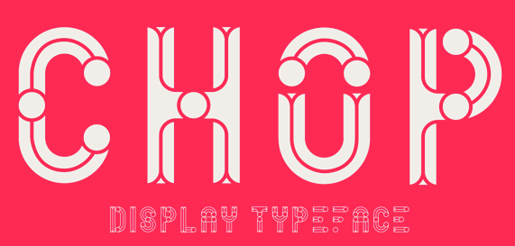
London, UK-based designer who was earlier located in Dublin, Ireland. Creator of Chop (2013, a display typeface) and Apex (2015, a free octagonal font made with FontStruct). Behance link. [Google] [More] ⦿ | |
Irish designer of the dingbat typeface DF Industrials (1994, Letraset). [Google] [MyFonts] [More] ⦿ | |
Author of The Irish character in print, 1571-1923 (with an introduction by Alf MacLochlainn), New York: Barnes&Noble, 1924 (1969). The book was originally written in 1924. [Google] [More] ⦿ | |
Creator of CurlyHogRunes (2007), a gorgeous Celtic illuminated lettering font that is part of the Open Font Library. Alternate URL. [Google] [More] ⦿ | |
During his studies at the National College of Art And Design, Dublin, Ellen Hickey created the paper airplane-inspired Flight Font (2015). [Google] [More] ⦿ | |
Empty Page Studio
| Lukasz Kulakowski, a Polish graphic designer in Dublin and Baile Atha Cliath, Ireland, created the free typeface Mosaic Leaf (2011), which was inspired by Akzidenz Grotesk typeface. In 2012, he published Orbits (a prismatic multiline face, done with Zbyszek Czapnik). Typefaces from 2013 include the free display typeface Rhubarb Display Font (a condensed art deco sans caps family for Latin and Cyrillic done with Zbyszek Czapnik). In 2014, he created the tweetware font Christmas Time. Emptypage Studio is presently located in New York City. [Google] [More] ⦿ |
During his studies in Dublin, Ireland, Eoghan Kerton created the stylized typeface Ogham (2015). Behance link. [Google] [More] ⦿ | |
| |
Irish creator of the geometric typeface Cubic (2012). [Google] [More] ⦿ | |
Eva Barabasne Olasz
| |
Evertype (was: Everson Typography)
| Michael Everson's (b. Norristown, PA, 1963) brilliant pages on Celtic and other languages and on font standards, featuring the following sub-pages:
Elsewhere, one can find rare Everson creations such as Musgrave (1994). MyFonts sells these typefaces:
His bio, in his own words: Michael Everson, based in Westport, Co. Mayo, is an expert in the writing systems of the world. He is active in supporting minority-language communities, especially in the fields of character standardization and internationalization. He is one of the co-authors of the Unicode Standard, and is a Contributing Editor and Irish National Representative to ISO/IEC JTC1/SC2/WG2, the committee responsible for the development and maintenance of the Universal Character Set. He is a linguist, typesetter, and font designer who has contributed to the encoding in of many scripts and characters. In 2005 and 2006 his work to encode the Balinese and N'Ko scripts was supported by UNESCO's Initiative B@bel programme. Michael received the Unicode "Bulldog" Award in 2000 for his technical contributions to the development and promotion of the Unicode Standard. Active in the area of practical implementations, Michael has created locale and language information for many languages, from support for Irish and the other Celtic languages to the minority languages of Finland. In 2003 he was commissioned by the United Nations Development Programme to prepare a report on the computer locale requirements for Afghanistan, which was endorsed by the Ministry of Communications of the Afghan Transitional Islamic Administration. He prepared a number of fonts and keyboard layouts for Mac OS X 10.3 (Panther). Michael moved to Tucson, Arizona at the age of 12. He studied German, Spanish, and French for his B.A. at the University of Arizona (1985), and the History of Religions and Indo-European Linguistics for his M.A. at the University of California, Los Angeles (1988). He moved to Ireland in 1989, and was a Fulbright Scholar in the Faculty of Celtic Studies, University College Dublin (1991). In 2010, he made Timenhor, a Latin-script font whose glyphs are based on the uncial letterforms of Coptic manuscripts. Speaker at ATypI 2010 in Dublin. Speaker at ATypI 2011 in Reykjavik. Dafont link. View Michel Everson's commercial typefaces. [Google] [MyFonts] [More] ⦿ |
Feòrag NìcBhrìde
| |
Feorag's Place
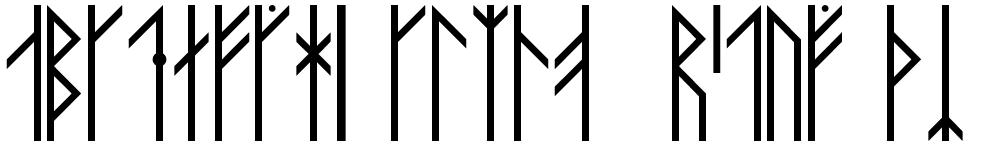
| Nice designs by Feòrag NìcBhrìde (or Feòrag Forsyth) from Edinburgh, Scotland. Her Mac TrueType and PostScript fonts are mostly reproductions of historic type. Styl, Styl Round, Astradyne and DaySquareCut are futurist in inspiration. Chapbook and Chapbook Italic are based on 17th century type and Vespasian is taken from a late 7th century manuscript. Symbats and Orkney Runes are of particular interest to occultists. Flgheadh, my first shareware font, makes the creation of knotwork rows as easy as typing three characters which happen to be next to one another on the keyboard. Viking Runes from the Orkney Isles, Taisean (2010, angular uncial), Accelerando (2009, nice simple techno face), Day Square Cut (1997; based on lettering designed by Lewis Day, some time around 1900), Cianán (Mac type 1 font based on an old Irish manuscript, 1998), Astradyne (based on the font used on Ultravox's Vienna LP from 1980), Symbats (1997-2008, a Pagan dingbats font), Innsmouth Plain (2011, hand-printed), Skelett (2011, blackletter), Maeshowe (2014, Futhark runes), Orkahaug (2014, a grungy version of Maeshowe), Lindberg (2007-2014, a beer bottle font), Lindberg Caffeine (2014), Springmarch (2014). In 2016, he designed the Victorian typeface Whittier. Dafont link. Older URL for her free stuff. [Google] [More] ⦿ |
Fergus Costello Studios
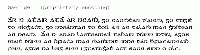
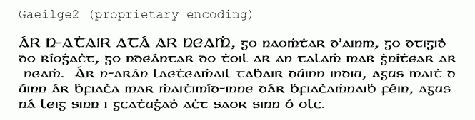
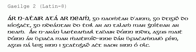
| The font Gaeilge 1 was originally developed by Pádraig McCarthy in 1993. Gaeilge 2 is an updated version, dated 1996, by Padraig McCarthy and Nikita Vsesvetskii (LINBIT group, P.O. Box 234, St. Petersburg 199155, Russia). Both are free at Fergus Costello Studios. Padraig McCarthy resides at The Presbytery, Rathdrum Co., Wicklow, Ireland. Alternate URL for Gaeilge1. Both fonts have proprietary encoding for the dotted consonants, but Gaeilge2 has nicer grave-accented vowels. Dafont download site of Peter Rempel. [Google] [More] ⦿ |
Creator of Gaeilge2, another version of McCarthy's Gaeilge1 for Irish/Celtic scripts, in 1997. There exists another Gaeilge 2, but that was made be Padraig McCarthy himself in 1996 with the help of Nikita Vsesvetskii. Free download here. [Google] [More] ⦿ | |
Aka F.M. O'Carroll Aberystwyth. Creator of the Gael AX and Gael BX fonts. The original version by F. M. O'Carroll (1997) consists of eight Gaelic fonts. These original fonts, packaged with some TrueType font development tools, are freely downloadable from the Celtic Department of University College Cork, Ireland. The Gael fonts come in two slightly-different minuscule styles. The fonts have acute accents on the vowels instead of grave. In 2003 (with an update in 2008), Korvellou An Drouizig made Unicode-compliant versions, Gael AX Unicode, Gael AX Unicode Bold, Gael BX Unicode and Gael BX Unicode Bold, available here and here. [Google] [More] ⦿ | |
Font Studio Four
|
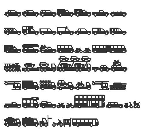
FontStructor (aka Four, or Font Studio Four) who made the dot matrix typeface Numbat (2012), the athletic lettering typefaces Atletica (2011) and Atletica Serif (2011), and the texture typeface Milky Way (2011). In 2011, he created Things That Go (car silhouette dingbat face). Faces from 2012: Crazy Fredericka (poster stencil face), Twisty, Remix Chinese Whispers, Toastbread (wavy, 3d) and Plywood (3d), Field Day (blackboard bold), Transfer Window (bilined), Walk in the woods (dot matrix face), Rock Paper Scissors (bilined), One Way Ticket (bilined), White Knight (outlined blackletter), Black Knight (blackletter), Shelf Life (stylish), Oystercatcher, Broken Promises (multiline typeface), Tarmac, Hibernation (German expressionist face), Glendalough (nibbed face), Tartan Permutations (multiline face), Return Flight, Orbital Flight, Quatermaster, Featherstone, Gorilla Republic, Granny's Bear Hunt (stencil), Detour Ahead (multiline face), Shanghai Express (angular), Cassiopeia, Camelopardalis. Creations in 2013: Solo, C Is For Cookie, Early Riser, Firelighter, Timberline (an angular script), Lupo, Polkastruct, Bridger, Six Quinces, Dompteuse, Scandalous, Lane Seven, Singel (cross stitching font), Shadowbox, Hide And Seek, Playroom, Realta 1, Glimpse, Sinistra, Crash Test Dummy, Flightpath, Close Shave, Popover, Switchboard (electrical circuit font), Black and Amber, Wavelength (prismatic), Sightline (multilined), Structurosa Outline, Sparky, Trasna (stencil), Hold Your Horses (Western), Lupo (a winner in the FontStruct Connected Script competition), Skate Park (multiline face), Circumscript, Blinker, Bobs Your Uncle, Snowcat (inline face), Cottage Industry (house silhouettes), Causeway, Springville, Longitude, Pebble Dash, Tulipano, Hitchhiker, Stretcher, Whalewatcher, Solituda, Carbonium, Railway Sleeper (shaded face), Bricklayer Sans, Candyfloss, Milvi, Bluebell Carpet, Pinball Dingo, Spinfish (blackboard bold), Pelicano (piano key typeface), Metropolaris, Glimpse. Typefaces from 2014: Thornbrush, Retro Pixel, Spacepixel, Level Rebel, Plutona, Blue Saloon, Seriosa, Bullwhacker, Spiegeltent, Stencilitis, Circumscript, Touchline Script, Brushland, Dordogna, Southbound, Things That Go (ar dingbats), Pacemaker Backslant, Hibernation (wood type emulation), Touchline Script, In Stitches, Stagefright, Process, Cabin Fever, Hamelin, Olingo, Black and Amber, Surftide, Move Over (stencil like Futura Black), Blackrock (rounded stencil), Windway (stencilish), Olingo (bubblegum face), a set of African-themed fonts (Bakelite, Amuletta, Spooner, Chevronel, Yellowhammer, Pinto), Rush Hour, Canario, Nova Zembla (sci-fi), Sleepless, Things That Go (vehicle dings), Cottage Industry (silhouettes of houses), Glimpse, Ticket to Ride (in the style of Tkachenko's Perfopunt), Oluna, Eyeliner, Linearo, Goldfinger, Permanent Black (fat rounded stencil), Solas (artsy dot matrix face). Typefaces from 2015: Structurosa Italic, Ketting, Panenka, Nook, Companero, Circularity (textured), Recap Stencil, Beach Street, Life Cycle, Waterway, Rock Paper Scissors, Microwave, The Pattern Exchange, Alphabetical Order, Bloem, Synopsis, Microwave, Marbello, Dustcloud, Timberline, Boxthorn. Typefaces from 2016: Proost, Blueback (a retro wood cut look). Typefaces from 2017: Appalachia, Chocomotion, CloseShave, CounterCulture (3d), Crocosmia (prismatic), FarewellOphelia, FromAToB, Hinterland, Madagascar (an art deco alphabet), Micrologue, PhoenixPark, PillowTalk, Roetsj, Shadowbox, Sinistra, Skatepark, Soulmates, Spacepixel, Stagefright, ThePatternExchange, Tulipano, UpsAndDowns, Velodrome. Typefaces from 2018: Hoek, Breach (paperclip style). Typefaces from 2019: Krabbel, Nollaig Shona (trilined), Night Swimming, Kwadrant, Soulpatch, Sylvestra. Typefaces from 2020: Bramble Pie (Western), Dialogue (prismatic), Greylock, Juggle, Tomorrow Never Comes (a great bubble font). Typefaces from 2021: Offstruct RGB (a color pixel font). Dafont link. Behance link. FontStruct link. Hellofont link. [Google] [More] ⦿ |
Four centuries of printing in the Irish character
| Dead link. Brendan Leen (St Patrick's College, Drumcondra) writes about the early Irish alphabets. The preface goes as follows: Although the existing roman letter was officially sanctioned as the standard medium for the printing of Irish language documents in the early 1960s, the four preceding centuries had witnessed a rich tradition of printing in the Irish character. The origins of Irish character typography regress to the high standard of calligraphy achieved by the monastic scribes of the fifth century, and to the two discrete styles __ the half-uncial and the minuscule__ that emerged from the scriptorium to subsequently exert a defining influence on the design of Irish printing types. The full, rotund form of the half-uncial was typically used in the transcription of Latin tracts _____ notably, in the earliest known Irish manuscript, the Cathach, and, magisterially, in the Book of Kells. The Irish minuscule, a more angular form with a pronounced vertical emphasis, was often resorted to in manuscripts where vellum, and as a consequence space, would have been premium, and normally for the transcription of Irish as opposed to Latin texts. Although mostly in Latin, early texts in which the Irish minuscule hand appears include the Book of Armagh and the Book of Leinster. [Google] [More] ⦿ |
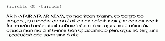
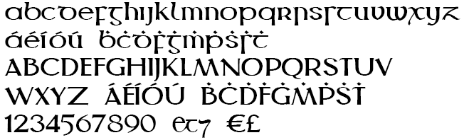
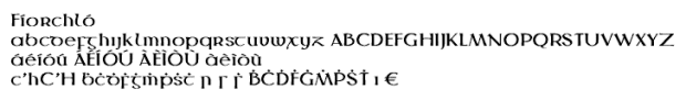
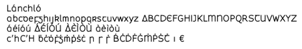
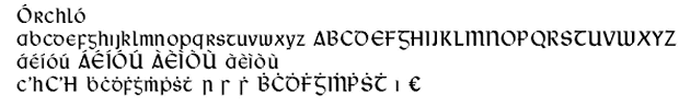
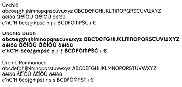
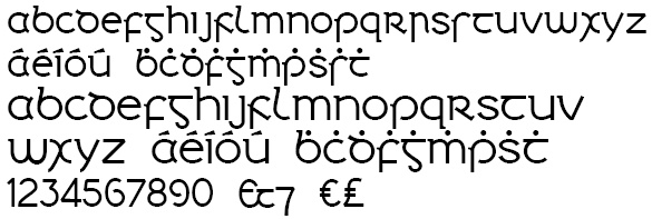
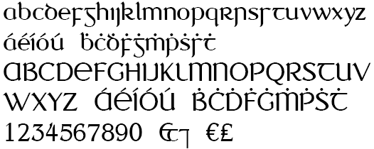
Gaelchló
| Since 1994, Vincent Morley has been designing Gaelic fonts, which can be freely downloaded at Gaelchló. His list, as annotated by Ciarán ó Duibhín:
|
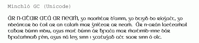
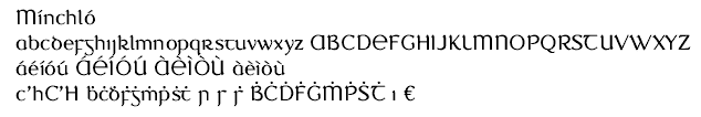
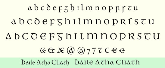
Gaelic Typefaces: History and Classification
| Detailed historical listing of Gaelic typefaces by Michael Everson. He says that it is not always easy to classify Gaelic typefaces. His classification proposal:
|
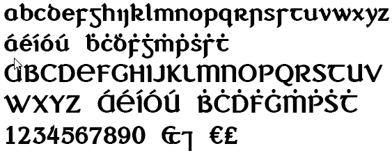
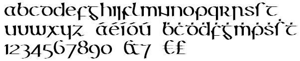
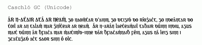
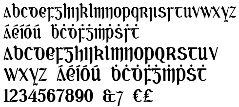
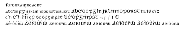
Creator of the gaelic script font Rudhraigheacht (2000), available here. Rudhraigheacht Unicode (2003) has extra characters and was re-encoded in Unicode by Korvellou An Drouizig. [Google] [More] ⦿ | |
Garrett Reil (Rain Design, Ireland) is a graduate of Limerick School of Art and Design and the National College of Art&Design (MA). He has worked in London and Dublin with leading international design consultancies. He founded Rain design partners in 1998 with Clíona Geary. Garrett lives in the picturesque twin towns of Ballina-Killaloe and does much of his work in Dublin and around Ireland. Garrett designed the size-specific New Johnston Book typeface for London Transport with Colin Banks and John Miles at Banks&Miles London; he co-designed signing manuals for Bass Plc and created a number of their retail brands; with Landor Associates he led the implementation of a new identity for Delta Air Lines. In 2008-2009, he got involved in the design of road signs for Ireland, and his proposal is Turas (2009). It deals with matters such as halation (the effect of headlights hitting a highly reflective material used in modern signs. This causes an overglow, which can make the sign difficult to read), bilingual time delay, and the longer Irish names. Ireland adopted the Transport type designed for UK roads by Jock Kinneir, a design lecturer at the Royal College of Art, and Margaret Calvert, his assistant, in the late 1950's and early 1960s. [Google] [More] ⦿ | |
Irish flash animator. He created the angry typeface Revelations (2010). [Google] [More] ⦿ | |
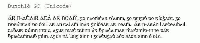
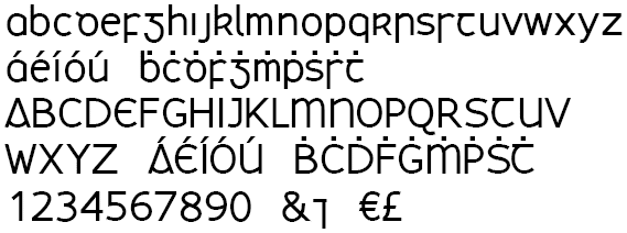
Dublin-based creator of the Gaelic uncial round typefaces Petrie A (also called Irish Archaeological Society 1 and 3), ca. 1835, and Petrie B (Irish Archaeological Society 2), ca. 1850. The Gaelic Modern round typeface Petrie C (also known as Thom) is due to Alexander Thom (ca. 1856). Petrie made the Gaelic modern angular typeface Newman (or: Keating Society) around 1857. That typeface was digitized as Gaeilge (1991) and Bunchló (1996). Brendan Leen explains: The artist and antiquary George Petrie occupies a central position in the history of Irish character typography in the nineteenth century. In 1830, Petrie purchased a holograph copy of the Annals of the Four Masters and, shortly afterward, commenced the design and production of an Irish type suitable for the printing of the Annals. An artist of contemporary renown, Petrie possessed a sound knowledge not only of the aesthetics, but also of the mechanics and technology of print production. The Petrie type continued to be used in the Clann Lir periodical, printed until 1922 by Colm Ó Lochlainn at the Sign of the Three Candles, Temple Bar, and by the National University of Ireland until 1957 for the setting of its examinations in Irish. Sample. About the Newman type, inspired by the Book of Hymns, and commissioned by Cardinal John Henry Newman, Leen writes: A typeface that owed more to the minuscule calligraphic tradition was prepared specifically for the Catholic University of Ireland, also by George Petrie. In order to avoid confusion with the earlier, half-uncial Petrie designs is generally referred to as the Newman type. [Google] [More] ⦿ | |
British designer of Playford (2003), a geometric sans with varying stroke width. Geraint works at Network Archaeology Ltd., a company registered in England and Wales. [Google] [More] ⦿ | |
Dafont link. Home page. [Google] [More] ⦿ | |
| |
During his studies at NCAD, Dublin, Ireland-based Graham Dow designed the squarish textured typeface Pink Blue (2018). [Google] [More] ⦿ | |
Irish designer of the ultra-fat counterless octagonal typeface Belfast (2014). [Google] [More] ⦿ | |
HandType Co (was: Cooee Design)
|
David Delahunty is convinced beyond a reasonable doubt that code/programming can add a fresh element to design. He used a program to create experimental glyphs in an imaginary alphabet, Alphabreak. In 2017, he published Joosey Loosey (handcrafted typeface), Neistat (2017) and Webby (a web-textured font). Creative Market link. [Google] [More] ⦿ |
Irish type designer. Lecturer in Design & Digital Media at IADT: Dun Laoghaire Institute of Art, Design and Technology. [Google] [More] ⦿ | |
Iordache Ionut
| |
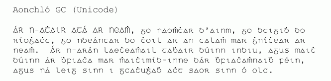
The Irish language (Gaelic) is also called Gaoileag, Gaoidhleag and Goidhealg. Its alphabet of 18 letters is Aibghitir, Aibidil, Aibchitir or Abchitir. Older alphabets had the letters in a different order, and those were called Beith-Luis-Nion (for b l n), Bobeloth (for b l) and Bobelloth. [Google] [More] ⦿ | |
Ivan A. Derzhanski works at the Institute for Mathematics and Computer Science of the Bulgarian Academy of Sciences in Sofia. His fonts include
| |
Dublin, Ireland-based designer of the cursive typeface Sunglasses (2014). [Google] [More] ⦿ | |
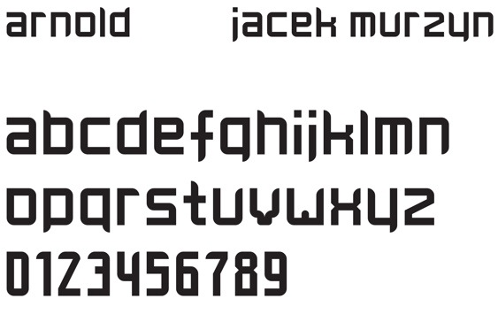
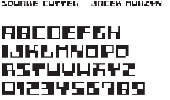
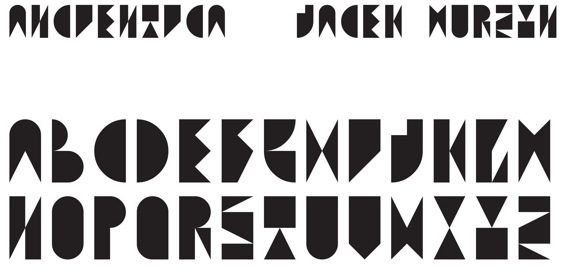
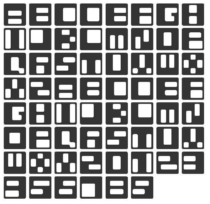
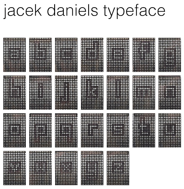
Ennis, Ireland-based FontStructor who made these typefaces in 2012: Coffee, Arnold, Puncher, Fontstrome Centred, Flora New (kitchen tile face), Square Cutter, Ancientica, Flora, Abacus, JM Squers, JM Aleksandra, JM Dominik, JM Daniels (dot matrix face), JM Beata (experimental). In 2013, he designed Jacek Daniel's by taping up holes of a Jack Daniels No7 bottle case. [Google] [More] ⦿ | |
Dublin-based creator of the Gaelic early transitional angular typeface Christie (1815-1844). This sample is from The Proverbs of Solomon. Brendan Leen writes: In 1815, the founder James Christie designed an Irish character type that represented the most legible fount to date. The Christie type also managed to retain the calligraphic qualities of the authentic Irish style. The type required meticulous care in the application of ink on account of its boldness and extreme contrasts of weights. [Google] [More] ⦿ | |
James' Font Page
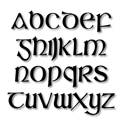
| James Shields is an Irish type designer who designed AceCrickey (1998), Armageddon (1998), ChubbyCheeks (1998), HesDeadJim (1998), Fuzzed (1998), GreenScreen (1998), HoneyIStoleYourJumper (handwriting, 1998), Ragamuffin (handwriting, 1999), Slaine (1999, a modern angular Gaelic font). See also here. Dafont link. Fontspace link for Clan Maclarens. Fontspace link. Abstract Fonts link. [Google] [More] ⦿ |
James Shields
| |
Irish creator (b. 1985) of the gothic modular typeface Scarlet River (2009, FontStruct). He lives in Dublin and is a graphic designer. Home page. [Google] [More] ⦿ | |
At one point director of the imprimerie de la république. Author of Alphabet irlandais, précédé d'une notice historique, littéraire, et typographique (Paris, Imprimerie de la République, nivôse an XII [1804]). This book explains the Irish alphabet, but has little in terms of typographic information. [Google] [More] ⦿ | |
John Barlow
| |
| |
Designer from Dublin (?) who, some time in the period 1571-1658 made the Gaelic typeface Queen Elisabeth. Everson says that the roman glyphs are by Pierre Haultin (but he gives no date for that). A draft digitization by Cois Life is mentioned. [Google] [More] ⦿ | |
Dublin-based creator of the roman aspirated Gaelic typeface Furlong (1842). [Google] [More] ⦿ | |
During his studies in Dublin, Ireland, John O'Reilly designed an ornamental caps typeface called My Alphabet (2013). [Google] [More] ⦿ | |
Irish designer of the geometric sans typeface Ardagh Sans (2014). [Google] [More] ⦿ | |
Designer (b. Fort Lauderdale, FL, 1965) of a few metafonts such as old uncial and cirth (Tolkien runes), to be found here, and Celtic Knotwork Font. Designer of the metafont Cun (runes, cuneiform). Now software engineer for IBM/Lotus in Ireland. [Google] [More] ⦿ | |
Irish designer of the free music dingbat font Frets. [Google] [More] ⦿ | |
Dublin, Ireland-based designer of the octagonal typeface Struttura (2019). [Google] [More] ⦿ | |
Waterford, Ireland-based designer of a few handcrafted typefaces in 2014. [Google] [More] ⦿ | |
Dublin, Ireland-based designer of Typonometry Caps (2015). [Google] [More] ⦿ | |
Graphic designer in Dublin, Ireland, who graduated from Institute of Technology Blanchardstown. In 2017, he designed the comic book or children's book typeface family A Little Odd Font. [Google] [More] ⦿ | |
Irish designer of the brushy typeface Abandon Normal Instruments (2018). [Google] [More] ⦿ | |
Commercial fonts for Gaelic: GaillimhLS, GaelicLS. At the same site of Linguist's Software, we also find the Ogham font BallymoteLS. [Google] [More] ⦿ | |
Laois, Ireland-based designer of the handcrafted typeface Sloppy Annabelle (2020). [Google] [More] ⦿ | |
| |
Newbridge, Ireland-based creator of the futuristic display typeface Delorean (2014, FontStruct). Behance link. [Google] [More] ⦿ | |
During her studies at student at the National College Of Art & Design (NCAD)in Dublin, Ireland, Lucija Cicin-Sain created the scratchy scary typeface Scar (2017). [Google] [More] ⦿ | |
Lukasz Kulakowski
| |
Graphic designer from Limerick, Ireland, who lives and works in London. Designer of the 3d typeface Jenga (2009), which was inspired by the game of Jenga. He also designed Hangman (2013). | |
Dandm3 is the design place of Deirdre Idema (Irish born) and Maarten Idema. Maarten was a student at the KABK in Den Haag from 2003-2004. His graduation typeface at KABK was Pam (2004), which was specifically crafted for street maps. He also designed the experimental typeface Before. Unclear if Maarten is Dutch, Irish or Kiwi. [Google] [More] ⦿ | |
Dublin, Ireland-based designer of the geometric sans typeface Voltaire (2014). Behance link. [Google] [More] ⦿ | |
Dublin-based designer of a few experimental typefaces in 2014, all called Fanfare. [Google] [More] ⦿ | |
Magic Fonts
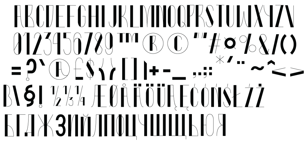
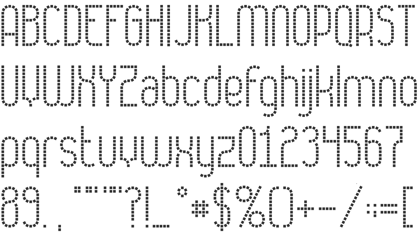
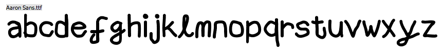
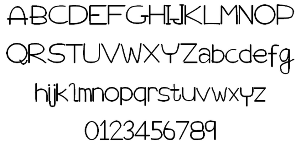
| Waterford, Ireland-based designer Aaron Patrick Ryan (b. 1988) set up Magic Fonts in 2013. Creator of the shaky hand typeface Aaron Sans (2013) and the hand-printed typefaces Love Me Tender (2013), Aw Jaysus (2013), Living Dead Girl (2013), When Love And Hate Collide (2013), Shoulda Known Better (2013), How Dumb Was I (2013), Meant To Be (2013), Blurred Lines (2013), You're Still The One (2013), I Tried But Failed (2013), Babylove (2013), Tammy (2013), Kiss From A Rose (2013), Beneath Your Beautiful (2013), Always On My Mind (2013), Soulmate (2013), Impossible (2013), Words In My Heart (2013), Autumn (2013), Aaron's Handwriting (2013), I Miss You (2013), Emerald Isle (2013), Written in my Heart College Upd (2013), Written in my Heart Shadow (2013), Feel This Moment (2013), Scrambles (2013), Not Broken Just Bent (2013), Blocks (2013), Stars (2013), Astral (2013), Static (2013), Bubbly (2013), Cheesy (2013), Irish Comic (2013), Move It (2013), Classy (2013), Stylez (2013), Misti (2013), Misti2 (2013), Forky (2013), So In Love With Misti (2013), Deadly (2013), Flying Without Wings (2013), The Power of Love (2013), My Special Angel (2013), Goodbye My Lover (2013), I Want You (2013), South (2013), Magic Christmas (2013), Ups Downs Highs + Lows (2013), Love Me For A Reason (2013), Baby You're A Star (2013), and Melting (2013). |
Dublin-based designer of Flukst (2006, pixel face). [Google] [More] ⦿ | |
Marcin Checinski
| |
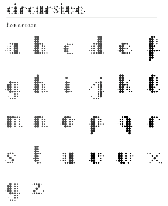
Graphic designer in Brisbane who created the purely geometric typeface Tritalics and the free dot matrix typeface Circursive in 2012. Born in Tanzania, Martin has lived in Laos, is half Dutch and has an Irish passport. Behance link. [Google] [More] ⦿ | |
Mary Ann Bolger lectures in design history and critical theory at the Dublin Institute of Technology (DIT). With Clare Bell, she organized the Dublin 2010 ATypI conference. Mary Ann holds an M.A. from the Royal College of Art, where she is completing a PhD on post-war Irish graphic design and typography. She is the author of a book on Irish graphic design, Design Factory: On the Edge of Europe (Amsterdam: BIS, 2009). Speaker at ATypI 2018 in Antwerp. [Google] [More] ⦿ | |
Visual communication student at IADT in Dublin, who created many highly experimental geometric typefaces in 2014, including Molecule Type, Destruct, D-Struct, Con-Nect, and Constellation Type. Behance link. [Google] [More] ⦿ | |
Max Phillips
| |
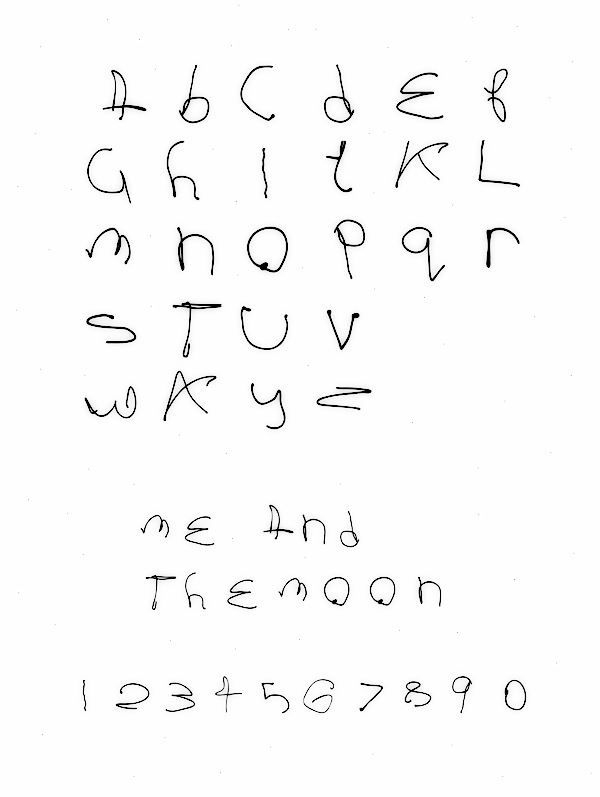
Designer in Dublin who graduated from the Limerick School of Art & Design. The moon on a clear night inspired her to create the experimental typeface Me and the moon (2012). [Google] [More] ⦿ | |
Irish creator (b. 1992) of Megs Hand (2013). [Google] [More] ⦿ | |
Dublin-based creator of the modern Gaelic Uncial typeface Biggs (1953). A draft of a digitization, called Doolish (Michael Everson), is in the works. [Google] [More] ⦿ | |
Mike Duggan is a lead typographer in the ClearType and Advanced Reading Technologies team at Microsoft, and an expert on all aspects of font hinting. Mike has a degree in Visual Communications from the National College of Art&Design in Dublin, Ireland. He previously worked for Compugraphic and Monotype Typography. Mike joined Microsoft in 1999, where he develops hinting of new typefaces targeted for screen legibility. Mike was the lead program manager on the recent optically scaled Sitka font family, designed by Matthew Carter, and was the typographic technical lead on the ClearType Font Collection project. Speaker at ATypI 2011 in Reykjavik on the topic of Cleartype hinting. [Google] [More] ⦿ | |
Michael Everson
| |
Michael Everson
| |
Michael Everson
| |
Creator from Trim (Ireland) of the Gaelic modern uncial typeface Binín (1994). [Google] [More] ⦿ | |
Cork, Ireland-based designer of Odyssey (2011). [Google] [More] ⦿ | |
Dublin-based designer of the lachrymal typeface Akron (2014). [Google] [More] ⦿ | |
Dublin, Ireland-based designer of the free polygonal or paper cutout typeface Paper Play (2019). [Google] [More] ⦿ | |
Dublin, Ireland-based studio. Their typefaces in 2018: Glory (a round serif font), Barbarossa (spurred), Mother Letters, Royal Brandy (a Victorian label font), Oleisia Script, Crawley (script font family), Brother (font duo), ECons (icons). [Google] [More] ⦿ | |
A small collection of commercial Gaelic typefaces. [Google] [More] ⦿ | |
MyFonts hit list for Irish typefaces. View a longer list of Irish typefaces. [Google] [More] ⦿ | |
| |
Creator of a hand-lettered caps alphabet in 2013. Natacha lives in Dublin, Ireland. [Google] [More] ⦿ | |
Graphic and web designer in Dublin, Ireland. Creator of Electro Alphabet (2013), a 3d font. [Google] [More] ⦿ | |
Ogham was a script devised by a Celtic grammarian from southern Ireland. The Old Irish of his day had no phoneme /p/, a fact which helps date the invention of the script to ca. the 4th century A.D. It was divided into four aicmí 'groups' of five letters each: b, l, f, s, n; h, d, t, c, q; m, g, ng, z, r; and a, o, u, e, i. Later, when diphthongs had developed and borrowings had reintroduced the /p/ phoneme into the language, five more signs, called forfede, were added to write eo, oi, ui, io/p, and �. Most of the Ogham inscriptions have been found in Ireland, though some bilingual inscriptions with Latin have been found in Wales; a few too are found in Cornwall and Scotland, and on the Isle of Man. The Picts, the non-Celtic indigenous inhabitants of Britain, took up the use of Ogham script as well; unfortunately we do not understand their language. Oghams were in use until the medieval period; the 14th century Book of Ballymote, for which this font has been named, gave the earliest transliteration key. [Google] [More] ⦿ | |
Dublin-based designer of Average (2014), a typeface obtained by overlaying hundreds of fonts. Little & Large Font (2009) combines upper and lower case in a constructive manner. [Google] [More] ⦿ | |
Pádraig McCarthy
| |
Paul Bokslag
| |
During her studies at DIT, Dublin-based Paulina Biskup created the curly display typeface Pala (2015). [Google] [More] ⦿ | |
Typefaces from 2016: Didonesque (didone headline typeface characterized by a large x-height and slightly curved v, w and y), Fnord (a serif family designed with a mischievous streak), Fnord Display (in Engraved, Inline and Woodcut styles), Eponymous (an experiment with chunky serifs), Pseudonym (a subtly falred sans with interlocking and unicase features). Typefaces from 2017: Didonesque Ghost (a stylish very contrasted didone typeface family), Banjax (humanist sans, followed in 2018 by Banjax Notched), Faded Grandeur (inspired by stone engravings that have withered and decayed over time), Torus (a rounded monoline organic sans; see also Torus Variations (2018): Torus Notched, Torus Inline, Torus Outline and Torus Biline), Meccanica (an intoxicating nuts and bolts-style engineering typeface). Typefaces from 2018: Eurocine (this is in the wide elliptical sans genre: This typeface attempts to capture the mood of movie credits from European Cinema in the 1970s, with a focus on Giallo films in particular. In terms of style, Eurocine sits somewhere between Walter Baum and Konrad Friedrich Bauer's Folio, and Aldo Novarese's Eurostile), Polyphonic (a 60-font slab serif family), Majesty (flared, incised), Verbatim (a 60-font sans family that was inspired by the best (and worst) of 1970s science fiction TV shows and movies, and aims to extract the essence of futuristic type from that era). Typefaces from 2019: Didonesque Script, Modica (an 18-style geometric sans that came from Technica), Technica (a more conservative rounded geometric sans / techno family than his earlier Meccanica), Rhetoric (a semi-cursive typeface), Quorthon (blackletter, in Black, Dark and Grey substyles), Yolk (a sans family based on the shape of an egg yolk), Transcend (an all caps titling typeface), Ergonomique (a humanist sans in 18 styles), Eloquence (a renaissance font family), Didonesque Stencil. Typefaces from 2020: Rodia (an 18-style oddball (sic) geometric typeface inspired by the iconic RADIO signage that was once in place at 5041, Pico Boulevard, Los Angeles in 1985), Arise (an 18-style text typeface family characterized by hooked terminals), Slabber (a slab serif inspired by 19th century wood type), Audacious (a 20-style decorative serif), Cream (a warm text family, with the heavier weights leaning towards Cooper Black), Sqwared, Logik (sci-fi). Typefaces from 2021: Evoque (a 36-style contrast-rich text typeface; followed in 2022 by the 16-style family Evoque Text which includes two variable fonts), Sienna (14 styles and two variable fonts; a warm soft serif with some angular design elements that make it a great choice as a text typeface), Torus Pro, Harmonique (a 32-style incised serif). Creative Market link. MyFonts link. Fontsquirrel link. [Google] [MyFonts] [More] ⦿ | |
During his studies in Dublin, Ireland, Pavels Lavrinovics designed the free semi-constructivist Latin/Cyrillic typeface family Kulag (2016). In 2021, he published the free techno / sports font Strandhill. [Google] [More] ⦿ | |
Irish designer of the free dot matrix fonts Matrixdancer (2018) and Matrixtron (2015) and the wide monoline sci-fi typeface The Rush (2016). In 2017, he designed 5Squared Pixel and in 2018 the pixel typeface Virale. [Google] [More] ⦿ | |
Dublin, Ireland-based designer of the pixel typeface Bitface (2016). Behance link. [Google] [More] ⦿ | |
Very early Irish type. Brendan Leen writes about : "Insistent on communicating with foreign visitors to her court in their own language, the Queen--in the period c. 1560 to 1565--commissioned from Christopher Nugent a manuscript Iryshe-Latten-Englishe Primer. The Primer included an Irish alphabet as well as a glossary of words and phrases in Irish with translations in Latin and English." The first book to use the Queen Elizabeth type was Aibidil Gaoidheilge agus Caiticiosma (1571), a catechism in the Irish language, by John Kearney. The hybrid Irish font of Queen Elizabeth was used initially for religious materials. [Google] [More] ⦿ | |
Richie Whyte from Dublin, Ireland, writes about his barcode font: Named after the inventor Émile Baudot, Baudot 5 (2008) is a 5-bit character set predating EBCDIC and ASCII, presented here in simulated punched paper tape form as used in TTY. [Google] [More] ⦿ | |
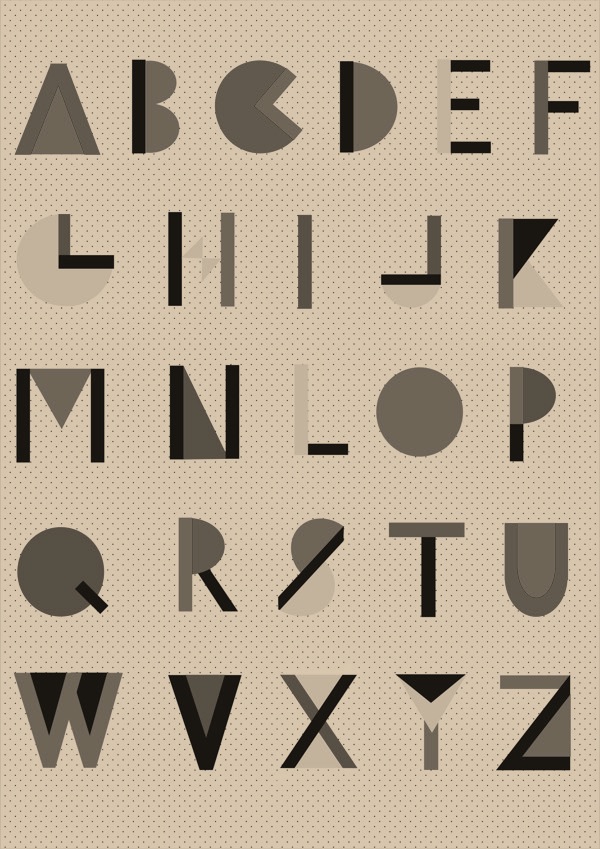
Graduate of Dublin Institute of Technology. Still based in Dublin, Rita Brereton designed the circle-based art deco typeface Circle in 2017. [Google] [More] ⦿ | |
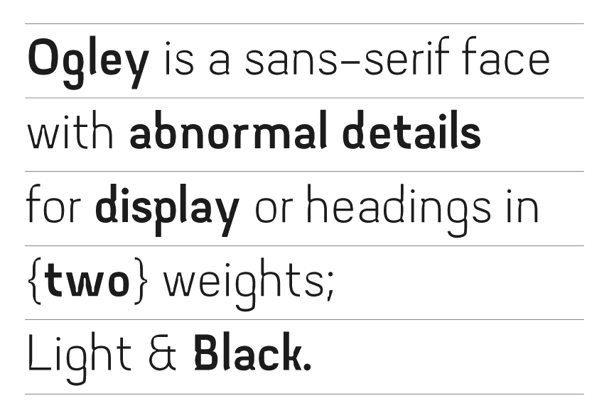
Roseanna studied Design in Visual Communications at IADT, Dun Laoighaire, Ireland. At he Type @ Cooper program in 2012, Roseanna Afrika McGuirk designed the modular typeface Ogley. [Google] [More] ⦿ | |
Cork, Ireland-based designer of the triangulated logotype font Vexila (2017) and the plumpish typeface Bulbous (2017). [Google] [More] ⦿ | |
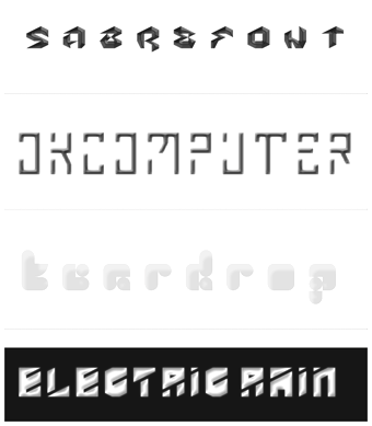
FontStructor from Limerick, Ireland. His fonts include Teardrop (2011) Sabrefont (2011) and Electric Rain (2011). [Google] [More] ⦿ | |
Dublin, Ireland-based designer of the abstract typeface Zero (2017). [Google] [More] ⦿ | |
Dublin-based designer of the pixelish typeface Block Formation (2015). Behance link. [Google] [More] ⦿ | |
Graduate of the University of Ulster. Irish designer of the bauhaus style typeface Kubrick (2019). [Google] [More] ⦿ | |
Scribhinn
| Info and links about Celtic fonts. By Michael Everson. [Google] [More] ⦿ |
Séamas Ó Brógáin
| |
During his studies in Dublin, Ireland, Sean Cummins designed the constructivist typeface Nuke (2016). Behance link. [Google] [More] ⦿ | |
| |
Seirbhísí Leabhar
|
|
Irish outfit that released these fonts: Alabama, Alaska, Arizona, Arkansas, California, Colorado, Conneticut, Delaware, Florida, GeorgiaBold, Hawaii, Idaho, Illinois, Indiana, Iowa, Kansas, Kentucky, Louisiana, Maryland, Massachusetts, Michigan, Minnesota, Mississippi, MissouriItalic, Montana, Nebraska, Nevada, NewHampshireBold, NewJersey, NewMexico, NewMexico, NewYork, NorthCarolina, NorthDakota, Ohio, Oklahoma, Oregon, Pennsylvania, Rho, SouthCarolina, SouthDakota, Tennessee, Texas, Utah, VermontThin, VirginaNormalItalic, Washington, WestVirginia, Wisconsin, WyomingNormal. These seem to be renamed typefaces from elsewhere. [Google] [More] ⦿ | |
Freelance designer in Dublin, Ireland. In 2016, he developed the typeface Athru for a journal on contemporary Ireland. He worked uncial elements into its design. Behance link. [Google] [More] ⦿ | |
SIAS (or: Signographical Institute Andreas Stötzner)
|
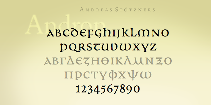
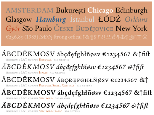
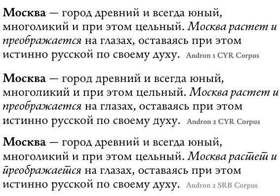
He created Andron Scriptor (2004, free), with original ideas for Greek and Cyrillic alphabets. The Andron project intends to extend this Venetian text typeface in many directions: right now, it covers Latin, Greek, Coptic, Gothic, runes, Cyrillic, Etruscan and Irish scripts, musical symbols, astronomical and meteorological symbols, and many dingbats. The Andron MC Corpus series (2012) contains Uncial, Mediaeval and Capital styles. He also created Andron 1 Monetary (2014), Andron 1 Alchemical and Andron 2 ABC (2014, for children's literature). On or before 2006, he created a few typefaces for Elsner & Flake. These include EF Beautilities, EF Ornamental Rules, EF Squares, EF Topographicals, EF Typoflorals, EF Typographicals, EF Typomix, EF Typosigns, EF Typospecs, EF Typostuff. Fonts from 2007-2010: Gramma (2007, three dingbats with basic geometric forms), Andron Corpus Publix (2007, dingbats including one called Transport), SIAS Freefont (2007, more dingbats), SIAS Lineaturen (2007, geometric dingbats) SIAS Symbols (2009), Andron Freefont (2009, text font), Andron 1 Latin Corpus (2009), Andron 1 Greek Corpus (2009), Andron Kyrillisch (2009, consisting of Andron 1 CYR, Andron 2 CYR and Andron 2 SRB where SRB stands for Serbian), Andron 2 English Corpus (2010, blackletter-inspired alphabet), Andron 2 Deutsch Corpus (2010), Andron Ornamente (2012), Reinstaedt (2009, blackletter family), Crisis (2009, economic sans). Lapidaria (2010) is an elegant art deco sans family that includes an uncial style and covers Greek. Hibernica (2010) is a Celtic variant of Lapidaria. Symbojet Bold (2010) is a combination of a Latin and Greek sans typeface with 400 pictograms. Rosenbaum (2012) is a festive blackletter face, obtained by mixing in didone elements. In 2013, he published Arthur Cabinet, a six-style inline art deco caps collection of typefaces, with accompanying Arthur Ornaments and Arthur Sans. Meanwhile, Andron Mega grew to 14,700 unicode glyphs in 2013. Typefaces from 2014: Behrens Ornaments (art nouveau ornaments based on Behrens Schuck by Peter Behrens, 1914), Fehlian (an open capitals typeface family with Plain, Gravur and Precious styles), Happy Maggie (a hand-drawn script based on Maggie's sketches when she was 13 years old), Abendschroth (for lullabies, girl's literature, murder poems, short stories and Christmas gift books), Abendschroth Scriptive, Albyona English No. 1 (as Andreas writes, suitable for children's books, fantasy literature, crime novels, natural food packaging and poison labeling, for infancy memories, vanitas kitsch items, dungeon museum bar menu cards, introductions to herbalism and witchcraft manuals), Lindau (a Venetian Jensonian typeface with considerable flaring in the ascenders), Grund (based on the 1924 art deco signage in Leipzig's Untergrundmesshalle Markt whose architect was Otto Droge), Leipziger Ornamente (based on variopus buildings in Gohlis, Leipzig, dating from the 1920s-1950s), Kaukasia Albanisch (ancient writing system of the Caucasus region, allegedly created by Mesrop Mashtots who also invented the Armenian alphabet in 405). Commissioned fonts include Runes (commission by Ludwig Maximilian University Munich), Lapidaria Menotec, Old Albanian, Dania (a special notation for Danish dialectology. Font extension of Latin Modern Italic (Open source), commissioned by the Arnamagnanean Institute, Copenhagen Universit). Typefaces from 2015: Andron 2 EIR Corpus (uncial, Gaeli), Artemis Sans (Greek version of Arthur Sans), Ardagh (a Gaelic / Irish version of Arthur Sans). Don Sans (a sturdy sans). Typefaces from 2016: Popelka (an uncial fairy tale font modeled after the opening sequence of the 1973 movie Drei Haselnüsse für Aschenbrödel). MyFonts. Behance link. Abstract Fonts link. Klingspor link. Showcase of Andreas Stötzner's typefaces at MyFonts. View the SIAS typeface library. [Google] [MyFonts] [More] ⦿ |
Signal Type Foundry
|
|
Simon Sweeney studied visual communication at the Dublin Institute of Technology from 2008 until 2011. Creator of the modular typeface Noodge (2012). Noodge was published at Typegroup. [Google] [More] ⦿ | |
Designer who studied at the National College of Art & Design and works in Dublin, Ireland. Designer of the handcrafted typeface Cipher (2016). Behance link. [Google] [More] ⦿ | |
Stanley Fonts
|
In 2018, he graduated from the University of Reading's MATD program. His graduation typeface, Hayward, is a multi- script typeface family designed to set printed novels built to perform at small sizes. The family is made up of 5 weights, an italic, a sans-serif and a ruqa'a style Arabic. [Google] [More] ⦿ |
Dublin-based type designer who made the early Gaelic typeface Parker (now also known as Brooke or Bonham), 1787-1815. [Google] [More] ⦿ | |
| |
Dublin-based graphic designer who studied visual communication at DIT. He created Noodge (2012, with Simon Sweeney). He writes: It's born out of our mutual love for typographic obsessiveness, systems, Wim Crouwel and 8vo. All three styles will be available soon (in OpenType format) to download for free. Noodge was published at Typegroup. [Google] [More] ⦿ | |
Susan Zalusky
| |
Suzanne Sweetman from Dublin, Ireland, drew the ornamental caps alphabet Creatures (2011). [Google] [More] ⦿ | |
Jim Michael's Fresno-based archive of GAELIC-L, a mailing list for users who want to communicate in Irish, Scottish or Manx Gaelic. The home of GAELIC-L is listserv@listserv.hea.ie at University College, Dublin in Dublin, Ireland. [Google] [More] ⦿ | |
Brendan Leen writes: "In 1732, an English Irish Dictionary, compiled by Conor O Begly, was printed by Jacques Guérin and the Paris type of its composition represented a major departure from preceding designs (it has been suggested that the type might have been modelled on a calligraphic sample supplied by O Begly). An unusual feature of the Paris type is its inclusion of an uncial, italic form of the letter a. With the exception of the Queen Elizabeth type, Irish character typography had to that point relied exclusively on the triangular or majuscule a." Shown here, it came about as the Moxon type of 1681 was strictly forbidden for religious literature, which had in the early 18th century been printed in roman characters. [Google] [More] ⦿ | |
The Parker type, produced in Dublin in 1787, was the first Irish character type cut and cast in Ireland. It is sometimes called the Brooke or Bonham type, as Charlotte Brooke used it in "Reliques of Irish Poetry". The Parker type was not appropriate for textbooks as it used up too much space. [Google] [More] ⦿ | |
After the Louvain type, the second true Irish type, cast in 1638 in Rome at the College of Saint Isidore. View a sample of its use in Lochrann na gCreidmheach by Fr. Francis O Molloy here. Brendan Leen writes about it: "Not dissimilar to the Louvain type, the Rome Irish type nonetheless represents a marked improvement on its predecessor. The letters have sloughed all of the vestiges of the ligature; now, they compose in a more vertical and distinct manner on the page. [...] On a "visit" to Italy in the early nineteenth century, Napoleon requisitioned the Rome Irish type for the National Print Museum of the Republic, the Imprimerie Nationale. The type was used by the Paris printer J.J. Marcel in the 1804 production of Alphabet Irlandais. [...] The Rome Irish type had been just one of an array of exotic punches pillaged in Italy and transported to the Imprimerie at the beginning of 1801; in an effort to obtain from the Propaganda samples of a range of foreign letters to complete the magnificent Paris collection, boxes of Arabic, Armenian, Brahmanic, Chaldaic, Coptic, Hebrew, Georgian, German Greek, Irish, Illyrian, Indian, Malabar, Persian, Ruthenian, Syriac and Tibetan had been unceremoniously looted and shipped northward. Ultimately, the original punches and matrices of the Rome Irish type were returned under threat of violence by the commissioners of the Tuscan Government." [Google] [More] ⦿ | |
His typefaces:
Speaker at ATypI 2010 in Dublin, where he discussed the history of Irish type and the roots of his book family, Nib. [Google] [MyFonts] [More] ⦿ | |
Irish site with a Celtic font archive: 26, 3DLET(BRK), Aarcover-(Plain):001.001, Alien, AngelOs1, Anglo-Saxon,-8th-c., ArborisFolium, Bones, BarbedWireSWFTE, BatMan, Beth-Luis-Fearn, Beth-Luis-Nion, BetsyFlanagan, BillyBear'sCrayons-Regular, BloodOfDracula, BulletHolz, Bunchlo, BurnstownDam, CHRISTMAS, Calendar-Normal, Campaign-Normal, CarrElectronicDingbats, CarrKeys, CeltGael, Celtic-Knot, CelticFrames, CelticPatterns, CelticPatterns, CelticmdDecorativeWDropCaps, CenturyGothic-Bold, CenturyGothic, ChineseTakeaway, Chlorinap, ChristianCrossesII, Christmas-Tree, Codex, CreepygirlLight, DarkWind, Dingbat-Cats2, ElectricHermesAOECharge, EnnobledPet, EuroSig, FZ-BASIC43, FZ-BASIC43COND, FZ-BASIC43EX, FZ-BASIC43HOLLOW, FZ-BASIC43HOLLOWEX, FZ-BASIC43HOLLOWITALIC, FZ-BASIC43HOLLOWLEFTY, FZ-BASIC43ITALIC, FZ-BASIC43LEFTY, Flakey, Flame, Flamer, Flower-Show, FlowerOrnaments, Frosty, GEMontage, GESheerScript, GabrielsAngels, Gaeilge1Normal, Glanchlo, Gnomes, GroovyGhosties, HalloweenBorders, Hazard-Regular, HolyMoly-Normal, Interdimensional, Iomanoid, Irish-Blessing, Jardotty, Jarman, Jasper(BRK), JewelSet, KarloffFont, KellyAnnGothic, KeltBold, KeltCapsFreehand, KeltItalic, KeltNormal, Kidprint, Lee, Mayan, Meroitic---Hieroglyphics, MomsTypewriter, MonsterParty, MonstersofStone, MostlyWaves-Regular, MusicalSymbolsNormal, National-FirstFont, National-FirstFontDotted, National-Primary, NoFear, Nosfer, Orna3, Orna4, ParaAminobenzoic, Pixel-Shift, Playbill, RNIB-Braille, Rainie'sKids-Regular, Ransom-Regular, Ruritania, Salter-Regular, SanskritNew4, ScratchyMess, Scythe, Seperates, Showboat-Regular, SkinnerAOE, Smartie, SnowCaps, SpiralsFont, Stjernetegn, SunnMoon, TattooNo1, TattooNo2, TeddyberV12, Tuamach-Regular, VintageDingbats, WeatherFont, WebOMintsGD, XmasClipart2, Zombified. [Google] [More] ⦿ | |
| |
Irish designer in Dublin who created the italic Henry Ford Type (2011). Behance link. [Google] [More] ⦿ | |
Tony Fahy
| |
Tony Fahy Font Foundry
| Designer at Bitstream of the elegant Roman sans Artane Elongated BT (2001). Born in Ireland, he designs type in Carrigallen. His early typefaces include Co Leitrim, Padraig (in the Celtic tradition), and the corporate typefaces BOC 100 Light and CIE 2000 Bold [the CIE Group of Companies includes Iarnród Éireann, Bus Éireann and Dublin Bus]. In 2020, he released the simple semi-stencil monolinear sans typeface Bredagh, the roman uncial hybrid Padraig Nua. In 2021, he released the multiline typeface Carrigallen Display, which is rooted in megalithic and Celtic Ireland. Its sculpted and spiral features are inspired by the graphics at the entrance stones and kerbstones at the Newgrange passage graves in Ireland. FontShop link. His home page. [Google] [MyFonts] [More] ⦿ |
German designer of Linotype IrishText (1997), a Gaelic uncial. Fontshop link. [Google] [MyFonts] [More] ⦿ | |
TypeGroup
|
Their custom typefaces include Gibson Gold (2012, Rob O'Reilly and Bobby Tannam), which is based on Canada Type's Gibson. TypeGroup should not be confused with the Eastcoast type foundry GroupType. Conor & David link (for the studio of Conor and David, launched in 2006). Behance link. [Google] [More] ⦿ |
TypeTrough
|
Walsh is also a talented illustrator. Behance link. [Google] [More] ⦿ |
A few Celtic truetype fonts at the Faculty of Celtic Studies of the University College Cork. The font collection, GAELA, GAELAW, GAELAX, GAELAXW, GAELB, GAELBW, GAELBX, GAELBXW, shows the following copyright line: TTGL/TTASM (C) F.M. O'Carroll Aberystwyth 1997. The page also has truetype executables such as TTASM, TTBIT, TTGL, TTVIEW, all truetype font utilities allowing even a limited amount of truetype font editing on DOS (not Windows). [Google] [More] ⦿ | |
During her design studies in Dublin, Ireland, Valentina Ali created the decorative caps typeface Silica (2015). [Google] [More] ⦿ | |
Dublin, Ireland-based designer of Egoistica (1999) and Nag Wile (1999) at Garagefonts. Klingspor link. [Google] [More] ⦿ | |
Vince Connare
|
At Connare.com (Seattle), he designed the transitional book text typeface Magpie in 2000. Vincent Connare joined Dalton Maag in the spring of 2001 as production manager. At Dalton Maag he was part of the team that developed Ubuntu and Nokia Pure. His own Magpie typeface was published in 2008 at Dalton Maag as Magpie Typo. Lesser known fonts by Connare include WildStyle (done for the Agfa Creative Alliance), Fabula (a font for children's texts in Basque, Catalan, Dutch, English, French, Frisian, Irish, Spanish and Welsh), Amaze (for mazes), and Vixar ASCII (1995, for Microsoft). Connare also enjoys a reputation as an expert font hinter. There is a movement by Isaac Stanfield to ban Comic Sans, discussed at Typographica and Typophile. Interview by Karen Huang. Piece by Emily Steel. Can Comic Sans look good in design? Check Markku Ylisirniö's Comic Sans poster. At Ampersand in 2011, he concluded "I just wanted to let it go; it just looks ridiculous" explaining why he was not involved with Ascender's Comic Sans Pro. Video: Influencers and Innovation: Comic Sans (2013). [Google] [More] ⦿ |
Vincent Connare
| |
Vincent Morley
| |
Graphic design studio in Dublin, Ireland. Their typefaces include Whiskey Type, also called DWC Headline (2013): DWC Headline is a font based on the hand rendered type used on Whiskey casks Inspired by the beautiful hand rendered, stenciled and paint forms we found on old Irish and Scottish Whiskey casks, particularly the casks from the Scottish Islands and distilleries. The font was created to replicate the work of unsung craftsmen from generations before. It is a condensed sans serif, with deliberate industrial characteristics and naturally it has a stencil version for burning onto those barrels. Buy it here. Behance link. [Google] [More] ⦿ | |
Dublin, Ireland-based designer of Legacy (2014), a typeface inspired by old stone-carved lettering found on two headstones in the Kiltane graveyard in North Mayo, Ireland. [Google] [More] ⦿ | |
Dublin-based creator of the roman Gaelic typeface Neilson (1808-1845). [Google] [More] ⦿ | |
Dublin, Ireland-based grpahic designer. In 2016, he created the rounded sans typeface Yikes. Behance link. [Google] [More] ⦿ | |
| |
Irish creator of the hand-printed typefaces Questra (2013), Drippy Watercolor (2013) and Seven Magpies (2012). [Google] [More] ⦿ |

 Adult Human Male is the type foundry of Malaysian designer Alex Hy, who is located in Berlin or Ireland. His Twitter account says that he is New York, Paris and Coolock. His Dafont account calls him Irish. Whatever. Alex has two aspects, a commercial one, expressed in his commercial foundry Adult Human Male, and a free one via his Squack site on Dafont.
  Graphic designer in Lisbon, Portugal (was: Dublin, Ireland), who studied at ISIA Roma in 2013. Creator of the
  [
[ Aoife is an Irish typeface designer and teacher. She has a BA degree in Visual Communications from Dublin Institute of Technology (2005) and an MA in Typeface Design from the
 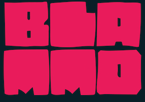 Illustrator and graphic designer in Dublin, Ireland. Designer of the
  [
[ Art director in Dublin, Ireland (was: Milan, Italy). In 2020, he designed the
  Aka Eva Barabas, and as Digital Studio. Ireland-based designer of Zenfyrkalt (2015, decorative textured caps), Papyrus EBO (2015), and Cirkus (2015, curly font).
 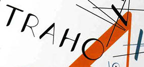 Dublin, Ireland-based designer of the fun all caps typeface Traho (2017). [
 Graphic designer from Dublin. He made the experimental
  [
[ Paul Bokslag is a Kilkenny, Ireland-based type designer.
 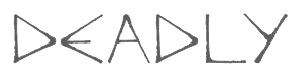 Typographer and type designer from Waterford, Ireland, b. 1980. Creator of
  Graphic designer in Dublin, Ireland, who created a set of 26 decorative capitals in 2015. [
 Graphic designer in Dublin, where he ran
  Irish type designer who graduated from the MATD program at the University of Reading in 2015. His graduation project was
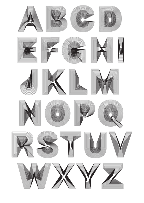
  Galway, Ireland-based Leon Butler created the programmed typeface Generative Sans in 2015. It redraws a letterform each time it is typed. Generative Sans won Butler a Type Director's Club Award of Excellence in its 2015 Communication Design Competition.
  [
[ Graduate of
  [
[ English designer in West Cork, Ireland. In 2014, he designed the classical roman caps typeface
  Sean Mongey is a designer, coder, and co-founder of Dublin-based design studio Post. He graduated from NCAD in 2008. Designer of these typefaces:
  Séamas Ó Brógáin (Seirbhísí Leabhar) is an Irish type specialist based in Dublin. He has a page on type measurements, with a proposal for reform. His typefaces are all free:
 Signal Type Foundry & Drawing Office is a type foundry in New York City, est. 2012 by Max Phillips (b. 1957, New York City), a typographer, graphic designer, toy designer, creative director and novelist who moved to Dublin, Ireland, in 2013 with his Irish spouse. His typefaces:
  Dublin, Ireland-based draduate of the
  Dublin-based freelance designer and illustrator.
  Or Tom Foley. Graphic and type designer in London. Foley obtained an MA in Communication Design Central from Saint Martins in 2009. Visiting lecturer on The MA Communication Design course at Central Saint Martins and the BA Visual Communications Course at Bristol University of Art&Design. In 2018, he became Creative Type Director at Monotype.
 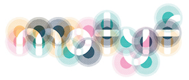 As a graphic design student in Dublin, Ireland, Tom Gillan created the colored ball font Motyf 2018 (2017). [
 In 2012, Conor Nolan (Dublin, Ireland), Bobby Tannam, David Wall and Rob O'Reilly launched the TypeGroup type foundry. Their first two releases are the sans-serif family
  Andrew Walsh (TypeTrough) is the Kiltimagh, Mayo, Ireland-based creator of a mechanical ornamental caps typeface called
  Vincent Connare (b. 1960, Boston) is an ex-painter turned type designer, who holds an MA in typeface design from the University of Reading in 1999. In the late eighties/early nineties Connare worked in the Ikarus, Intellifont and TrueType teams for Agfa/Compugraphic, and was one of the first type designers to learn TrueType hinting. Then he joined Microsoft, where he designed
  Based in Dublin, Ireland, Sarhan is a student at The National College of Art&Design, Ireland. He created just one typeface, a sans typeface made up of line segments and arcs of circles, called
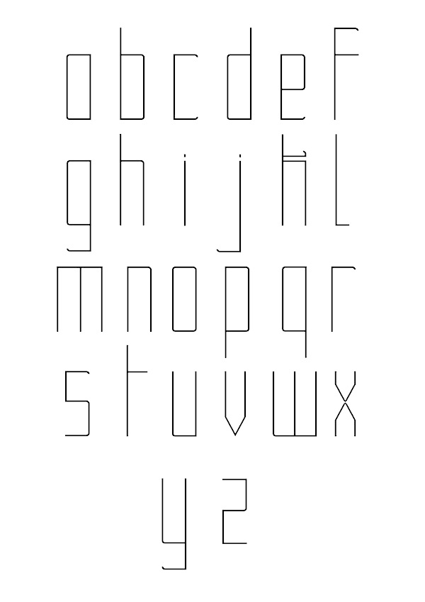
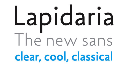
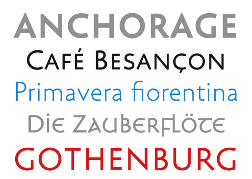
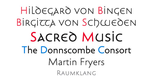
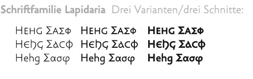
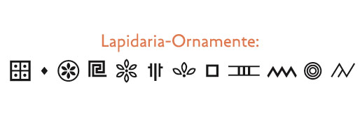
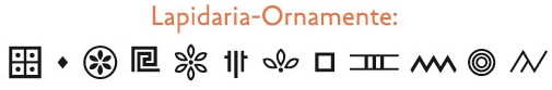
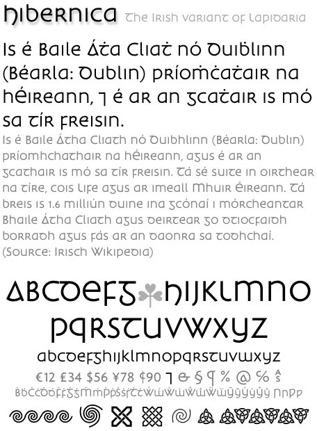
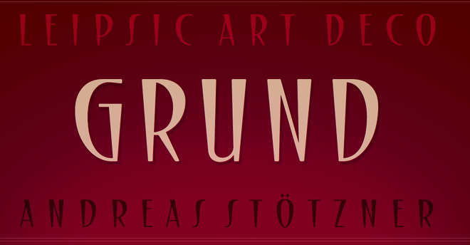
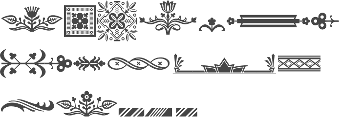
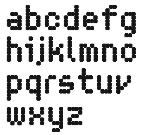
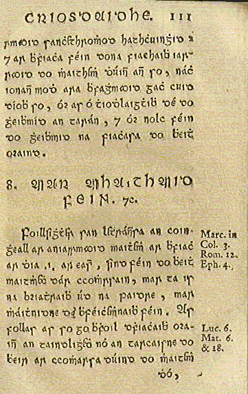
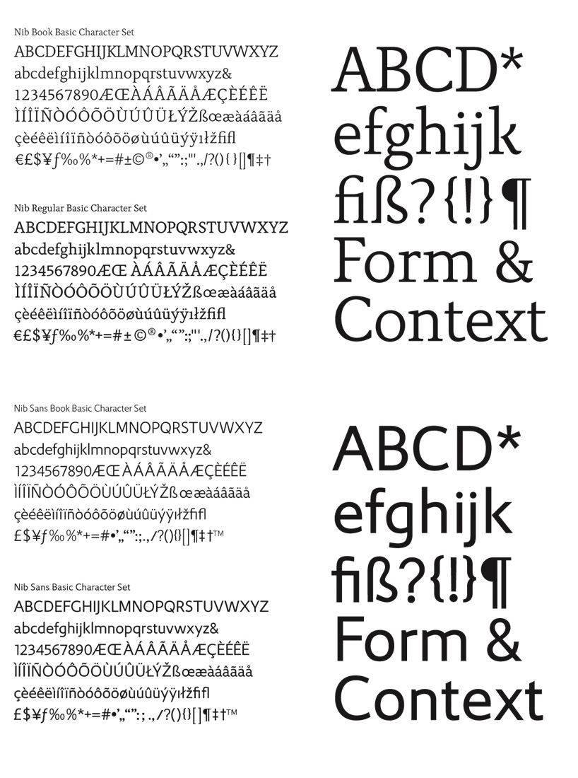
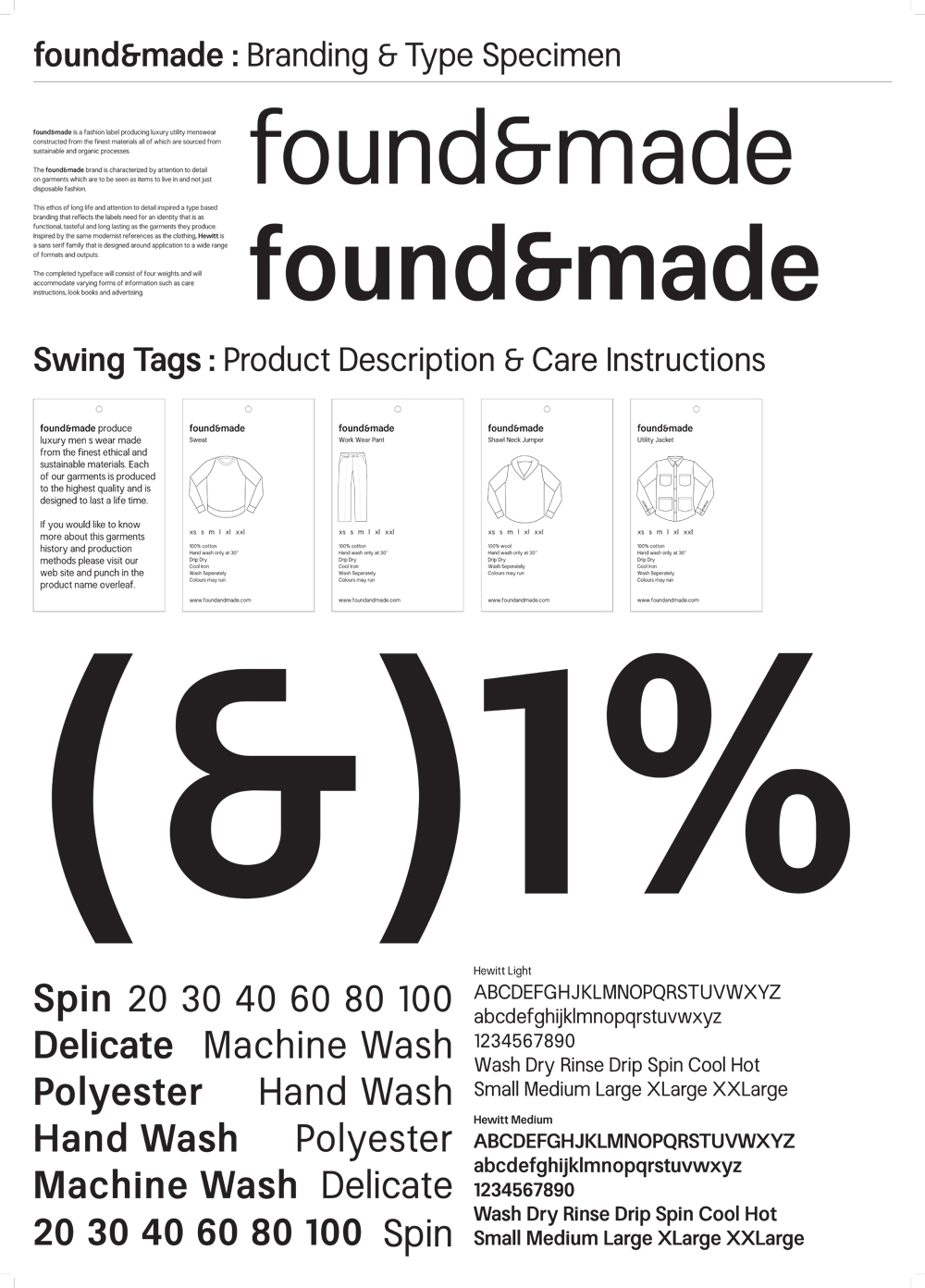
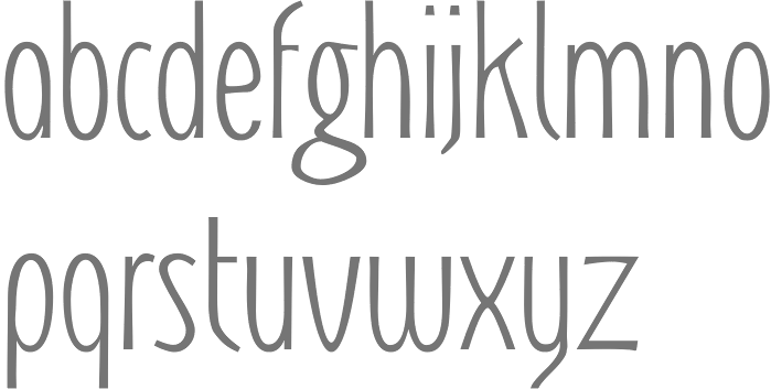
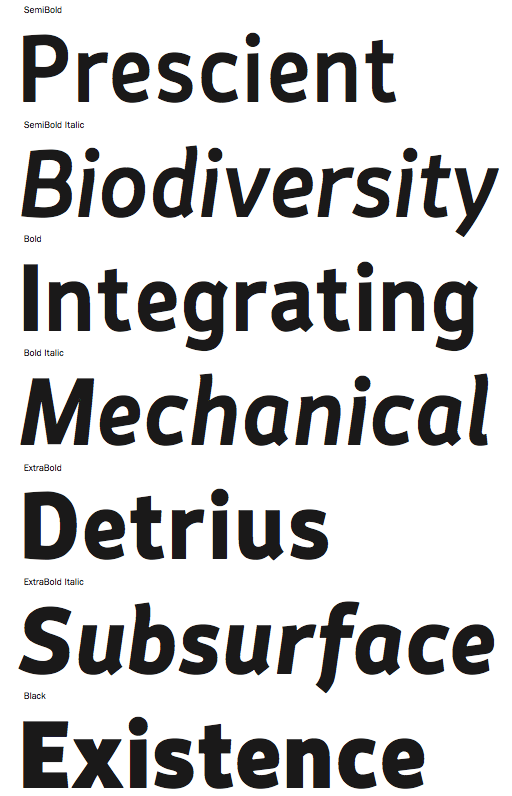
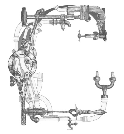
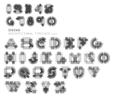
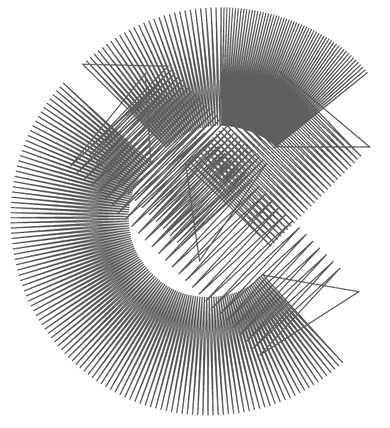
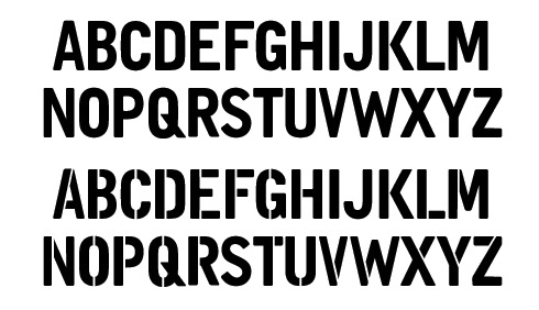
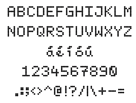
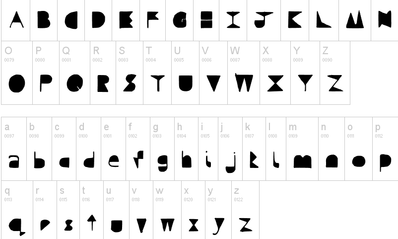
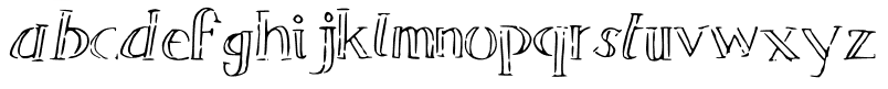
|
|
|
|