TYPE DESIGN INFORMATION PAGE last updated on Thu Jul 16 06:21:17 EDT 2026
FONT RECOGNITION VIA FONT MOOSE

|
|
|
|
|
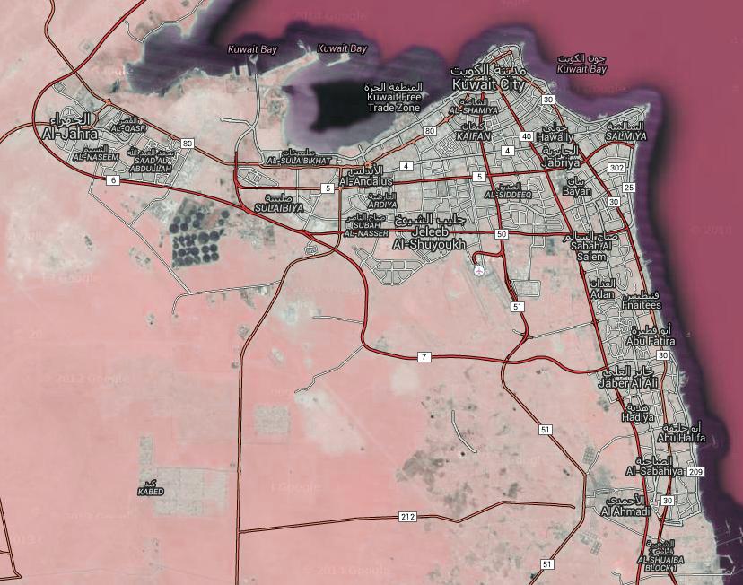
Type design in Kuwait | ||
|
|
|
|
SWITCH TO INDEX FILE
29 Letters
|
At ATypI 2008 in St. Petersburg, he ran a workshop on the Arabic Kufi script. Speaker at ATypI 2010 in Dublin on the topic of political resistance and expression through graffiti in Lebanon and Palestine. His contributions to type design:
|
Kuwait City-based designer of the free typeface American Captain (2015). [Inside the font however, we find a copyright notice of The Fontry, dated 2010.] [Google] [More] ⦿ | |
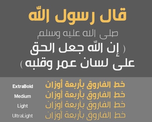
In 2014, he created Sheba. In 2015, he added Sanaa, Balqees and Sheba Ye. In 2016, he designed Sanaa Ye. In 2017, he added the rough brush typeface Angry Bird. [Google] [More] ⦿ | |
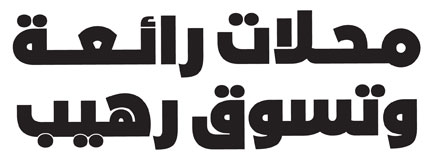
Free Arabic typeface made in 2015 by a female type designer in Kuwait, aka Purity KW. Google Plus link. [Google] [More] ⦿ | |
During her graphic design studies at the American University of Kuwait, Amoona Saohin designed the triangle-themed geometric typeface Triagulum (2013). [Google] [More] ⦿ | |
Boutros International (or: Boutros Arabic Typefaces)
|
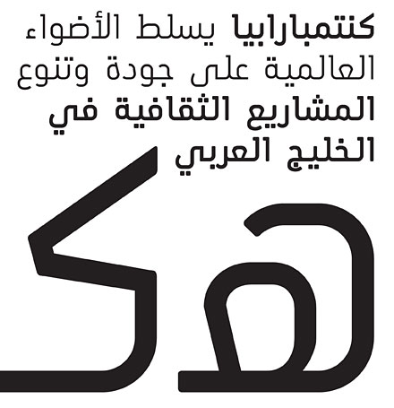
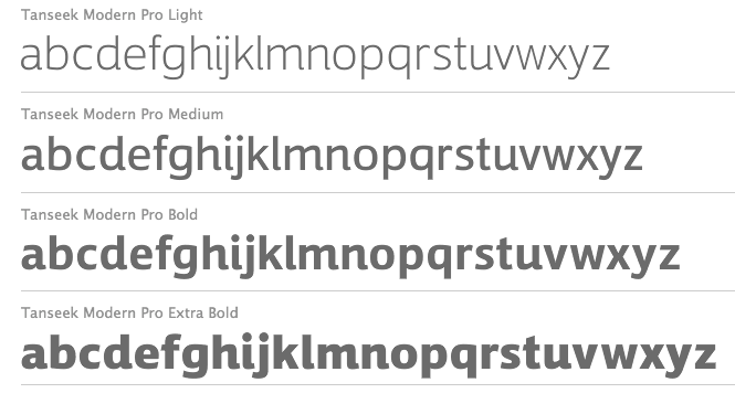
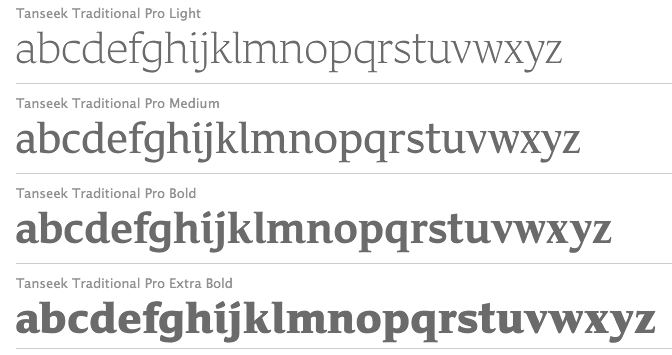
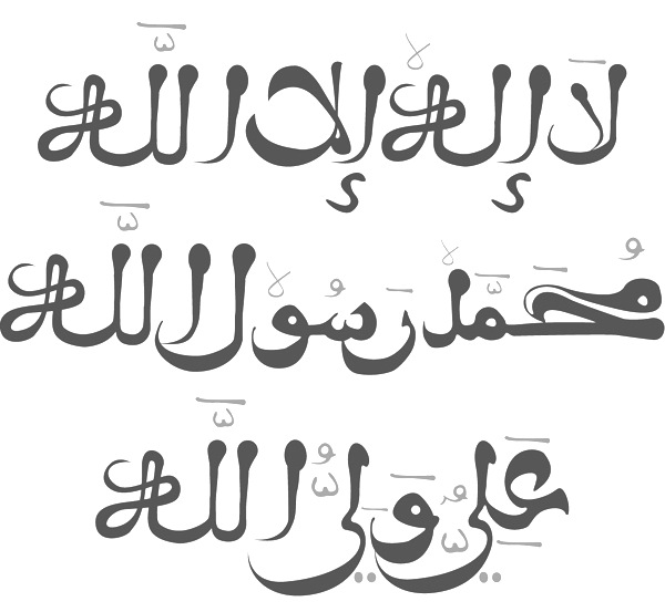
Their fonts include Boutros Decorative Kufic, Boutros Display, Boutros Koufic, Boutros MB Naskh, Boutros Modern, Boutros New Koufic Modern, Boutros Simplified Naskh, Boutros Asifa, Boutros Farah, Boutros Farasha, Boutros Fares, Boutros Najm, Boutros Thuluth (2012, based on Arabic bamboo calligraphy), Boutros Advertisers Naskh, Boutros Advertising, Boutros BBC Arabic, Boutros GE Tasmeem, Boutros Latin (Serif, Sans Serif), Boutros Maghribi, Boutros Minaret. See also here. Mourad Boutros is an experienced Arabic creative director, calligrapher and typographer. From his bio: Since 1978, he has been Arabic typographical consultant to many international companies including Letraset. Mourad has designed more than 50 Arabic typefaces, some of which are available on IBM printers as core fonts. Typeface commissions have included corporate typefaces for Mercedes-Benz and for Al Anba, the leading Kuwaiti Arabic newspaper. The early ITC collection in the 1980s had six Arabic typefaces: ITC Latif, ITC Boutros Calligraphy, ITC Boutros Setting, ITC Boutros Kufic, ITC Boutros Modern Kufic, ITC Boutros Rokaa. At Ascender, Mourad published Boutros Maghribi (2009, co-designed with Rana Abou Rjeily), based on the Arabic calligraphy bamboo classical Maghribi style. In 2008, Boutros co-designed Tanseek Modern and Tanseek Traditional with Richard Dawson and Dave Farey. Here you can download these 2004 fonts by Boutros: GEBox-Bold, GECapMedium-Medium, GEContrastBold-Bold, GECurvesMedium-Medium, GEDinarOne-LightItalic, GEDinarOne-Medium, GEDinarOne-MediumItalic, GEDinarTwo-Light, GEDinarTwo-LightItalic, GEDinarTwo-Medium, GEDinarTwo-MediumItalic, GEEast-ExtraBold, GEEast-ExtraboldItalic, GEElegant-Italic, GEElegantMedium-Medium, GEFlow-Bold, GEFlow-BoldItalic, GEFlow-Italic, GEFlow, GEHili-Book, GEHili-Light, GEJarida-HeavyItalic, GEJaridaHeavy-Heavy, GEMBFarahBold-Bold, GEMBFarashaLight-Light, GEMBFaresMedium-Medium, GEMBMBBold-CondensedBold, GEMBNajmBold-Bold, GEModernBold-Bold, GEModernLight-Light, GEModernMedium-Medium, GENarrowLight-Light, GESSTVBold-Bold, GESSTextBold-Bold, GESSTextItalic-LightItalic, GESSTextLight-Light, GESSTextMedium-Medium, GESSTextUltraLight-UltraLight, GESSThree-Italic, GESSThree-Light, GESSTwoBold-Bold, GESSTwoLight-Light, GESSTwoMedium-Medium, GESSUniqueBold-Bold, GESSUniqueLight-Light, GESmooth-LightItalic, GESmoothLight-Light, GETasmeem-Medium, GEThameen-Book, GEThameen-BookItalic, GEThameen-DemiBold, GEThameen-DemiBoldItalic, GEThameen-Light, GEThameen-LightItalic, GETye, GEUnique-ExpandedBold, GEWideExtraBold-ExtraBold. Here one can find Boutros-Ads-Pro-Bold, Boutros-Ads-Pro-Bold-Condensed, Boutros-Ads-Pro-Light, Boutros-Ads-Pro-Medium, and Boutros-Ads-Pro-Medium-Italic. In 2017, Mourad Boutros and Soulaf Khalifeh published the free low contrast Tajawal sans typeface family for Latin and Arabic. Google Fonts link. Github link. In 2018, Boutros Fonts published URW Geometric Arabic. FontShiop link. [Google] [MyFonts] [More] ⦿ |
Fabrizio Schiavi
| |
Fabrizio Schiavi Design (or: FSD)
|
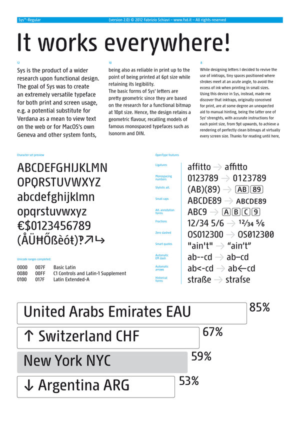
Bio at FontFont where he made FF Mode 01, FF 0069, FF GeabOil, FF9600, FF Trade 01, FF Steel Mix, FF Steel Ring, FF Steel Jones. [T-26] designer of D44 (1994), Lithium (1994, dingbats), Moore895 (1994), Moore899 (1994), Sidewalker (1994), Exit (1988). Many of his typefaces are grungy such as Washed (1994). Some are minimalist, such as Monica Due (1999), Monica (1999), and Eco (2001, developed from a logo in the 70s for Ageco). The latter three fonts are very geometric in nature. Other fonts: Washed (1994), Parakalein, Aurora Nintendo (1995), Aurora CW (1995), Mode01 (1995), GeabOil (1995), 9600/0069 (1995), Fontology (1995), CP Company (2000: a corporate sans), FSDItems (2001), FSDforMantraVibes (2001), Pragmata (2001, monospace, designed for programs), PragmataFlash (2002, a pixel font), Pragmata Pro (2011, still monospaced), Sys (2002), SysFlash (2002, a pixel font), Sys 2.0 (2012, a condensed sans designed for very small print), Virna (2003, a multiline typeface for Italian MTV, discussed here). The Pragmata and Sys series were optimized for screen usage. In addition, Sys has many ink traps, so it prints well at small sizes, and is more legible than Verdana. He does some custom typeface design, such as the innovative sans serif family called CP Company (2000). Other clients include Al Hamra Complex Kuwait, Nike, MTV, YU, Beretta, Abitare magazine, Ferrari and Philip Morris. In 2007, he produced a stencil and signage font, Siruca (see also here), for the Al Hamra Complex, one of highest skyscrapers in the world, located in Kuwait. Siruca Pictograms (2008) is free. In 2015, he followed that up by a non-stencil rounded sans called Sirucanorm: Designed using golden ratio formulas, it's inspired to DIN and Isonorm typeface. In 2013, he published Sys Falso, Abitare Sans (30 weights, originally commissioned by the group Rizzoli Corriere della Sera. Abitare is an Italian magazine). Typefaces from 2014: Nove (a German expressionist typeface inspired by B movie typography: Nove freshly reworks exploitation film era movie poster lettering, refitting the genre to a contemporary audience. The expressive typeface was done for a Nike Italy spoof campaign featuring 1970s cult film director Enzo Castellari and a recently found film reel from his archives, featuring several current Italian athletes and American basketball star Kobe Bryant). The rounded sans typeface Widiba Bank (2015) was co-designed with Jekyll & Hyde in 2015 for the brand identity of the new bank of Gruppo Monte dei Paschi di Siena. In 2016, he designed the custom corporate typeface R&M in art nouveau style. In 2020, he released the (variable) retail version of CP Company called oook. In 2021, he released Nure (a 54-style sans font family that includes a three-axis (weight, optical, width) variable font). At ATypI in Rome in 2002, he spoke about the need for more fonts. Hellofont link. FontShop link. Font Squirrel link. Showcase of Fabrizio Schiavi's typefaces. [Google] [MyFonts] [More] ⦿ |
At the American University of Kuwait in Kuwait City, Farah Asaad designed the decorative Latin / Arabic typeface Mixaur (2016). [Google] [More] ⦿ | |
Graphic designer in Kuwait who created an Arabic typeface in 2014. [Google] [More] ⦿ | |
| |
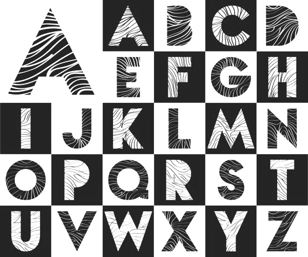
Graphic designer in Jleeb al Shuyoukh, Kuwait. Designer of the Latin caps alphabet Striped (2013). The outlines of Striped are from Nova. [Google] [More] ⦿ | |
| |
Khalid Al-Mazrouei
| |
Kmaz
|
|
Damascus, Syria-born, 1993. As a graphic design student at the American University of Kuwait, Mai Ghannam created the display typeface Primitive Type (2015). [Google] [More] ⦿ | |
During her studies in Qortuba, Kuwait, Mariam Al-Hassan designed the squarish typeface Hantangular (2016). [Google] [More] ⦿ | |
Designer in Qurtoba, Kuwait, b. 1988. Flickr page. In 2010, he designed Dots and Lines. [Google] [More] ⦿ | |
Kuwait-based designer of the Latin typeface MHD (2014). [Google] [More] ⦿ | |
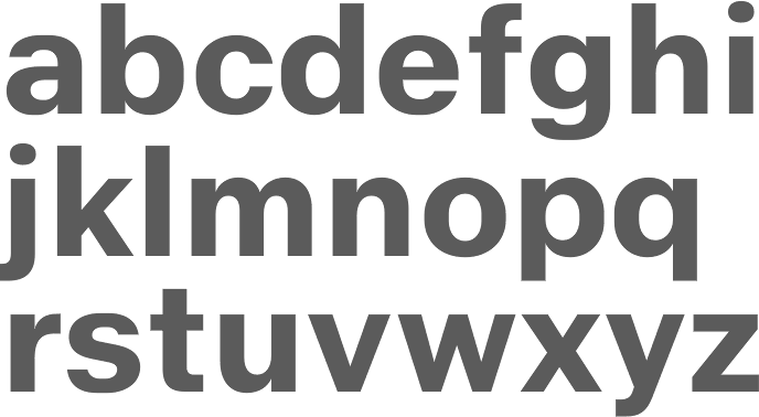
Kuwait City-based designer of the free all caps sans typeface Black (2018). [Google] [More] ⦿ | |
Mourad Boutros
| |
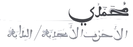
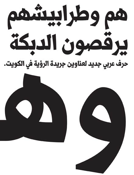
Kuwait City-based designer of a geometric kufi Arabic typeface in 2016. [Google] [More] ⦿ | |
Pascal Naji Zoghbi
| |
In 2013, he created the Latin typeface Pills. In 2014, he created the Latin typeface Folded Paper and the calligraphic typeface Aramisque. [Google] [More] ⦿ | |
During his studies at the American University of Kuwait, Rawan Alhussaini (Qortuba, Kuwait) designed several all caps Latin display typefaces (2016) and the skull-themed Skullets (2016, for Latin and Arabic). [Google] [More] ⦿ | |
Adiliya, Kuwait-based designer of the free font Circle Curve (2018), and the free font Clicky (2018). [Google] [More] ⦿ | |
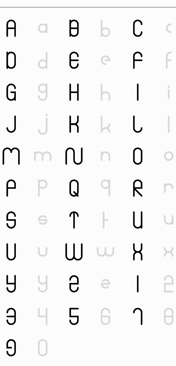
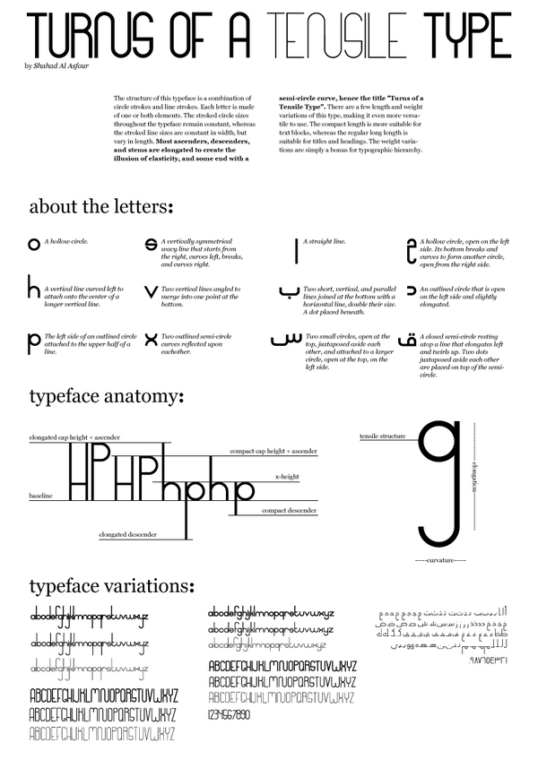
Student in Kuweit. Pure geometry (circles and lines) and a rigorous design process led to Shahad AlAsfour's Turns of a Tensile Typeface (2012) for Latin and Arabic. [Google] [More] ⦿ |
 Madrid (and before that, Lebanon)-based Arabic type designer who runs the Arab type news and blog site called Arabic Typography.
  Graphic designer from Sanaa, Yemen, now loacted in Kuwait City. Creator of several Arabic typefaces in 2013:
 Boutros calligraphic Arabic fonts (sold by
  [
[ Fabrizio Schiavi was born in Ponte dell'Olio in the Piacenza province in 1971. FSD Fabrizio Schiavi Design in Piacenza was opened in 1998. With Alessio Leonardi, he co-founded Fontology. He also co-launched the experimental graphics magazine Climax in 1994.
  Designer (b. 1990, Kuwait) of the free dingbat typefaces Camera Fotograami (2019), Fotograami Lamp Islamic (2018), Fotograami Shuruq (2018), Fotograami Hearts (2016) and Fotograami Flower (2016). [
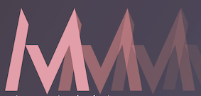 Kuwaiti designer of the Latin display typeface
  [
[ Designer in Hawalli, Kuwait. Creator of the calligraphic Arabic typeface
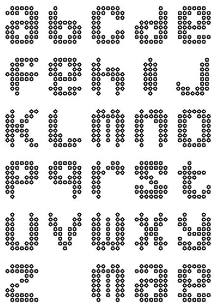
|
|
|
|