October 9, 2005
MacKellar, Smiths & Jordan
...
This page is about a foundry that dominated all American
foundries in the nineteenth century. It spearheaded the
big merger in 1892 that created the American Type Founders
Company (ATF): MacKellar, Smiths & Jordan.
History
American typefounding started in the 18th century.
In 1735, Christopher Saur established a foundry mainly for German type
at Germantown, PA.
His foundry was finally absorbed by Binny & Ronaldson.
Dutchman Adam G. Mappa settled in New York around 1787 and cast Dutch
and German faces, roman styles and oriental alphabets. Under
financial stress, many of the
matrices passed into the hands of Binny & Ronaldson.
In 1796, typefounding started in Philadelphia when Archibald Binny
and James Ronaldson, both natives of Edinburgh, Scotland, set up shop there:
they created the Philadelphia Type Foundry, aka Binny & Ronaldson
and the James Ronaldson Type Foundry.
Binny had emigrated in 1793.
James Ronaldson (b. Gorgie, Scotland, 1768, d. Philadelpoha, 1842)
arrived in Philadelphia in 1794.
The firm published specimen books in 1809, 1812, 1814 and 1816.
In 1815, Binny left, and the company became
James Ronaldson, successor of Binny & Ronaldson.
The last specimen book is from 1822.
In 1823, Richard Ronaldson (James' brother) took over the foundry, until 1833,
when he in turn was succeeded by Lawrence Johnson
Lawrence Johnson, an energetic and well-loved person (b. Hull, England, 1801,
d. Philadelphia, 1860),
and George F. Smith.
Johnson had introduced stereotyping in Philadelphia.
George Smith, who had come from England ca. 1810, was a good manager and a practical typefounder.
The company was called Johnson & Smith from 1833 until 1843.
The L. Johnson Type Foundry flourished
under Johnson's workaholic reign.
In 1843, Smith, who was in ill health, retired. The company
was renamed L. Johnson & Co, and existed under that name from 1843-1860.
In 1845, Johnson was
associated with Thomas MacKellar (b. 1812, New York, d. 1899, Philadelphia), John F. Smith and
Richard Smith (the sons of George Smith). The foundry now quickly grew in reputatioon.
In 1855, the firm published the Typographic Adviser, the first printer's
newspaper in the United States--it kept running and being distributed to printers until 1897 under the editorship of Thomas MacKellar (until 1885) and
later William Brasher MacKellar.
Johnson died in 1860, and was succeeded by his three partners
who, with Peter A. Jordan, constituted the firm known as
MacKellar, Smiths & Jordan. It became one of the world's main foundries.
John F. Smith (b. Philadelphia, 1815, d. Philadelphia, 1889) was the financial expert.
Richard Smith (b. Philadelphia, 1821, d. Paris, 1894) liked machinery, and thus, naturally,
he ran the mechanical department. He was put in charge of the James Conner Type Foundry in New York. After that, he had an important position at the Figgins Type Foundry in London, and
later he traveled through Europe where he studied type manufacturing methods. It was after that that he he took up the manufacturing position at the
L. Johnson Type Foundry.
Peter A. Jordan (b. Philadelphia, 1822, d. 1884) was a good business man.
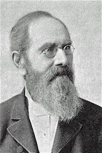
Thomas MacKellar had experience from the printing company
Harpers Brothers in New York and started out at Johnson & Smith as a proofreader
in 1833. He was also a poet, who was known as a generous person and a respected citizen
who helped many causes. So we had tytpefounders with very different
backgrounds.
In 1868, the business was still called the Johnson Type
Foundry.
Jordan died in 1884.
In 1885, William Brasher MacKellar (b. Philadelphia, 1844), G. Frederick Jordan
(b. Philadelphia, 1850, son of Peter A. Jordan) and
Carl Friederich Huch (b. Brunswick, Germany, 1830,
an immigrant since 1850) were associated with the remaining partners
and they formed The MacKellar, Smiths & Jordan Company.
George Frederick Jordan introduced many mechanical improvements
to typecasting.
In 1892, the American Type Founders' Company was created,
and MacKellar was absorbed into it, becoming its
principal branch.
At the formation of ATF, William Brasher MacKellar was its first Vice-President.
Later he became the Manager of ATF.
George Frederick Jordan became Director of the ATF Company.
Carl Friederich Huch, on the other hand, retired in 1892.
The source of this material was MacKellar's own book from 1896:
1796-1896 One Hundred Years MacKellar Smiths and Jordan Foundry,
Philadelphia, PA.
For a list of specimen books and a few pictures from them, check
Maurice Annenberg's book, Type Foundries of America and their Catalogs (1975, Maran Printing Services; reprinted in 1994 by Oak Knoll Press, New Castle, DE).
Links include

The specimen books
The early typefaces of the Johnson Type Foundry all
came from Binny & Ronaldson, which owned
several Scotch typefaces. Many designs
were added by MacKellar, mostly between
1876 and 1891, with a clear acceleration of the
production in 1889-1891.
None of the punchcutters
or type designers are named in any specimen book:
the status of the punchcutter was like that of a
craftsman or expert mechanic. MacKellar's specimen books
were beautifully printed and widely distributed---MacKellar
clearly had an eye for the business part of his foundry.
It was not until the early part of the 20th century
that we saw other foundries produce such wonderful
catalogs.
The Compact Book of Specimens
 The Compact Book of Specimens
(MacKellar, Smiths & Jordan Company, 1890)
has an impressive 512 pages of partial specimens of their types.
Only a few types, namely those produced in 1891-1892, are missing.
I will attempt to list all types shown in the catalog--not
an easy task since I was not allowed to scan or photocopy
any part of the book by Harvard University librarians.
This was a book known by all printers at the time.
The dates shown refer to original types patented in that
year. Many patented faces had no date.
Omitting borders, ornaments, Greek faces, music faces, and so on,
we could find these:
The 1868 specimen book
Specimens of Printing Types Borders Cuts Rules Etc
(MacKellar, Smiths & Jordan,
Philadelphia, 1868, 601 pages)
is a large format book that showcases most, if not all, types
owned by the company at that time.
In the book, the company is still called the Johnson Type Foundry,
but the preface is signed by Thomas MacKellar, John F. Smith,
Richard Smith and Peter A. Jordan.
This book does not have a single full alphabet,
and thus, I am afraid that many glyphs of many types may
never be found again.
Half the book consists of ornaments, flourishes, and so forth.
There are also Greek and Hebrew types, as well
as a large section on blackletter faces, which was standard
for that era.
I listed many types in the previous section, but
it is quite amazing that the majority of the types
were already in this 1868 book.
We have
many Scotch faces, specially adapted
for newspapers.
The book prominently showcases Law Italic , so I assume
that that was probably an original.
Among the scripts, we find
Garibaldi Script,
Hairline Italic,
Italian Script,
Graphotype (formal script),
English Script
+ No. 2,
Calligraphic Script,
Secretary (upright script),
Hancock,
Bulletin Script,
and
Arabesque (a psycho script).
The blackletter section
shows
Cuneiform,
Lutetian,
Black Ornate No. 2,
Borussian,
Card Text (1868),
Black Ornate,
Allemanic,
and many others too numerous to mention.
The fancy style types include
Minionette,
Philadelphian (1867),
Minaret (original),
and
Byzantine (original).
Many ornamented faces from the 1890 catalogs are
already in this early specimen book.
A curiosity is the stars and stripes ornamented letter face called National.
The 1890 specimen book
Specimens of Original Printing Types
cast by the patentees MacKellar, Smiths & Jordan Co.
(Philadelphia, PA , 1890)
is a small book,
mostly, but not entirely, contained in the bigger
Compact Book described above.
Here is a list of faces I did not see in the Compact Book:
But even with this, the very latest fonts are still elusive.
I am thinking, e.g., of some types made in 1892, such
as Isabella, a nice
art nouveau type digitized by Adobe.
Author
Luc Devroye
School of Computer Science
McGill University
Montreal, Canada H3A 2K6
lucdevroye@gmail.com
http://cg.scs.carleton.ca/~luc