TYPE DESIGN INFORMATION PAGE last updated on Sat May 16 08:11:51 EDT 2026
FONT RECOGNITION VIA FONT MOOSE

|
|
|
|
|
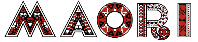
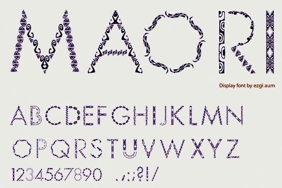
Maori fonts | ||
|
|
|
|
SWITCH TO INDEX FILE
A typeface by Agfa-Monotype, dated 2001, that covers Maori. [Google] [More] ⦿ | |
Graphic designer in Marilia, Brazil, who created the ornamental typeface Maia Maori (2012). [Google] [More] ⦿ | |
BluHead Studio LLC
|
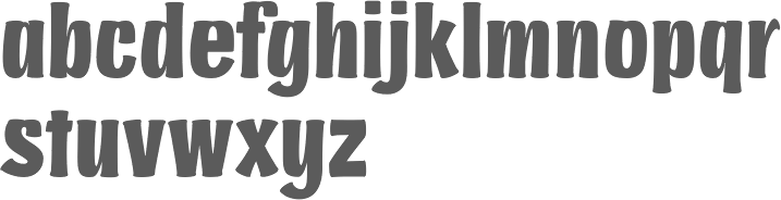
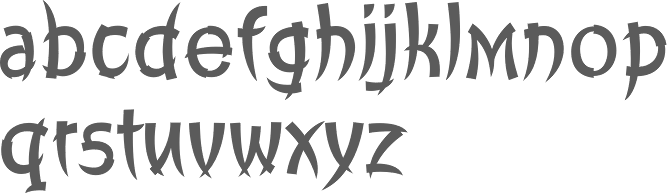
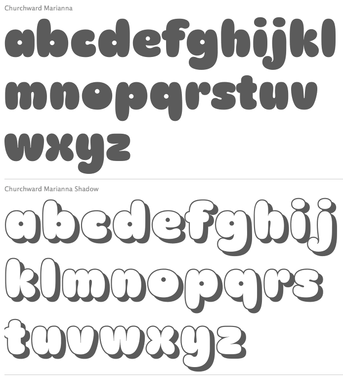
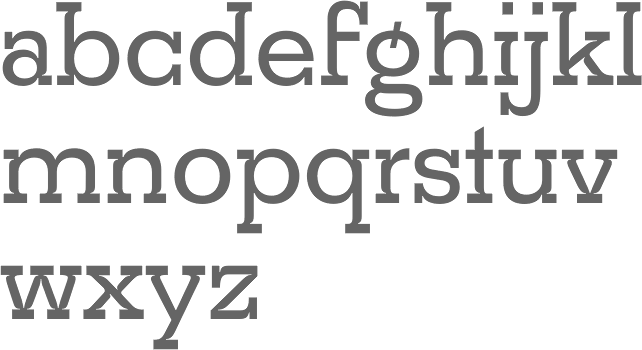
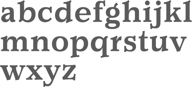
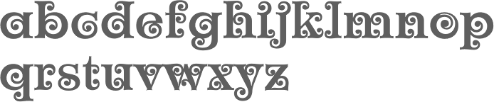
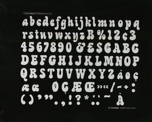
BluHead Studio LLC was founded in 2005 by a group of type designers, including Steve Zafarana, who founded Tail Spin Studio in 1999, also in Norwood, MA. Steve Zafarana was senior type designer at Bitstream from 2006-2012 and at Monotype from 2012 onwards. BluHead Studio was filling out the character sets and digitizing the font designs of New Zealand designer Joseph Churchward. These include the psychedelic Ta Tiki CW (2006) and Conserif CW, Design CW (2006, geometric). Creations by Tallulah Bluhead include Soylent Blu BH (2006: a bouncy cartoony wedge serif)) and Conference Call BH (2006). Roy Preston published the Prenton RP humanist sans family in 2006 and the comic book style families Comixed RP and Roy Hand RP in 2007. Between 2006 and 2008, several hand-printed typefaces were published. These include Barbara Script BH (2007, after the hand of Barbara Bemiss), Ciof Script BH (2008, a felt tip pen font after Susan Ciofolo Antico), Sally Script BH (2006, after Sally Muspratt), and Joanne Script BH (2007, by Joanne Paul). Sparkle Bluff BH (2007) is a ball and stick font for children. Notebook BH (2008) is a block letter face. In 2007, BluHead started publishing fonts by Joseph Churchward: Churchward Asia, Churchward Brush, Churchward Chinatype, Churchward Heading, Churchward Lorina (2014---the original by Churchward goes back to 1996), Churchward Maori, Churchward Maricia, Churchward Ta Tiki, Churchward Conserif, Churchward Design Lines, Churchward Freedom, Churchward Isabella (2015, a sans), Churchward Marianna (bubblegum face), Churchward Montezuma (2012, based on an Aztec-inspired design), Churchward Newstype (2008), Churchward Samoa, Churchward Supascript, Churchward Typestyle (2022; a 12-style sans). FontShop link. Creative Market link. Klingspor link. View the BluHead typeface library. [Google] [MyFonts] [More] ⦿ |
Churchward Type
|
His early type designs were released as photolettering through Berthold. In 2000, in partnership with Chank, his fonts are finally being converted to the standard electronic formats. In 1984, he won a Silver Prize at the Morisawa Awards competition. In 2009, he was made a life member of The New Zealand Designers Institute DINZ. MyFonts writes: Churchward Type started in 1962 as Joseph Churchward's freelance lettering service. Within six months he had generated enough work to move from his job as Senior Artist into setting up Churchward International Typefaces, which became one of the largest typesetting companies in New Zealand. In 1969 Joseph was asked to submit alphabet designs to Berthold Fototypes and saw immediate success. He later went on to sign distribution agreements with D.Stempel AG, Dr Böger Photosatz GmbH/Linotype, Mecanorma-Polyvroom B.V and Zipatone. He self-published a handful of original fonts in 1978 becoming the first and only company in New Zealand to publish original photo-lettering. Churchward International Typefaces was forced to close in June 1988 but Churchward Type lives on with a fresh set of independent releases. David Buck has taken on the role of digitisation. Joseph continues to draw alphabets and now has a stockpile of over 300 unique alphabets to his name. Catalog of Joseph Churchward's typefaces:
View Joseph Churchward's typefaces. [Google] [MyFonts] [More] ⦿ |
Wellington, New Zealand-based digital designer. in 2019, she made the textured all caps color font Naumai, which is based on the geometric patterns found in traditional Maori art forms, weaving and tukutuku patterns. [Google] [More] ⦿ | |
During her graphic design studies in Auckland, New Zealand, Emma Takiwa created the ornamental caps typeface Maori (2013). [Google] [More] ⦿ | |
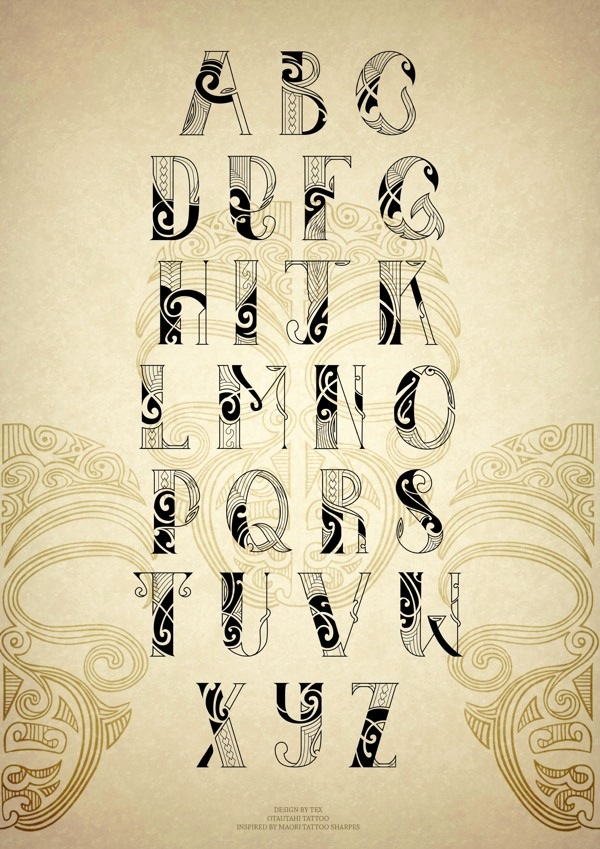
Istanbul-based designer of Maori (2013), a display typeface that builds on Maori ornaments. Behance link. [Google] [More] ⦿ | |
Vicky Tay's great fancy/faerie/fantasy/dingbat font archive. Has some Maori fonts (Verdana, ComicSans, TimesRoman). [Google] [More] ⦿ | |
During her studies at Auckland University of Technology in Auckland, New Zealand, Georgina Page designed the Maori-inspired all caps typeface Korowai (2016). [Google] [More] ⦿ | |
Free Maori fonts could be had at this defunct Government of New Zealand web site: ArialMT-Mäori, Arial-BoldMT-Mäori, Arial-BoldItalicMT-Mäori, Arial-ItalicMT-Mäori, ArialNarrow-Mäori, ArialNarrow-Bold-Mäori, ArialNarrow-BoldItalic-Mäori, ArialNarrow-Italic-Mäori, BookAntiqua-Mäori, BookAntiqua-Bold-Mäori, BookAntiqua-BoldItalic-Mäori, BookAntiqua-Italic-Mäori, BookmanOldStyle-Mäori, BookmanOldStyle-Bold-Mäori, BookmanOldStyle-BoldItalic-Mäori, BookmanOldStyle-Italic-Mäori, CenturyGothic-Mäori, CenturyGothic-Bold-Mäori, CenturyGothic-BoldItalic-Mäori, CenturyGothic-Italic-Mäori, CenturySchoolbook-Mäori, CenturySchoolbook-Bold-Mäori, CenturySchoolbook-BoldItalic-Mäori, CenturySchoolbook-Italic-Mäori, CourierNewPSMT-Mäori, CourierNewPS-BoldMT-Mäori, CourierNewPS-BoldItalicMT-Mäori, CourierNewPS-ItalicMT-Mäori, MonotypeCorsiva-Mäori, TimesNewRomanPSMT-Mäori, TimesNewRomanPS-BoldMT-Mäori, TimesNewRomanPS-BoldItalicMT-Mäori. But no longer. [Google] [More] ⦿ | |
Maori page with 600kb worth of Maori fonts for Mac and PC: Arial, TimesNewRoman, Verdana. The fonts need a macron over vowels. Otherwise, they are indistinguishable from ordinary Latin fonts. [Google] [More] ⦿ | |
Brisbane, Australia-based designer of Saber (2014, a stencil typeface with maori symbolism) and of the alchemic Symbols Typeface (2014). [Google] [More] ⦿ | |
Graphic designer in Hamilton, New Zealand. For a school project, she created Nga Mihi (2013), a typeface inspired by common Maori motifs appearing in traditional art and designs, in particular the art of ta moko (tattooing). [Google] [More] ⦿ | |
| |
| |
Maori designer in Hamilton City, New Zealand, who created the computer simulation typeface Nikora (2013) during his studies at Waikato Institute of Technology. [Google] [More] ⦿ | |
Jaduger Design Studio (and: Twodollarshop)
|
Typefaces from 2017: Ashial Chalky, Mibrush (dry brush script), Malo Script, Egyp (hieroglyphs), Cycle Font (bike scanbats), Tamaki Pro (grungy letterpress emulation typeface), Stone Age, Kabadi (a geometric headline sans), King's Initials, Handwriter (grungy). Typefaces from 2018: Gothink (an ultra-condensed sans family with solid and aged versions of all styles), Kula, Reformer (a tall condensed gothic sans). Typefaces from 2020: Kula (+Shadow: a 4-style poster serif), Typrighter V1. A substore of Jadugar Design Studio is Twodollarshop. MyFonts link. [Google] [MyFonts] [More] ⦿ |
Witehira is of Tamahaki (Ngati Hinekura), Nga Puhi (Ngai-tu-te-auru), Ngati Haua, and New Zealand European descent. In 2014, he developed the Maori typeface Whakarare after he returned to New Zealand to pursue his doctorate in Maori design at Massey University. Linkedin link. [Google] [More] ⦿ | |
During her studies at the School of Media Arts, Wintec in Hamilton, New Zealand, Jordan Mawer (Tauranga, New Zealand) created the display typeface Mawi (2015), which was influenced by some shapes from the Maori culture. [Google] [More] ⦿ | |
Joseph Churchward
| |
In 2019, Kendra Leilua (Auckland, New Zealand) and Jacob Lepper embarked on a project to map and ccreated the (Maori) Te Reo alphabet. [Google] [More] ⦿ | |
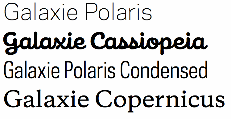
KLIM (or: Klim Type Foundry)
|
In 2020, he started writing the text The Art of Letters. [Google] [MyFonts] [More] ⦿ |
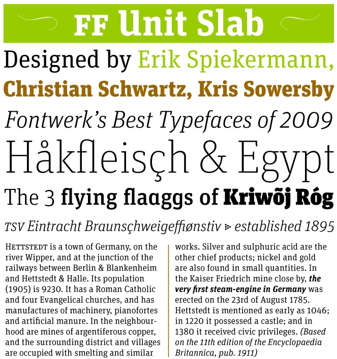
Kris Sowersby
| |
Honolulu, HI-based designer of the blackletter typeface Ngatahi (2016): Ngatahi's forms are influenced by the structure and shapes inherent in 19th century Gothic Revival Architecture; a style that was brought to New Zealand by the early European settlers. The pattern work and koru shaped terminals are a reflection of Maori weaving and Kowhaiwhai patterns that are commonly used in Maori art and architecture. [Google] [More] ⦿ | |
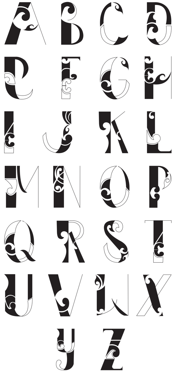
Graduate of Yoobee Design School. Inspired by Maori carvings, Lee Taniwha (Auckland, New zealand) created Te Wero (2012). [Google] [More] ⦿ | |
Two orphaned fonts from ca. 2000: Garamond Macron Maori, Reddfish. Designers unknown. [Google] [More] ⦿ | |
Canterbury, UK-based creator of the ornamental caps typeface called Maori (2011). [Google] [More] ⦿ | |
Mobaric Minhas
| |
Otto Maurer
| |
Otto Maurer (was: Tattoofont)
|
Otto Maurer (Tattoofont) created Ipoint (2008, a 15-style fun-filled Bauhaus-inspired family), Black and Beauty (2007, blackletter family), Big Rain (2007), Blood (2007, dripping blood type), Preussen (2007, a 4-style blackletter family), Otto Bismarck Italic (2007), an italic blackletter face, and its parent, Otto Bismarck (2007). Designer of the free curly font Corps Script (2006) and Corps Script Shadow (2006). Creator with Sabrina of the free handwriting fonts Sabsis Handwriting Version 3 (2007) and Sabsis Handwriting (2007). Home page. Dafont link. Yet another URL. In 2007, he went partially commercial and set up shop at MyFonts. His fonts there include the artsy Sailors Tattoo (2006), SailorsTattoo-waves (2007), Sailors Tattoo Pro Xmas (2007), Sick Skull (2007, scary), Tribal Maori (2007), MauBo Flatline (2007, experimental), Tribal Dingbats (2007), Tribaltypo (2007: quite interesting), MauBo (2007, mechanical look), Hotrod (2007), Blood (2007, scary), MauBo Flatline (2007, white on black) and Corpse Fairy (2007), Mrs. Sabo (2007, calligraphic and grunge hand), Tribal King (2007), Pierced (2007), Big Rain (2007), Detective Maurice (2007, a typeface with fingerprints on the alphabet), Cutdown Maurice (2007), Digital Maurice (2007), Good Old Fifties (2007, 11 styles), Tribal Dingbats II (2008, a tattoo font), Tribal tattoos III (2010), Hot Flames (2008), Drago (2008, a blackletter and alphading family), Party Night (2009), Tattoo Girl (2008). Typefaces from 2009: Yuma (2009, Western saloon font), Freiheit (2009, blackletter), Lycaner (2009, blackletter), Sud France (2009, script), Psychbilly (2009, fat brush), Love Mom (2009), Vampire (2009), Animal Zoo (2009), Turtle (2009), Grunge (2009, cracked marble family), Crate (2009). Typefaces from 2010: Big Mom (2010, a family that includes a blackboard bold style), Haike (2010). Typefaces from 2011: Tinka Babe (2011, a gangster or tattoo script), Poisoni Pro (2011, tall art nouveau style brush face, with Shadow and College sub-styles), Lanzelott (2011, a very elegant retro display family, followed in 2017 by New Lanzelott), Stencilla (2011, a heavy stencil face), Guilin (2007, brushy), Darkwood (2011), Rock n Roll Typo (2011), Loreen (2011: an elegant display family that includes a hairline and a shadow style). In 2012, he made the pointy Psychomonster typeface. In 2013, Otto Maurer published the gangster tattoo font Bibiana as a companion for Tinka Babe. Typefaces from 2014: Cupcakes Winterwonder (snowy font), Soul Winterwonder, Loreen Hollywood (art deco), Soul Material Design Dingbatz, Soul Love (Valentine's Day font), AZ Cupcakes, Soul (a sans family with some flaring), Christe Wagner (a great set of curly Victorian music sheet-inspired typefaces), Spider Type, Marie Lyn, Mariedean (a Victorian titling set, including decorative caps), Peachy (+ Shadow: a slab serif). Typefaces from 2015: Maori New Zeeland, Chika Tattoo (12-style tattoo script), Chino Tattoo, Big Yukon (Wild West font), Bonecracker, Freibeuter NR (Western Tuscan family), Sailor Marie (tattoo font family), Baby Lyns ABC (children's book alphabet). Typefaces from 2017: Anchorage (a sailor's tattoo font), Friedrichsfeld (blackletter). Typefaces from 2018: Lettre Damour (handwriting font), Cryptolucre (started in 2014, Cryptolucre is a font specifically for all crypto currencies like Bitcoins, Litecoins, Ethereum, Ark, Siacoin and Golem--the icon version includes some existing currency logos and newly invented currency logos), Haike, Soul Leo (textured), Soul Skull, Tattooflash Fingers, Tattooflash Marie. Typefaces from 2019: Stencilla. Showcase of Otto Maurer's fonts. View the typefaces made by Otto Maurer. [Google] [MyFonts] [More] ⦿ |
Paul Cracknell
| |
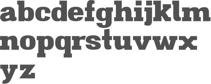
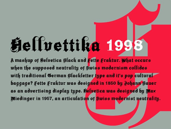
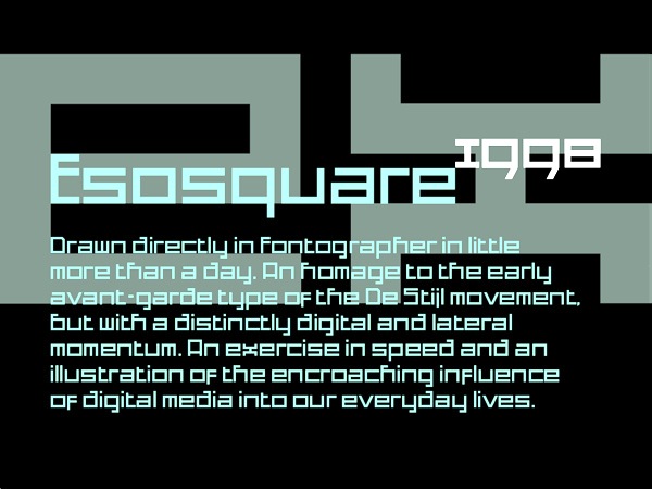
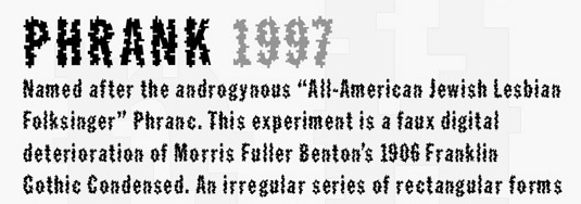
Graphic designer in Auckland, New Zealand. In 2013, he summarizes his career: Early career working in New Zealand for not for profit clients in theatre, music and fine arts. Two years at Saatchi & Saatchi NZ followed by ten years in New York City as a type director, design director and photographer. Recently returned to New Zealand after two years in Shanghai. Typefaces designed by him include Basalt (2011, bilined), Brutalism (2008), Cement (2009, octagonal), Hellvettika (1998, gothic, tattoo font), Esosquare (1998, squarish), Phrank (1997, experimental), and Hanson Unicase (2006). In 2015, the custom octagonal typeface Pure Pakati was developed at Whybin TBWA Auckland for Tourism New Zealand. Its design team comprised Philip Kelly (design director), Karl Wixon (Maori design consultant), Kris Sowersby (type designer) and Rangi Kipa (Maori carver). Pure Pakati blends the traditions of wood type with the traditional indigenous carving style of Aotearoa (New Zealand) in a hand-carved and digital fonts. Behance link. Another Behance link. Old URL. [Google] [More] ⦿ | |
Wellington, New Zealand-based designer of the Maori-themed textured typeface Ngake (2015). [Google] [More] ⦿ | |
Auckland, New Zealand-based designer of Aotea Square (2018), which is an Aztec / Maori decorative caps typeface. [Google] [More] ⦿ | |
| |
Hamilton, New Zealand-based designer of Whanau Kaha (2014), a typeface that is inspired by the Maoris. [Google] [More] ⦿ | |
Something and Nothing
|
Typefaces from 2021: Poxy (a sans typeface with water bubble texture), Swipe Write (a dry brush script). [Google] [MyFonts] [More] ⦿ |
Steve Zafarana
| |
During her studies at the School of Media Arts, Wintec in Hamilton, New Zealand, Tiana Paul created the super-organic typeface Aihikirimi (2015). This typeface uses some shapes from the Maori culture. [Google] [More] ⦿ |

 Type design studio located in Norwood, MA, est. 2005. Fonts can be bought at
 Haylie Gray (Hamilton, New Zealand) created
  Hanoi-based designer of the ornamental caps typeface
  Mobaric Minhas is the Auckland, New Zealand-based designer of the old typewriter typeface families AMTW (2016), Typerighter (2016), Silk Remington Typewriter (2016),
  KLIM is a type and graphic design studio run by Wellington, New Zealand-based designer
  [
[ [
[ [
[ Tattoo artist and graphic designer from Dinslaken (Duisburg), Germany, b. 1968, Duisburg.
  Sam Bunny (Wellington, New Zealand) created
  Auckland, New Zealand-based designer of
|
|
|
|